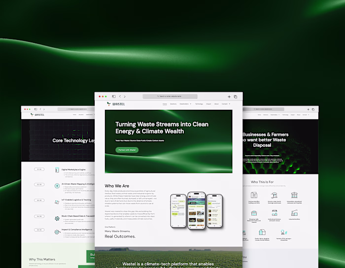
UX/UI Design: Wastel, India's Waste-to-Biofuel B2B Marketplace
Dorcas Thirugnanam
UX/UI Design: Wastel, India's Waste-to-Biofuel B2B Marketplace
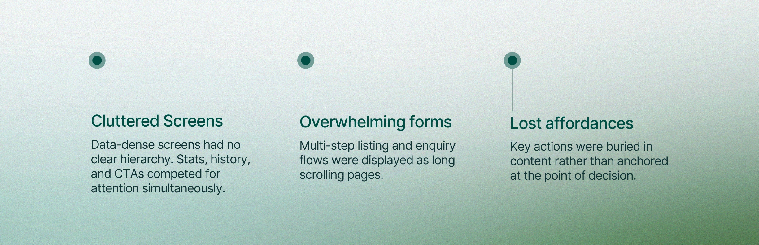
THE PROBLEM: Information-heavy screens doing too much
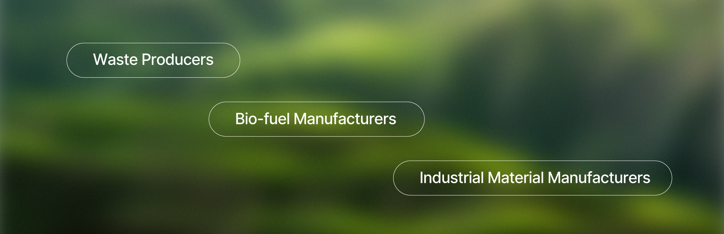
THE THREE VERTICALS
Each vertical unlocks a different version of the app at onboarding. A waste producer never sees the trading dashboard. A manufacturer never sees the waste listing form. The same app; three entirely different experiences.
MY SCOPE
I did not own end-to-end UX. What I owned was the quality of the experience at the screen level, hierarchy, affordances, interaction logic and the emotional tone of the product.
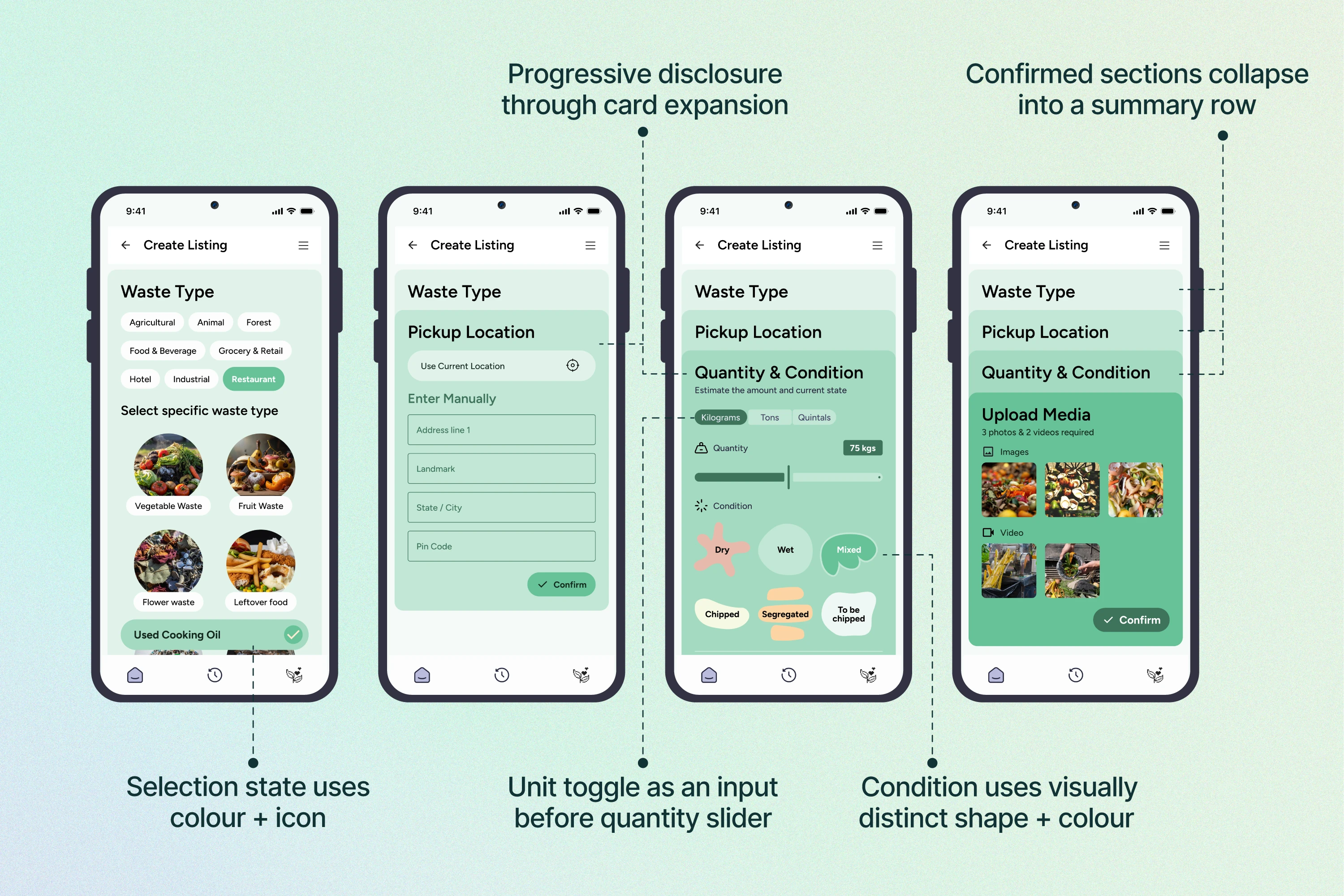
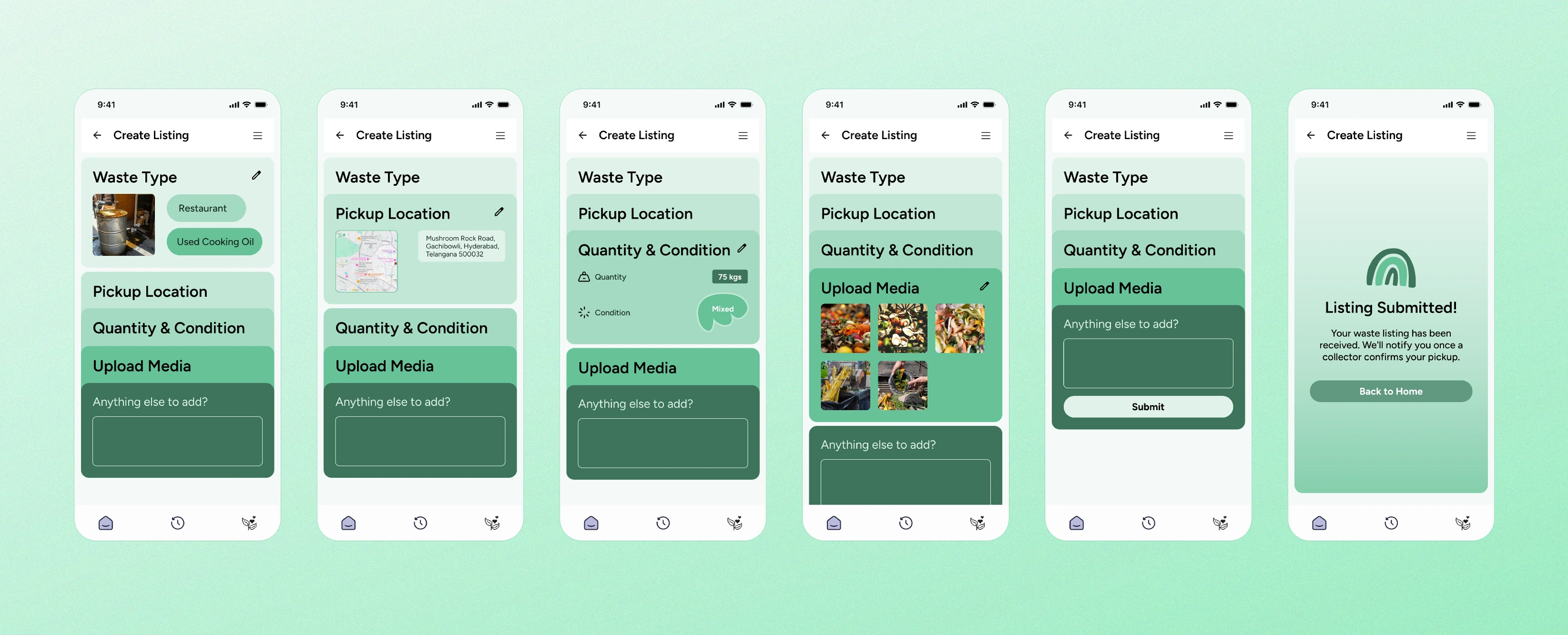
Progressive Card System:
The most technically demanding design challenge. A single long form was broken into a card-based accordion. Each section collapsed until the previous was confirmed.
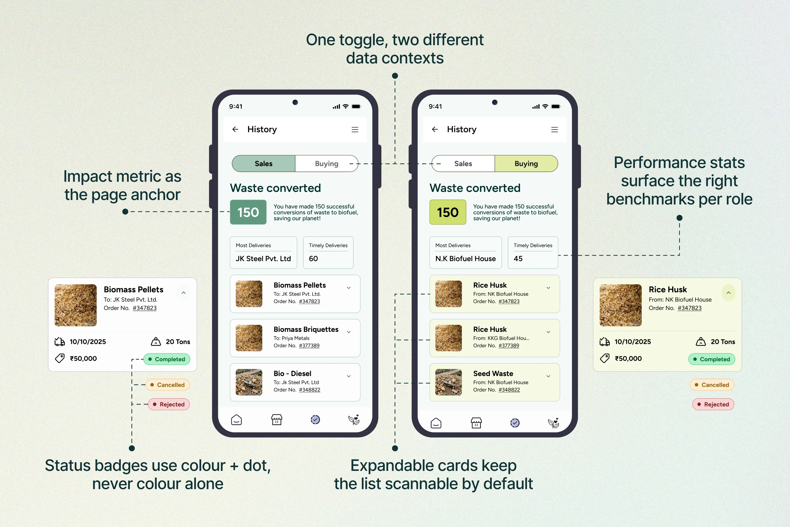
History: Sales & Buying Views
A single History screen serves both sides of every transaction. The Sales/Buying toggle is the primary navigation.
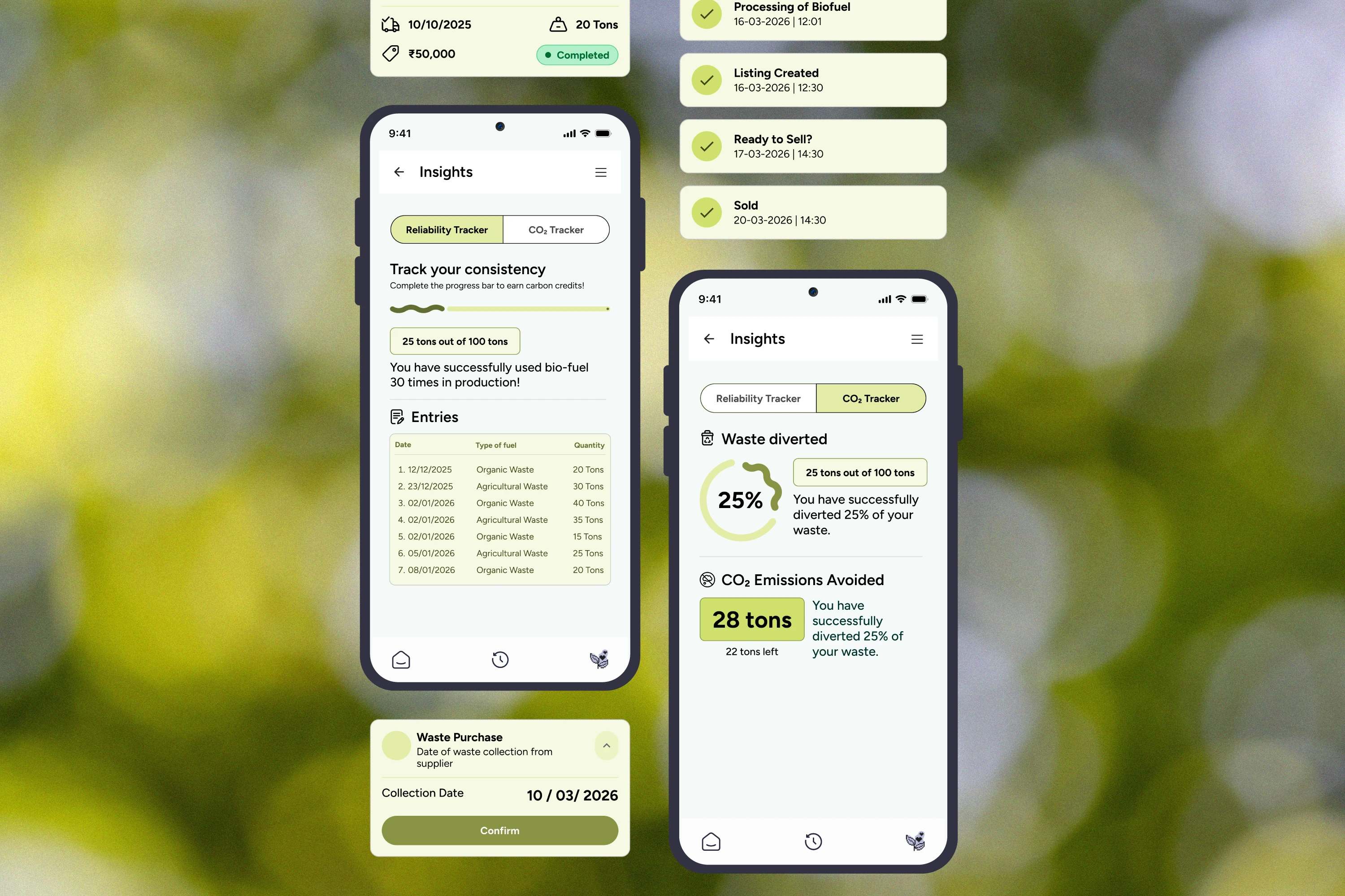
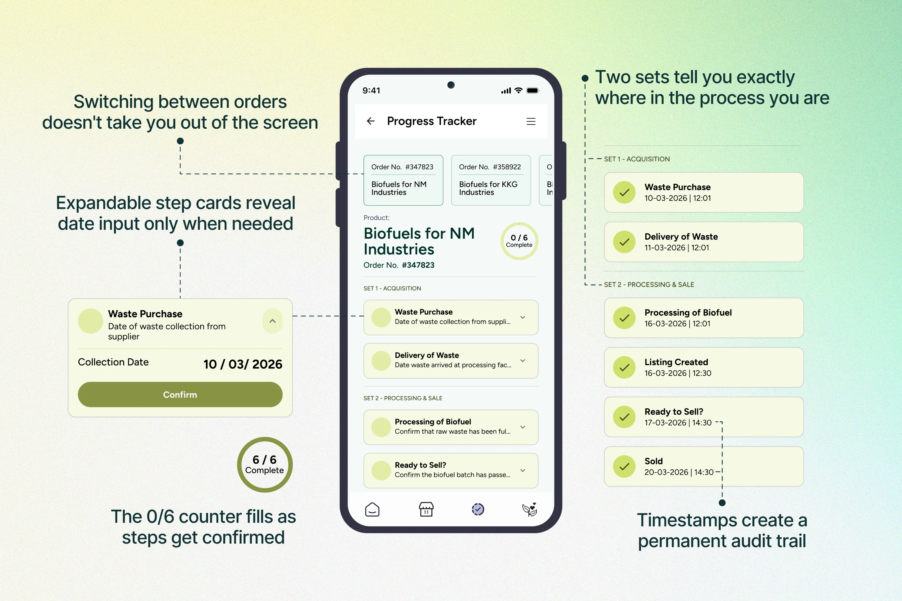
Progress Tracker: Step-by-step Order Traceability
Bio-fuel production is a multi-step physical process. The Progress Tracker maps each order across two sets: Acquisition and Processing & Sale.
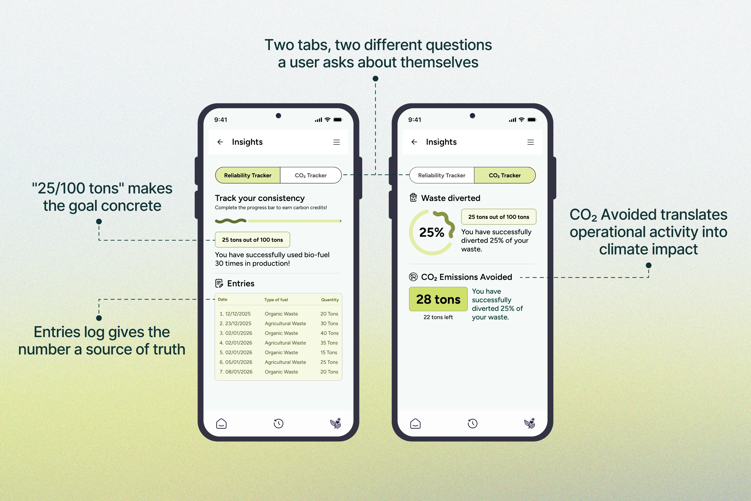
Insights: Reliability & CO₂ Tracking
Insights is where the product earns its climate-tech identity. Two tabs that give users a personal impact dashboard.
Market Products: Industry Overview
A radial segment map lets manufacturers orient quickly to their industry context before diving into trade stats. The design decision was to show market position first, then numbers.
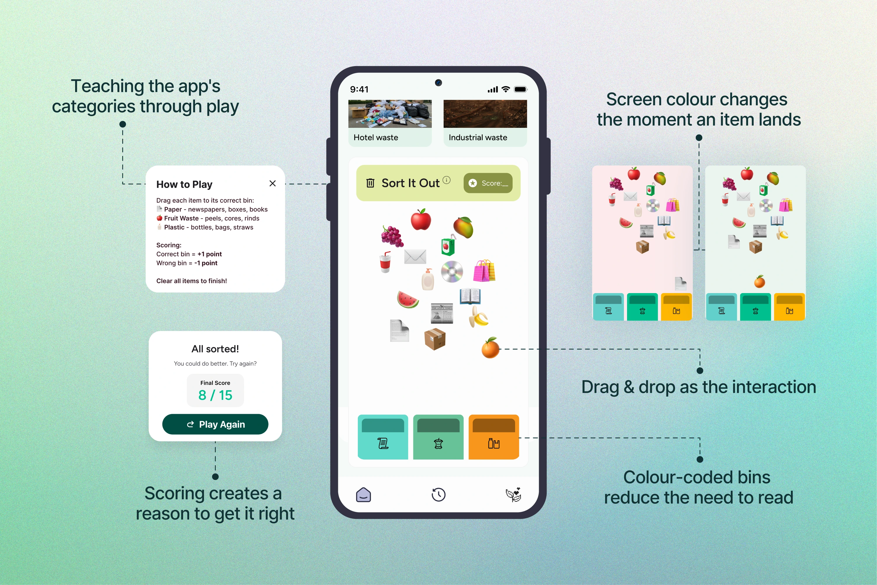
Prototyping in Figma Make: The waste segregation game
Used Figma Make & Figma Design to build an interactive mini-game embedded in the onboarding experience, where users sort waste into categories by dragging items into their corresponding bins.
EXPECTED IMPACT
Like this project
Posted Jun 26, 2026
UX/UI design for Wastel, a B2B SaaS platform connecting India's waste producers to biofuel manufacturers. Owned screen hierarchy, interactions & emotional tone.
Likes
1
Views
1
Timeline
Jan 19, 2026 - Apr 30, 2026