
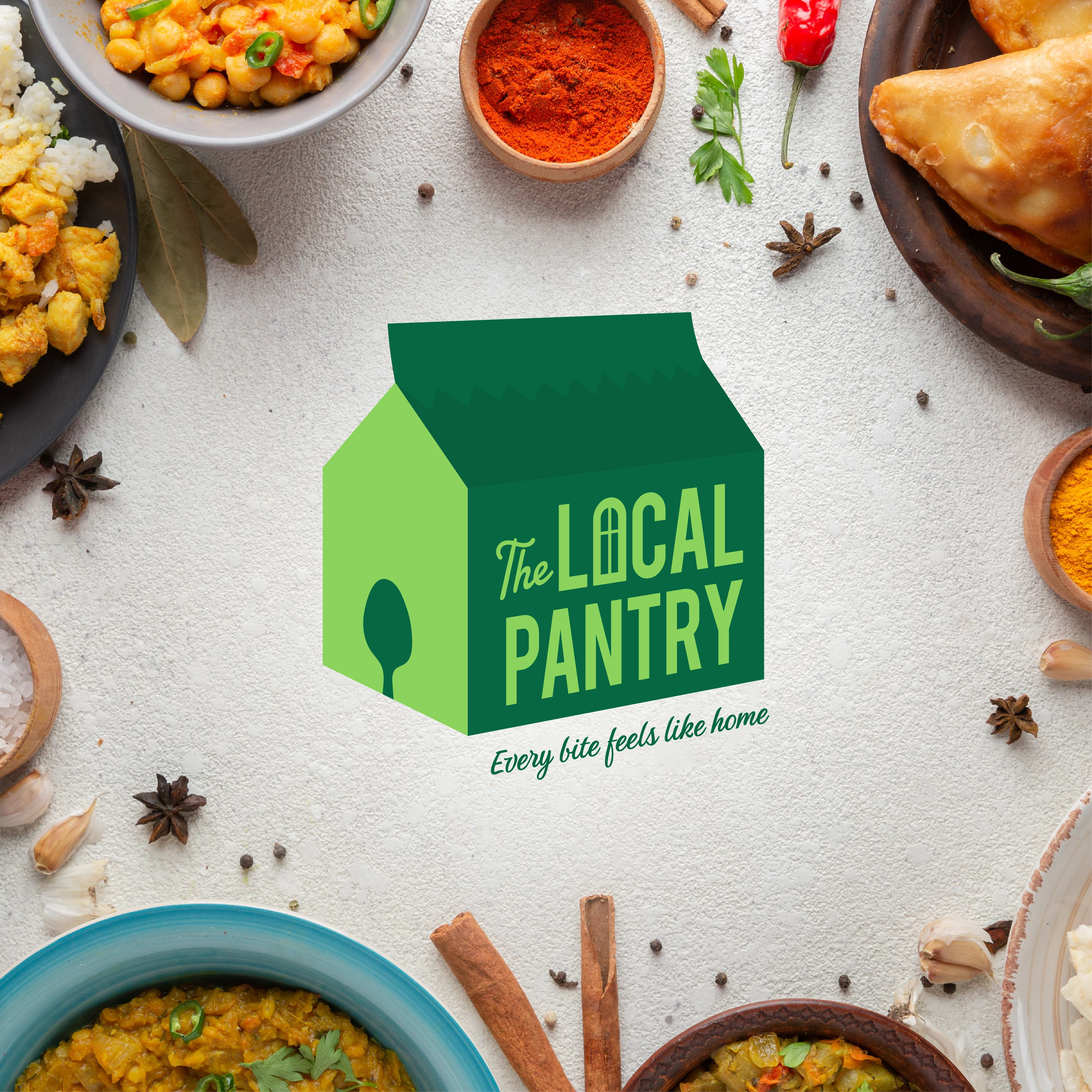
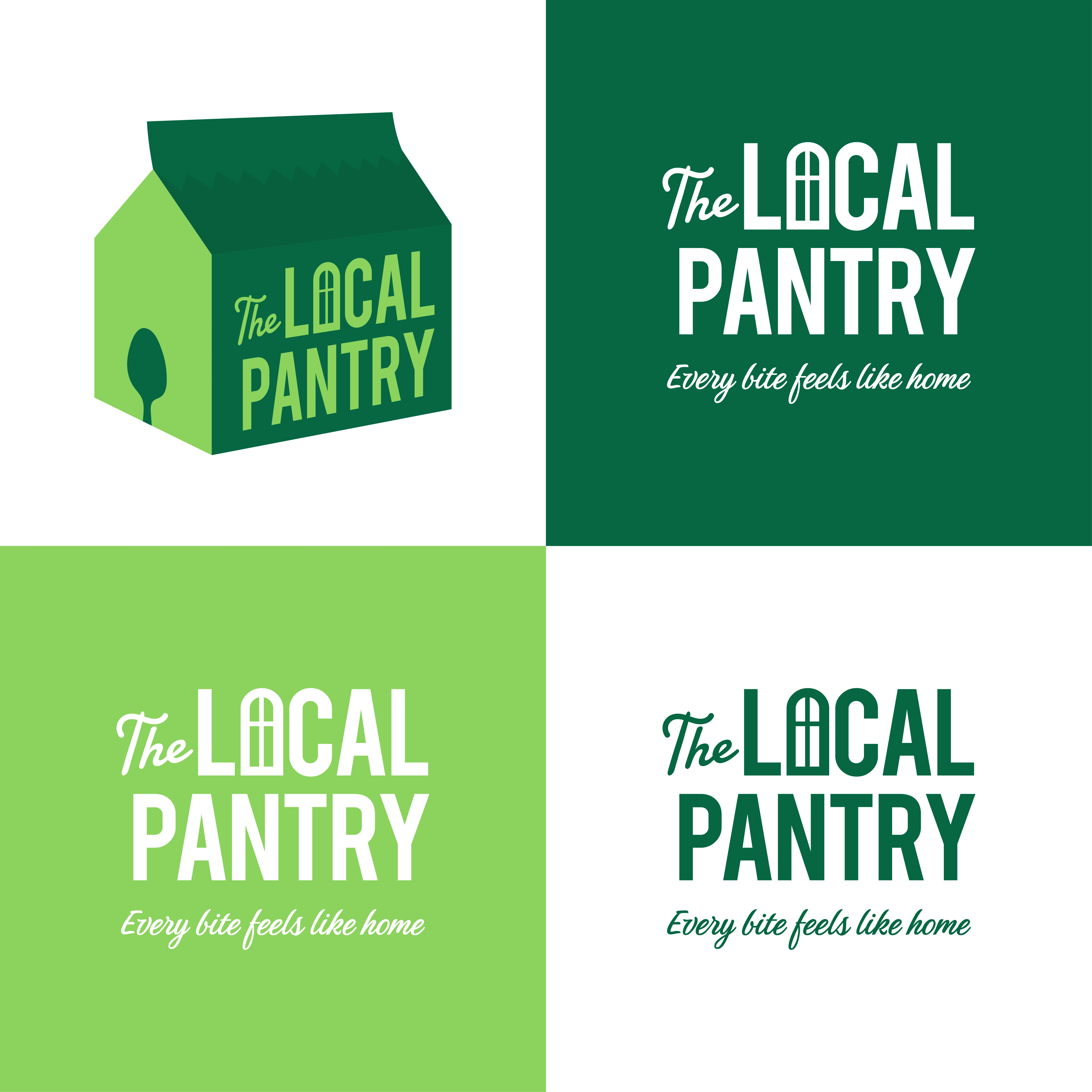
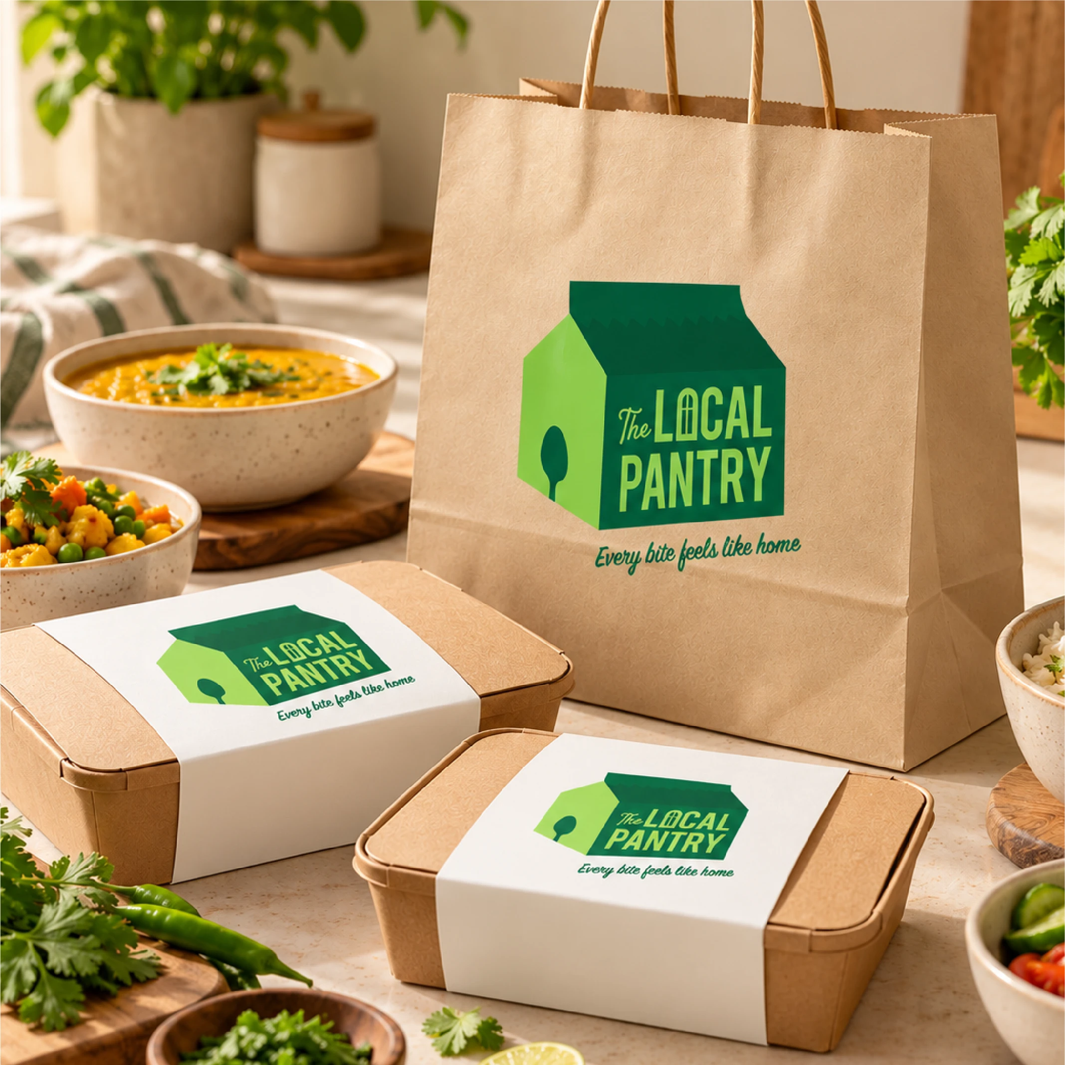
The Local Pantry is a catering service that specialises in homely, vegetarian meals. The idea behind the logo was a takeout bag shaped like a house (thus, signifying “homely meals”). A spoon-shaped door stands as a visual cue that “every bite feels like home.” A green palette was chosen to shed light on the “vegetarian” aspect.
•
Deliverables for this project included a primary logo, secondary logo and tagline design.
•
Brand Identity Design, Logo Design, Food Branding, Vegetarian Food Branding, Restaurant Branding, Food Packaging Design, Takeaway Packaging, Food Logo, Visual Identity, Brand Strategy, Packaging Mockups, Graphic Design, Hospitality Branding.
#BrandIdentity #LogoDesign #FoodBranding #PackagingDesign #VisualIdentity #BrandDesigner
0 likes · 4 views · Oct 12, 2026
The Local Pantry is a catering service that specialises in homely, vegetarian meals. The idea behind the logo was a takeout bag shaped like a house (thus, si...
Timeline
May 9, 2024 - Jun 18, 2024
