Beautymed Experts (Branding)

The main task of the project is to create a visual identity and logo for Beautymed Experts.
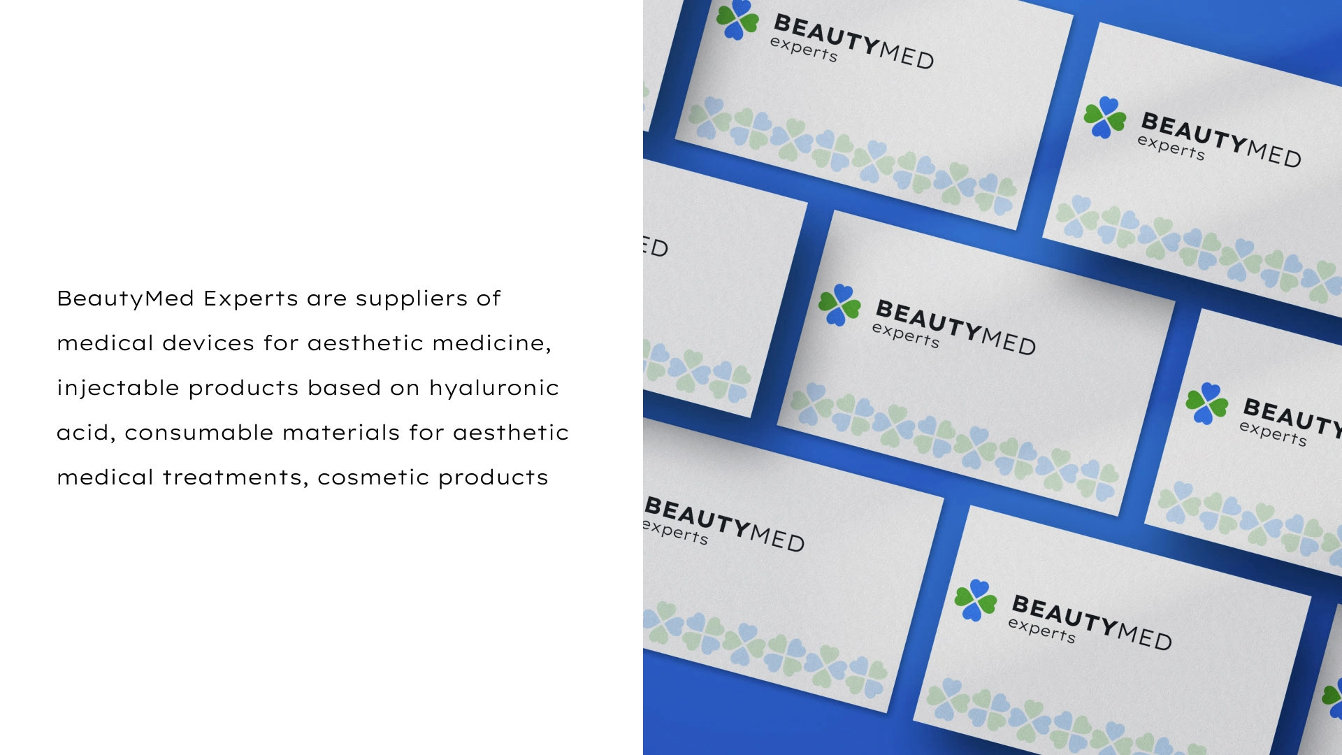
Beautymed Experts, renowned suppliers in aesthetic medicine, entrusted us with the task of reimagining their brand representation. Their offerings include medical devices, hyaluronic acid-based injectables, consumables for aesthetic treatments, and an array of cosmetic products.
Design Approach
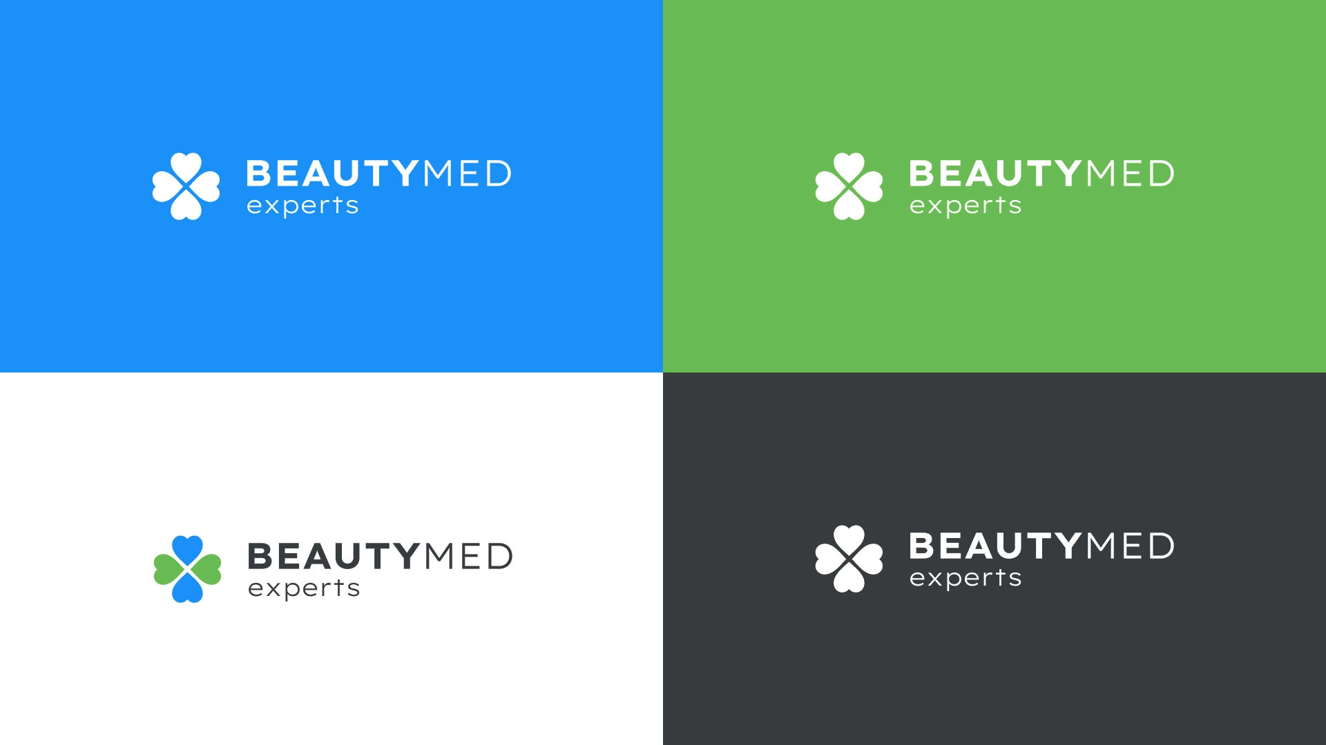
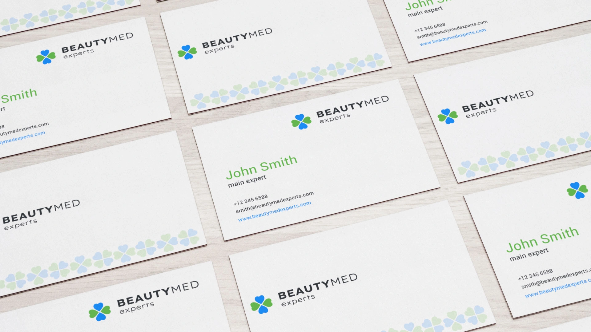
A thoughtful selection of light blue, coupled with natural green, aimed to convey professionalism and trust, aligning seamlessly with Beautymed Experts' core values. The focal point of the logo became a custom-designed cross symbol, meticulously formed from four hearts. This unique amalgamation not only signifies the medical focus but also radiates trust and professionalism, encapsulating the essence of Beautymed Experts. To ensure a lasting brand impression, we employed bold and impactful typography for the company's name.
Impact and Results
The implemented visual identity has not only enhanced Beautymed Experts' standing as leaders in their industry but has also fostered increased trust and recognition. The strategic color palette and symbolic elements resonate cohesively with the brand's offerings, establishing a distinctive and memorable identity in a competitive market. This case exemplifies the successful fusion of design strategy and client vision, resulting in a transformed and resonant brand online presence for Beautymed Experts.



Like this project
Posted Oct 8, 2023
Visual identity development for BeautyMed Experts, suppliers of medical devices for aesthetic medicine and injectable products. Logo symbolizes a cross and care
Likes
0
Views
13

