Parts & Mats Brand Identity
Sergei Chyrkov
Task was to shape the identity of a truck parts and mats company, my objective was clear: forge a name and logo that resonate with the essence of their offerings.
Strategic Naming:
The outcome — “Parts & Mats” — a straightforward and bold name, precisely reflecting the core products. Its simplicity not only enhances memorability but also ensures prominence on store shelves.
Design approach:
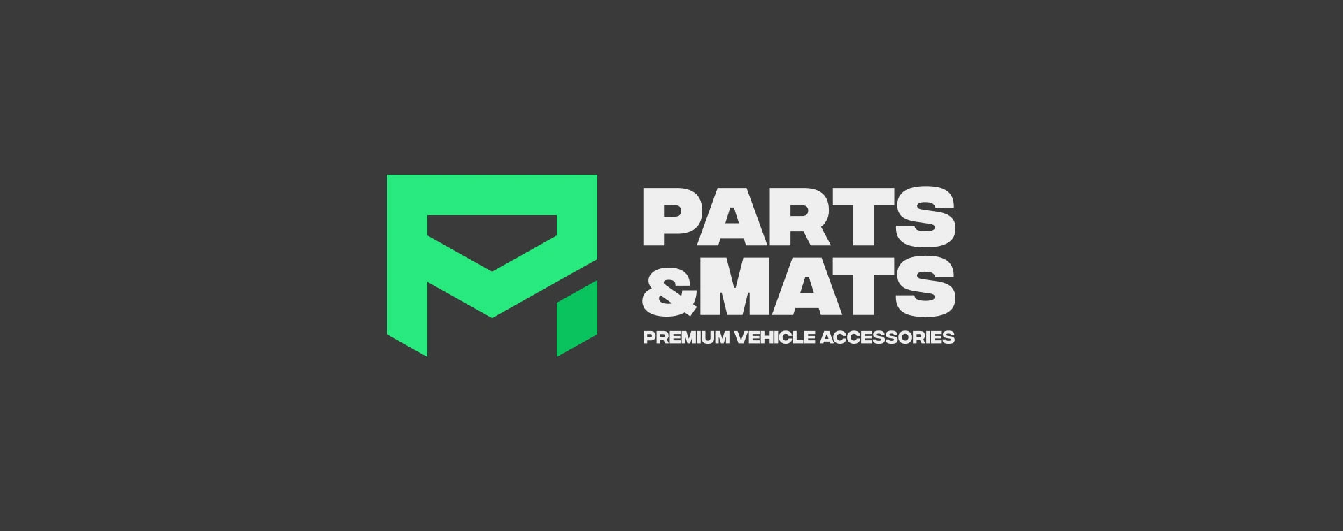
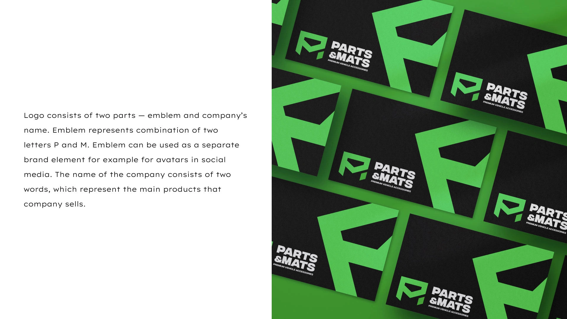
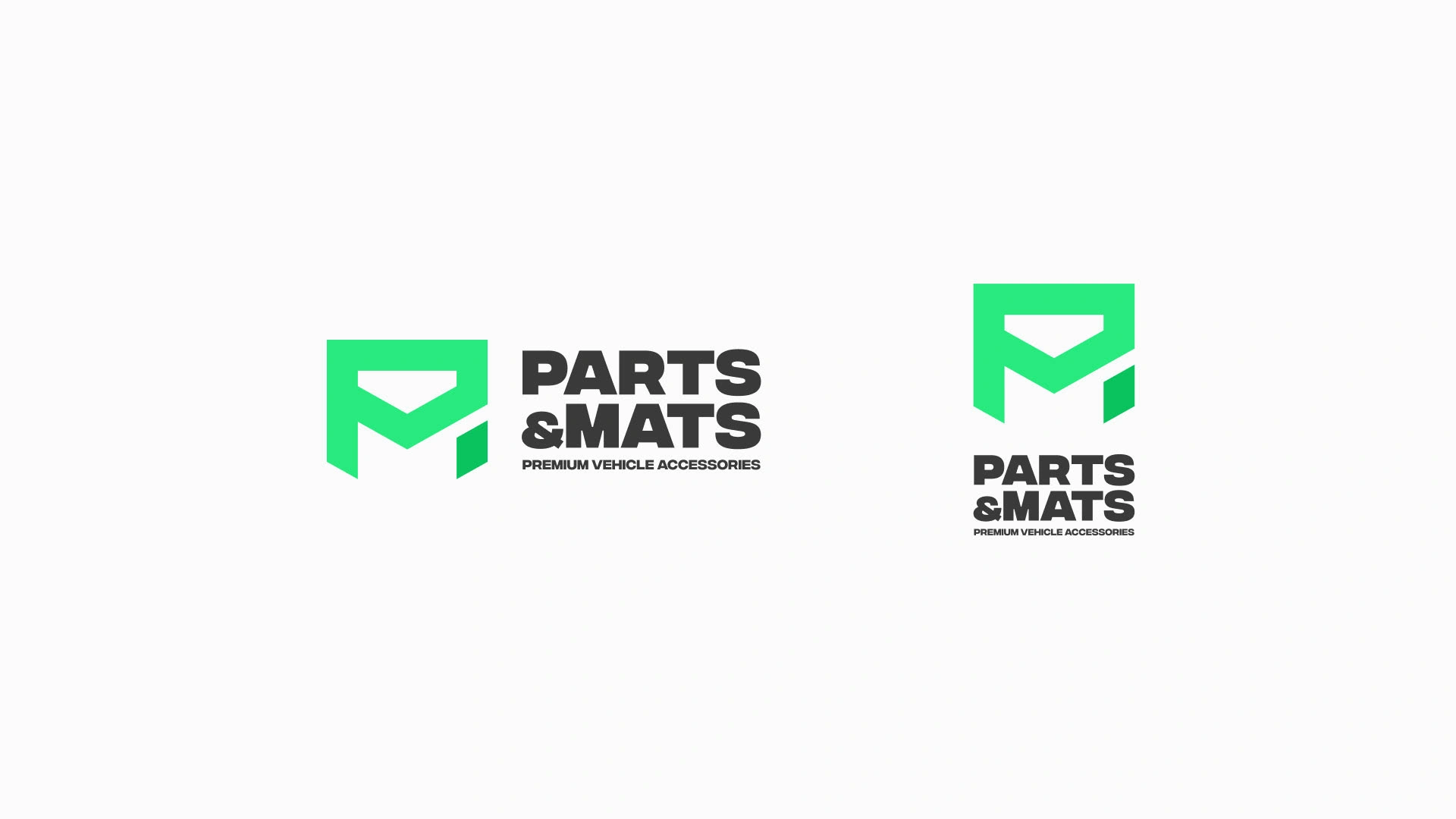
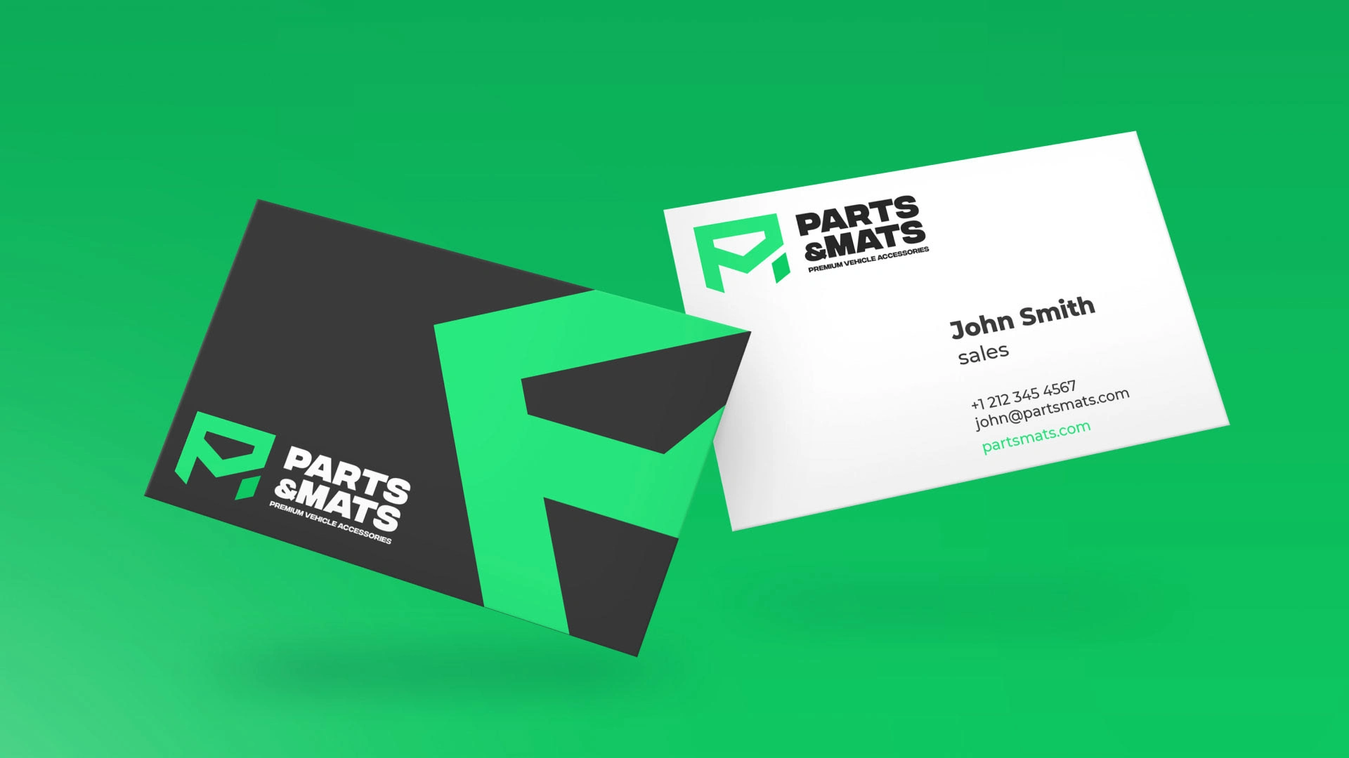
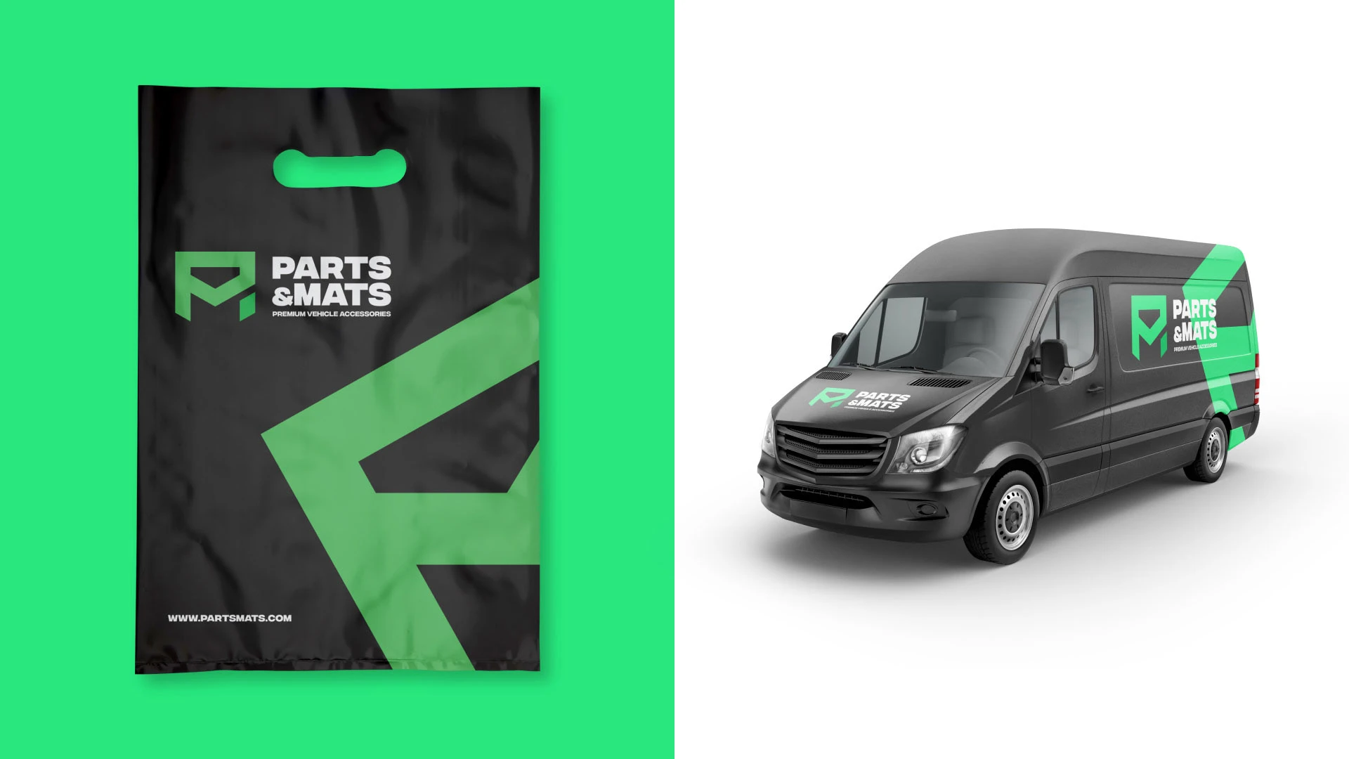
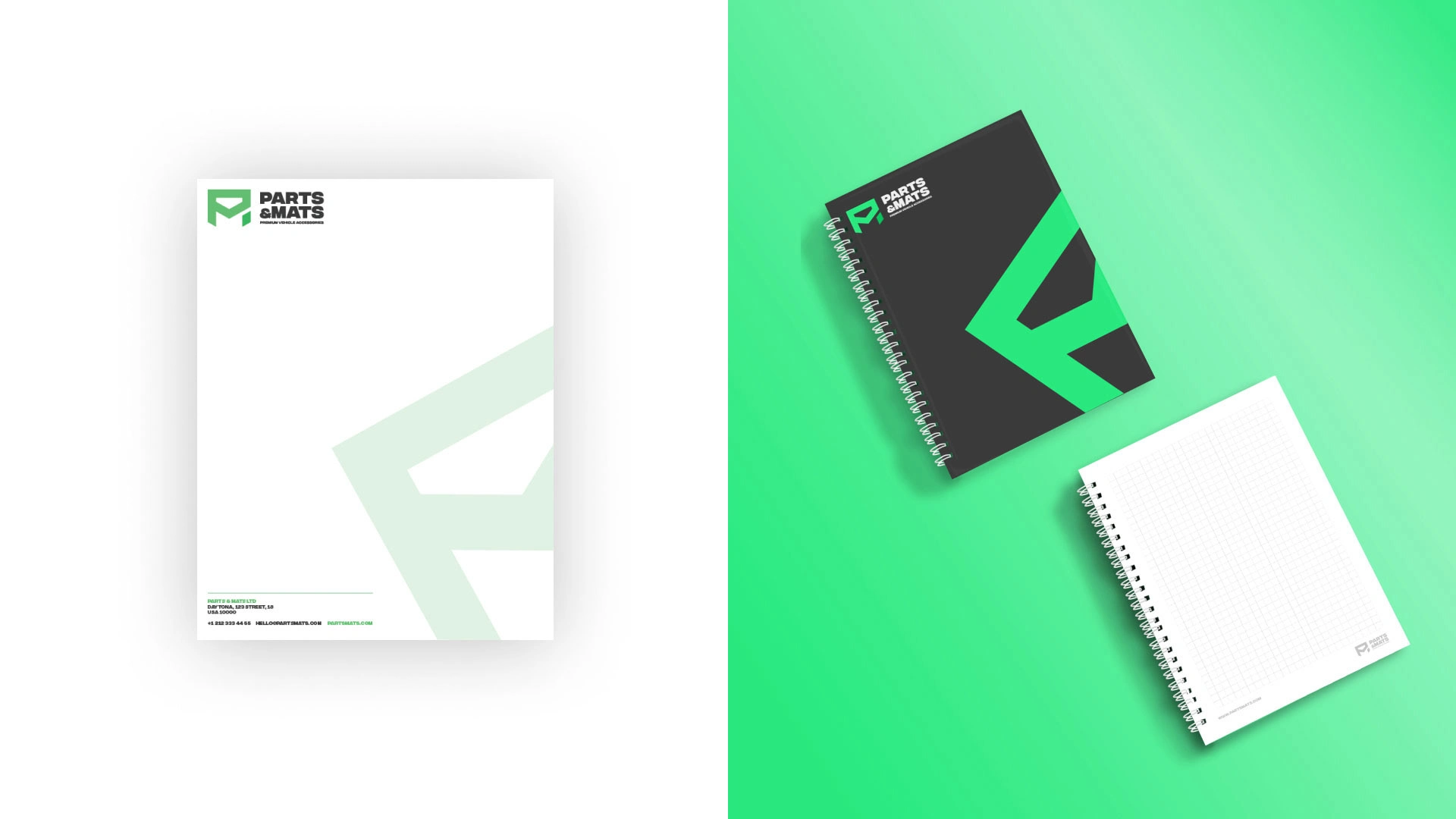
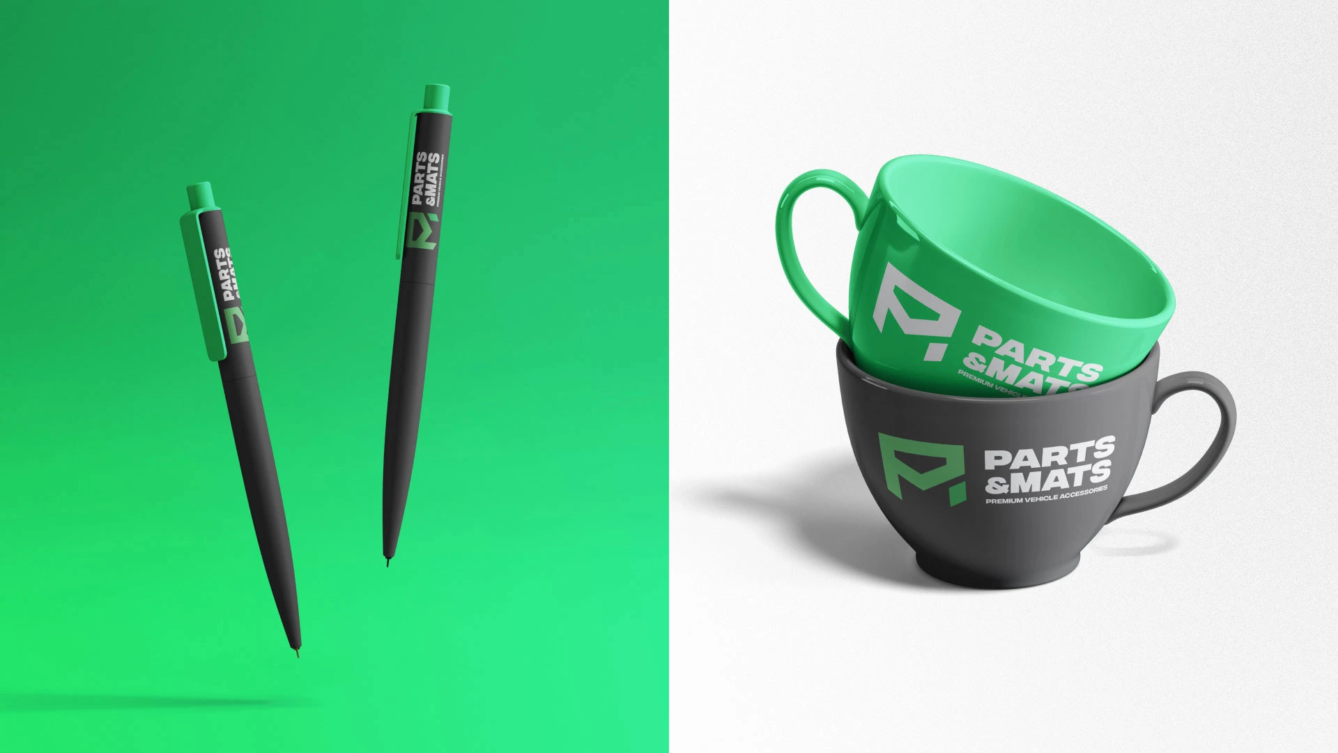
The logo unfolds in two parts—an emblem and the company’s name. The emblem creatively fuses the letters 'P' and 'M,' forming a bold geometric shape representing a car mat. This innovative design ensures a unique and memorable brand representation.
A deliberate choice of green as the primary color, alongside white and graphite gray, infuses sophistication into the brand. This palette not only aligns with industry aesthetics but also enhances visibility across various platforms.
Results:
The comprehensive branding strategy has positioned Parts & Mats as a distinguished player in the market. The simple yet bold design, coupled with a strategic color palette, ensures lasting recognition and recall. This case underscores the impact of thoughtful branding in enhancing brand presence within a specific market niche.


Like this project
Posted Oct 8, 2023
Naming and visual identity for "Parts & Mats" company, which sells premium vehicle accessories. Logo mark is a combination of P and M, creating a bold symbol.
Likes
0
Views
13