Logo and Identity Design for Tattoo Removal Clinic
Design and development of corporate identity for a clinic, which specializes in tattoo removal services.
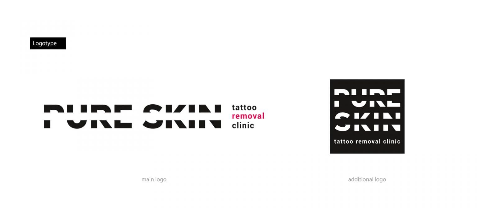
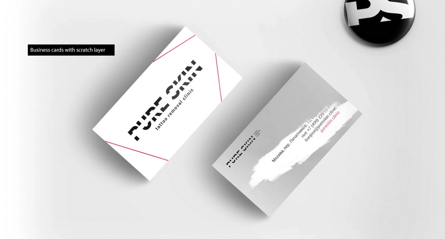
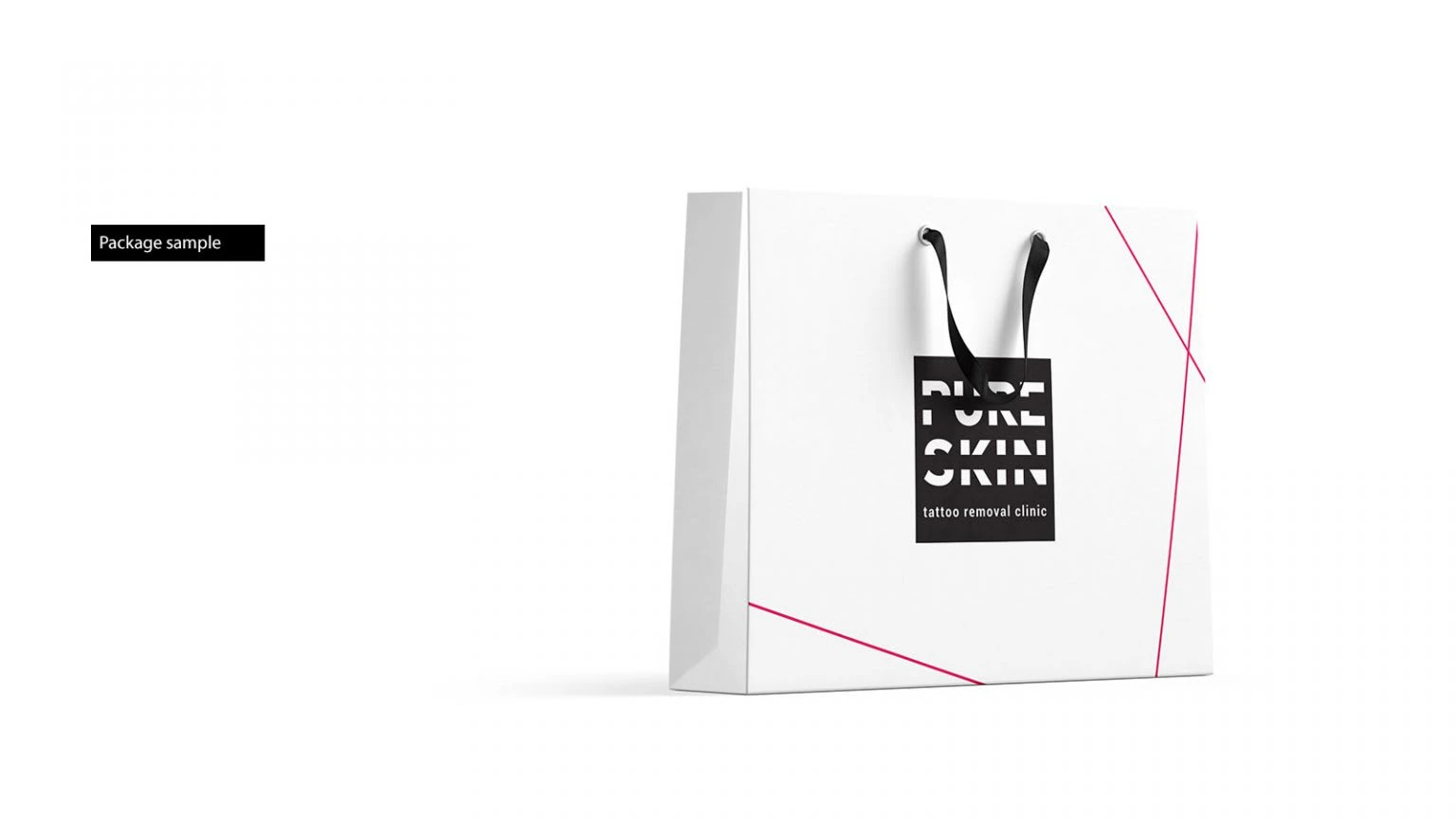
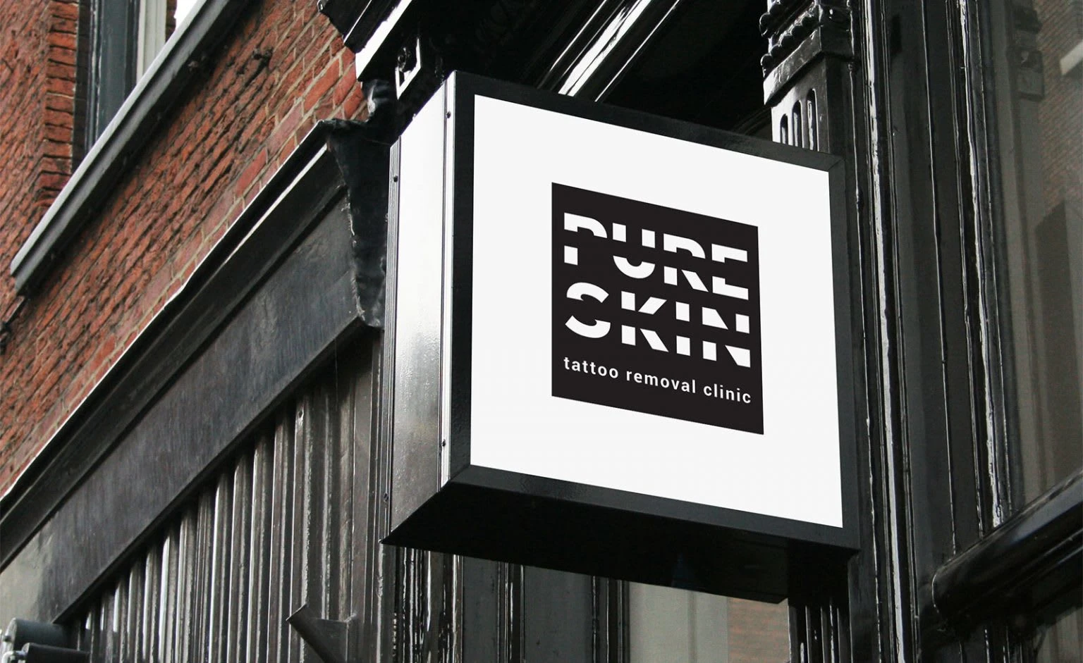
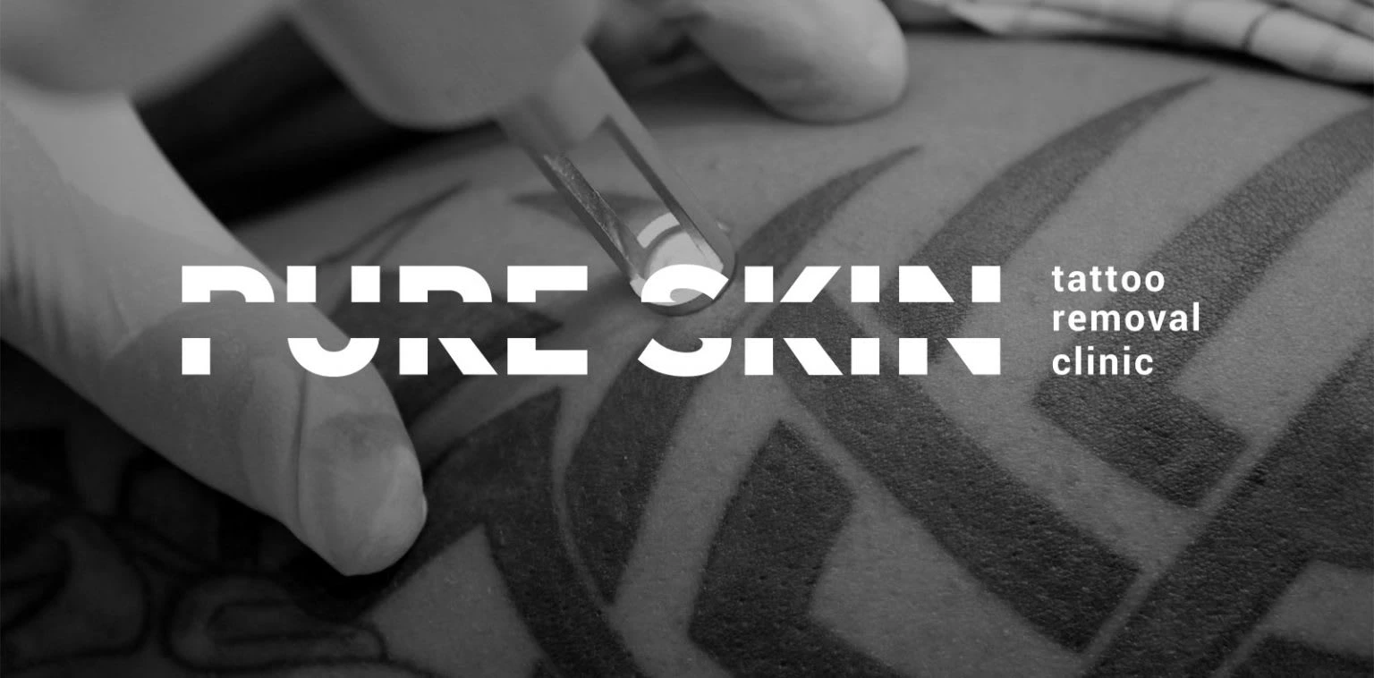
The development of the brand “Pure Skin” was focused on creating a logo and corporate identity. Before starting work, we conducted a series of studies and surveys with a focus group. We tested hypotheses for the name of the future brand and style. We were pleasantly surprised by the results, because we realized that we were moving in the right direction. The target audience made us understand that they want to see a minimalistic, strict design, a grotesque in the black and white logo.“Pure Skin” is a premium class clinic for the removal of tattoos, in addition to high-tech laser. The concept of the logo is to "delete" part of the company name, which emphasizes its main activity.It was important for us that the brand was associated with the target industry with premium-class beauty and medicine, so the main corporate colors are black and white. They convey professionalism, brevity and premium.
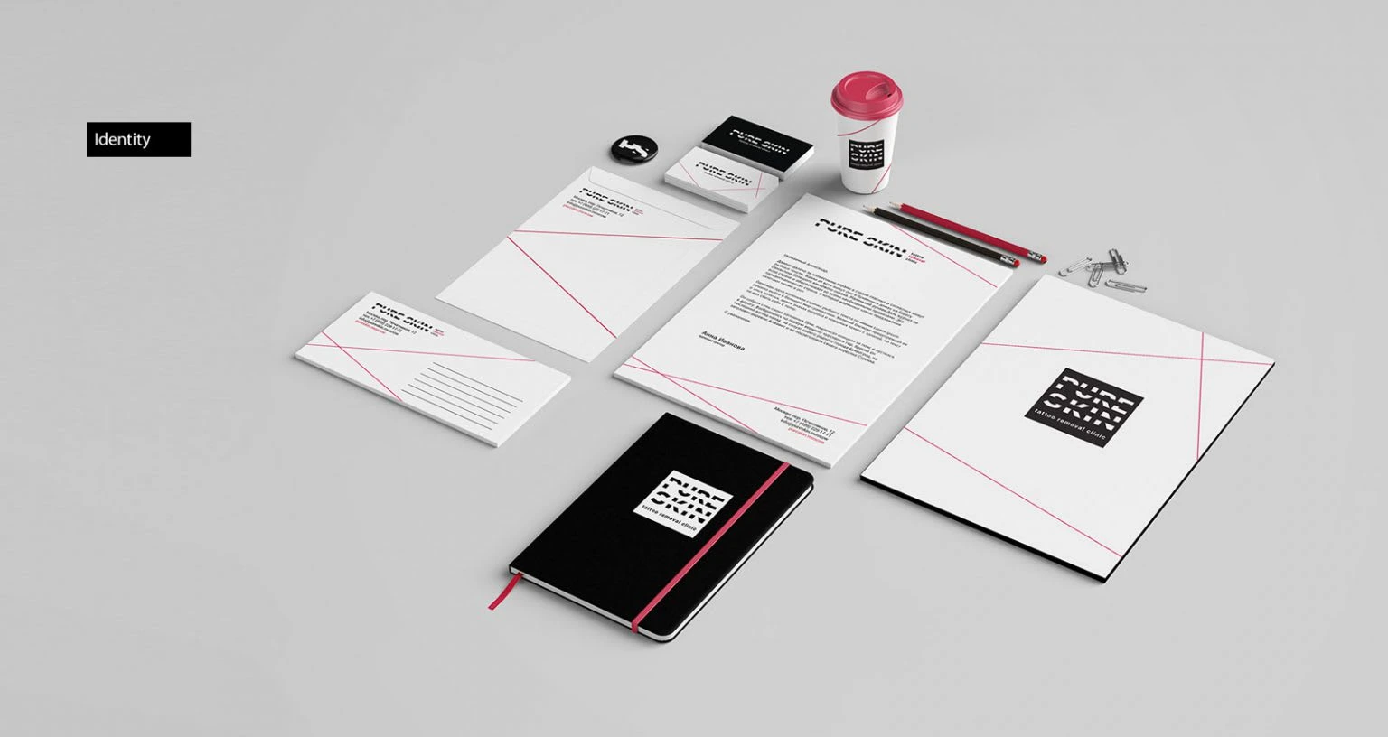
The solution for the corporate pattern lay on the surface: these are laser beams that remove tattoos.
The corporate identity turned out exactly the way we conceived it: minimalistic, recognizable and most importantly associated with cleanliness and high quality standards.
Like this project
Posted Jan 24, 2023
Naming, logo and visual identity development for the clinic. The name of the clinic is wiped cross symbolizing the tattoo removal as clinic's key service.

