Musician portfolio
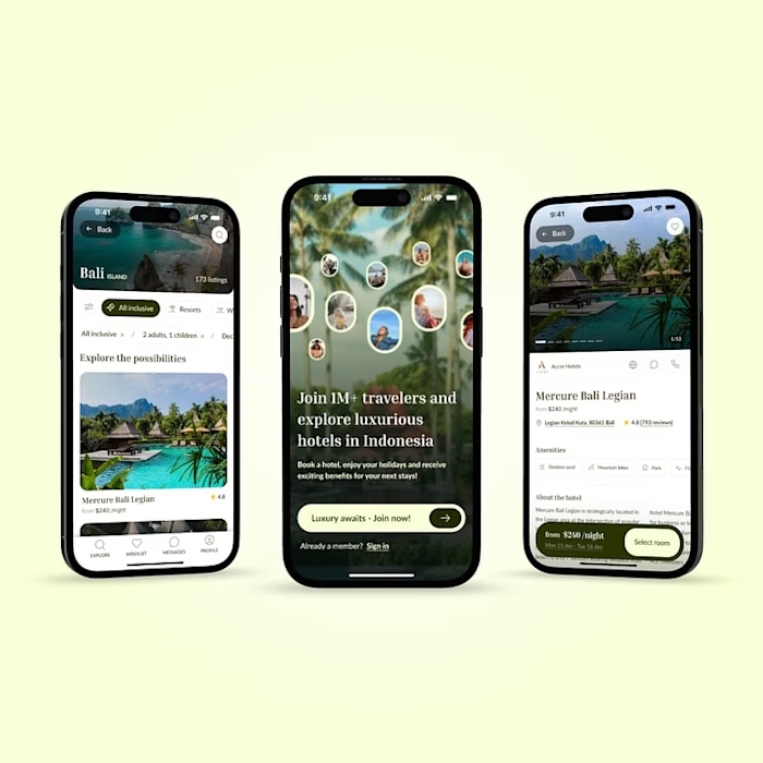
A musician portfolio for Connor Fernandez - a singer and songwriter mainly focusing on expressing himself through his work and passion - indie music.
The project was done in a group of 3 (2 UX/UI designers and 1 Front-end developer)

Acknowledging the problem
Connor is a singer and songwriter mainly focusing on expressing himself through his work and passion – indie rock music. People around him and himself perceive him as optimistic dreamer and believer in the power of nature.
At the moment, his only way of reaching out to people and promoting himself is through social media platforms. Although they have their advantages, they come with many limitations.
The focus of the project was to develop a website for Connor to represent himself as an artist, advertise his albums, concerts and singles and tell his full story in a way that inspires other people.
Client meeting
Meeting Connor was a big step forwards for understanding him as a person and musician. We gathered key insights that helped us further in the brainstorming session for generating ideas on the look & feel of the website.
Analyzing the potential user
Before creating the user categorization and finding the best fit target audience for qualitative interviews, we had received crucial data from the clients Spotify, which helped us to move forward more efficiently and understand his listeners better.
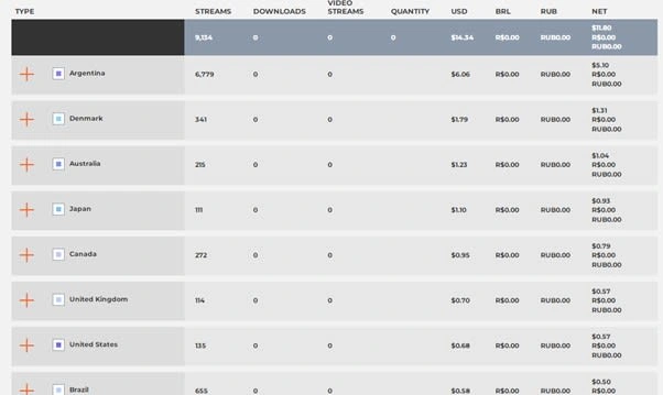

After analyzing the data, we conducted the user categorization using Kottler’s Marketing segmentation scheme, were we categorized users by 5 main segmentations - Geographics, Demographics, Occasions, Benefits and Psychographics.
Interviews & analysis
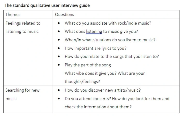
After categorizing the potential user, we developed a purpose of the interviews and research question, followed by the interview guide. After these steps, each of the group members conducted a qualitative interview. To understand Connor even better, we conducted a group interview with Connors closest people, which, as expected provided us with interesting and helpful insights.
Main takeaways from individual interviews

Main takeaways from group interviews

Brainstorming, Priority matrix and Sitemaps
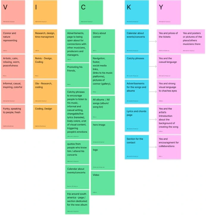
As a starting point for solving the problem, we went through the analyzed data and performed brainstorming session with the use of VICKY method, generating ideas for content.
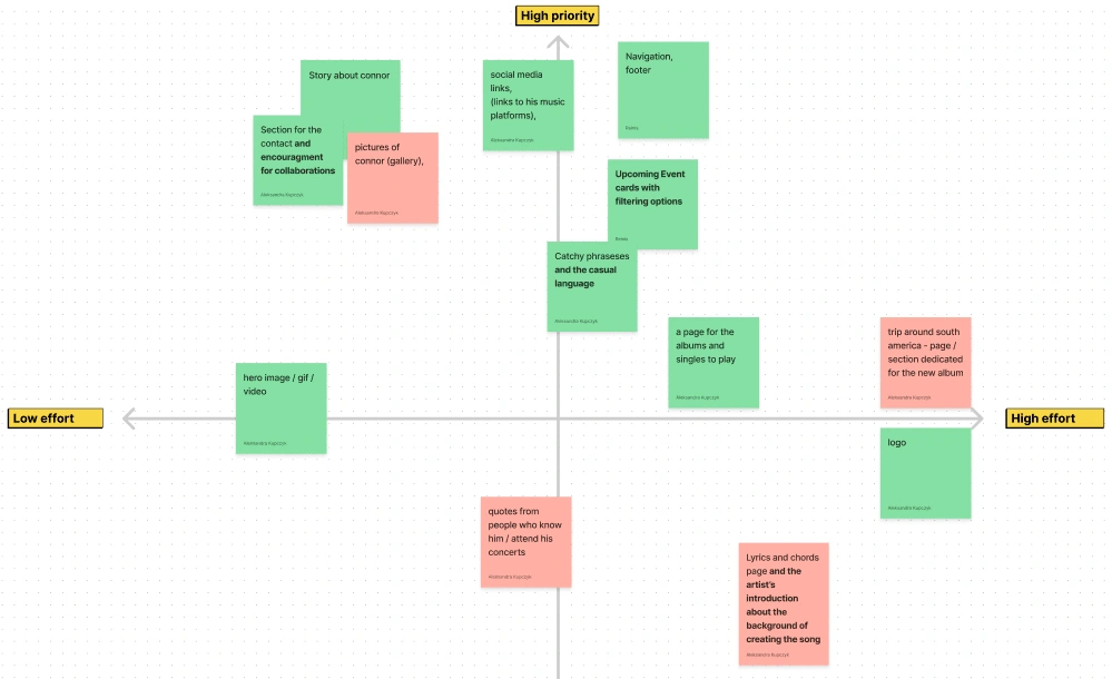
After finishing the idea generation process, the importance of each idea and its execution difficulty were discussed and placed in the prioritization matrix figure. Since the number of the concepts was fairly large, we decided to eliminate some of them, eventually color coding the cards to emphasize the selected ones.
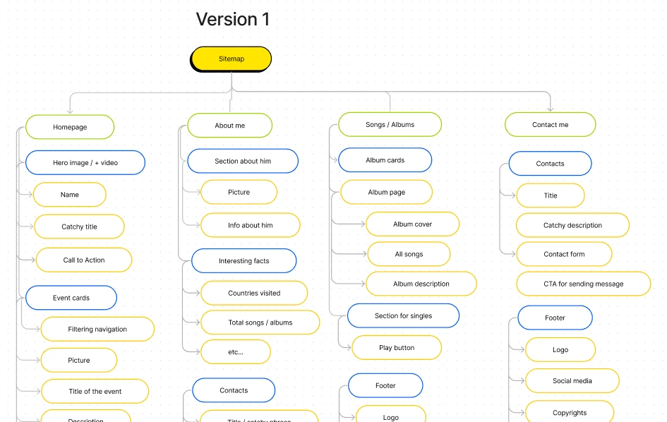
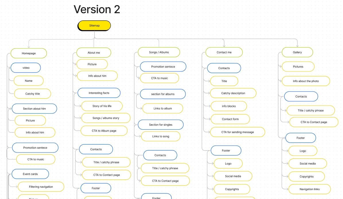
The next step in the overall design process was determining the whole websites IA. The client meeting and qualitative research provided the base for the group to create. The creation of sitemap was an iterative process, in total with 2 different versions.
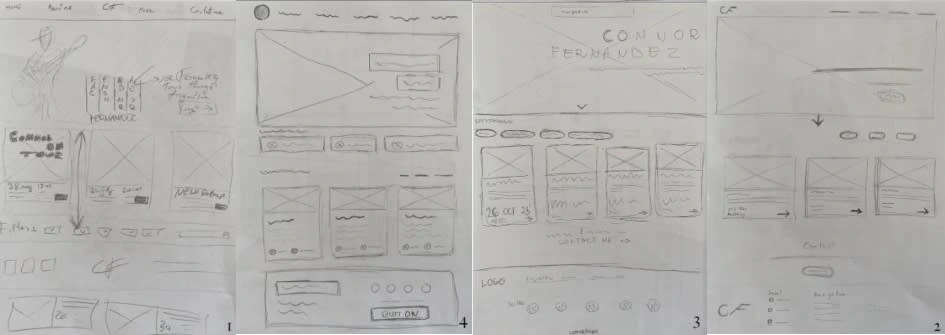
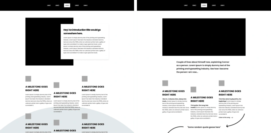
Multiple iterations of sketches and wireframes

User tests and final design
Color palette & font family
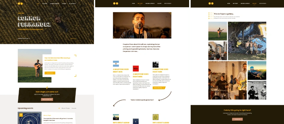
Based on previously gathered data from interviews, Connor himself and his closest people, we decided to go with a monochromatic and warm color palette, that in our opinion fits his personality the best. Afterwards, we chose the font family, that is easily readable, modern and fits well together with indie-rock style.

First iteration & user tests
5 Second test
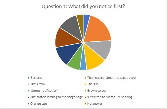
To get more thoughts and data on the first iteration of the design, we performed 5 second and think aloud tests, as well as got feedback from the client himself. During the 5 second test, we asked people questions, like, what they noticed first when they entered the website or if they remember anything of what was written in the photo, as well as if they noticed specific buttons. The test showed us, that we need to take steps back and re-think some of the parts, which later on were adjusted in the version 2.
Think aloud test
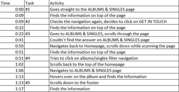
The purpose of the think aloud test was to discover any possible faults and ensure the navigation design allows users to find the desired information within a relatively short period of time.
The results of the user tests showed that there are no major problems in the navigation design and is easy to find information and navigate throughout the website.
The final design
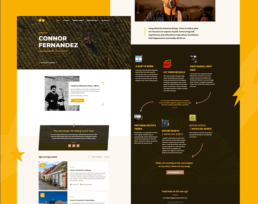
Thanks to the conducting the tests and some minor changes, we ensured that the website’s information architecture and design is clear, meeting our expectations and goals, which lead us to finalizing the websites interface and finishing the design stage.
Like this project
Posted Dec 22, 2023
A website for an Indie Rock musician hoping to attract more listeners and inform them about his upcoming events through a visually pleasing website.

