Hedwig
Hedwig provides in-depth insight and uses objective data to communicate amongst your engineering team. You can integrate your engineering data into a single place and select your repos and teams. Provides granular visibility into your engineering team and helps make data-driven decisions. Set objective goals, understand real-time insights, and increase your development speed.
Why This Redesign?
Before this redesign, the design of this website was focused primarily on functionality rather than usability. The team wanted a revamp of the UI, focusing on ease of use. Once I started using this website, I faced a lot of trouble understanding it; many graphs didn’t make sense. The design felt outdated and poorly organised, colour palette felt very dull and unpleasing.
Design Analysis
In the analysis following issues were identified.
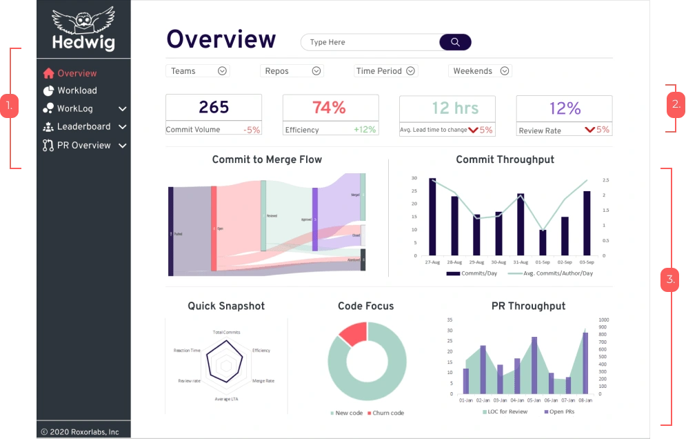
Side menu is very congested
Use of multiple colours doesn't correctly highlight the stats
Multiple graphs showed without any hierarchical structure
Graphs are tiny to read the statistics properly
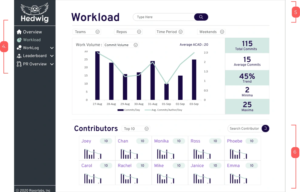
Inconsistent use of colour in the side menu
Lack of structure for the header
Multiple graphs displayed, which are illegible
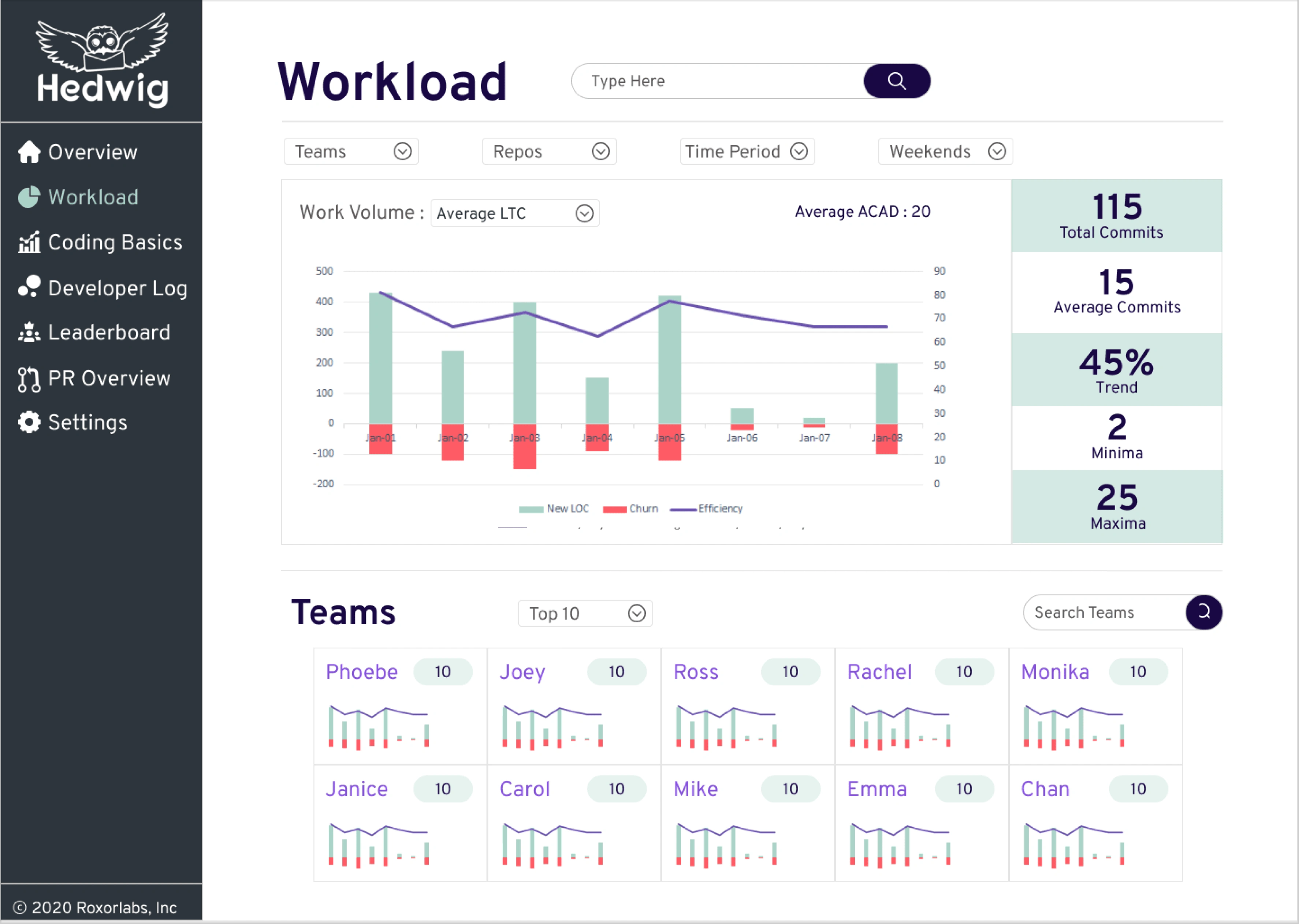
Overlapping data difficult to interpret
The critical finding of UX Audit
During the UX audit, multiple areas were found where better UX can be adapted to represent the data better. The main findings of the UX audit are as follows:

Goals of the redesign
To deliver intuitive interface design
Easy to understand and work with design
Functionality to be easier to grasp
Data displayed in an aesthetically pleasing way
Design and Prototype
The platform being data-heavy, the most suitable UI would be clean and straightforward. It will allow data to be visible efficiently and not create clutter.
Logo
The logo's colour was changed to purple to improve the contrast of the logo with the background. The logo still uses the same Impact font and minimalistic approach, but the typography and icon were altered.

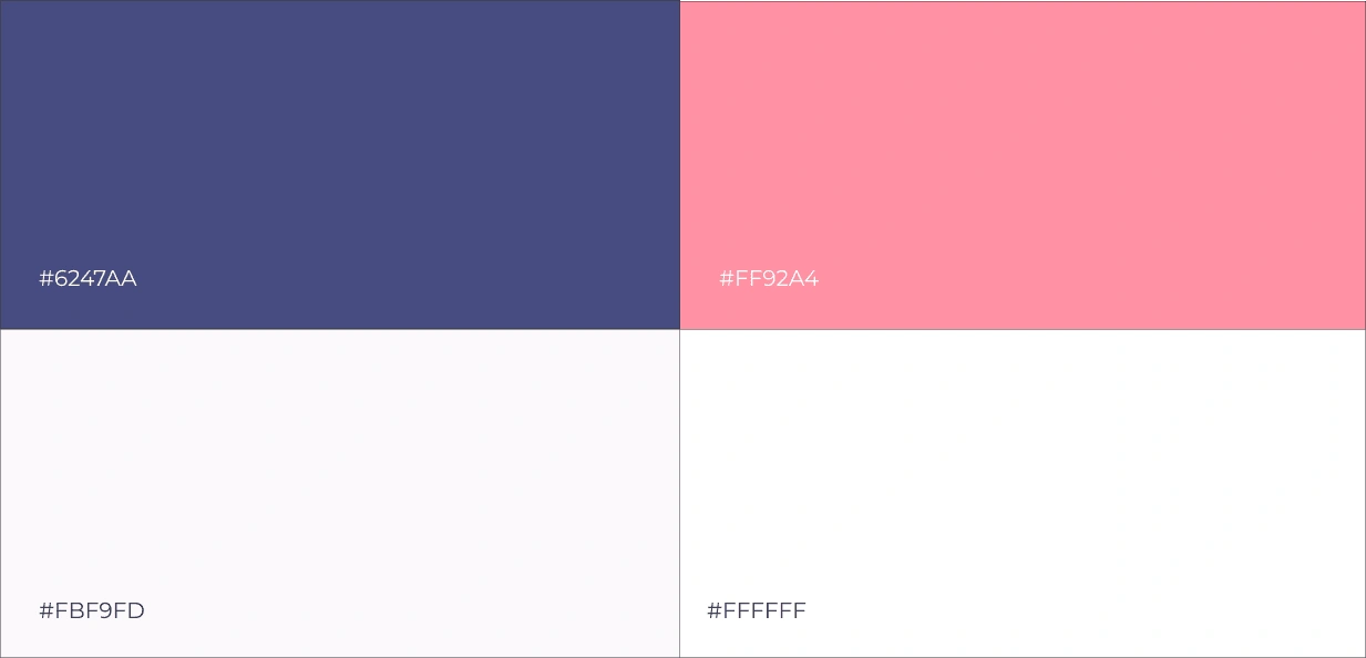
Colour Palette
Colour Palette transformed for better contrast and readability
Redesign
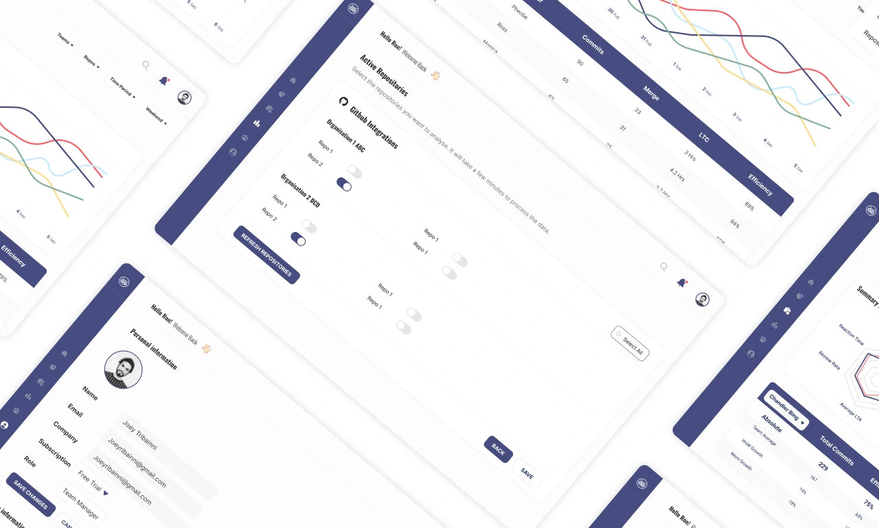
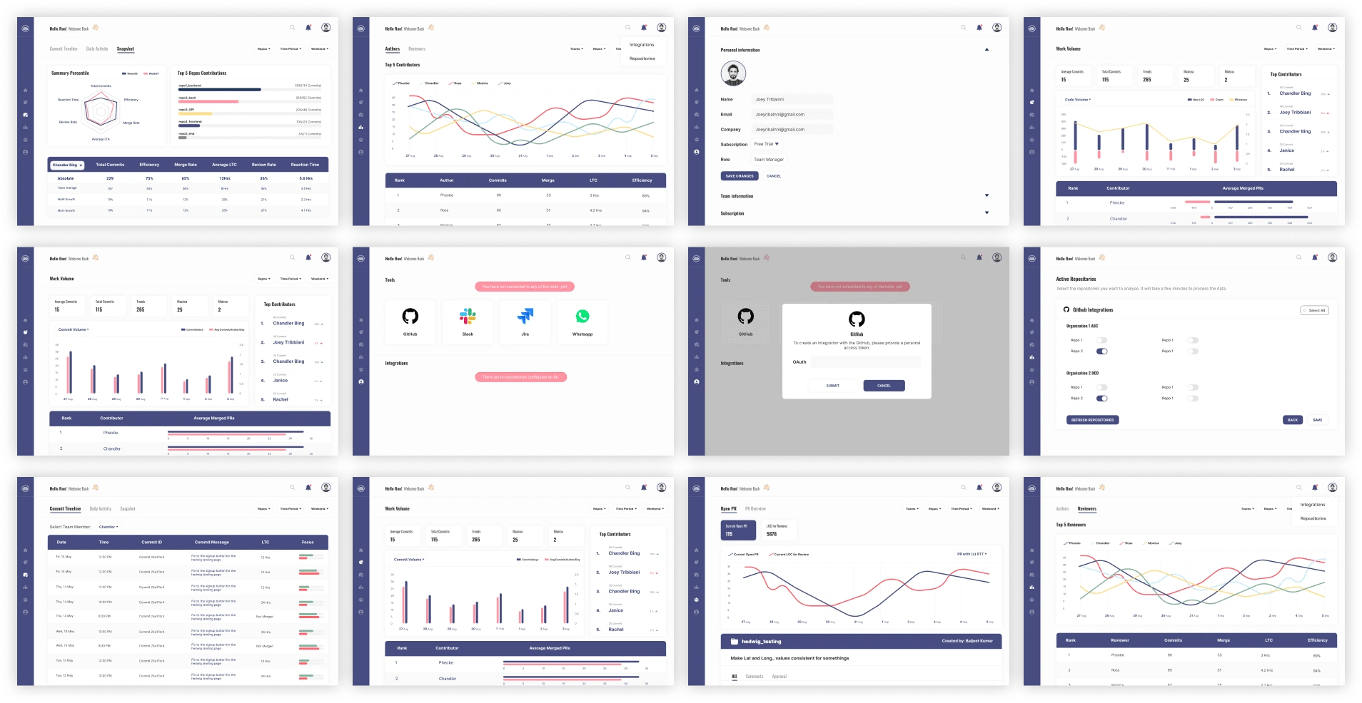
UI redesign required me to evaluate individual elements and go back and forth with the client to understand the hierarchy of each component. A few of the redesigned screens are shared below to highlight the changes.

Distance in the side menu increased to let the elements breathe
Simplified graphs used for easier readability
Notification bell and profile section included on the header with the search bar
Stats are displayed on the side with different backgrounds to increase the visibility

Stats are listed on the top
Top contributors are listed
Individual contributor graphs are shown as vertical graphs for easier readability
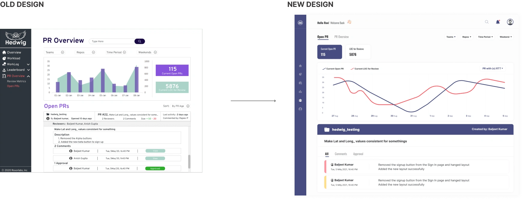
Minimal colour is used for a cleaner look
Consistent design for a consistent look throughout
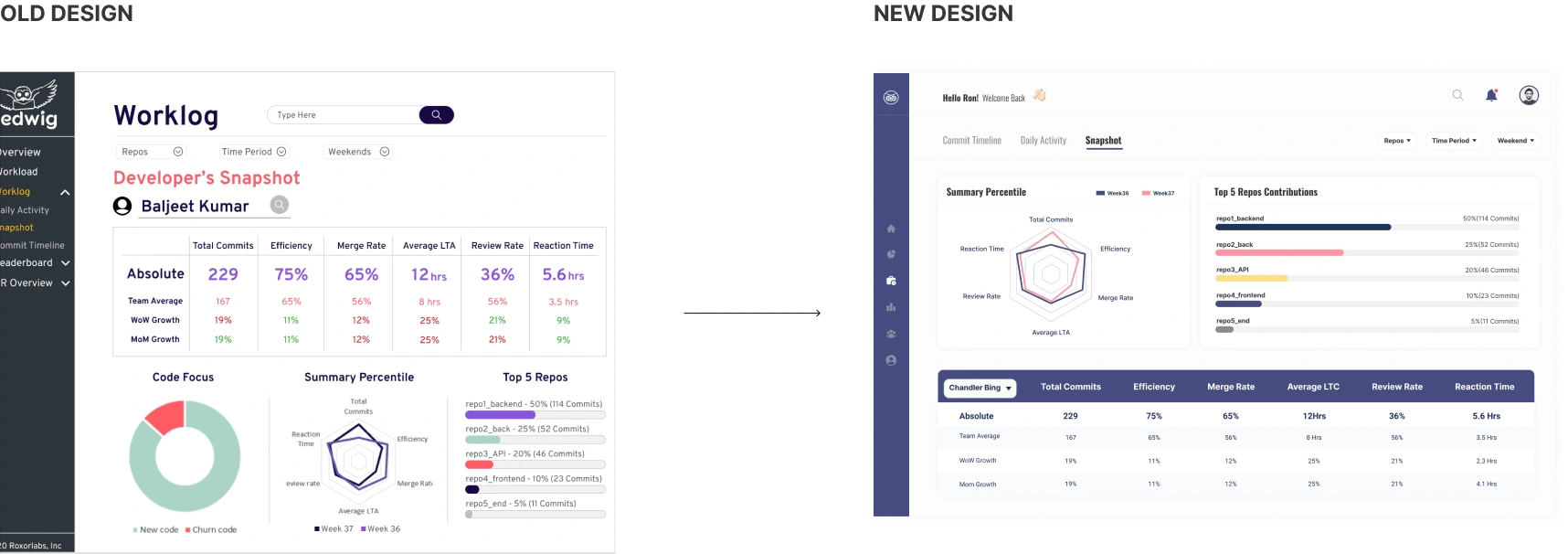
Minimal colour is used for a cleaner look
Consistent design for a consistent look throughout
Project Reflection
While working on this project; a cleaner design could better understand the data displayed
Although there were no significant changes to wireframes and the system's flow, I understood how tiny tweaks could do magic for the system.
Focus on each element's hierarchy and importance concerning the rest of the features on the page is very important. You might find parts that seem very important but are redundant.
Like this project
Posted Jul 31, 2023
Hedwig provides in-depth insight and uses objective data to communicate amongst your engineering team. To integrate your engineering data in a single place.
Likes
0
Views
44

