Brand Identity Design for Shutter Story
CHINONSO

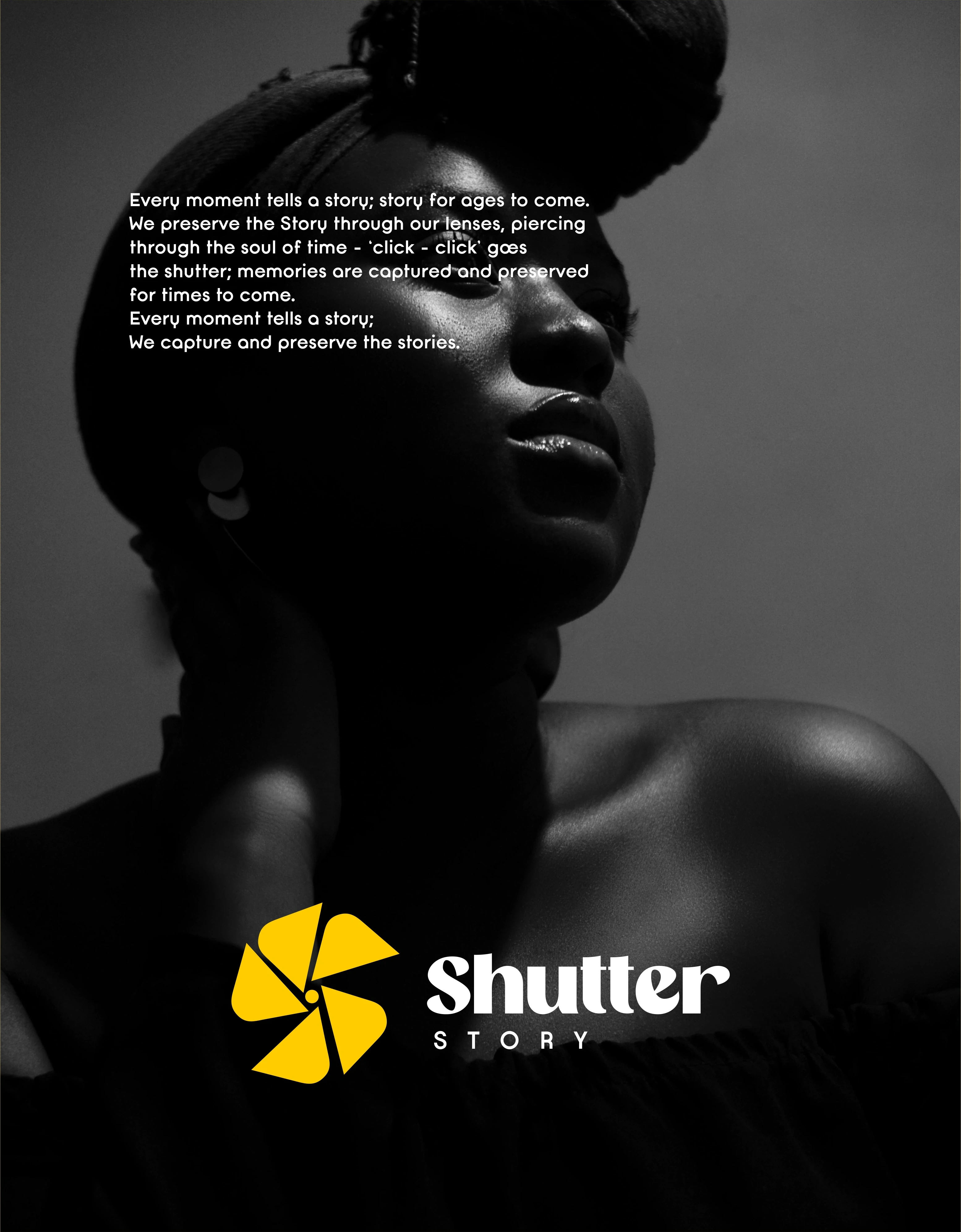
In a world overflowing with images, Shutter Story exists to slow time, to frame emotion, preserve memory, and transform fleeting moments into lasting narratives.
The brand is built around the idea that photography is not just about pressing a shutter, but about seeing, feeling, and telling stories through light.
This identity was crafted to be quiet yet confident, timeless yet modern. Every design choice; from typography to color, was made to step back and let the photographs speak, while subtly guiding the viewer into the story behind each frame.
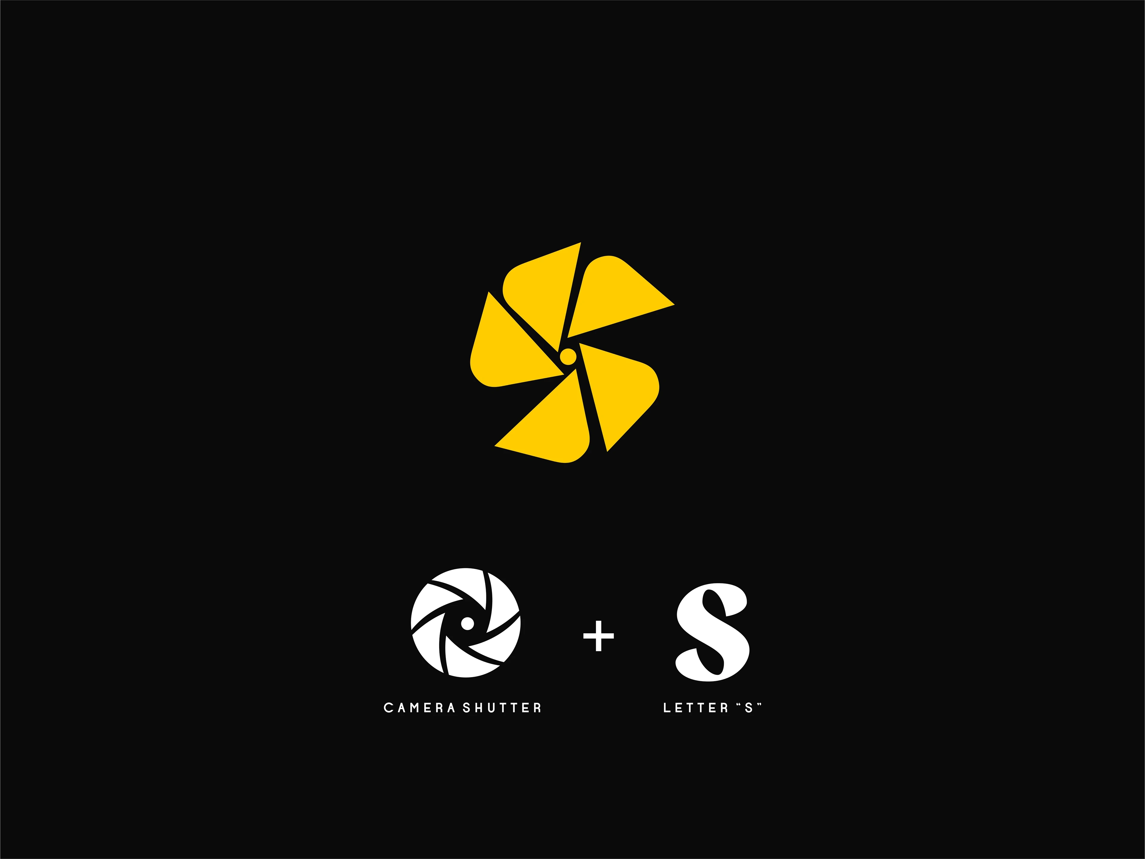
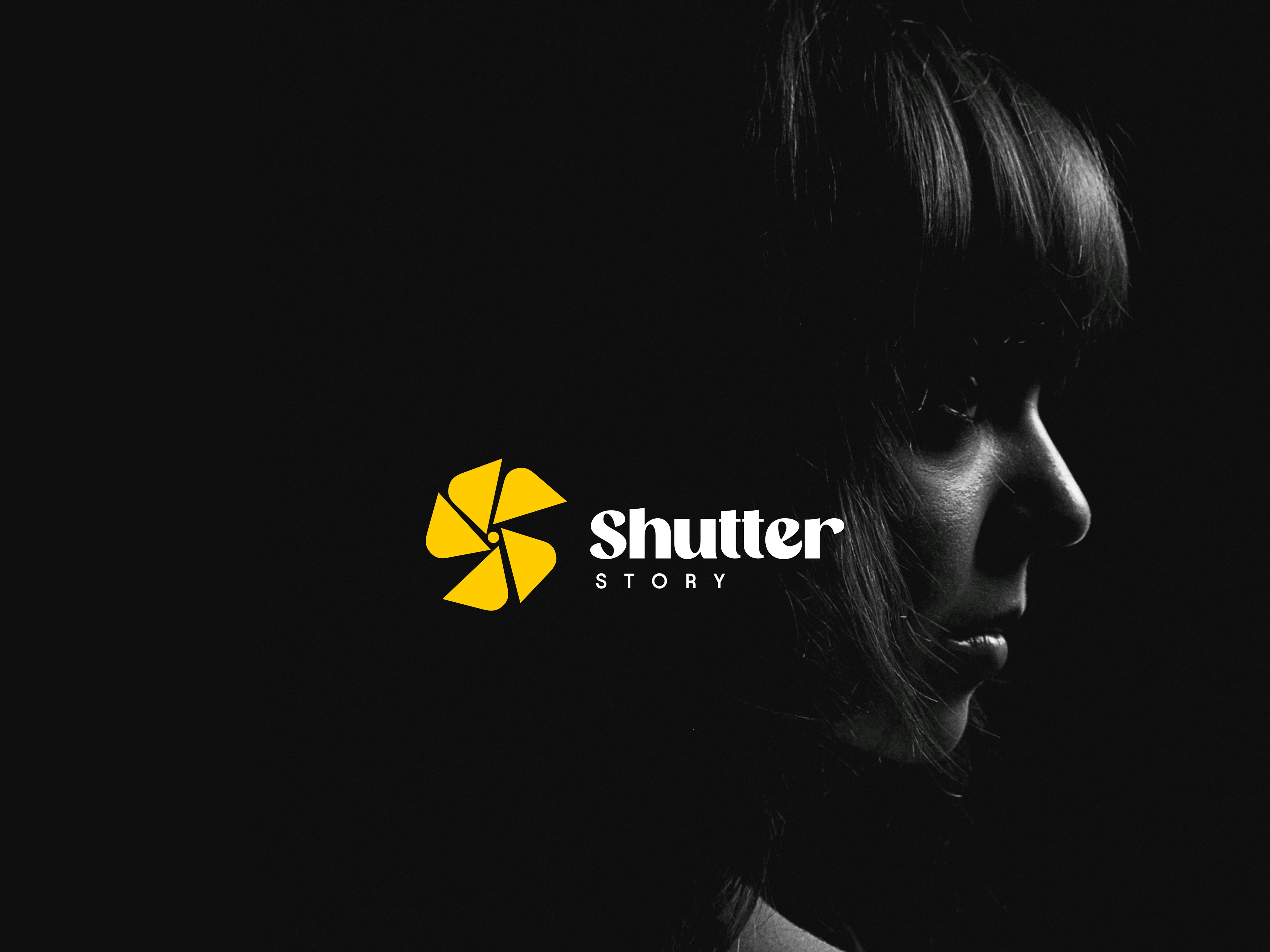
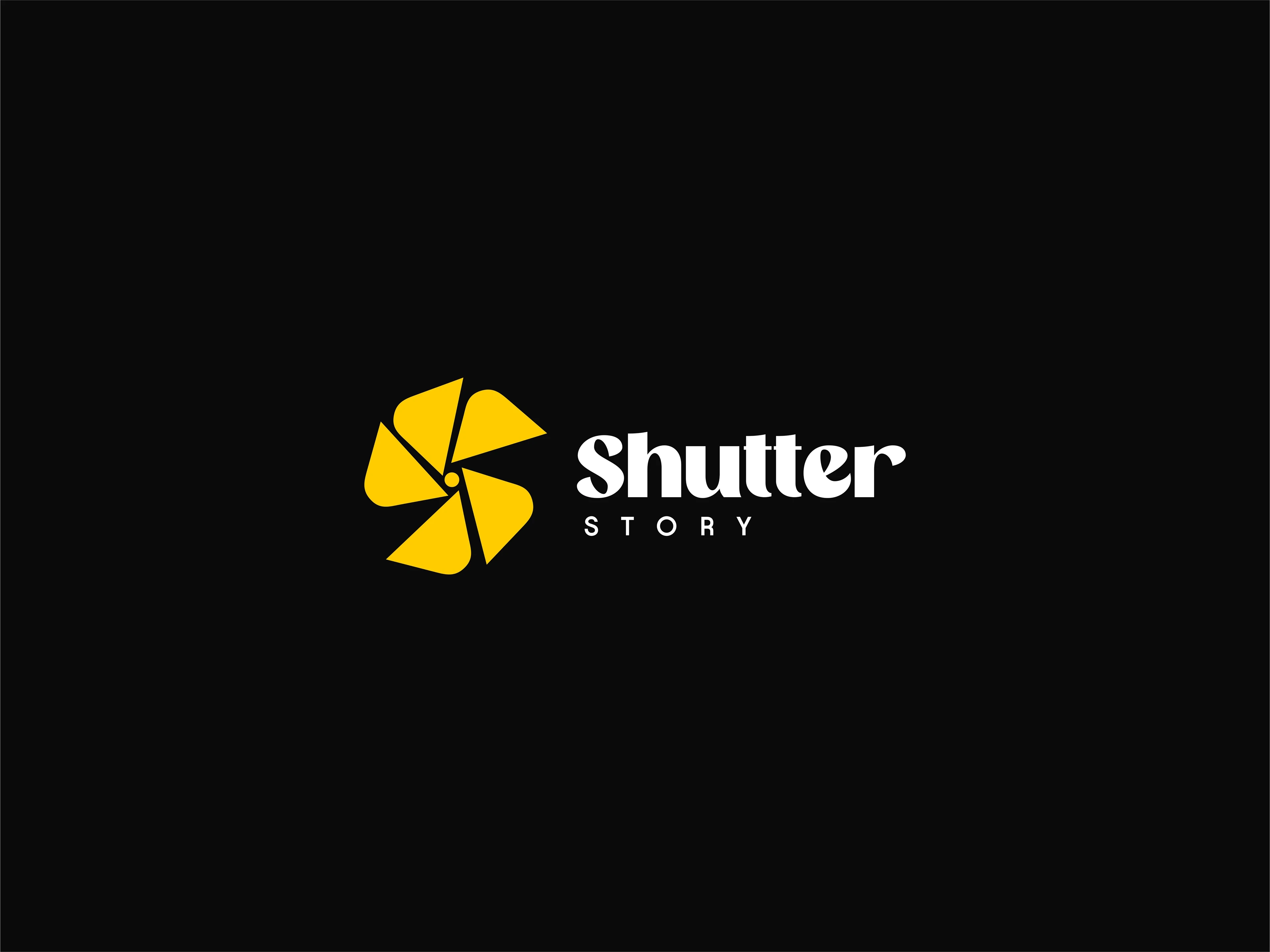
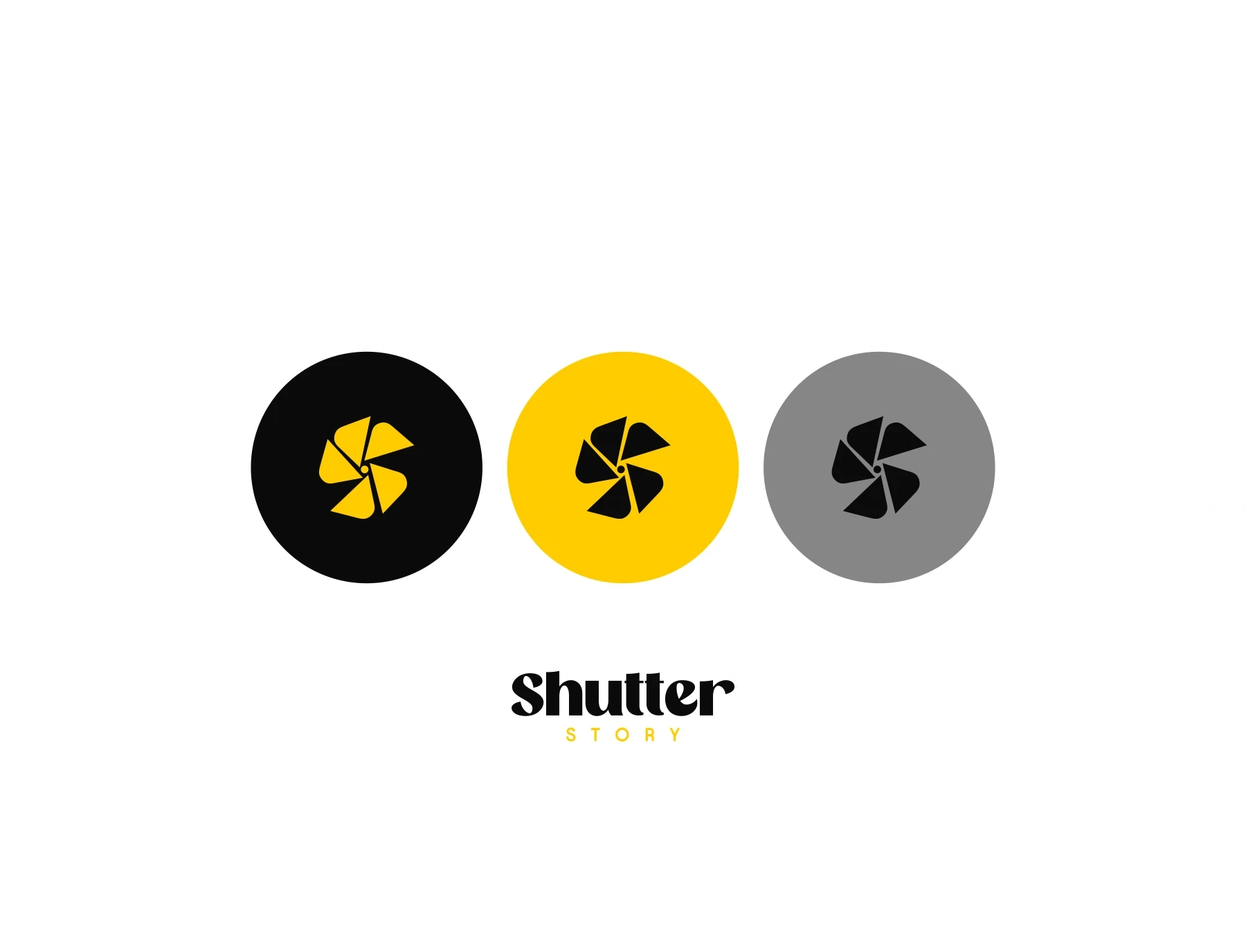
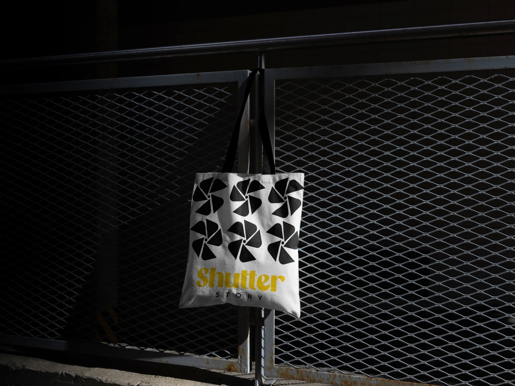
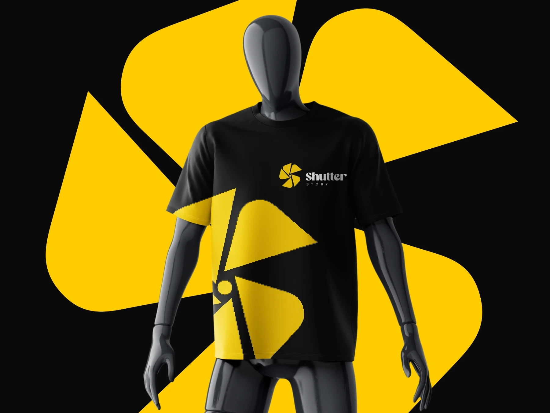
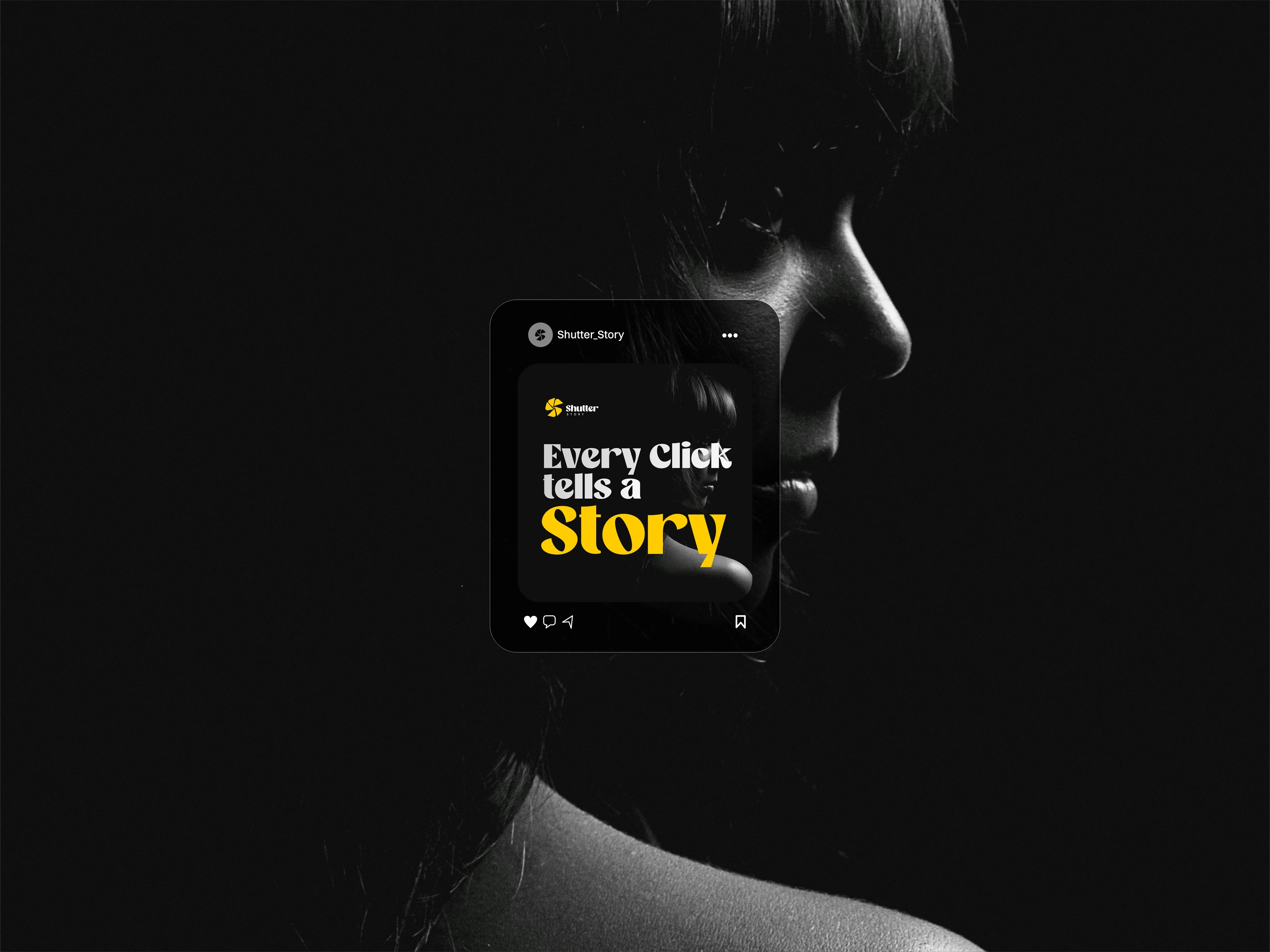
The Shutter Story logo was born from the moment where mechanics meet meaning.
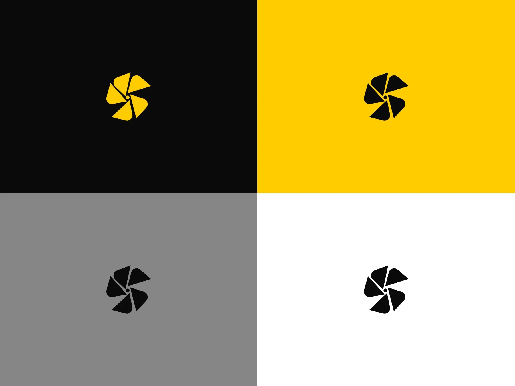
At its core is a camera shutter the universal symbol of photography, precision, and timing. But instead of leaving it as a familiar icon, the shutter was reshaped to form the letter “S”, turning function into narrative.
Each blade represents a fragment of a moment. Alone, they are incomplete. Together, they align, rotate, and lock into place; just like a story coming into focus through the lens.
The result is a mark that captures both what Shutter Story does and what it believes:
that every photograph begins with a shutter, but becomes powerful only when it tells a story.

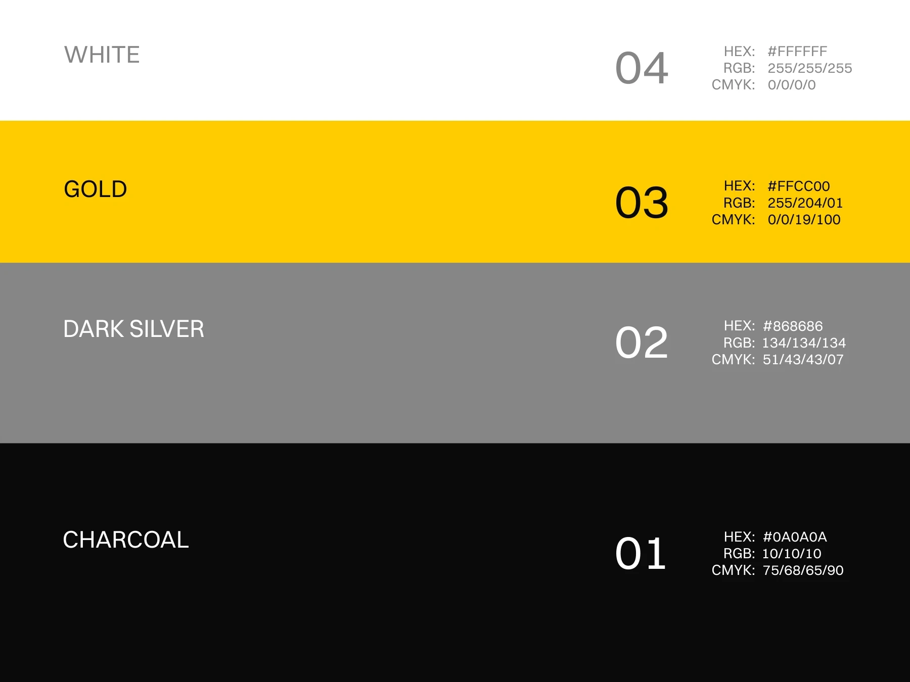
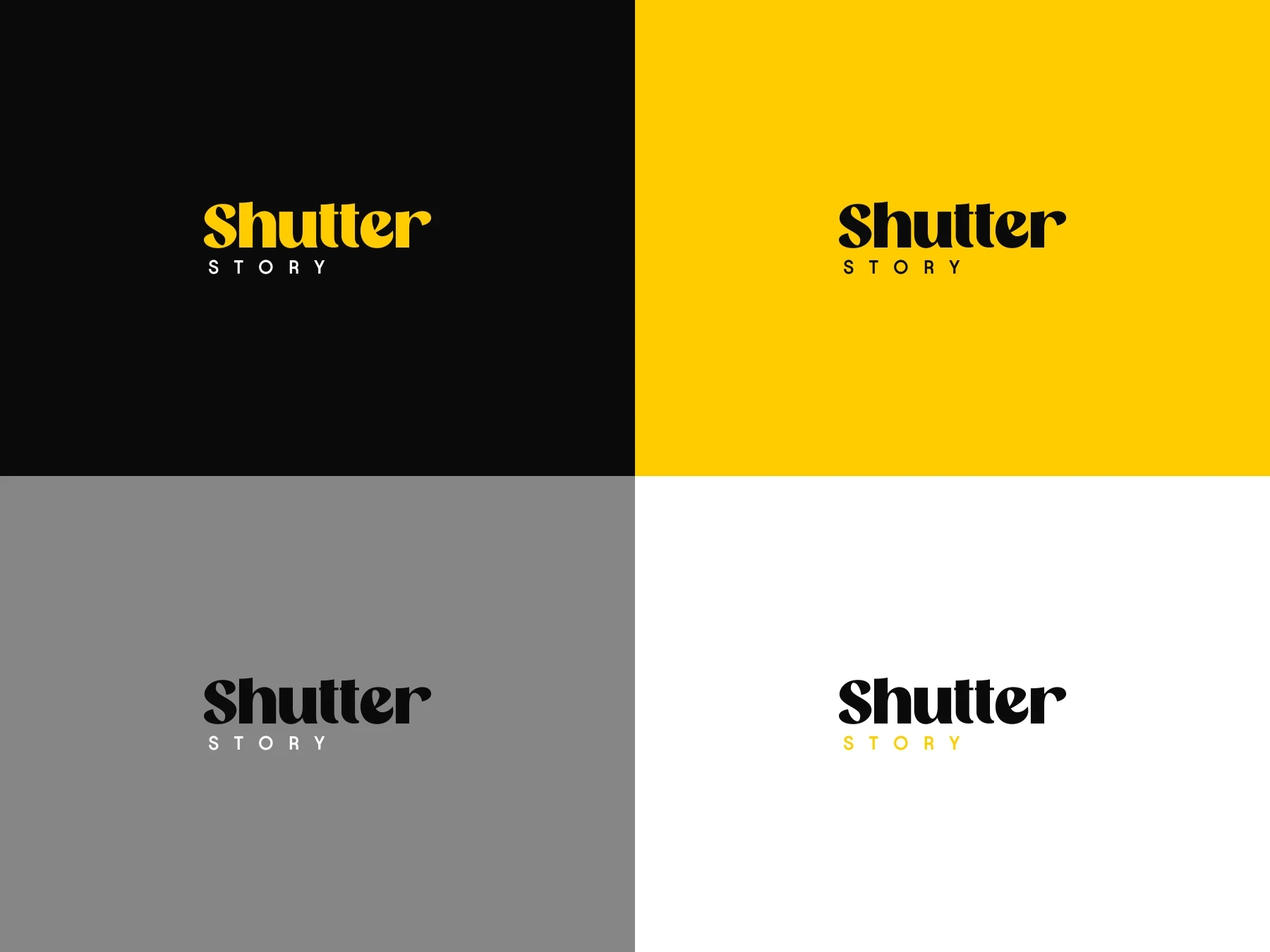
The palette of Shutter Story is inspired by the environment photography lives in.
Charcoal represents darkness before the shutter opens; depth, focus, and anticipation. It creates space for images to shine.
Dark Silver reflects camera bodies, lenses, and metal surfaces; quiet, professional, and timeless.
Gold is the moment of capture. The spark of light. The instant when everything aligns and the shutter clicks. It highlights what matters most.
White brings balance and breath, allowing the story to unfold clearly and without distraction.
Together, these colors create a cinematic contrast that feels premium, intentional, and enduring; just like the stories Shutter Story tells.
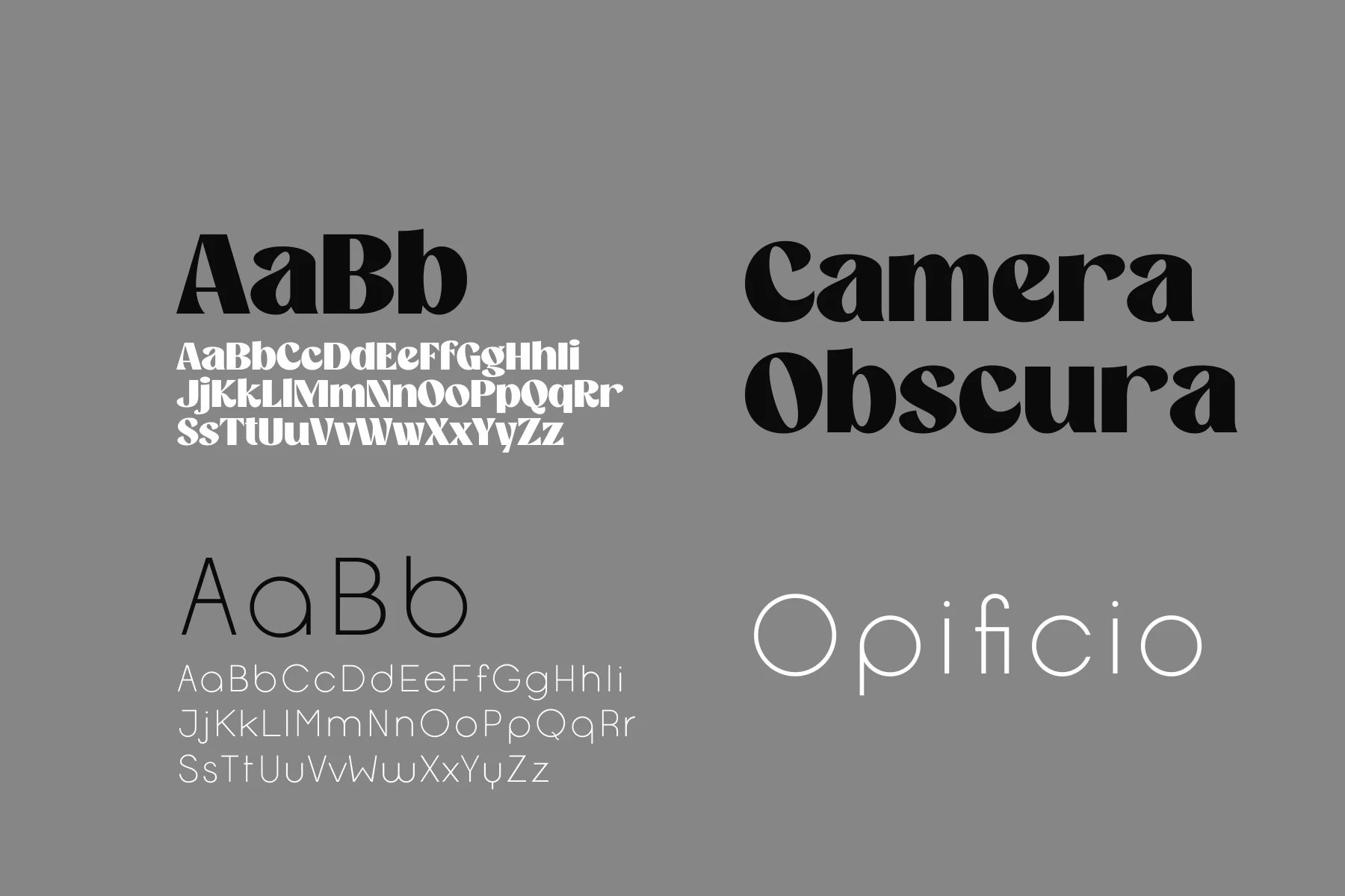
Typography is the voice of Shutter Story.
Camera Obscura brings character, contrast, and intention. Its bold curves and sharp edges echo the play of light and shadow found in photography; dramatic where needed, subtle where it matters. It speaks in headlines, setting the emotional tone and anchoring the brand with confidence.
Opificio balances this expression with clarity. Clean, modern, and unobtrusive, it supports the story without competing for attention. Like a well-composed photograph, it knows when to step back and let the subject breathe.
Together, the type system mirrors the photographic process itself:
expression and precision, emotion and control.


Like this project
Posted Jan 6, 2026
Crafted a timeless brand identity for Shutter Story focused on storytelling through photography.