Let’s talk about the typography
Faruk Mustapha
Let’s talk about the typography of premium brands.
Why do some brands instantly feel like they cost $10,000+, while others look like a $50 template, even when using similar clean layouts?
The secret is usually hiding in the typesetting discipline.
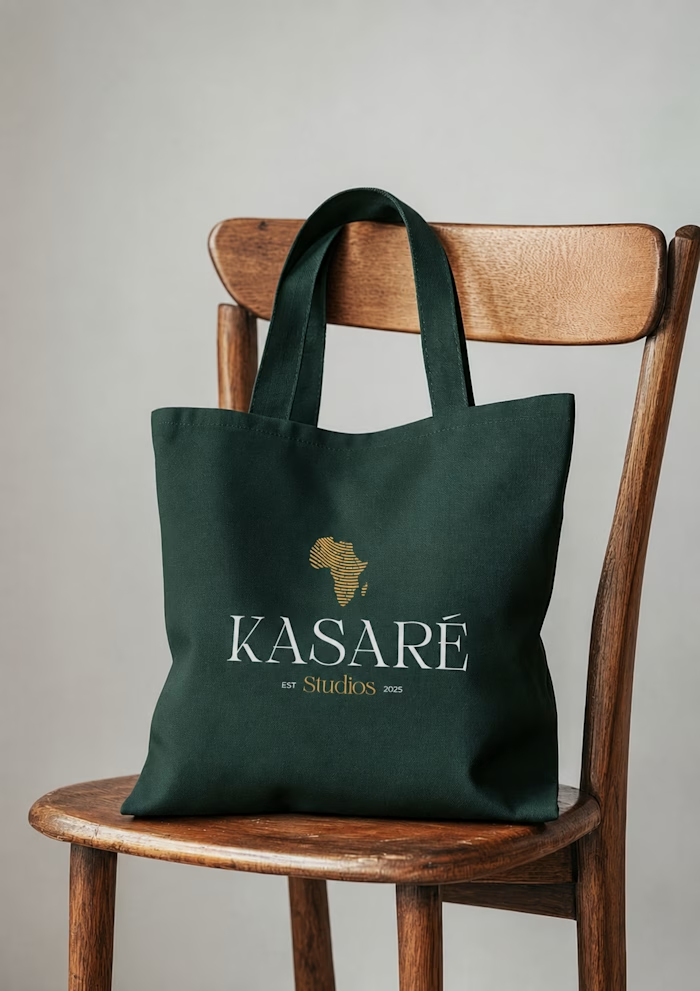
In premium brand and editorial design, layout is everything. Mass-market brands prioritize packing information tightly to "save space." Premium brands prioritize spatial rhythm, wide letter-spacing (tracking) on uppercase headers, and strict alignment to an invisible grid system.
Let’s settle a debate for high-end corporate identity: When designing a brand identity or corporate profile for an elite client, which typographic direction commands more executive trust?
Like this project
Posted Jul 2, 2026
Let’s talk about the typography of premium brands. Why do some brands instantly feel like they cost $10,000+, while others look like a $50 template, even whe...
Likes
0
Views
2