Faruk Mustapha - Brand Designer | ContraWork by Faruk Mustapha
Faruk Mustapha

Faruk Mustapha

Brand Identity, Editorial & Presentation Designer

    5.00
    Rating
    11
    Followers
Cover image for Should every brand have branded
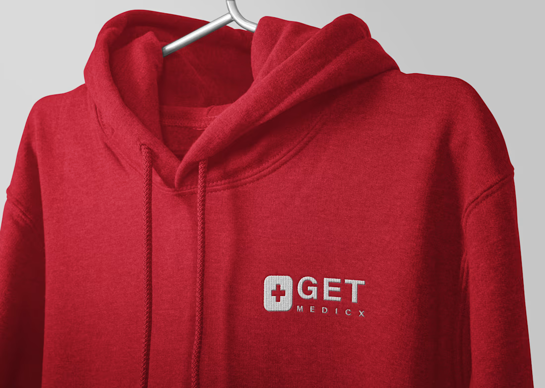
Should every brand have branded merchandise? I don't think so. Merchandise only works when it serves a purpose. For some brands, it's marketing. For others, it's culture. For internal teams, it builds belonging. For customers, it becomes a reminder of the brand. I designed this hoodie concept to explore how a visual identity translates into something people would actually wear. What's one branded item you've received that you still use today?
1
15
When design is simple, every single detail must be perfect. When you strip away loud patterns and distracting clutter, you remove the places where bad design hides. In a premium visual system, every millimetre is a critical decision. To build a premium minimalist letterhead, you rely on wide, intentional letter-spacing that instantly signals executive authority. Every element must lock flawlessly into an invisible grid system, because being off by even two pixels shatters the high-end feel. Surrounding tiny, sharp typography with vast empty space forces focus and completely commands the room. True authority never needs to scream. It speaks in a whisper.
0
71
Cover image for Harness the Power of Negative Space in Premium Design
The Power of Negative Space in Premium Design: Whitespace isn't wasted space. It’s luxury branding. In strategic layout design, negative space is not a void; it is an active structural asset. When you eliminate visual noise, you remove cognitive friction. You force the reader’s eye to lock precisely onto what matters most, whether that is a critical financial metric in a pitch deck, a sharp brand mark, or a single, commanding value proposition.
0
68
Cover image for SNT Developers: Brand Identity for
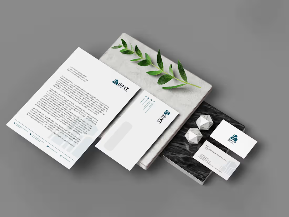
SNT Developers: Brand Identity for a Modern Real Estate & Development Company SNT Developers is a contemporary real estate and property development brand built to inspire confidence, credibility, and long-term value. The goal of this project was to create a sophisticated visual identity that reflects the company's commitment to quality construction, innovation, and architectural excellence. The identity combines clean geometric forms, refined typography, and a timeless colour palette to communicate professionalism and trust. Every element was intentionally designed to position SNT Developers as a premium brand capable of attracting investors, homeowners, and commercial clients alike. Beyond the logo, I developed a cohesive brand system that extends seamlessly across corporate stationery, marketing materials, signage, digital platforms, and property presentations. The result is a scalable identity that strengthens brand recognition and elevates every customer touchpoint.
0
90
Cover image for Santé: Premium Brand Identity for
Santé: Premium Brand Identity for Modern Medical Wear Santé is a contemporary medical apparel brand created to redefine how healthcare professionals experience workwear. The objective was to develop a sophisticated visual identity that communicates trust, comfort, and professionalism while elevating the perception of medical scrubs through thoughtful design. The branding centers around a refined serif wordmark that balances elegance with approachability, complemented by a distinctive icon derived from the accented "é." A calming teal palette, clean typography, and minimalist visual language reinforce the brand's commitment to quality, innovation, and confidence. Beyond the logo, the project established a cohesive identity system designed to scale seamlessly across apparel labels, packaging, digital platforms, stationery, and marketing collateral. Every design decision was guided by a single goal: creating a brand that healthcare professionals would be proud to wear and instantly recognize.
0
95
Cover image for Websites should do more than
Websites should do more than look good they needs to clearly state your purpose. Here is a look at the desktop UI designed for Fabricates, balancing a strong, dark-mode statement section with sharp, editorial typography and clean navigation pathways. Looking to overhaul your digital presence? Let's talk.
2
2
135
I see a massive divide in the creative industry right now. On one side, you have designers who focus entirely on the craft—hyper-focused on visual execution, trendy mockups, and micro-animations. On the other side, you have strategists who deliver 50-page Google Docs full of abstract business theory but zero actionable visual direction. I believe true premium branding only happens at the intersection of both. I call it 'visual intellectualism'. It’s the belief that design strategy must have structural rigor, and visual execution must have deep analytical logic. You cannot build a high-end corporate identity or a pitch deck without an empathetic understanding of the target audience. Where do you think the freelance market is failing clients more right now?
2
111
Cover image for Let’s talk about the typography
Let’s talk about the typography of premium brands. Why do some brands instantly feel like they cost $10,000+, while others look like a $50 template, even when using similar clean layouts? The secret is usually hiding in the typesetting discipline. In premium brand and editorial design, layout is everything. Mass-market brands prioritize packing information tightly to "save space." Premium brands prioritize spatial rhythm, wide letter-spacing (tracking) on uppercase headers, and strict alignment to an invisible grid system. Let’s settle a debate for high-end corporate identity: When designing a brand identity or corporate profile for an elite client, which typographic direction commands more executive trust?
3
109
Cover image for A premium tote bag mockup
A premium tote bag mockup showcasing the KASARÉ Studios visual identity. This application highlights how thoughtful branding extends beyond the logo to create a refined, memorable brand experience across everyday touchpoints.
1
89
Designed a complete premium brand identity for Hatik Integrated Services, transforming the company into a modern, credible, and market-ready brand through strategic visual identity, brand guidelines, and professional collateral.
0
88
Cover image for Developed a modern brand identity
Developed a modern brand identity and corporate design for GrandHills, a real estate and development company based in Nigeria. The project focused on creating a professional, trustworthy visual identity that reflects the company's commitment to quality developments, premium properties, and long-term value across all brand touchpoints.
1
105
Cover image for Company Profile
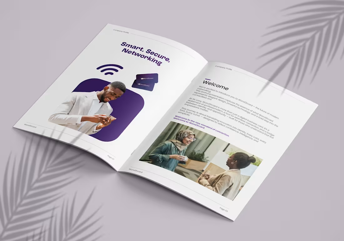
Company Profile
1
5
Cover image for HATIK Integrated Services
A strategic brand
HATIK Integrated Services A strategic brand identity project developed for an engineering and construction company committed to delivering quality infrastructure and development solutions. The project focused on creating a modern, cohesive brand system that reflects professionalism, precision, and trust. Beyond the visual identity, the work establishes a consistent design language across corporate collateral, marketing materials, and branded experiences, ensuring every interaction strengthens the company's reputation and market presence. By combining strategic thinking with refined execution, the identity positions HATIK Integrated Services to communicate with confidence, compete effectively, and support long-term business growth.
2
141
Cover image for Designed a contemporary editorial magazine
Designed a contemporary editorial magazine for BUG, a fashion brand based in Abuja, Nigeria. The layout combines bold typography, clean composition, and striking visuals to showcase the brand's collections while reflecting its modern identity and creative vision.
1
99
Cover image for Designed a modern, premium packaging
Designed a modern, premium packaging solution for a halal frozen foods brand, combining strong shelf appeal with clear product communication. The design emphasises freshness, quality, and trust through clean typography, appetising visuals, and a well-structured information hierarchy, resulting in a print-ready package optimised for retail.
1
99