Barrel Aged Gin Branding and Packaging Design
Marius Manea
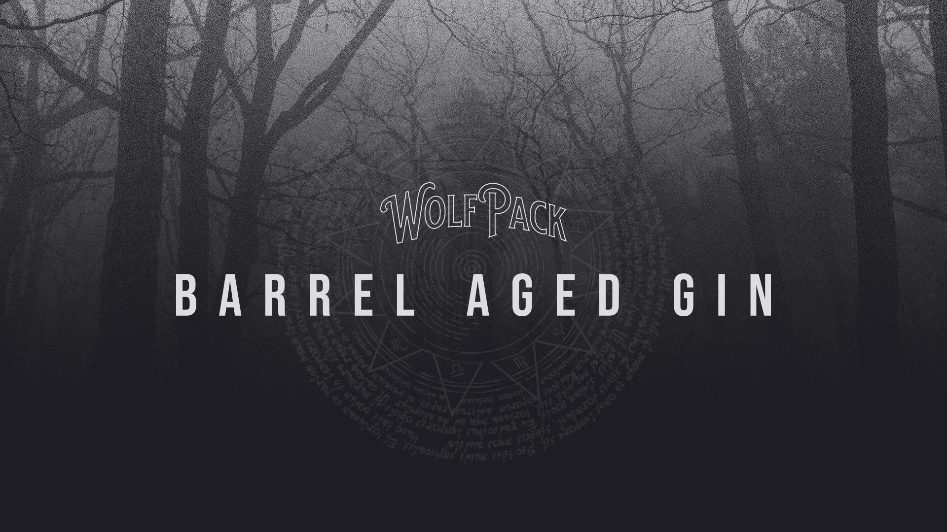
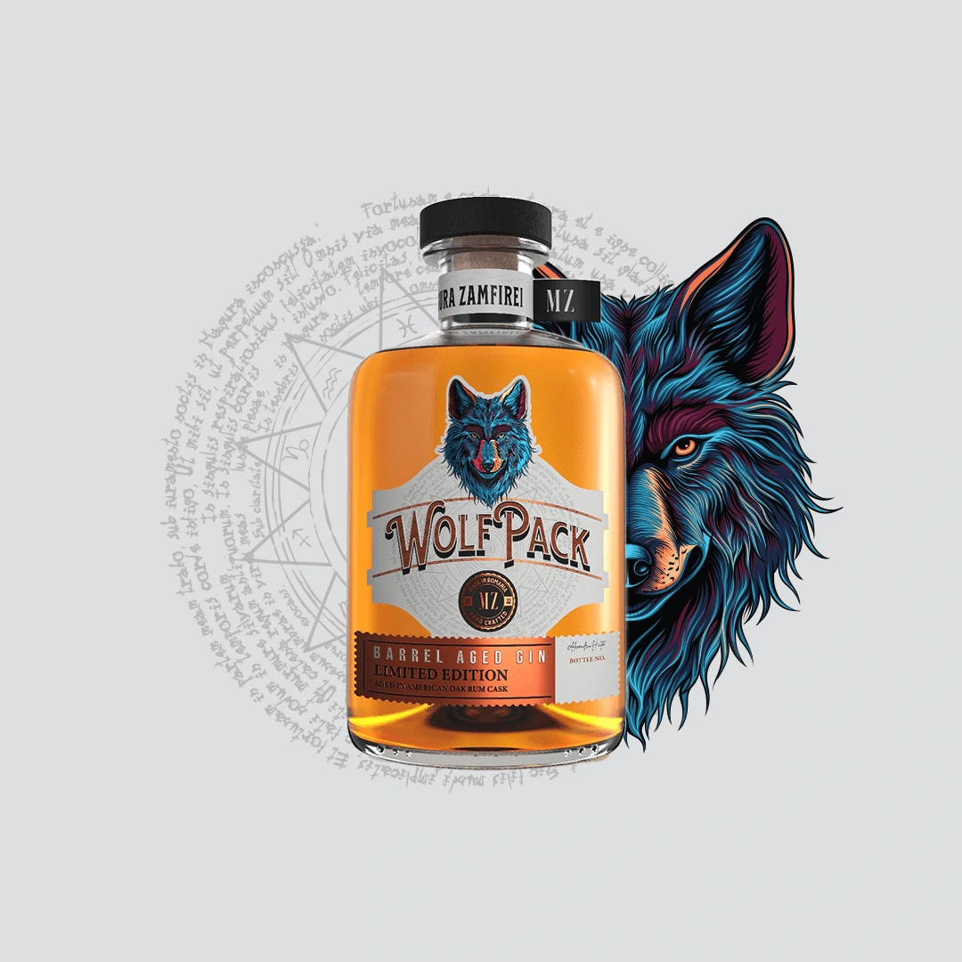
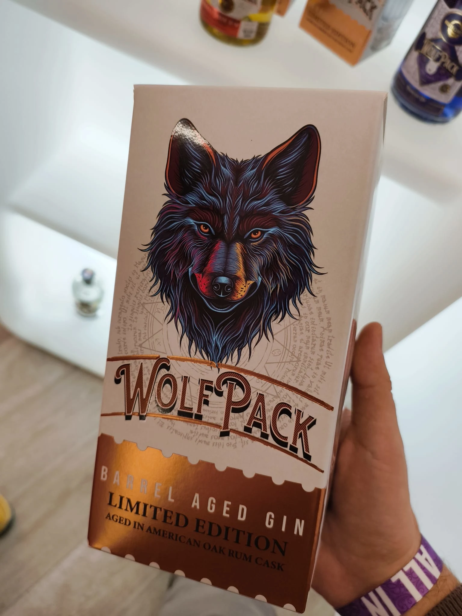
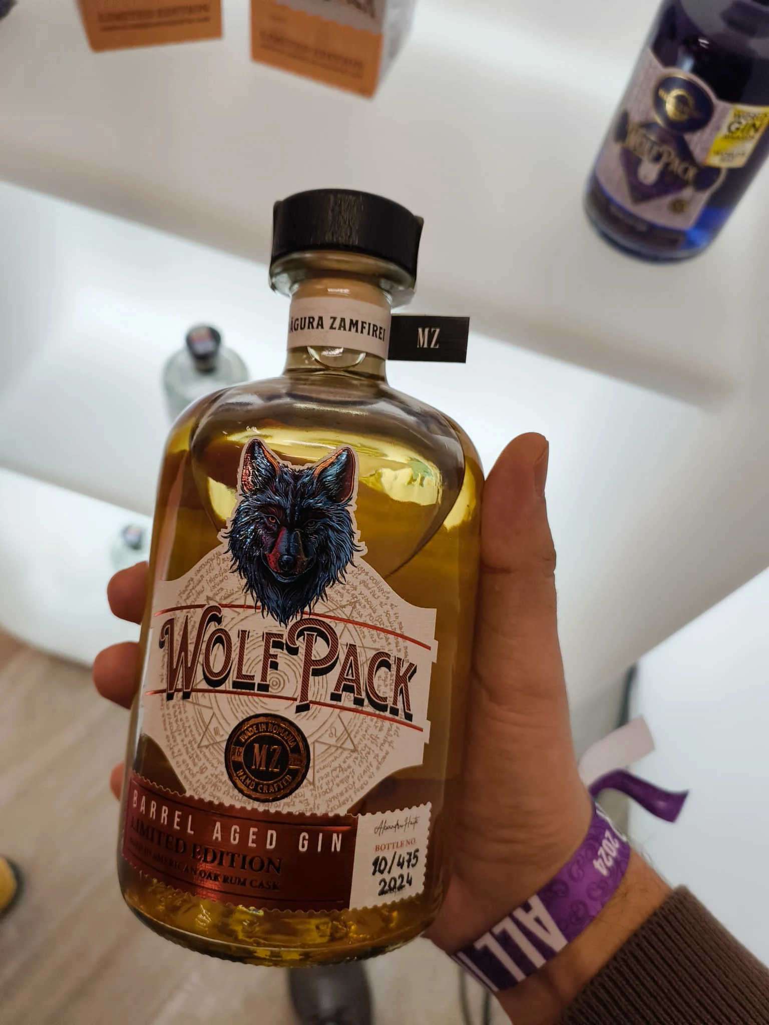
Barrel Aged Gin
Crafting a premium identity inspired by time, tradition, and character.
Overview
Barrel Aged Gin was created to explore the intersection between traditional gin-making and barrel aging, a process that adds depth, complexity, and character to an already distinctive spirit.
The objective was to develop a premium visual identity and packaging system that communicates craftsmanship, authenticity, and refinement while standing out in a category often dominated by traditional botanical aesthetics.
The Challenge
Most gin brands rely heavily on heritage-inspired visuals, intricate illustrations, and familiar category cues. While effective, these conventions often make it difficult for new products to establish a distinctive presence.
The challenge was to create an identity that would:
Highlight the unique barrel-aged positioning.
Communicate premium quality and craftsmanship.
Appeal to both gin enthusiasts and whiskey drinkers.
Deliver strong shelf presence without relying on visual clutter.
Create a scalable system for future product extensions.
Strategy
The brand was built around a simple idea:
Character takes time.
Unlike traditional gin, barrel-aged gin evolves through maturation, developing richer flavors and a more complex profile over time. This concept became the foundation of the visual narrative.
The identity was designed to express:
Craftsmanship
Maturity
Confidence
Authenticity
Premium simplicity
Rather than relying on decorative elements, the system focuses on strong typography, refined composition, and a restrained visual language that allows the product itself to take center stage.
Visual Identity
The logo and supporting graphic elements were designed to balance timeless elegance with contemporary sophistication.
Every element of the system was created to reinforce the perception of a carefully crafted product, from the typography and label hierarchy to the overall packaging architecture.
Key considerations included:
Premium positioning
Clear visual hierarchy
Scalability across formats
Shelf recognition
Long-term brand consistency
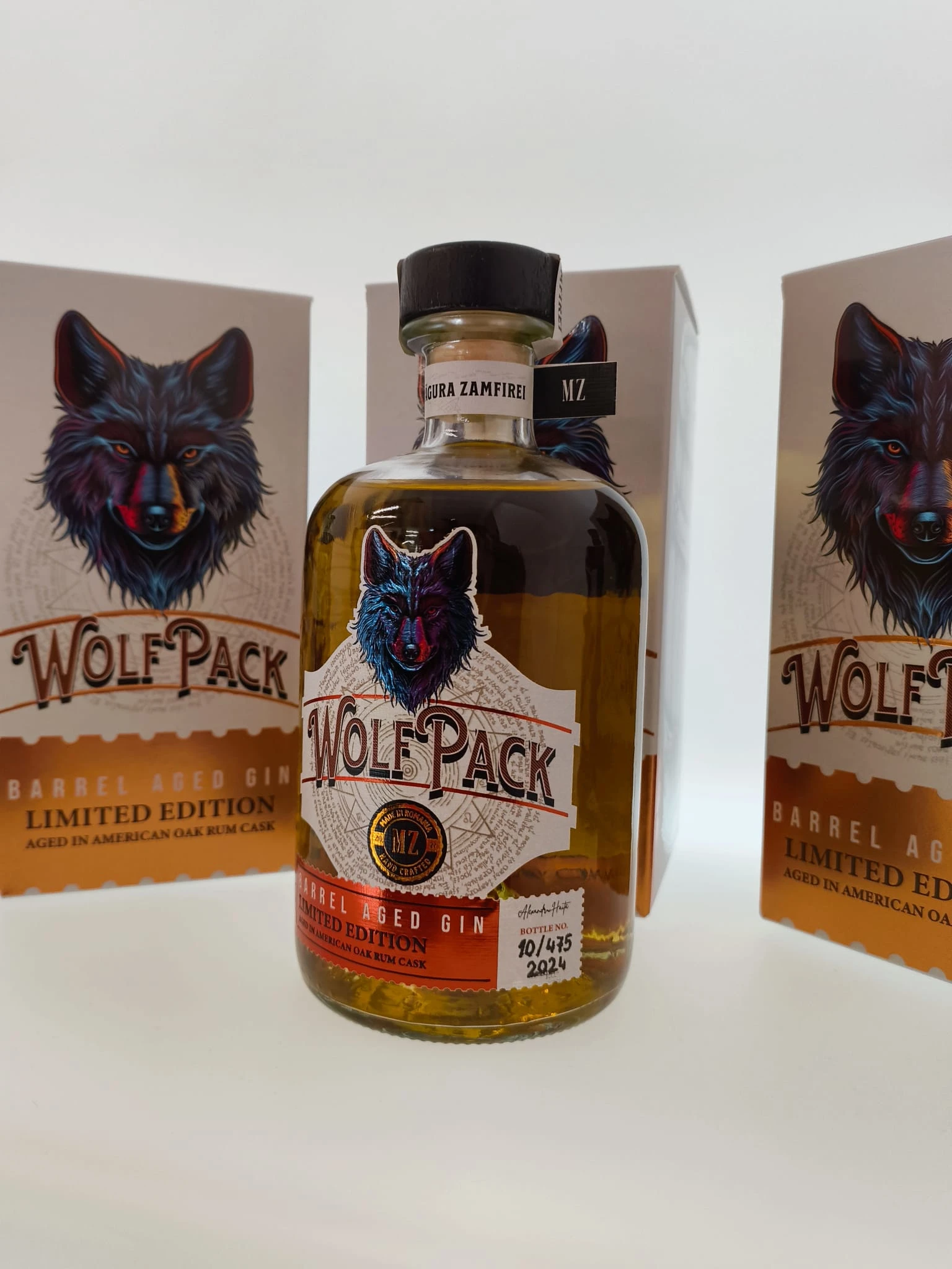
Packaging Design
Packaging became the primary storytelling tool.
The label system was designed to communicate the product's unique aging process while maintaining a clean and sophisticated appearance.
By combining refined typography, balanced layouts, and subtle premium cues, the packaging creates a sense of quality and exclusivity without feeling overly luxurious or inaccessible.
Outcome
The result is a cohesive brand identity that transforms Barrel Aged Gin into more than just a product, it becomes an experience rooted in craftsmanship, patience, and character.
The project demonstrates how strategic branding and packaging design can elevate a specialty spirit, creating a distinctive presence in a highly competitive category while remaining authentic to the product's story.
Thank you for taking the time to explore this project.
Like this project
Posted Jun 2, 2026
Developed a premium visual identity for Barrel Aged Gin, focusing on craftsmanship and uniqueness.