Perivon | Unisex Clothing Logo & Brand Identity

Ram Cael


A visual identity for everyday fashion
Perivon is a unisex clothing brand for people aged 20 to 35 who care about style, comfort, and individuality. The idea was to create a brand that feels easy to wear but still has its own personality.
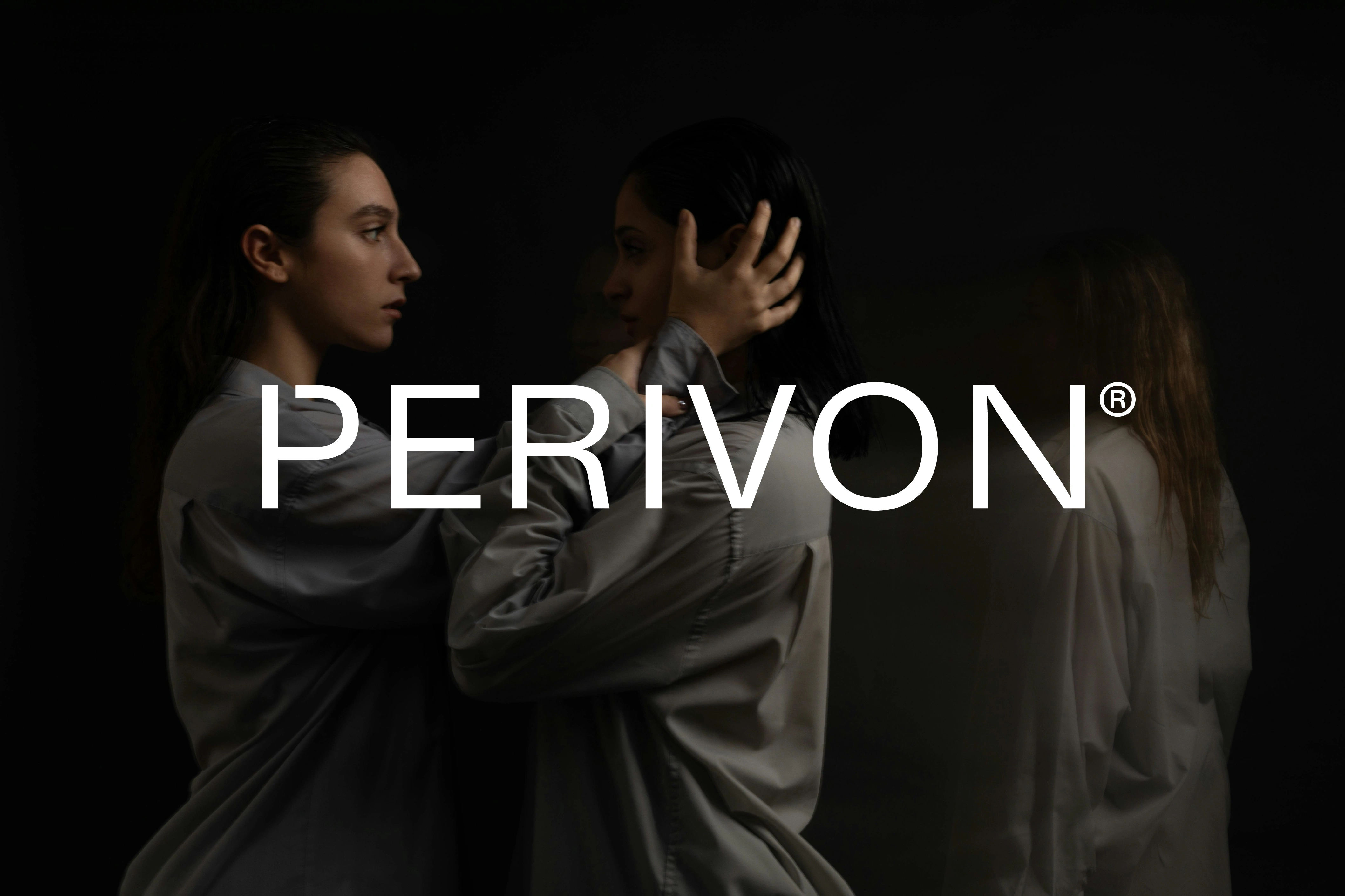
The visual direction is simple and minimal, with a strong focus on the clothing, photography, and typography. I wanted the identity to feel confident without adding unnecessary visual elements.
The Logo
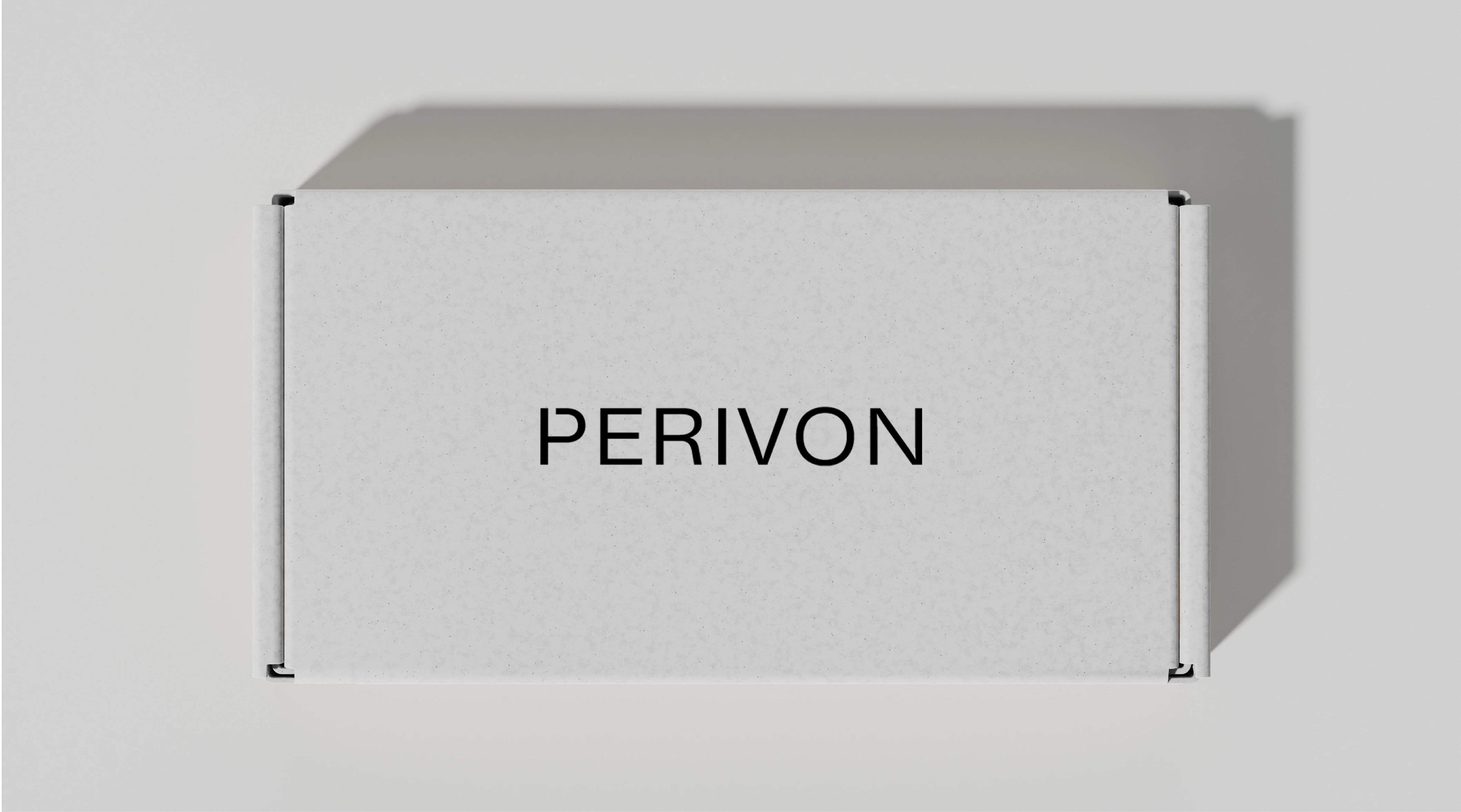
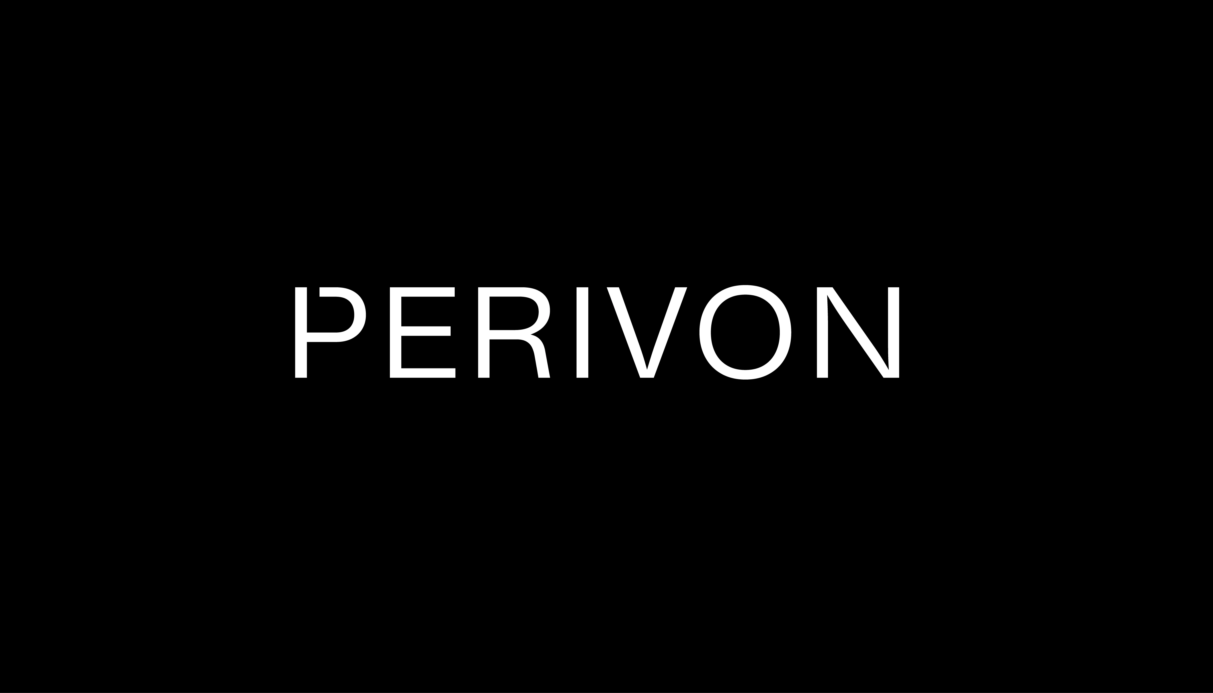
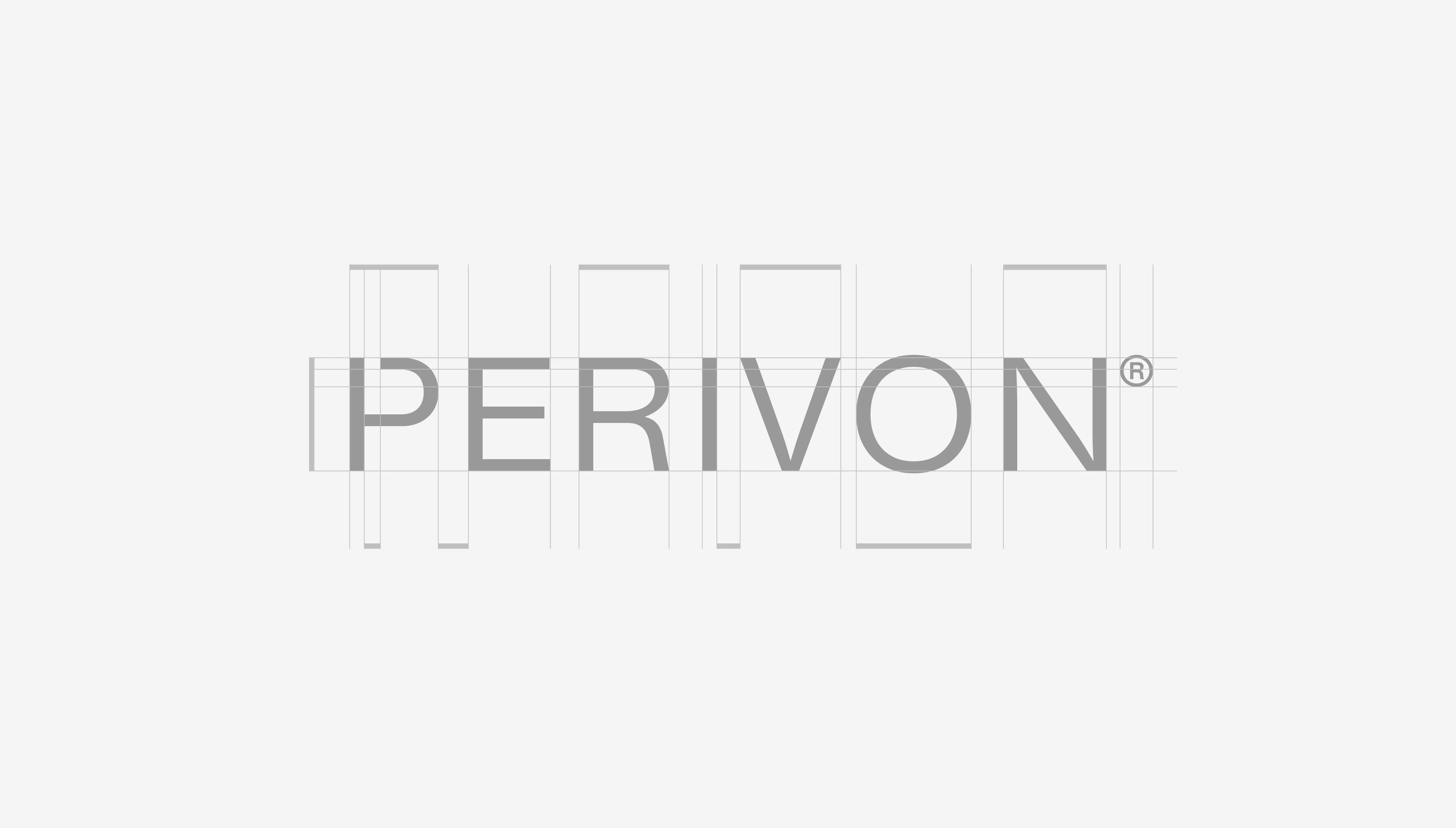
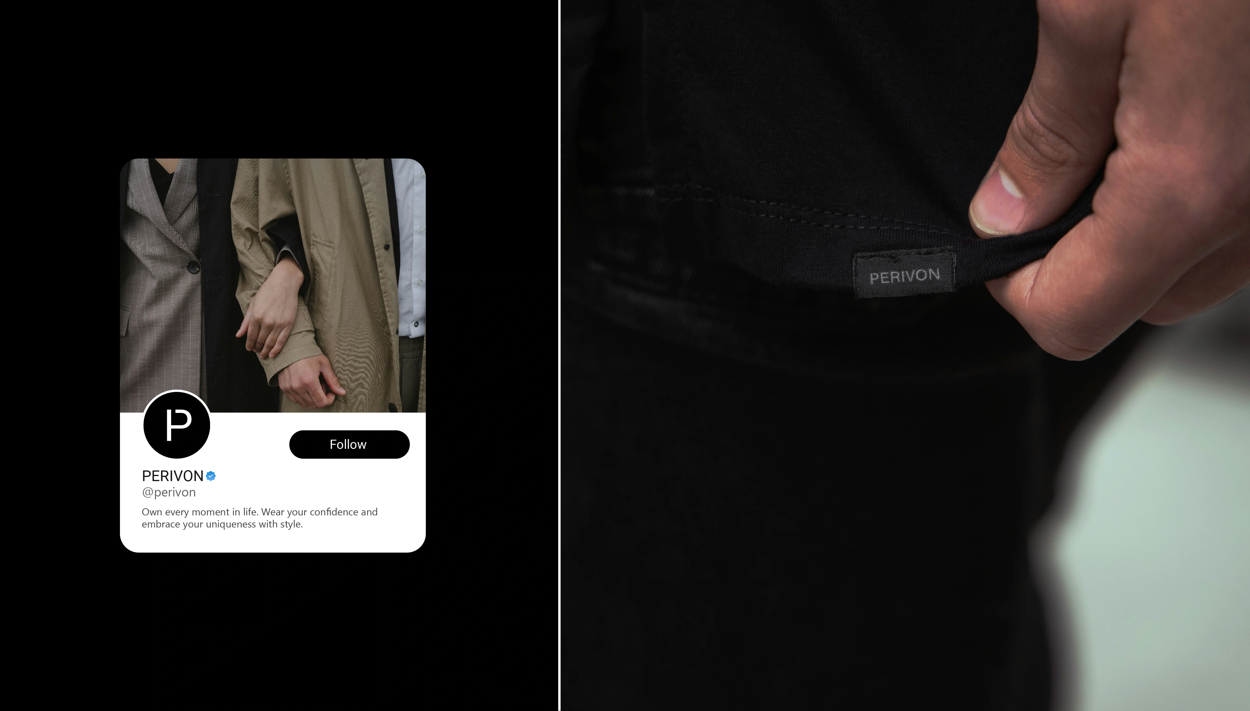
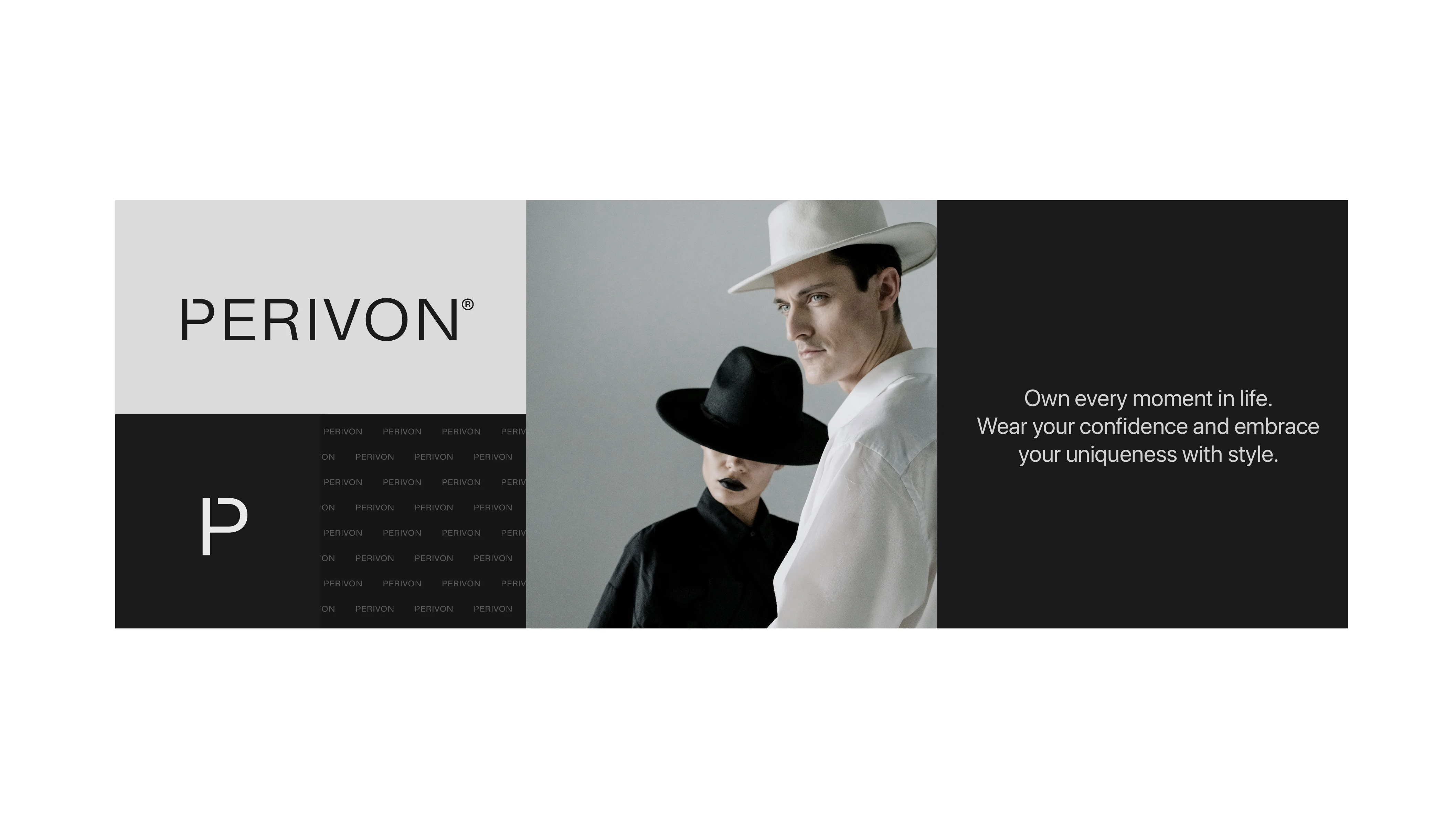
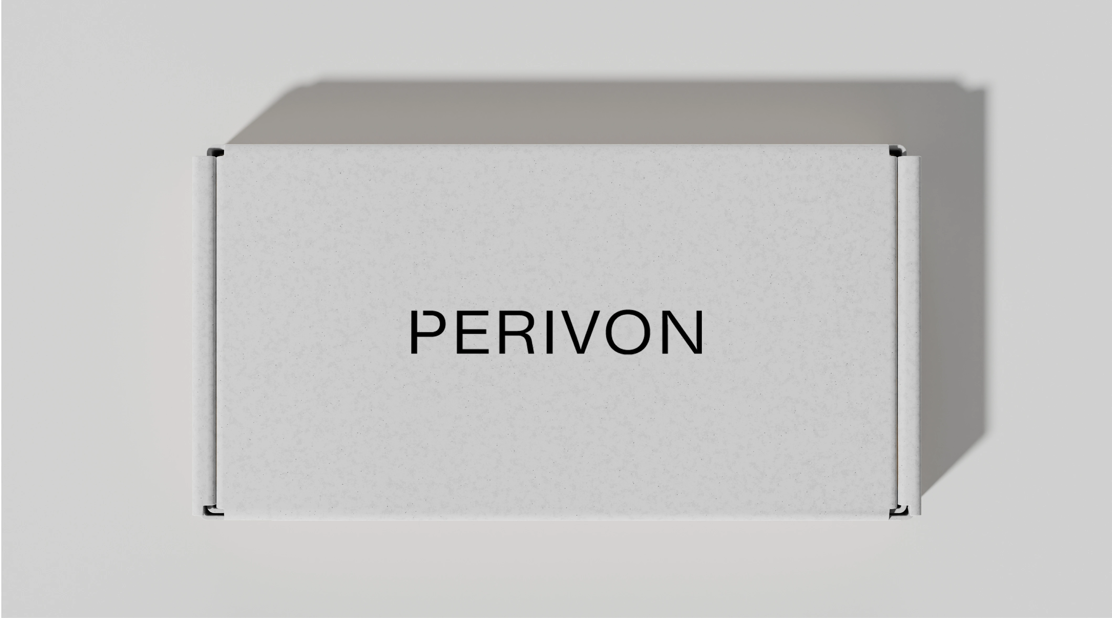
The main idea behind the logo came from a clothes hanger. I combined the shape of a hanger with the letter "P" to create a simple symbol that connects directly to fashion.
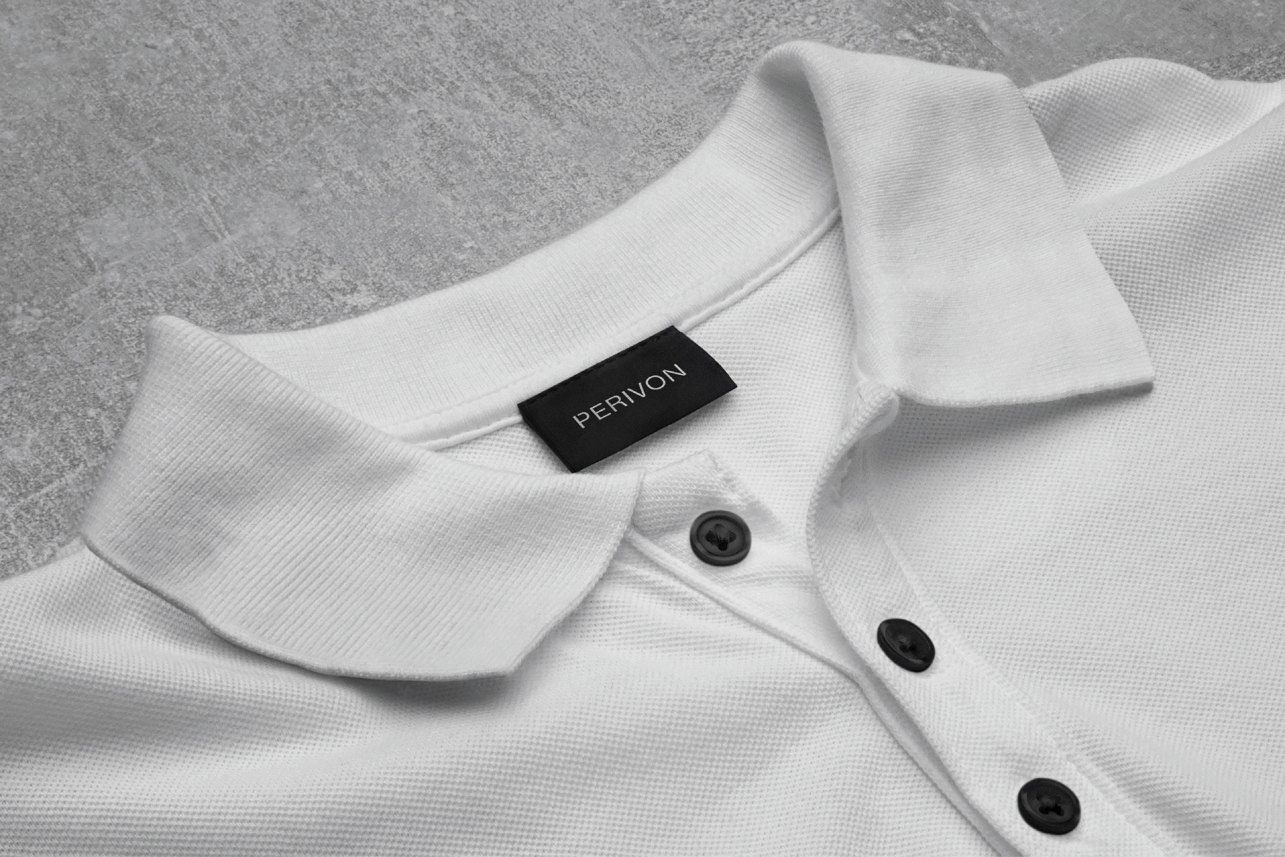
The result is a mark that is easy to recognize and works well on different applications, especially clothing, packaging, and signage.
Visual Direction
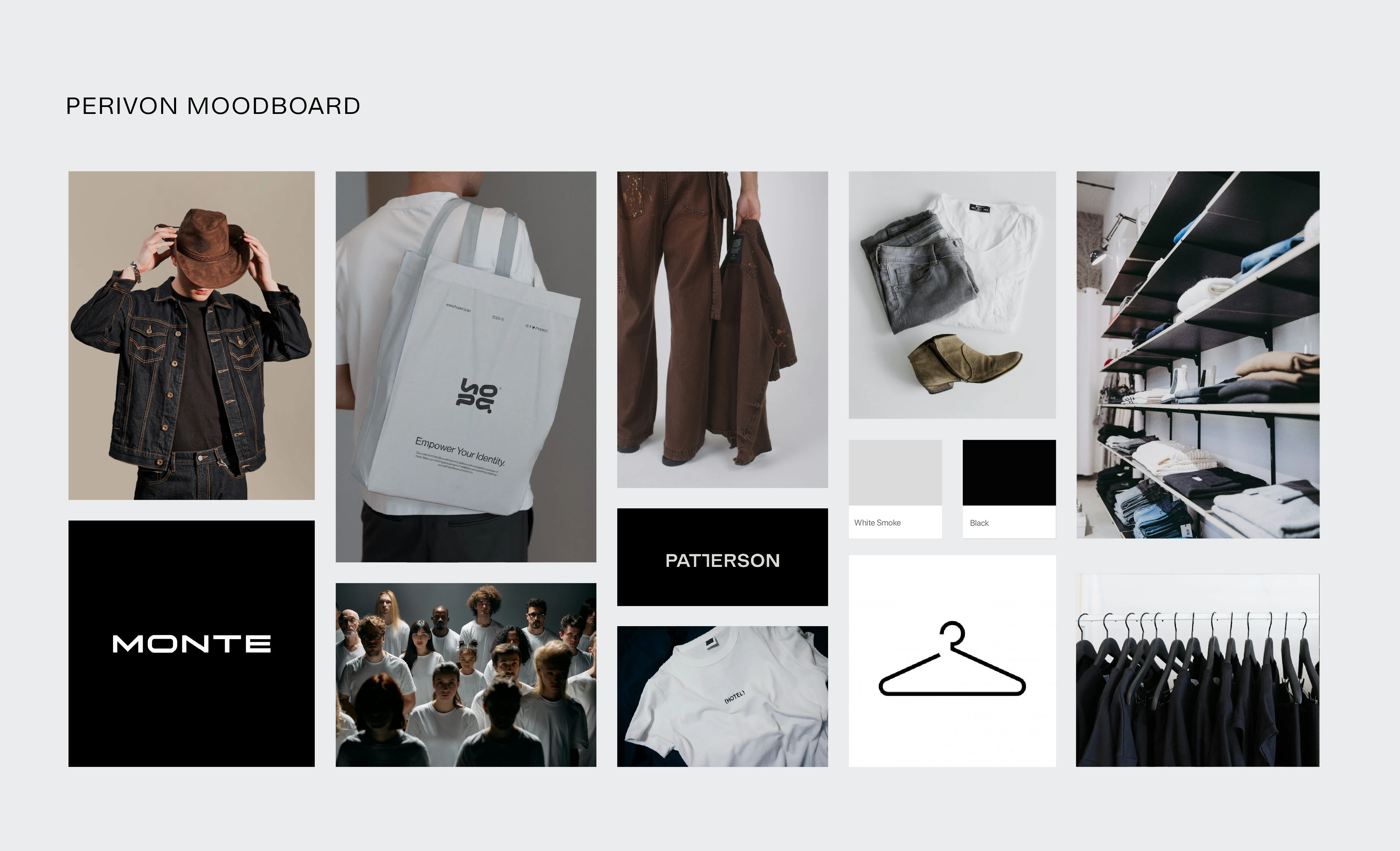
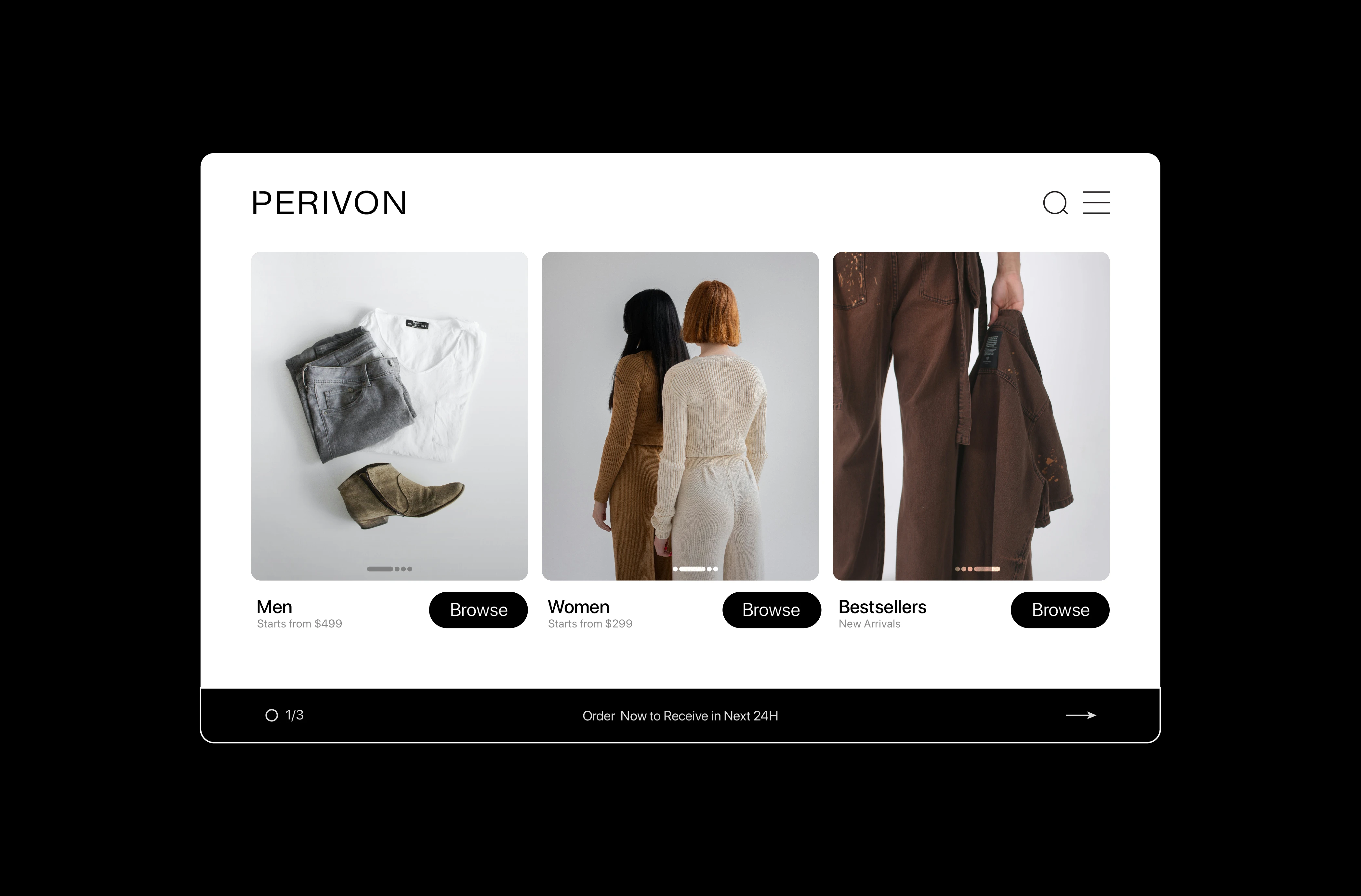
The identity uses a mostly black, white, and neutral color palette. This keeps the system clean and gives the photography and clothing enough space to stand out.
For the imagery, I focused on everyday clothing, people, fabric, and simple compositions. The overall direction is inspired by contemporary fashion editorials, but kept approachable rather than overly polished.
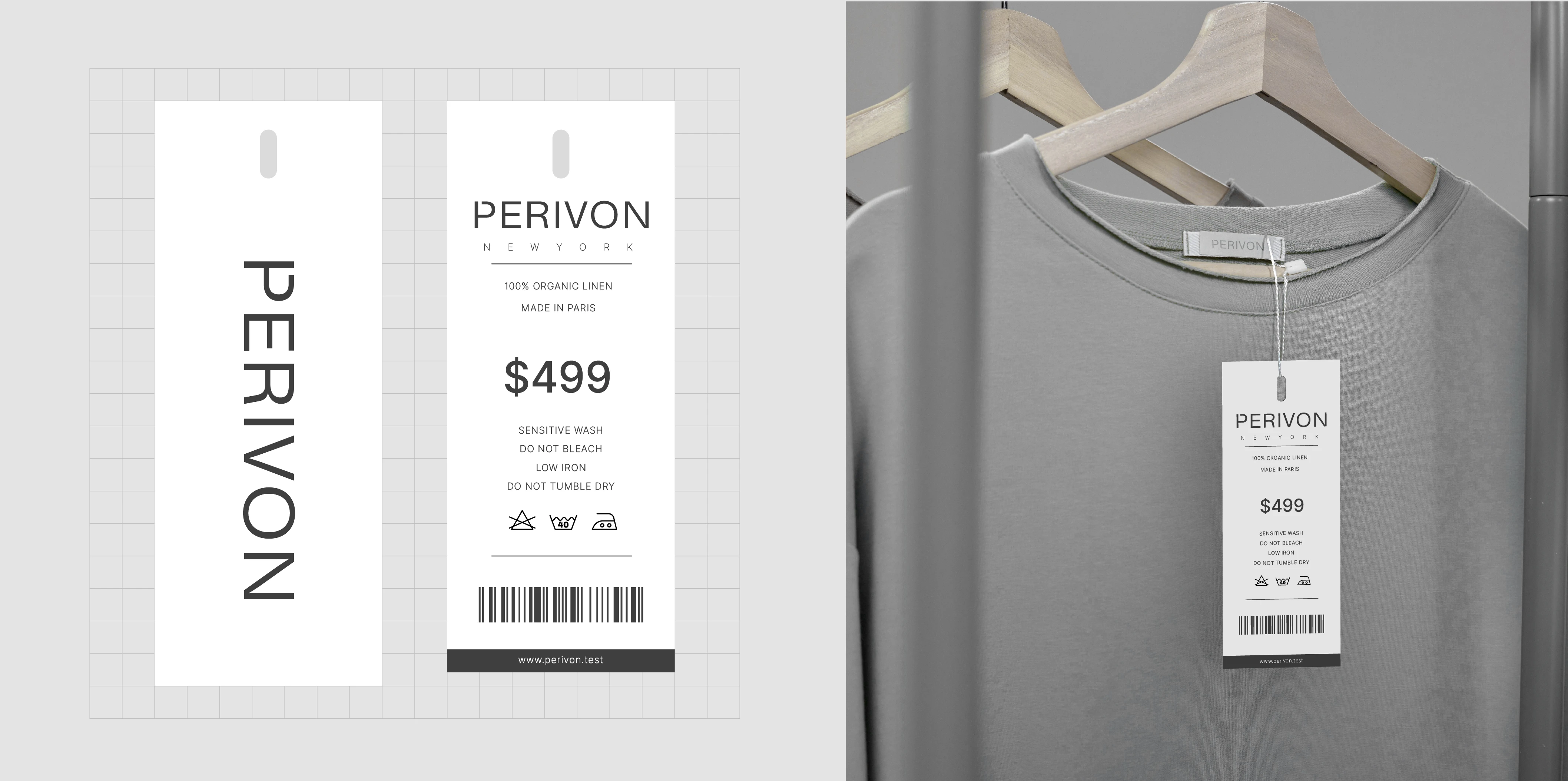
Typography is also an important part of the identity. Large type, clean layouts, and plenty of space give the brand a confident fashion feel.
The Result
Perivon now has a simple visual language built around its clothing and its audience. The hanger inspired P gives the brand a recognizable symbol, while the typography, photography, and neutral palette give it a consistent look across different applications.
The final identity is understated, confident, and designed to let the clothing remain the focus.
Like this project
Posted Oct 6, 2026
A minimal visual identity for Perivon, a unisex clothing brand built around everyday style, individuality, and a hanger-inspired P logo.