Visual Identity Development for Nueva Real Estate

Ram Cael


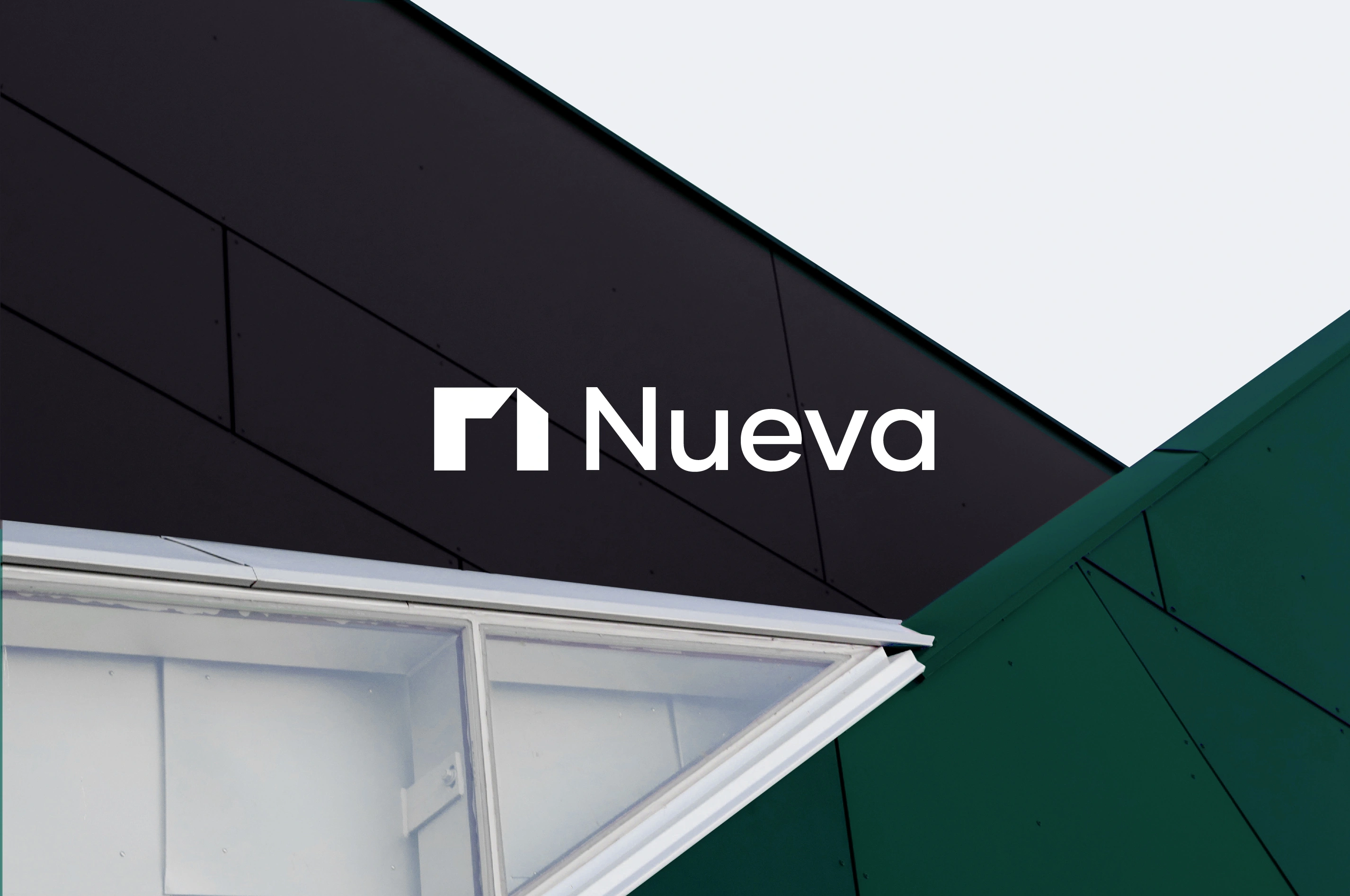
A distinctive identity for a real estate brand built around the stories we live
Nueva Real Estate is a Savannah-based real estate brand helping home buyers and sellers navigate one of the most personal decisions they make — finding a place to call home. In a crowded real estate market dominated by established names, Nueva needed a distinctive identity that could give the brand a recognizable presence while communicating trust, expertise, and a more personal approach to real estate.
The challenge was to create a visual identity that balanced the precision and structure of architecture with the human side of real estate — the homes, experiences, and stories that give each space meaning. With a startup budget and a six-week timeline, the goal was to create a brand that could stand confidently alongside much larger competitors without losing its individuality.
Approach
The identity was built around Nueva's belief that real estate is about more than transactions. It is about the stories that unfold within the spaces people buy, sell, and call home.
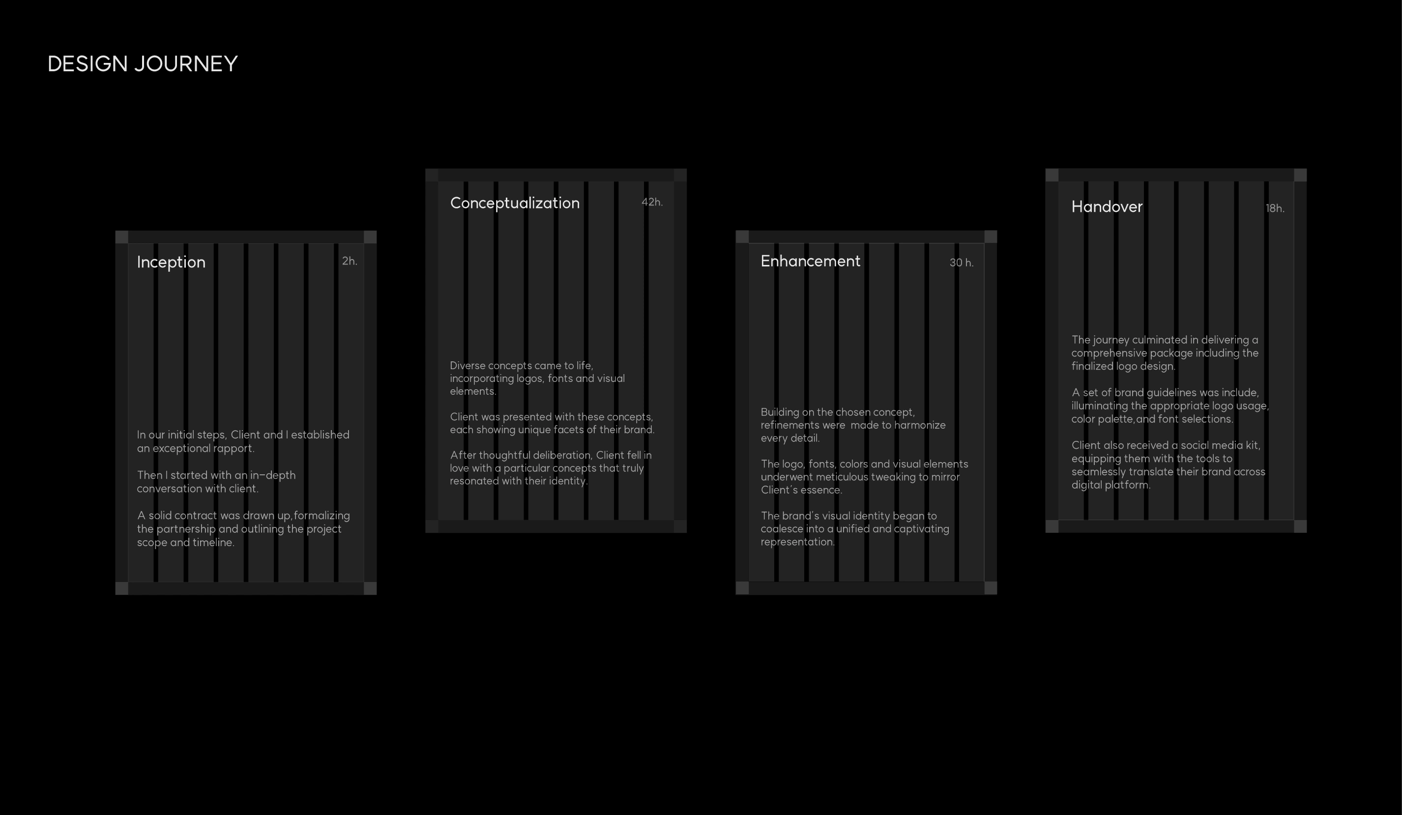
This idea became the foundation for a visual system that combines architectural structure with a more human and editorial approach. Rather than relying on conventional real estate symbols, the identity uses proportion, negative space, typography, imagery, and composition to create a distinctive character

Logo Identity
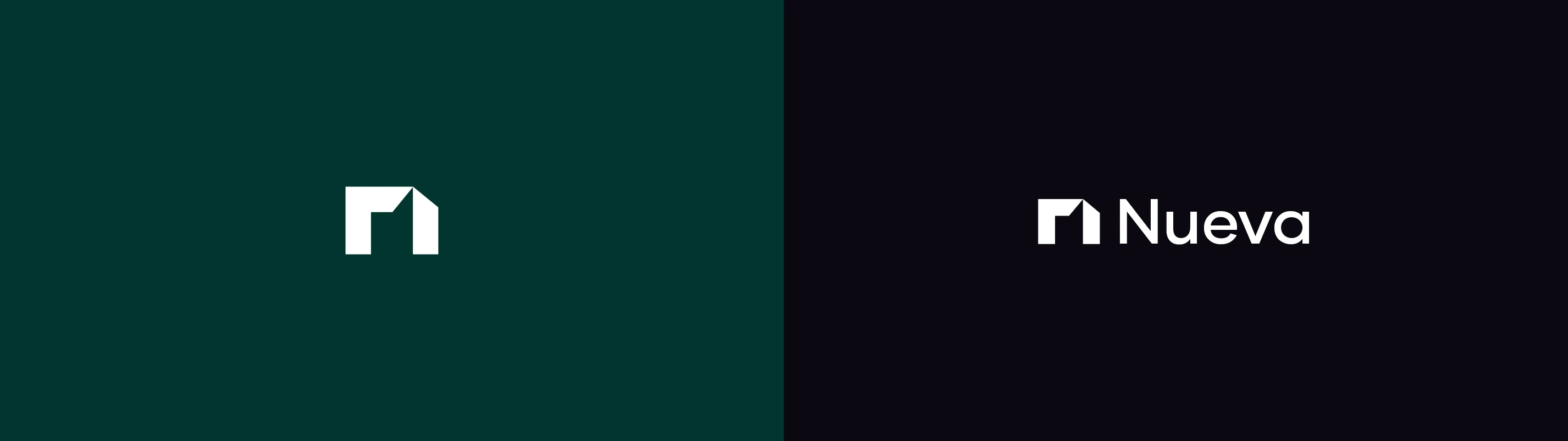
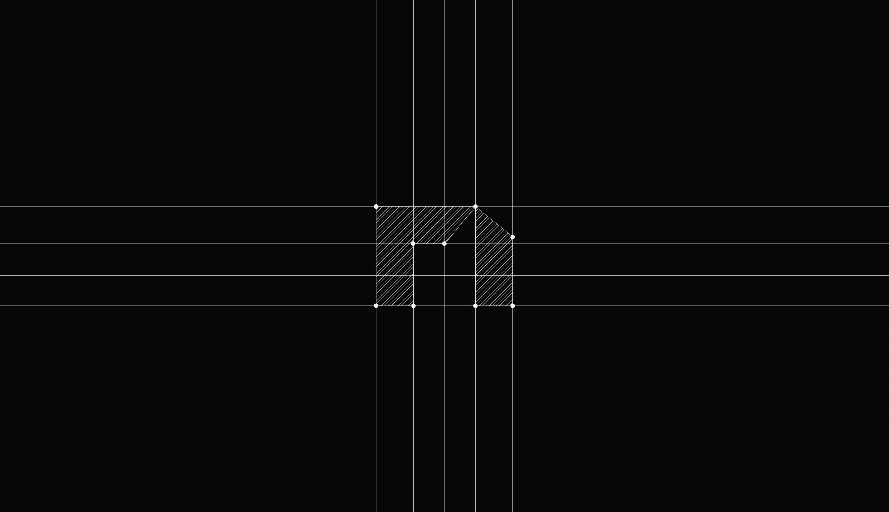
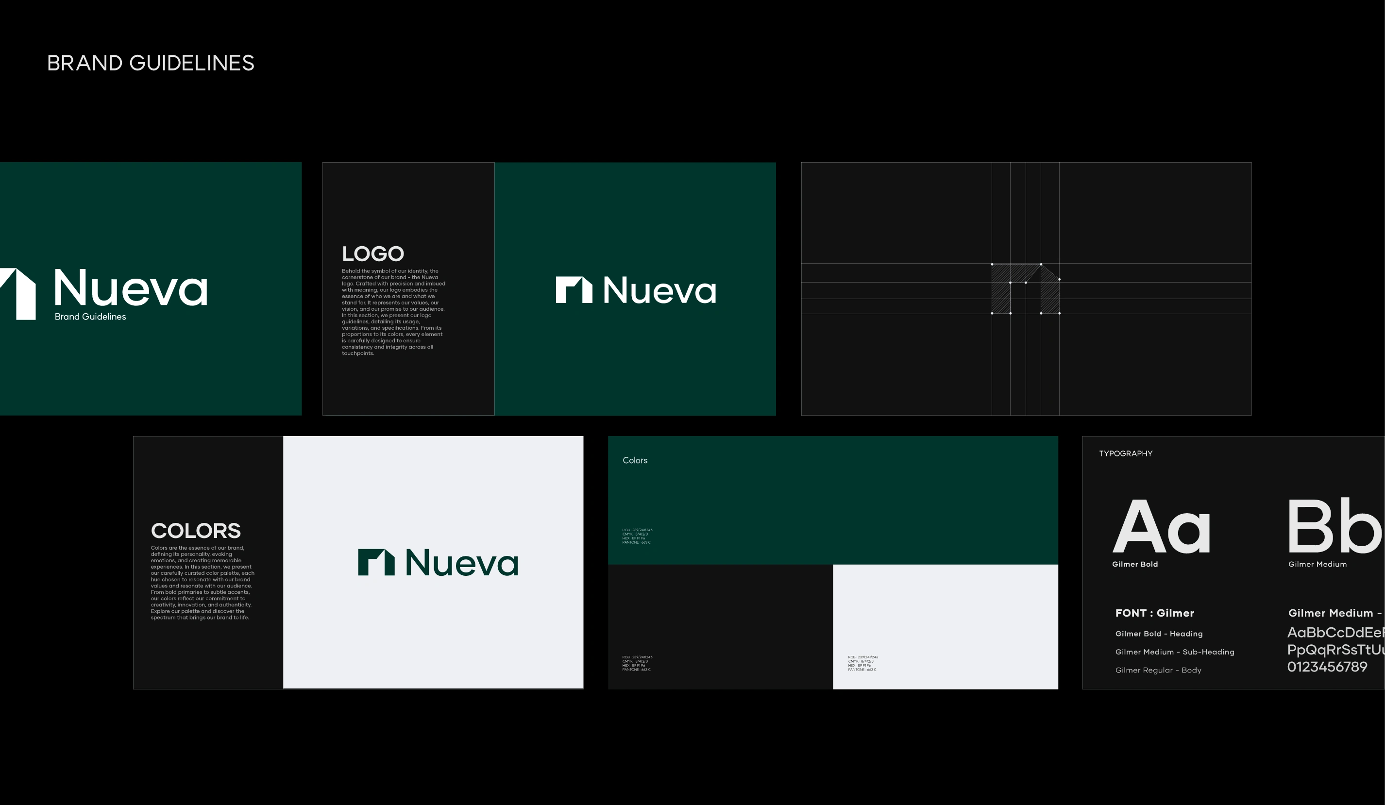
The Nueva logo was developed around a simple but considered idea: creating the N-shaped core through negative space.
The challenge was to make the connection to Nueva recognizable without making the symbol overly literal. The resulting mark uses carefully considered forms and negative space to create an N while maintaining a sense of architectural precision.
This approach reflects the qualities at the heart of the brand precision, refinement, and thoughtful design while creating a symbol that can exist independently across different applications.

Visual Identity
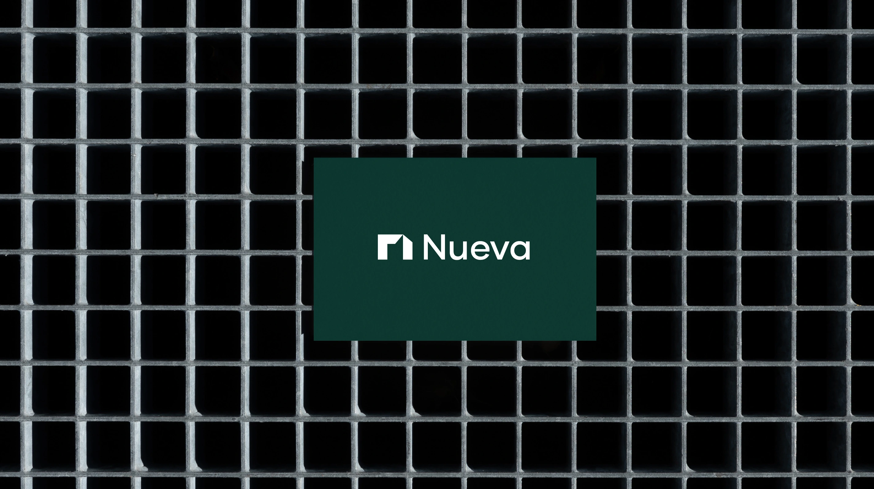
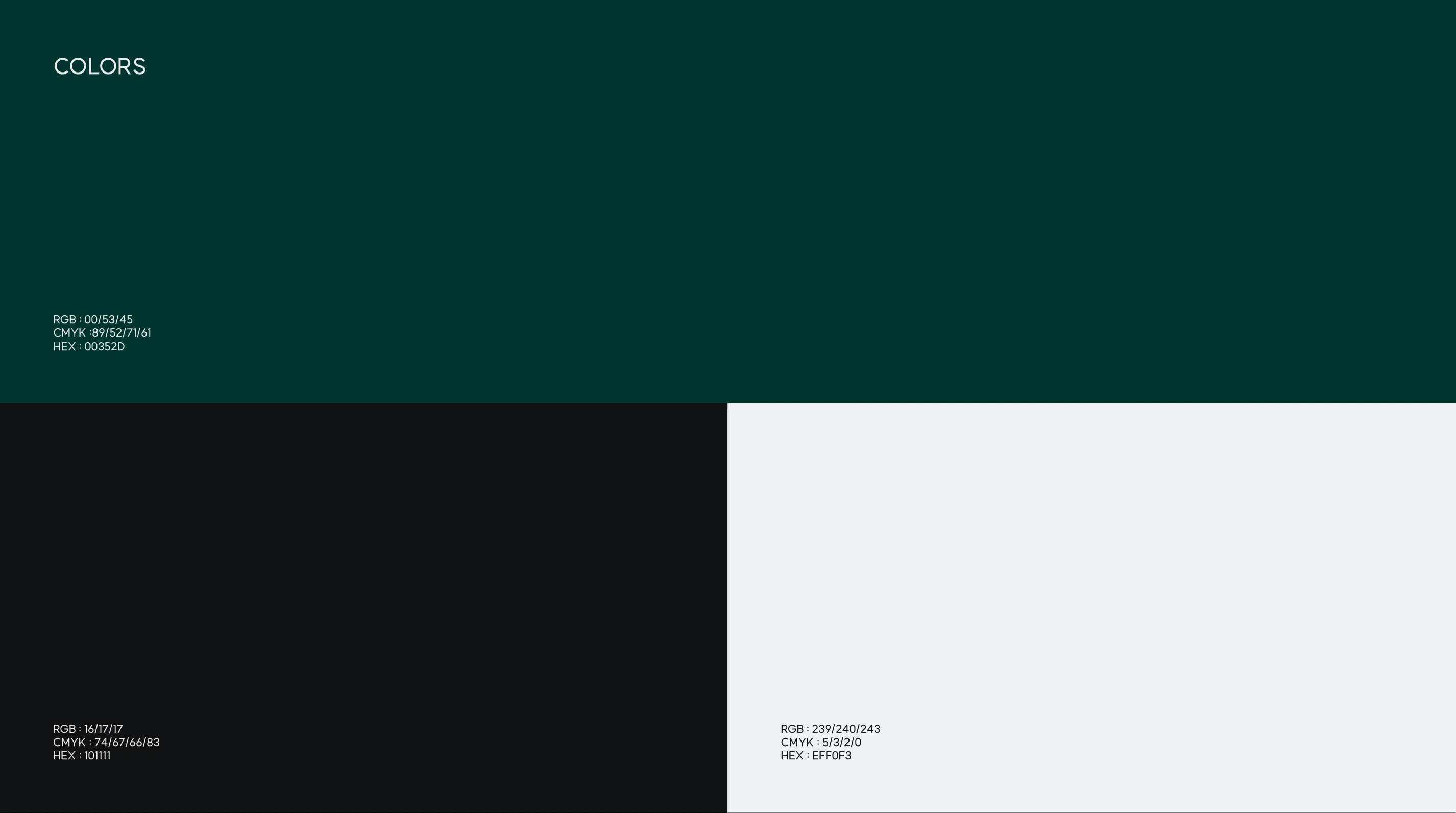
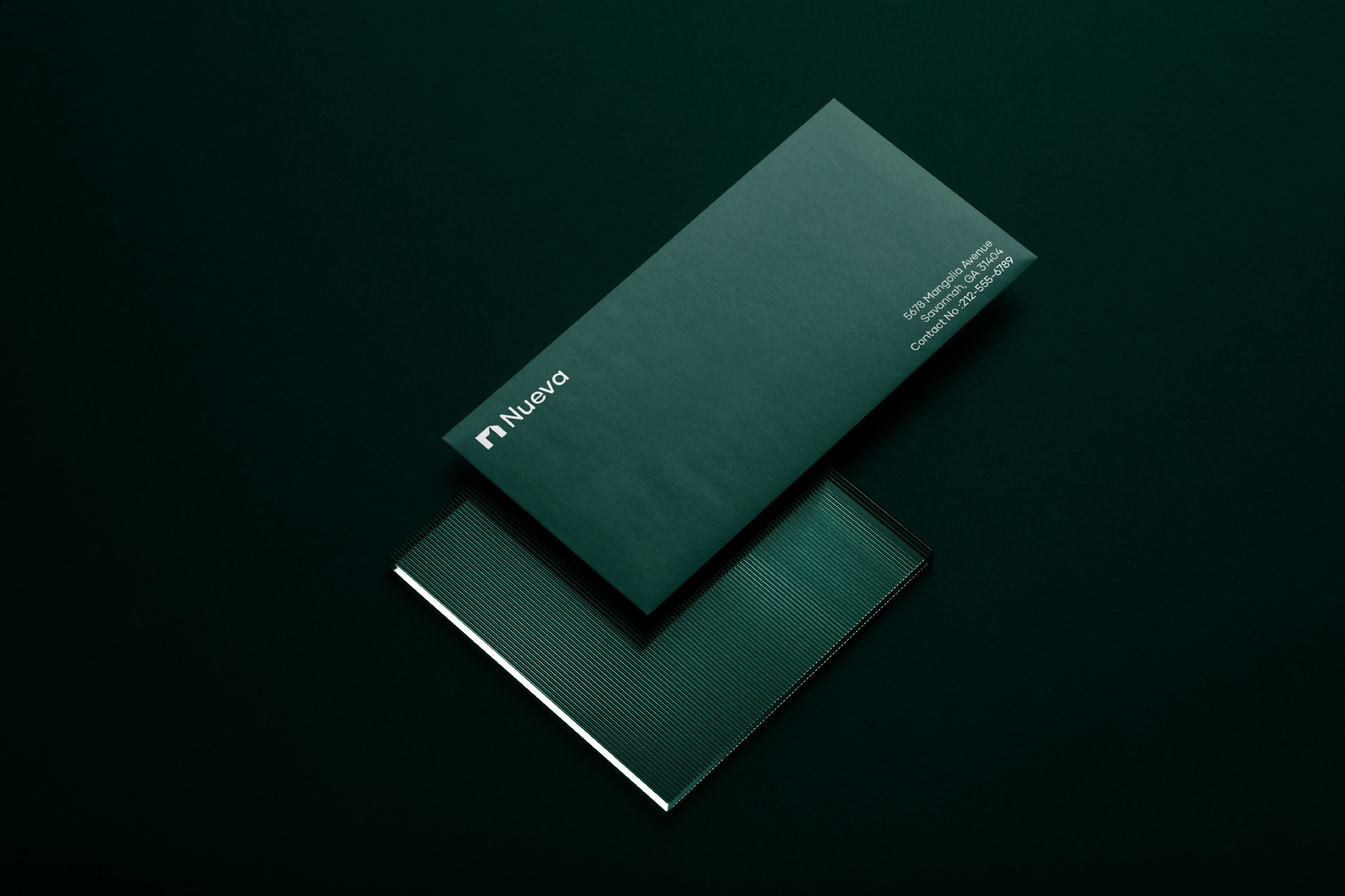
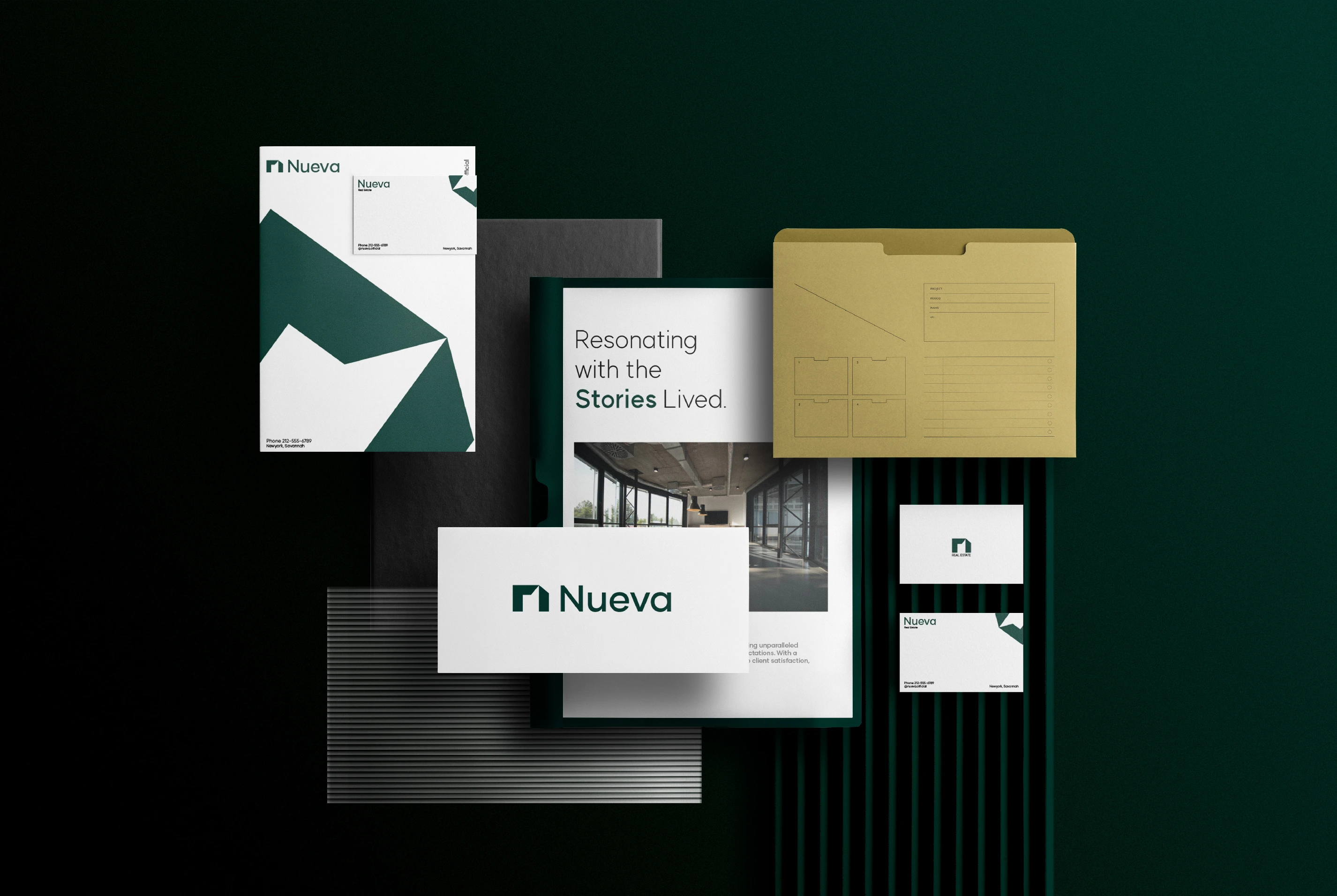
The visual language combines a deep green, charcoal, and soft neutral palette to create a grounded and sophisticated atmosphere.
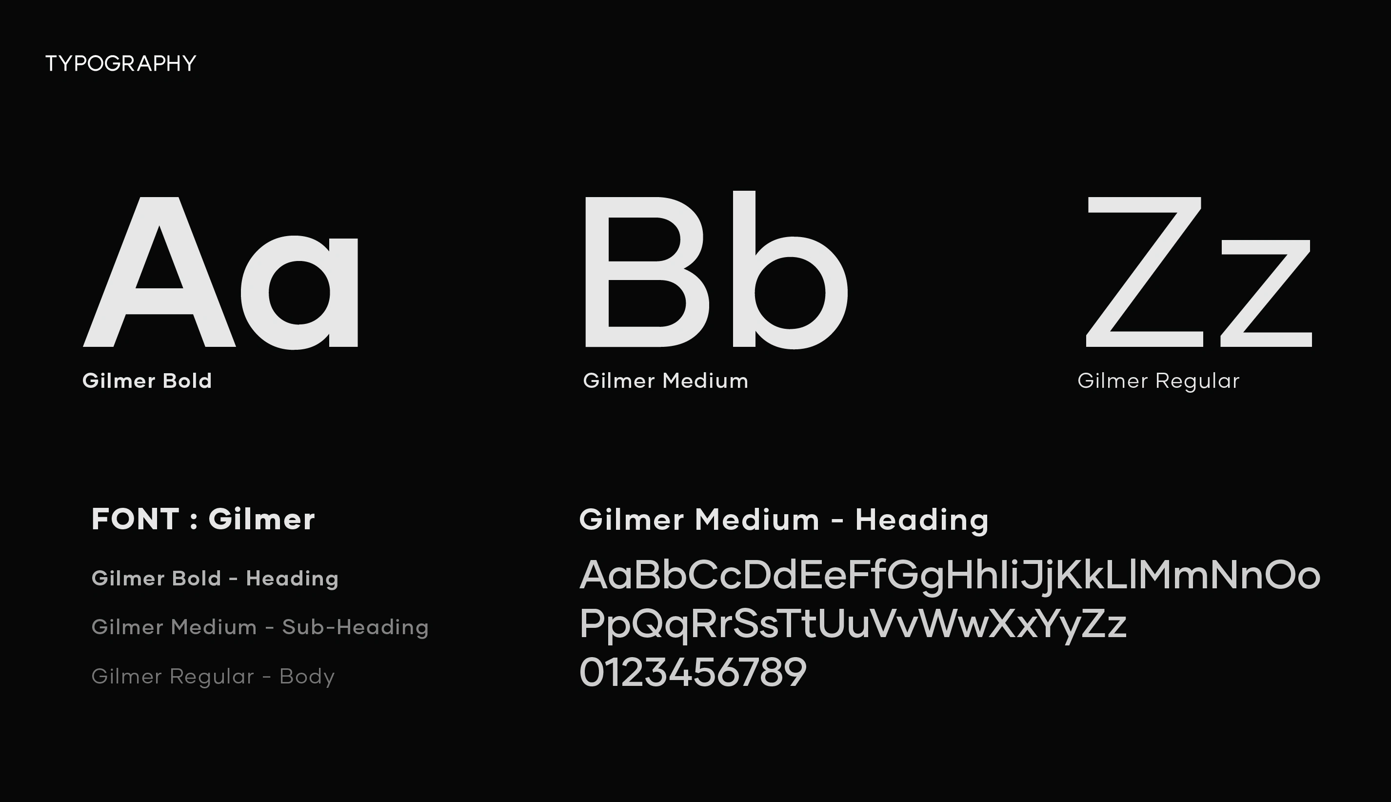
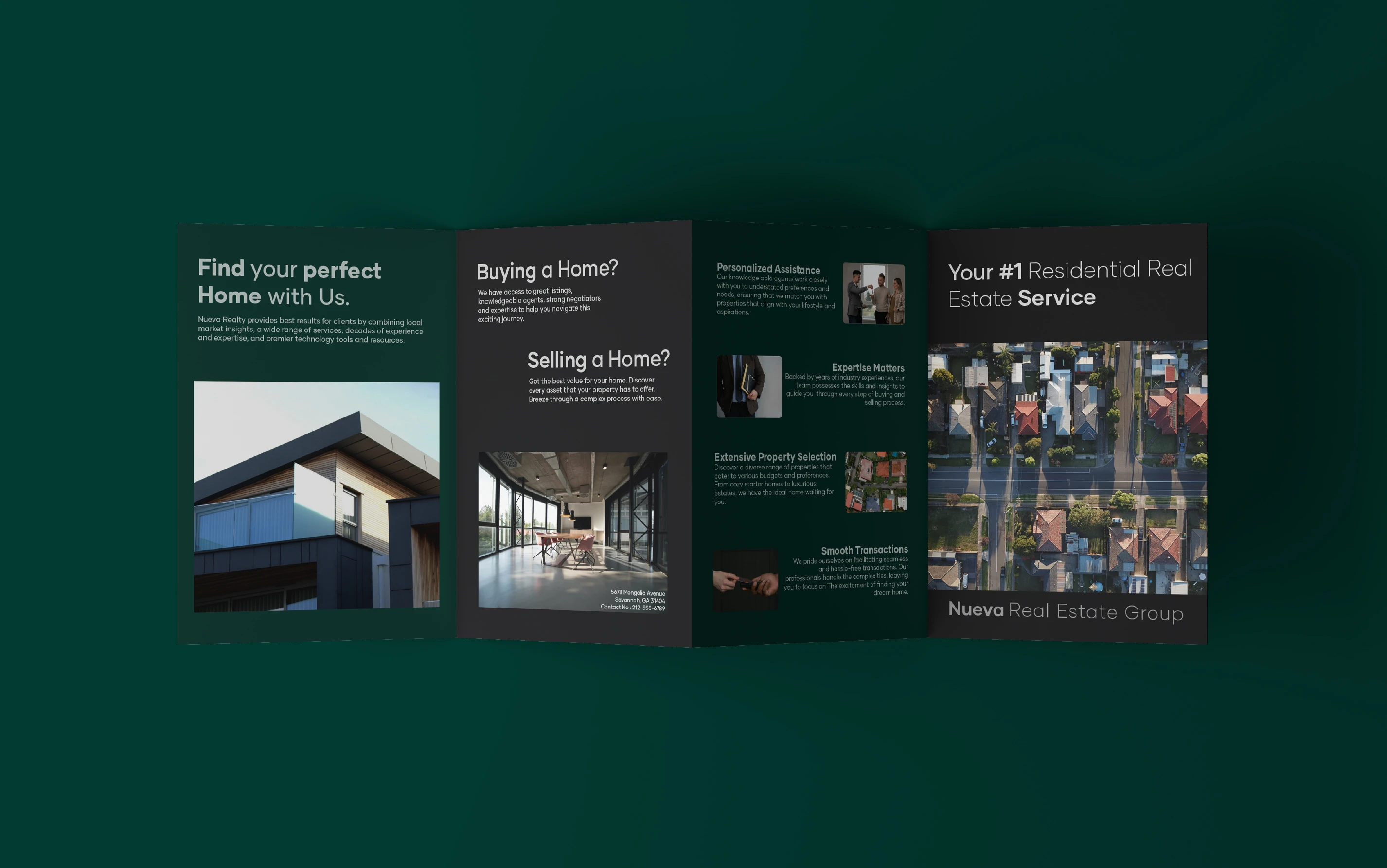
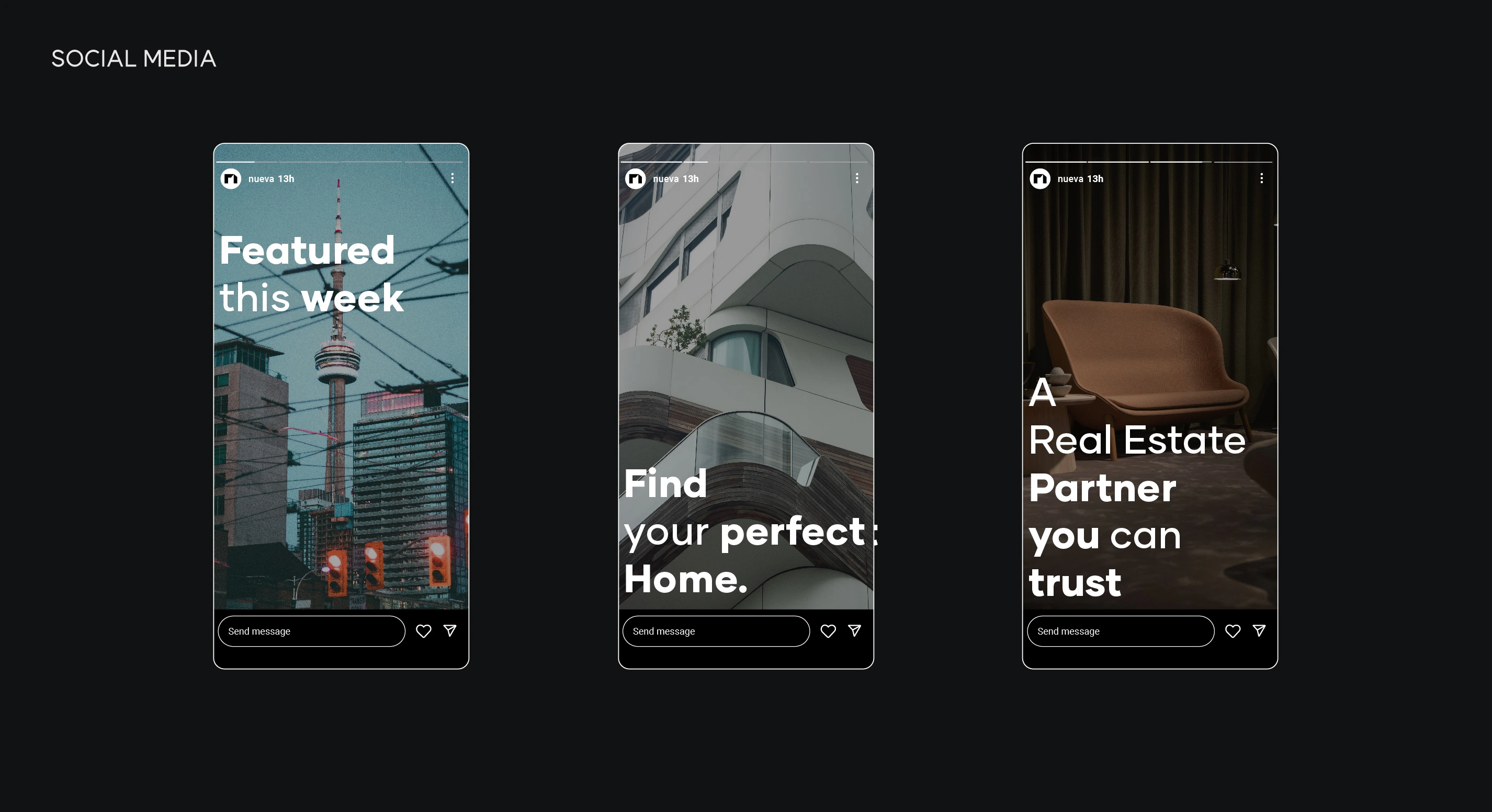
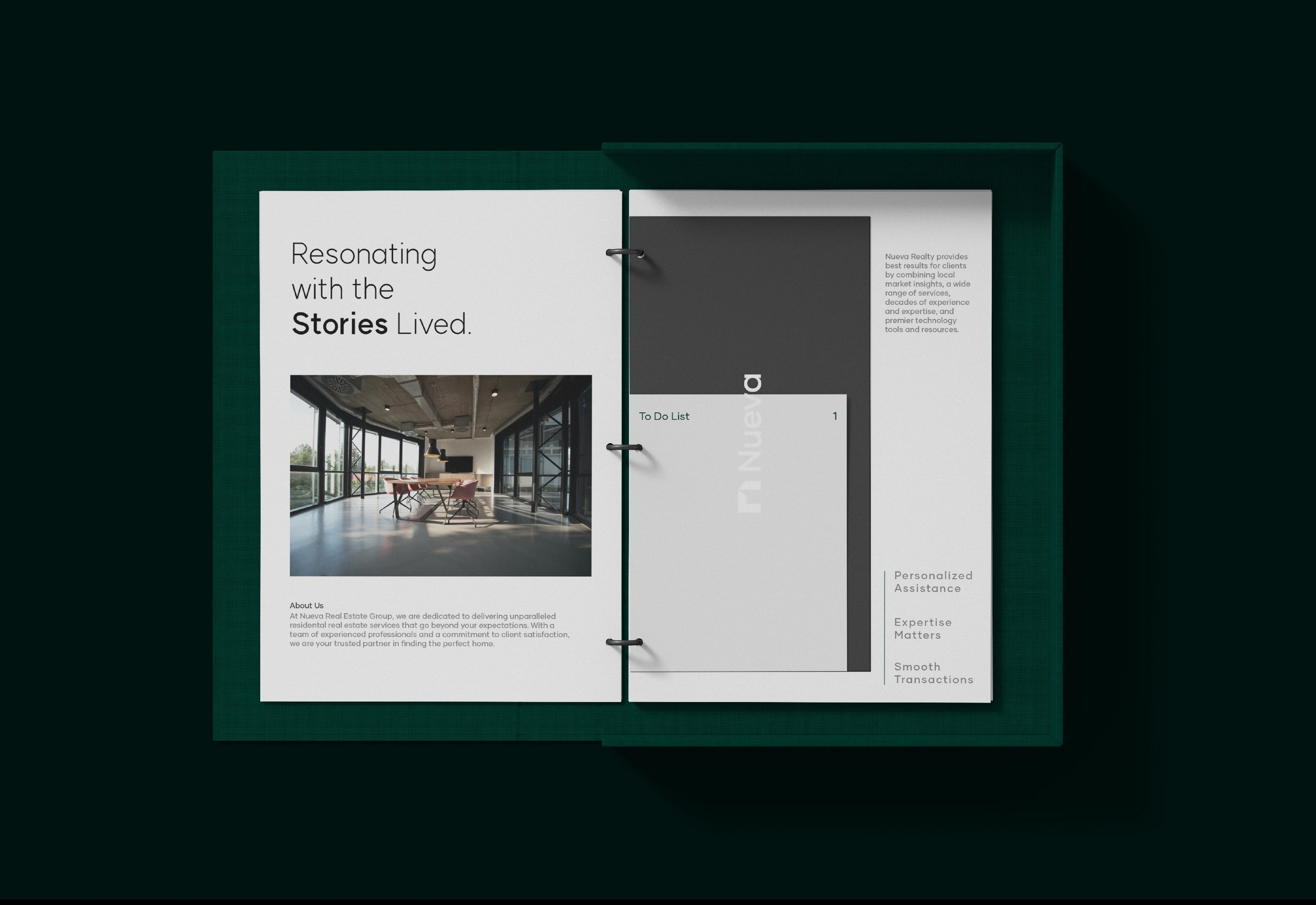
Typography provides a clean editorial structure, while variations in scale and weight help create hierarchy across communications. Architectural and residential photography brings the identity back to its central subject: the spaces people live in and the experiences they create within them.
The system intentionally moves between dark, immersive compositions and lighter editorial layouts, allowing the brand to communicate both confidence and warmth.
The Outcome
The resulting identity gives Nueva Real Estate a distinctive presence in a crowded market while staying true to the human experience behind real estate.
By combining an architectural logo concept, considered typography, a deep and grounded color palette, and editorial storytelling, Nueva moves away from conventional real estate branding and establishes a visual language with its own character.
The identity creates a foundation for Nueva to communicate with confidence across its customer journey from the first property search to the moment a new space becomes home.
Like this project
Posted Oct 6, 2026
Distinctive brand identity for Nueva Real Estate, built around architectural precision, human connection, and the stories behind every home.
Likes
0
Views
0
Timeline
Feb 8, 2024 - Mar 6, 2024