Oncare Healthcare & Wellness Logo & Brand Identity

Ram Cael


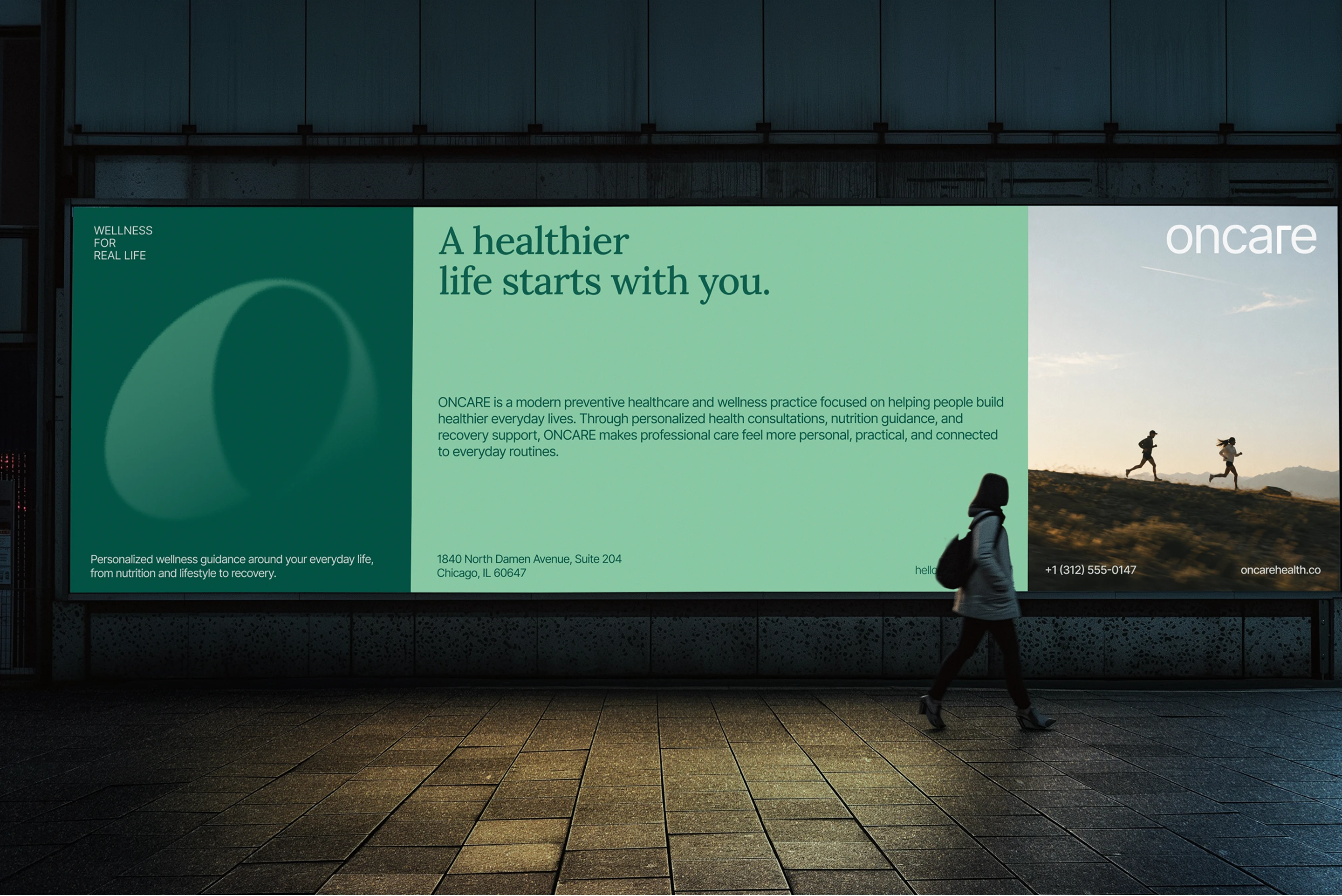
Oncare | Healthcare & Wellness Brand Identity
Oncare is a healthcare and wellness brand built around a simple idea: care should feel personal. The brand focuses on creating a more human experience around health, moving away from the cold and clinical feeling often associated with healthcare.
The goal was to create an identity that feels calm, trustworthy, and approachable while still looking professional enough to represent a healthcare brand.
The Challenge
The challenge was to create a healthcare identity that felt human and reassuring without looking overly clinical or generic. Instead of relying on familiar medical symbols, the identity needed a simple visual idea that could communicate the feeling of care and protection while remaining distinctive and easy to recognize.
The Logo
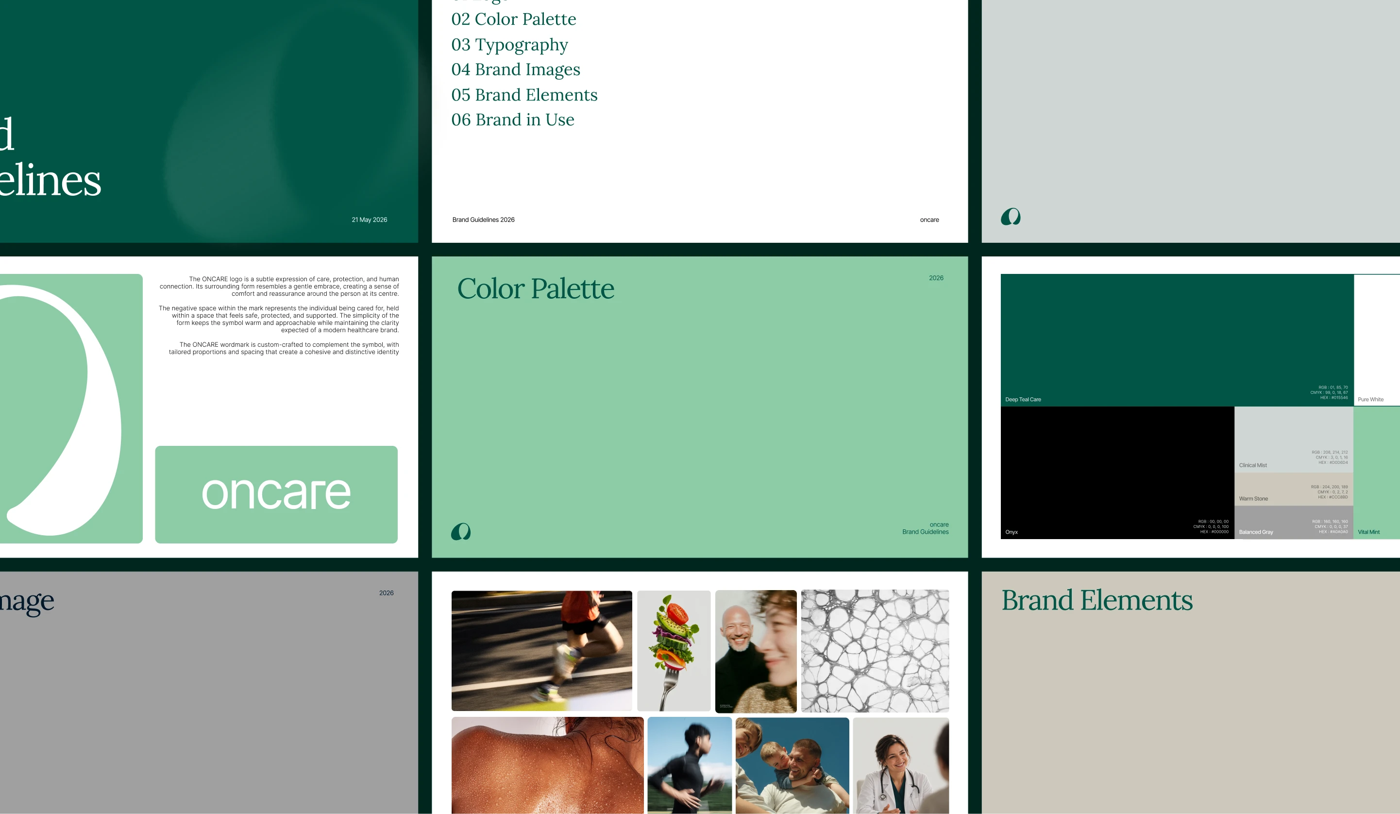
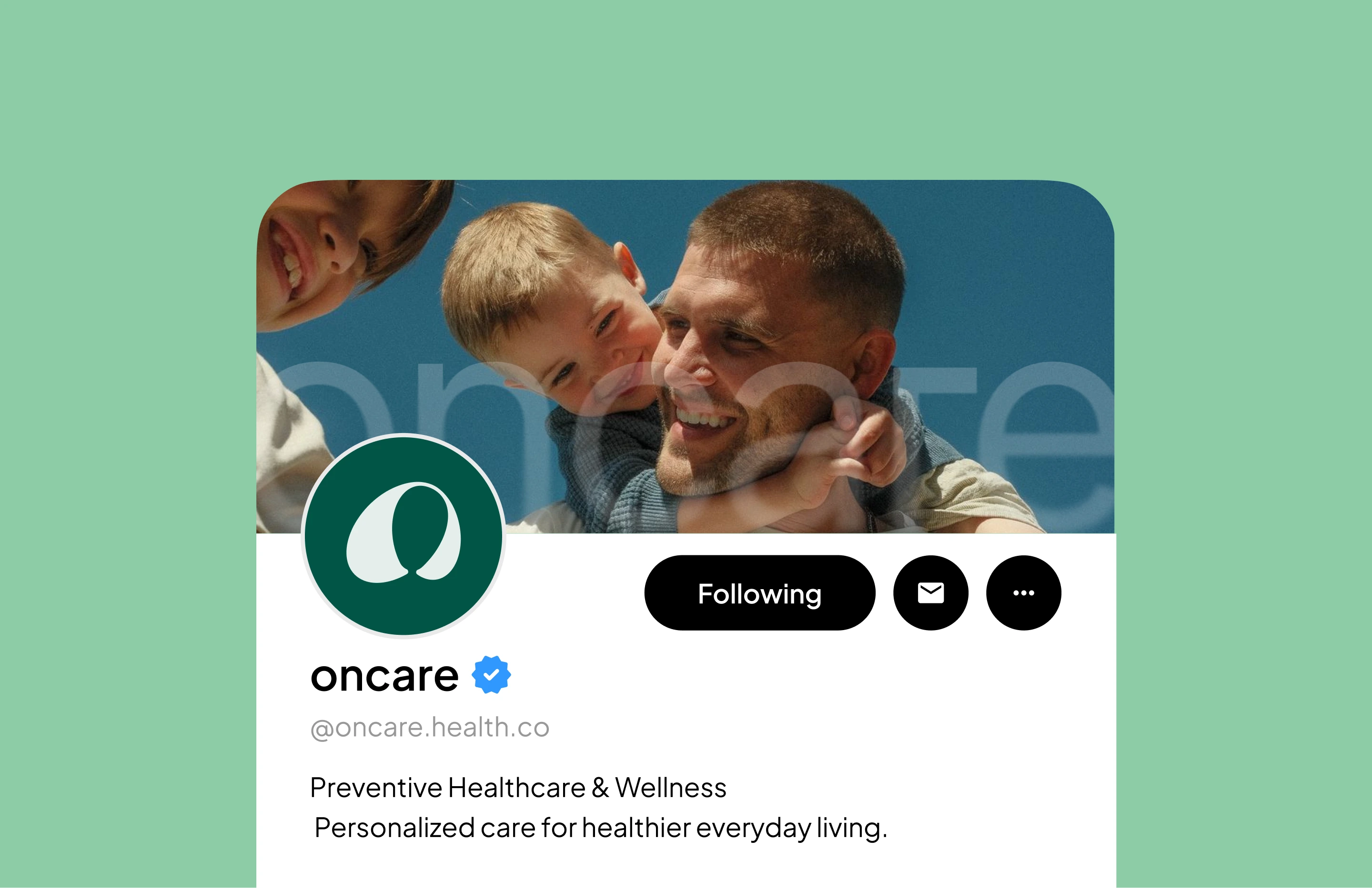
The Oncare logo is built around the idea of being cared for. Two soft, curved shapes form the impression of arms, while the negative space in the middle represents a person being held between them. Together, the symbol creates a subtle reference to a hug, expressing care, protection, comfort, and human connection.
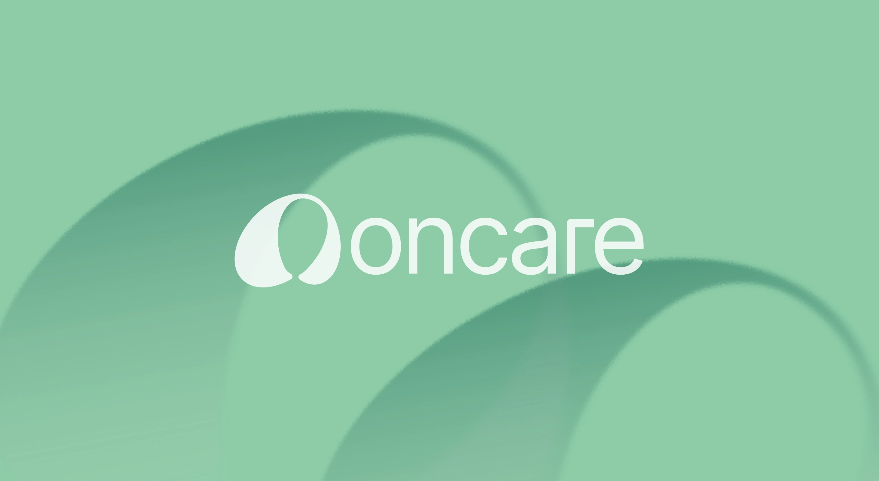
The concept stays intentionally simple. Instead of using familiar medical symbols, the mark communicates what healthcare should feel like through a more human gesture

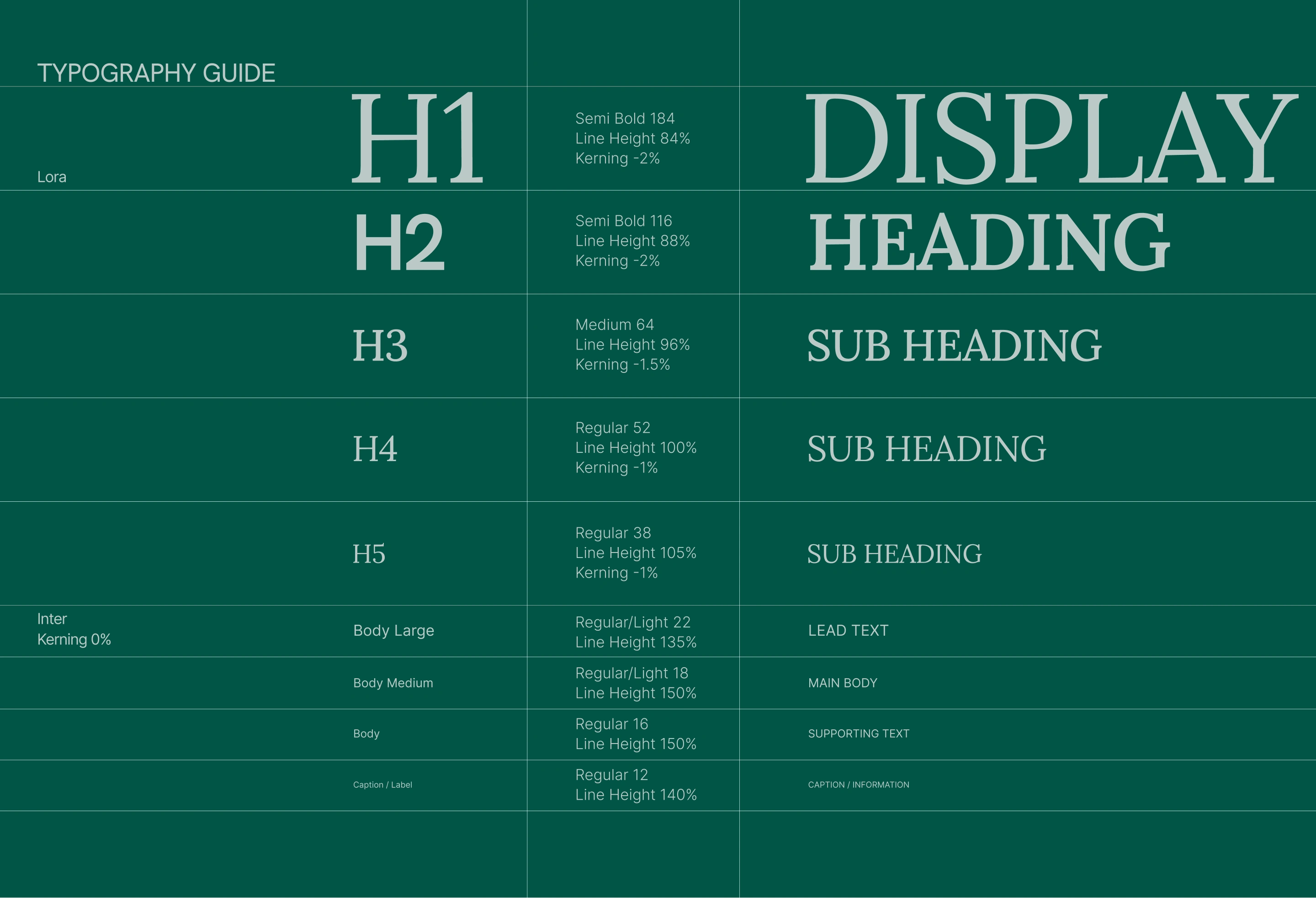
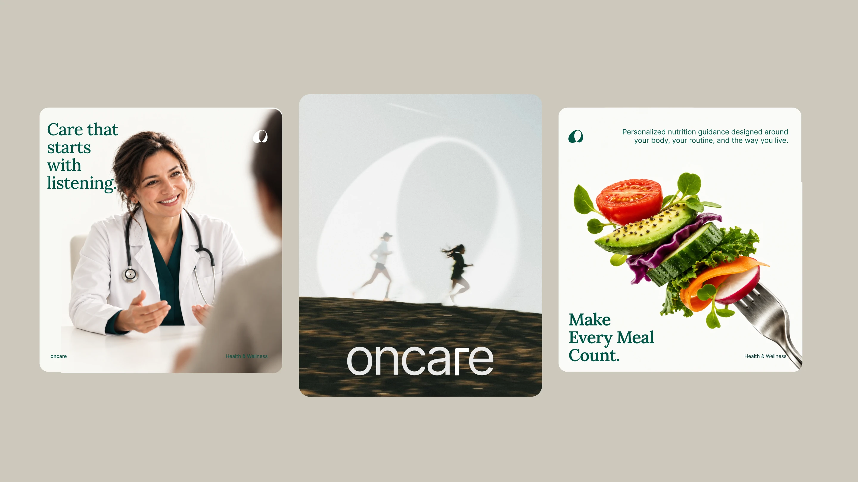
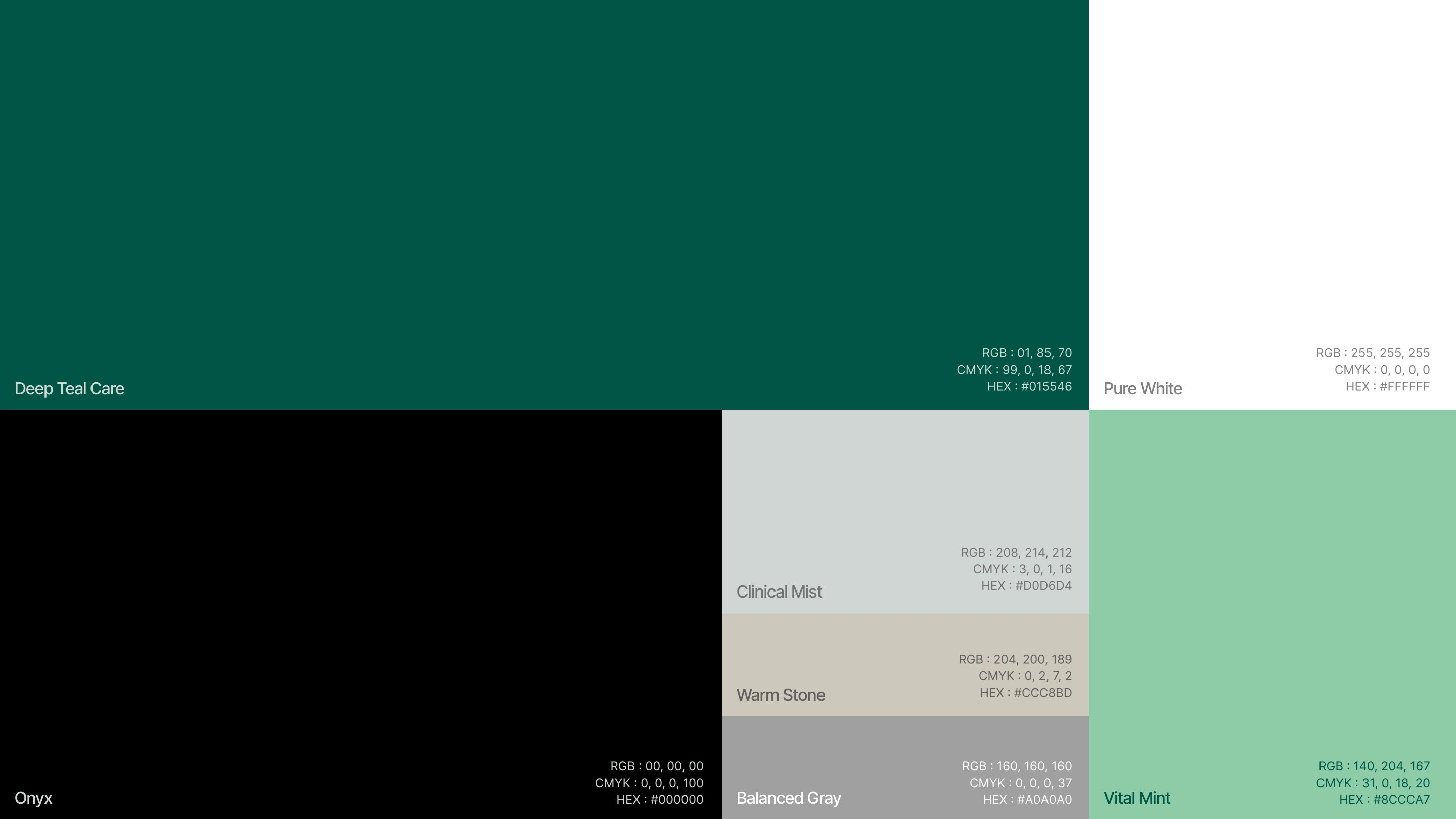
Soft green tones form the main color palette, giving the brand a natural and reassuring character. The lighter tones keep the identity open and approachable, while deeper shades provide enough contrast for communication and applications.
The Result
The final identity gives Oncare a warm, approachable, and recognizable presence within the healthcare space. The two-arm symbol creates an immediate emotional connection with the idea of care, while the soft palette and clean typography support the same feeling throughout the identity.
Rather than looking like another conventional healthcare brand, Oncare has a visual language built around support, protection, and human connection.
Like this project
Posted Oct 6, 2026
A warm, human-centered identity for Oncare, built around care, protection, and the feeling of being supported.