The Creative Marketer - Landing Page Redesign
Breeje Anadkat
Verified
I know people don’t like to read long case studies, so I’m adding my work first below. But if you’d still like to read the full case study, you’ll find it after the project images.

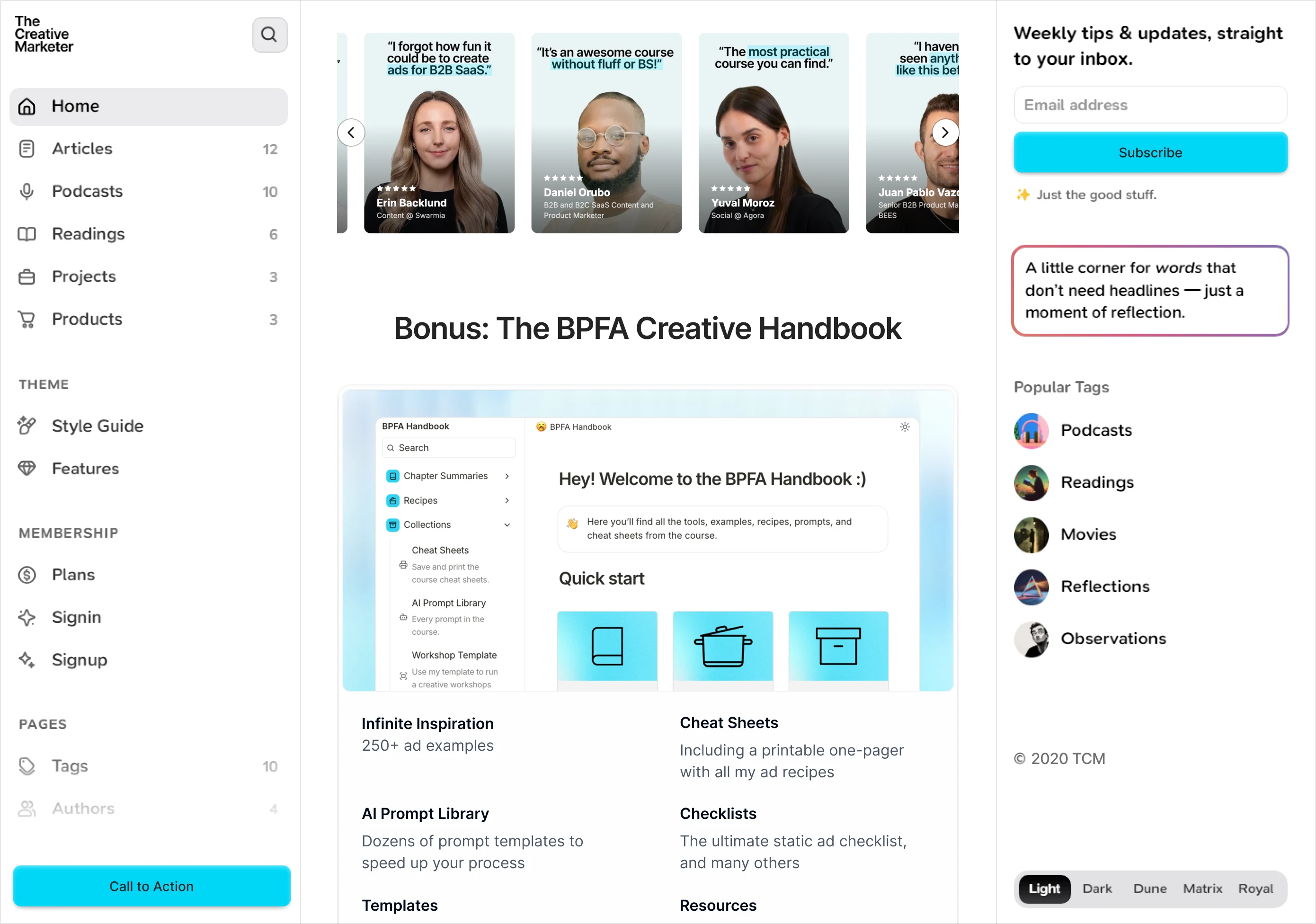
Project Overview 🌐
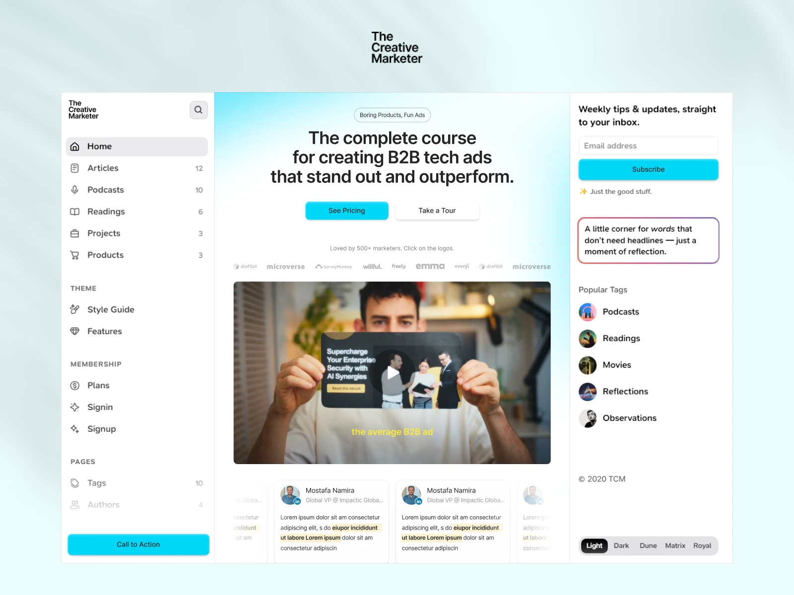
The Creative Marketer is a marketing education platform focused on helping B2B professionals create high-performing tech ads and campaigns.
The founder had recently purchased a new sidebar-based template for the website and needed the course page redesigned to fit this new structure. Our goal was to modernize the main content area while preserving the template’s side navigation — ensuring the page felt premium, clear, and conversion-focused.
Deliverables: Landing Page redesign (main content only)
Platform: Figma
Timeline: 1 Week
The Challenge
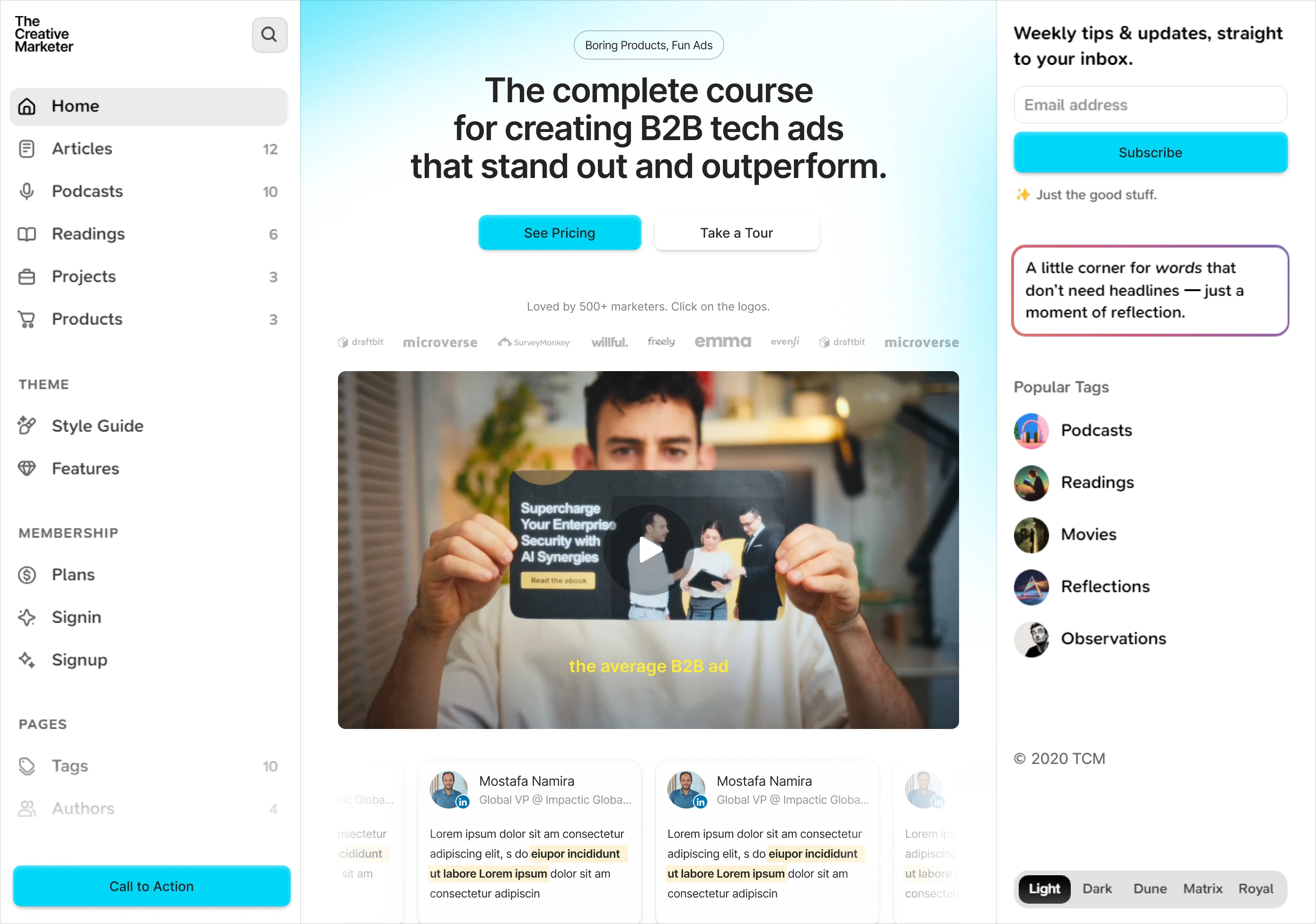
The original website used a full-width layout without sidebars. The new template introduced fixed left and right sidebars, significantly reducing the width of the central content area.
We set out to:
Adapt the course page into a narrower content frame without losing clarity
Strengthen headline hierarchy and course positioning
Improve scannability and reduce content density
Ensure the central content felt intentional — not constrained by the template
Deliver a modern, polished redesign within a one-week timeline
My Role
I led the UI redesign in Figma, covering:
Review of the existing course page and new template structure
Interpreting the provided low-fidelity wireframe
Refining layout rhythm and spacing systems
Creating a modernized typographic hierarchy
Redesigning CTAs and content blocks for better conversion flow
Preparing a clean, developer-ready Figma file
Process
1. Template Constraint Analysis
Since the sidebar structure was fixed, the first step was analyzing how the reduced central width would impact readability and hierarchy. This helped define spacing rules and content grouping.
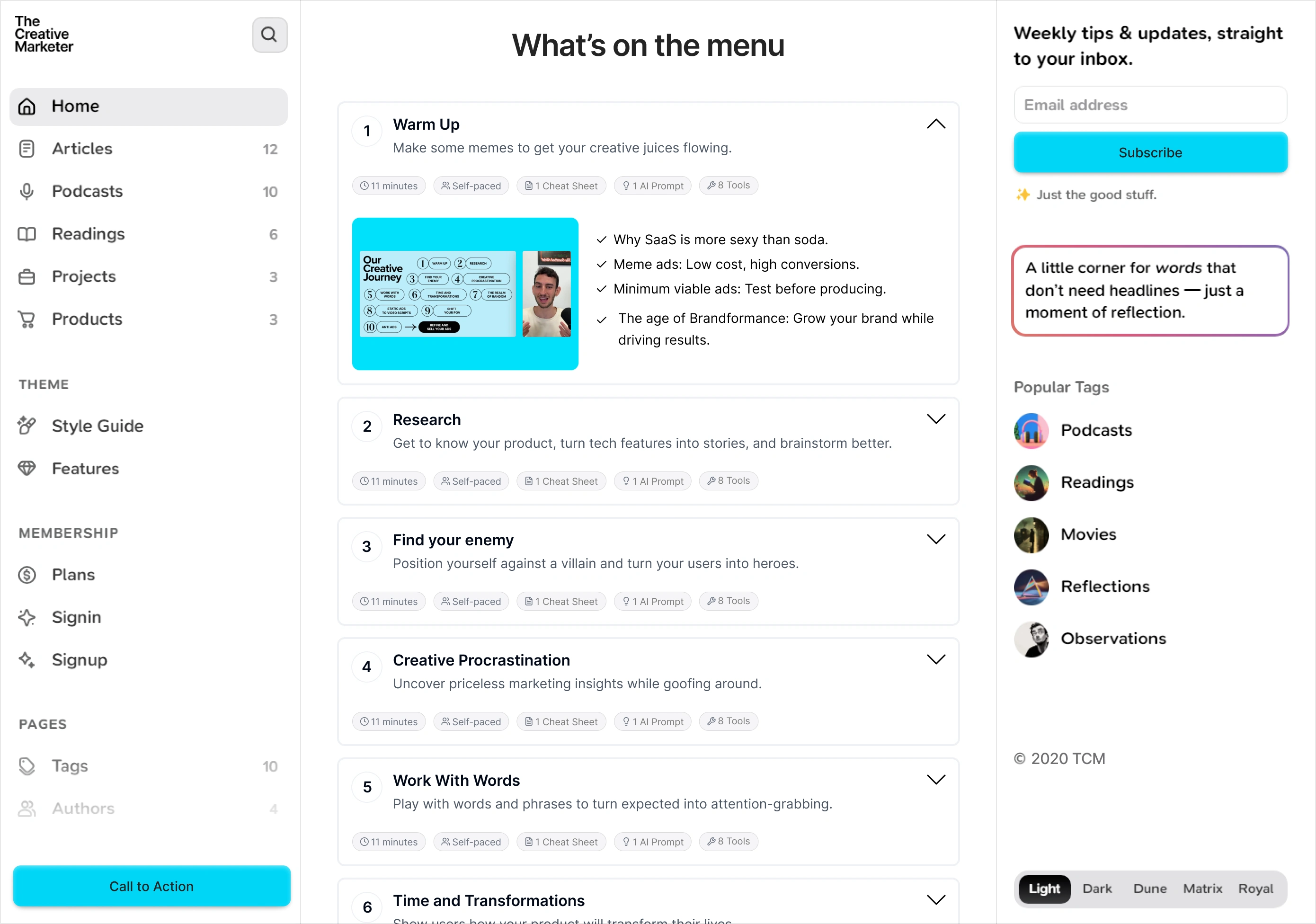
2. Low-Fidelity to Structured Layout
Using the provided lo-fi wireframe as a guide, I rebuilt the structure with:
Clear modular sections
Stronger visual breaks between content blocks
Balanced negative space to avoid visual compression
3. Visual System Refinement
The design focused on clarity and marketing credibility:
Improved typography scale and contrast
More breathing room between sections
Stronger CTA styling and positioning
Cleaner card layouts for testimonials and content previews
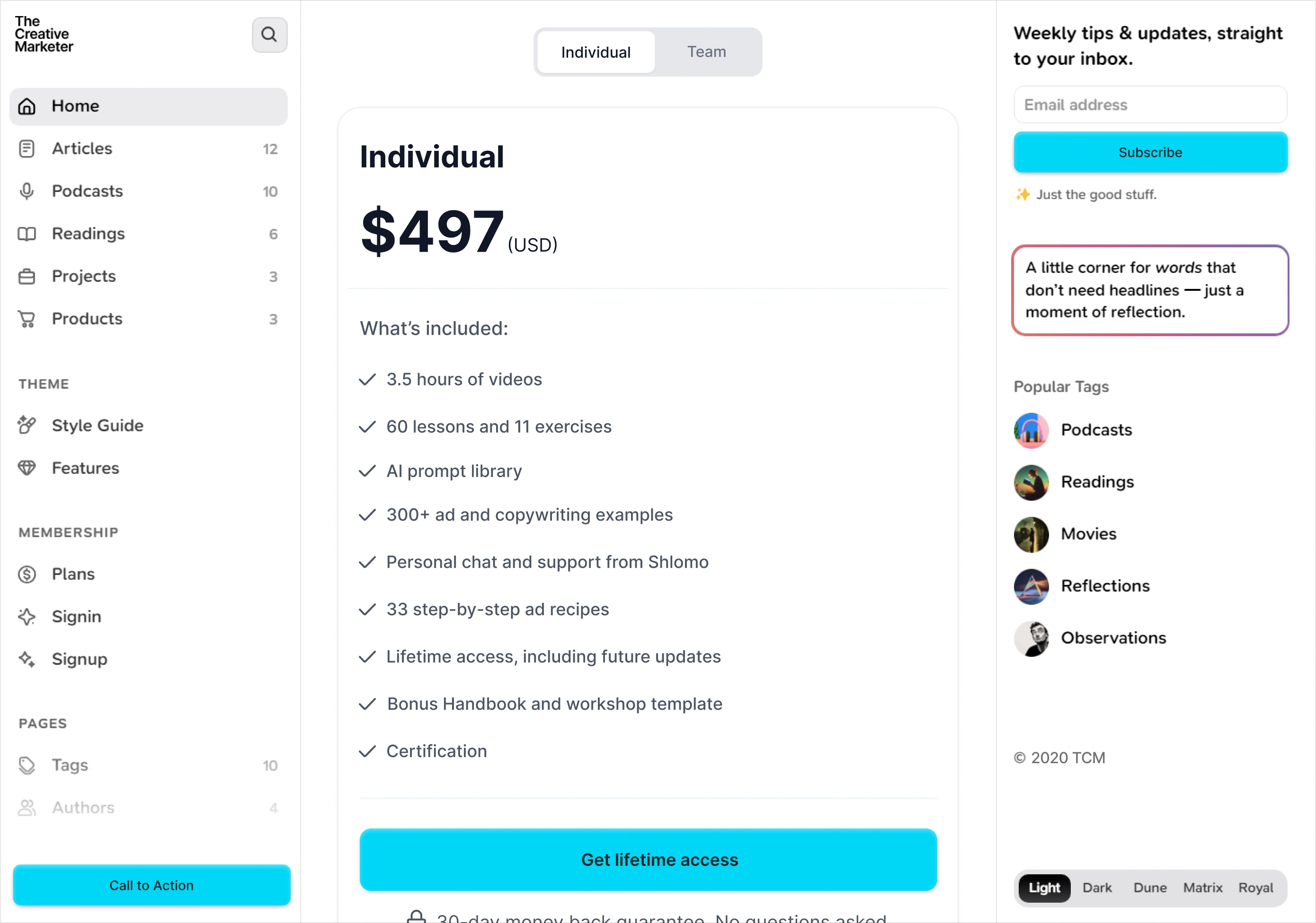
4. Conversion Flow Optimization
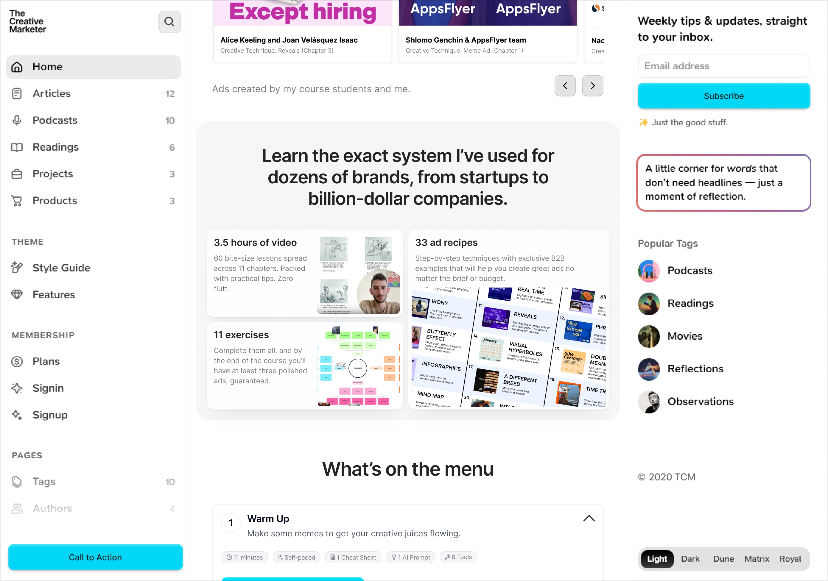
The page flow was reorganized to guide users naturally:
Clear course promise at the top
Outcome-driven content mid-page
Proof and supporting content strategically placed
Primary CTAs spaced intentionally for rhythm
Results
A modernized course page that fits seamlessly within the new sidebar template
Improved content clarity and hierarchy
Stronger visual rhythm within a constrained layout
Cleaner, more premium UI aligned with a marketing audience
A fully structured Figma file ready for development
Like this project
What the client had to say
Breeje is a fantastic designer and Framer expert. He's quick, professional, and helpful. I highly recommend working with him!
Shlomo Genchin, Unbore
Feb 9, 2026, Client
Posted Feb 18, 2026
Redesigned the central content of The Creative Marketer’s course page to fit a new sidebar-based template.
Likes
2
Views
15
Timeline
Jan 29, 2026 - Feb 9, 2026
Clients
Unbore