Studio Mila | Rebranding
Anna Grzybowska
About the Brand
Studio Mila, founded by Natalia Mila, is one of Poland’s leading specialists in dip powder manicure and pedicure. Beyond salon services, she is widely recognized for offering professional training where students can earn certificates, establishing her as a respected figure in the nail industry.
Challenge
With a move to a new location, the brand required a visual refresh that felt timeless, sharp, and minimal, yet still inviting. The existing logo “Natalia Mila manicure tytanowy” was text-heavy, limiting its use across applications and making it difficult to scale. The goal was to simplify the name, introduce an English descriptor for broader recognition, and build a flexible identity system adaptable to signage, social media, and print.
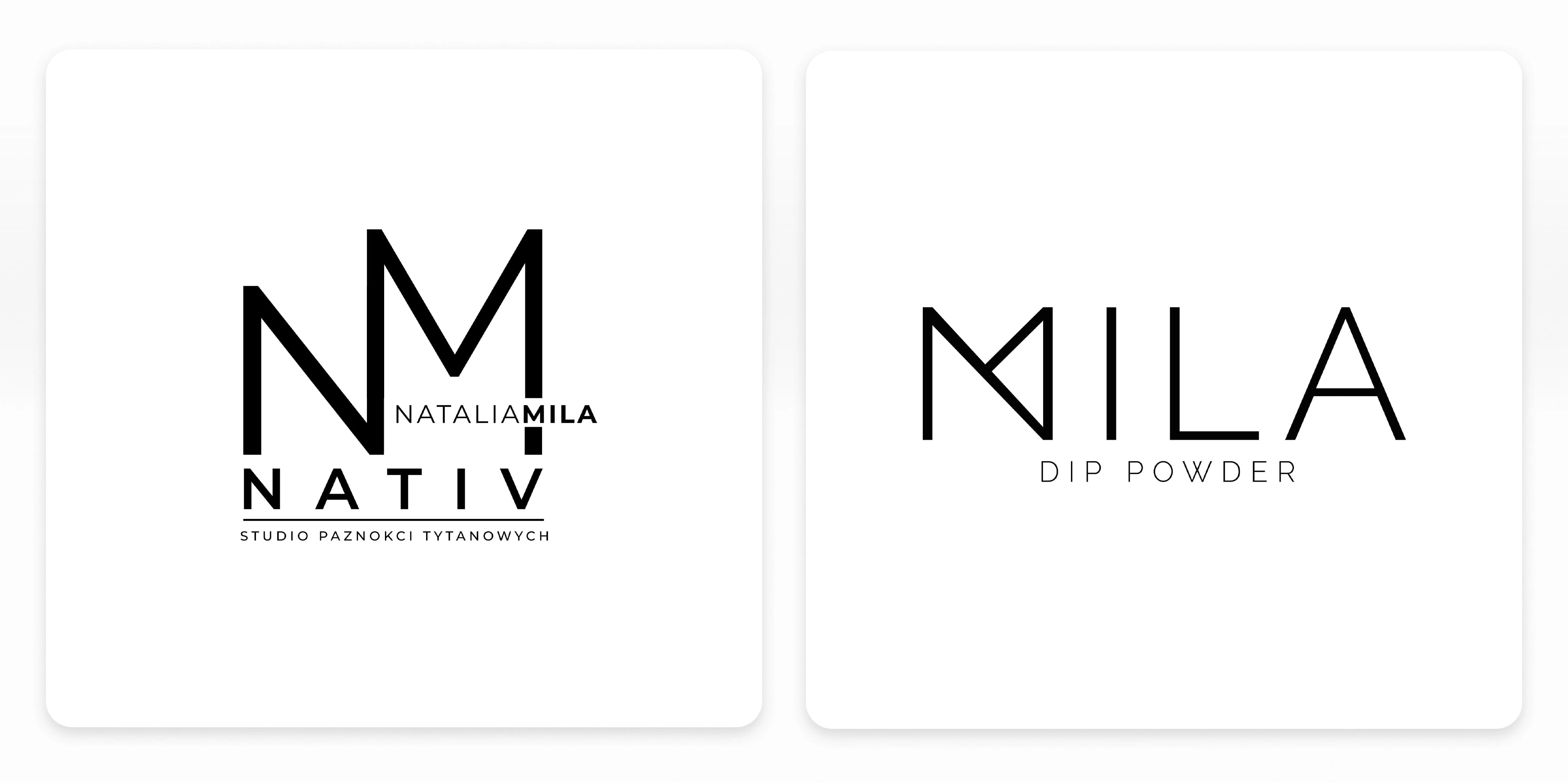
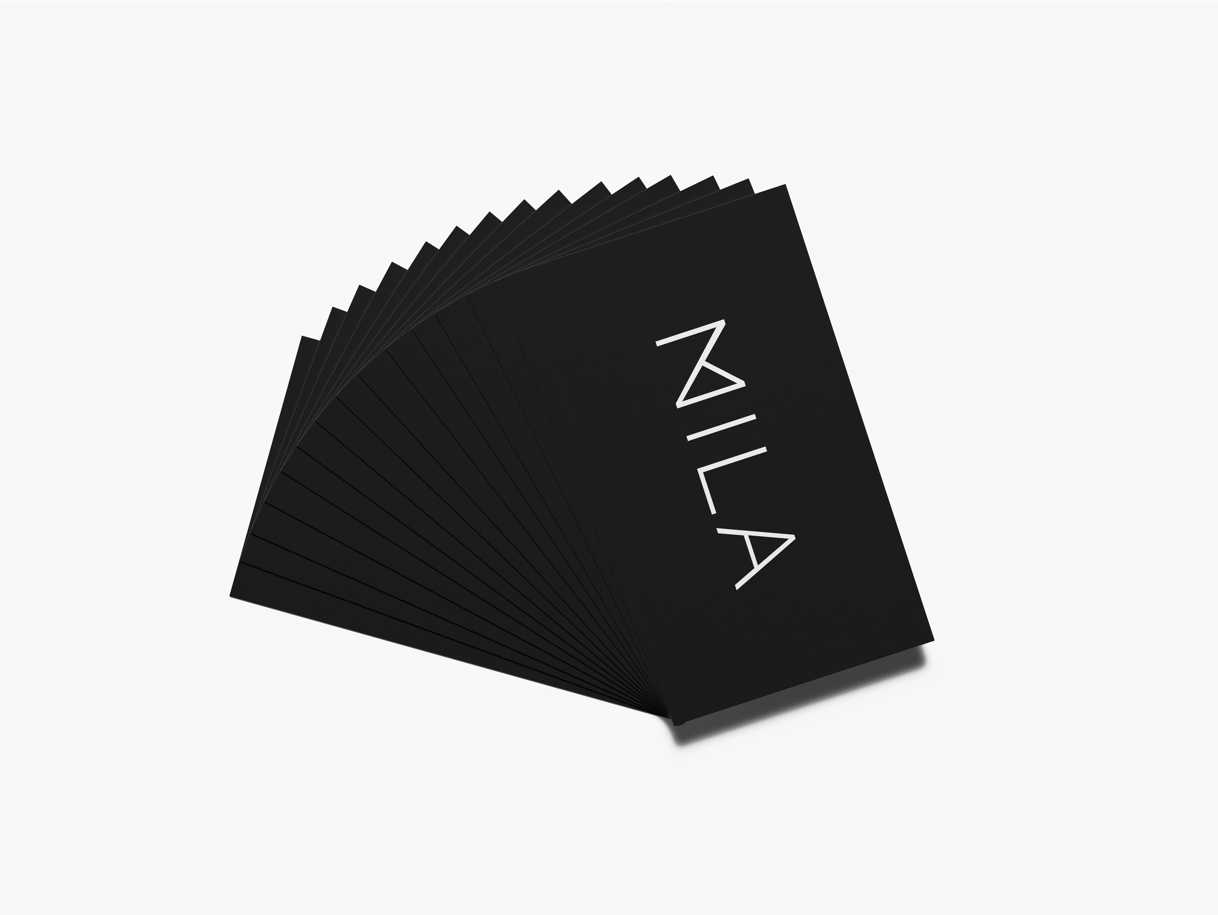
Logo before and after rebranding.
Design Solution
The work included redesigning the logo, creating supporting brand materials, and preparing graphics to support the opening of new salon locations. Since the client wished to keep the existing colour palette, the focus was placed on modernizing the identity through form and application rather than colour.
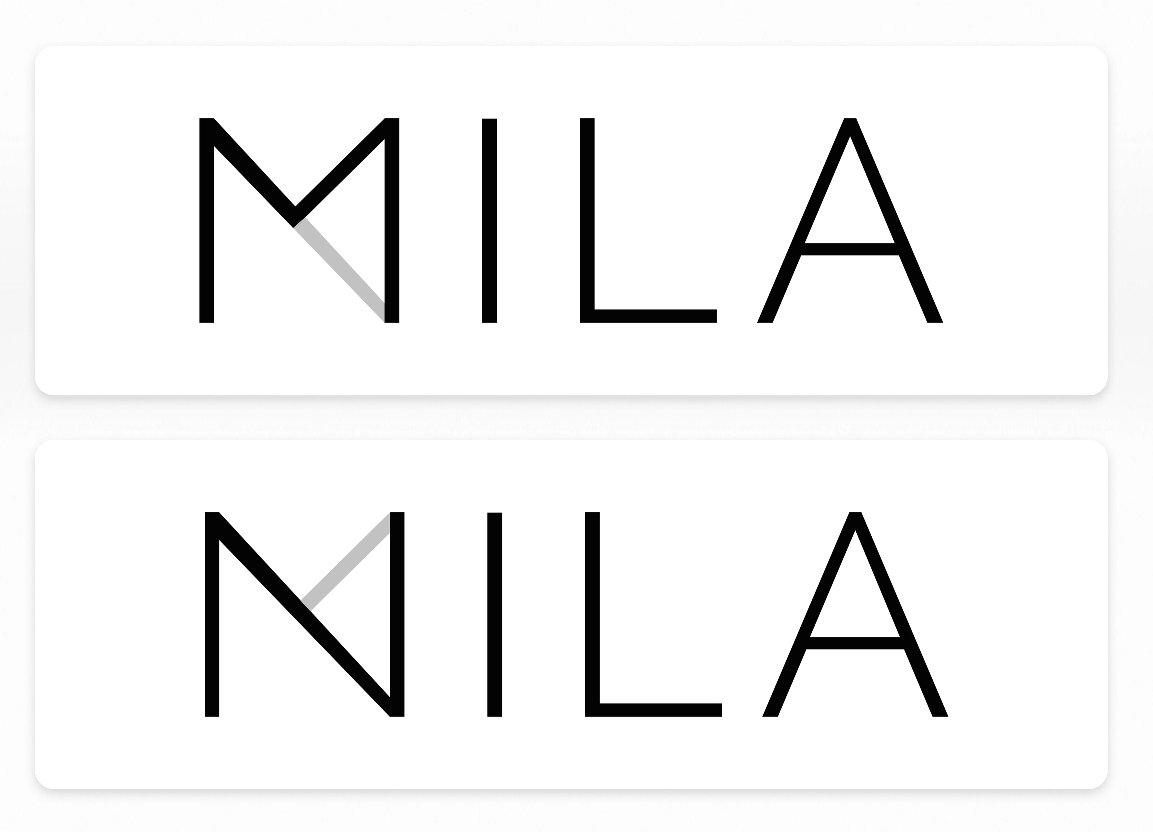
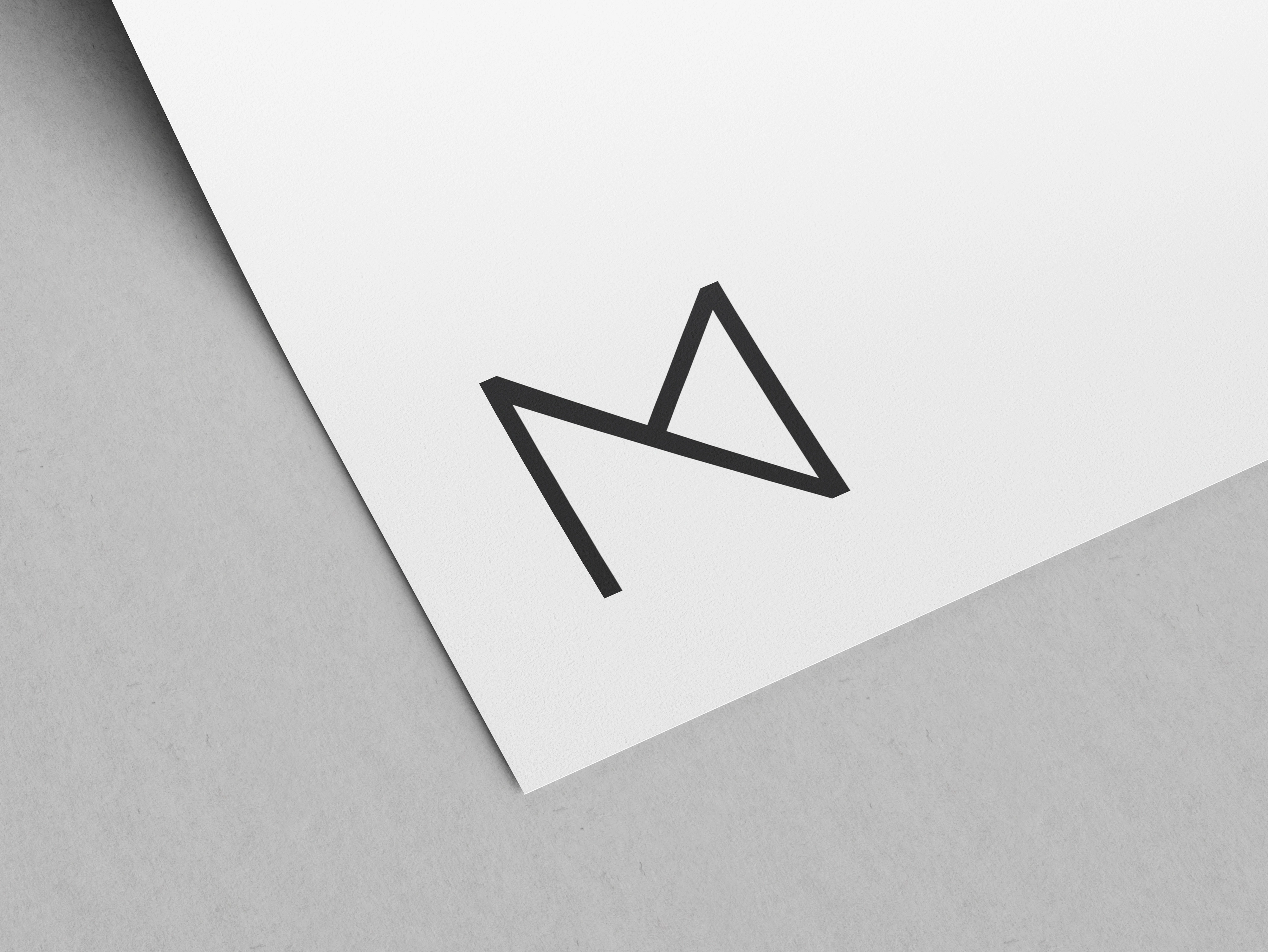
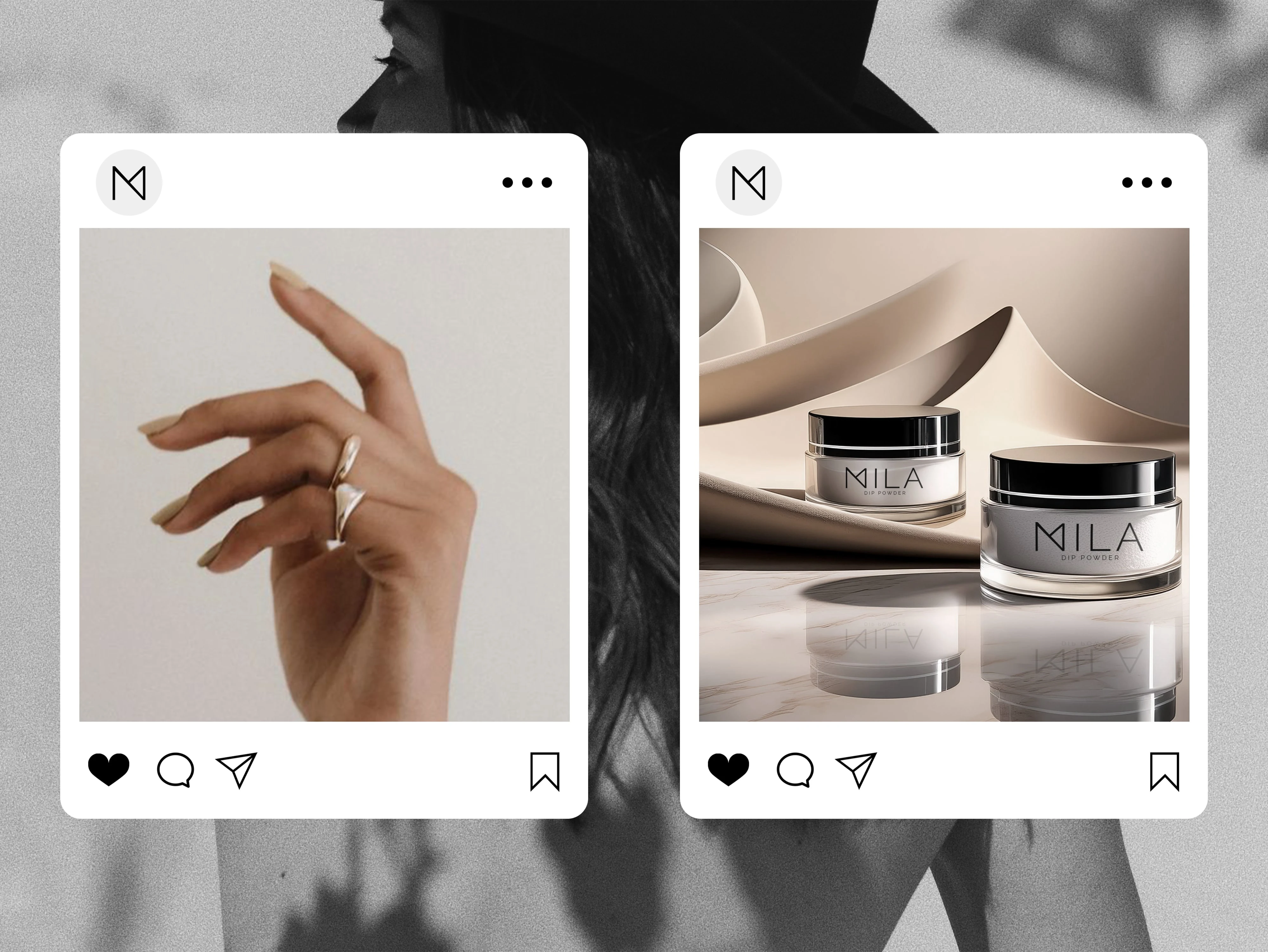
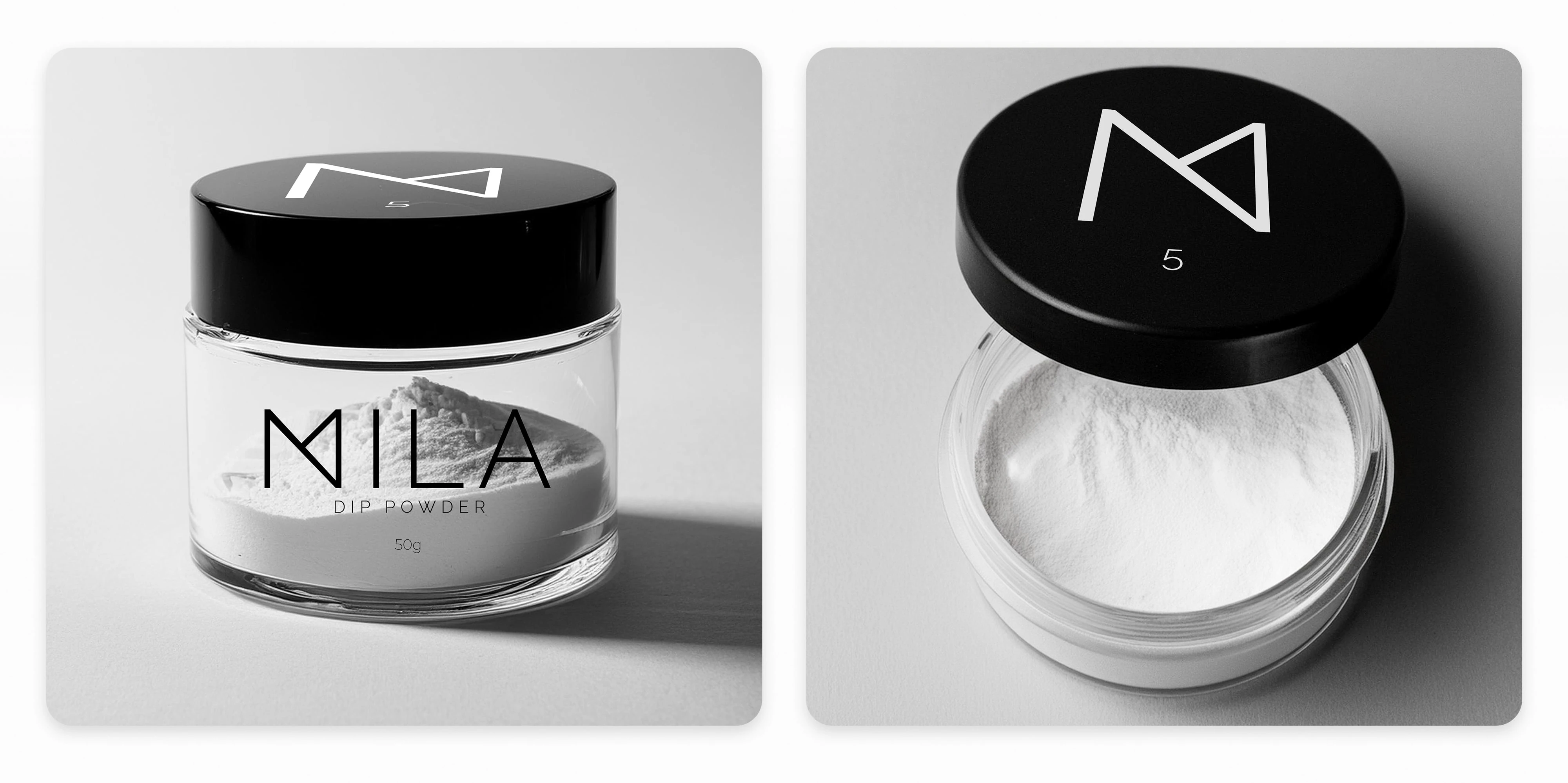
The centrepiece of the new identity is a custom “M” monogram that subtly integrates the “N” from Natalia through negative space, creating a distinctive mark that works well across different contexts while keeping the brand elegant and approachable.

Results
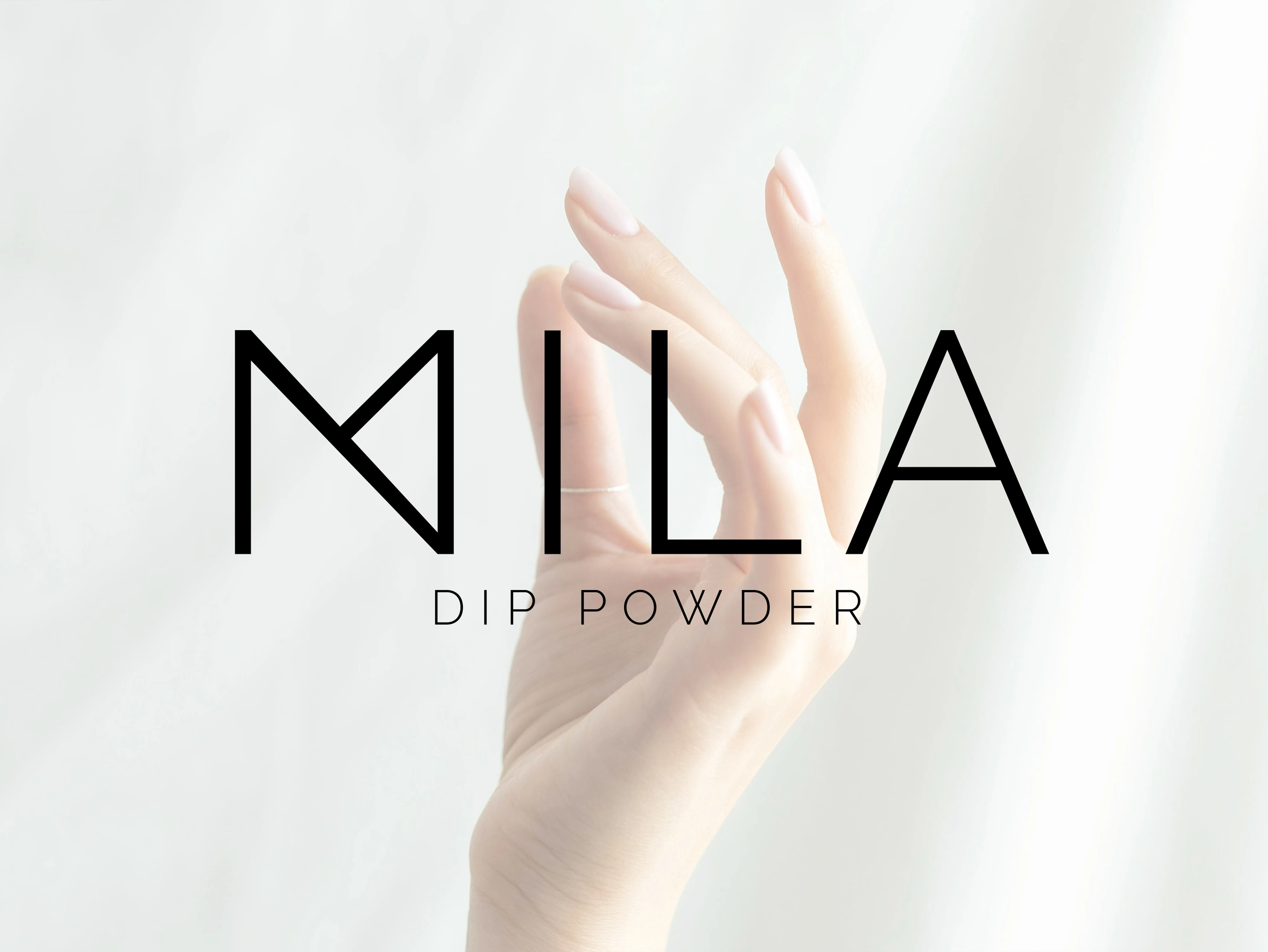
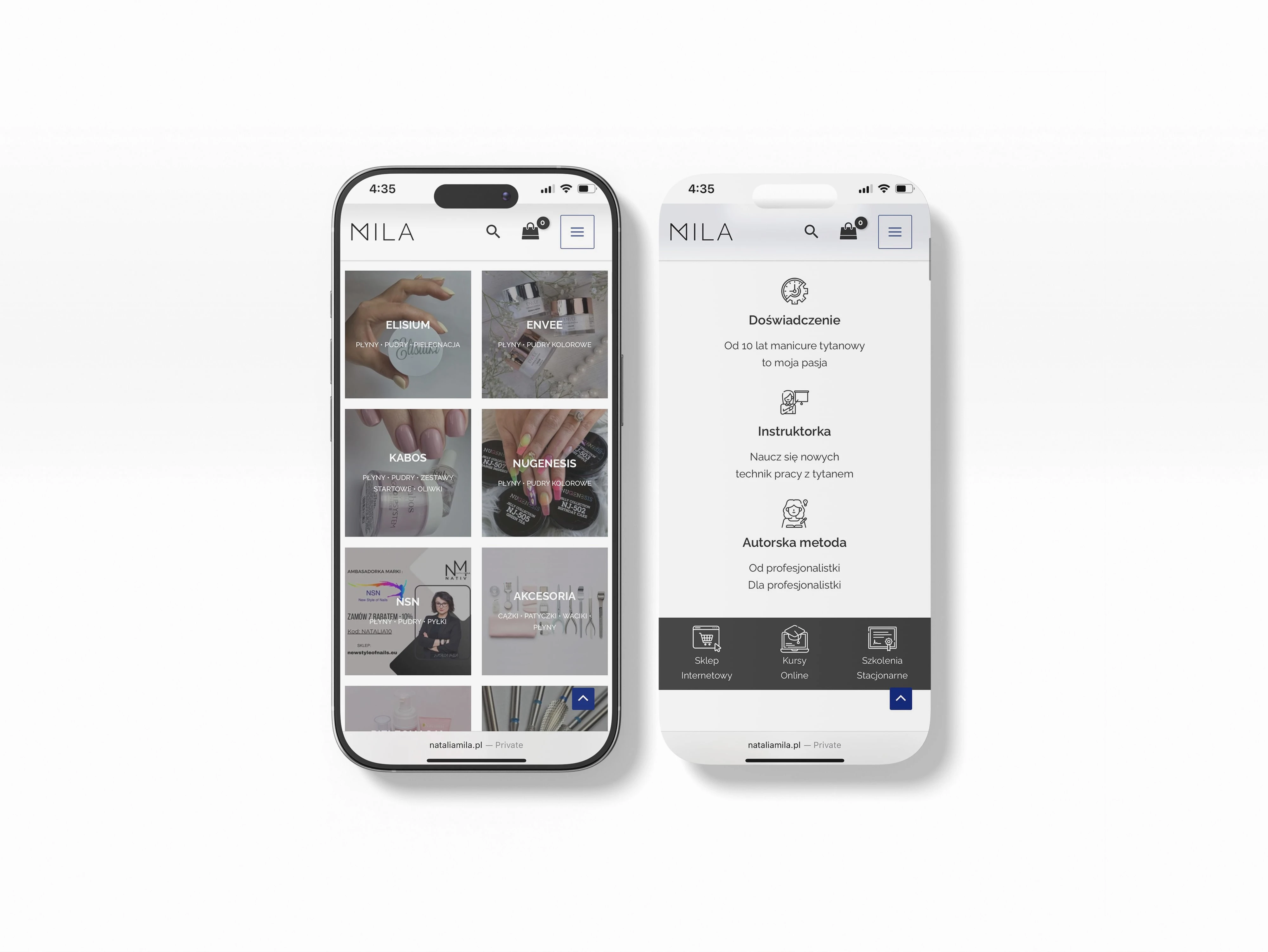
The refreshed identity was applied across salon signage, business cards, appointment cards, social media, and digital marketing materials, ensuring a consistent and flexible brand presence. The custom monogram works at any scale, supporting both client-facing and training materials while keeping the brand elegant and approachable. This refreshed system balances elegance and approachability, giving Studio Mila a cohesive and memorable visual presence.
Like this project
Posted Aug 18, 2025
Redesigned Studio Mila's brand identity with a custom monogram and supporting materials.