A single pixel can cost you thousands in revenue. It's about...
Banjoko Timothy
A single pixel can cost you thousands in revenue.
It's about the subtle friction hiding in plain sight.
The navigation that makes users think twice, the button that doesn't feel clickable, the form that overwhelms before they even start.
I've seen startups lose 40% of their conversions because their primary CTA blended into the background.
Others hemorrhage users at checkout because the path felt uncertain.
The brain processes visual information in milliseconds.
If users have to decode your interface, they're already gone.
Every extra click is a chance to lose them.
Every moment of confusion is revenue walking away.
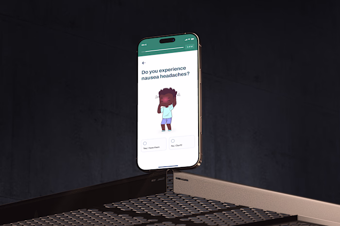
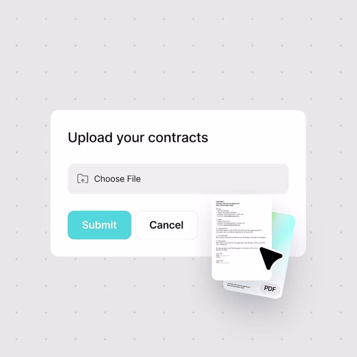
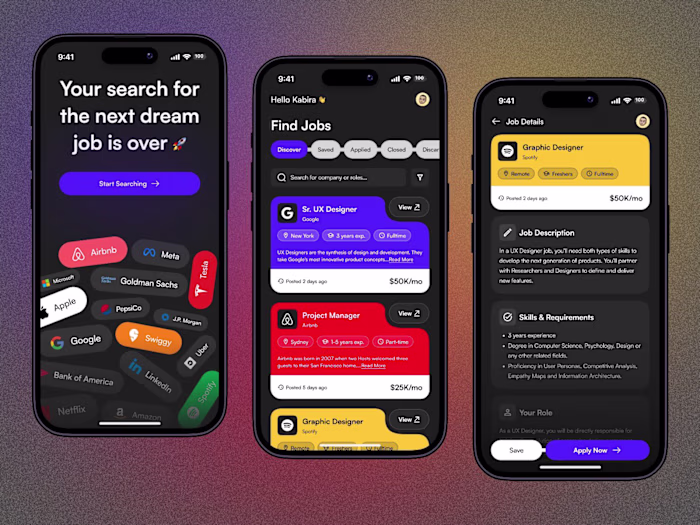
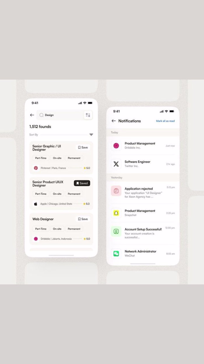
The magic happens in the details:
🎯 Navigation that guides, not confuses
🔥 CTAs that scream "click me" without saying a word
🧠 Layouts that reduce cognitive load, not increase it
Like this project
Posted Nov 17, 2025
A single pixel can cost you thousands in revenue. It's about the subtle friction hiding in plain sight. The navigation that makes users think twice, the but...