The classic 404 Error — Simplifying the navigation with words
Rohan Bhattacharya
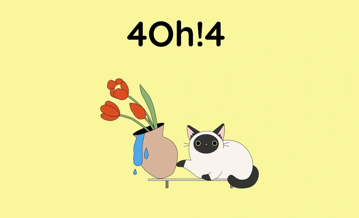
Illustration by error404.fun
Decoding the speciality of 404 Error messages
Yes, while 404 Error pages are the ideal playground for many UX Designers and writers to brush up on some skills, the truth is it is nearly unavoidable not to encounter one.
In my scenario, I first wanted to understand why having a custom 404 Error message is imperative. I did a fair amount of research online to dig into the reasons for having a good 404 Error page.
I found the following points most crucial:
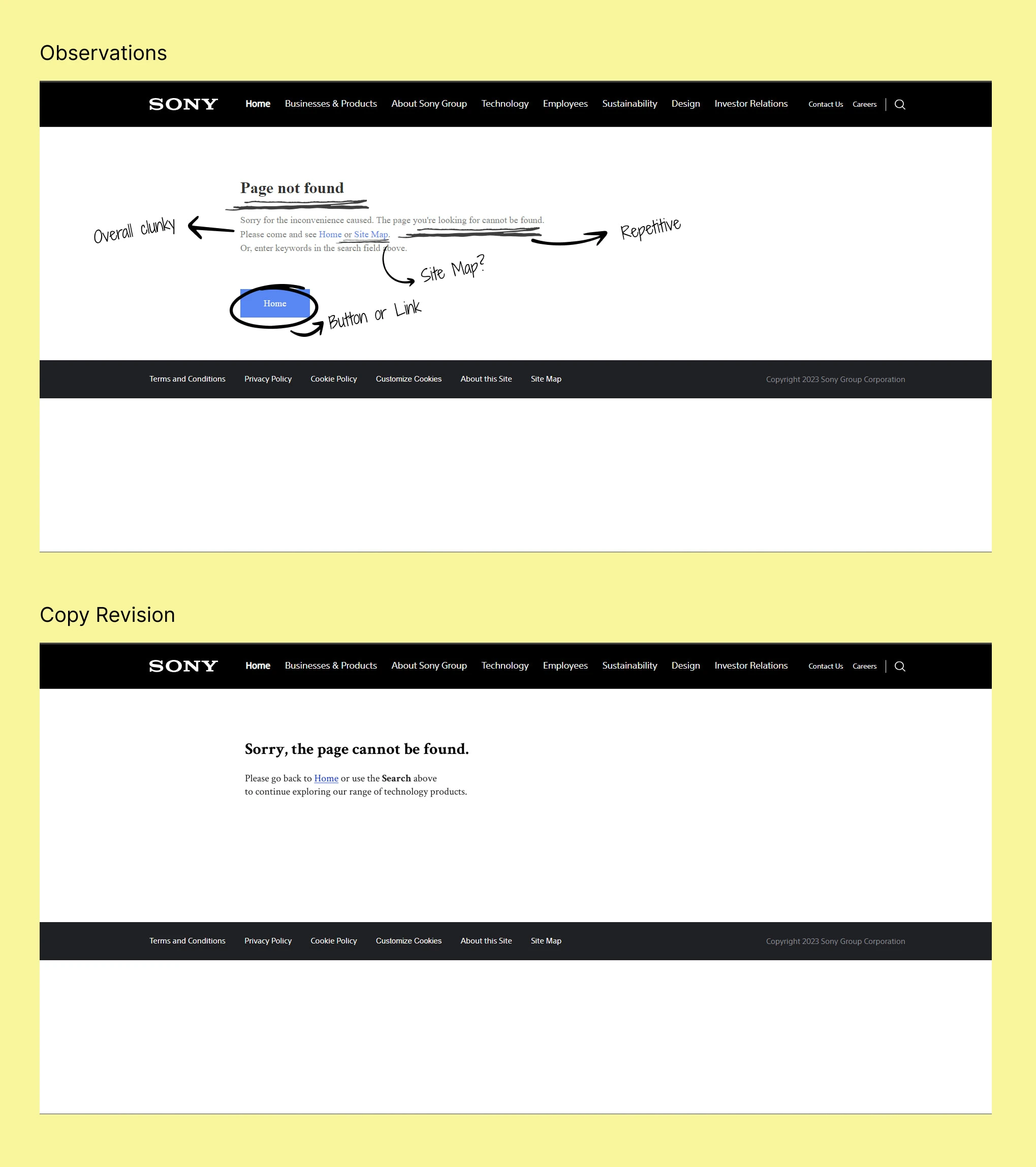
404 Error requires an understanding in plain language free of any technical jargon
The users need precise information to interpret what went wrong
A constructive message helps allow users to navigate or continue their journey onwards
A branded voice and design on a 404 page will keep users informed where they are on the page
Helpful 404 Error pages reduce bounce rate and keep people engaged on the website
Positive user experience keeps the SEO of the pages in healthy condition, thereby improving the search ranks
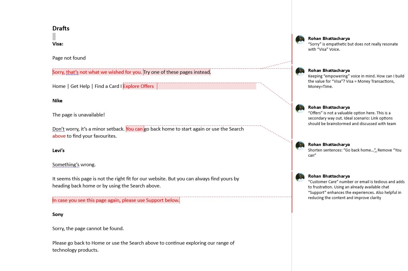
My approach to get better at crafting 404 Error messages
I chose five companies/brands that I look up to daily. These brands have been in the business for a long time, and I admire them for their persistence in being good at what they do.
However, one aspect that took me by surprise was their 404 Error pages. Putting myself in the user’s shoes, I felt disappointed. The current messaging lacks clarity, usefulness, and, most importantly, empathy.
By rewriting these, I aimed to ensure users have a consistent experience throughout their journey. And brands can count on the positive imagery in their user’s minds.
The versions below are an output of my analysis around best practices and understanding other brands’ voice & tonality using UX Writing quality criteria such as clarity, conciseness and branded voice.
I worked on a few iterations and copy drafts before finalizing my revised messages for each of the products.
Moving towards my final versions of the 404 Error messages
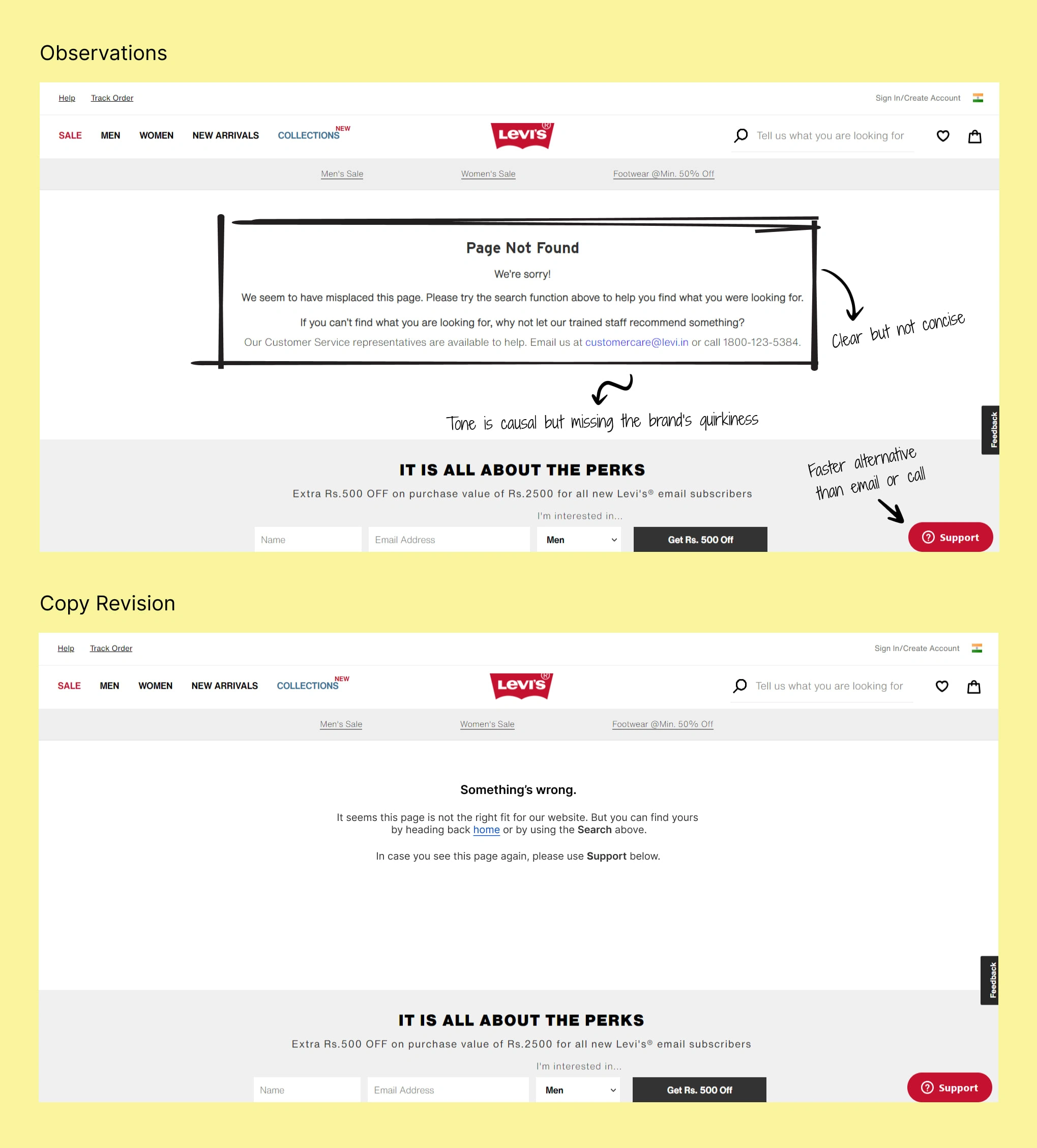
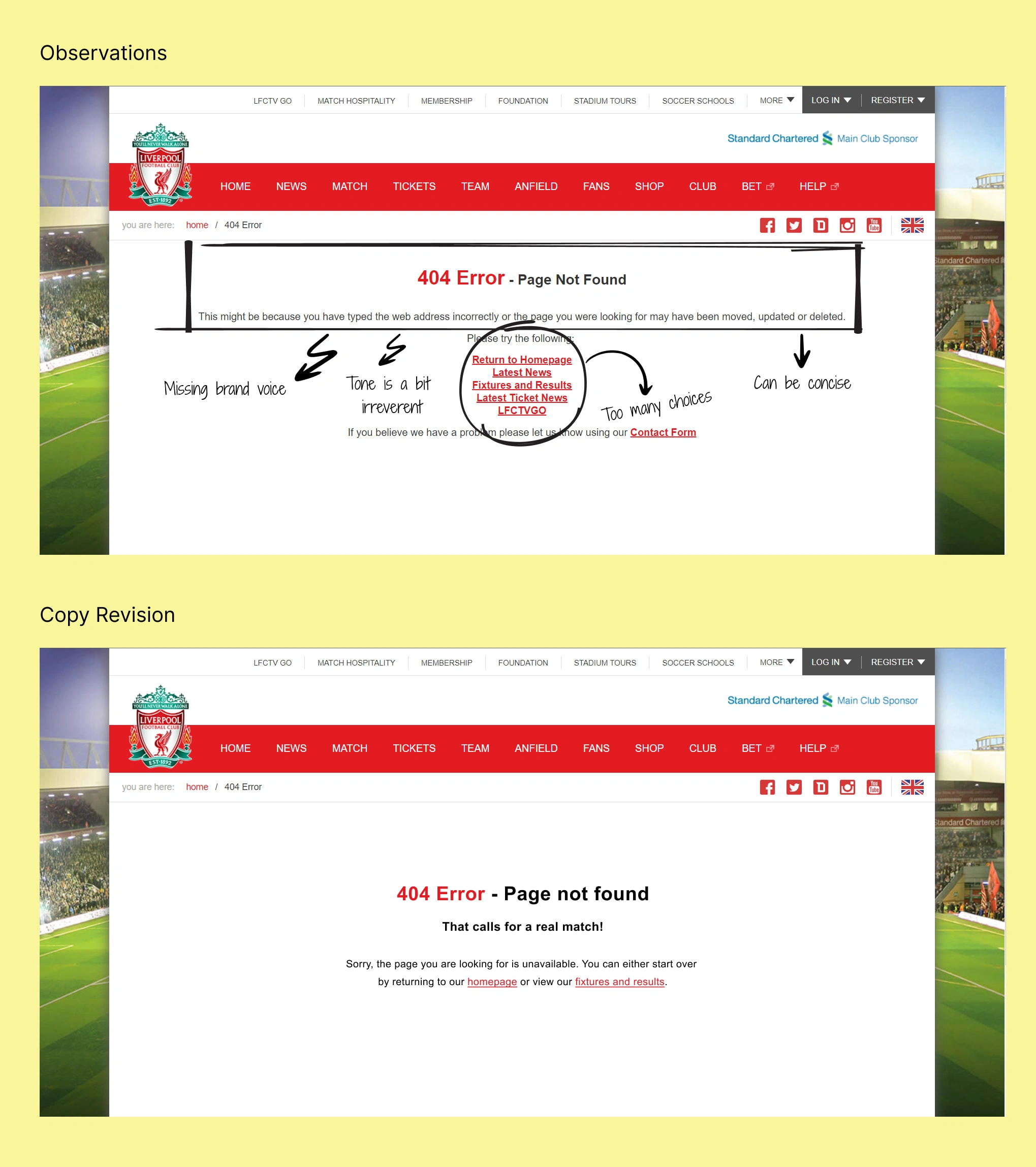
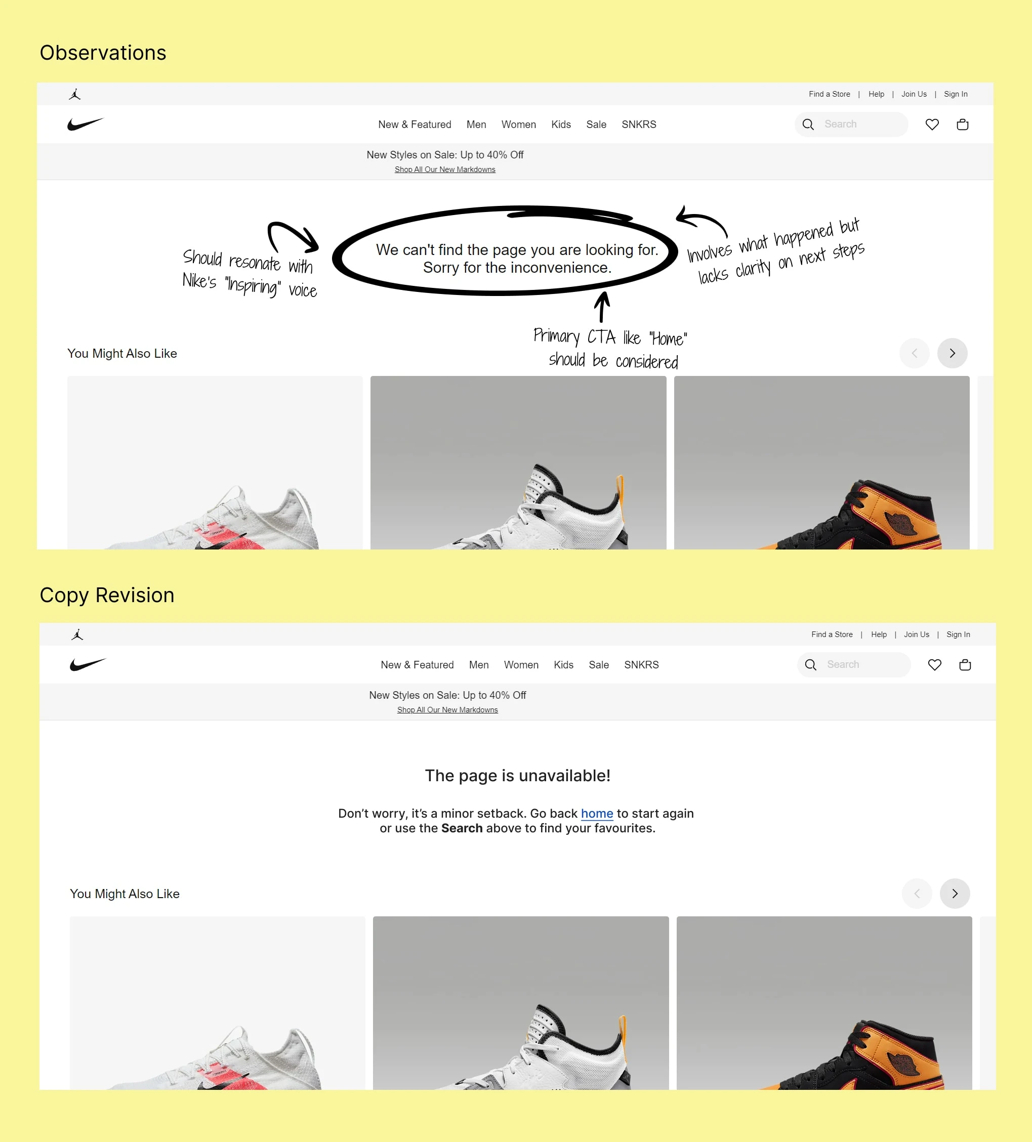
Key copy changes I made during the process:
Used plain and simple language for all the examples to bring clarity
Reduced use of repetitive and unnecessary words to achieve conciseness
Introduced branded voice to help users stay connected with the product
Made “Home” as the primary CTA as it is the most usable and simple navigation forward for all use cases
Avoided multiple, uncommon, unnecessary navigation links that don’t go with the user’s mental model
Like this project
Posted May 17, 2024
Drafted clear, concise and crisp Error 404 messages for some of the well-known brands
Likes
0
Views
9