Improving UX Copy in Existing Products
Rohan Bhattacharya
Overview
As a part of our learning goals under the UX Writing certification courses by Dr. Katharina Grimm, our task was to craft UX Copy for various elements of interfaces such as CTA, Empty State etc. We chose real products to write fresh UX copy or improve the existing copy using UX Writing best practices.
My Approach
For all the UX Writing tasks, I primarily researched competitor brands to understand their copy that enhances the user experience. Using the research findings along with the 6 quality criteria (Necessary, Clarity, Concise, Conversational, Useful and Branded) as taught by the course tutor, Dr. Grimm, I developed the revised UX copies.
#Task 1
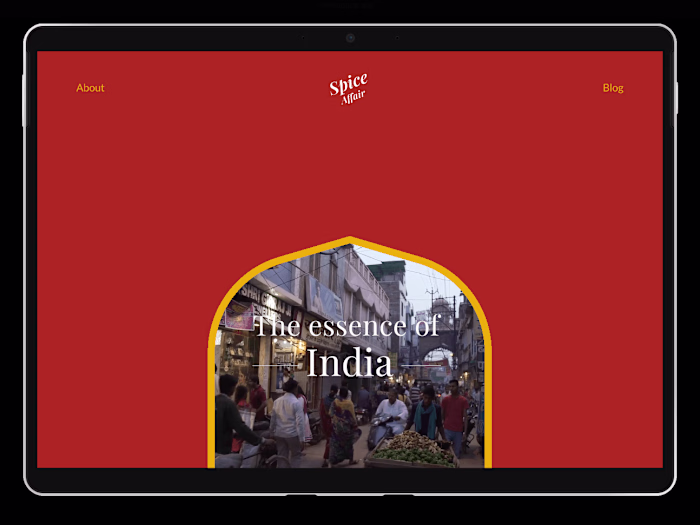
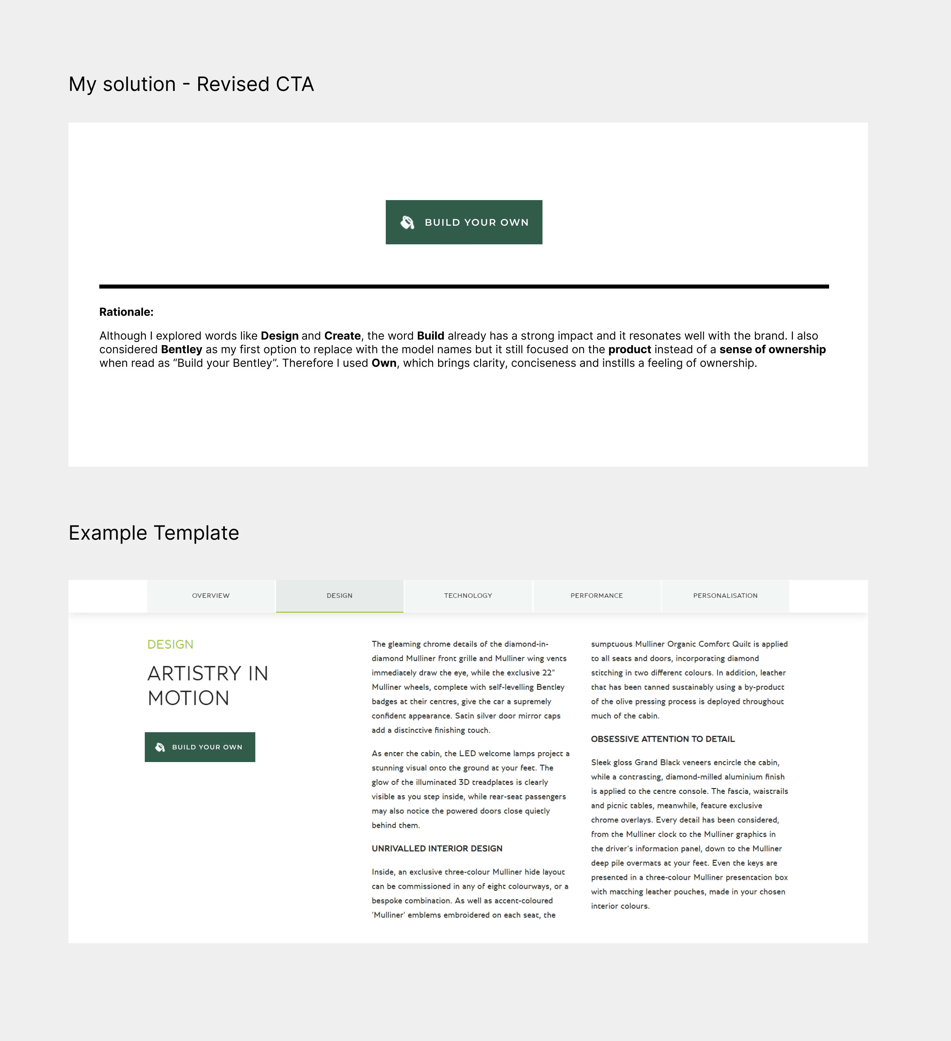
Write a CTA for a car manufacturer with which the user can start the car configurator. The car manufacturer produces luxury cars.
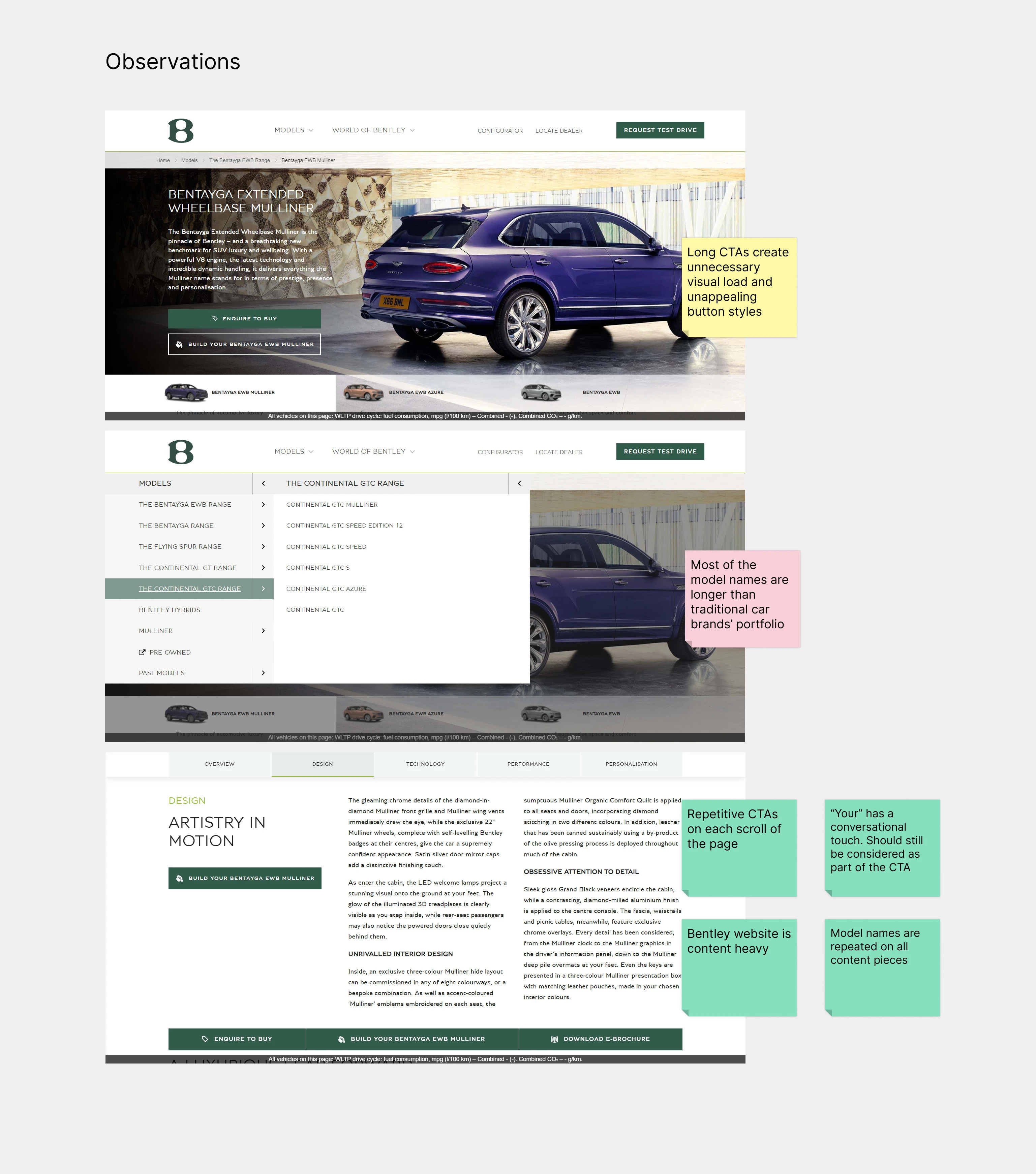
I chose Bentley as my brand for this task. Their website is quite content-heavy and the pages with car models have long descriptive text. Among these are the chunky car configurator CTAs which needed some rework. In this task, I only wanted to focus on the CTA copy to make it more consistent and concise. However, as a UX person, I would have loved to work closely with the UI designer to check the overall copy of other elements and the button sizes on the website for consistency.
#Task 2
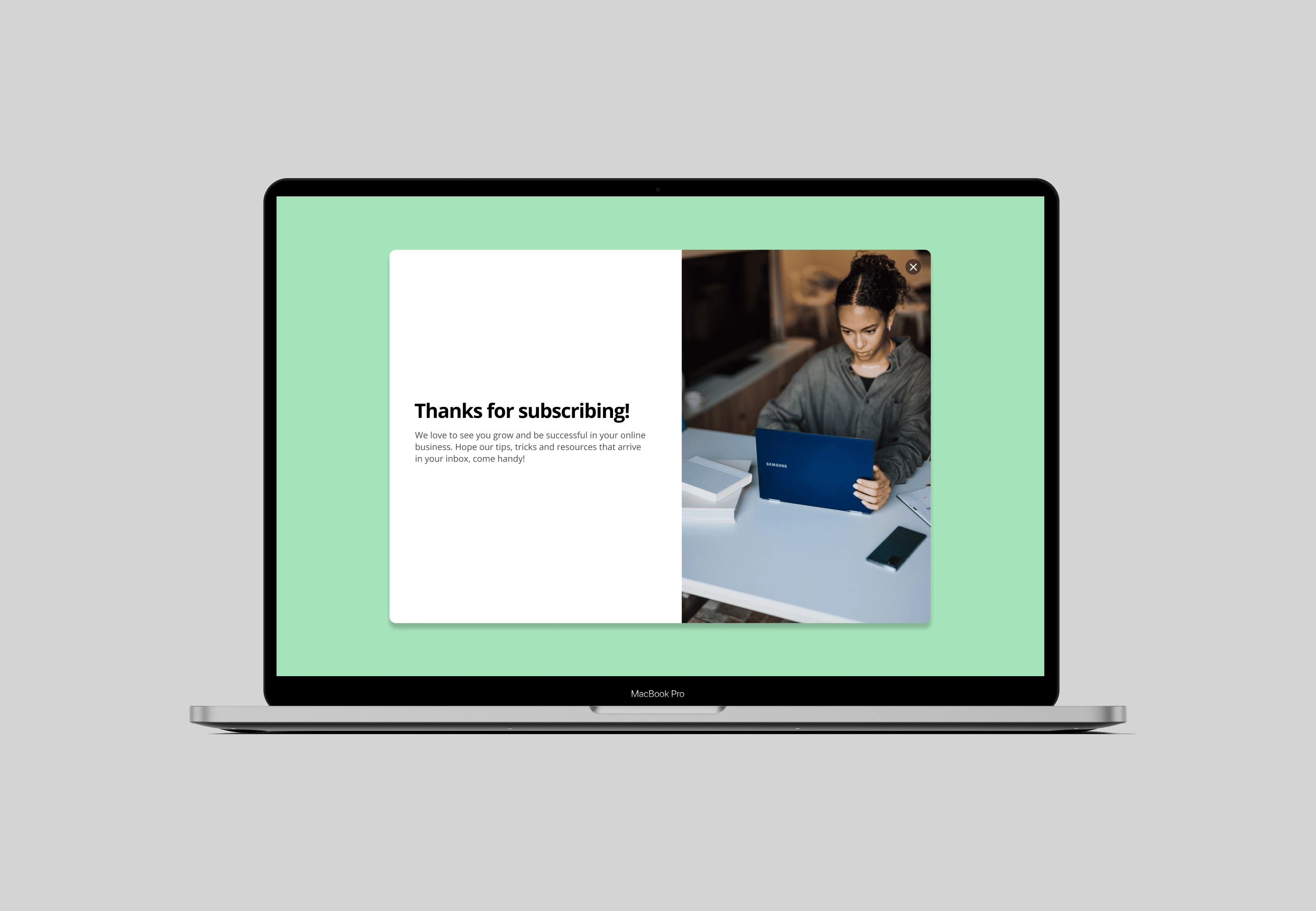
Write a success message for a newsletter signup
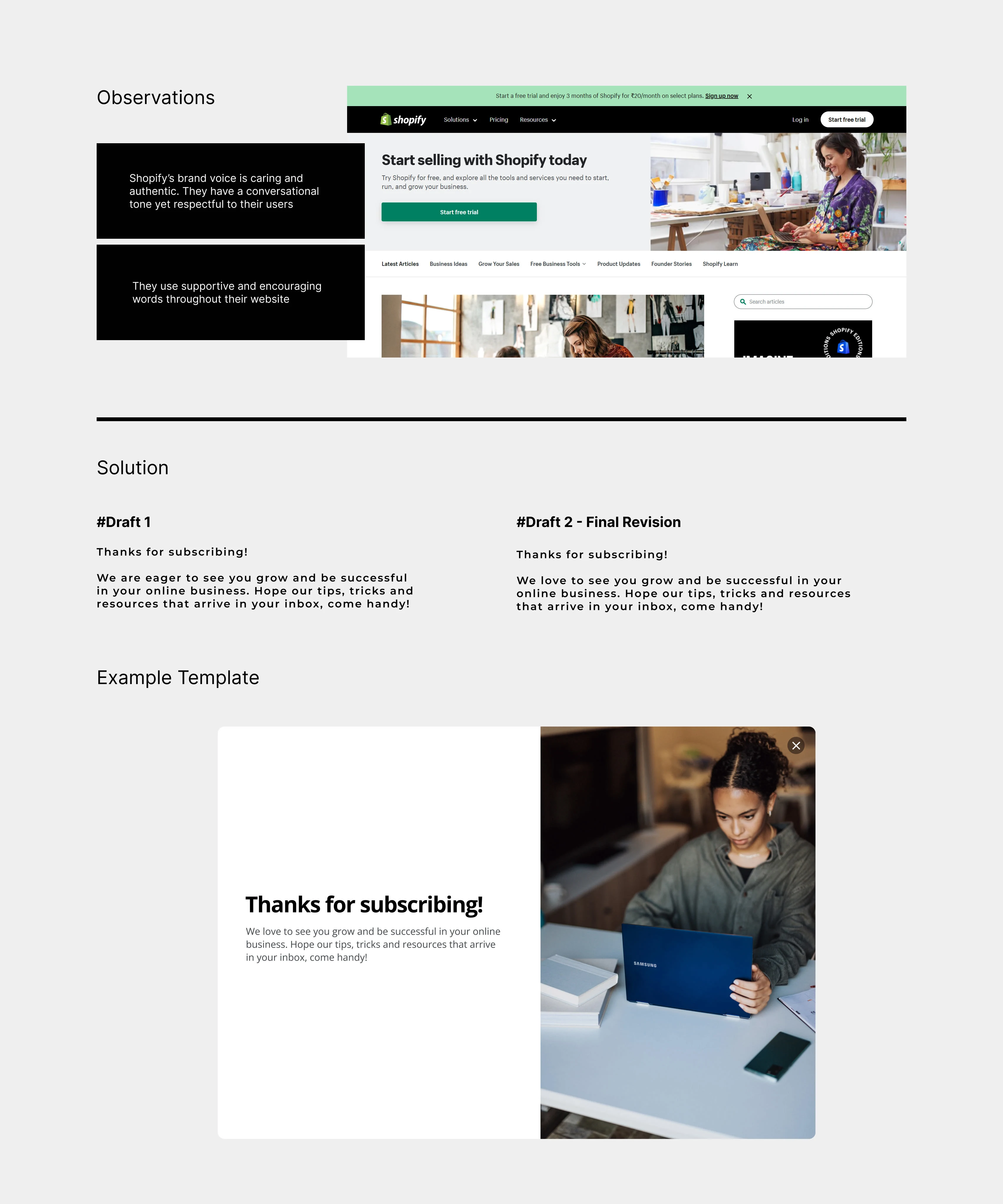
For this exercise, I thought of many products but finally chose Shopify. While I was browsing their website, I could not find any newsletter subscription section so I decided to write a fresh copy for their success message imagining if they had one.
I discussed a draft with my course tutor after I sorted through my versions. She encouraged me to change the word from eager to see to love to see so that the overall tone becomes more conversational. For the remaining part of the copy, I focused on the quality criteria of usefulness to share information about what the users can expect in their inbox when they receive the newsletter.
#Task 3
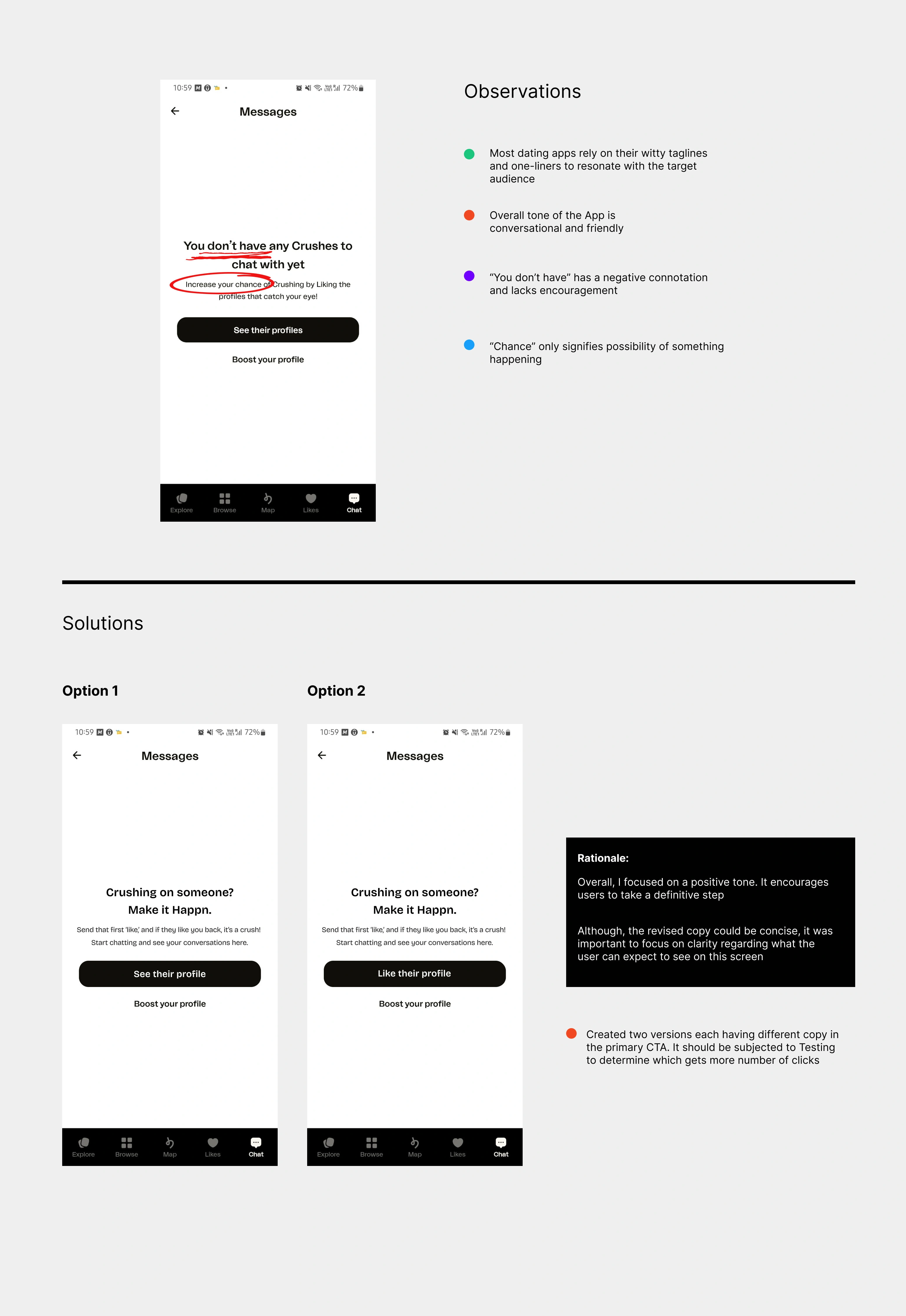
Write an empty state text for a contact/conversation list in a dating app
I chose the Happn App for this exercise. Happn is quite a popular dating application and I admire their refreshing voice and tone. After I reviewed their Chat tab, one thing that stood out the most was the negative connotation in the copy. I tweaked certain sections of the copy so that it gives the user a definitive action to take without compromising on the friendly and conversational tone.
I also shared two options of CTA where the words See and Like are placed in them respectively. I would want to test the same with users to see which CTA brings more clicks and supports the user’s mental model.
#Task 4
Look for an example of inaccessible UX copy online and rewrite the same to make it Screen Reader-friendly
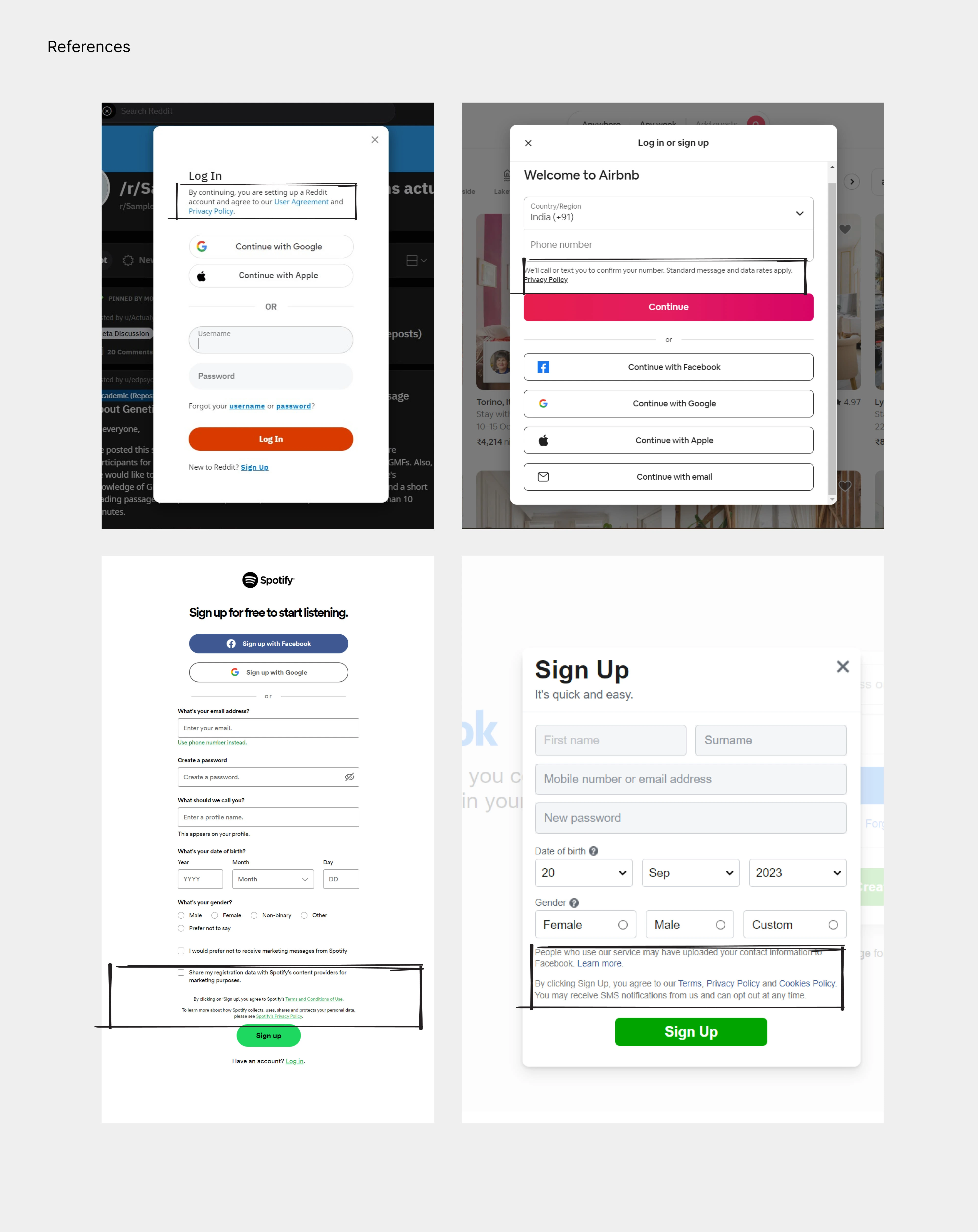
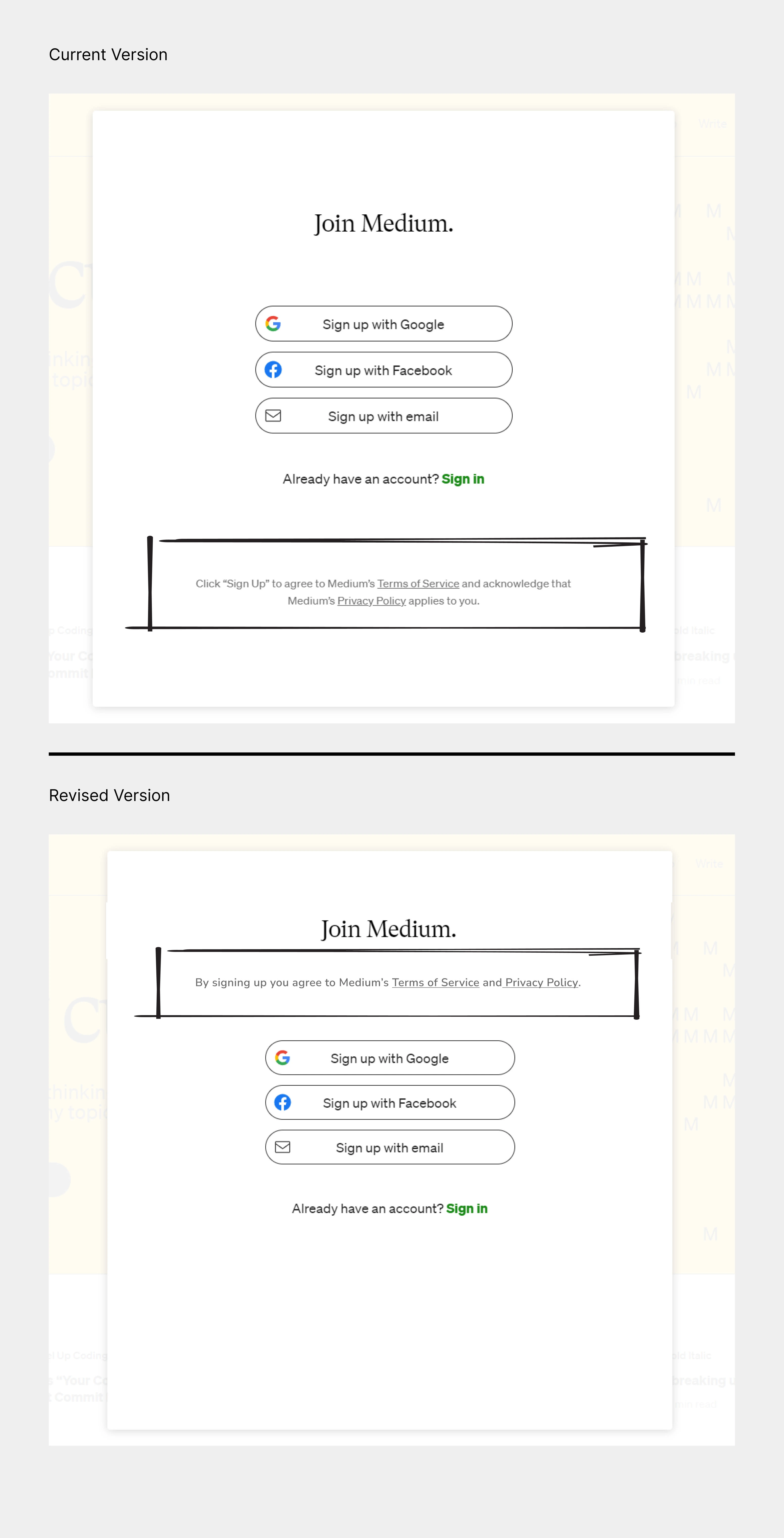
While I found several examples of Login/ Signup pop-ups that violate accessibility for this task I wanted to focus on Medium’s Terms & Conditions disclaimer.
Medium is a very well-known platform accessed by millions of people daily. However, an important aspect of the Signup/Login form i.e., the Sign-in Policy disclaimer sits right at the bottom of the screen after the CTA. Although this practice is adopted by dozens of websites, many differently-abled users who rely on screen readers would miss this notice if that is of significance to them.
After researching online for best practices around accessible UX Writing, I found a few examples below that suggest a better approach. All of these examples signify that accessibility should lead the argument in case it is discussed as part of design decisions. Moreover, according to benefits described by the Bureau of Internet Accessibility, a small step towards web accessibility can improve the overall usability of any application significantly.
I rewrote the existing UX copy of the disclaimer to make it clear and concise. I also considered the approach of other brands and positioned the disclaimer in the section of the pop-up that sits above the CTA and well within the hierarchy of other text elements without compromising accessibility.
My learnings
Words play a crucial role in sharing information, guiding users, and creating a seamless experience.
Clear and concise text reduces user frustration and errors, enhancing user satisfaction.
Useful copy provides value to users, helping them achieve their goals efficiently and effectively.
A well-branded copy reinforces the product’s identity, making it more memorable and distinctive in the user’s mind.
Continuous improvement through testing and iteration helps adapt the copy to changing user preferences and behaviours, leading to better user experiences over time.
Like this project
Posted May 17, 2024
User-Centered Messaging: A Case Study on Improving UX Copy in Existing Products