Groupy - Group traveling app
Jennifer Mercado
A B2C mobile app designed to simplify and enhance group travel experiences.
Overview
Groupy is a mobile app that simplifies group travel planning, expense management, and communication. The aim was to create a user-friendly solution that enhances the overall group travel experience.
Problem
Traveling with a group of people can often turn into a logistical challenge, especially when it comes to setting up a budget and scheduling activities. Keeping track of expenses, coordinating everyone's preferences, and ensuring a smooth and enjoyable trip can become overwhelming.
Solution
To address these challenges, I embarked on an extensive research process to gain a deep understanding of user needs, pain points, and preferences. This research guided the design of intuitive user flows, interactive features, and a visually appealing interface. The goal was to create a seamless and enjoyable experience for planning, organizing, and managing group trips. Groupy offers a range of solutions, including seamless trip planning, efficient expense management, and sharing, effective communication and collaboration tools, and intuitive itinerary planning features.
Tools
Figma
Figjam
Google Docs
Zoom
My Role
Solo UX designer
Timeline
7 weeks
Process
Discovery
Ideate
Design
Test
Reflection
Discovery
Secondary Research
During my research, I discovered common challenges when traveling with a group. Miscommunication, budgeting, and conflicting travel styles can strain relationships. Planning destinations and accommodations also add stress due to limited budgets and the need for group consensus.
Miscommunications often arise when group traveling, resulting in conflicts and discomfort.
Budgeting and sharing expenses can create significant concerns and friction within the group.
Conflicting travel styles, such as preferring structured itineraries or a more relaxed approach, can lead to conflicts and strained relationships.
Planning destinations and accommodations can be stressful due to limited budgets, time management, and the challenge of reaching a group consensus.
Primary Research
Primary research involved conducting a survey to understand user behaviors, preferences, and pain points related to group travel.
Objective
To gain insights into the challenges faced by group travelers and identify opportunities for designing products or services that address their needs.
Objective Screen
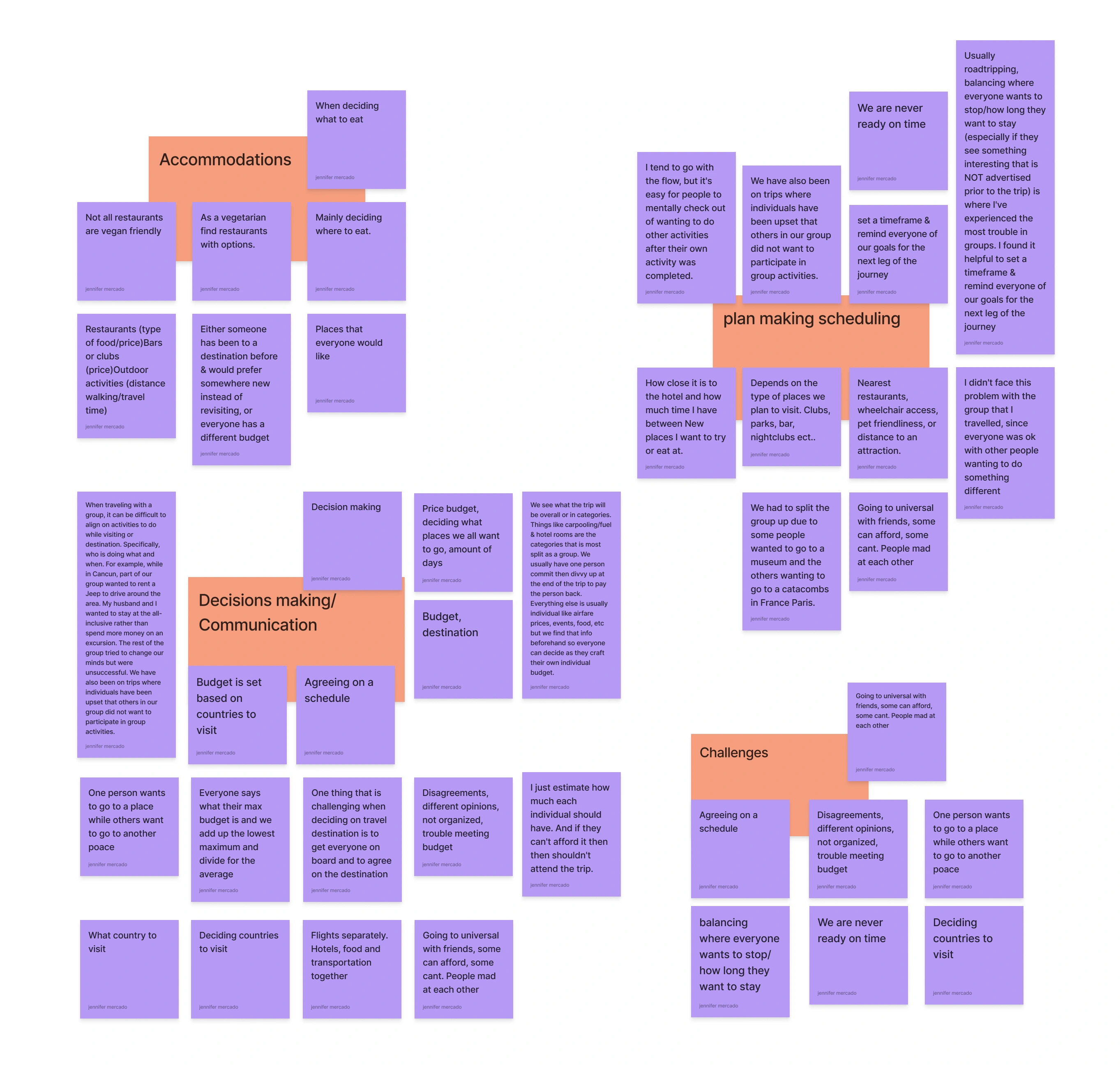
In the screener survey, we aimed to understand the common challenges group travelers face during trip planning, budgeting, and activity coordination. We also explored how they currently manage expenses within their travel groups and their preferences for tools to simplify these processes.
To gather responses, I shared the survey on social media and within family and friend group chats. After collecting the data, we conducted an analysis using an affinity mapping technique, which helped identify recurring themes and user issues. Insights were organized into categories such as
Accommodations/Needs, Challenges
Plan-making/Scheduling
Decision-making/Communication
These findings provided valuable guidance for the subsequent ideation phase of the project.
Ideate
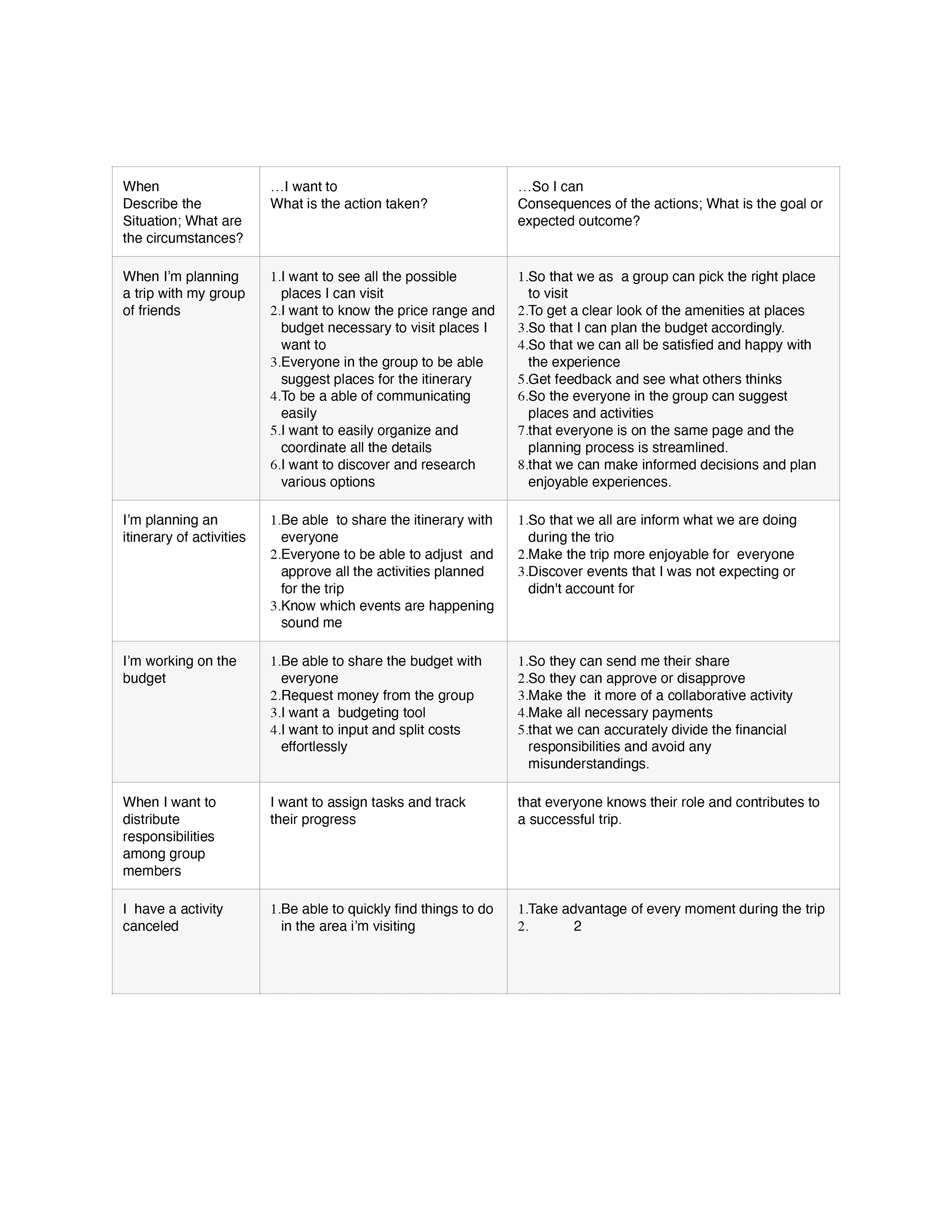
Jobs to be Done
The jobs-to-be-done exercise was a very helpful step during the discovery phase because it helped me organize all the information that I had gathered so far from secondary research. By diving into their specific goals and challenges, I gained valuable insights into their pain points and aspirations. This deep understanding allowed me to design a solution that truly addresses their needs. The impact of this activity on the design process was profound, as it guided my decision-making and shaped the features and functionalities of Groupy.
By aligning the app's design with the jobs users want to accomplish, I wanted to ensure that Groupy would be intuitive, user-centric, and capable of delivering a seamless and enjoyable group travel experience.
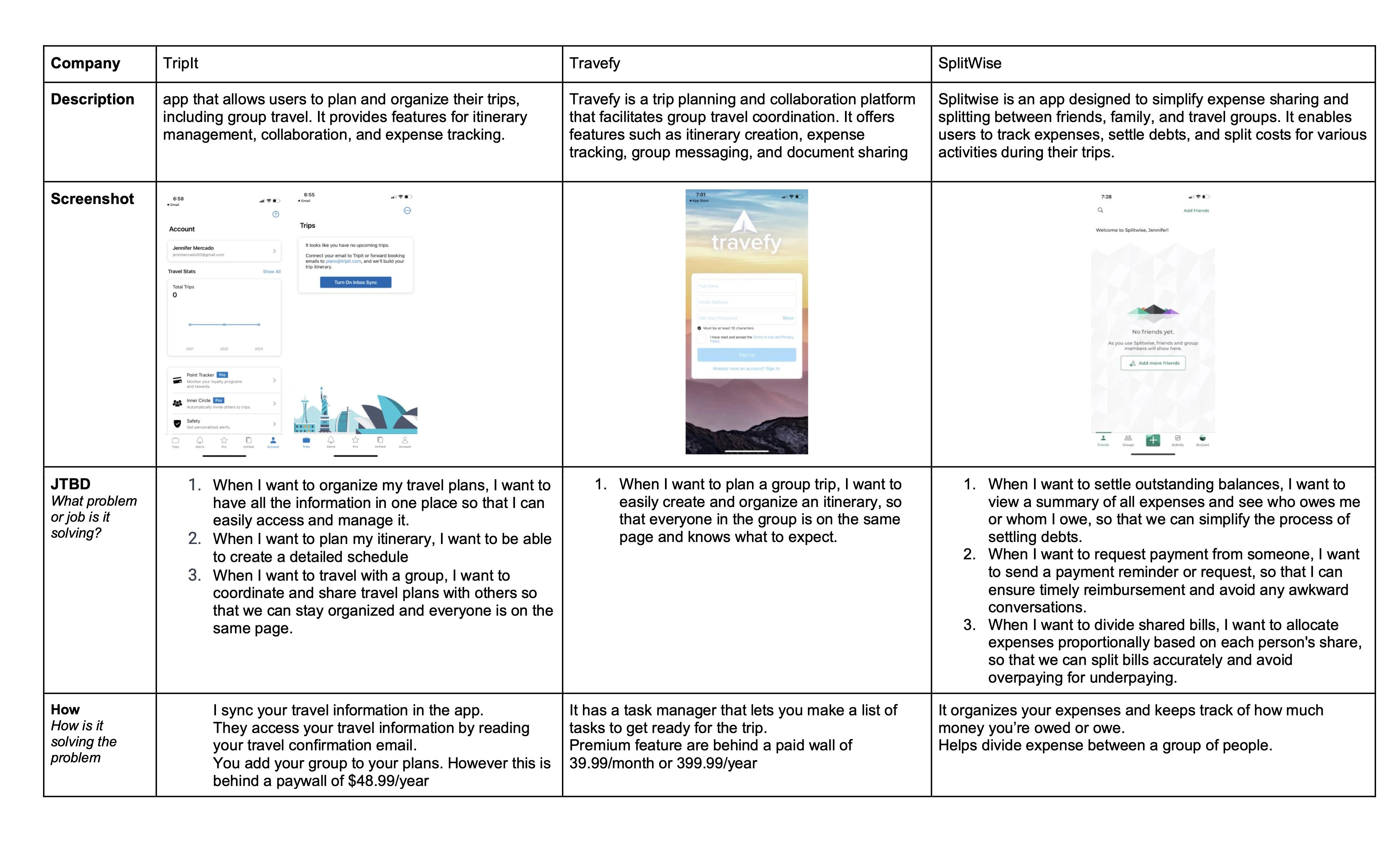
Competitive Research
During my competitive research, I analyzed apps that address similar challenges related to group travel. Two notable apps in this space were Tripit and Travefy, both of which provide features such as itinerary management, group collaboration, expense tracking, and messaging. These apps served as direct competitors for the product I aimed to design. Additionally, I examined SplitWise, which focuses on splitting expenses and settling debts for various activities. Through this research, I gained valuable insights and inspiration, realizing the potential and possibilities in solving the problems I aimed to tackle. It also reinforced my vision for Groupy as a more straightforward and user-friendly solution.
How Might We...
With a solid foundation of user insights gathered through affinity mapping, secondary research, and survey analysis, I proceeded to the ideation phase of the design process. To maintain a user-centric approach, I formulated a series of "How Might We" (HMW) questions. These questions provided specific scenarios and challenges to guide me in generating innovative solutions. By addressing these HMW questions, I aimed to create a product that effectively addressed the needs and desires of the users.
How might we simplify the process of choosing a travel destination that accommodates everyone's preferences and limitations?
How might we strike a balance between individual preferences and group interests to enhance the group travel experience?
How might we streamline the management and splitting of expenses for groups during their travels?
How might we leverage technology to make itinerary planning effortless and provide timely updates and notifications to group members?
Brainstorming
Brainstorming was a pivotal step in the design process as it allowed me to transform my main ideas into visual representations. Drawing from the insights gathered during my research, I focused on key priorities such as group organization, travel planning, and expense tracking and sharing. By visually mapping out these features, I was able to explore various design concepts and identify potential solutions to address user needs effectively.
User Stories
User stories allowed me to empathize with the user and better understand their needs and desires. This understanding is vital for a designer because it helps create a more user-centered and meaningful experience.
As a user, I want to create a new trip and invite my friends/family to join, so that we can plan our vacation together.
As a user, I want to set a budget for the trip and easily track and split expenses with my group, so that we can manage our finances efficiently.
As a user, I want to create and manage an itinerary for the trip, including activities, reservations, and timings, so that we can stay organized during our trip.
As a user, I want to explore popular destinations and attractions at the chosen travel location, so that I can discover new places to visit.
As a user, I want to have a group chat feature where I can communicate with my travel companions so that we can discuss plans and share updates.
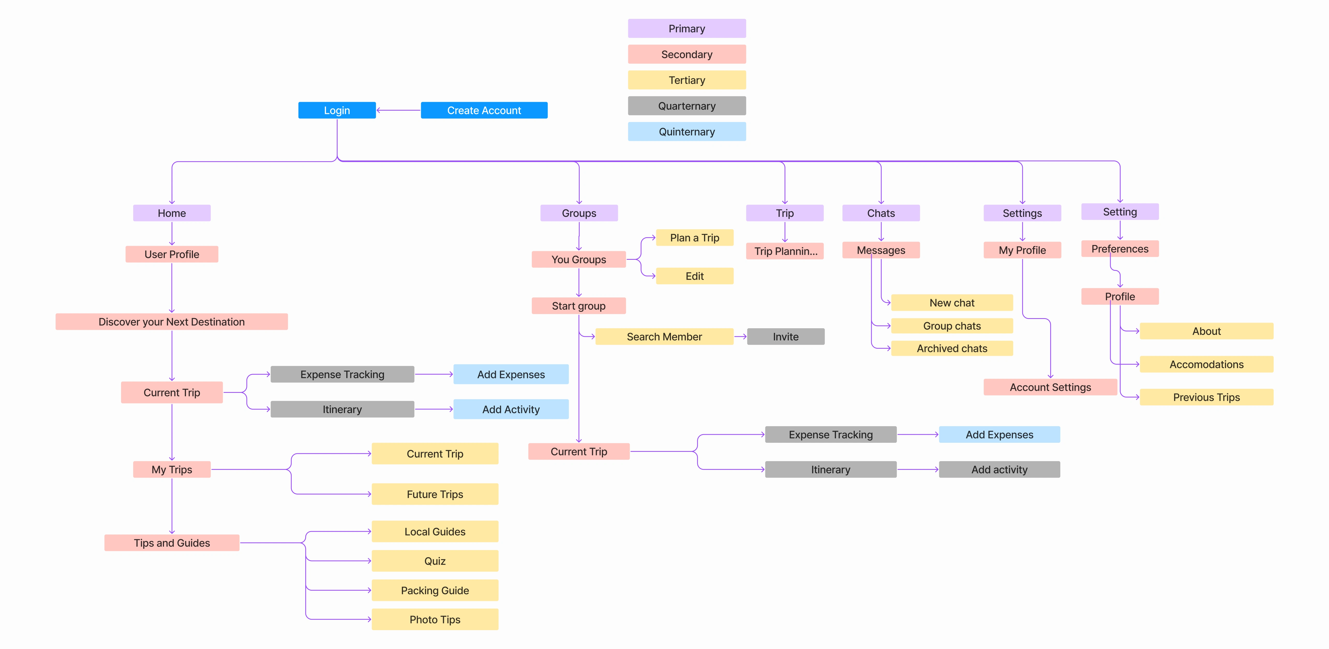
Site Map
Creating the site map served as the essential backbone of the user experience design process. It provided a clear and organized structure for mapping out the various experiences and micro-solutions within the app. By visualizing the app's architecture and navigation flow, the site map gave me a solid foundation and a clear roadmap for the subsequent wireframing phase. Without the site map, the wireframing process would lack direction and coherence, making it difficult for users to navigate and comprehend the overall experience. Ultimately, the site map played a vital role in ensuring a well-structured and user-friendly design for Groupy.
User Flows
Focusing on the core functionalities of the app, I designed user flows for the key tasks: creating a group, planning a trip, and adding an expense to a current trip. These user flows were prioritized as they are fundamental actions that users must be able to perform in order to effectively utilize the app and achieve their desired goals. By breaking down the app flow into single tasks and ensuring each one was well-designed before moving on, I was able to maintain focus and ensure a seamless user experience throughout the app.
Sketches
Sketching played a crucial role in my design process as it allowed the ideas and concepts to take shape and come to life. It served as the stage where the initial vision of the app started to materialize. Through sketching, I was able to explore different design possibilities, refine the user interface, and iterate on the overall concept. Sketching served as a creative and iterative tool, transforming abstract ideas into tangible design solutions for Groupy.
Wireframes
Using Figma, I created wireframes as a visual guide for the final designs. These wireframes served as the skeletal structure of the app, representing the screens required for the user flows previously defined. This step integrated all the prior work, including research, user stories, and brainstorming. It involved multiple iterations to find the optimal layout that was intuitive and easy to navigate for users.
Some of the component I created were user cards, cheers module, a profile for the user, itinerary card.
Design
Brand Platform and Moodboard
Creating a Brand Platform and mood board was really important to me before moving to the High Fidelity design because I needed to make sure that the branding of the app was focused on making the user attracted to use it. The vision was colorful, young, fun, and inclusive. From this point on the vision of the final product that I had in my head was created in full color.
Style Guide
Creating a style guide was a crucial step in the design process. It allowed me to maintain consistency and ensure a cohesive and clean design throughout the high-fidelity screens. The style guide also plays a vital role in representing the branding of the app, ensuring that the design aligns with the overall visual identity.
I chose a vibrant and youthful purple as the primary color for Groupy to convey a sense of youthfulness, inclusivity, and adventure. This fresh and vibrant shade creates a visually appealing and inviting atmosphere, reflecting the app's mission to provide a fun and enjoyable travel experience for all users. The sweet undertones of the colors in the whole color palette evoke a sense of excitement and positivity, further enhancing the overall brand personality of Groupy.
I chose Avenir as the main font for its clean and modern look, while Roboto is used for long copy and inline links to add a touch of informality and friendliness to the typography. This combination creates a balance between a clean and professional aesthetic and a hint of fun.
Hi Fidelity UI's
Using the brand platform and style guide, along with the wireframes as a reference, I developed high-fidelity screens for the app. The main focus was to create an interface that prioritized ease of use and navigation while maintaining a visually appealing design. The screens were designed with a balance between simplicity and functionality, ensuring that users could easily understand and interact with the app without feeling overwhelmed.
When taking the mid fidelity wireframes into many element change in dimension but mostly stayed very close to the first concept. the screen that changed the most was the Home which instead of showing everyday itinerary together I added tabs for each day. I adapted this make it easier to distinguish the itinerary between each day.
Prototype
By using Figma, I created a prototype to test the intuitiveness and overall user experience of the app. This process allowed me to gather valuable insights and identify areas for improvement. I discovered that two of the user flows were easily understood by testers, while one required significant reworking. This experience taught me the importance of keeping user flows simple and minimizing the number of steps required for users to accomplish their tasks.
Test
Usability Testing
To evaluate the usability of the interface, I conducted user testing with 5 participants. Each participant was asked to perform three key user flows: creating a group, planning a trip, and adding an expense to a current trip. The purpose of this exercise was to assess the ease of use and enjoyment of the user interface. The goal was to ensure that these important tasks were not only achievable but also intuitive and user-friendly. By testing the app with real users, I aimed to identify any usability issues and make improvements to enhance the overall user experience.
I conducted remote sessions via Zoom where participants shared their screens while using the prototype on Figma and performed the three tasks. All participants had prior experience traveling in groups, and I hypothesized that the last task could present challenges. To recruit participants, I reached out to family and friends who had previously traveled in groups and had also completed my survey beforehand. I conducted interviews with a total of five individuals.
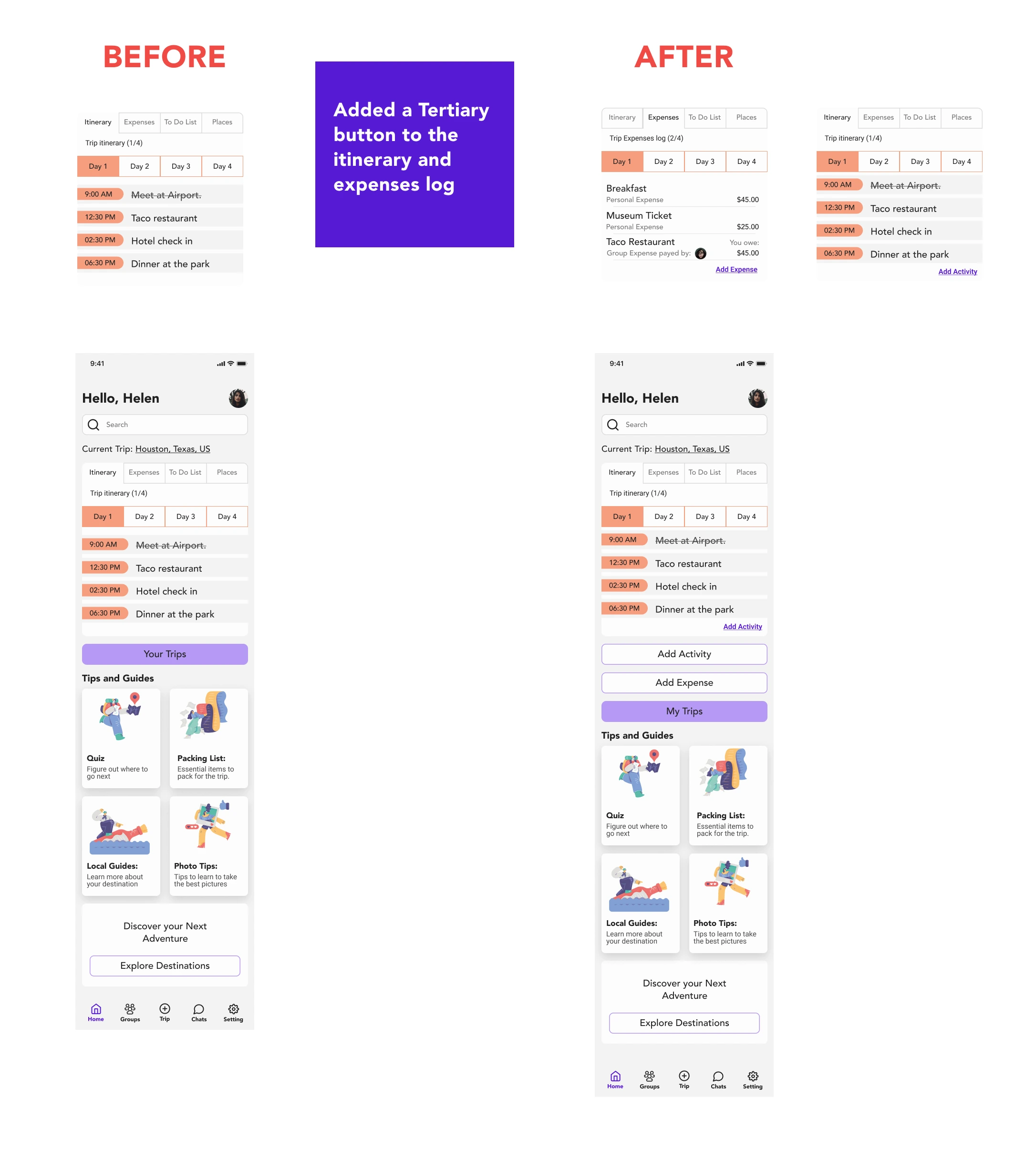
Issue #1
Users had trouble finding the “Add Expense” button to add an expense to the trip.
Summary:
3 of 5 After getting to the “Your Trips” Screen they couldn’t find the “add expense button”. It wasn't very visual to them.
2 of 5 users could not find the “Your Trips” page.
Users scrolled up and down and did not see the button. The user wondered aloud if there was a button for it. The secondary button didn’t stand out enough where it was located
Recommendations:
Moving the add expense button to the home screen is something the user might constantly do during a trip.
Add a tertiary button to “add expense” on the expenses log.
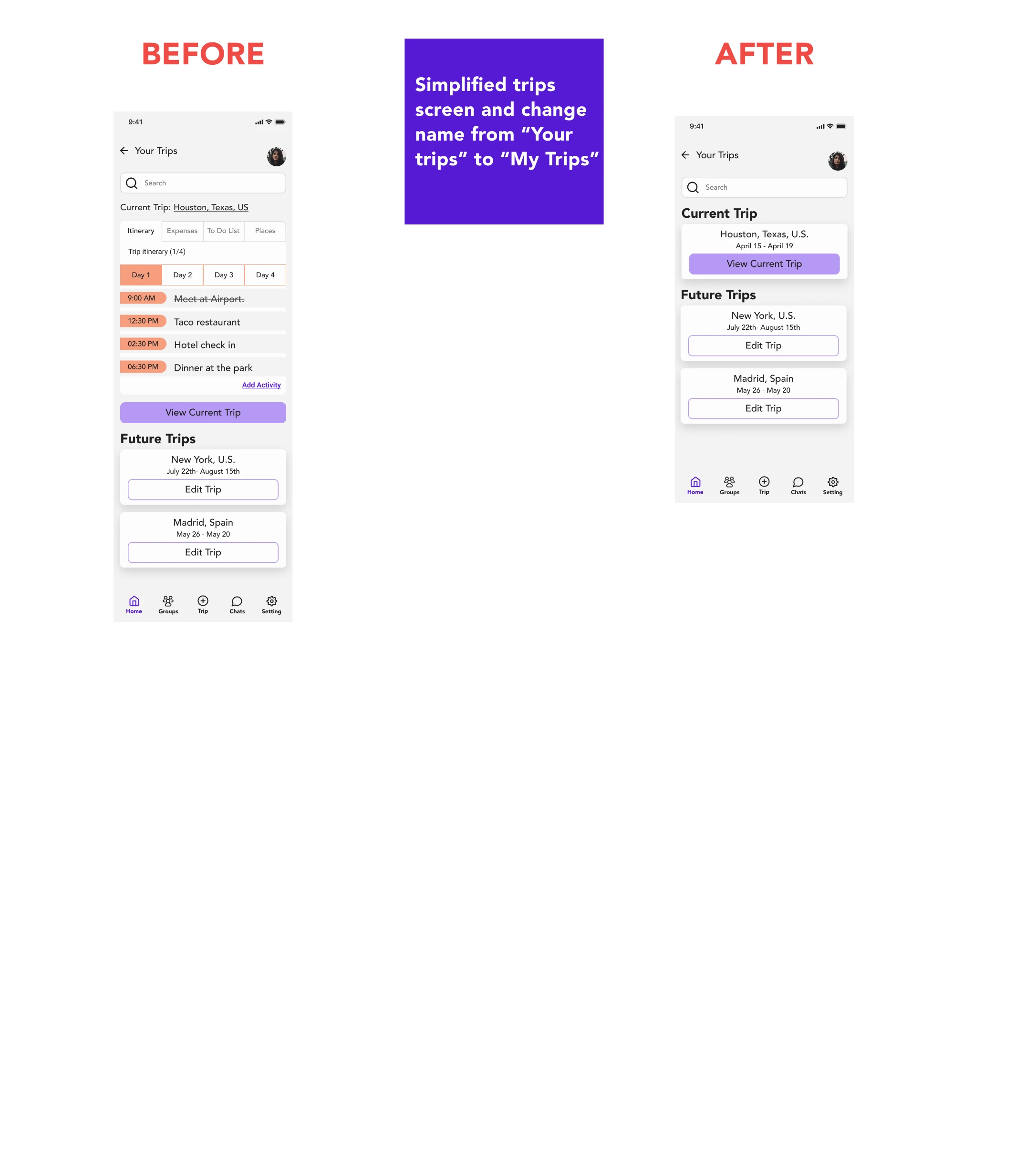
Issue #2
Users could not find the trips page.
Summary:
The “your trips” buttons were confusing
1 user didn’t find the Your Trips page
1 user got confused by the button labeled “Your Trips”
Recommendations:
Changing the language of the button for the trips screen. From “Your Trips” to “My Trips”
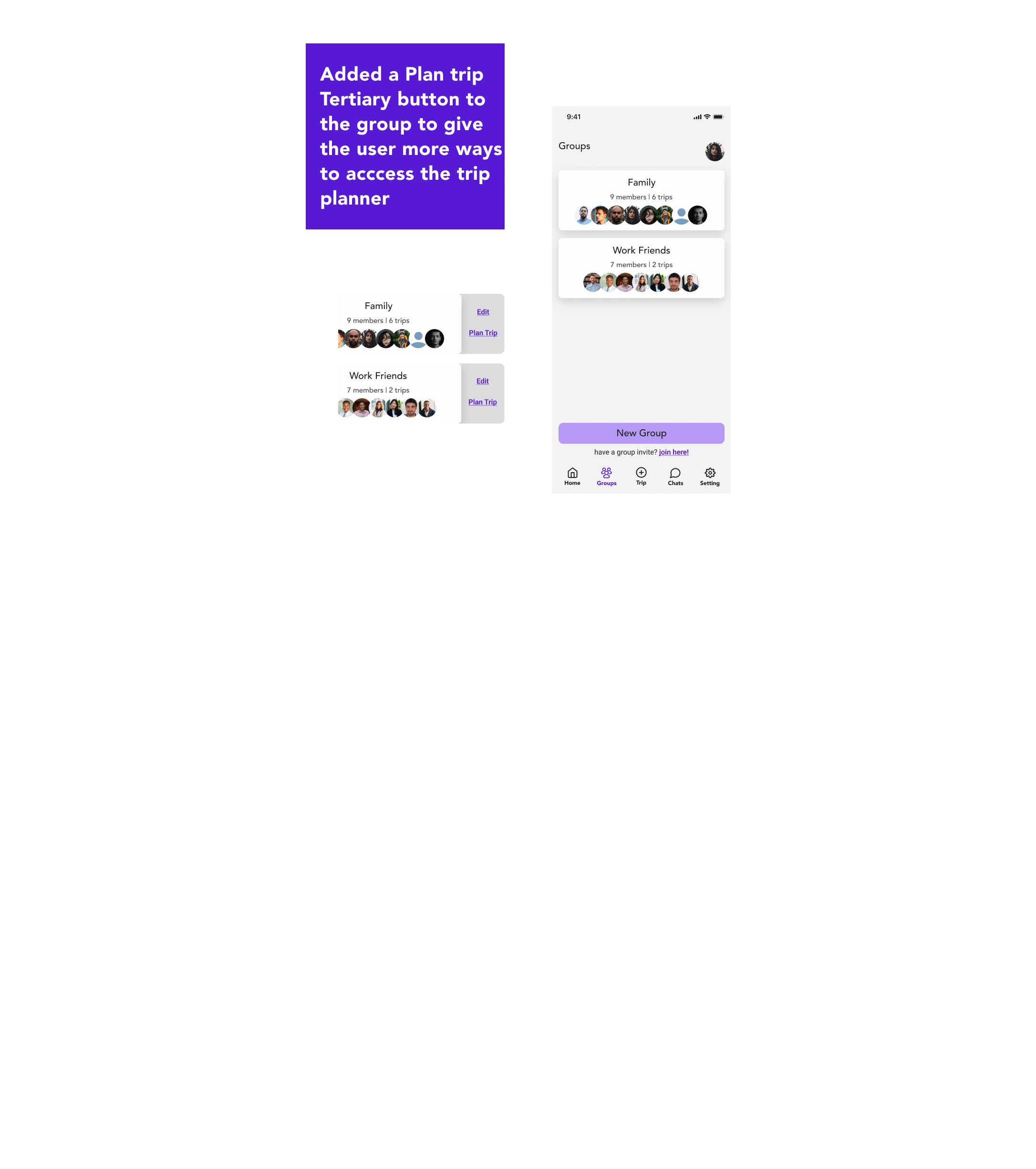
Issue #3
The user wanted to plan a trip by selecting a group and inviting them to a trip
Summary:
1 user tried to invite a group first when trying to plan a new trip instead of going to the trip section on the navigation menu
1 User said wanted to go see which group wanted to travel first and then start planning the trip with that group
1 User tried to click on the groups on the groups screen to invite them.
Recommendations:
Add an "Plan trip" option on group card of each group when slide to left and. inside the group profile.
Redesign
Based on the insights gathered from user testing, I implemented three key changes to the app design.
Added secondary buttons on the home screen for "Add Expense" and "Add Activity," as these were identified as critical tasks during a trip.
Simplified and renamed the "Your Trips" page to "My Trips" to improve clarity and remove redundant information. This streamlined the user experience.
I introduced the ability to start a trip directly from the groups' screen, which was inspired by user observations during testing. These design enhancements aim to make the app more intuitive and user-friendly for seamless trip management.
Screen design displayed in a mockup
Screen design displayed in a mockup
Screen design displayed in a mockup
Reflection
Throughout this project, I gained a deep appreciation for the importance of simplicity in design. I realized that by minimizing barriers and reducing the number of steps in key user flows, I could create a more seamless and efficient user experience. In future projects, I will prioritize simplicity and aim to streamline the most important user tasks.
Additionally, I identified several potential enhancements for the app design. These include features such as task assignment for each group member, a location tracking feature to help locate group members while traveling separately, a suggestion feature for members to propose places to visit during the trip, and an itinerary that considers individual and group activities. By incorporating these additions, Groupy can further enhance the user experience and provide even more value to its users.
Like this project
Posted Apr 21, 2024
A B2C mobile app designed to simplify and enhance group travel experiences.
Likes
0
Views
12