Cohere
Jennifer Mercado
A B2B web mobile community driven platform that connects independent retailers with emerging brands.
Overview
Cohere is a community-driven platform that bridges the gap between independent retailers and emerging consumer brands. The platform aims to enhance transparency and authenticity in the retail industry by facilitating connections, providing authentic buyer reviews, and offering AI-powered market insights. This case study outlines the journey of designing Cohere's user experience.
Problem
As an early-stage startup, Cohere had no web presence. The Cohere team needed an end-to-end design. Cohere aims to connect brands with small retailers. For this project, we worked on building a web presence to help their goals.
Solution
To address this challenge, my team and I created 22 web and 22 mobile screens, each designed to:
Convey Cohere's Values and Mission
We emphasized transparency and authenticity throughout the interface, aligning it with Cohere's core mission.
Provide an Enjoyable User Experience
We prioritized an intuitive, clutter-free design with engaging visuals for a seamless and pleasant user journey.
Empower Retailers to Discover
Retailers can easily find new products and brands through clear navigation, search options, and authentic buyer reviews.
Tools
Figma
Figjam
Google Docs
My Role
Lead UX designer, team of 5
Timeline
6 Months
Process
Discovery
Ideate
Design
Developer Handoff
Reflection
Discovery
Kickoff
Cohere provided my team and I with their logo, color palette, and font. which was the backbone of building a style guide to follow when building high-fidelity wireframes. The client had answer a questionnaire for us and user stories they'd created previously.
Client Questions/Answers
The client answered a questionnaire for us in which we learned what they envisioned for their web presence, and who their competitors were. After analyzing the questionnaire we put together a few follow-up questions from which we learned which is the most important information to present to the user
What we learned from both questionnaires:
Reviews are Cohere main focus. Motivating users to leave reviews on product they've tried and creating trust in the the review already there.
Clear vizualition of the date on their suggested product for the user.
The client was open to allowing users to create shelves.
The Discovery hero image should be used for promotional purposes.
Heuristic Evaluation
My team and I conducted a heuristic evaluation to assess the platform's usability, identifying potential issues and areas for improvement. This evaluation informed our design decisions. Some areas with issues we found were:
Visibility of system status. Pages failed to tell the user where they where.
User control and freedom. Some forms didn't allow users to exit out or go back to previous page.
Consistency and standard. CTAs with the same goal had different copy. modules design were inconsistent.
Competitive Analysis
My team and I conducted a thorough competitive analysis to understand the landscape and identify opportunities for Cohere to differentiate itself. We conducted separate research and after gathering enough material and knowledge we met to discuss our findings. This analysis helped us benchmark our design against industry leaders.
Some important things we wanted to make sure bring to our designs were:
Clean design
Trustworthy
High quality photography
Clear CTAs
I spearheaded the research behind Faire clear design and clear CTAs are the best part of the experience they offer, but they could improve on their menu, at the moment is too extensive and could cause confusion and decision fatigue to the user.
Ideation
User Stories
We received a list of five user flows from the client. These user stories were the main tasks the user must be able to do when using the client portal. My team and I met and we all worked on our respective user stories. I worked on user story 5, "As a user (retailer), I want to view and access my shelf (products I’ve chosen or favorited.)"
As a user (retailer or brand), I want to be able to create an account and log in.
As a user (retailer), I want to be able to access my profile.
As a user (retailer), I want to easily discover products and review them.
As a user (retailer), I want to view and access the new product dropped this week and claim it.
As a user (retailer), I want to view and access my shelf (products I’ve chosen or favorited.)
User Flows
After analyzing the user stories we created a user flow map to identify the screens we needed to design to make it possible. We worked together on FigJam to create flow maps. Some of the screens we identified needed to be created were:
Discover
Drop of the week
User Profile
Shelf
Onboarding sequence
Reviewing form
Wireframes
Our wireframing process unfolded in two key phases: low-fidelity and medium-fidelity. In the initial low-fi stage, we digitally outlined fundamental concepts, serving as our visual scaffolding. These initial sketches allowed us to collectively visualize and refine our ideas as a team, fostering collaborative ideation. Each team member worked on the screens that formed their user flow. To streamline our wireframing process, each of us contributed by crafting essential components. For instance, I took charge of building a product card and the side menu, which was later changed to a top menu based on client feedback. I created a couple of product cards that organized the product information and showed a five-star rating and how many people have reviewed it. This component card went through several rounds of reorganization by me and sometimes with the help of my team.
Design
UI Inspiration
Our design inspiration drew from websites characterized by a harmonious blend of cleanliness and vibrant colors. This choice aligned with Cohere's vision of a professional yet lively portal.
This approach ensures information is easily accessible. The infusion of colorful elements not only adds visual intrigue but also makes the portal enticing.
The concept of a clean and colorful interface served as our guiding principle. Our goal was to craft a portal that effortlessly caters to user needs, presenting valuable information in a user-friendly and visually engaging manner.
UI Iterations
For this phase, I decided to iterate on the discovery page as it's the most important and the main screen for users to find products and brands. The way we did it was each team member did their own version of the screen by following the already created medium fidelity screen. After we had all 5 iterations the team voted for the three. We felt more reflected Cohere's goals.
My iteration was one of the chosen ones. After getting feedback from the client that they wanted the look to be more mature and trustworthy. We reworked the screens and the components. making the reviews and ratings more important since is the main focus of Cohere vision. We reworked the components until satisfied with the message and hierarchy of the iteration the client liked best.
This step was important in pivoting how I saw the website after this I was more aware that Cohere is like a bridge that connects the retailers needing great products with emerging brands that produce them .
Style Guide
I created the style guide with the help of another team member. We organized the components that we had designed as a group and the branding information that we got for the client. Later on in the process, the client provided us with an updated and more complete color palette, font, and the latest version of their logos.
Screen design displayed in a mockup
Screen design displayed in a mockup
Screen design displayed in a mockup
Screen design displayed in a mockup
Screen design displayed in a mockup
Screen design displayed in a mockup
Hi Fidelity Screens
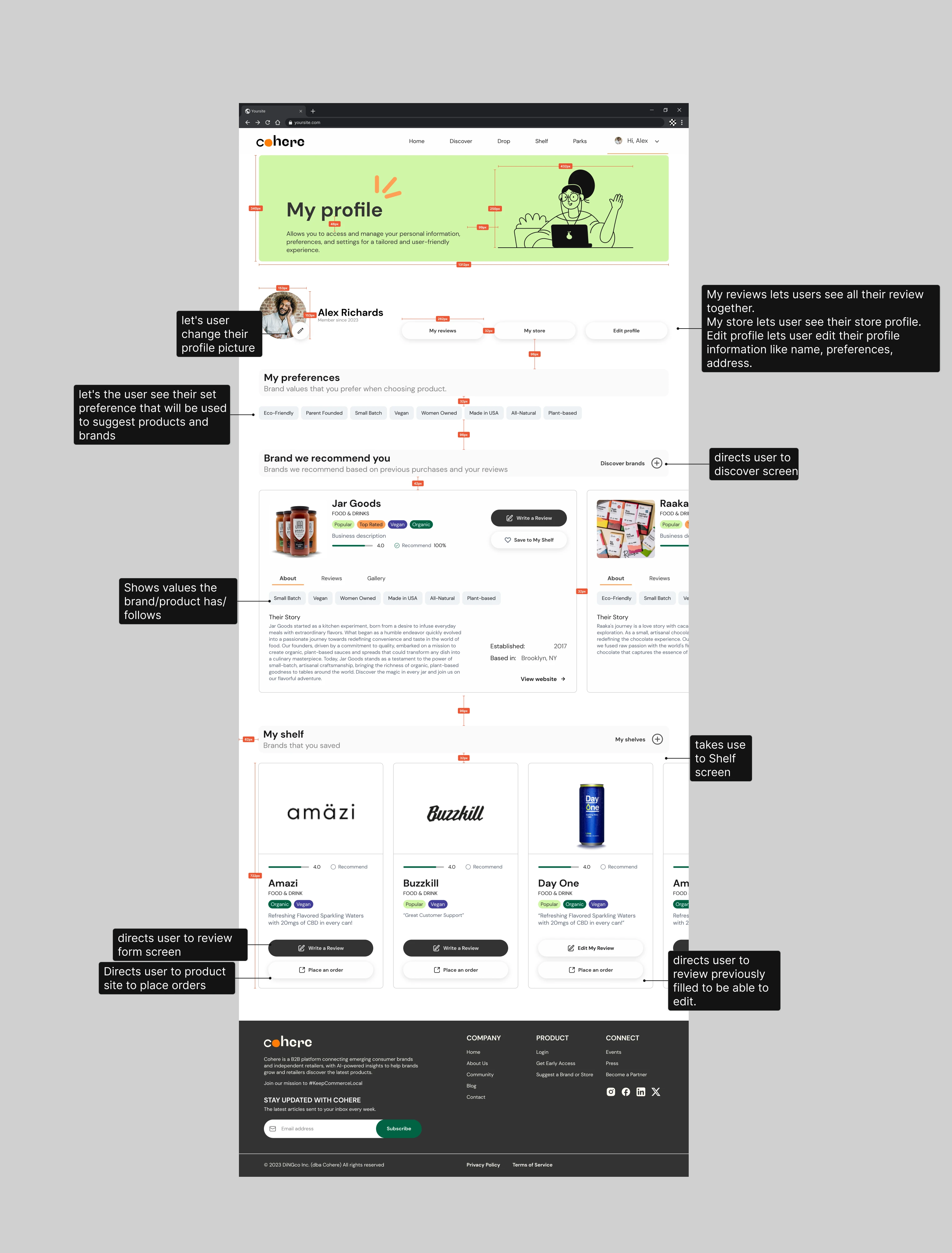
In the High-Fidelity design phase, my primary focus was on crafting the screen for the user flow I had been working on, "As a user (retailer), I want to view and access my shelf," and on the user profile screen. I worked independently, utilizing the chosen UI Iteration from the Discovery screen and the style guide as my guiding references.
Some of the element I played areound and iterate during this phase where:
Rating system: We discussed as a group and with the client different options of how to represent the rating system. We started with a 5 stars icon, but quickly moved to change the stars for circles for a more modern look. After that with the client input we decided to change the rating to a line for a cleaner look, Showing the rating as a number for clear understanding.
Header: We decided the header on the Discover page was great for highlighting a product, but on the shelf and profile as these are more of a space for the user to organize information and lists I decided the best use was to inform the user what can they use this space for.
By this stage, I had already developed low and medium-fidelity versions of the screens. Elevating them to a high-fidelity stage required several iterations, involving the exploration of different ways to organize the components. The goal was to create an intuitive experience that is also aesthetically pleasing.
Developer Handoff
The final phase of our project involved preparing our work for handoff to the developers. While I primarily worked on my screens independently, I maintained open communication with my team throughout the project. We leveraged each other's expertise to ensure the highest quality final product possible.
Screen design displayed in a mockup
Reflection
This project evolved through several iterations and phases until we effectively delivered Cohere a web community that aligns with their goals. Every component of our final product was thoughtfully designed for a specific purpose.
As I end this project, I'm reminded of the iterative nature of design and its demand for adaptability. Simplicity and clarity in design are potent tools for enhancing user experiences. Leading the team reinforced the values of organization and collaboration, while also highlighting the importance of continuous improvement and openness to feedback. This experience enriched my skill set and will undoubtedly shape my future design work, inspiring user-centered solutions that harmonize with clients' visions and objectives..
Thank you for reading my case study!
Like this project
Posted Apr 21, 2024
UX/UI Designer leveraging my experience in graphic design to create usable and intuitive digital products.
Likes
0
Views
8