New Visual Identity for a Premium Carpenter Brand
Redesigning the Visual Identity for the Premium 'Jonas Wild Holzkonzepte'
Challenges
Jonas Wild’s previous logo and branding no longer reflected his identity as an independent craftsman after parting ways with his former business partner. The old design was functional but lacked the premium, personalized, and modern feel Jonas wanted to convey. As a high-end carpenter specializing in custom interior solutions, Jonas needed a visual identity that showcased his meticulous craftsmanship, innovative use of technology, and commitment to quality. The challenge was to create a brand that bridged the gap between premium aesthetics and the warmth of traditional woodworking.
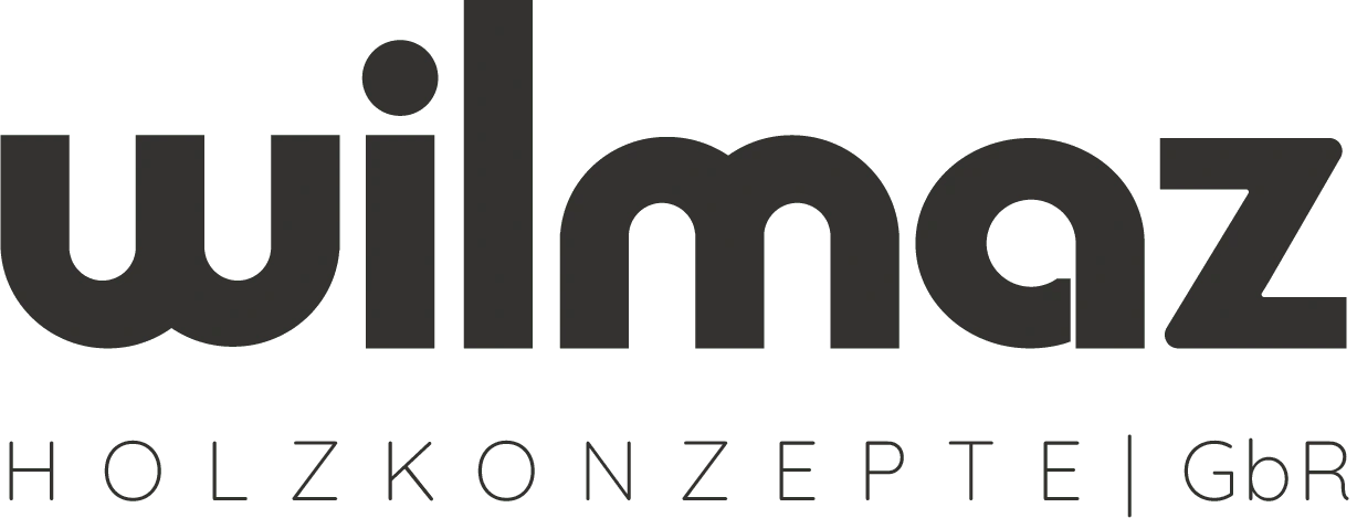
Jonas Wild contacted me to redesign his entire visual identity after changing his business name. The old logo did not represent who he wanted to be seen as and what he offers.
Approach
I began with an in-depth discovery process to understand Jonas’ vision, target audience, and brand values. Inspired by his dedication to precision and the natural materials he works with, I developed a visual identity that balances craftsmanship and modernity. The logo’s “W” design subtly references a saw blade, connecting to his woodworking expertise. A harmonious color palette of muted greens and earthy tones evokes nature and sustainability, while clean typography ensures a modern, approachable feel. The brand suite was designed to be versatile, working seamlessly across print and digital media.
\The Logo: From Concept to Final Version
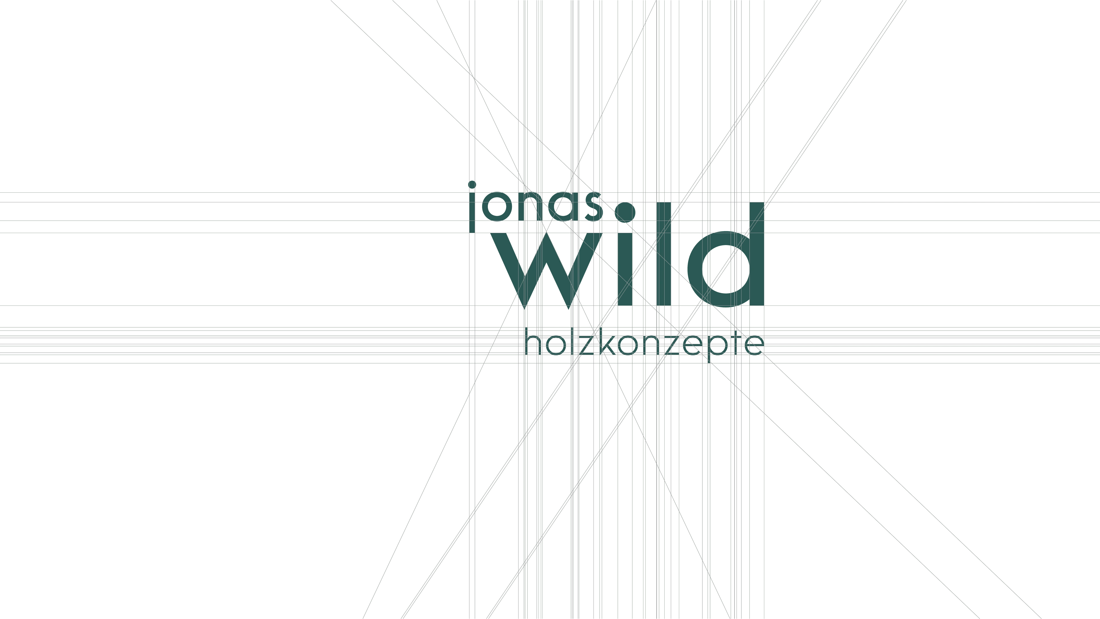
Technical structure of the logo
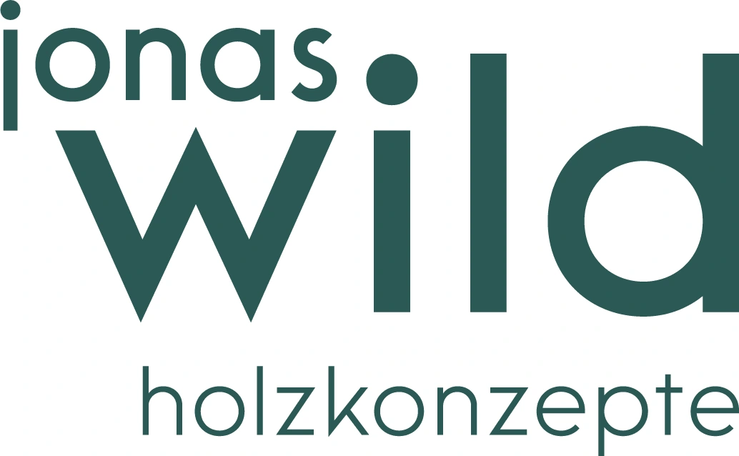
The wordmark ‘jonas wild’ uses a modern typeface in which both ‘jonas’ and ‘wild’ are set in lowercase letters, but are differentiated by different font sizes. This creates a balanced hierarchy, with ‘wild’ standing out as the central focus, while the overall design remains harmonious and appealing. The consistent use of lowercase letters conveys a modern, friendly appearance that radiates both openness and strength - in keeping with the brand's ethos. The tagline ‘holzkonzepte’ appears in a smaller font size under the brand name, emphasizing the company's expertise in woodworking. The reduced size ensures that the tagline does not dominate the main logo, but still clearly conveys the company's focus on high-quality and innovative wood solutions.
The Logo Versatility

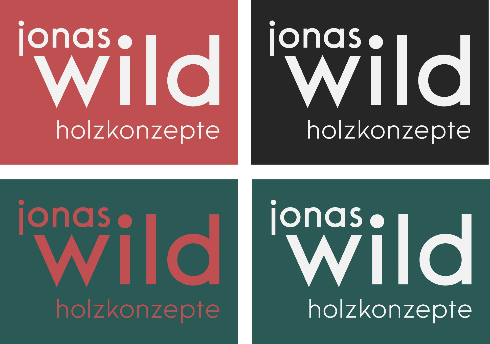
When the Wild logo is placed on a dark background, a lighter version of the logo using the colours from the brand palette will ensure that the logo stands out clearly and retains its legibility and visual integrity. On lighter backgrounds, using the darker colours from the palette should ensure that the logo retains a strong and prominent presence. This approach allows the Wild logo to remain adaptable in different media and contexts while maintaining a coherent brand identity. By using the colour palette harmoniously, we create a distinctive and versatile brand mark that ensures the Wild logo remains recognisable and effective in any environment.

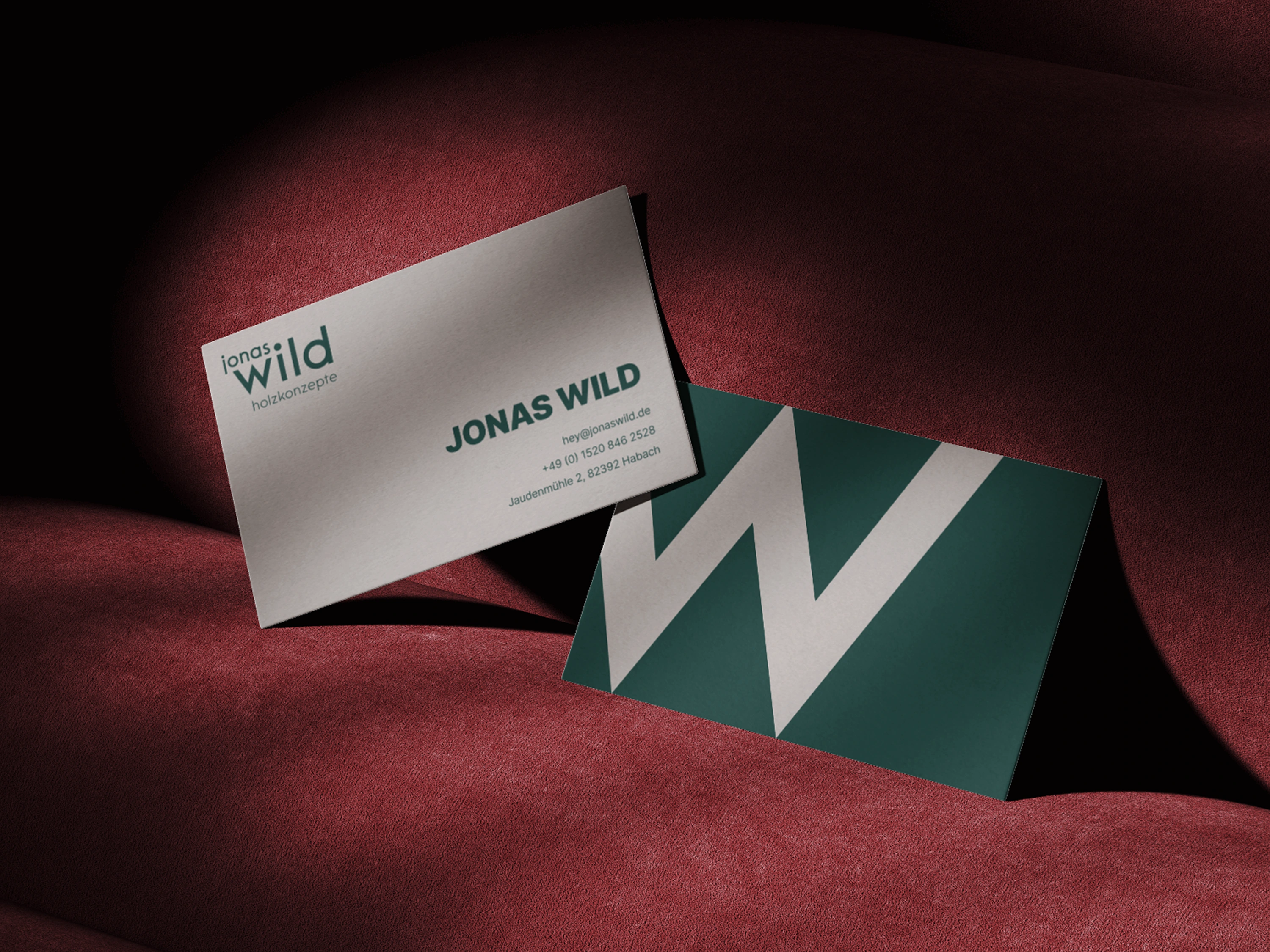
The ‘W’ in the logo design is a reduced representation of the brand name ‘Jonas Wild’ and at the same time carries a deeper symbolism that reflects the company's focus on carpentry and craftsmanship. The sharp angles and geometric structure of the ‘W’ are subtly reminiscent of the shape of a saw blade, referencing the tools and precision craftsmanship that are central to woodworking. This design links the logo to the world of carpentry and emphasises the brand's commitment to the highest quality and attention to detail.
The Identity in Use
Brand Colours

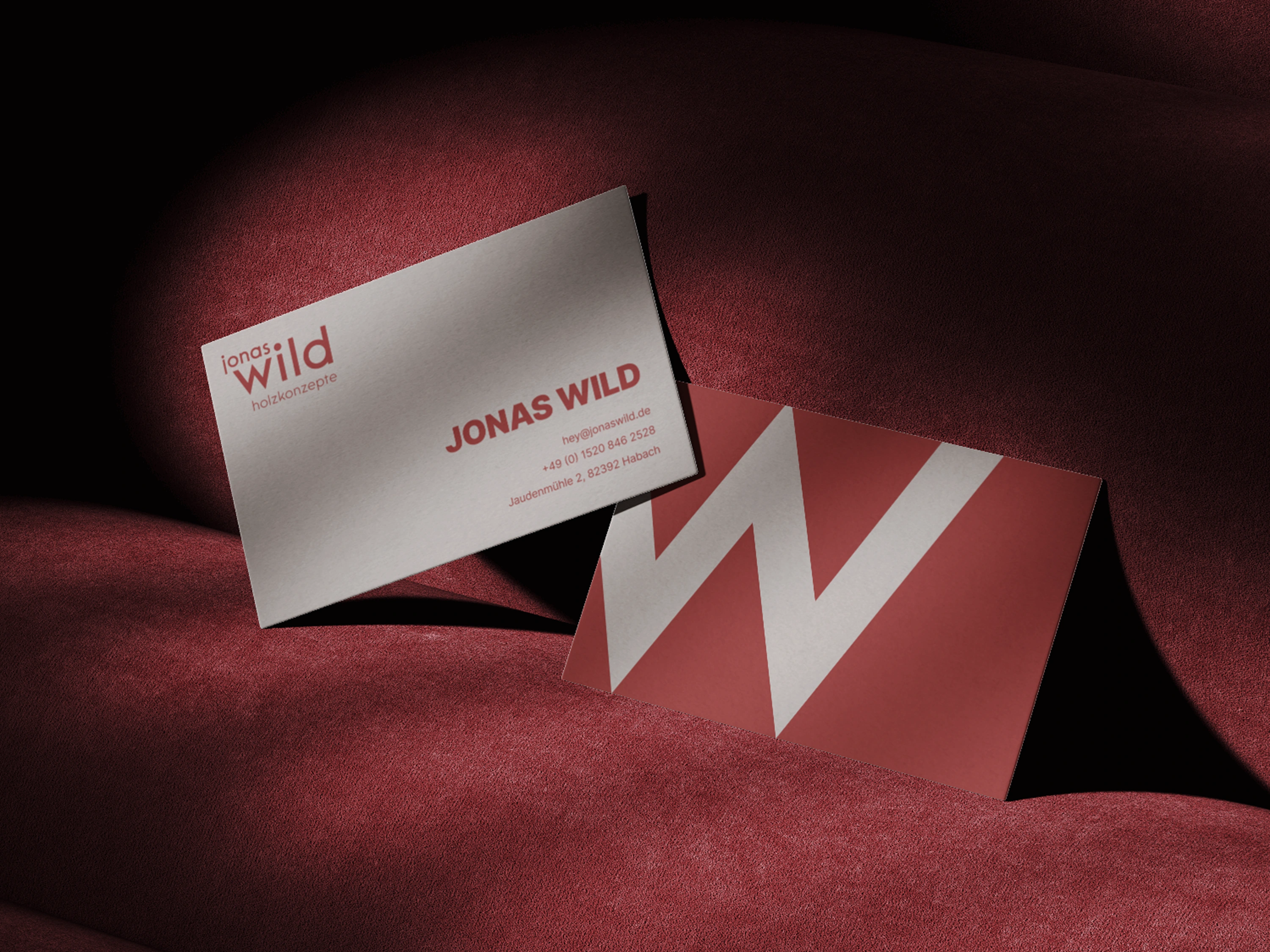
The strong contrasts between black and white are balanced by muted, earthy tones such as turquoise and reddish brown, resulting in a harmonious and modern aesthetic. This colour palette is particularly suitable for designs that need to convey professionalism, sophistication and a warm, inviting atmosphere at the same time.
The Typography
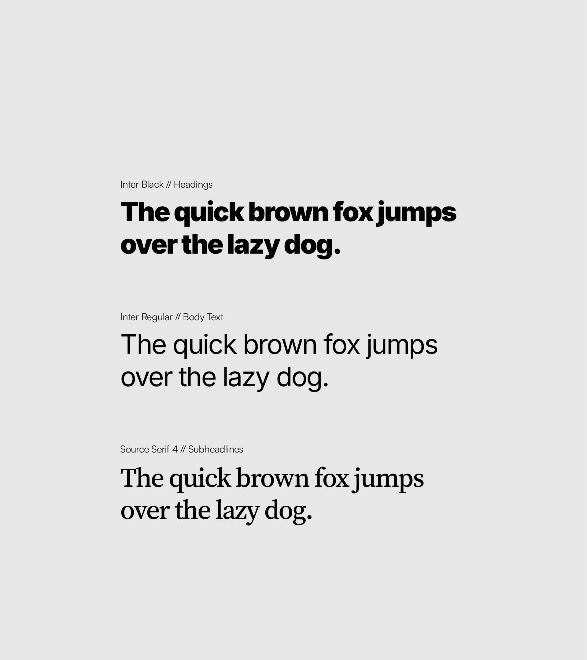
A font combination of Inter Black, Inter Regular and Source Serif 4 was chosen for the Jonas Wild brand, combining professionalism, modernity and legibility. Inter Black ensures strong, easy-to-read headlines, while Inter Regular impresses with its clarity and modern look in body text. Source Serif 4 complements the design as a serif font for subheadlines and creates an elegant contrast to the Inter font. This combination emphasises the brand's craftsmanship and design-oriented concept.
Project duration
4 weeks for logo design & visual identity
Outcome
The new branding and logo perfectly reflect Jonas Wild Holzkonzepte’s values: precision, premium quality, and a personal touch. The visual identity has elevated Jonas’ business, presenting him as a craftsman who combines tradition with innovation. The cohesive brand elements communicate professionalism and trust, helping Jonas stand out in a competitive market. Clients now see not just a carpenter but a design-oriented artisan capable of creating unique, long-lasting interior solutions.
Like this project
Posted Jan 18, 2025
Inspired by the client's dedication to precision and the use of natural materials, I developed a visual identity that balances craftsmanship and modernity.

