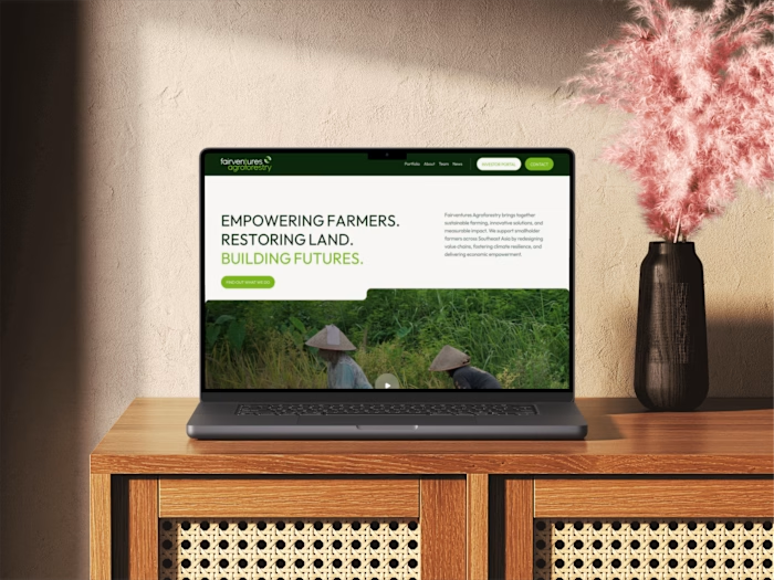
Logo Design & Visual Identity for Social Enterprise
Redesigning the Visual Identity for the Mission-Driven Social Enterprise 'Fairventures Agroforestry'
Challenges
Fairventures’ existing website and branding no longer aligned with their evolved mission. As the organization shifted its focus from reforesting degraded land in Indonesia to empowering smallholder farmers across Southeast Asia, their digital presence lacked the modernity and narrative clarity needed to reflect their new business model. The challenge was to create a professional, yet approachable, identity that resonates with their target audience and highlights their impactful work in sustainable agroforestry.

The brand's old logo felt too corporate and didn't reflect the company's values and mission.
Approach
I took a holistic approach to this redesign project, starting with an in-depth understanding of Fairventures' mission, values, and goals. The new visual identity combines modern, professional aesthetics with natural, earthy elements inspired by Southeast Asia’s vibrant landscapes. I designed a logo that symbolizes growth, sustainability, and Fairventures' connection to local communities.
The Logo: From Concept to Final Version
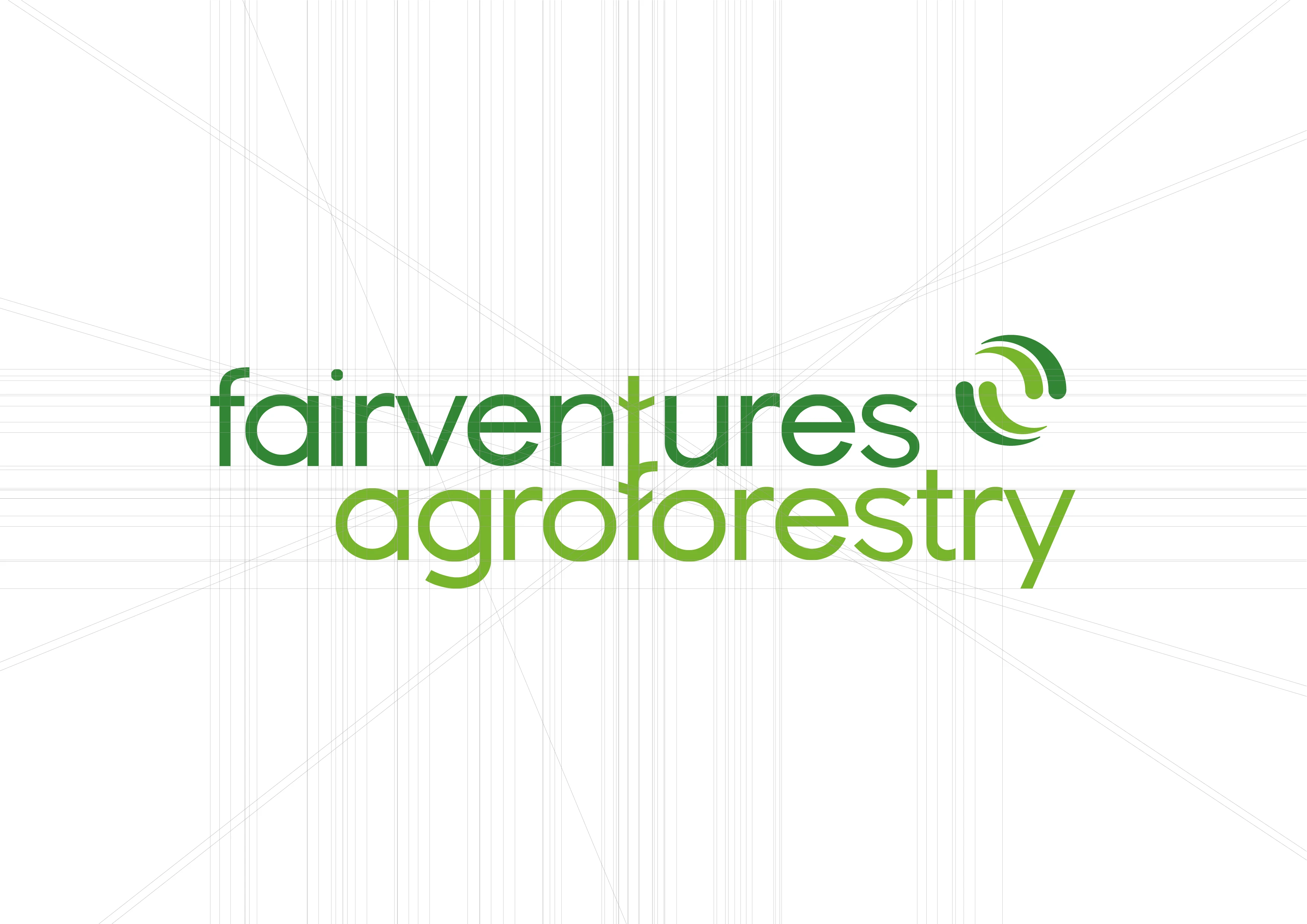
Technical structure of the logo

The new Fairventures Agroforestry logo
The Logo Versatility
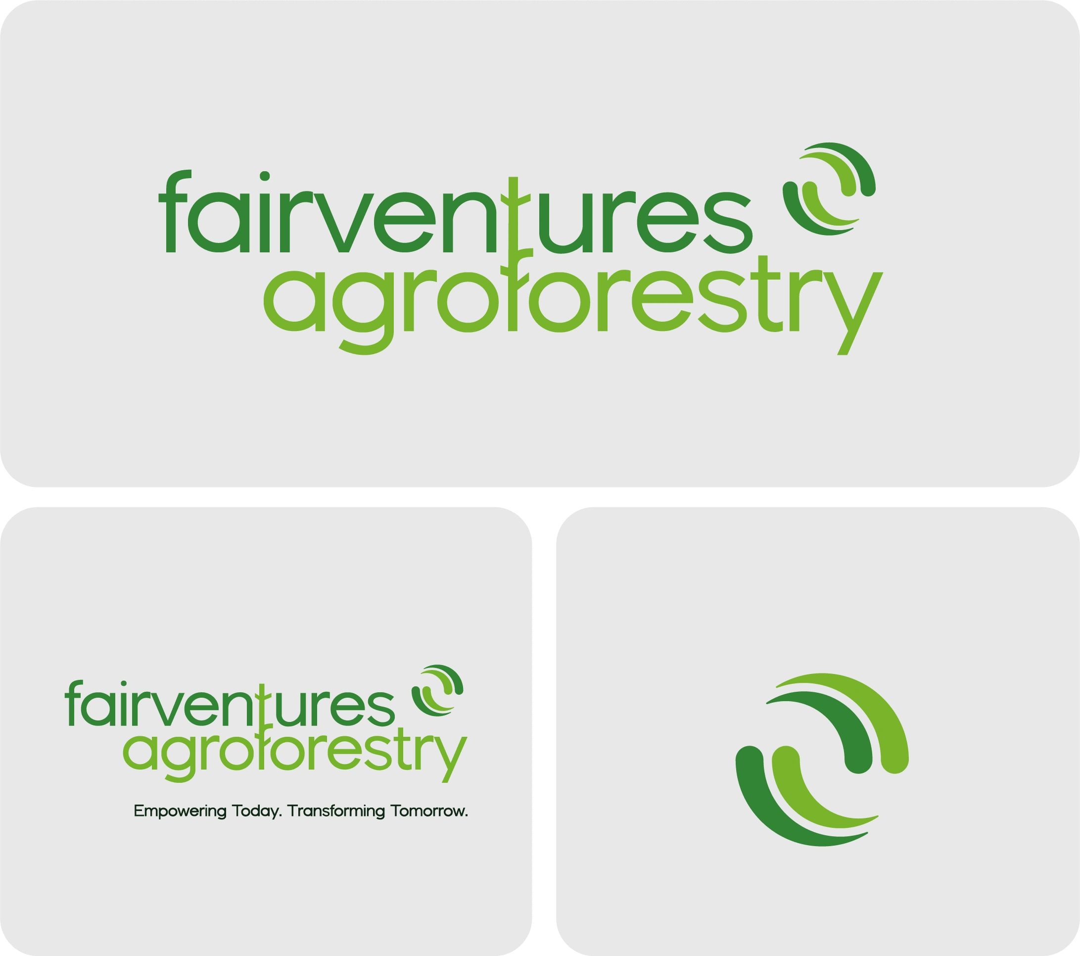
The logo suite ensures responsiveness and versatility
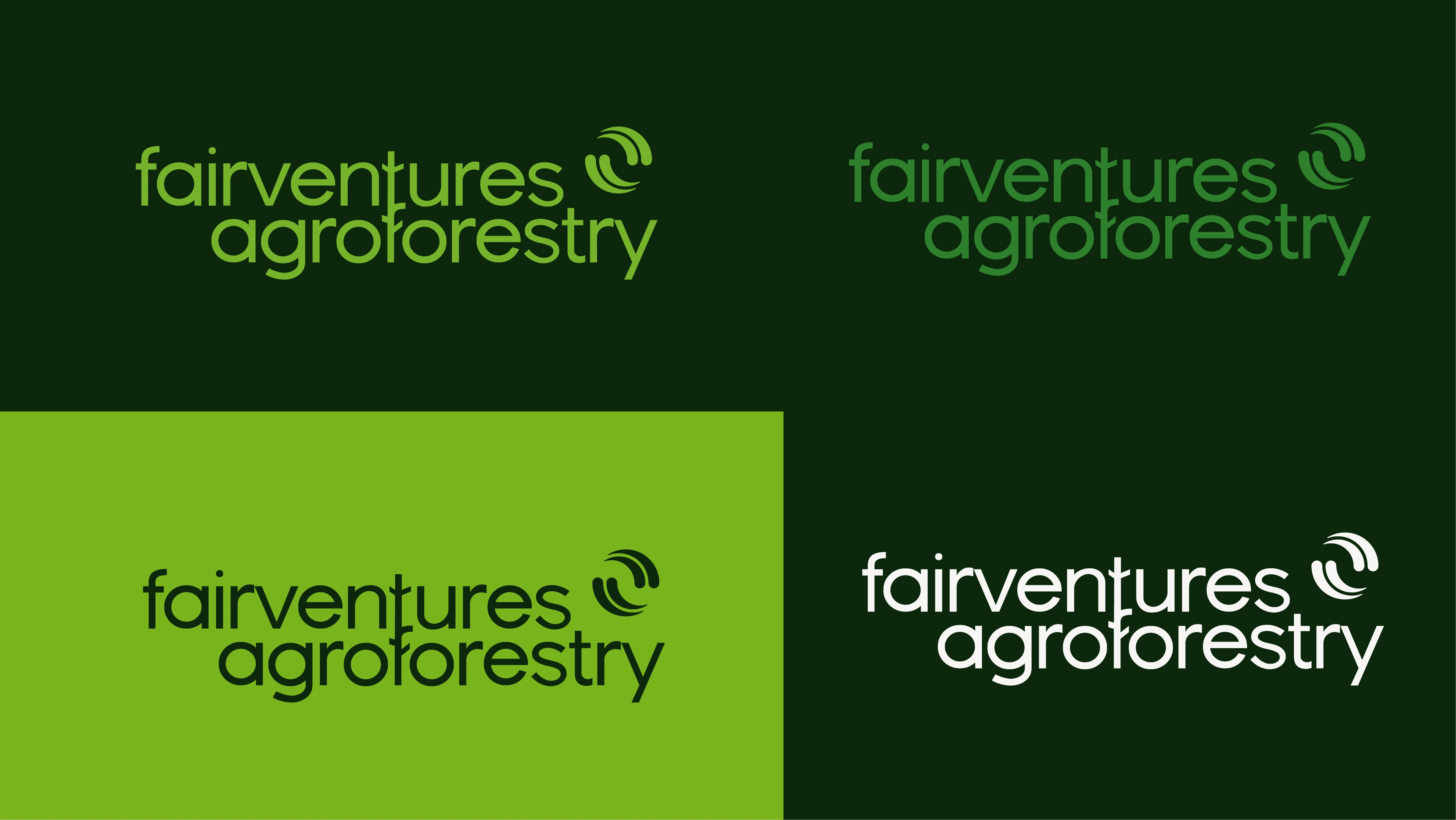
The various colour options allow the brand to use their new logo in various situations without breaking the identity.
Brand Colours
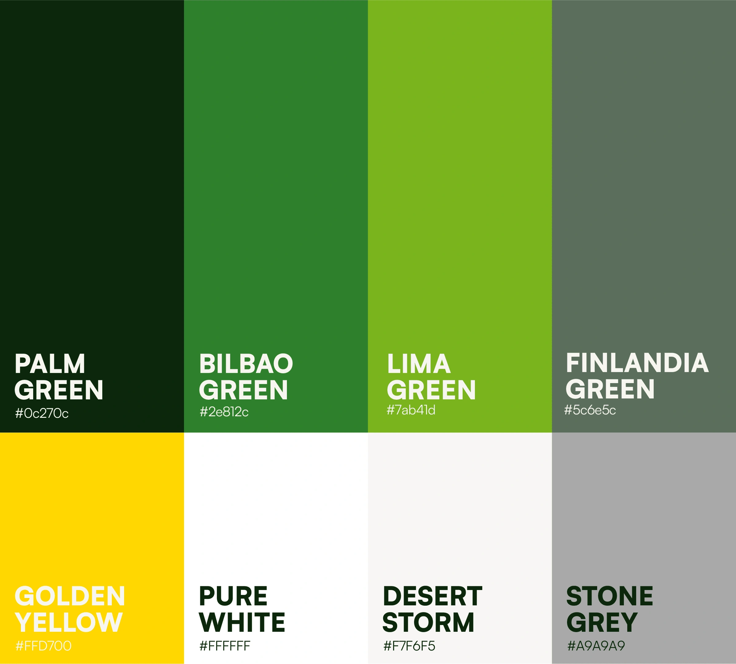
The Colours for Fairventures Agroforestry are all inspired by natural, earthy tones that can be found in their project area in Indonesia and across all of Southeast Asia. The dark green jungle, bright and saturated green leaves as well as the golden sun.
The Typography

The Google Font 'Outfit' was chosen as the new corporate font for the brand. It perfectly complements the logo and creates a cohesive visual identity. This font integrates seamlessly with Google's services, ensuring consistency across digital platforms while standing out from standard options. Its clean, balanced design reflects Fairventures' innovative, forward-thinking approach and reinforces the brand's authority in the agroforestry sector.
Project duration
3 weeks for logo design & visual identity
Outcome
The result is a cohesive brand identity that clearly communicates Fairventures' mission and impact. The redesigned logo and visual identity now encapsulate the organization’s core values, while the website engages stakeholders, partners, and funders effectively. By connecting visually to Southeast Asia, the brand and website convey authenticity and trust, empowering Fairventures to amplify its message and drive its mission forward.
Visit the website project here
Like this project
Posted Dec 18, 2024
I took a holistic approach to this redesign project, starting with an in-depth understanding of Fairventures' mission, values, and goals.

