Barca Edutech: Improved Mobile Learning UX for Student Retention
Jesutofunmi Oluwalade
🔍 Project Overview
Barca Edutech is a mobile-first learning platform designed to help students preparing for international exams (like SAT, IELTS, GRE) study effectively and track their progress. The goal was to create an intuitive, distraction-free experience that encourages retention and builds confidence.
🧠 Problem Statement
Students often struggle with consistency and motivation when studying independently for high-stakes exams. Existing platforms are cluttered, lack personalization, and fail to provide actionable feedback.
🔬 Research & Insights
Conducted interviews with 12 students across Nigeria, Ghana, and Kenya
Key pain points: lack of structure, poor mobile responsiveness, and no feedback loop
Competitive audit of Duolingo, Magoosh, and Khan Academy
🎯 Goals
Simplify the learning interface for mobile users
Improve retention through progress tracking and gamification
Build trust with clear UX patterns and responsive design
Create a scalable design system for future modules
🧩 UX Strategy
Modular Learning Paths: Students choose topics and get bite-sized lessons
Progress Tracker: Visual dashboard with streaks, scores, and reminders
Minimal UI: Focused on clarity, contrast, and accessibility
Gamified Feedback: Encouraging messages
👥 Team & Role
Collaborated with:
Oyun Adetomiwa – UX Research
Babalola Emmanuel – UI Design
Oluwadunsin Bridget – Content Strategy
Oluwatobi Ilawole – Frontend Dev My role: Lead UX Designer – responsible for wireframes, user flows, and prototyping in Figma.
COMPETITIVE ANALYSIS
To understand competitors strengths and weaknesses in comparison to Barca and to find a gap in the market. We conducted a competitive analysis to identify what competitors are doing right and identify areas of opportunities in the marketplace and test out new marketing strategies they haven’t taken advantages of.
OPPORTUNITIES FOR BARCA
Enhanced personalization by offering tailored study plans according to students strengths and weaknesses
Social and collaborative features to create a sense of community and facilitate knowledge sharing
Seamless cross-platform experience including offline access allowing users access resources conveniently at any time
Advanced analytics & progress tracking
Interactive learning tools to make learning more engaging
USER PERSONAS & EMPATHY MAPS
Following our user interviews, we compiled all the responses gotten to create user personas that enabled us foster empathy with our users and helped us get a better understanding of their goals & objectives .
We came up with two comprehensive persona that shared the attributes and requirements of the target users.
USERFLOW & INFORMATION ARCHITECTURE
This user flow shows the step and processes a user take from the authentication screen down to where he can register for his preferred course, watch tutorials and engage himself in doing assessment for every subjects
Userflow
This information architecture represents the organization, and arrangement of information within the app to facilitate efficient and intuitive access to relevant content for users preparing for exams. It involves the thoughtful design and categorization of information, ensuring that it is logically organized, easy to navigate, and supports users in finding the materials they need to study effectively.
DESIGN SYSTEM

High Fidelity Mockups
VISUAL DESIGNS & MOCKUPS
Onboarding Screens
INFORMATIVE onboarding screens that introduce the users into the application
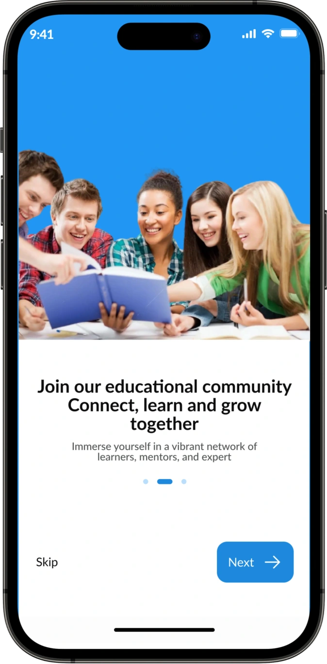
One of the onboarding screens
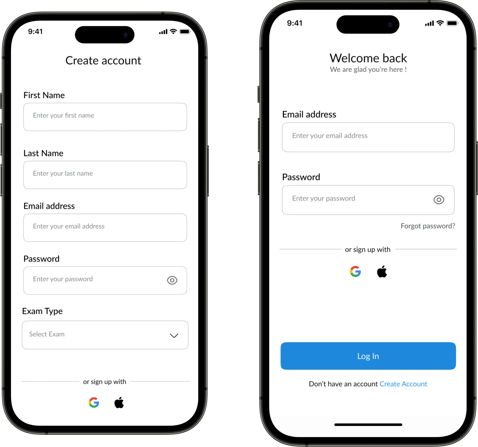
Login & Signup
Simplified registration form only asking for essential information.
Social media login options to allow users to sign up quickly.
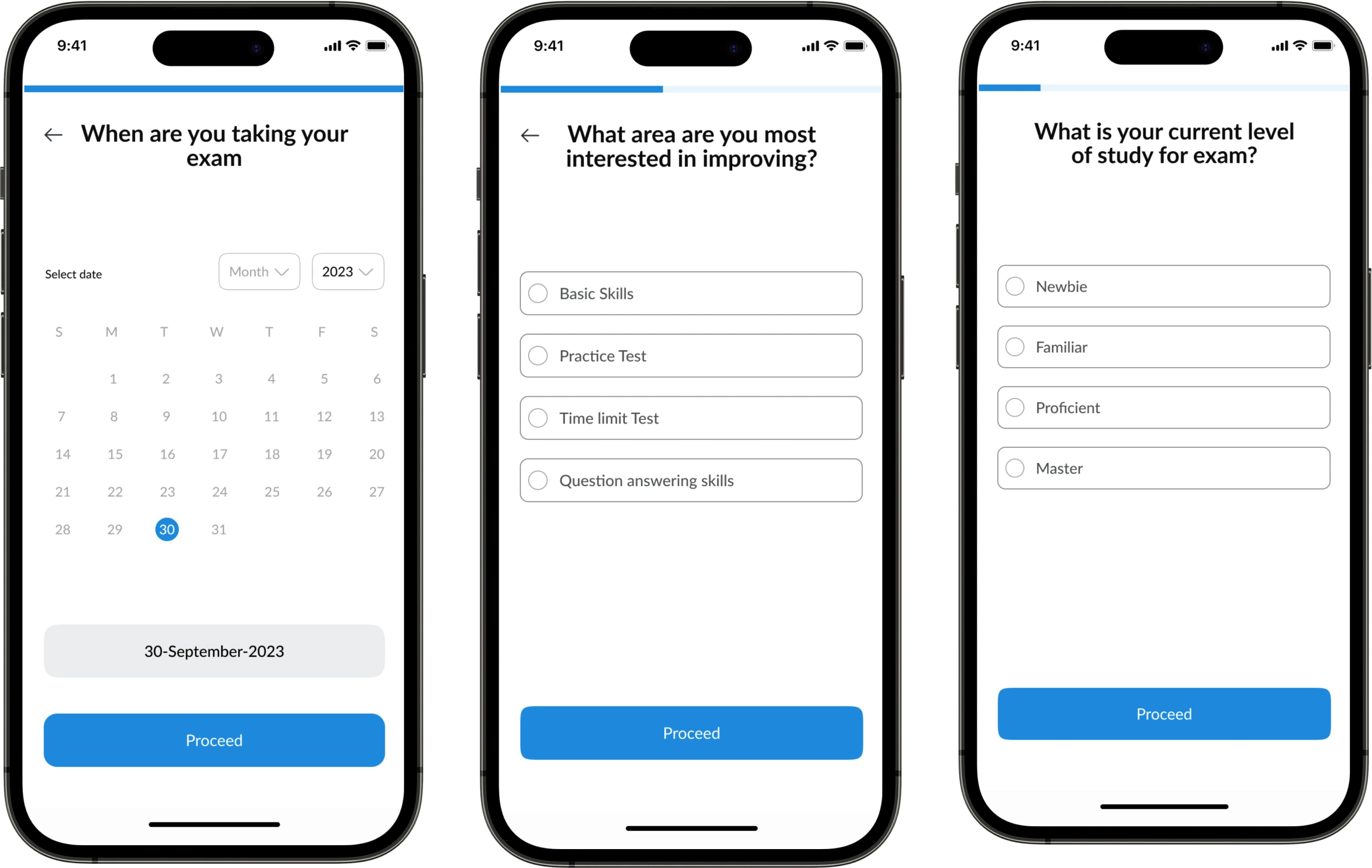
Other Onboarding process
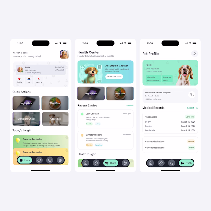
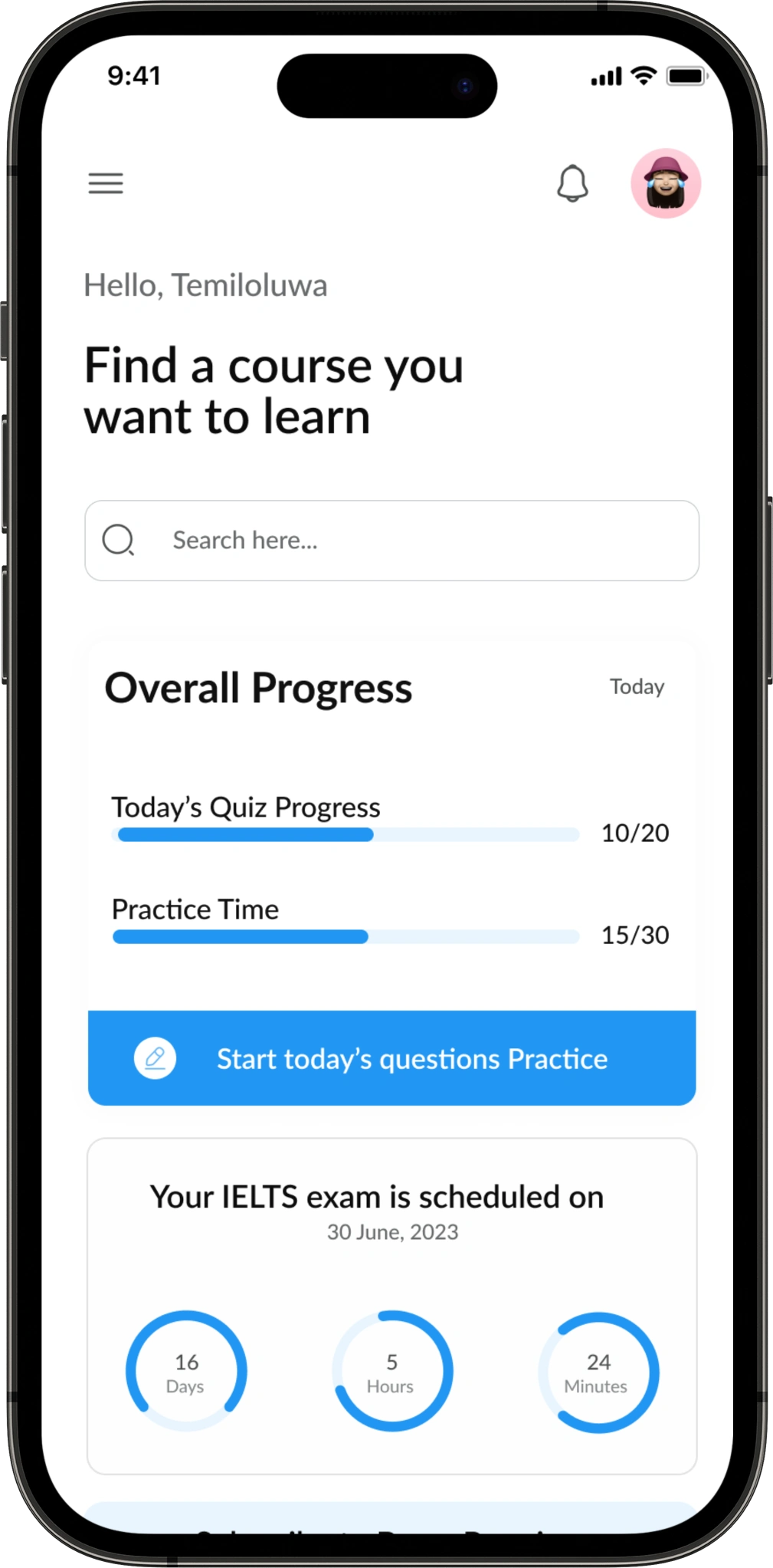
Home Screen
The home screen of the app presents essential features that users rely on daily. These include a user friendly search bar, enabling users to easily find courses. Additionally, there is a progress tracker to monitor their advancement, along with an exam date reminder to ensure they stay prepared.
Navigation/Menu Bar
Navigation side bar to display expanded menu options for users to easily navigate through different sections and features within the app.
COURSES & CURRICULUM
Other Screens & Website
📱 Final Design Highlights
Clean onboarding flow with personalized goal setting
Dashboard showing daily progress, upcoming lessons, and motivational nudges
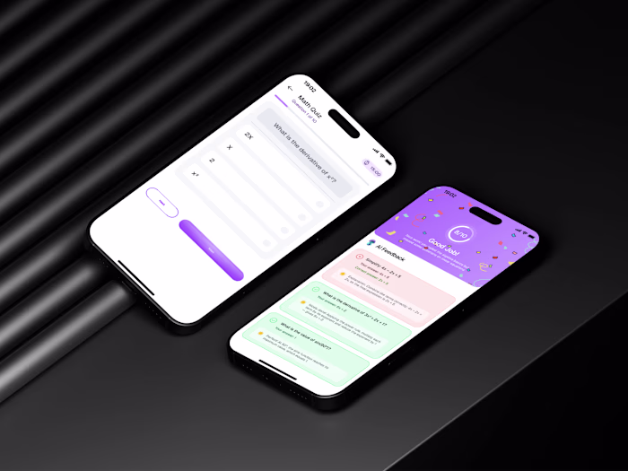
Quiz module with instant feedback and explanations
Adaptive layout for low-bandwidth devices
💬 Reflection
This project taught me the power of simplicity in mobile UX. Designing for real constraints—like low data plans and small screens—forced us to prioritize what truly matters. I’m proud of the impact we made and excited to keep building tools that empower learners.
🔗 View Full Case Study
Like this project
Posted Oct 2, 2025
Conducted a full UX case study for Edutech, redesigning their mobile learning app to boost engagement & retention through intuitive flows and improved usability
Likes
1
Views
3
Timeline
Jun 2, 2022 - Jun 17, 2022
Clients
BARCA