Blemish babes Skincare Website.

Maham Vohra
Verified


Skincare Site on Webflow
Webflow was the platform choice because the client's team needed to manage content independently without developer support for every update. The CMS capabilities combined with design flexibility made it the right fit.
💡 The Challenge
The skincare market is saturated. Every brand claims to be "clean," "natural," and "science-backed." The challenge wasn't just building a beautiful website. It was creating a digital experience that communicated what actually made this brand different without relying on the same tired industry language.
Specific challenges:
Differentiating in a crowded market where every competitor looks similar
Translating a tactile, sensory product experience into a digital format
Building trust with first-time visitors who can't touch or smell the products
Creating a CMS structure flexible enough for the client's content team
Achieving sub-2-second load times despite heavy use of product photography
Ensuring accessibility compliance (WCAG 2.1 AA) across all pages
🔍 Research & Discovery
I audited 15 competitor websites across three tiers: luxury skincare, mid-range DTC brands, and emerging indie labels. The patterns were clear. Most skincare sites fall into two camps: either overly clinical (white backgrounds, microscope imagery, ingredient lists) or overly lifestyle (models in bathrobes, soft focus everything).
The opportunity was in the middle. A site that felt premium and editorial without being cold, and warm and approachable without being generic.
I also conducted user interviews with 8 existing customers to understand their purchase decision process. The key insight: ingredient transparency was the #1 trust signal, but most sites buried it 3 clicks deep. We made it a first-scroll priority.
🎨 Creative Process
The design started with mood boarding and art direction. I pulled references from fashion editorial, architectural photography, and Japanese packaging design. The common thread was restraint: letting negative space do the heavy lifting.
I developed 2 concept directions:
Editorial Luxe: Magazine-style layouts with large typography and full-bleed photography
Minimal Science: Grid-based, data-forward, with ingredient breakdowns as visual centerpieces
The client chose a hybrid. The homepage and brand pages leaned editorial, while product pages incorporated the scientific transparency of the second direction.
Typography was a serif/sans-serif pairing: a refined serif for headlines that conveyed heritage and quality, paired with a clean geometric sans for body text and UI elements. The color palette was built around the product packaging: warm neutrals with a single accent color pulled from their hero product.
📐 Layout & Interaction Design
Every page was designed with scroll behavior in mind. Webflow's interaction capabilities allowed for subtle but impactful animations:
Product images that parallax slightly on scroll
Ingredient lists that reveal on hover with sourcing details
A sticky navigation that transforms from transparent to solid as users scroll
Page transitions that feel smooth without being slow
The product page layout was the most iterated element. We tested 6 different configurations before landing on a split-screen approach: product imagery on the left (with a zoom interaction), and purchase details on the right with ingredient transparency built directly into the buy flow.
🔧 Technical Build
The Webflow build prioritized performance and maintainability:
Platform: Webflow with CMS
Performance: 96 Lighthouse score on desktop, 91 on mobile
CMS Collections: Products, Ingredients, Blog Posts, Press Mentions, FAQs
Animations: Native Webflow interactions (no external JS libraries)
Forms: Custom contact and wholesale inquiry forms with conditional logic
Integrations: Klaviyo for email capture, Google Analytics 4, Meta Pixel
The CMS architecture was designed so the client's team could add new products, publish blog posts, and update homepage featured sections without touching any code. I created a 6-page CMS guide with screenshots for every common task.
📦 Key Deliverables
Fully responsive Webflow website (14 unique page templates)
CMS structure with 5 collections and relational fields
Complete Figma design system (36 components)
Animation system (12 custom interactions)
SEO foundation (meta tags, Open Graph, structured data for products)
CMS training documentation (6 pages with video walkthroughs)
Performance optimization (image compression pipeline, lazy loading, font subsetting)
📊 Results & Impact
The site launched alongside a PR push and influencer campaign. The digital experience became the centerpiece of the brand's growth strategy.
First 60 days post-launch:
Average session duration: 4 minutes 12 seconds (industry average is 1:45)
Bounce rate: 28% (industry average is 47%)
Product page to cart rate: 12.4%
Mobile traffic: 71% of total visits, with a 3.1% conversion rate
Email capture rate: 8.7% (via exit-intent and inline signup forms)
Page load time: 1.6 seconds average across all pages
The client's wholesale inquiries also increased 340% in the first quarter, driven largely by the dedicated wholesale landing page and the overall brand credibility the site established.
🧠 Key Takeaways
Skincare websites live or die on trust. The biggest design lever wasn't the hero animation or the product photography (though both mattered). It was making ingredient information immediately accessible and beautifully presented. When you treat transparency as a design feature rather than a compliance checkbox, it changes how visitors perceive the entire brand.
The Webflow CMS architecture was equally important. A beautiful site that the client can't update independently becomes a bottleneck within months. Building the CMS thoughtfully upfront saved the client thousands in ongoing developer costs.

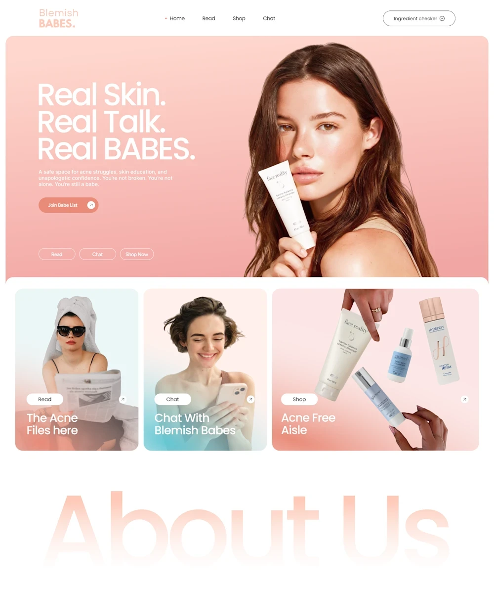
Bleamish babes homepage
✨ Blemish Babes — Designing a Fresh, Confident & Conversion-Focused Skincare Experience
🌸 Project Overview
Blemish Babes is a modern skincare e-commerce experience designed around a simple but powerful idea: real skin, real conversations, and real confidence.
The goal of this project was to create a website that feels completely different from the typical clinical skincare store.
Instead of relying on overly medical visuals, sterile layouts, or generic product photography, I developed a warm, editorial-inspired digital experience that combines beauty, authenticity, education, community, and e-commerce into one cohesive interface.
The design uses a soft peach and coral color palette, large editorial typography, authentic skincare photography, rounded UI components, and carefully structured content sections to create a website that feels approachable and contemporary.
The result is a skincare website that feels less like a traditional online store and more like a digital beauty community. 💕
🎯 The Challenge
Skincare is an incredibly visual industry, but creating a successful skincare website requires more than simply displaying beautiful products.
Customers want to understand:
✨ What the product does
🧴 Whether it is right for their skin
💬 What other people experience
🔍 What ingredients are included
🛒 How they can purchase it
❤️ Whether they can trust the brand
The challenge was therefore to design an experience that could communicate trust and credibility while still feeling young, friendly, human, and visually exciting.
I wanted the website to feel like a place where someone could learn about their skin, discover products, interact with the brand, and ultimately feel comfortable making a purchase.
🌷 Creating a Distinctive Visual Identity
The first impression is intentionally soft, warm, and welcoming.
The peach-toned hero section immediately establishes the visual personality of the brand.
Large typography introduces the central message:
“Real Skin.
Real Talk.
Real BABES.”
This statement sets the tone for the entire experience.
It communicates that Blemish Babes isn't trying to hide imperfections or present unrealistic beauty standards.
Instead, the brand celebrates real skin and real experiences.
That positioning becomes a major part of the website's storytelling.
🎨 A Soft, Contemporary Color Palette
The color system is one of the most recognizable aspects of the design.
The primary peach/coral tone creates a warm and feminine atmosphere without becoming overly traditional or childish.
Soft neutral backgrounds provide breathing room, while subtle accent colors help differentiate individual sections.
The palette allows the product photography and human imagery to remain the visual focus.
The overall combination creates a feeling that is:
Warm → Friendly → Fresh → Playful → Premium
This balance was important because the website needed to appeal to a beauty-conscious audience while still maintaining a polished e-commerce appearance.
👩🦰 Real People, Real Skin
Photography plays a major role in the storytelling.
Rather than relying exclusively on perfectly retouched beauty imagery, the website incorporates close-up skin photography, acne-related imagery, and authentic portraits.
This creates an important emotional connection with the audience.
The website doesn't simply say that the brand understands skincare.
It shows real skin.
The photography therefore becomes part of the brand message rather than simply decorative content.
This approach helps reinforce the central philosophy behind Blemish Babes:
❤️ Skin doesn't have to be perfect to be beautiful.
🧭 Designing the Homepage Journey
The homepage is structured as a carefully planned visual journey.
Instead of immediately overwhelming visitors with products, the page gradually introduces the brand.
The experience moves through:
Hero → Content Discovery → About the Brand → Personal Story → Product Shopping → Community → Newsletter → Social Proof → Footer
This structure gives the visitor multiple opportunities to understand the brand before making a purchasing decision.
Each section has a clear purpose.
🏠 The Hero Section
The hero section immediately communicates the brand's personality.
The large headline creates an emotional hook while the supporting copy provides context.
A prominent product image reinforces the commercial purpose of the page, while the surrounding interface keeps the composition clean and easy to understand.
The primary CTA encourages visitors to begin exploring the brand.
Below the hero, smaller content cards introduce different pathways into the experience, including:
🧴 Products
💬 Conversations
📖 Educational content
This allows different types of visitors to find their preferred entry point.
💬 Turning Content Into Conversation
One of the most interesting parts of the design is the emphasis on conversation.
The “Chat With Blemish Babes” section gives the website a more human personality.
Instead of positioning the brand purely as a product seller, the design presents it as a place where people can discuss skincare and their experiences.
This helps move the brand from:
“Buy our skincare.”
to:
“Let's talk about your skin.”
That distinction is important for building a memorable beauty brand.
👩 “Hi, I'm Tiffany.”
The About section introduces a personal story through the “Hi, I'm Tiffany.” content block.
This creates a human face behind the brand.
The combination of portrait photography, personal messaging, and supporting skincare imagery makes the section feel much more authentic than a conventional corporate About Us page.
The visitor isn't simply learning what the company does.
They're learning why the company exists.
That emotional storytelling helps establish trust before visitors reach the shopping sections.
🔍 “So Like, Why?”
This section expands on the brand's philosophy.
The conversational headline is intentionally informal and friendly.
Rather than using corporate language, the website speaks directly to the audience in a tone that feels natural.
This creates a brand voice that feels more like a friend giving skincare advice than a traditional beauty company delivering a marketing message.
The visual composition also combines skin photography with supporting content, creating a balance between education and visual storytelling.
🛍️ Creating a Better Shopping Experience
The “Why Shop With Us?” section acts as a bridge between storytelling and e-commerce.
The product area is presented through clean cards with clear product imagery, product names, pricing, and shopping actions.
This keeps the interface familiar and easy to navigate.
The product grid avoids unnecessary visual complexity so visitors can quickly scan the available products.
The use of generous white space also gives each product enough room to breathe.
This is particularly important in skincare e-commerce, where product packaging and visual details can influence purchasing decisions.
🧴 Product Presentation
Product photography is treated as an important part of the user experience.
Products are shown against clean backgrounds, allowing their packaging to remain clear and recognizable.
The product cards provide a consistent structure so that users can quickly compare different items.
This creates a smoother shopping experience and reduces unnecessary friction between discovery and purchase.
The visual system can also be easily expanded as the product catalog grows.
💌 Building the Community
The “Join the Club, Babe” section introduces another important conversion opportunity.
Instead of simply asking visitors to subscribe to a newsletter, the design frames the signup as joining a community.
That small change in language makes the interaction feel more personal.
The section promises:
✨ Skincare tips
🧴 Product updates
💬 Community conversations
🎁 Exclusive content
This turns email capture from a generic marketing requirement into another part of the brand experience.
📱 Social Media Integration
The “Follow us on Social” section extends the brand beyond the website.
The grid-style photography creates an Instagram-inspired visual experience and reinforces the idea that Blemish Babes is an active community rather than simply an online store.
The imagery focuses heavily on real skin and skincare experiences.
This creates visual consistency between the website and the brand's potential social presence.
It also gives visitors another way to interact with the brand after leaving the website.
🎯 Conversion-Focused Design
Although the design is highly visual, the experience is still built around clear conversion opportunities.
The interface repeatedly provides pathways toward:
Explore → Learn → Shop → Subscribe → Connect
Calls to action are intentionally visible without overwhelming the page.
The user is never forced into a purchase immediately.
Instead, the design allows them to build familiarity and trust before reaching stronger commercial interactions.
This is especially useful for skincare brands because purchasing decisions often depend on education and confidence, not just product appearance.
🧠 UX/UI Strategy
From a UX/UI perspective, the project focuses on creating a balance between content discovery and e-commerce functionality.
The interface uses:
📐 Clear visual hierarchy
🎨 Consistent color language
🧩 Reusable card components
📱 Responsive-friendly layouts
🔘 Distinct CTAs
🖼️ Strong visual storytelling
🛍️ Product-focused sections
💬 Conversational content
Every section contributes to the overall experience instead of existing independently.
📱 Designed With Digital Scalability in Mind
The visual system was created with future growth in mind.
The same design language can be expanded into:
🌐 Product pages
📱 Mobile experiences
🛒 E-commerce flows
💌 Email campaigns
📲 Social media content
🎁 Promotional campaigns
🧴 Product launches
📚 Skincare education pages
This means the website isn't simply a single homepage design.
It establishes a foundation for an entire digital brand ecosystem.
✨ The Final Experience
The final Blemish Babes website combines skincare e-commerce, editorial web design, brand storytelling, community building, and conversion-focused UX into one cohesive experience.
The warm color palette creates an immediate emotional connection.
The typography gives the brand personality.
The photography communicates authenticity.
The product sections support e-commerce.
The conversational copy makes the experience approachable.
And the overall layout gives the brand enough flexibility to grow.
The result is a skincare website that feels human rather than clinical, confident rather than corporate, and modern without losing its warmth. 🌸
💭 Design Takeaway
For this project, the biggest design principle was simple:
Don't just sell skincare. Build a relationship with the person looking for it.
Blemish Babes is designed around that philosophy.
The website doesn't hide behind perfect imagery or complicated messaging.
Instead, it uses real skin, real stories, approachable language, strong visual design, and an intuitive shopping experience to create a brand people can connect with.
From the first hero section to the final social media grid, every part of the experience works toward making skincare feel more approachable and more human. ❤️
The final result is a modern skincare e-commerce website and visual identity experience designed to educate, connect, engage, and convert. 🚀
🔎 Project Keywords
Skincare Website Design • Beauty E-Commerce Design • Shopify Website Design • E-Commerce UX/UI • Skincare Branding • Beauty Brand Design • Web Design • UI/UX Design • Responsive Web Design • E-Commerce Website • Product Page Design • Conversion-Focused Web Design • Beauty Website • Skincare E-Commerce • Brand Storytelling • Modern Web Design • Editorial Web Design • User Experience Design
Like this project
What the client had to say
Maham is talented and a pleasure to work with.


Tyrina Neely-Rolle, Fusion IMC
Sep 2, 2026, Client
Posted Apr 23, 2026
🧴 Premium skincare brand site built on Webflow. Clean layout, smooth animations, CMS-powered product catalog, and a checkout flow designed to convert.✨💅🎨
Likes
3
Views
44
Timeline
Aug 14, 2026 - Sep 2, 2026
Clients
Fusion IMC