Butterfly - Desiging a Website for an Eco Checkout Product
In October 2023, I designed a checkout widget product which would enable users to donate towards sustainability efforts, alongside a website to showcase it. It was a small project, but with a real cause behind it.
discovery
To begin the project, I met with George, the founder, to get some more information on the brand - this is to guide the design direction and ensure we’re aligned on the vision. To do this, I ask question like:
What do we want users to feel about the site?
Who will the users be?
What is the goal of the site (what do we want users to do)?
What styles do you take inspiration from?

Alongside this, George also provided me with a logo (which I offered to ‘upscale’ into an SVG due to the blurry quality) and colour scheme, both of which I thought were well-aligned with the brand’s intentions.
We also discussed who the main competitors were and I looked into them to get an idea of what their approaches were.
After nailing everything down, I suggested a plan for delivering the project. As this was fairly simple, and it needed to get built ASAP, I allocated around 3 days of work with feedback cycles in between the design stages:

widget
I started by first getting the widget together. For this, no further research work was required as George and Adam had already validated the user needs and problems on both the business and consumer sides; it was just a matter of getting it together as a proof of concept.
I took the information I collected during discovery and went straight into high-fidelity designs, using modern and friendly typography and nature-centred colours and imagery:
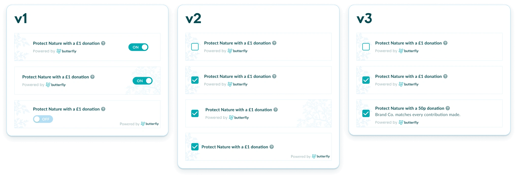
After a few rounds of feedback, we decided on both versions of v3 - this is to give clients an option of how they wish to display the widget as insights from prior research suggested that e-commerce teams need flexibility for both branding and testing purposes.
From that same insight, I then created a microcopy version for clients who wanted to match each purchase to a donation amount, instead of having the user opt in for a donation:

Finally, to improve the user experience, I suggested we implement an animation to make the interaction more interesting. Seeing as the widget itself wouldn’t be incredibly complex to build, we deemed this as a reasonable requirement to add:
brand + website
Once the widget was finalised, I started working on the website to expand the design direction for the brand. George did some prior work gathering some images and writing the copy for the website, so I took these, along with the data gathered during the discovery phase, to iterate a few different landing page designs:
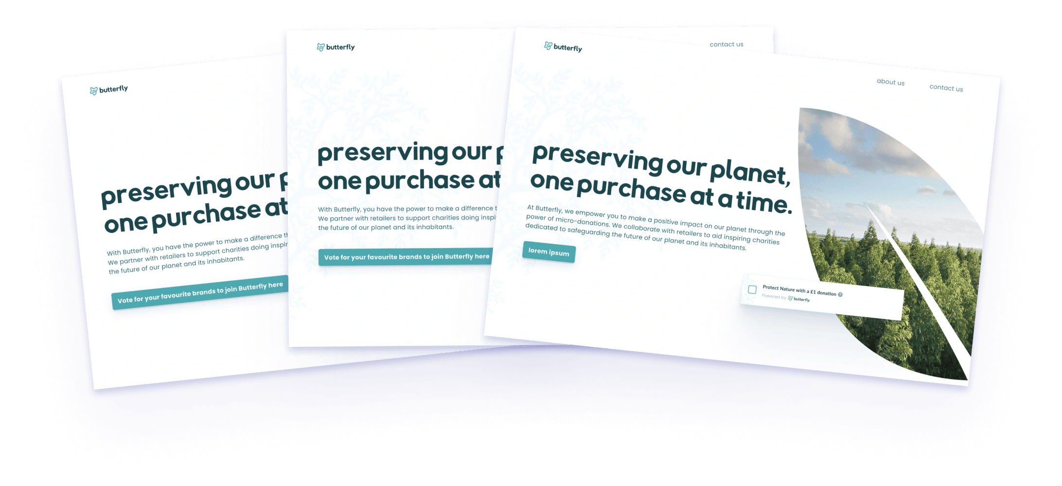
Adam and George were happy with the result, so I designed the rest of the homepage and other pages using the same style to arrive at version 1 for a full feedback round:
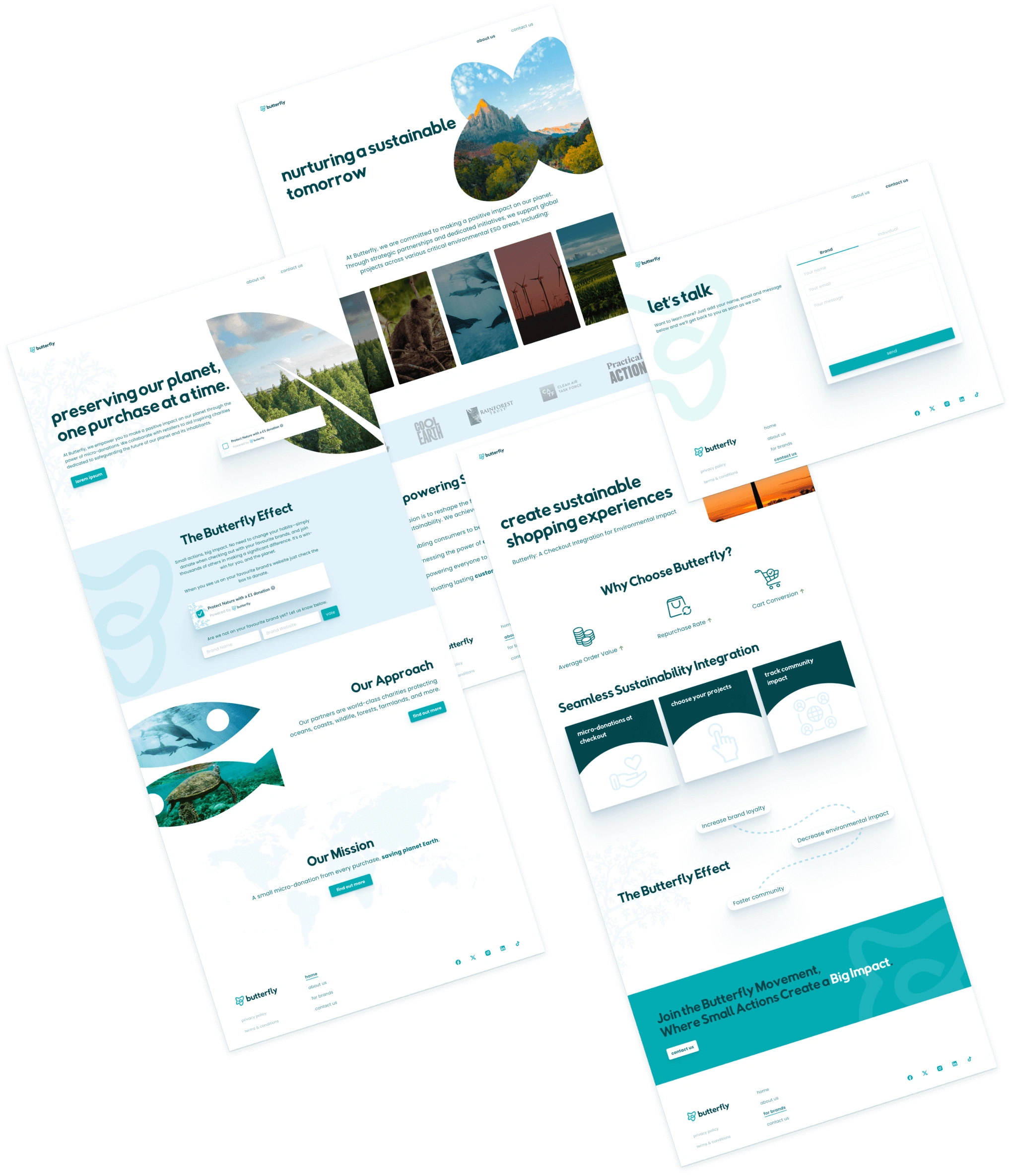
I chose to go with the silhouette style for displaying images to emphasise the brand’s focus on sustainability and nature:

I also added some unique interactions to make the site more interesting to navigate:
And finally, to ensure the site was responsive, I also created a mobile version:
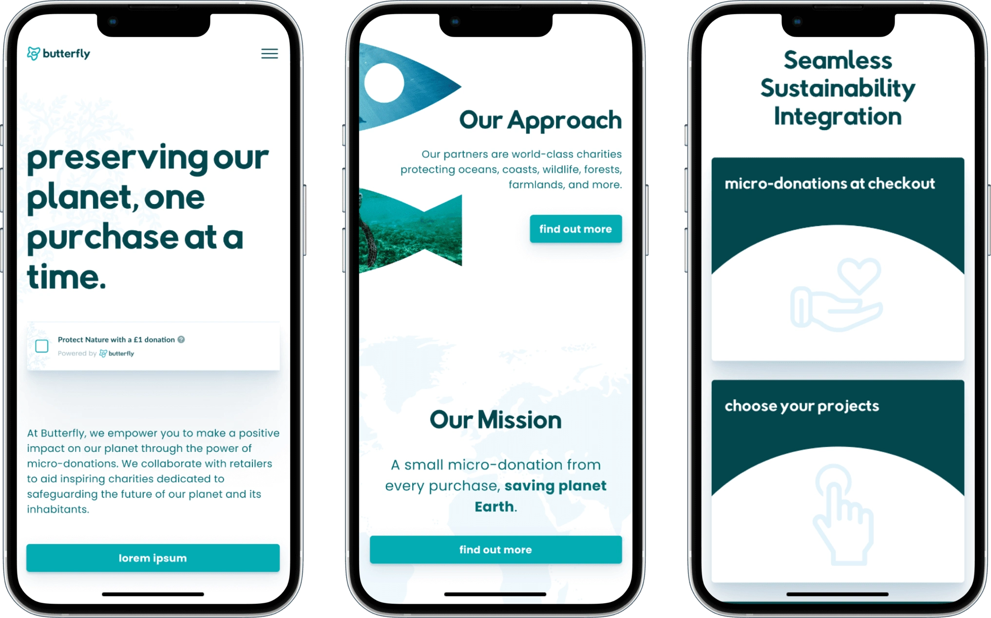
All in all, we managed to get everthing done on schedule, and the client was very happy with the results. I’m looking forward to seeing where they take their project!
Like this project
Posted Jul 30, 2024
I designed a eCommerce checkout widget for enabling users to donate towards environmental efforts and designed a website to showcase it.
Likes
0
Views
3


