Equ — Website Redesign & Brand Refresh
Dung Nguyen
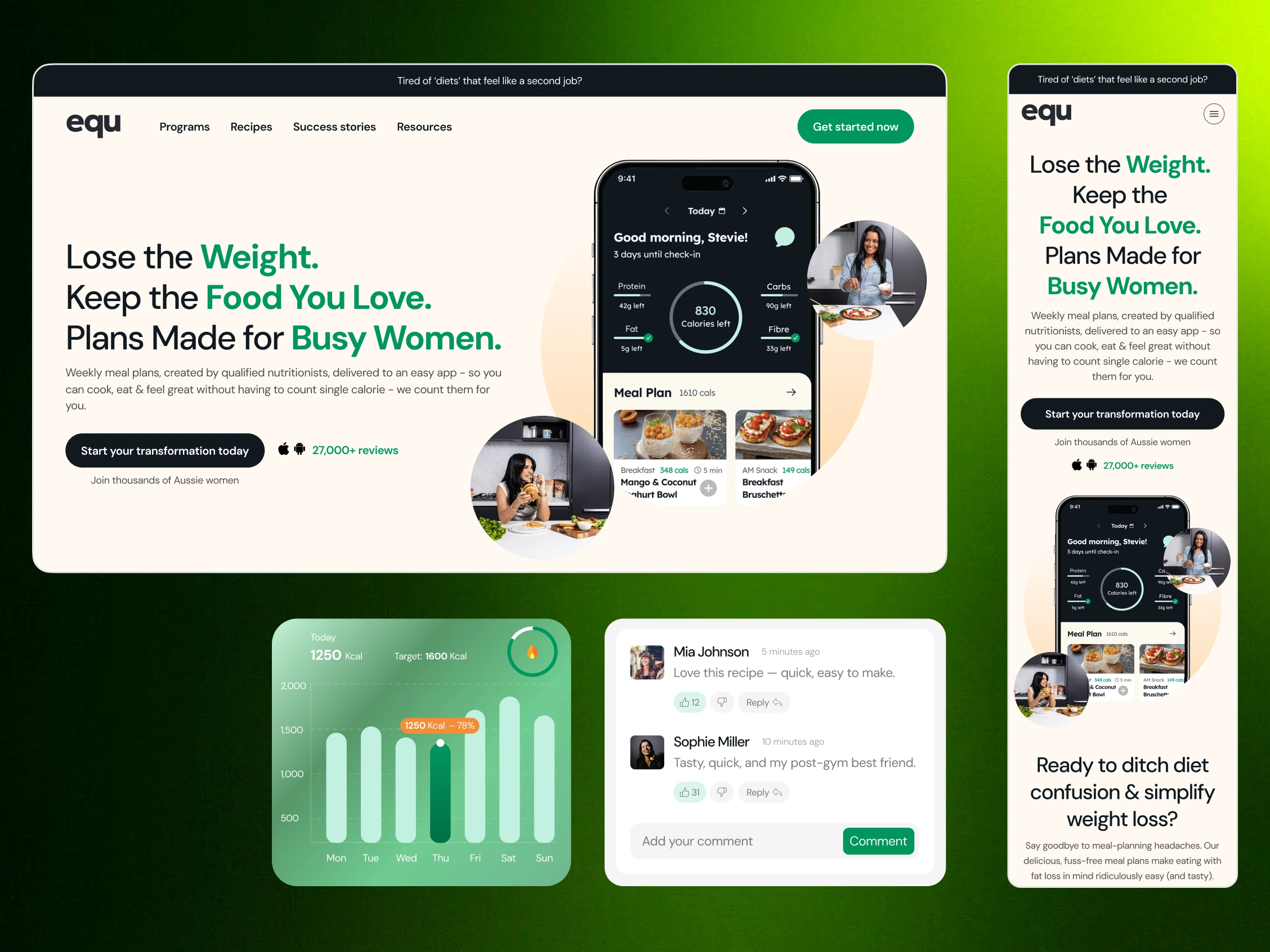
Overview
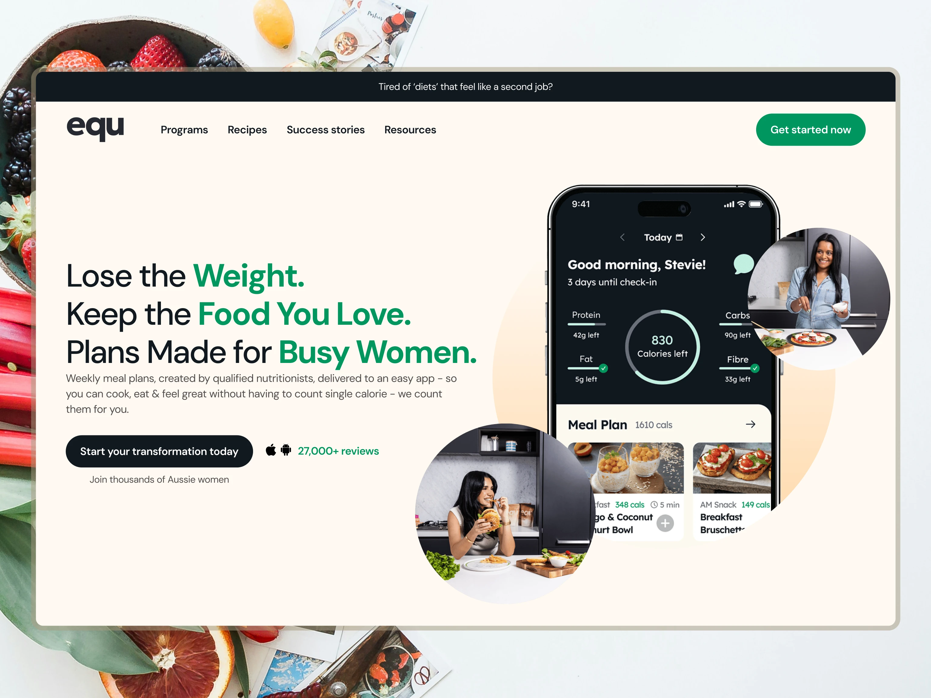
Equ is a personalized nutrition and weight-loss platform designed to help users build healthier habits through tailored guidance and goal-based experiences.
During the rebranding phase, the platform faced challenges with unclear messaging, generic visuals, and a user journey that wasn’t effectively converting visitors into subscribers. The goal was to create a more trustworthy and conversion-focused experience while improving overall brand perception.
Over a 4-week design process, the website was redesigned to strengthen brand clarity, improve user engagement, and create a smoother path from discovery to subscription.
My Role
Led the website redesign and visual rebrand for Equ.
Focused on UX/UI design, brand clarity, and conversion-driven layouts.
Improved navigation and optimized user flows for stronger engagement.
Refined calls-to-action and onboarding touchpoints to support subscriptions.
Challenges
Inconsistent visual direction and weak brand identity.
Messaging lacked clarity and trustworthiness.
User flow created friction during onboarding and conversion.
Existing layouts felt generic and didn’t communicate product value effectively.

Design Approach
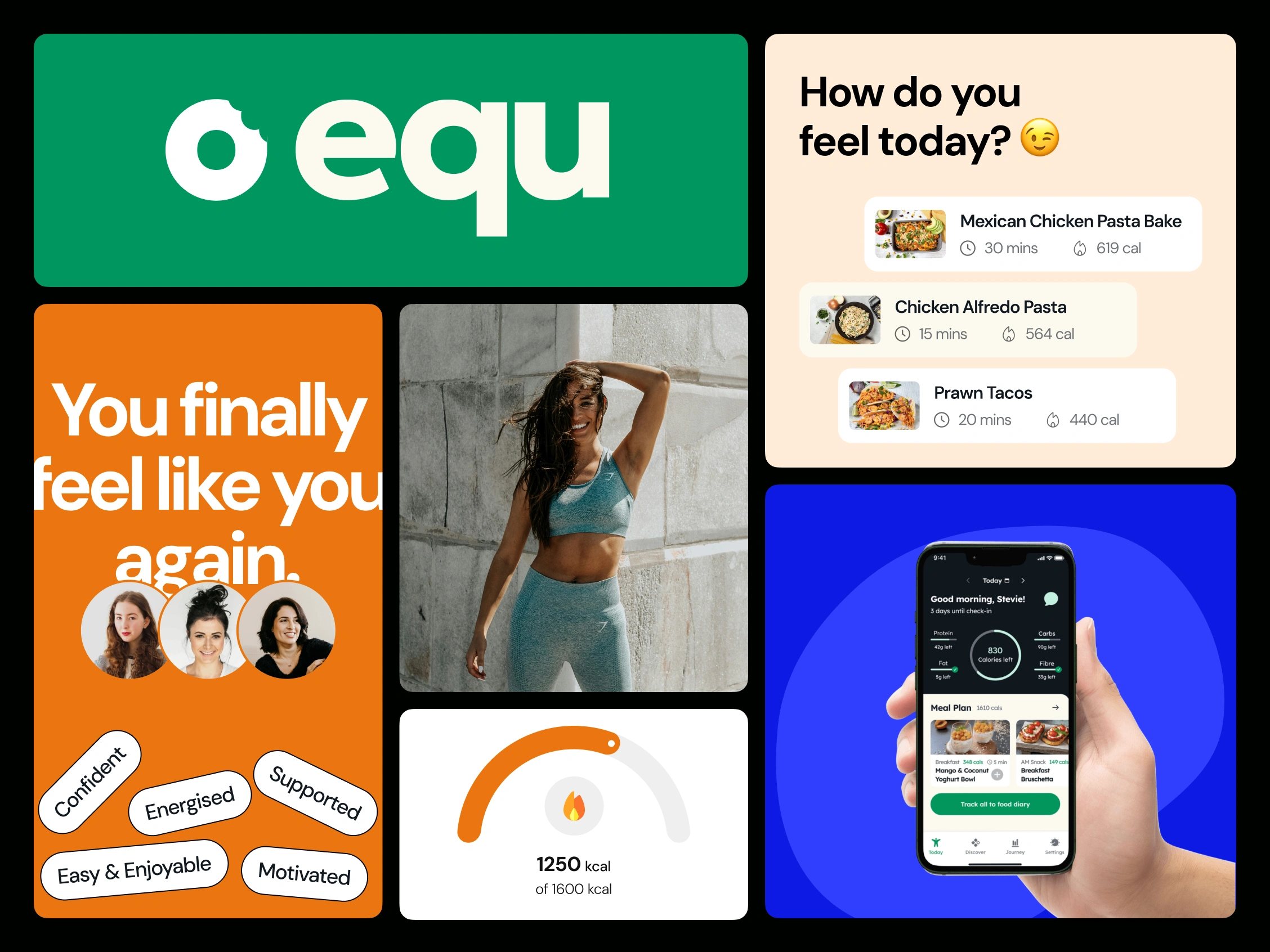
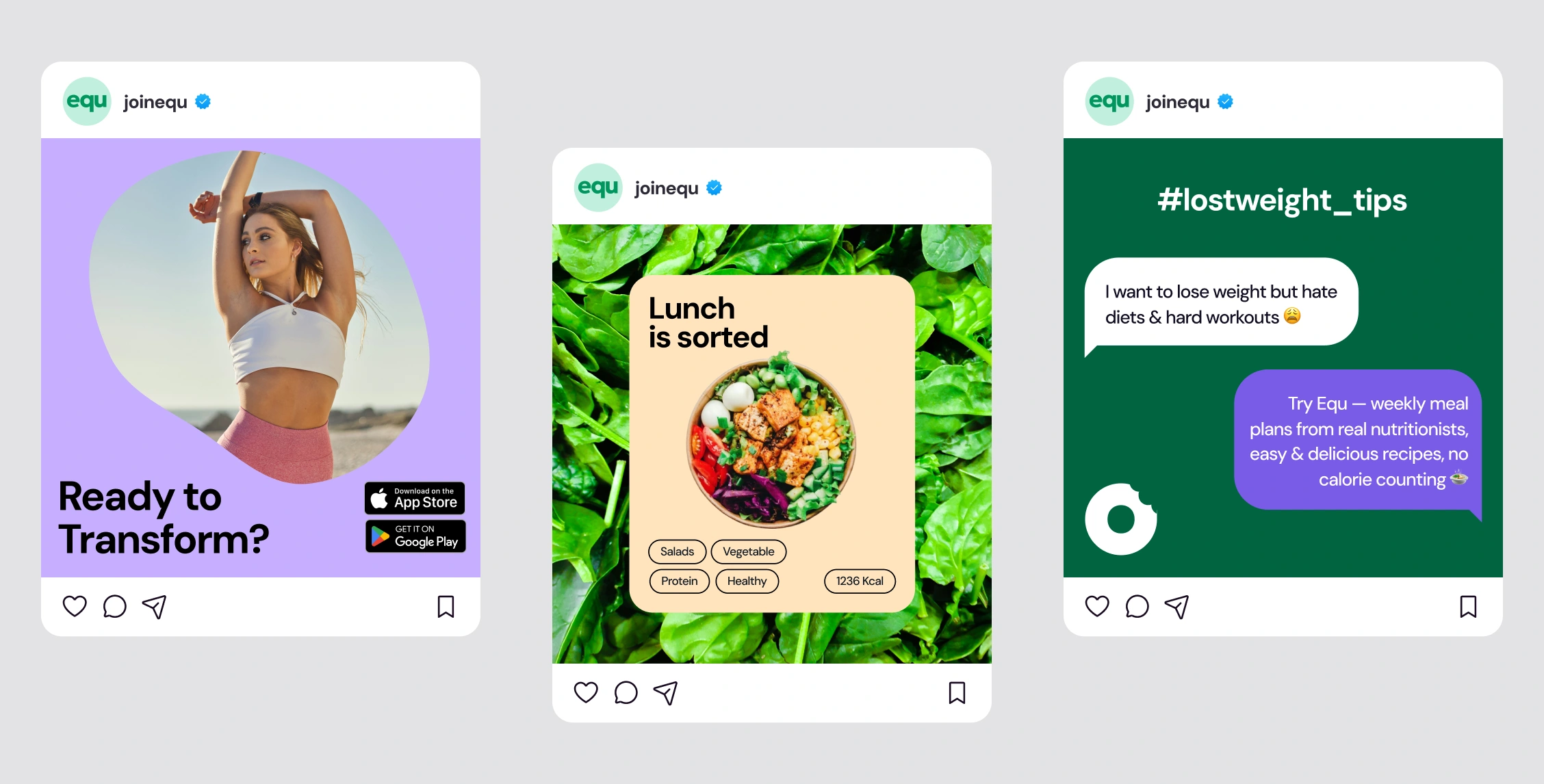
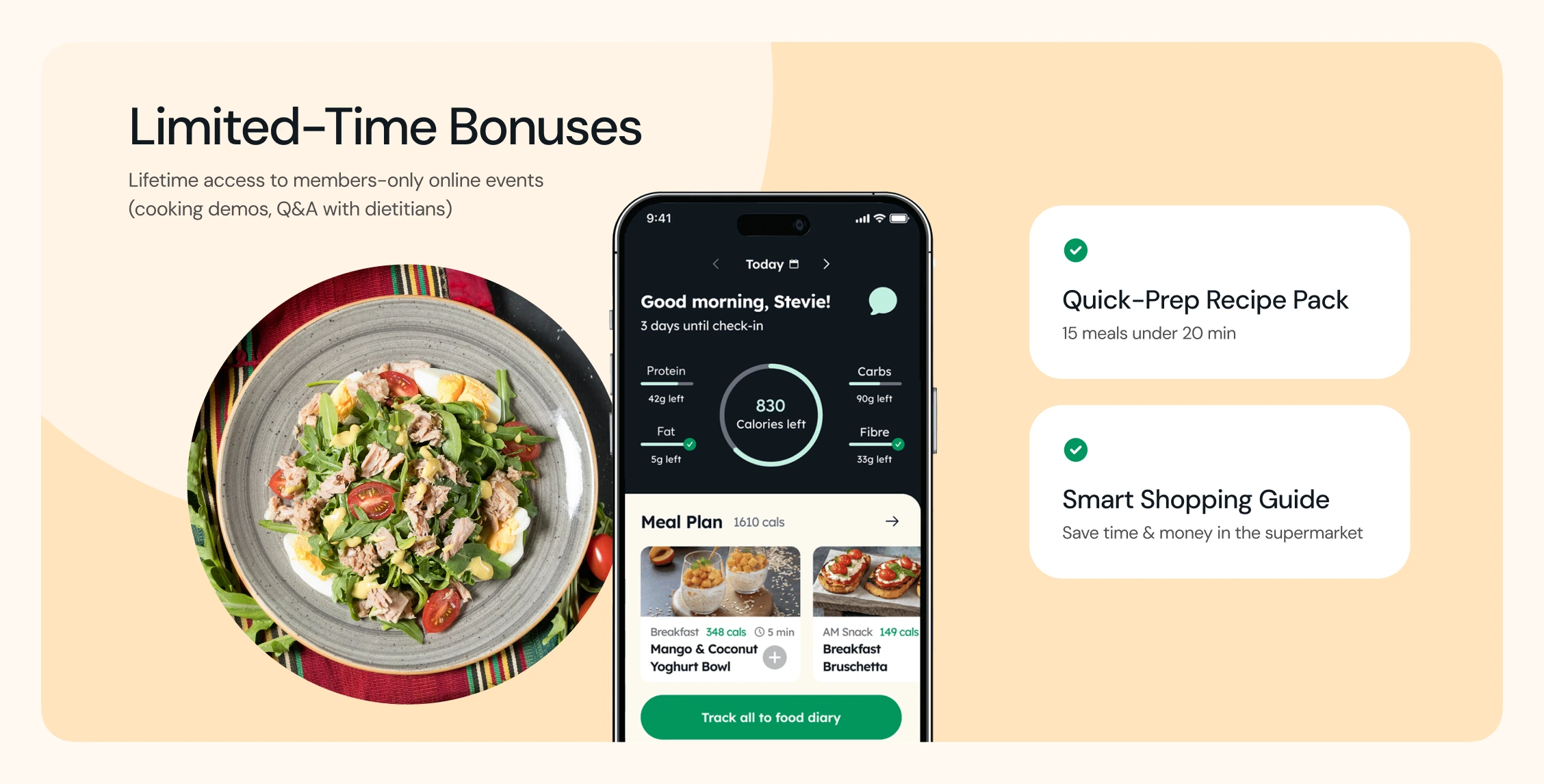
The redesign focused on creating a cleaner, more modern experience that balanced wellness aesthetics with conversion-focused design principles.
Key improvements included:
Simplified information hierarchy for better readability.
Stronger visual storytelling and product positioning.
Refined CTA placements throughout the landing experience.
Improved onboarding and quiz flow visibility.
A more premium and trustworthy visual system.
Results
35% increase in quiz completions.
25% increase in subscriptions.
Reduced bounce rates across landing pages.
Stronger trust and positioning as a credible health platform.
Like this project
Posted May 20, 2026
Redesigned Equ’s website and brand experience, increasing quiz completions by 35%, subscriptions by 25%, and reducing bounce rates with clearer messaging.
Likes
1
Views
1