JobRig Logo Design The symbol combines

Oleh Urazovskyi 🇺🇦

JobRig Logo Design
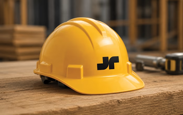
The symbol combines three ideas within a single simple form.
The primary shape is based on the letter J, creating a direct connection to the JobRig name.
The yellow element references a measuring tape, one of the most universal tools used across construction trades, representing accuracy, planning, and practical problem-solving.
The overall silhouette creates a subtle sense of forward movement and completion. Its dynamic upward form suggests progress from planning and measurement to finished work, while also hinting at a check mark: a quiet reference to confidence, reliability, and getting the job done right.
Together, these elements reflect JobRig’s mission: a simple, dependable tool that helps tradespeople stay organized, work efficiently, and complete jobs with confidence.
Like this project
Posted Jul 24, 2026
JobRig Logo Design The symbol combines three ideas within a single simple form. The primary shape is based on the letter J, creating a direct connection to t...
Likes
0
Views
8