Nodo Restaurant Brand Identity Design

Yan Kravec


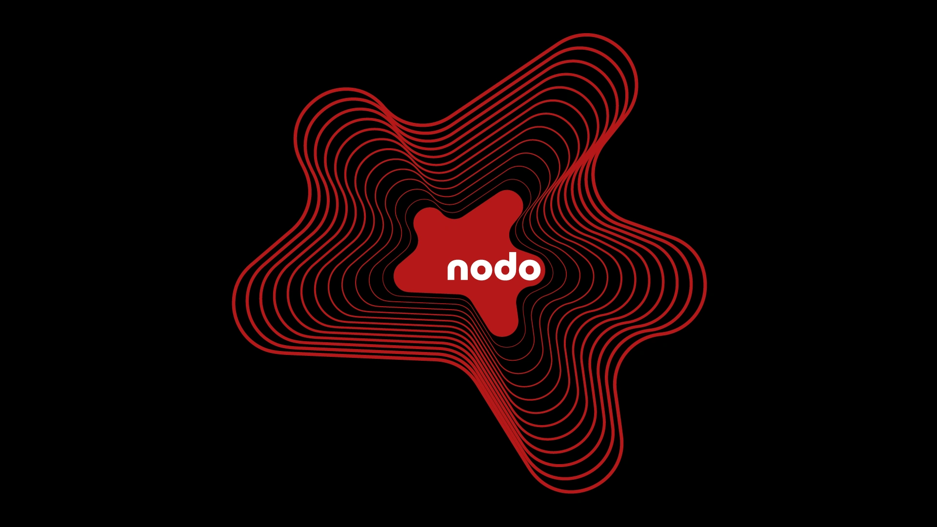
Nodo Restaurant | Brand Identity & Concept
The Challenge: Escaping the Literal
The client approached me with a brief for a mixed-cuisine restaurant. The core request was highly specific and literal: they wanted the logo to visually represent a local 5-way road intersection (symbolizing friends gathering from all directions) using the visual metaphor of "knots."
The Concept: A Geographic Culinary Metaphor
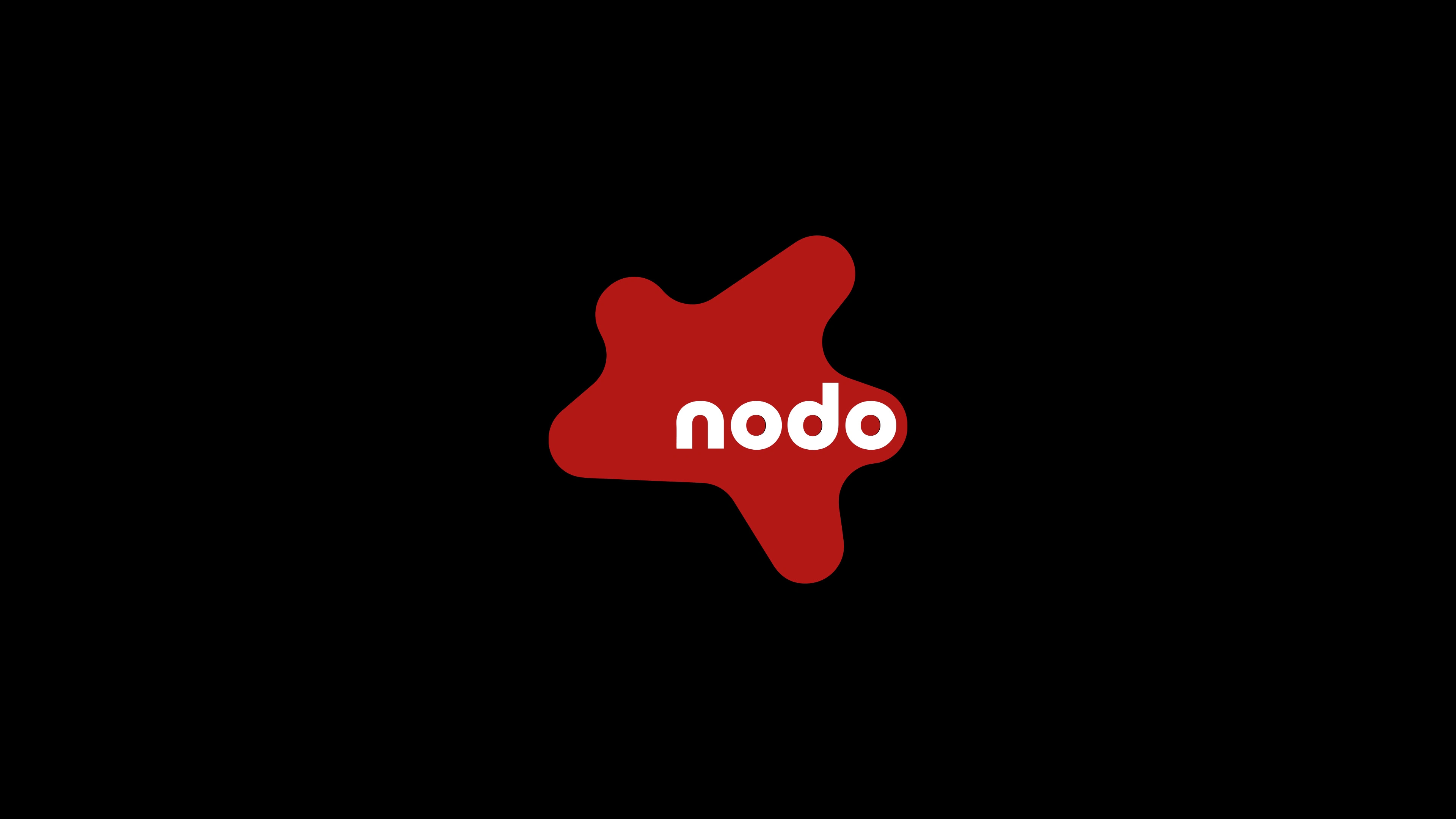
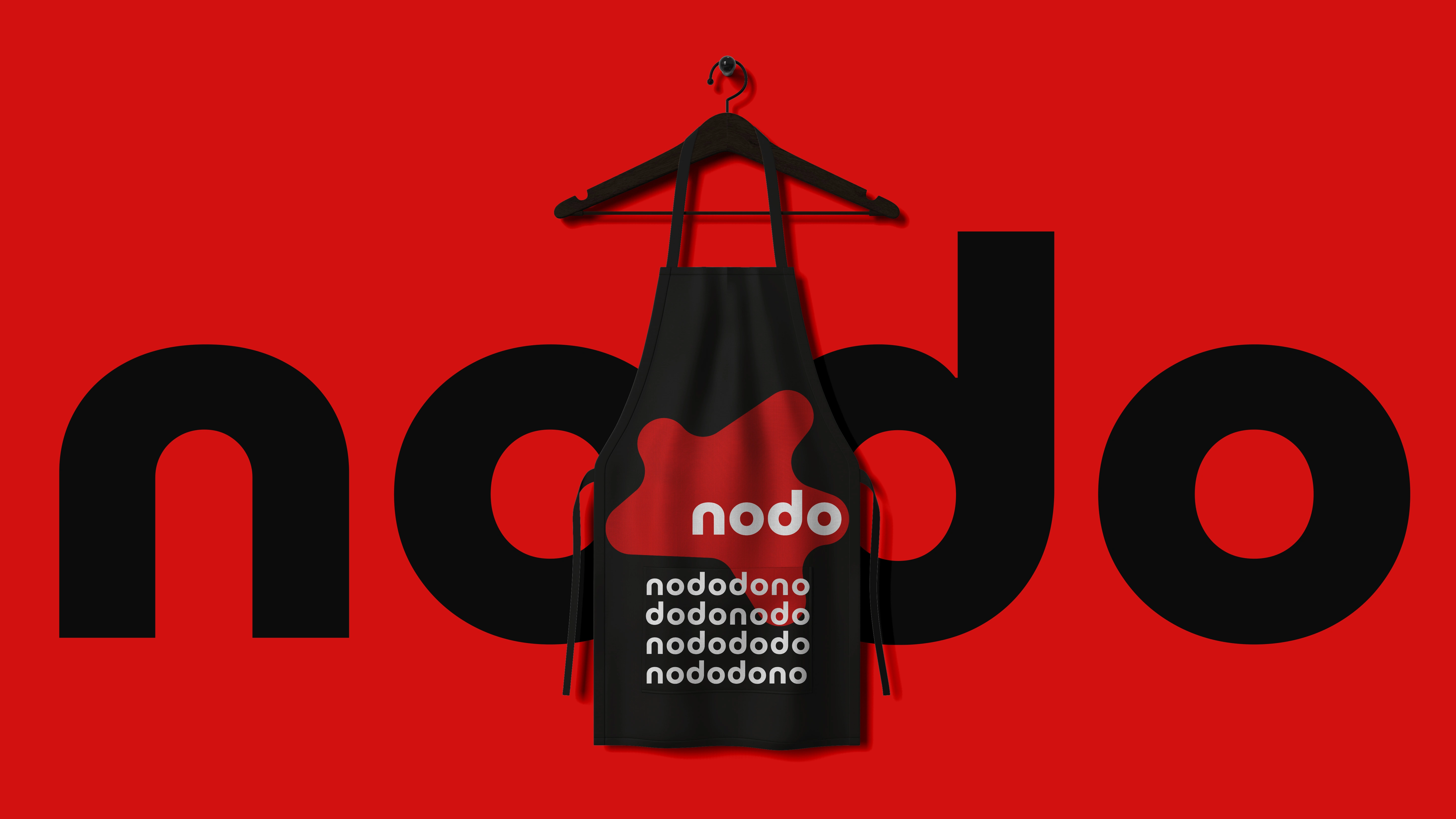
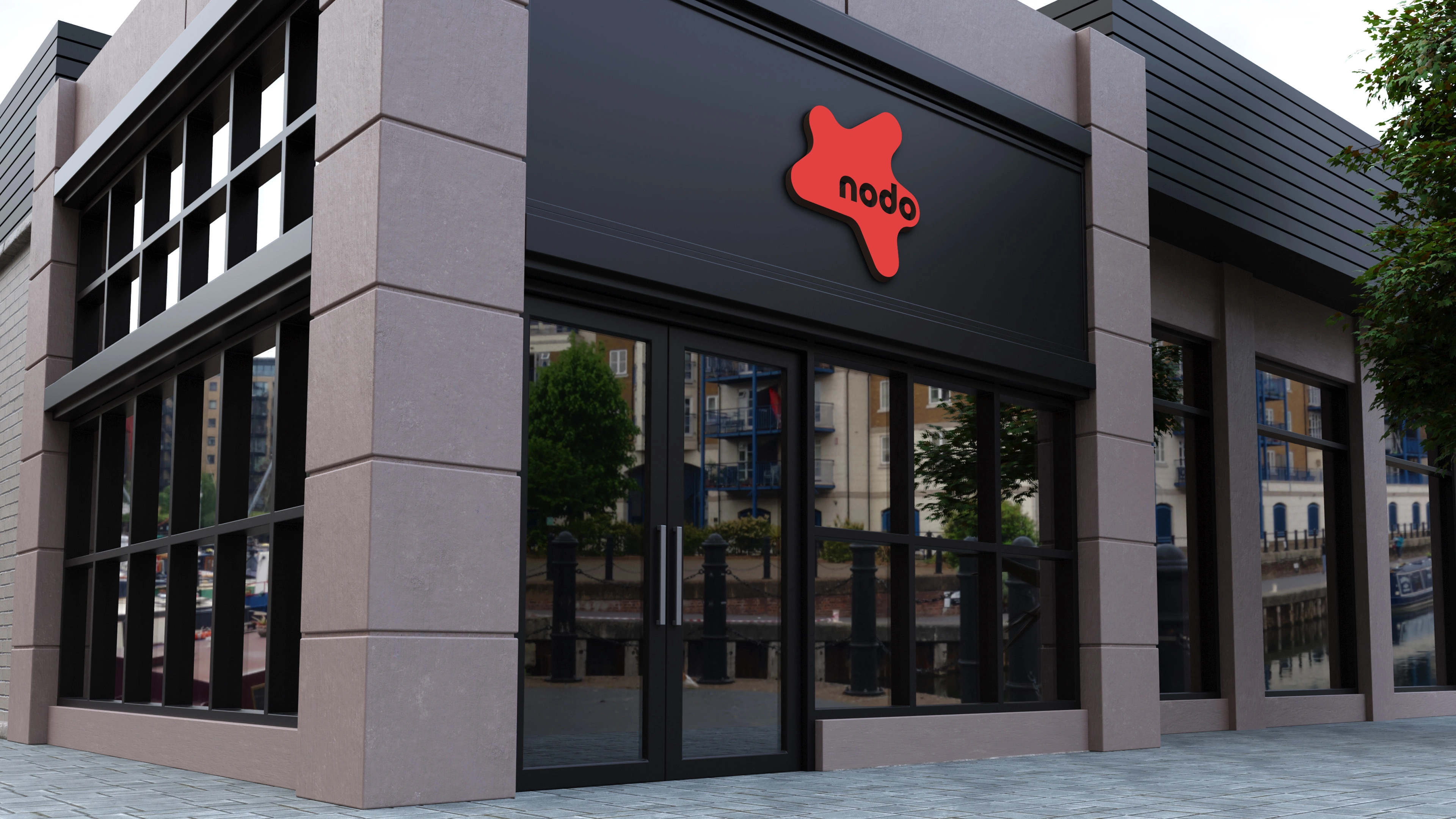
Literal roads and knots don't appetizingly communicate "food." Instead of blindly following the original brief, I took ownership of the concept and re-engineered the metaphor. I kept the exact geographic layout of the 5-way intersection but transformed it into a bold, 5-pointed sauce splatter.
The Execution & Style
This conceptual pivot preserved the client's core narrative — people coming together at a central hub — but translated it into a relevant culinary language. Visually, I ignored the messy "knot" concept to maintain a strict, clean, and minimalist aesthetic. The result is a bold, scalable identity that honors the original geographic meaning without sacrificing visual integrity.
Like this project
Posted Jul 29, 2026
Developed a brand identity for Nodo Restaurant using a unique visual concept.
Likes
0
Views
0
Timeline
Jul 29, 2023 - Aug 16, 2023