KEYS Real Estate | Brand Identity & Offline UX

Yan Kravec


KEYS Real Estate | Brand Identity & Offline UX
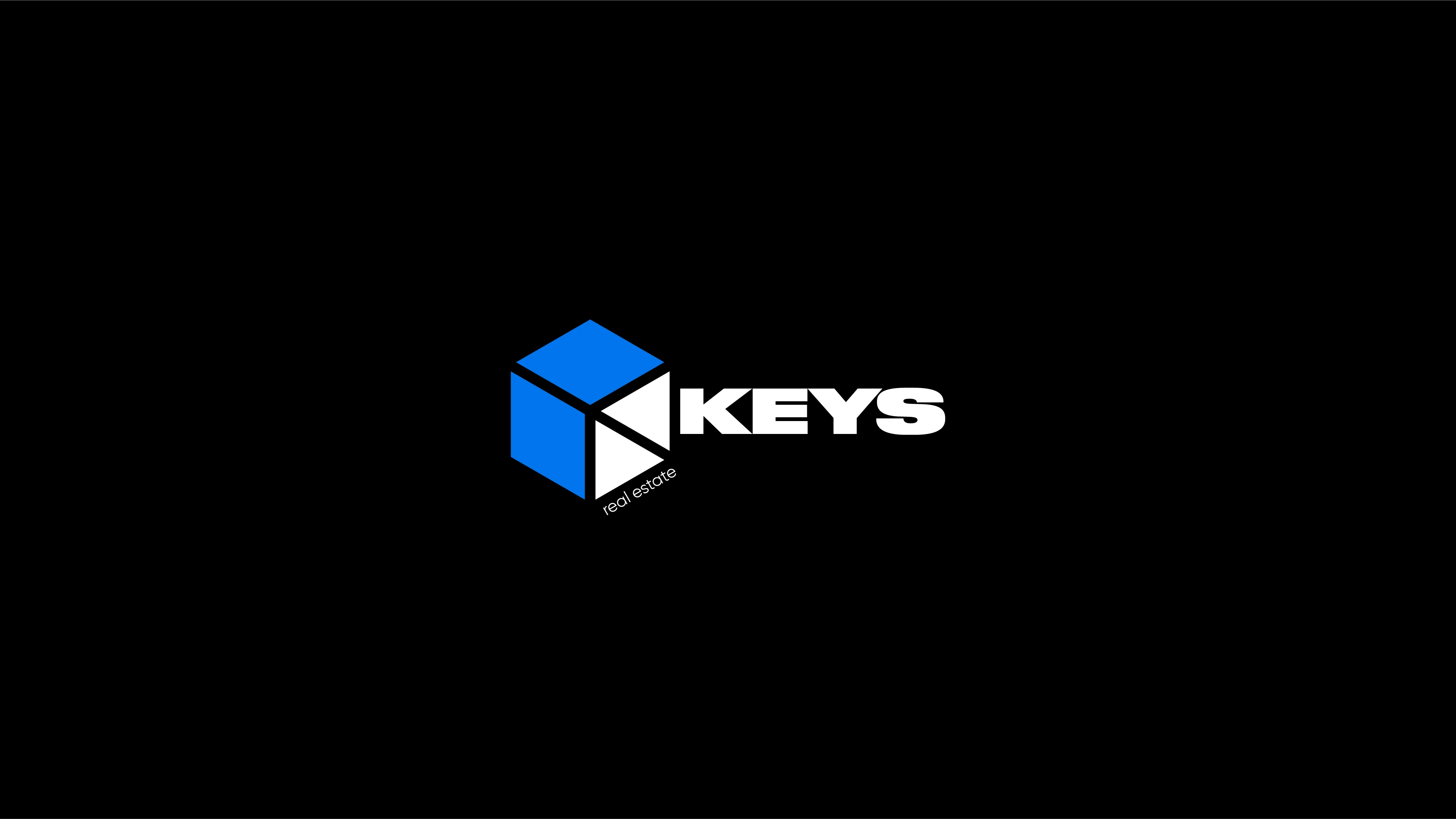
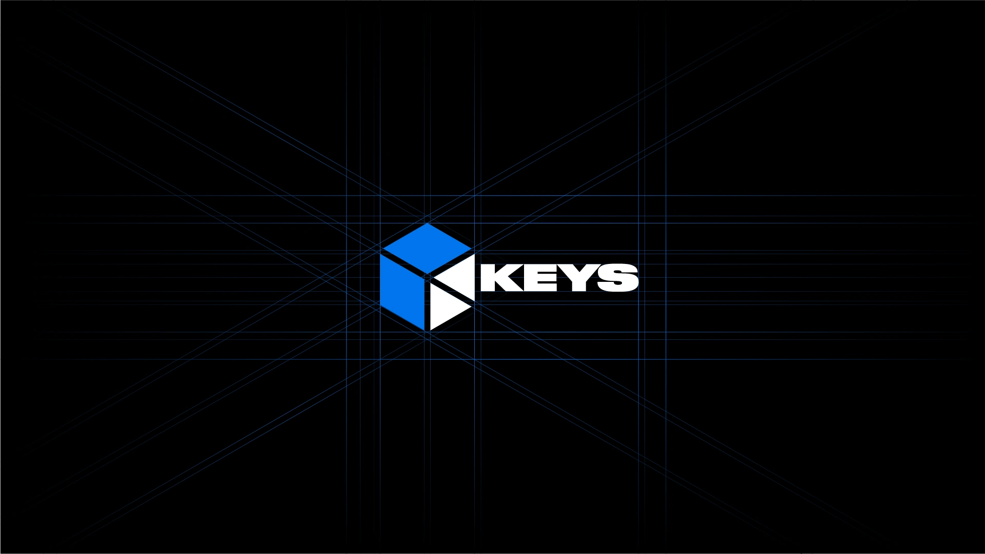
The client approached me with a name that is understood literally: "KEYS." I set out to avoid, as much as possible, the cliches typical of the real estate industry (roofs or buildings) and to create a memorable, conceptual, and evocative logo.
The Logo Concept
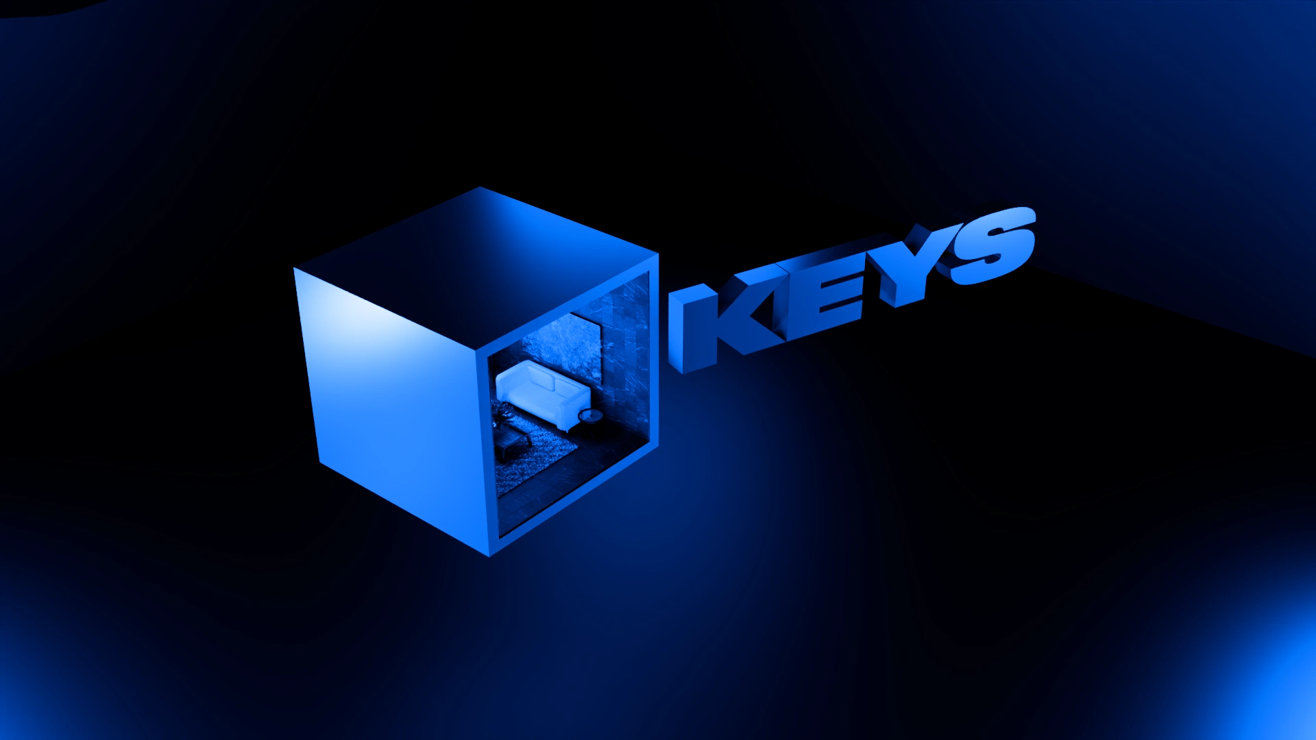
The logo is a visual hybrid: it forms the shape of a key, but the base is a 3D room (a cube). The core idea hides in the white space. It’s not just a geometric cut-out — it represents a lit room. An empty dark cube is just a concrete box, but when the light is on, it means someone is home. This was my way of injecting warmth, coziness, and life into a strict, minimalist shape.
Offline UX
The Frictionless Business Card
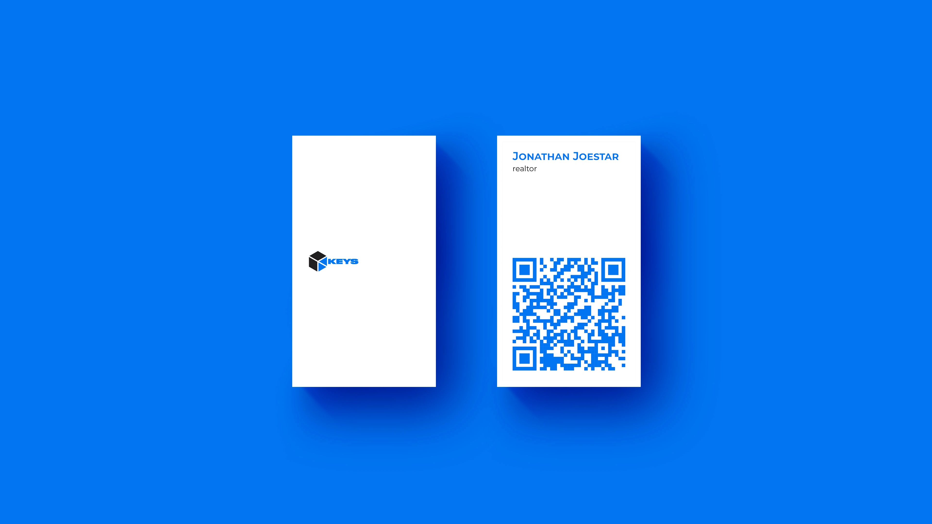
I didn't just design a piece of paper; I built a physical interface. Visually, the card mimics a door where the logo acts as the handle. Flipping the card is conceptually like opening the door to that specific agent's personal office.
Functionally, I wanted to eliminate user friction entirely. Instead of cluttering the surface with tiny text, the back features a massive QR code. One quick scan acts as a direct line to the agent, instantly routing the user to their e-mail, phone, Telegram, WhatsApp, or the agency website.
Zero manual data entry, zero effort.

Like this project
Posted Jul 27, 2026
Transformed a generic naming into a smart isometric concept. Business cards designed as a frictionless 1-click physical UI.
Likes
1
Views
7
Timeline
Jun 13, 2023 - Jun 29, 2023