Carbon Removal Alliance
About the project
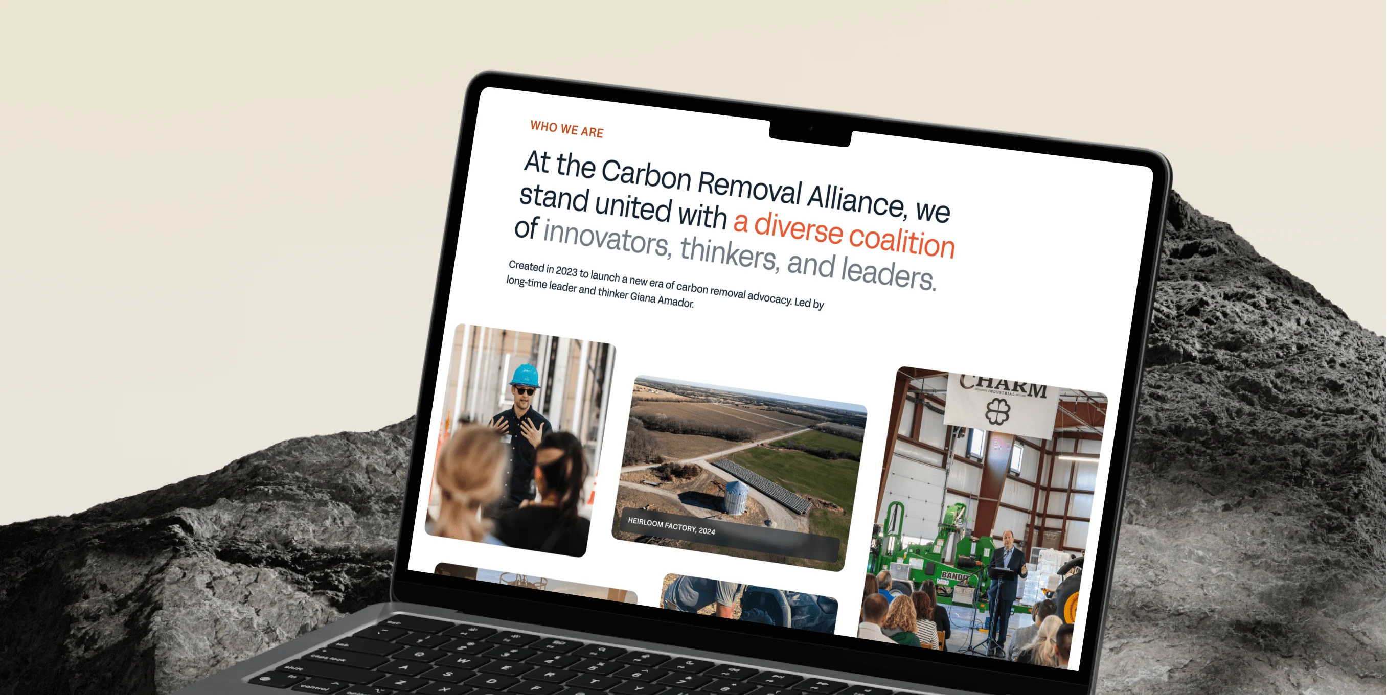
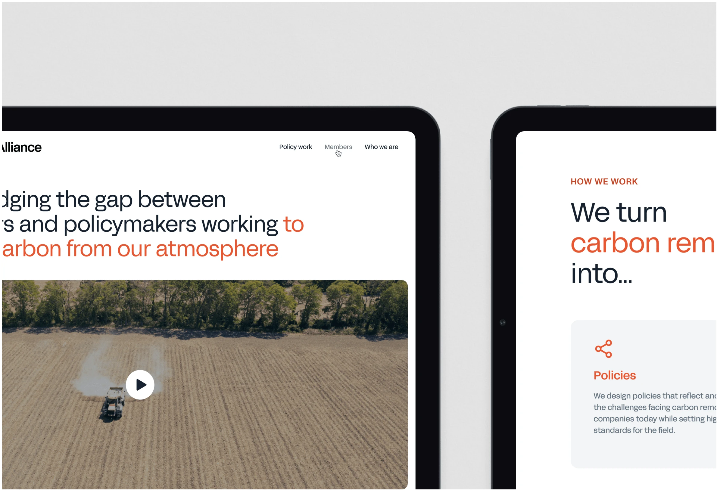
The Carbon Removal Alliance is driving a new wave of carbon removal advocacy, bringing together industry leaders to push for policy changes that can help scale up carbon removal technologies. Their mission is to promote sustainable solutions for significantly reducing CO2 levels in the atmosphere, playing a crucial role in the fight against climate change.
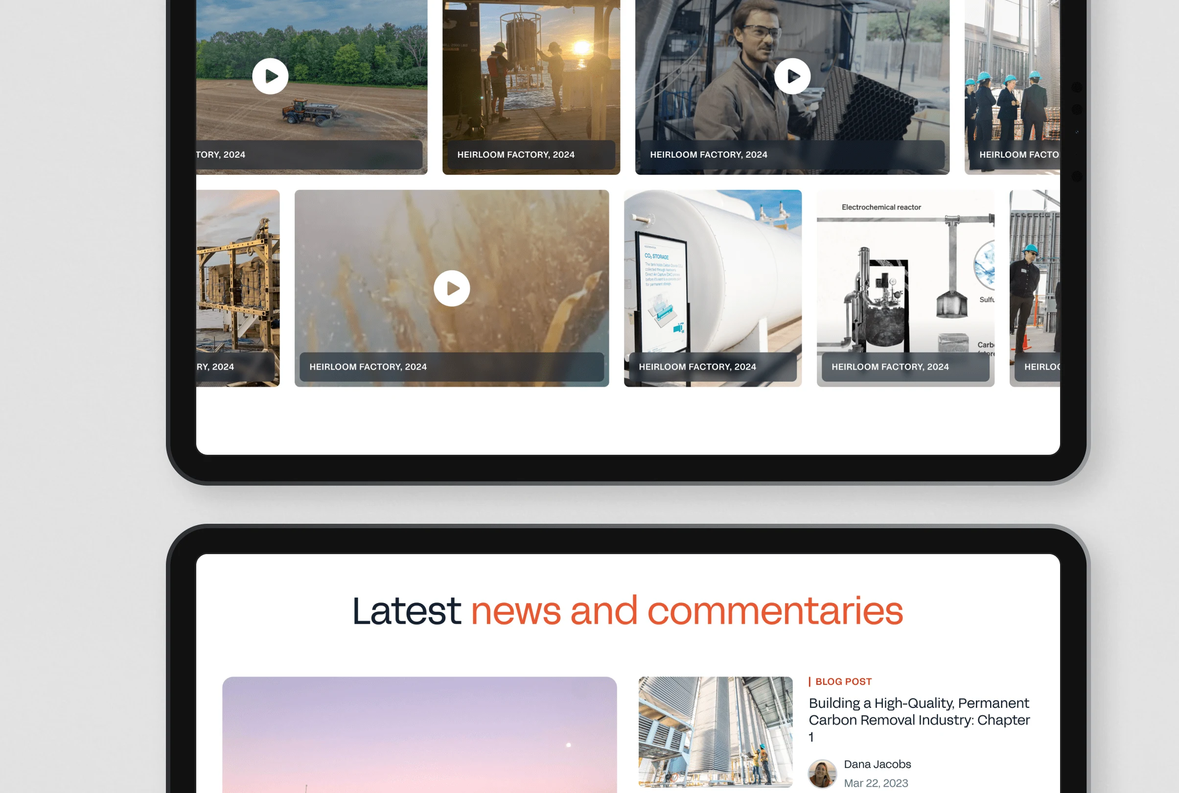
The Goal
The client’s previous website was very basic, with limited content and low traffic. They wanted to expand the site by adding more pages, like a blog and a resources section, to share research and news. The main goals were to improve SEO, attract more visitors, and bring a more aspirational vibe to the design. On top of that, we needed to make sure the new site better communicated their mission, as some users didn’t fully understand what the organization was about.
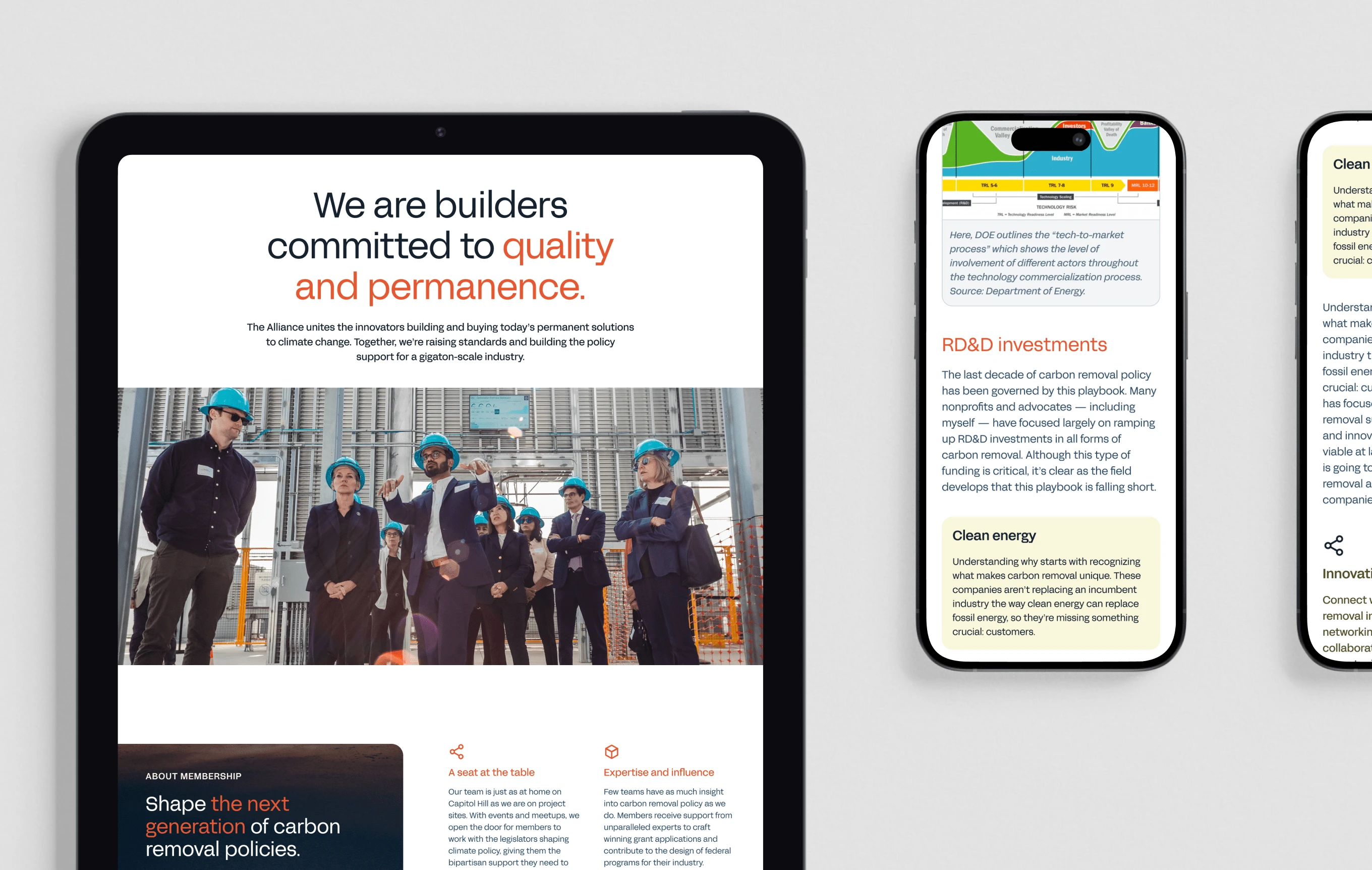
The Process
We kicked things off with a UX workshop to get a clear understanding of the client’s goals, challenges, and vision for the new site. After that, I dug into research, including analyzing the site’s metrics (like engagement and exit rates) and checking out competitor sites to see what we could do better. Staying in close contact with the client throughout helped keep everything on track.
Since they had a new brand guide they were happy with, we used that as a starting point but aimed to take it further. I worked on a mood board and a few initial design concepts, and once they got the thumbs-up, we rolled out the style across the other pages. We also added some animations to make the site feel more engaging and lively.
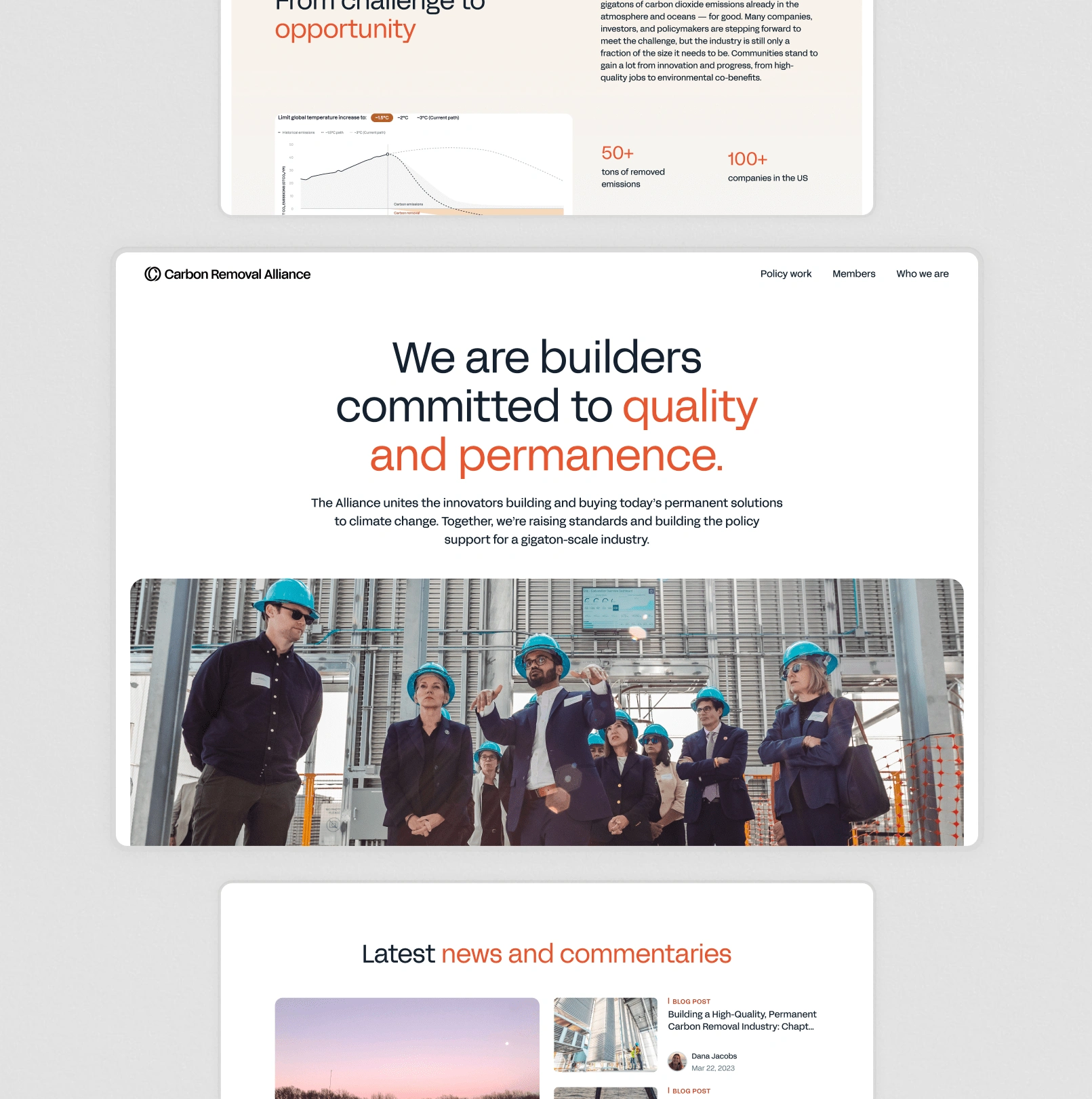
Challenges and Insights
The biggest challenge was capturing the core message and translating it into a fresh, appealing design. We needed to create a more aspirational look and feel while making sure users could easily understand what the Alliance stands for and why it matters. It was all about striking the right balance between inspiring visitors and delivering clear, accessible information.
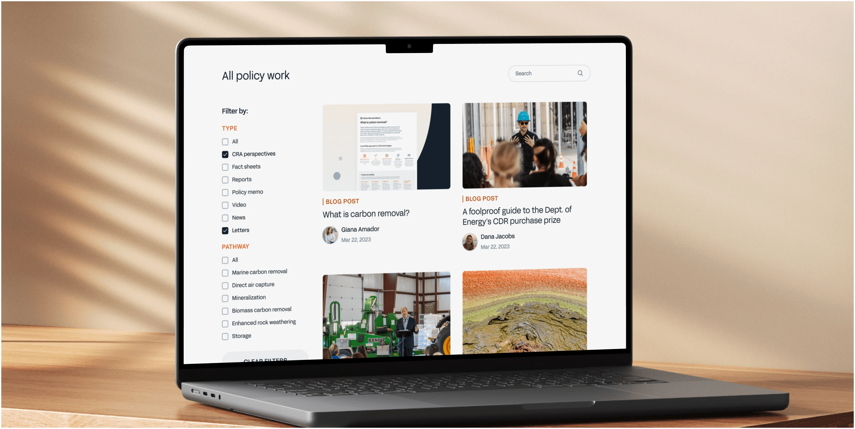
Outcome
The new website came together with a clean, modern design that aligns perfectly with the updated brand. While we haven’t done a full post-launch analysis yet, early feedback has been great. Users are spending more time on the site, especially on the new Resources page, which is exactly what we were aiming for.
Lessons Learned
I received some helpful feedback about finding the right balance in design. At times, we pushed for high-definition, modern visuals, but a more refined and quiet style would’ve been better. I’ll keep this in mind for future projects. Also, I learned the importance of clearly communicating design blockers and setting expectations about feedback timelines to keep everything on track.
Like this project
Posted Oct 21, 2024
The Carbon Removal Alliance is driving a new wave of carbon removal advocacy, bringing together industry leaders to push for policy changes that can help scale
Likes
0
Views
4

