
The Australian specialty food market has seen a rapid rise in design-forward, contemporary condiment brands that lean into clean typography, modern minimalism, and curated aesthetic appeal. However, a distinct market gap exists within imported Indonesian chilli pastes (sambal).
While these traditional products dominate shelves with authentic flavours, their visual identities have largely remained stagnant, relying on heavily cluttered layouts, dated typography, and literal product photography that fails to resonate with modern, design-conscious consumers. The challenge for Roempah was to bridge this cultural gap: honouring the deep-rooted heritage of Indonesian sambal while crafting a sophisticated, shelf-ready brand identity that fits seamlessly into contemporary Australian kitchens and retail spaces.
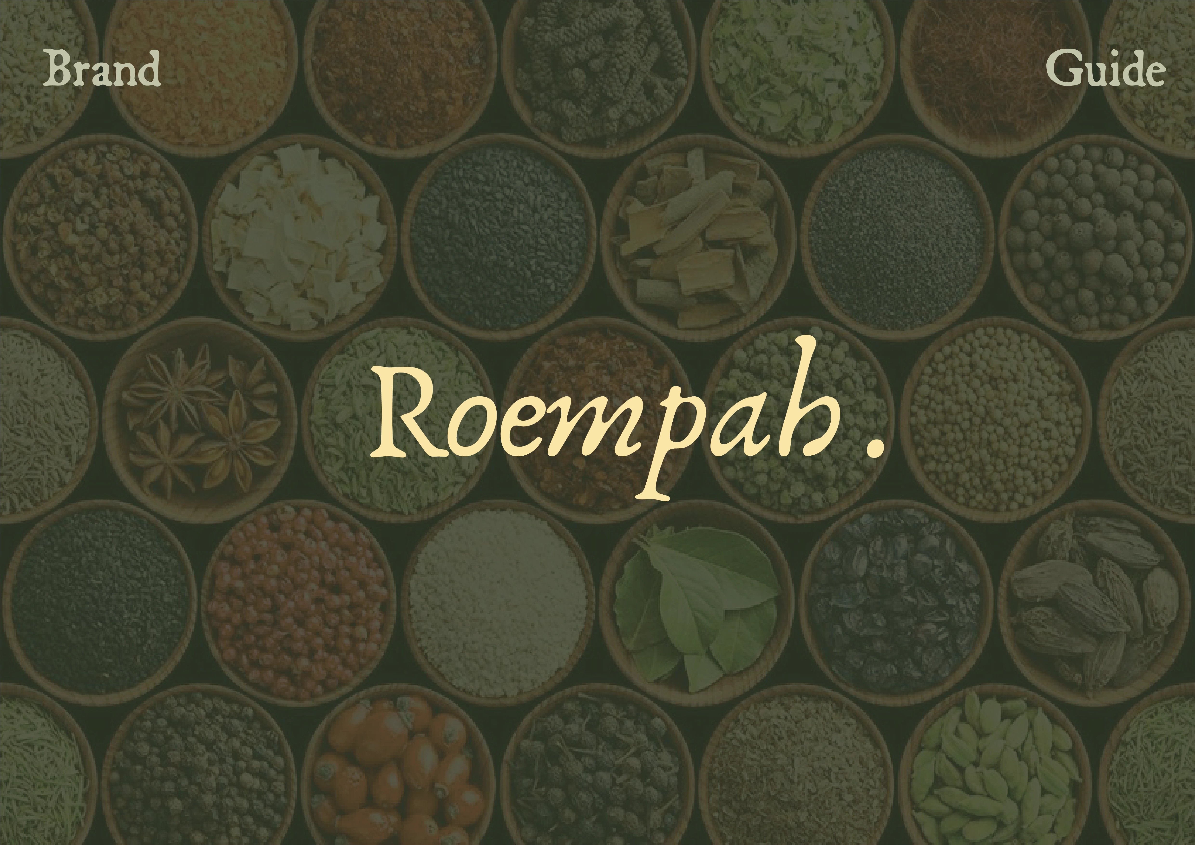
Brand Guide Front Cover
Roempah reimagines the traditional sambal packaging experience through a contemporary, premium lens.
Vibrant Earth Palette: Moving away from aggressive, hyper-saturated primaries, the packaging utilises rich, grounded earth tones inspired by raw Indonesian spices (such as burnt turmeric, deep terracotta, and muted clove brown) to establish a warm, organic visual hierarchy.
Culturally Reverent Illustration: Integrating abstract, minimalist interpretations of traditional Wayang shadow puppet heads provides a sophisticated nod to Indonesian storytelling and artistry without feeling dated or overly complex.
Structured Multipack Architecture: Designed as a cohesive range, the multipack format uses clean grid systems, restrained typography, and refined matte finishes to elevate sambal into an artisanal product category, appealing directly to premium retail environments.
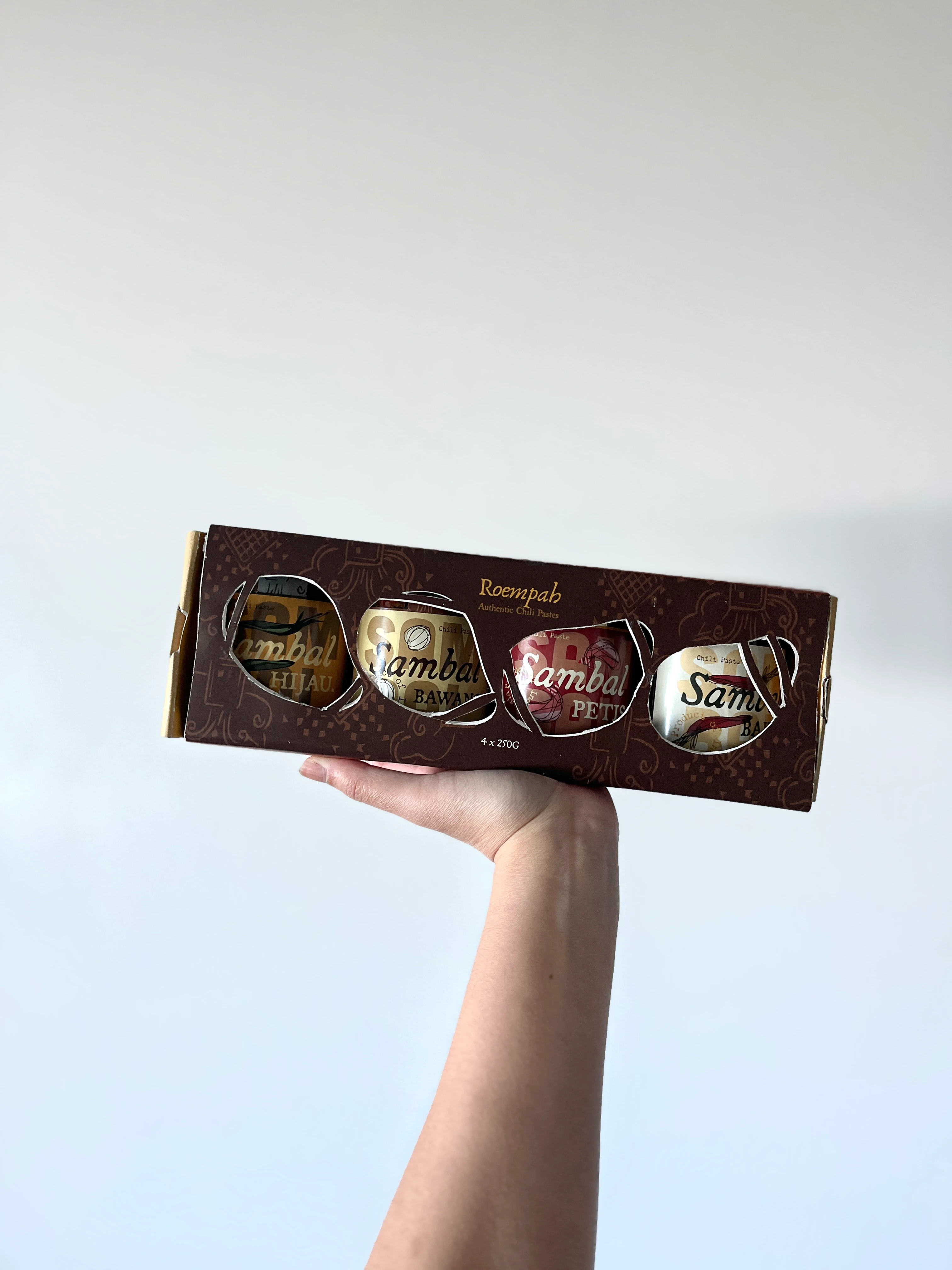
Real Life Mockup of Label and Packaging
Market Research & Positioning: Analysed the current condiment landscape in Australia to identify visual fatigue in traditional packaging versus the sleek minimalism of contemporary specialty brands. Pinpointed the sweet spot where authenticity meets modern luxury.
Visual Exploration & Iconography: Experimented with custom digital illustration styles to distil intricate Wayang motifs into clean, scalable geometric vectors that maintain cultural integrity while supporting a minimalist layout.
Colour Theory & Materiality: Curated a sophisticated palette of warm earthy tones, testing contrast and legibility across various finishes. Focused on matte textures and tactile elements to emphasise an artisanal, high-end feel.
Layout & Typography System: Developed a balanced typographic hierarchy utilising modern, elegant sans-serif fonts paired with subtle classic accents, ensuring clear flavour differentiation across the multipack range while maintaining a unified brand architecture.
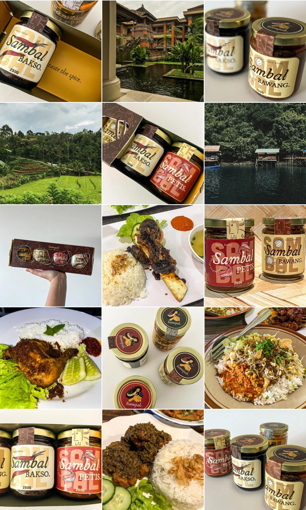
Moodboard
0 likes · 0 views · Nov 13, 2026
A conceptual packaging and brand identity design for Roempah, an artisanal Indonesian sambal range tailored for the Australian market.
