
Overview & Objectives
The Client / Event: Adelaide Film Festival – celebrating cinema from independent voices to major directors, uniting diverse cultures and age groups through storytelling.
The Challenge: To modernise and unify the festival’s visual identity while ensuring the brand could flex seamlessly across digital touchpoints and physical event environments.
Your Role: Lead Brand & Visual Designer (handling concept development, logo design, visual system, and POS rollout).
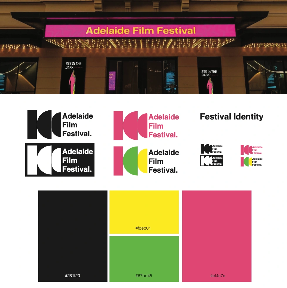
Brand Identity
The Concept & Brand Strategy
The Core Theme: Cinematic unity—bringing together varied cultures and generations through the shared language of film.
The Logo Mark: Explain the geometry behind the design. The three distinct shapes that subtly mimic a movie film camera represent diversity, movement, and the multifaceted nature of storytelling.
Design Approach: Emphasise a clean, minimalist, and elegant aesthetic that balances cultural prestige with modern accessibility.
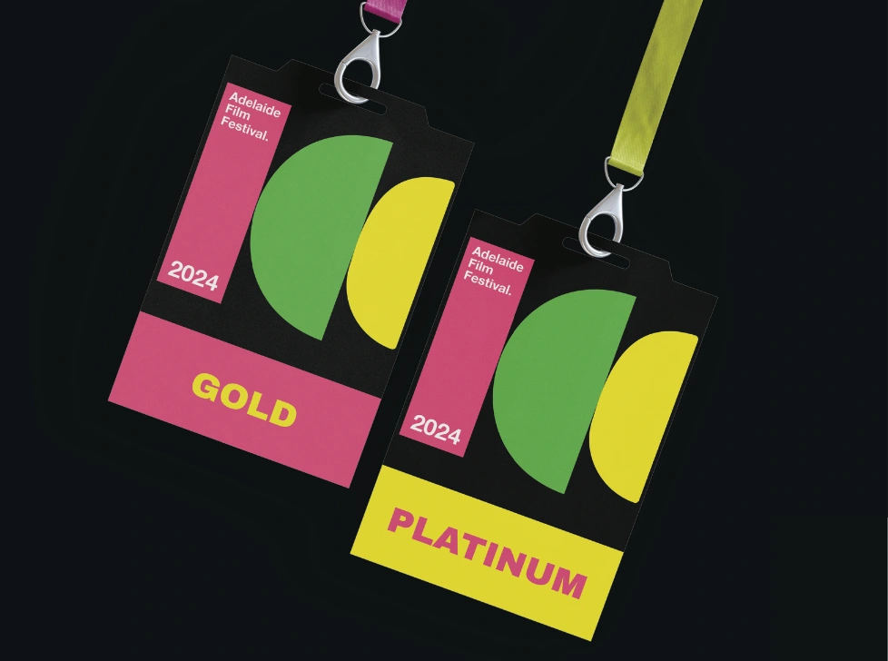
Landyard Design
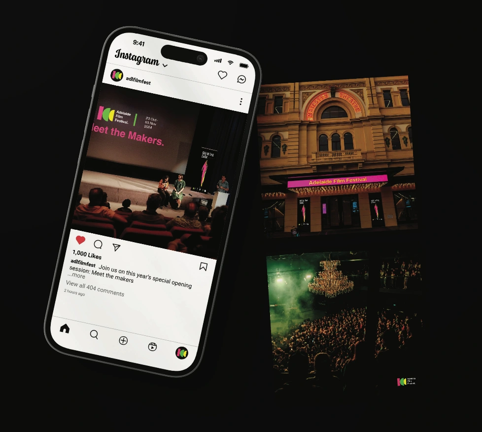
Social Media
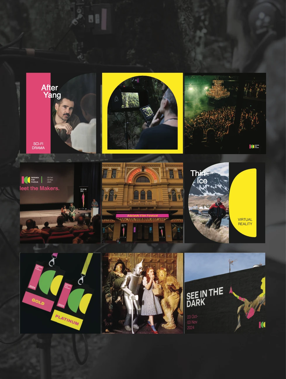
Social Media
Visual System & Asset Rollout
The Flexible Shape System: Detail how the three foundational camera shapes act as modular design elements. They can be rearranged, scaled, and repurposed across different mediums.
Point-of-Sale (POS) & Event Collateral: Showcase how the visual identity translates into physical spaces. Mention key items like festival signage, ticketing displays, merchandise, spatial branding, and digital campaign templates.
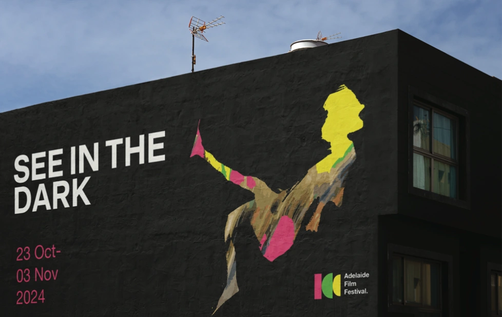
Marketing
Impact & Results
Cohesion: Delivered a unified, instantly recognisable brand language that elevated the festival's professional standard.
Versatility: Enabled the in-house team to easily deploy on-brand POS materials across diverse event venues without losing visual integrity.
0 likes · 0 views · Nov 13, 2026
Led the rebrand for the Adelaide Film Festival, creating a cohesive visual identity centred on three dynamic shapes that mimic a movie film camera.

