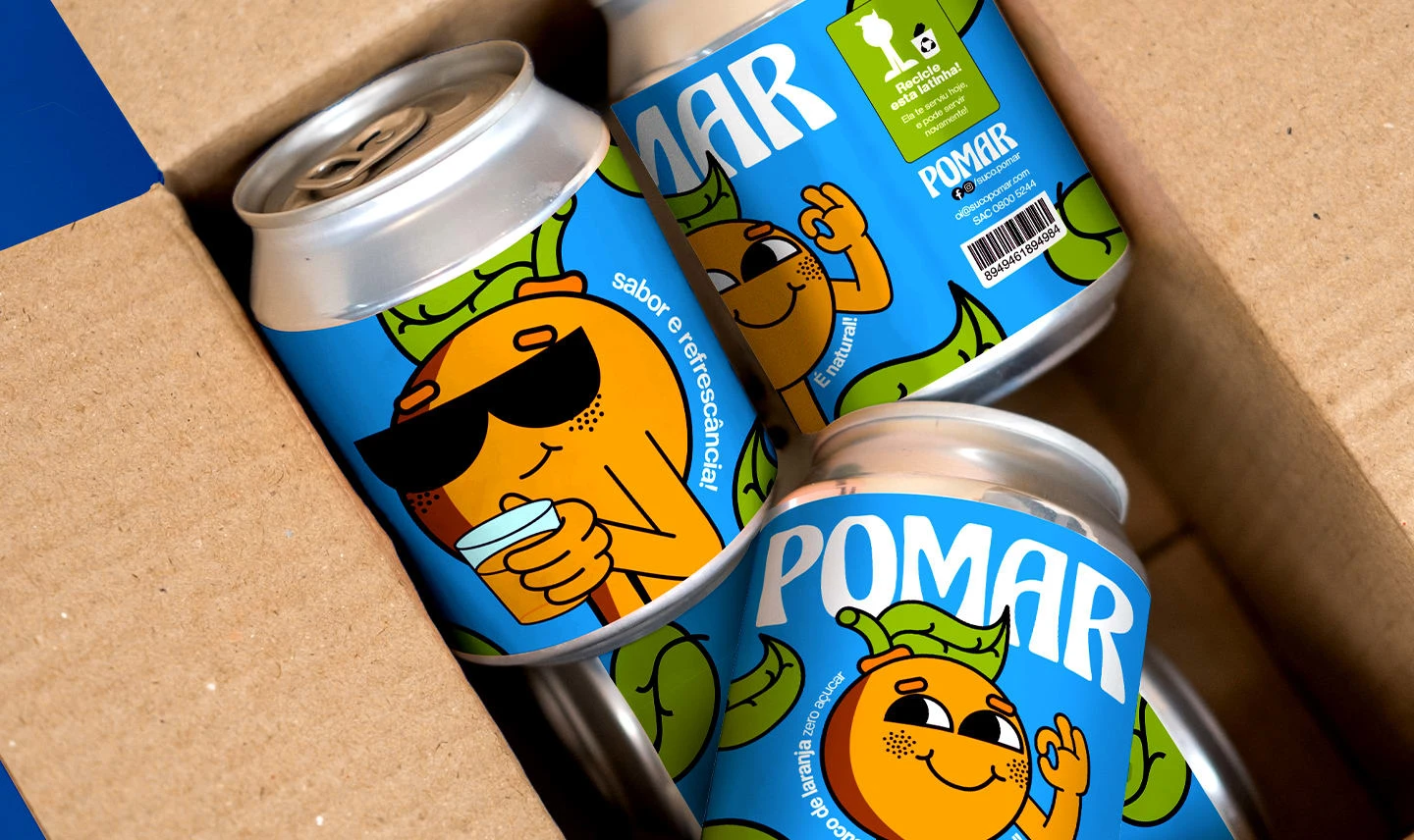
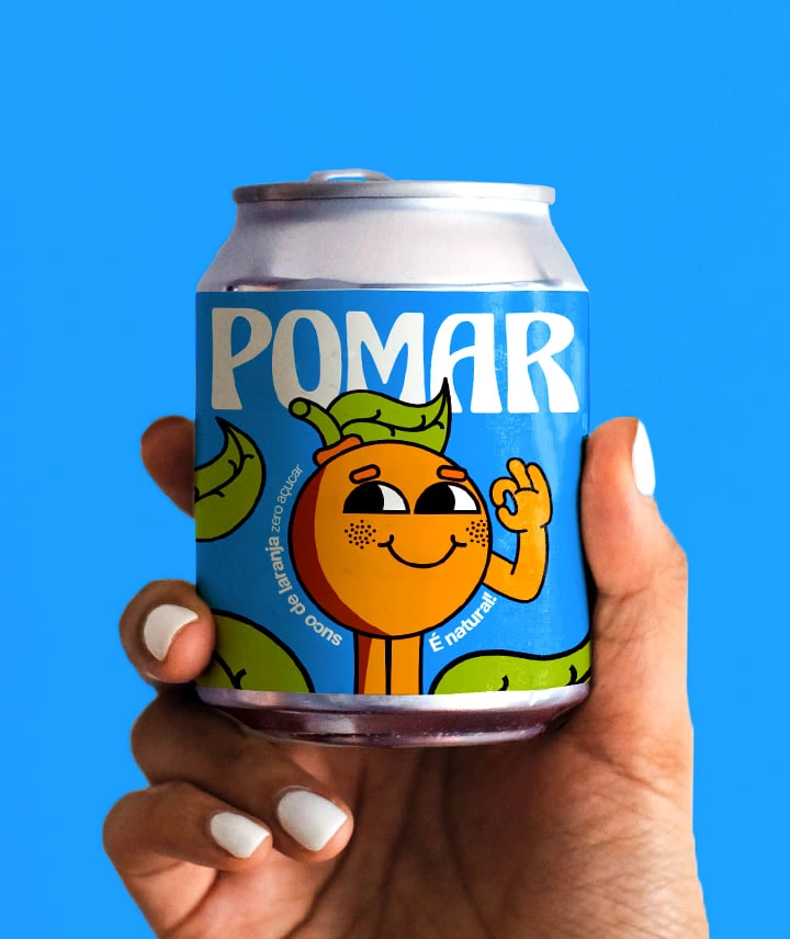
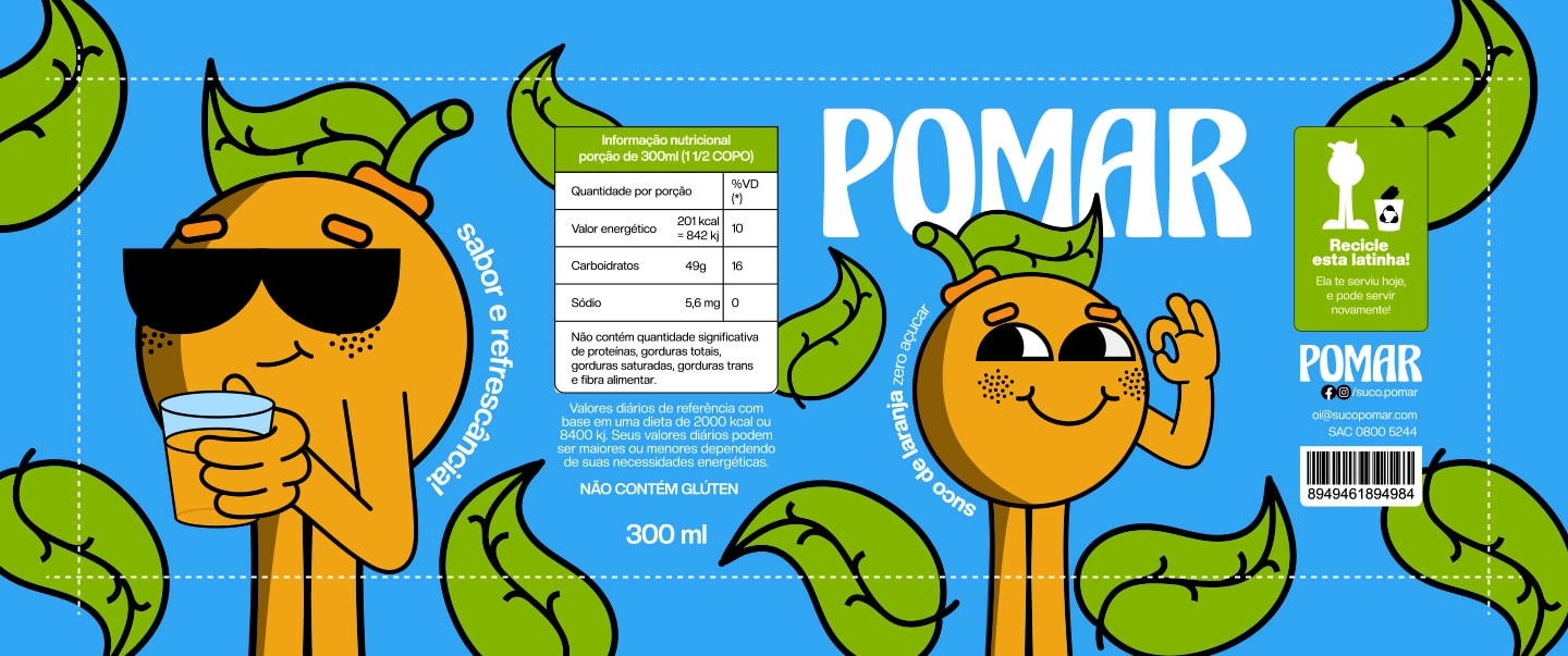
Brand and Package for Pomar
Henrique Oliveira
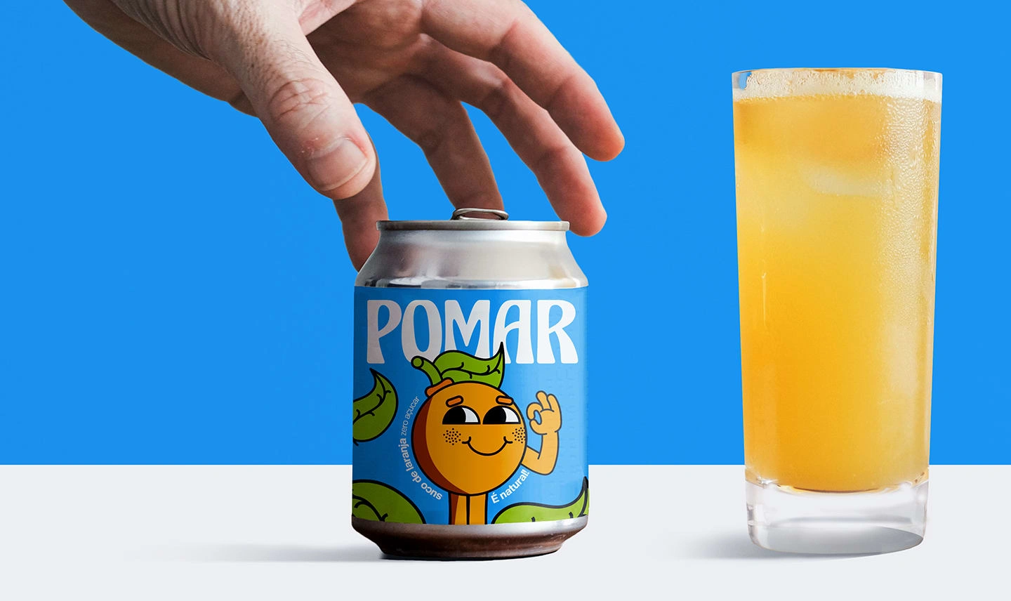
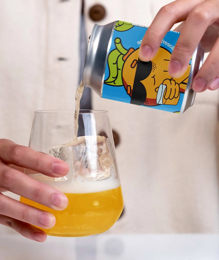
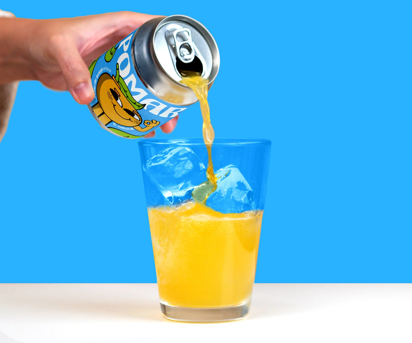
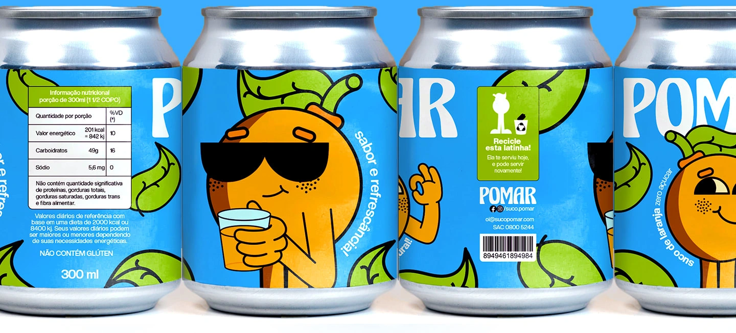
Label/package design for can of natural orange juice, using friendly and fun vintage illustrations.
Natural juice labels follow several popular stereotypes. Nothing more than just taking into account the competition and competition with the new products that constantly appear. It is an assertive and consistent solution.
However, Pomar wants to follow another path and sought to be a natural orange juice different from what is normally seen on the market. Premises such as differentiation, being energetic, jovial, and relaxed were guiding principles for the label that became the face of the Pomar brand.
The challenges were in turning a can of orange juice into a product that appeared to be natural but did not use images and photos of oranges, as is usually the case.
As a result, the best path to follow was illustrations with a certain vintage style, which help to mark being natural, jovial, and energetic, but different from the ordinary within its context!


Like this project
Posted Apr 25, 2023
Label/package design for can of natural orange juice, using friendly and fun vintage illustrations.
Likes
0
Views
21