Branding And Packaging of a Honey Jar - Mel Primavera
Henrique Oliveira
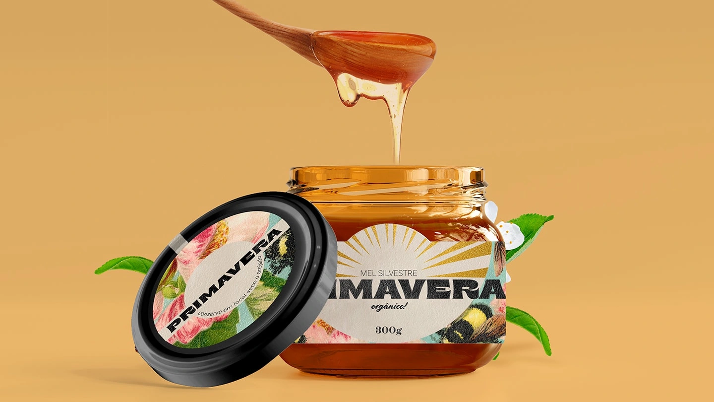
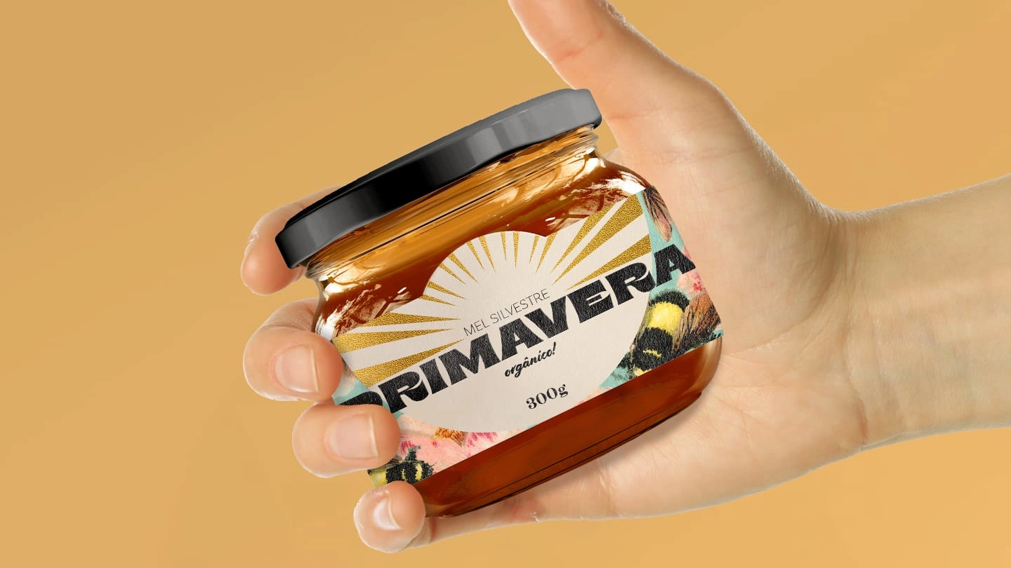
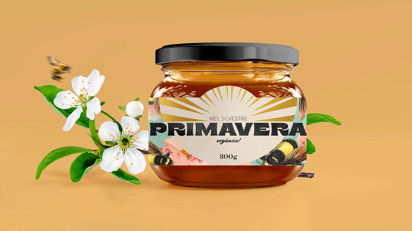
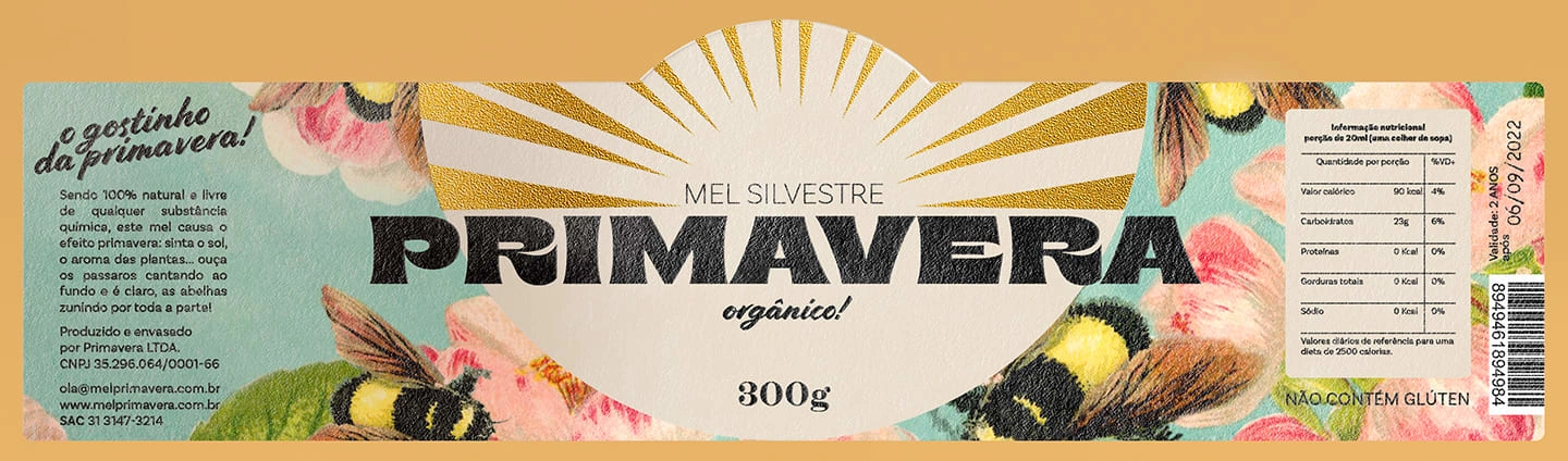
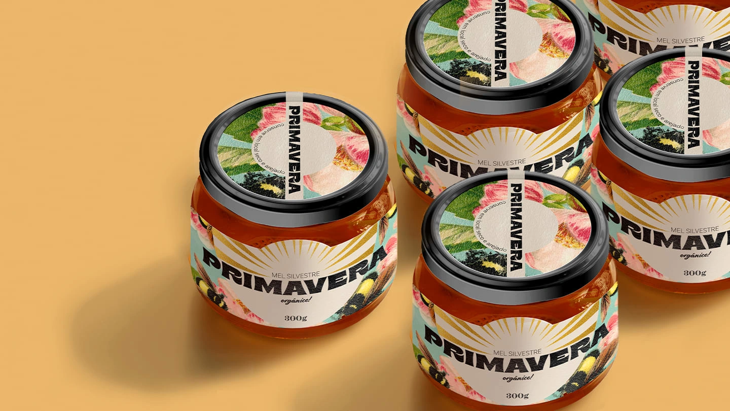
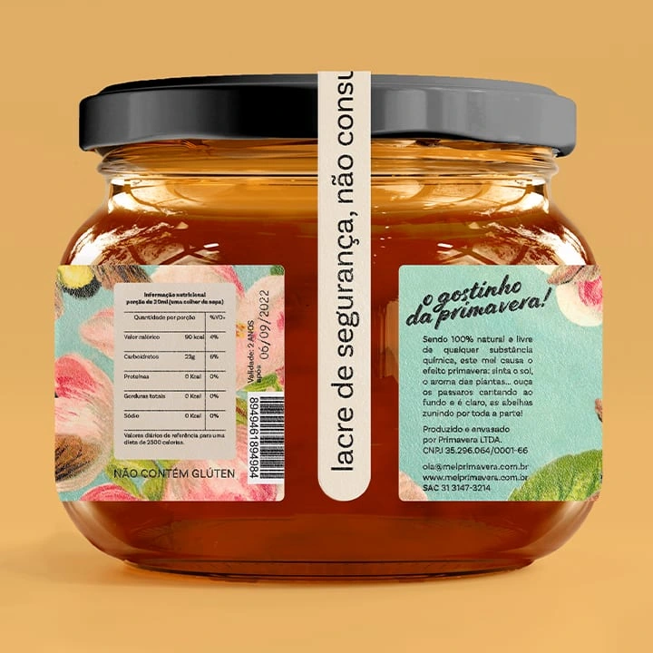
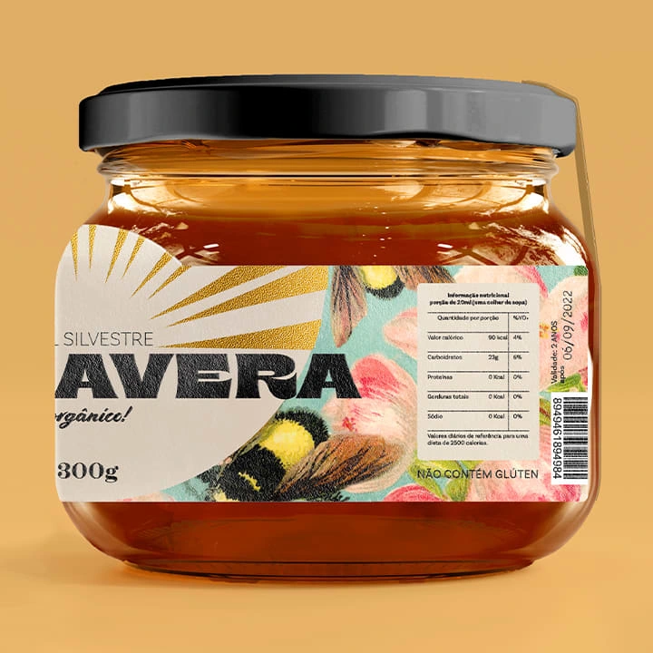
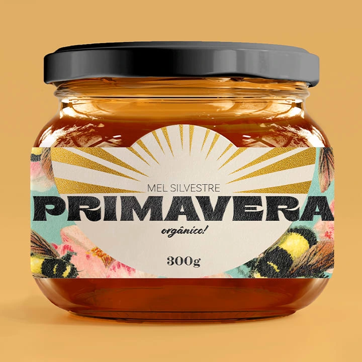
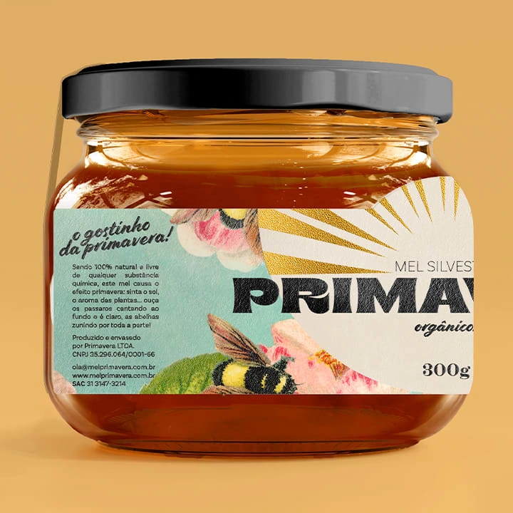
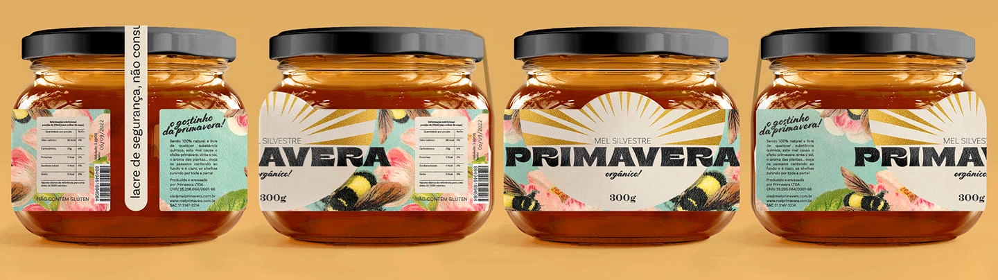
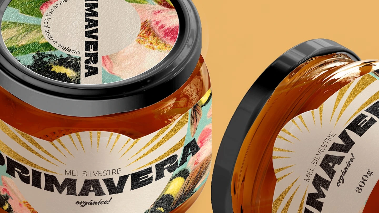
Primavera is organic, wild, and artisanal honey. Its main objective is to bring people the taste of pure honey produced with great care by countless beekeepers.
The challenge was to put in its name, label, and visual identity, this sweetness, delicacy, affection, and above all, to make it clear that it was a natural and reliable product.
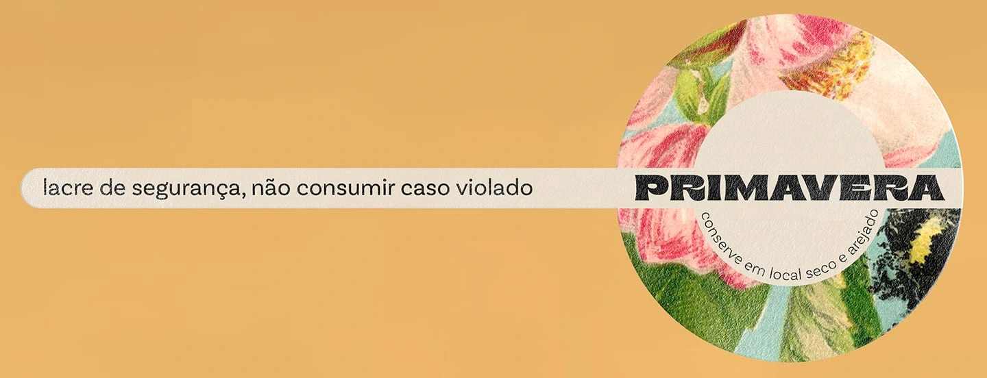
As a final result, the honey presents a beautiful illustration of bees collecting pollen in what reminds us of a spring morning. The logo uses spontaneous and organic forms while maintaining a certain seriousness. Golden lines in the background look like the sun's rays lighting up the day.
Add headings to create a table of contents.
Like this project
Posted Mar 29, 2023
Label design project for organic, wild, and artisanal honey. The name, visual identity and label were created for Mel Primavera using illustrations and typograp