IFPEC Solutions Branding

IFPEC-Branding-by-Asimba-Edward
About The Project
IFPEC SOLUTIONS LTD is a truly full-service medical waste management company that offers clients a comprehensive package of biohazardous waste removal, medical waste management audits and in-house training on safe waste handling.
The Brand USP
No waste never leaves IFPEC's hands until it is safe and no longer infectious. As such, they are able to protect their customers from any future liability that may arise from the it’s mishandling.
IFPEC also offers secure document destruction operations that entails collection, shredding and disposal of any items containing confidential data like financial information, business records and sensitive contracts.

IFPEC-Branding-by-Asimba-Edward
Identity Construction
The logo is constructed to keep to the design principles of simplicity, relevance, versatility, uniqueness and memorability.
This is attained by the use of the circular shape of the bio-hazard symbol which is striking and readily identifiable together with the leaf symbol which communicates the brand’s safe and sustainable practice of disposing bio-medical waste.
The identity communicates these key messages to IFPEC’s audiences.

IFPEC-Branding-by-Asimba-Edward
Logo Structure
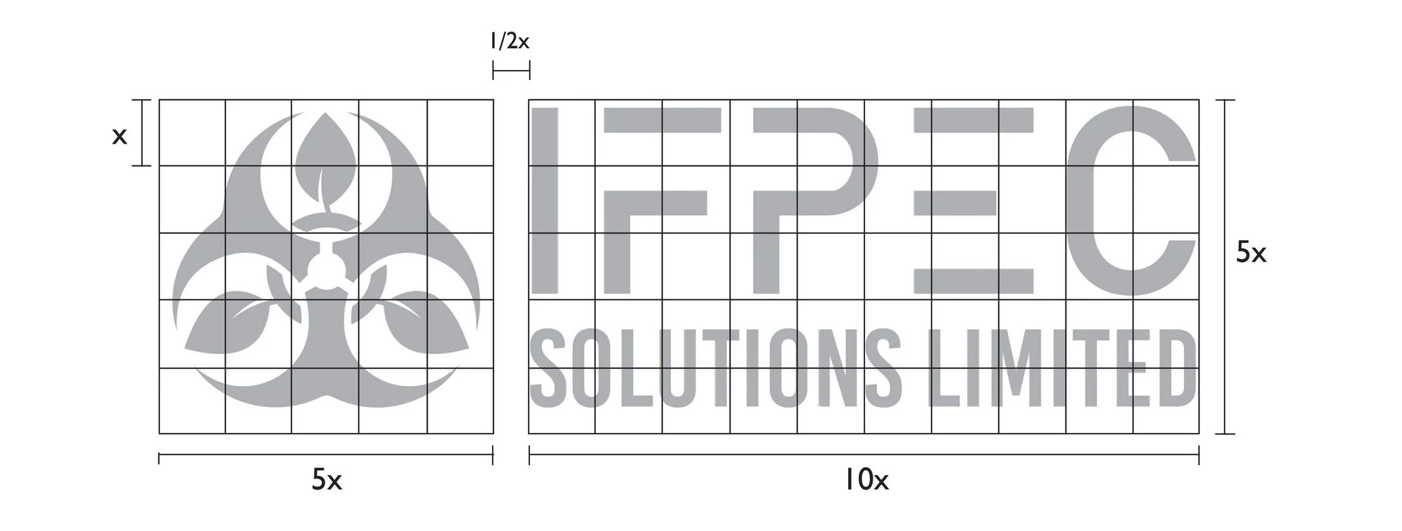
The logo consists of the visual mark and the logotype.
The visual mark is bounded by a square while the logotype is bounded by a rectangle.
IFPEC-Branding-by-Asimba-Edward
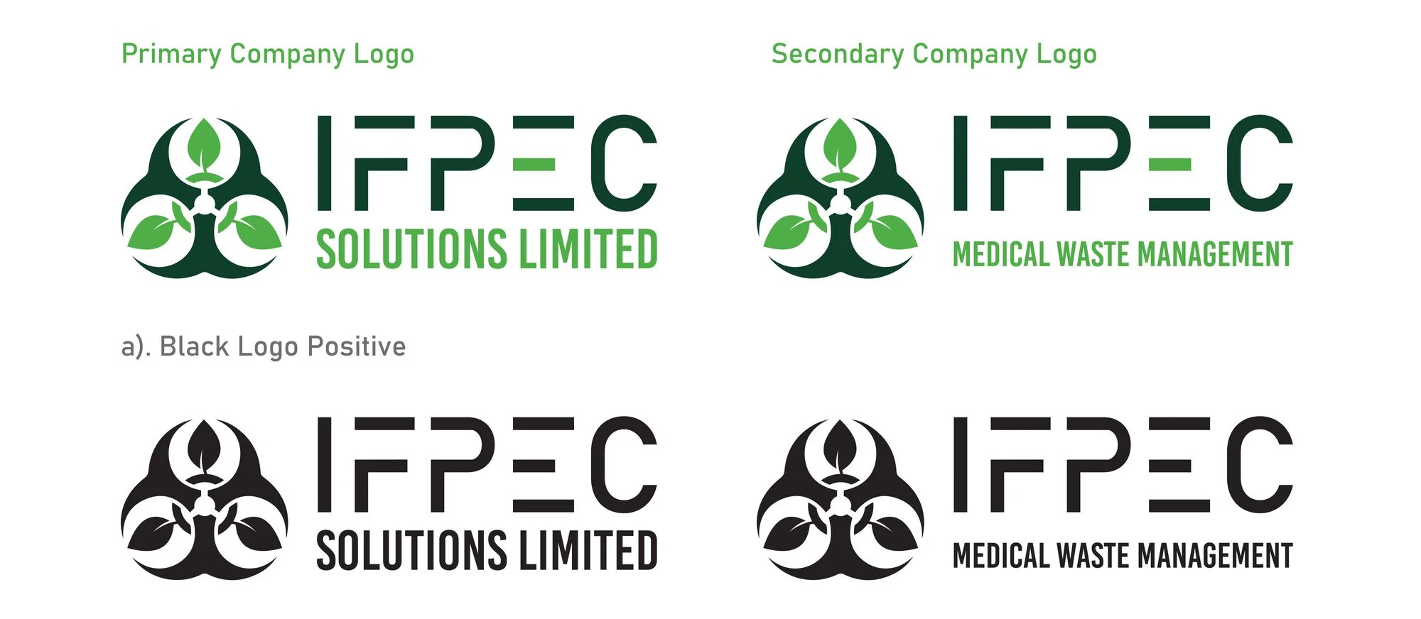
Primary Logos
IFPEC-Branding-by-Asimba-Edward
IFPEC-Branding-by-Asimba-Edward
Color Palette Development
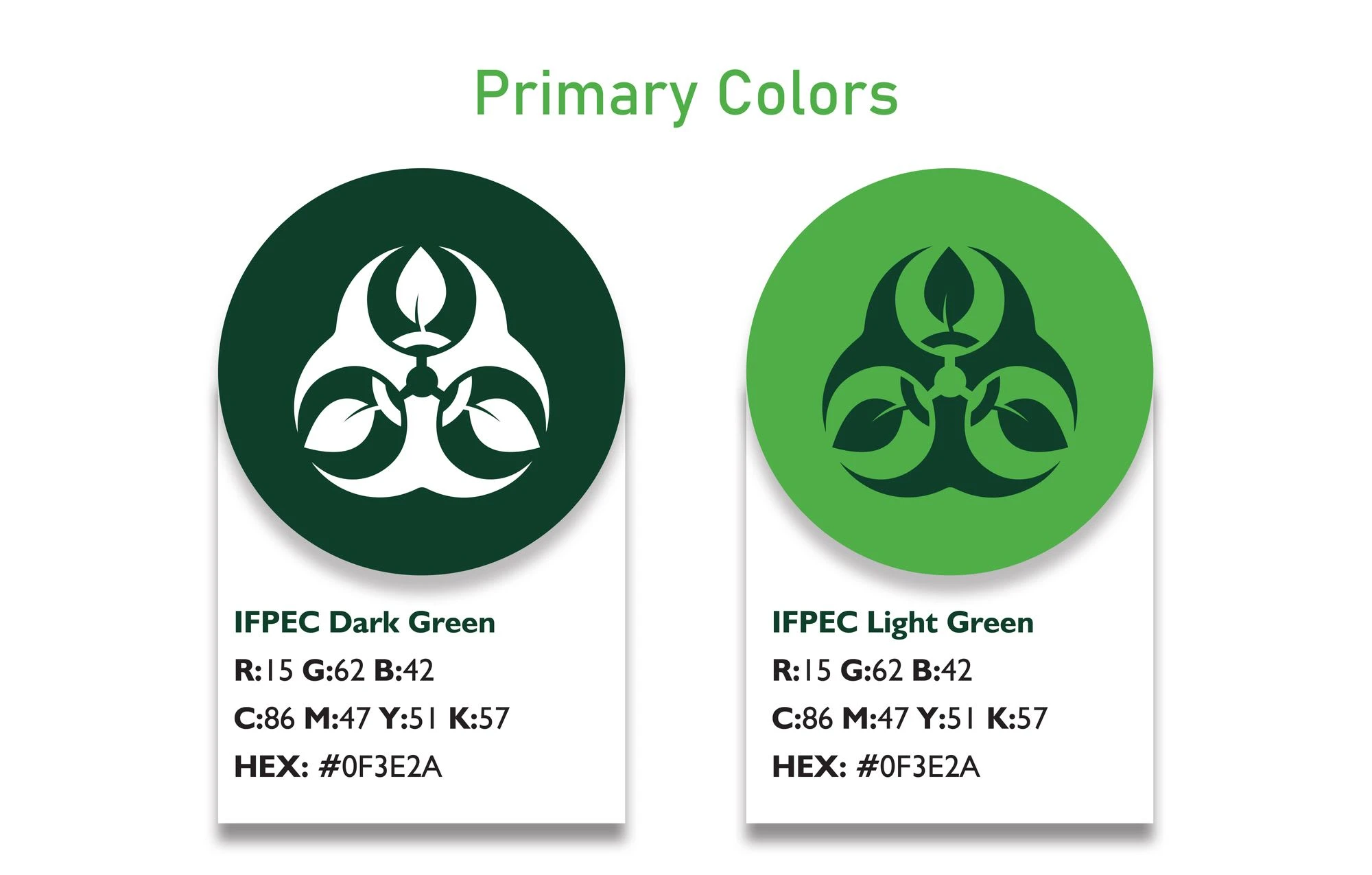
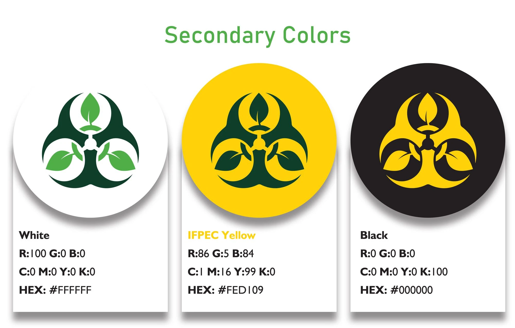
I developed the color palette to represent the brand as calm, precise, friendly and sustainable therefore I chose signature shade of greens as the colors that matches the company’s philosophy and personality.
IFPEC-Branding-by-Asimba-Edward
IFPEC-Branding-by-Asimba-Edward
Typeface Development
Primary Typeface

IFPEC-Branding-by-Asimba-Edward
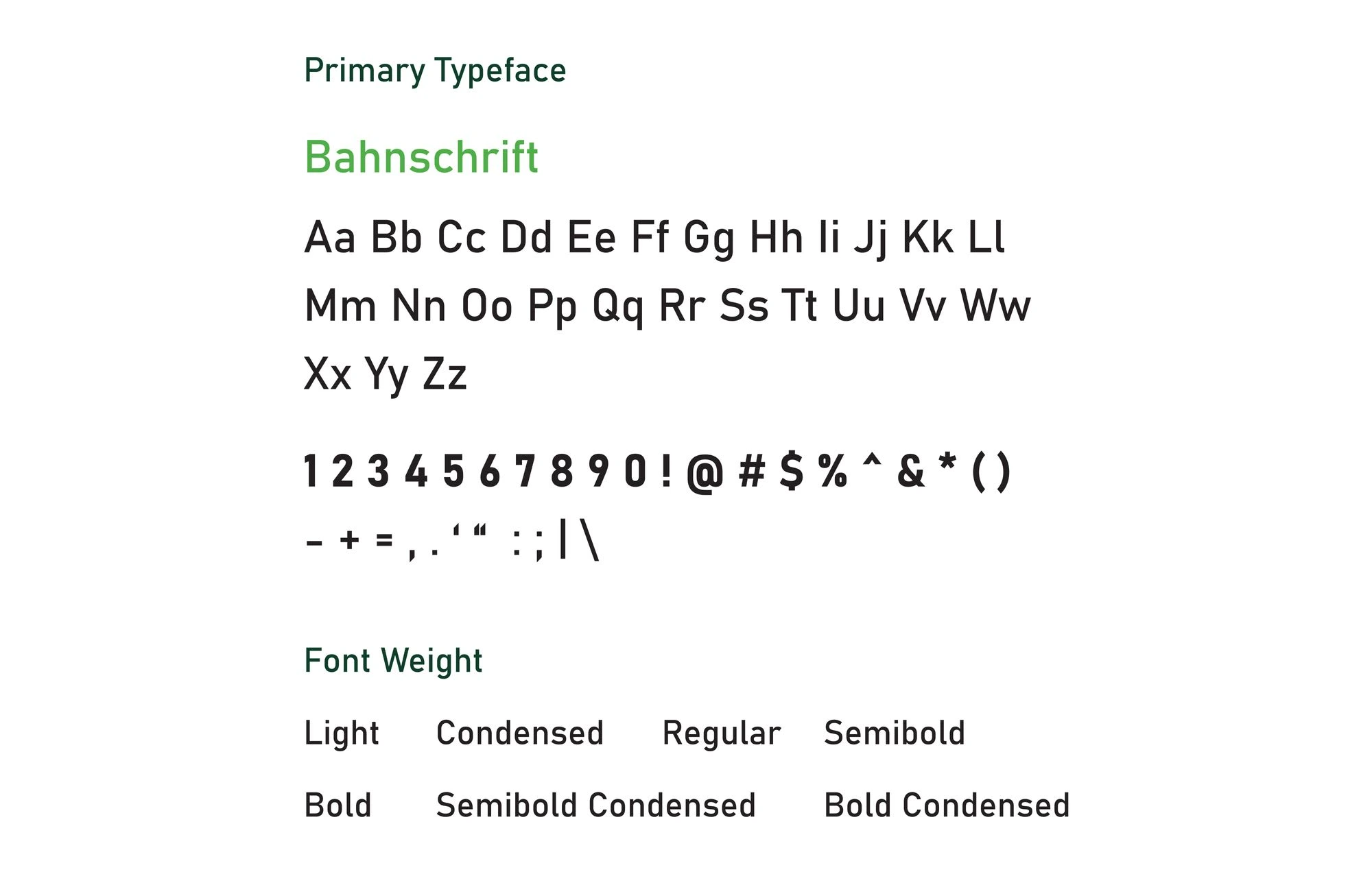
I chose **“Bahnschrift”** as the logo typeface for the IFPEC brand. **“Bahnschrift”** is contemporary, modern, clean and inviting making it key as the primary typeface.
The primary typeface is bold and is to be used for headings in a bold state, and for sub-headings in the regular state.
IFPEC-Branding-by-Asimba-Edward
Secondary Typeface
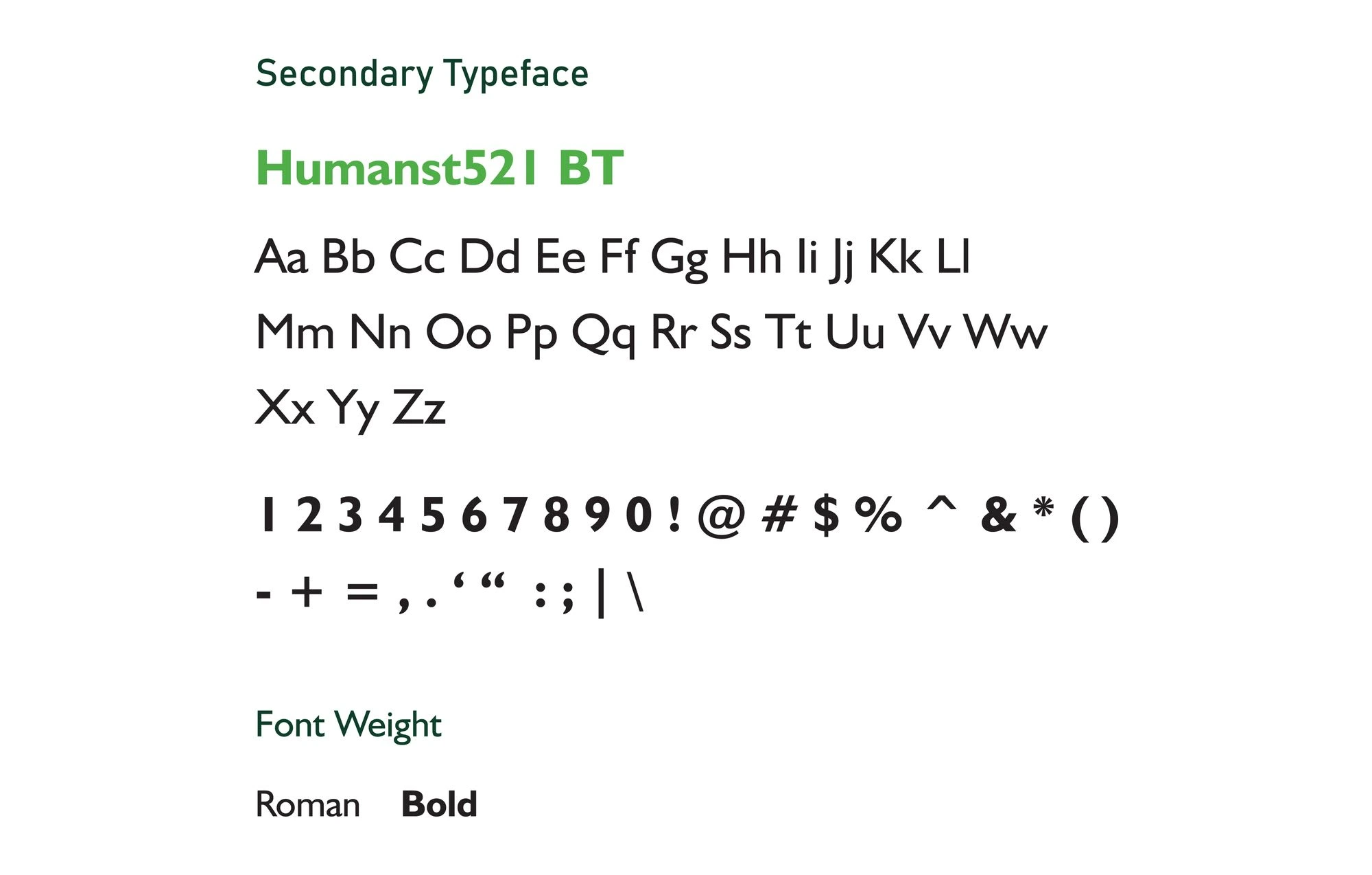
I chose “Humanst521 BT” for the secondary typeface. It is used for body text, paragraphs and in some instances, when applicable, for sub-headings.
IFPEC-Branding-by-Asimba-Edward
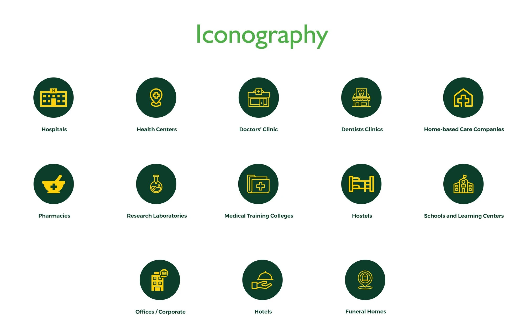
Visual Language
IFPEC-Branding-by-Asimba-Edward
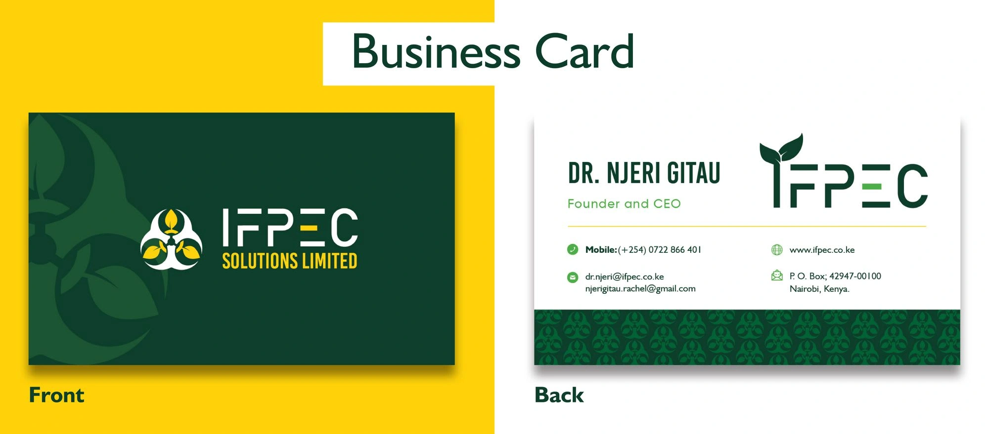
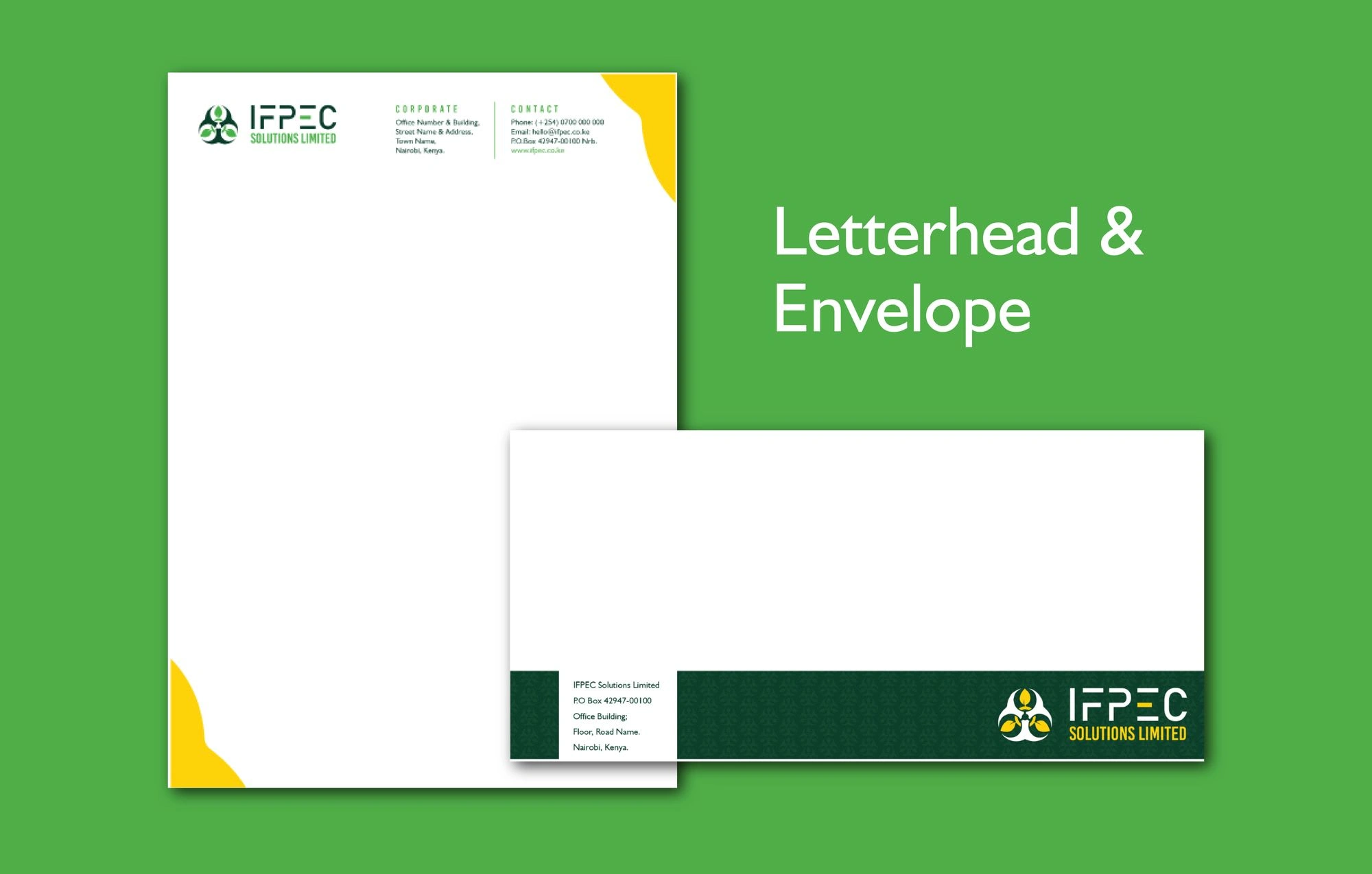
Collateral Development
IFPEC-Branding-by-Asimba-Edward
IFPEC-Branding-by-Asimba-Edward
Brand Application
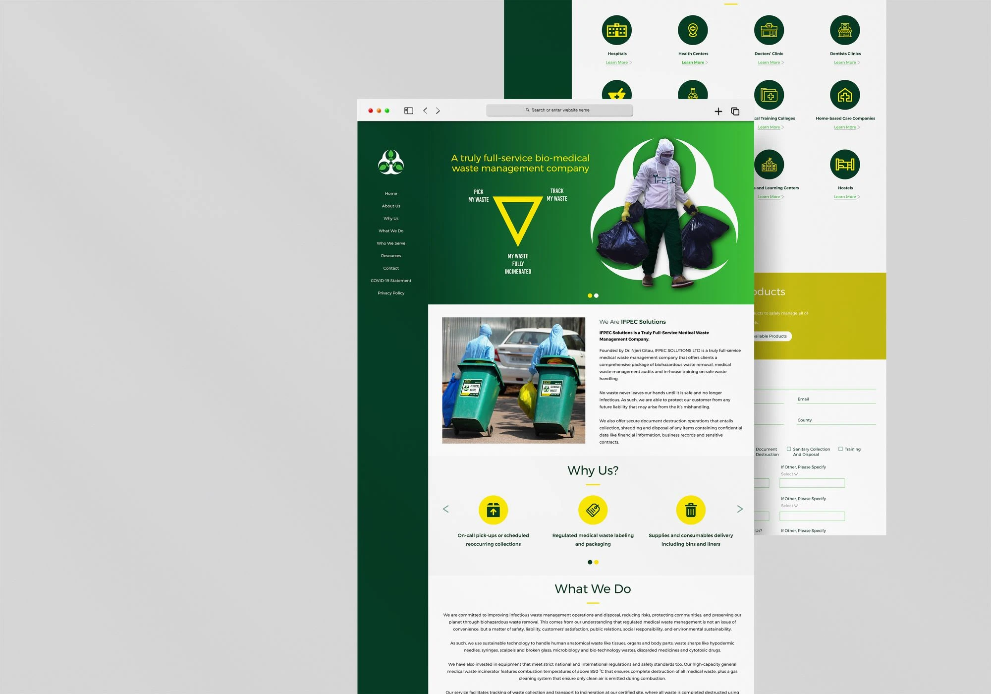
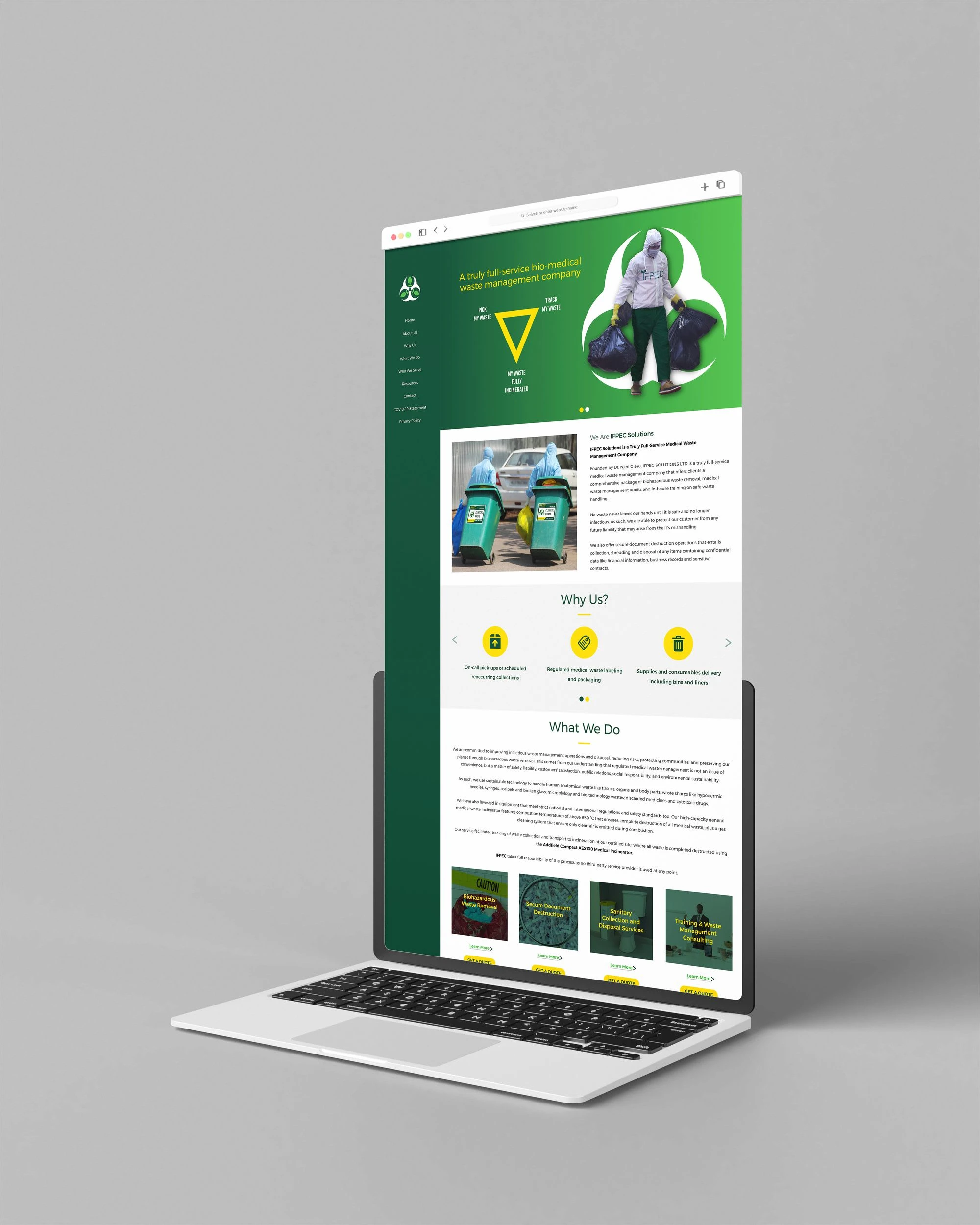
Landing Page Design
I designed the landing page in line with the developed brand guideline.
I crafted clear-inviting messaging that showcases the company’s information concisely to visiting customers and ensures conversion.
IFPEC-Branding-by-Asimba-Edward
IFPEC-Branding-by-Asimba-Edward
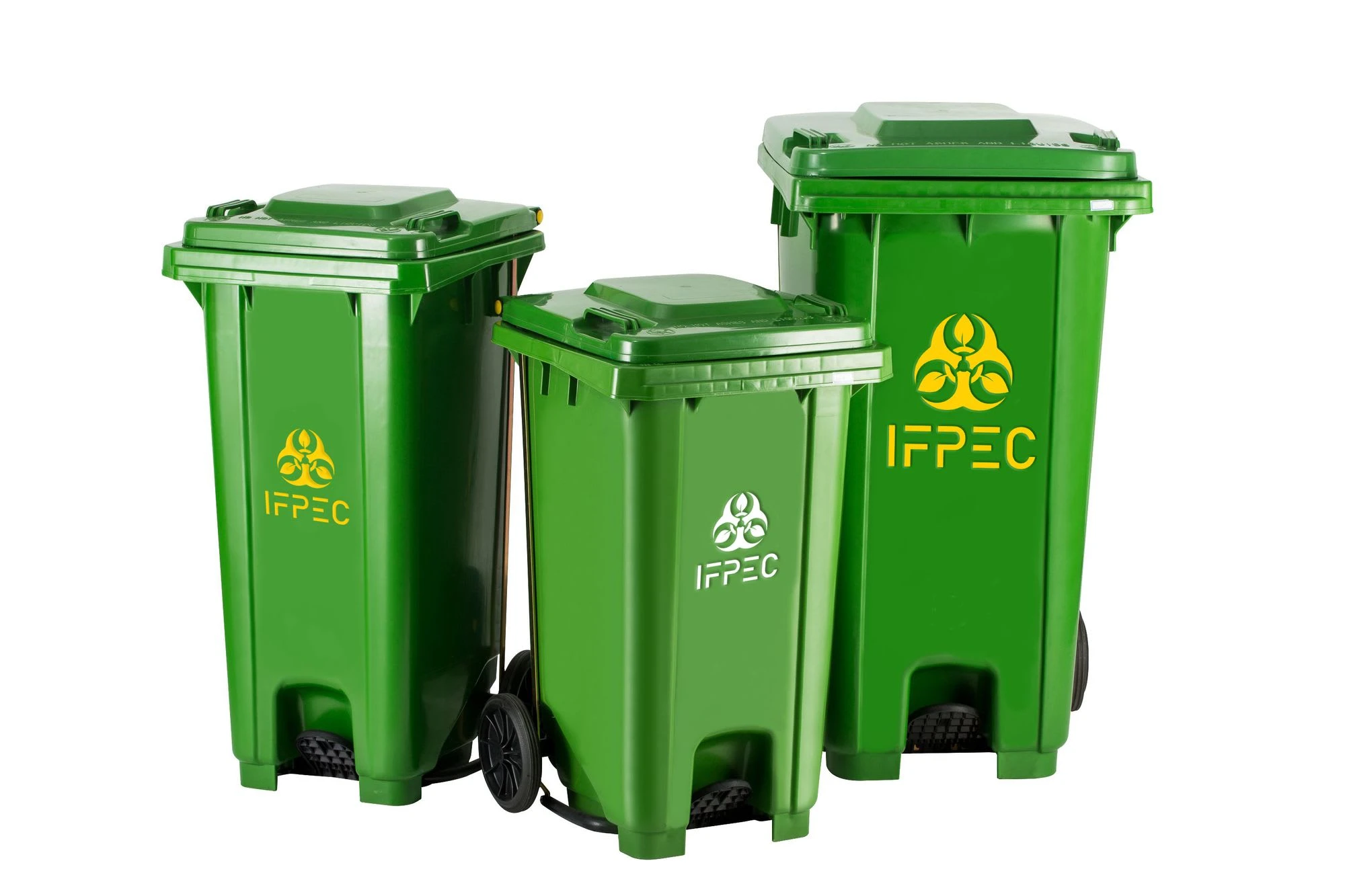
Brand Mockups


Thanks for viewing 🙂
Like this project
Posted Aug 28, 2023
Full brand development and design for IFPEC, a full-service medical waste management company that offer clients comprehensive biohazardous waste removal.
Likes
0
Views
6


