ADVANCED MOBILITY CENTER Branding
Asimba Edward
Advanced-Mobility-Center-Branding-by-Asimba-Edward
About The Brand
Advanced Mobility is a driving training center that seeks to deliver high impact learning for drivers & road users in the East Africa region.
Poor road safety skills are main cause of accidents leading to injury, death & huge economic losses in Africa. Advance Mobility seeks to solve this issue by advocating and impacting a safe & productive mobility for road users in Africa through specialized courses (practical & theoretical)
The Mission
Advanced Mobility’s mission is to turn the road safety challenges in Kenya into a success story by advancing actionable training aimed at skills not just a driving license.
The Brandmark & Symbol
The developed Advanced Mobility Centre brandmark is the master-brand representation of the company’s promise to its customers - safety, reliability and enhanced skills.
The idea behind the brandmark is the “Steering Wheel” to represent the above qualities, The letter “A” representing the “Advanced” aspect and the “Smile” symbol representing the warm approach to teaching and impacting valuable knowledge to the students.
The brandmark utilizes the developed color system to complete its form which is modern, distinct and timeless.

Advanced-Mobility-Center-Branding-by-Asimba-Edward
The Logomark
The logomark compromises two elements, the logo symbol and logo type. The Logo Symbol is a powerful image evoking the culture of design - the connection between the strength of communication and the different points that influence.
Advanced-Mobility-Center-Branding-by-Asimba-Edward
The Logotype
The logotype has been carefully developed to reflect modernity and refined to be legible in all collateral; both online and offline. The logotype consists of bold legible sentence case typography arranged to compliment the logomark.
Advanced-Mobility-Center-Branding-by-Asimba-Edward
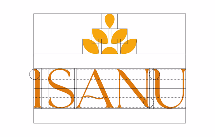
Logo Construction
The logo is what connects with customers, and it is the #1 item that customers will identify the Advanced Mobility brand, therefore it needed to stand out. Respecting the perfect amount of clear space gives the logo the optimal legibility, visibility, prominence and impact.
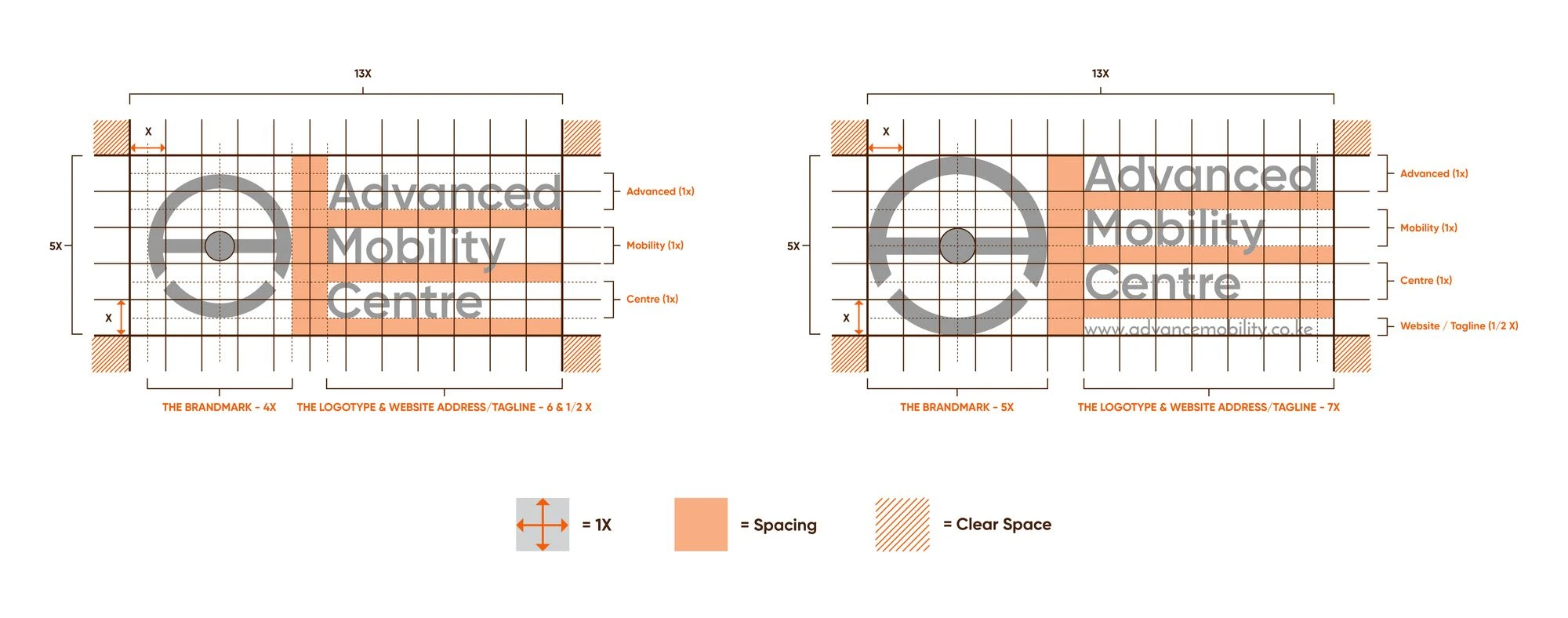
Advanced-Mobility-Center-Branding-by-Asimba-Edward
Color Architecture
The logo colors play an important role in defining the identity and branding.
Advanced-Mobility-Center-Branding-by-Asimba-Edward
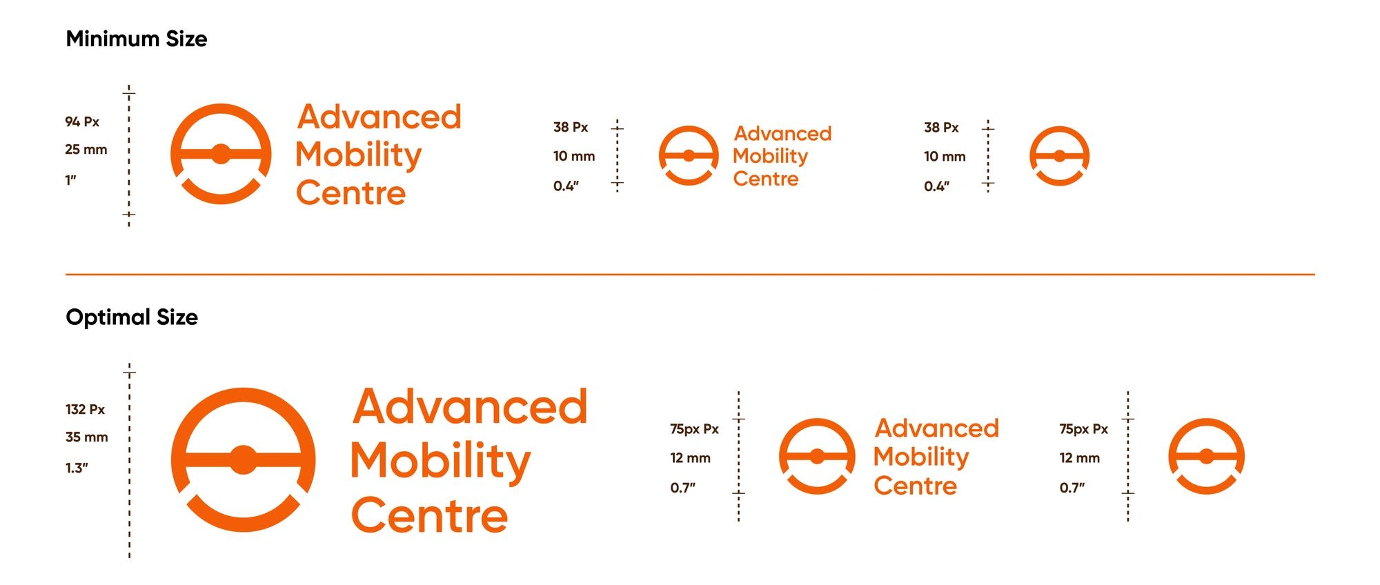
Minimum Sizes
The logo should not be reproduced smaller than the specified minimum size as doing so compromises its readability.
Just as the logo should not be shown smaller than the minimum size, it should also not be made proportionally too large for its intended use.
Advanced-Mobility-Center-Branding-by-Asimba-Edward
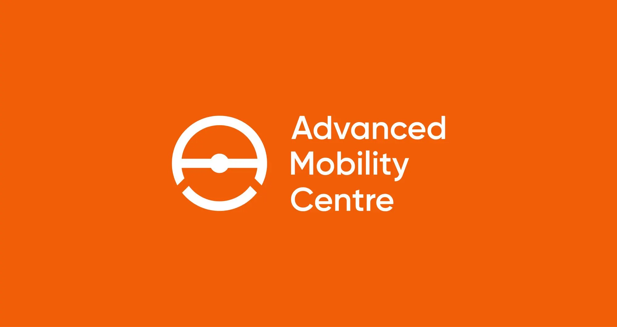
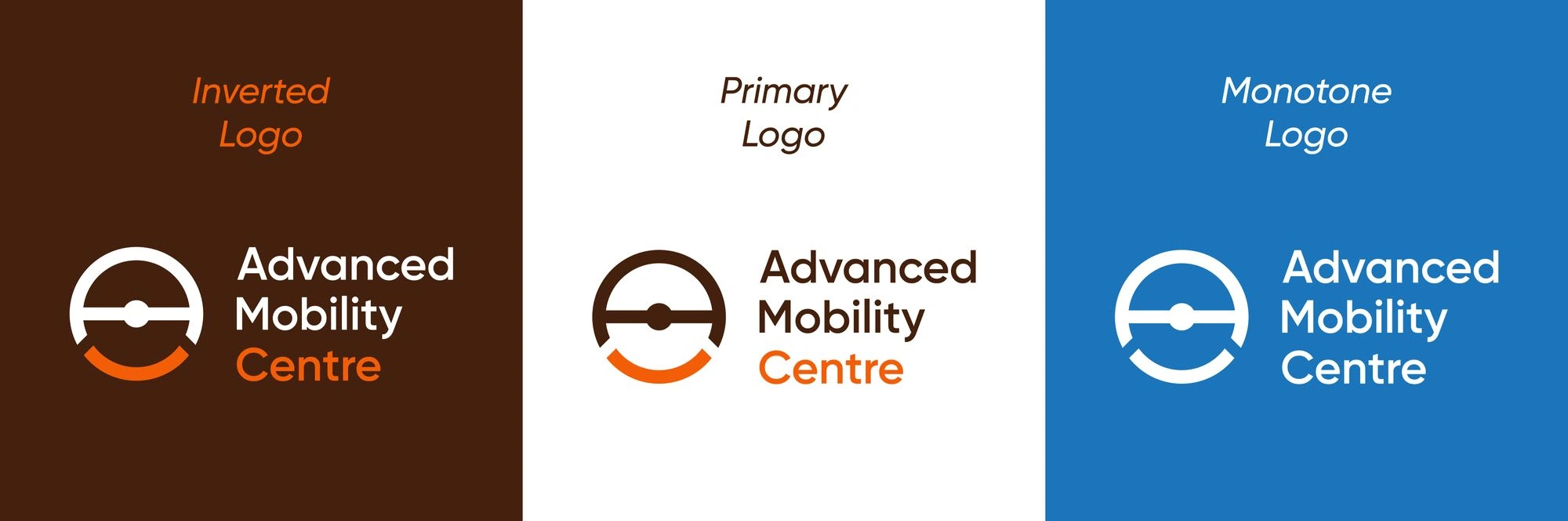
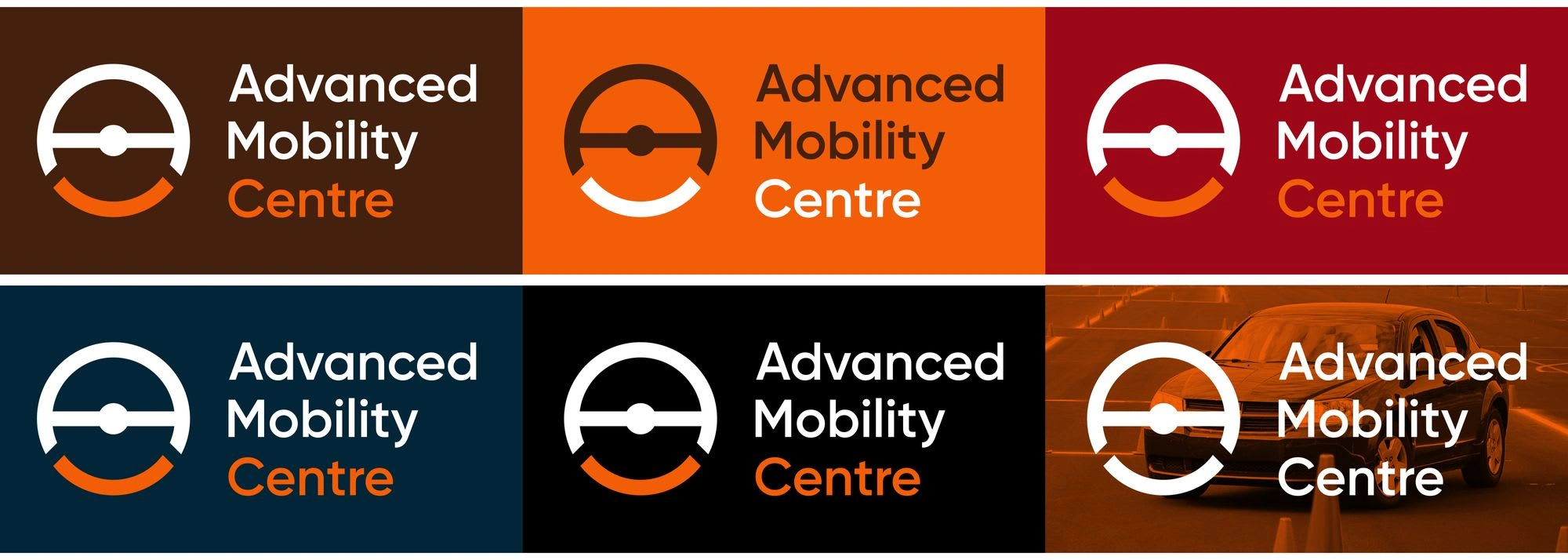
Logomark On Backgrounds
The below represents the ideal logo-background matching. The main rule is that the logo must be clearly readable, the primary color palette is to be used wherever possible, in the case where the primary color set isn’t applicable, the secondary color palette should be used.
Advanced-Mobility-Center-Branding-by-Asimba-Edward
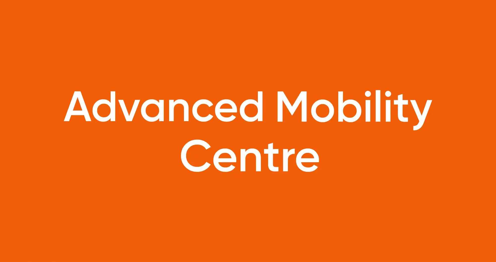
Typography
Typography plays an important role in the visual identity. Maintaining consistency font usage helps to convey the Advanced Mobility personality across all channels.
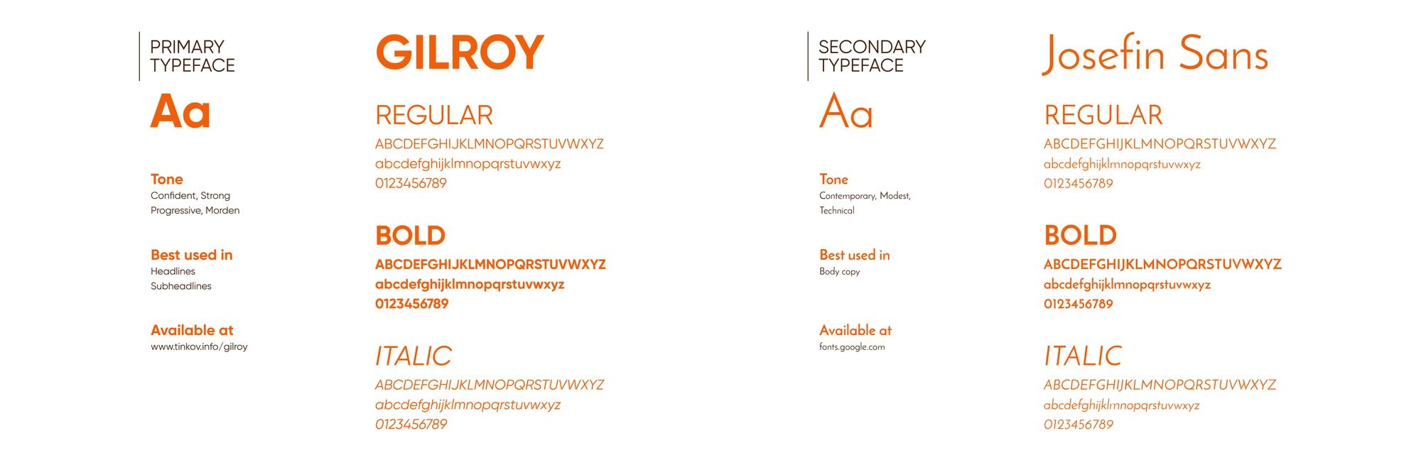
Advanced-Mobility-Center-Branding-by-Asimba-Edward
The Color System Development
Color plays an important role in the brand. It not only reinforces the cohesiveness of the brand, but also serves a psychological purpose by communicating specific feelings to the Advanced Mobility audiences.
Primary Palette
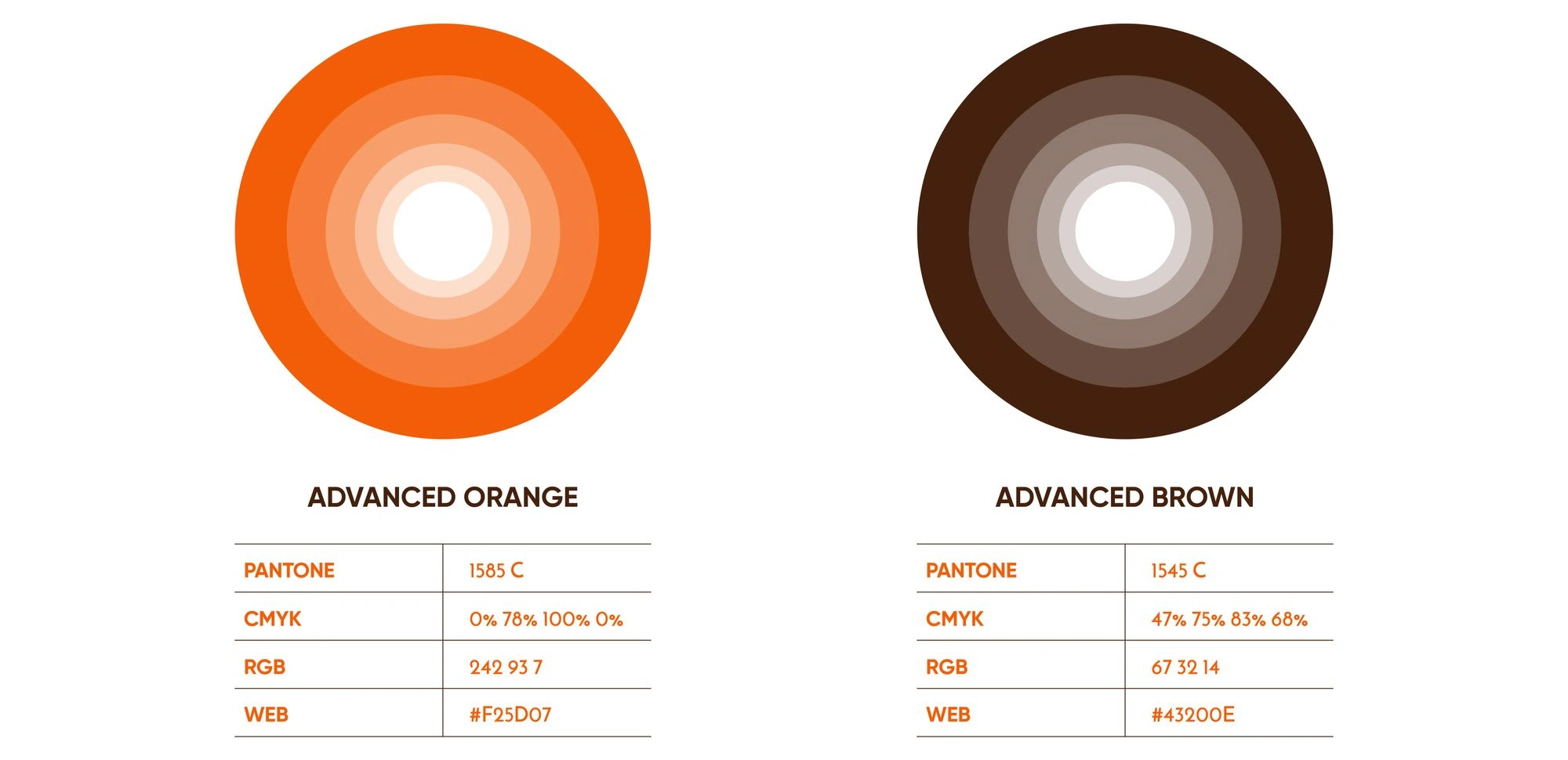
Advanced-Mobility-Center-Branding-by-Asimba-Edward
Secondary Palette
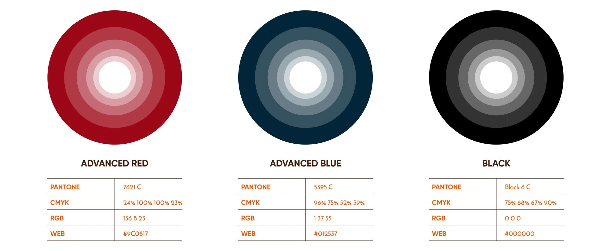
Advanced-Mobility-Center-Branding-by-Asimba-Edward
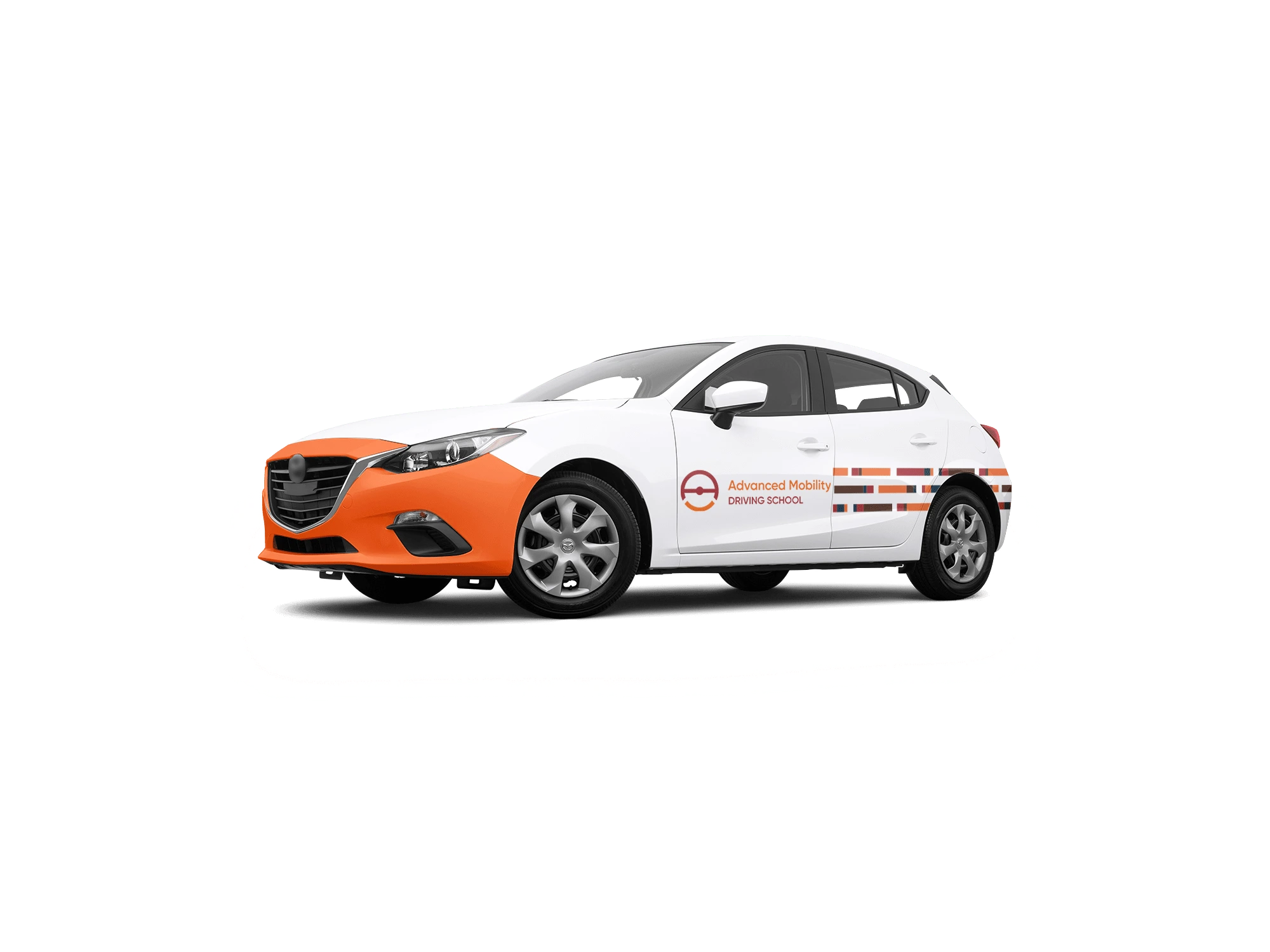
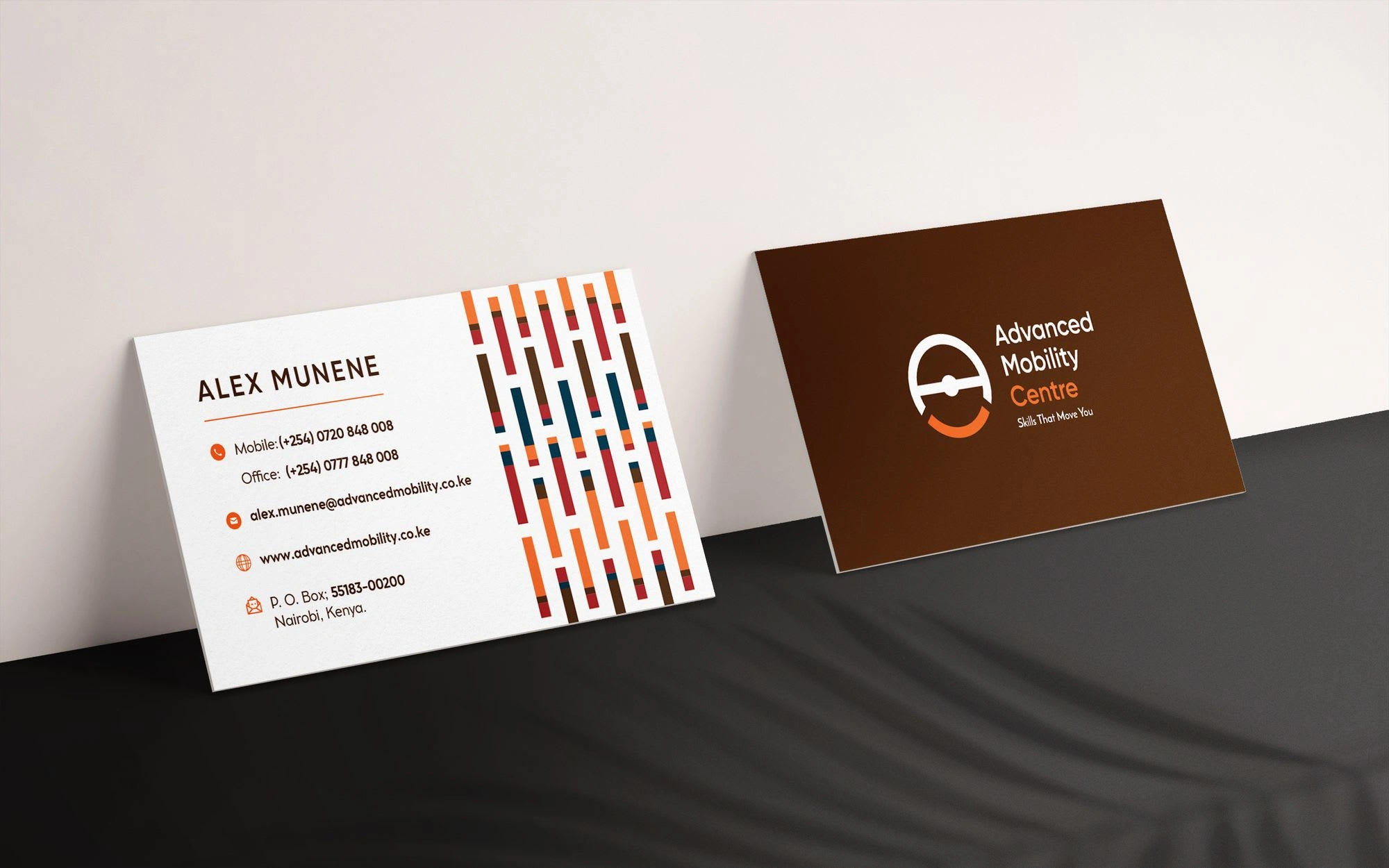
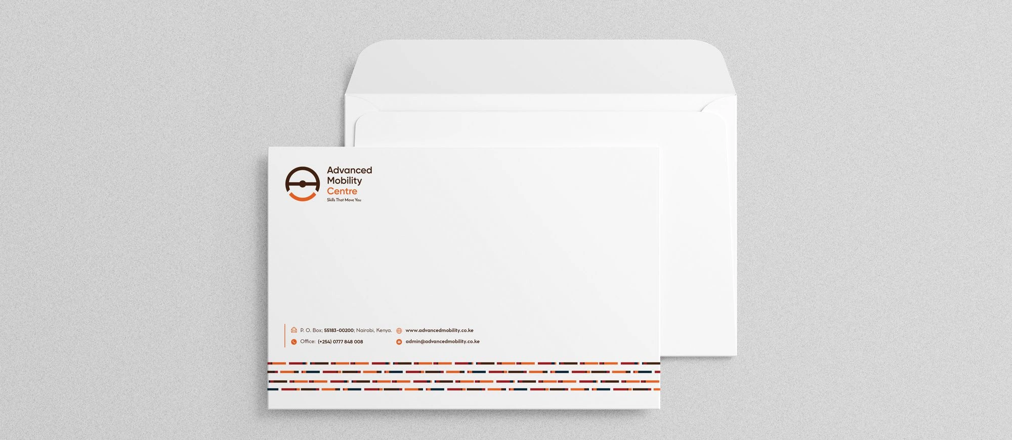
Brand Application
Corporate Stationary
Advanced-Mobility-Center-Branding-by-Asimba-Edward
Advanced-Mobility-Center-Branding-by-Asimba-Edward
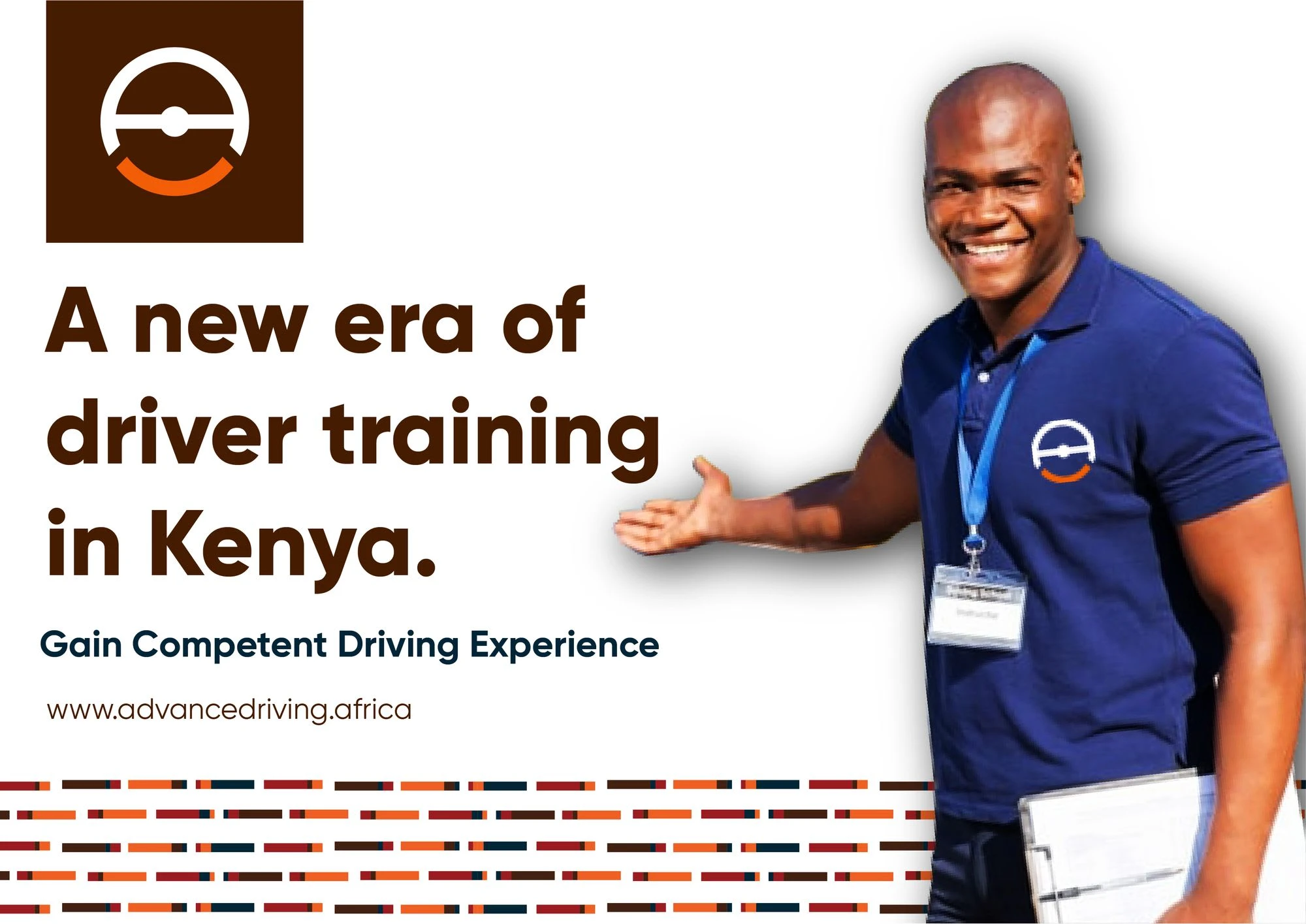
Brand Messaging
Advanced-Mobility-Center-Branding-by-Asimba-Edward

Advanced-Mobility-Center-Branding-by-Asimba-Edward
Thanks for viewing 🙂
Like this project
Posted Aug 28, 2023
Full brand development & design for Advanced Mobility, a driving center that delivers high impact learning solutions for drivers & road users in East Africa.
Likes
0
Views
20