Exploratory Data Visualization Tool for 2023 Survey

Ihar Yanouski


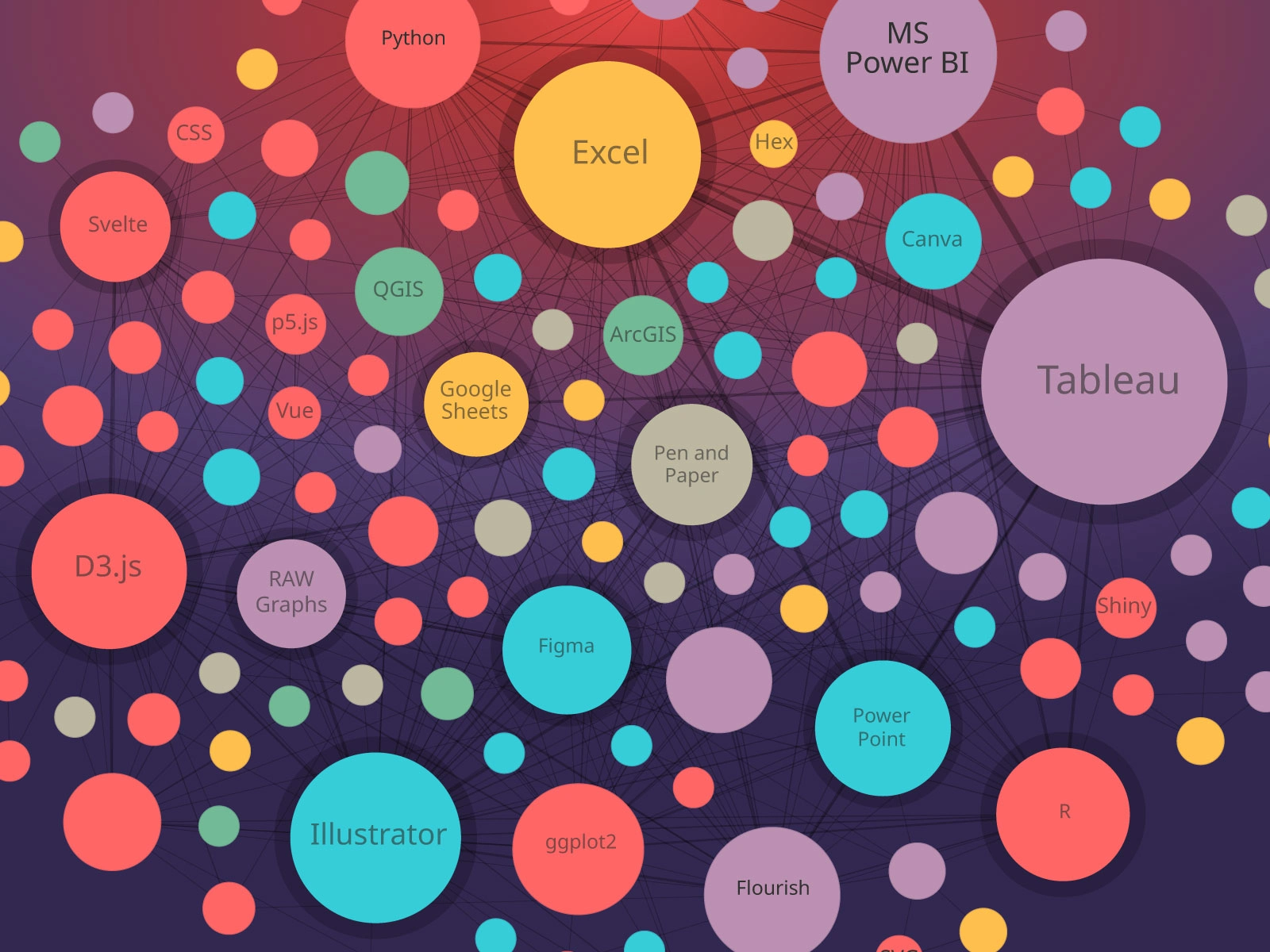
I created an exploratory visual tool using responses from the State of the Data Visualization Industry 2023 survey. The interactive network links 138 data visualization tools based on respondents' the most enjoyable tools.
See the live version.
Explore how different tools relate to each other
Each connection represents a shared pattern of use, making it possible to explore clusters of tools, identify common combinations, and see where different parts of the data visualization ecosystem overlap.
Data visualization tools map for different categories
The project turns a large set of poll responses into a navigable map for practitioners who want to understand the tools shaping contemporary data visualization work.
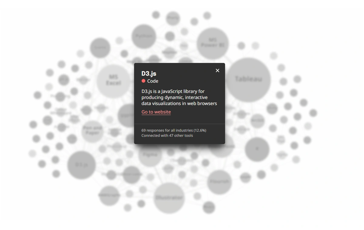
You can find details about every tool in the tooltip
This work was submitted to the State of the Data Visualization Industry 2023 Challenge and was selected for 1st place in the Exploratory category.
Like this project
Posted Sep 4, 2026
Interactive network visualization showing which tools data visualization professionals enjoy the most.
Likes
0
Views
6
Timeline
Feb 1, 2024 - Mar 13, 2024