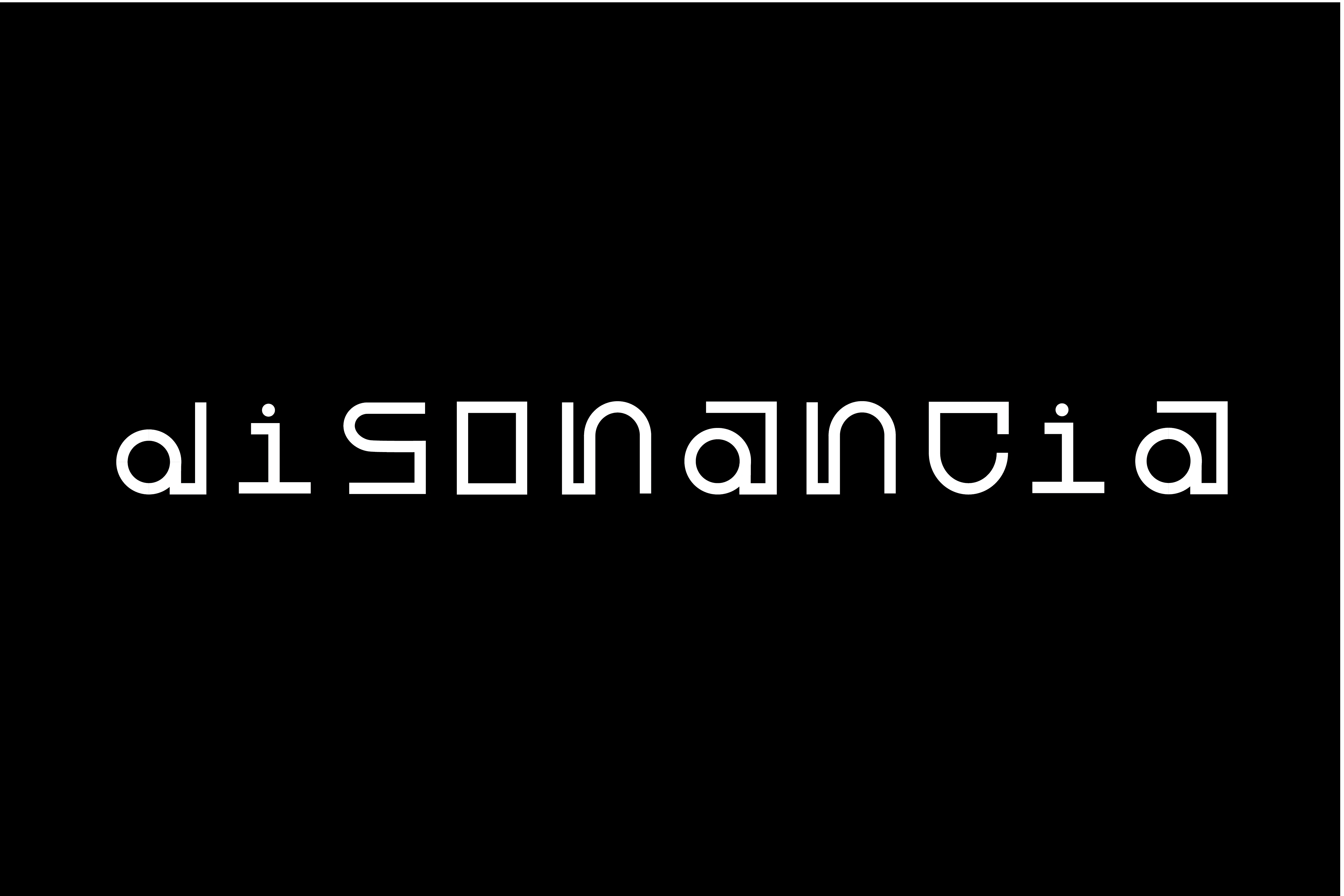
Disonancia
Alessandra Escobar
Dissonance: disproportion or lack of the natural conformity and proportion that something should have.
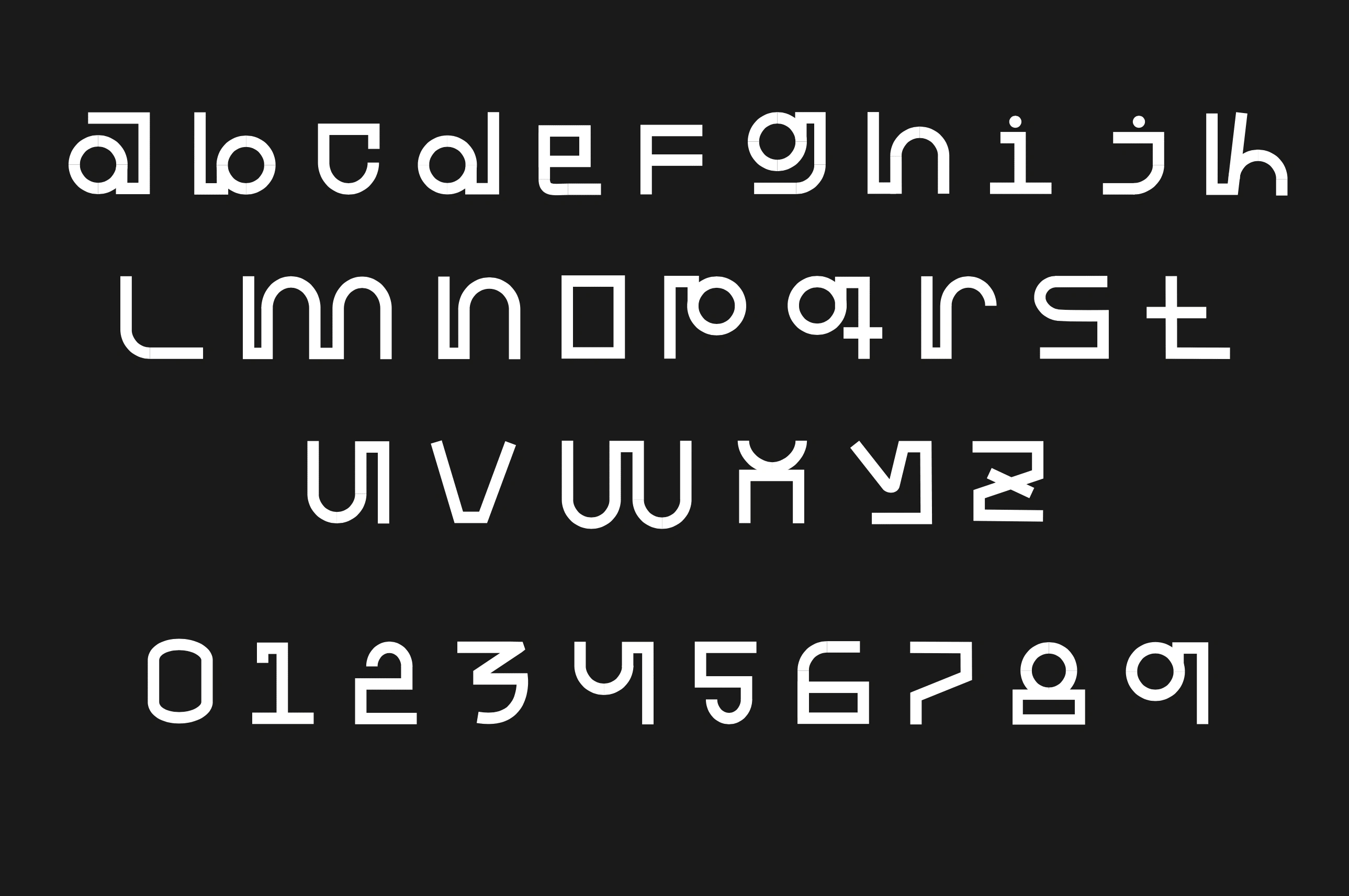
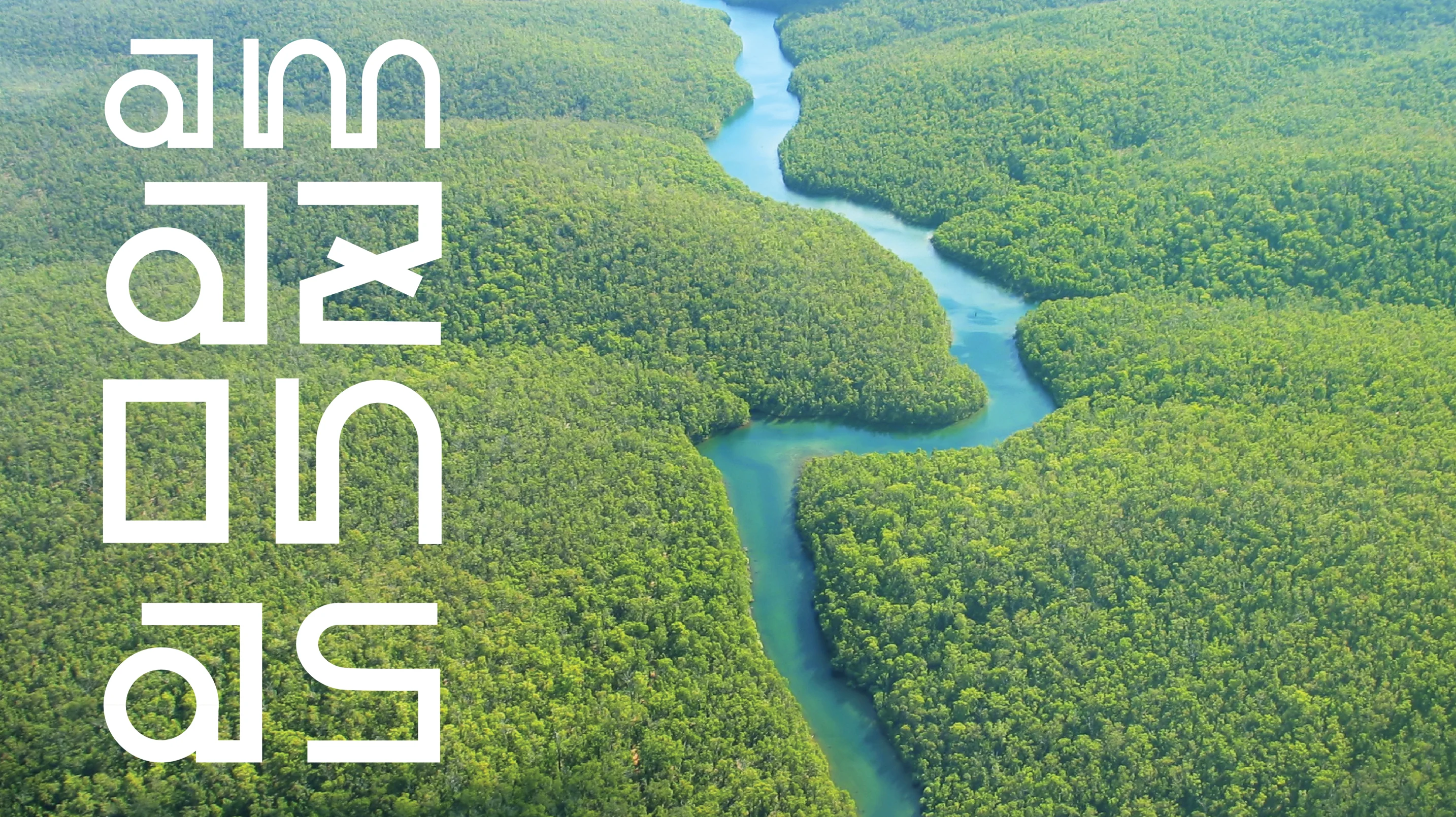
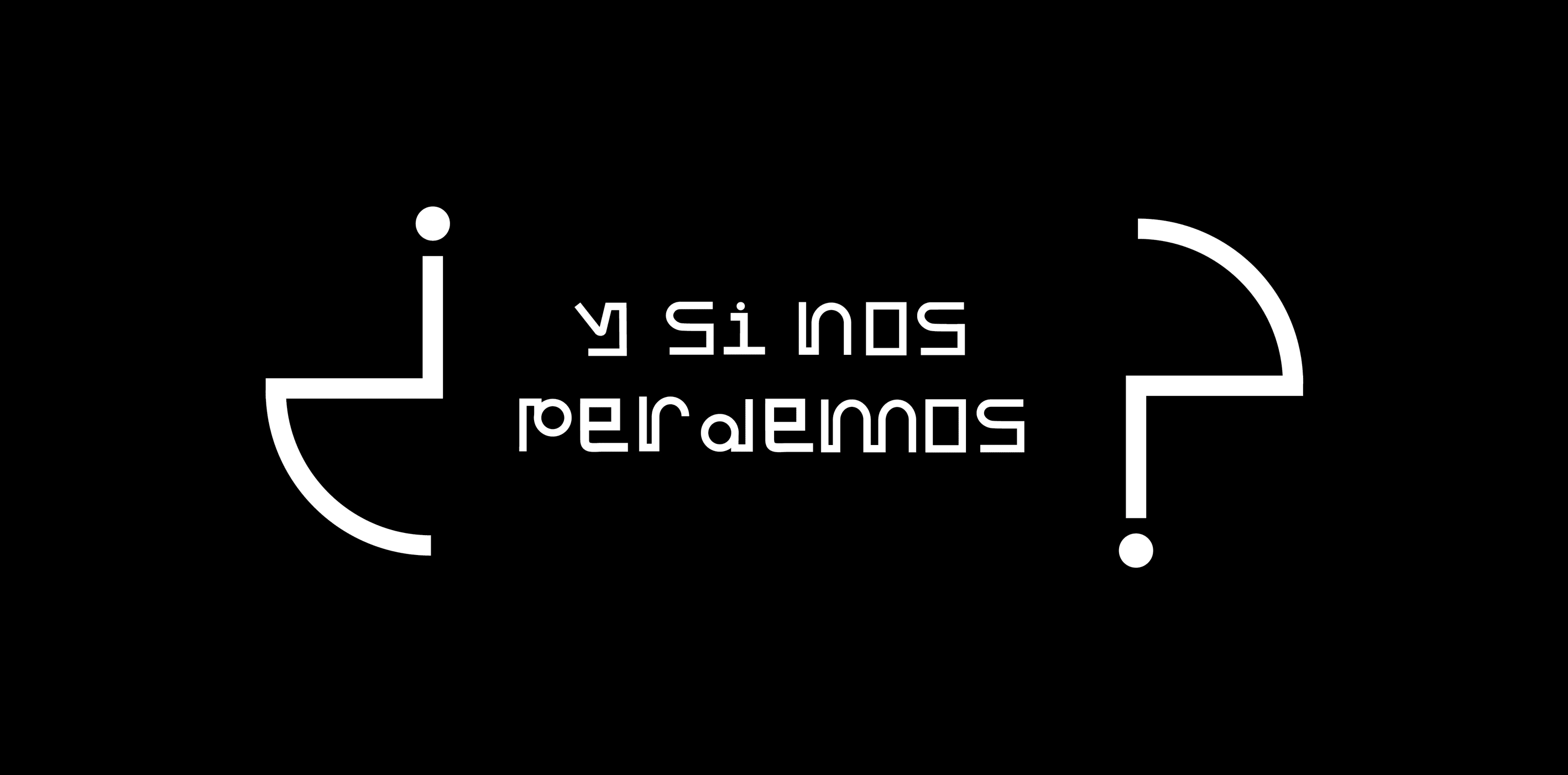
For a class project, I designed a typography inspired by the intricate relationship between human creations and nature. The name of the font itself and the unique design, where each letter is subtly detached from its origin by delicate lines, symbolize this connection.
Inspired by the relationship between machines and the environment. Straight lines, which symbolize machines, embody the precision and design of human creations, always striving for perfection. On the other hand, the environment is represented by curved lines, mirroring the organic flow found in nature, like trees and rivers, simply allowing themselves to be.
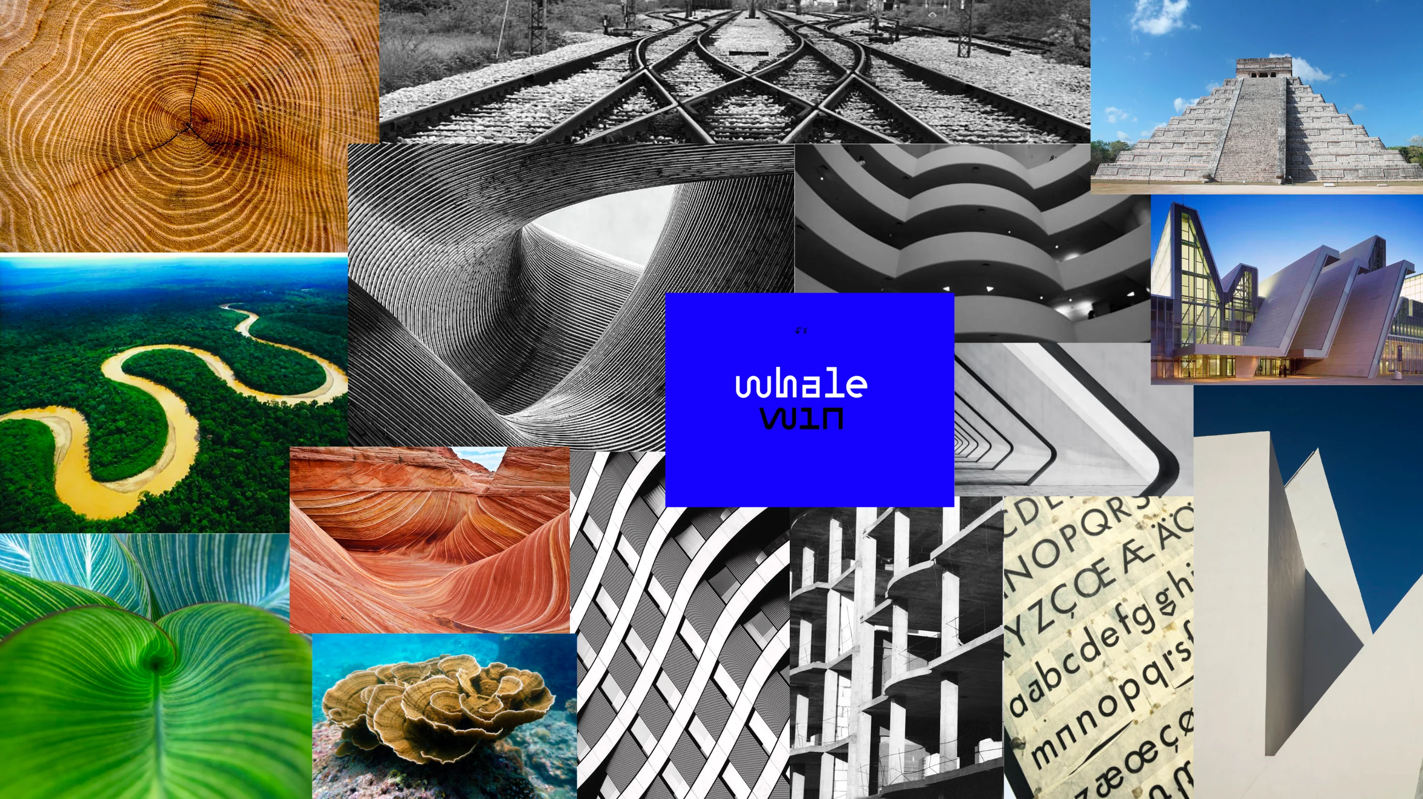
Mood Board
Like this project
Posted Sep 20, 2023
Typography creation for class assignment.
Likes
0
Views
3