ECM Chinese Medicine Clinic|Strategise content to explain diffi…
Overview: Transform the website with easy-to-navigate structure, clear positioning and simple copywriting
ECM Clinic is a reputable Chinese Medicine clinic run by a registered Chinese Medicine practitioner who has over 10 years of experience. When she approached me, she already had a website that she had built herself, but it was lying idle because it did not meet her standards.
Overloaded with the technical explanations of her unique therapy, the website with over 35 pages was not easy to navigate. The detailed yet difficult explanations created barriers for the commoners to understand the therapy despite the client’s strong desire to promote her grounded treatment.
In this project, I was first commissioned to create the homepage only. After that, I got the opportunity to extend the project to the entire website. With medical concept information delivery as the priority, I focused on structuring the website and simplifying the difficult concepts.
Objective: Market the clinic and educate difficult medical concepts
The initial website was overloaded with information ranging from services, medical concepts, case studies, and many others without a clear structure and messaging. Passionate about the Chinese Medicine theory she built, she intended to put out every bit of the theory and concept on the website but to no avail, she failed in educating the audience because the information was uneasy to digest.
With that in mind, the key objective of the project was to focus on marketing the clinic with standardized messaging and simplifying the information.
My Approach
Understanding client’s needs and brainstorming ideas: Before signing a contract, I conducted a call to understand the businesses and what made me win the contract was that I provided a brief idea on how I plan to simplify the difficult medical concept.
Current website audit: I audited the current website and pointed out the key problem was the unaligned message shadowing the client’s potential and the overloading and difficult concept explanations.
Develop a communications strategy and website structure: Based on what values the client upheld, I built a one-pager pinpointing the key message, voice and tone, and visual style. Subsequently, I advised on the website structure and built the content framework of each page.
Content creation and mid-fidelity mockup: I brought everything on plans to life on Figma including the entire copywriting and the website design, inspired by an Avada theme called Energy.
Deploy on WordPress: I migrated the mockups to WordPress from Figma during which I balanced the aesthetic features and the functionalities of Avada to ensure responsiveness and navigation.
1. Create the key message to cut through the noise
The original website lacked a clear key message, instead opting to unintentionally list keywords like "safe," "unique," and "multi-beneficial" on the homepage. However, these failed to capture audience attention, as patients visiting the clinic already expected these qualities. Understanding the uniqueness of the business owner's therapy and the audience's goals, I crafted a key message: "We cure from the root cause to make the symptom disappear." This message aimed to cut through the noise and effectively communicate the essence of the therapy offered.
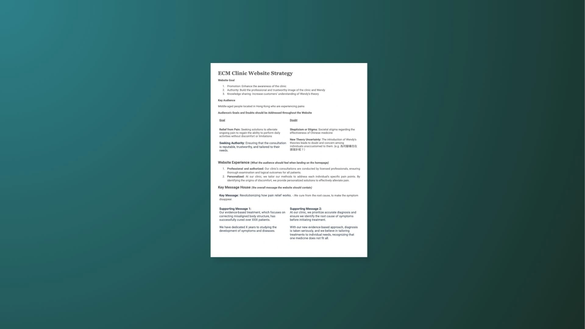
The website strategy one-pager
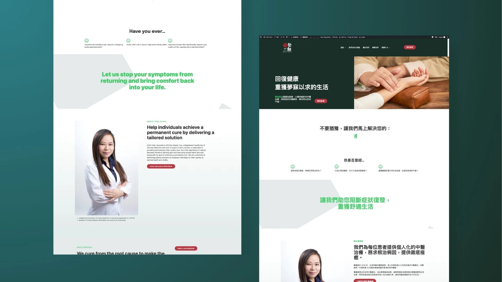
Website homepage
2. Reorganize the content: Balance what the client wants to deliver vs the audience needs to know
The therapy founder initially wanted to delve into every detail of the therapy and its underlying science. However, from a marketing perspective, this is overwhelming for laymen to grasp. Collaborating closely with the client, we meticulously identified the most crucial information to include on the website. This involved striking a balance between what the client deemed important to convey and what the audience needed to know. We agreed to highlight essential details on the website, complemented by easy-to-understand graphics. Additionally, we provided options for users interested in delving deeper into the subject matter. This balanced approach ensured that the website effectively conveyed key information while catering to varying levels of audience understanding.
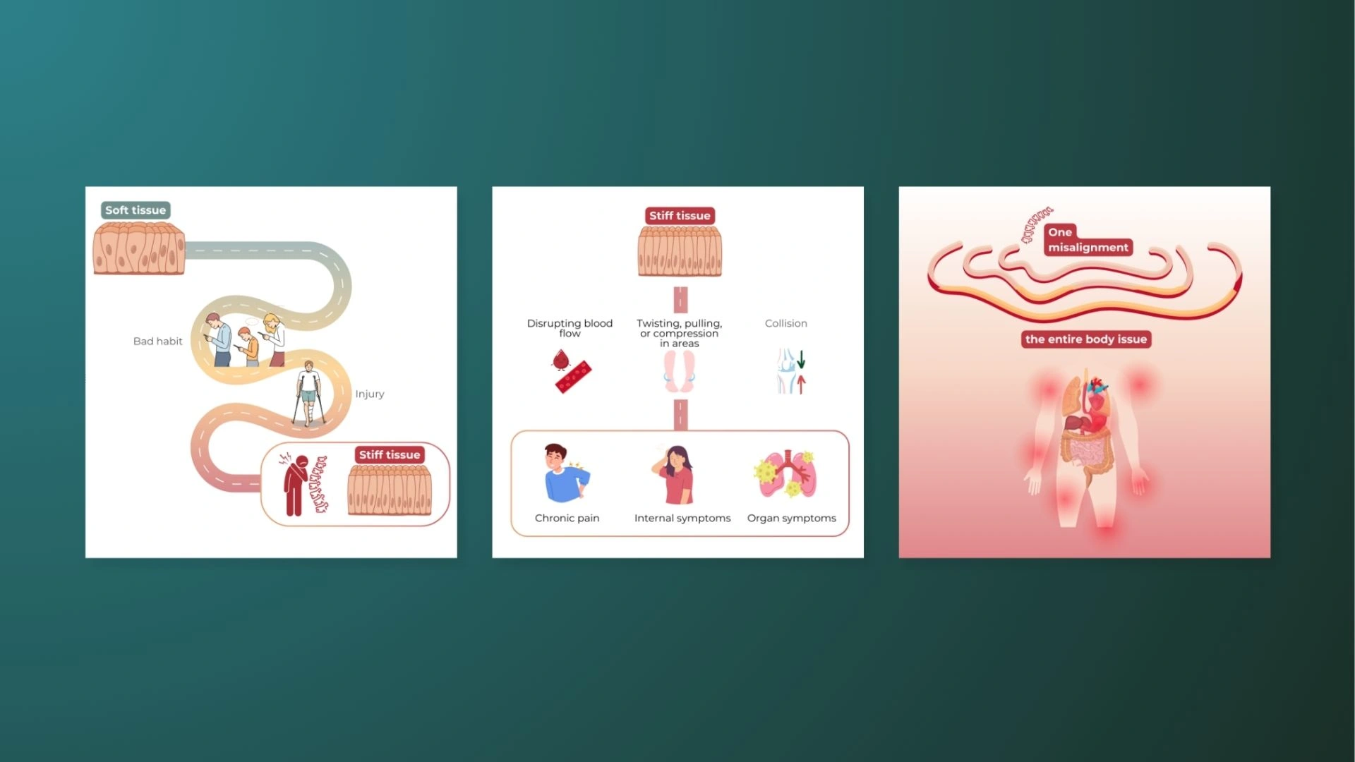
I created infographics to explain the key concepts of the theory to help the audience to understand.
Like this project
Posted May 17, 2024
Marketing the clinic with standardized messaging and simplifying the information on the website.
Likes
0
Views
10

