Worldwide Medical and Regulatory Brand Refresh
Sydelle Creative
Worldwide Medical and Regulatory — Brand & Presentation Design
Logo Redesign · Custom Icons · Infographics · PowerPoint Templates
I partnered with Worldwide Medical and Regulatory (a division of Baxter) to refresh their visual identity and streamline internal communications. The goal was to modernize their brand while supporting the complexity of global medical and regulatory messaging.
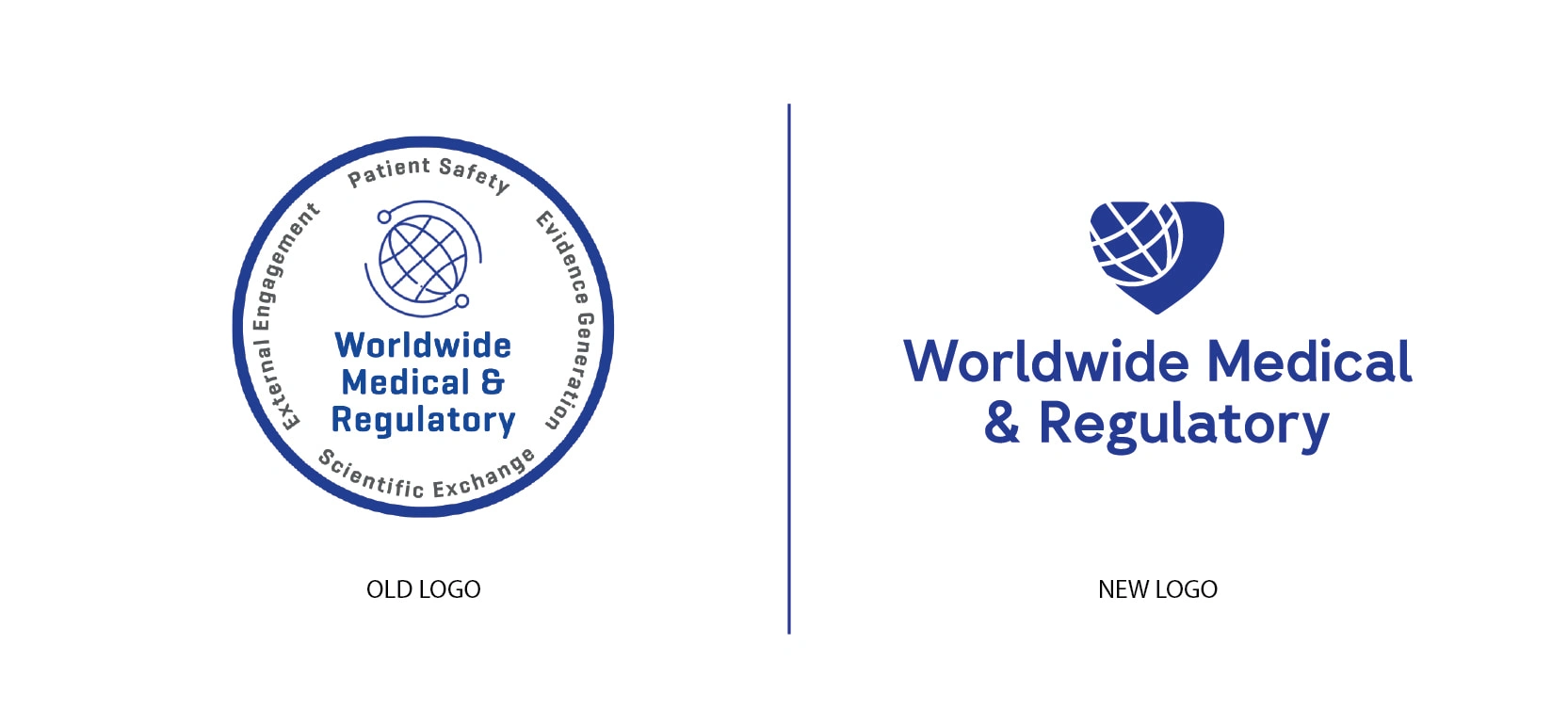
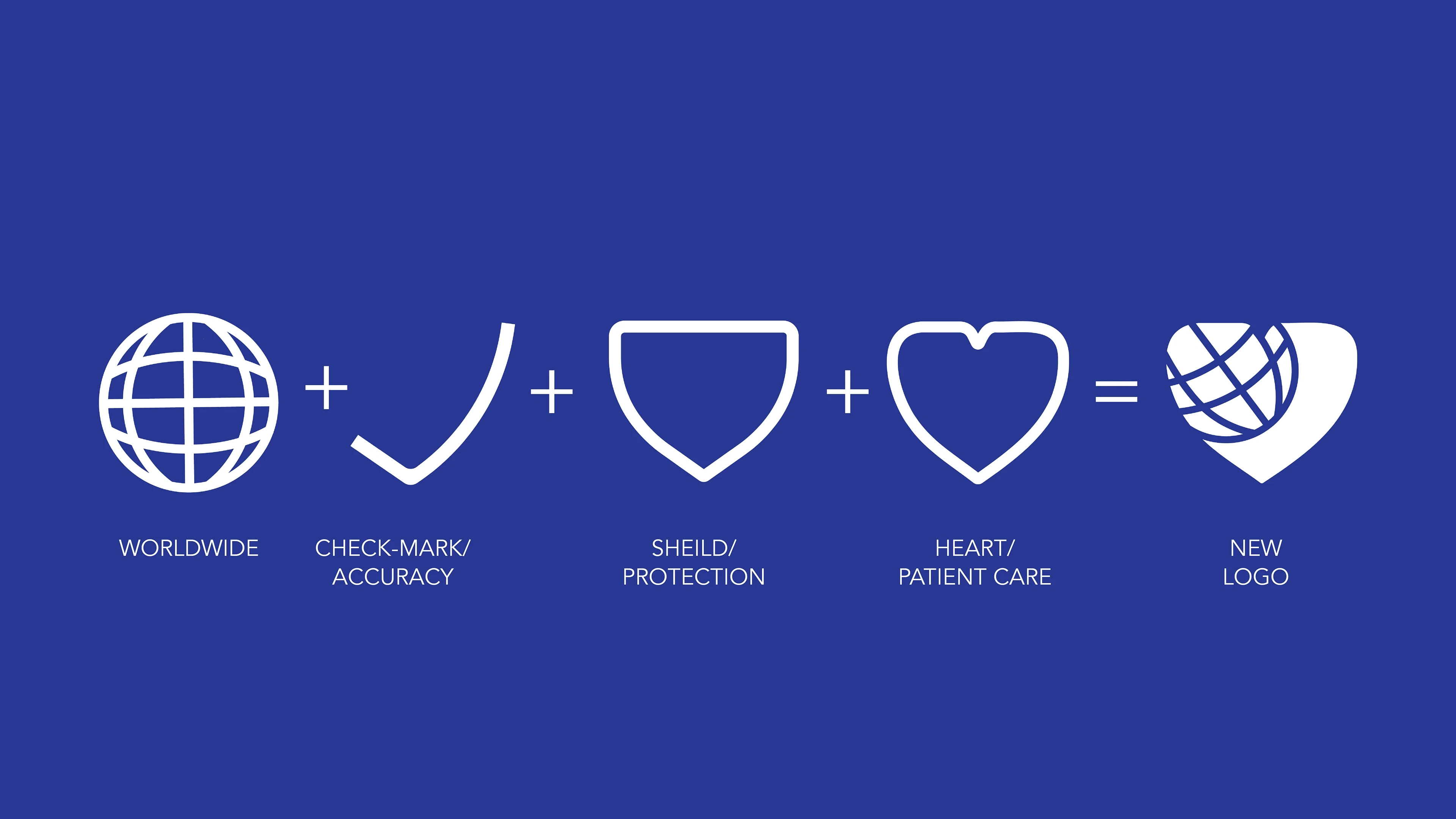
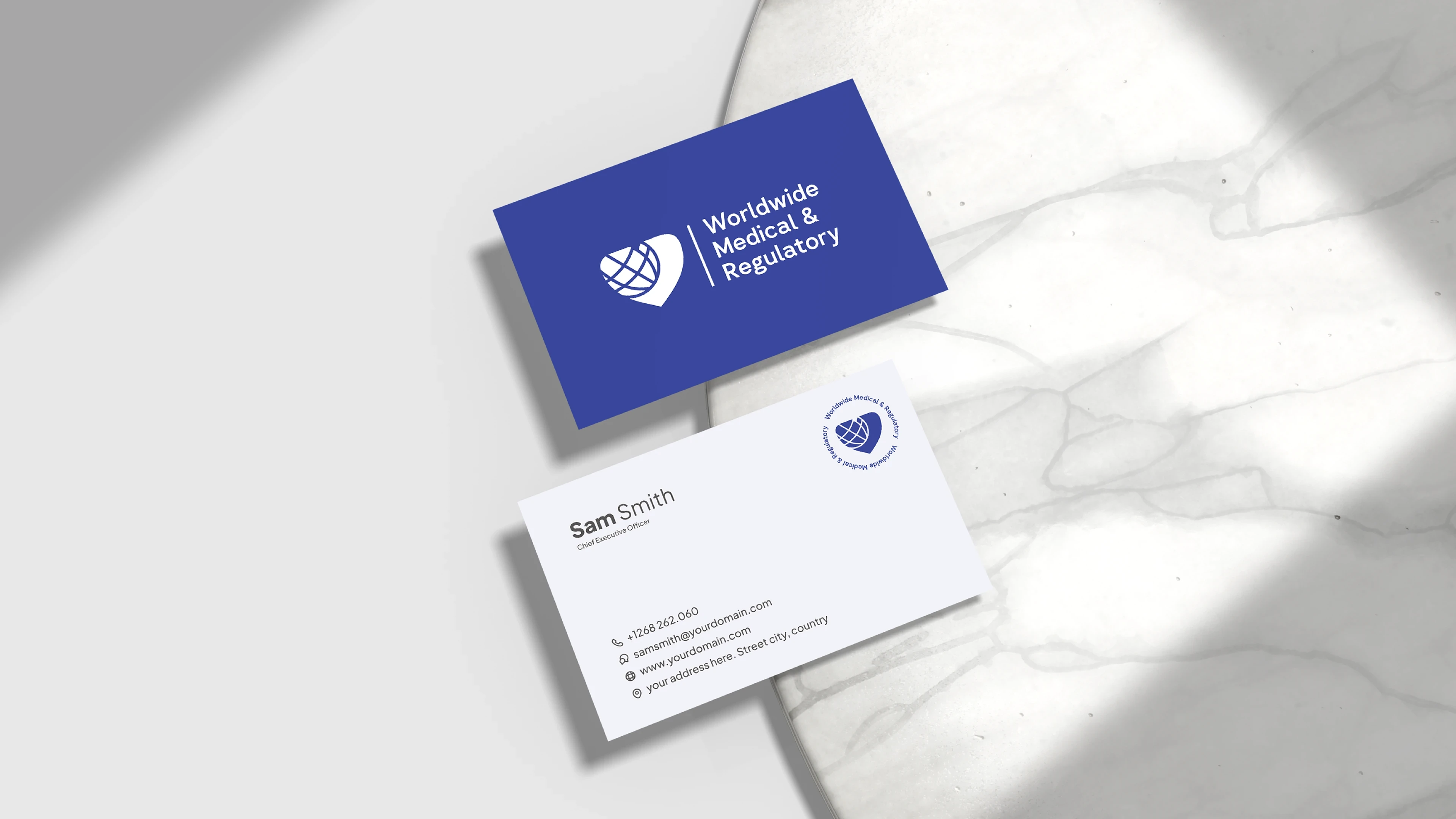
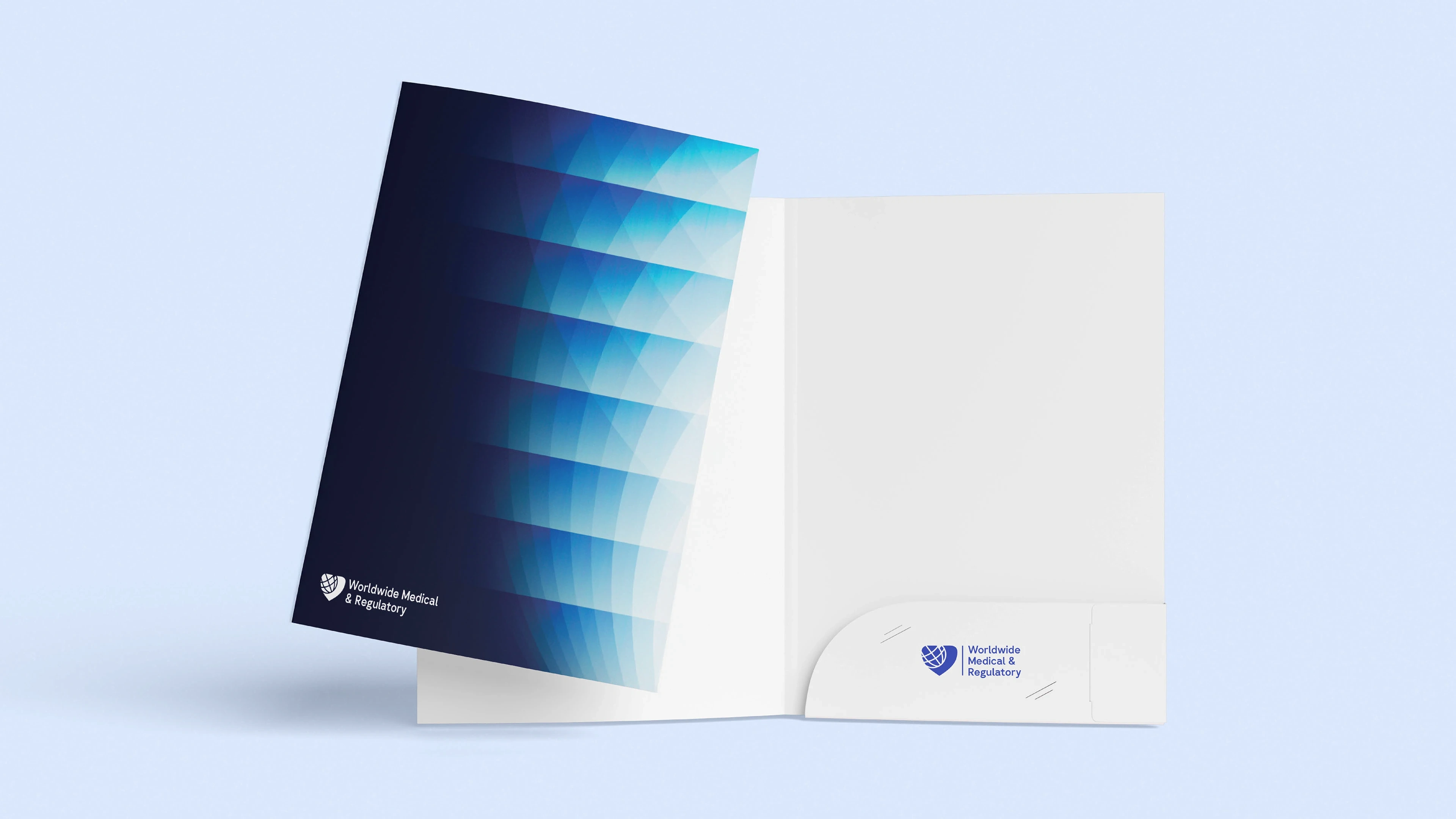
The old logo was dense, text-heavy, and difficult to apply consistently across formats. I simplified the system with a modern symbol—combining a globe and heart to represent both global reach and patient safety. The streamlined mark improves legibility at small sizes and creates a stronger, more professional visual foundation.
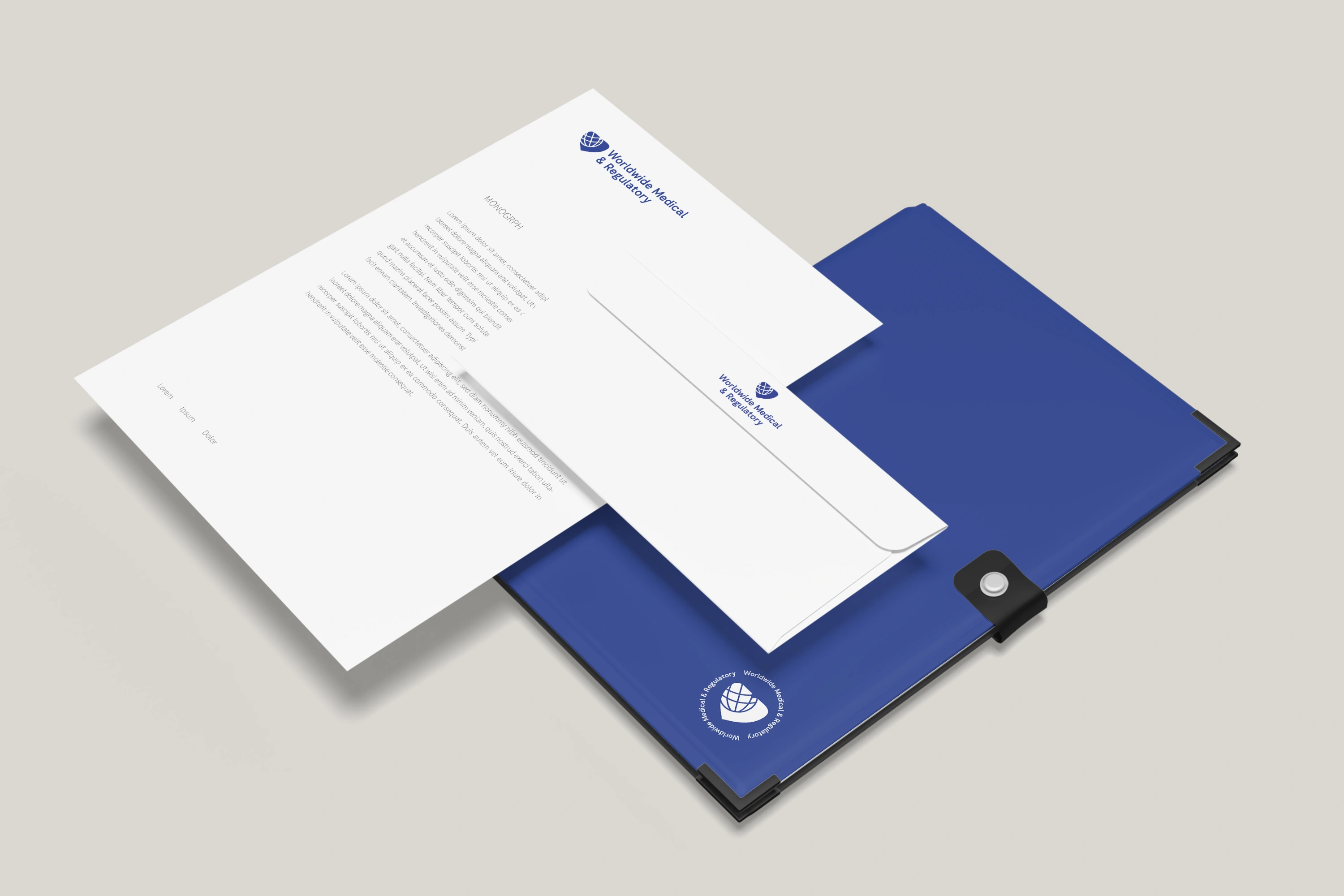
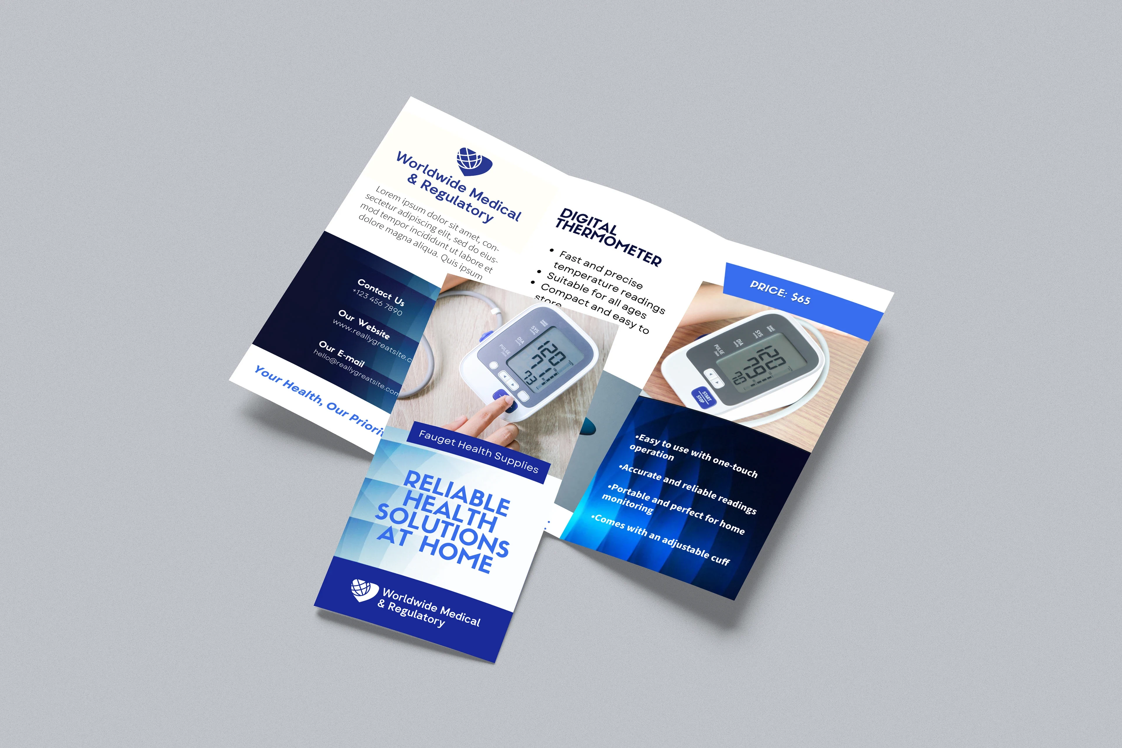
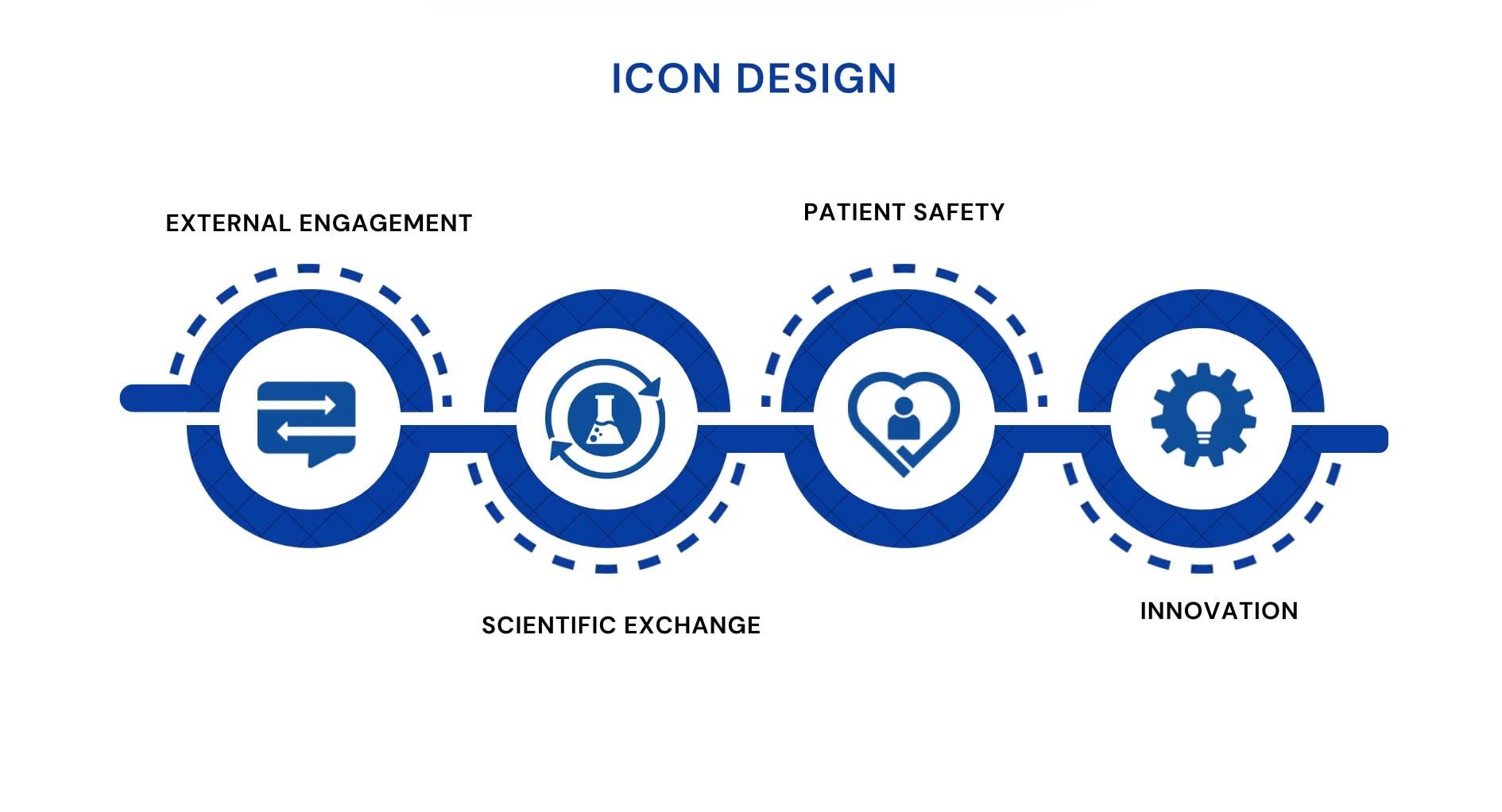
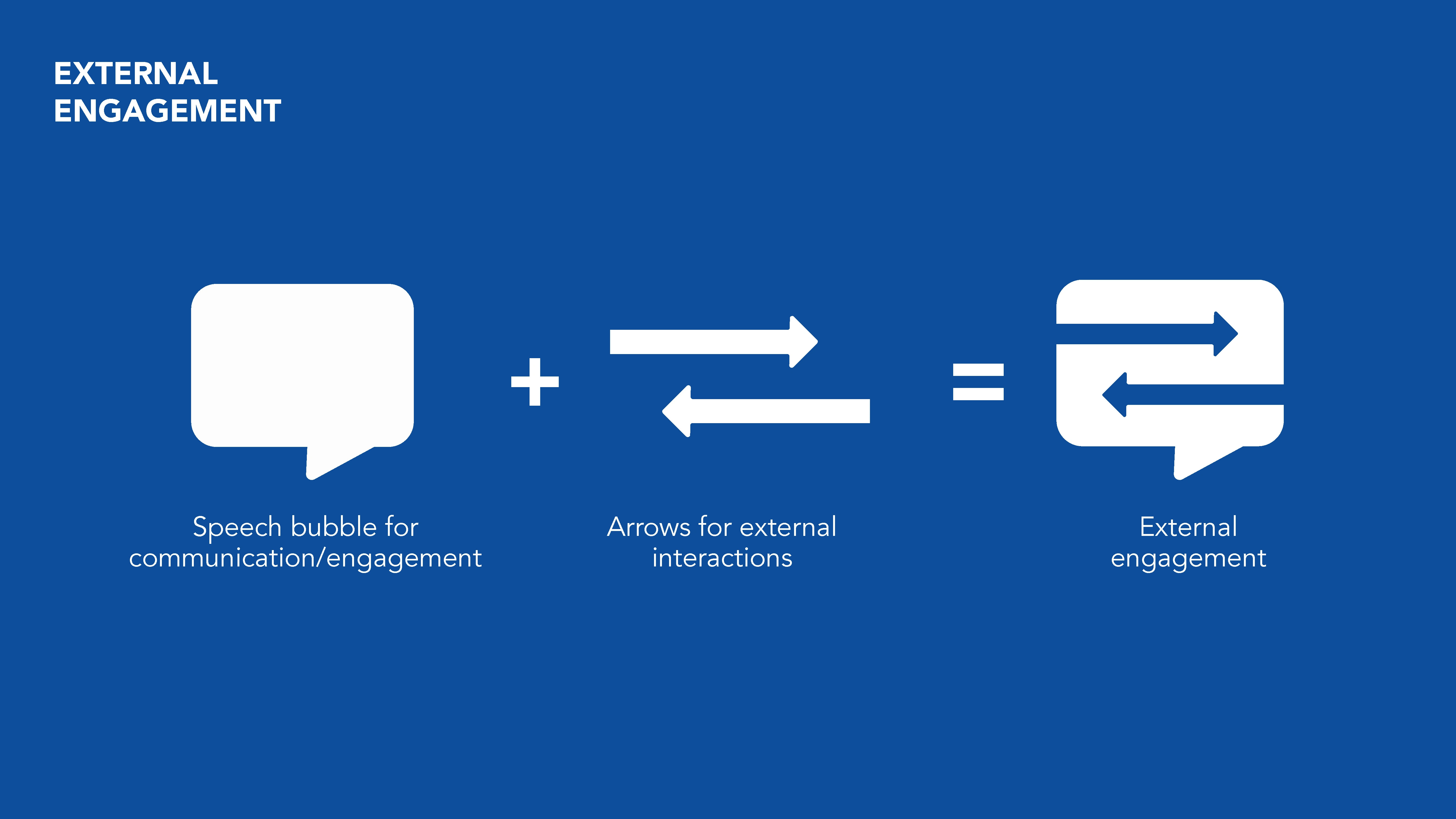
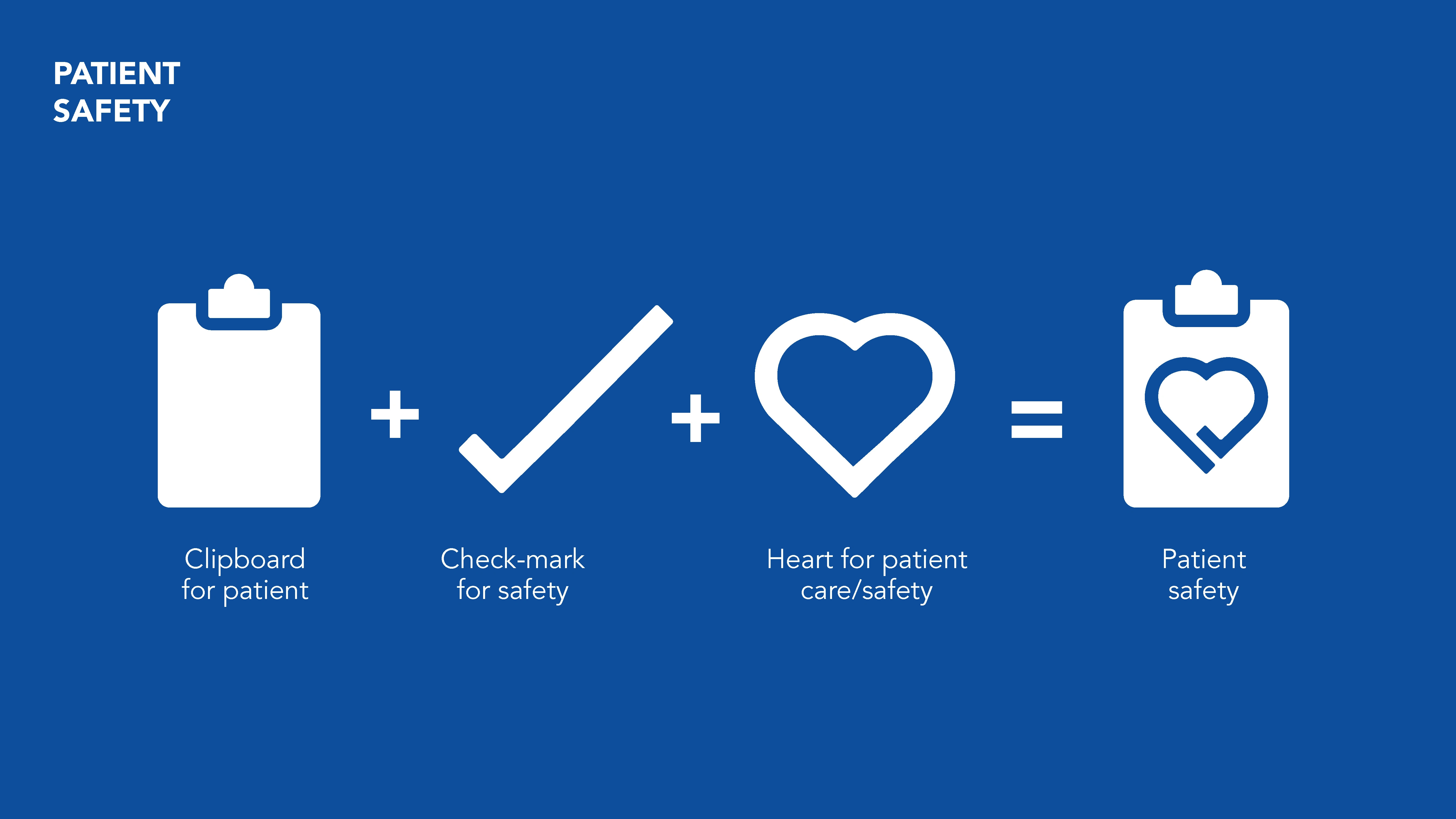
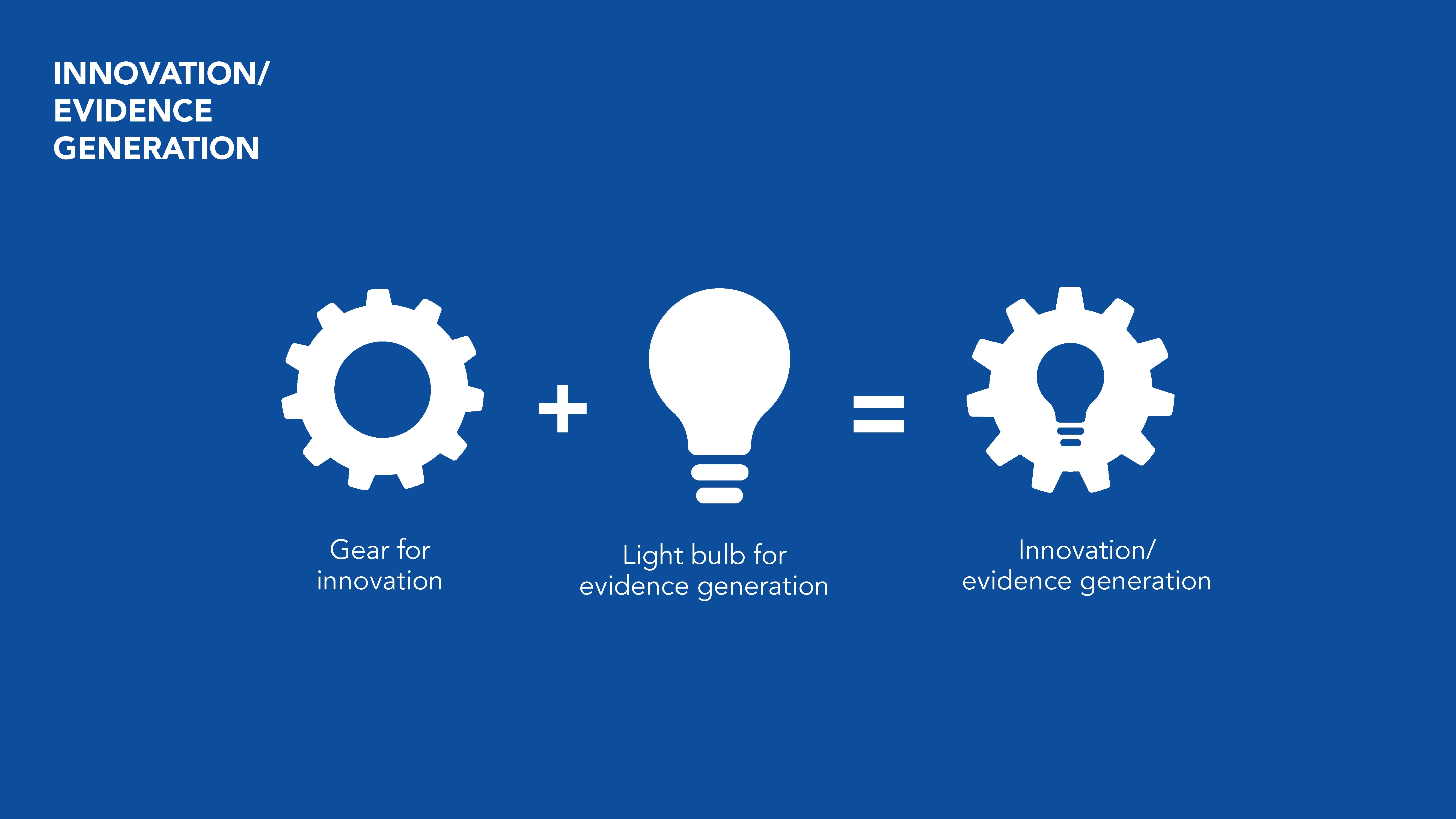
To support the team’s highly technical content, I developed a suite of custom icons and infographics. These visuals distilled complex concepts into accessible, scannable formats, helping teams communicate with clarity across presentations, reports, and international stakeholders.


Transforming complex regulatory messaging into clear, scalable visuals for global communication.
Like this project
Posted Sep 3, 2025
Modernizing a corporate brand through logo redesign, icons, and presentation templates with clarity and consistency for worldwide medical teams.