KAFÉN | Brand Identity

Zyric Studios


KAFÉN is a new coffee brand shaped by clarity and built with intention, designed to create structure without losing life.
From the start, the idea was to create a packaging system that feels structured and confident, while allowing the product itself to bring the energy. KAFÉN doesn’t lean on lifestyle stories or trends. It relies on design that holds its shape. Bold, balanced, and made to be used. The result is a brand that feels alive without being loud.
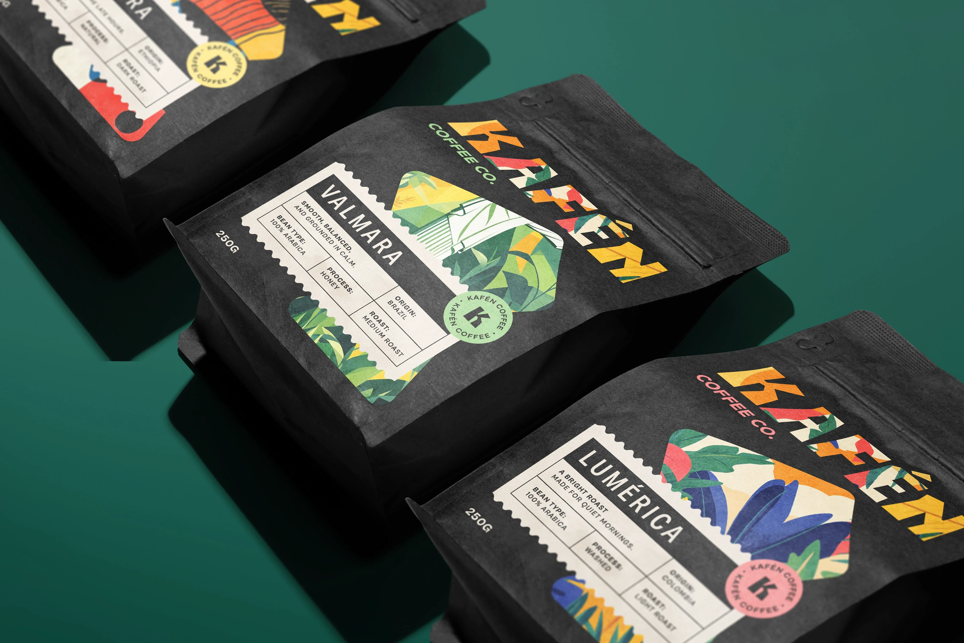
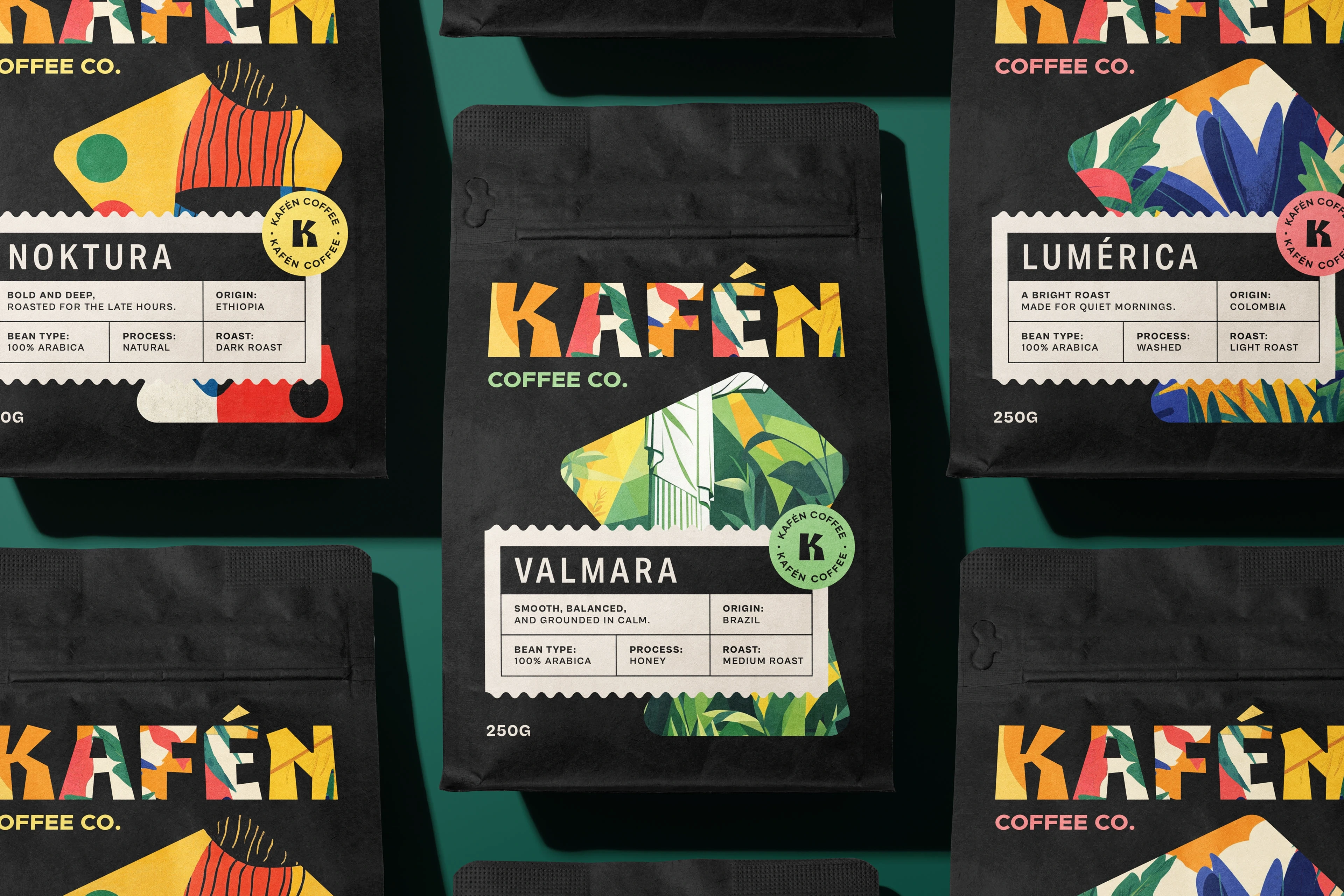
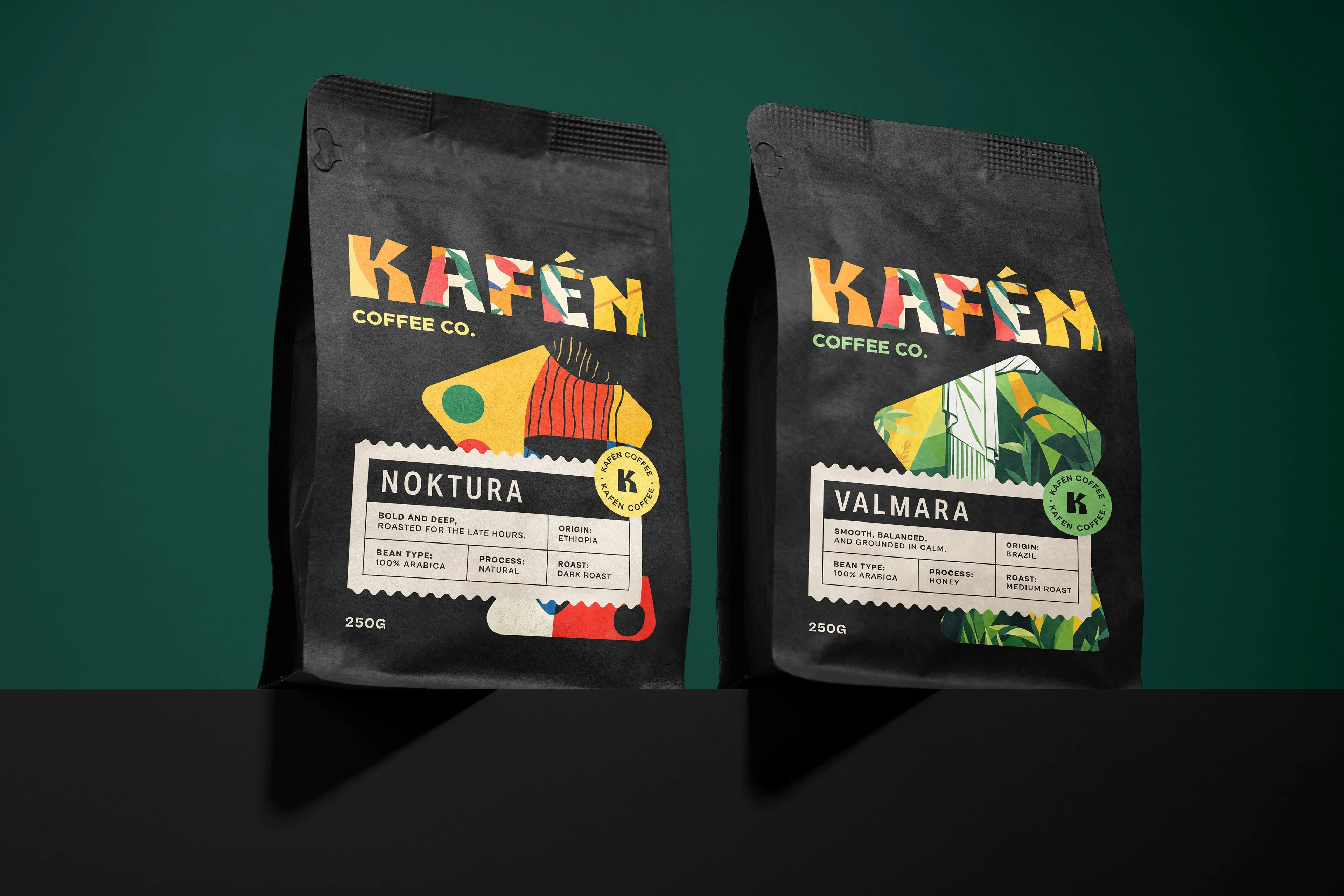
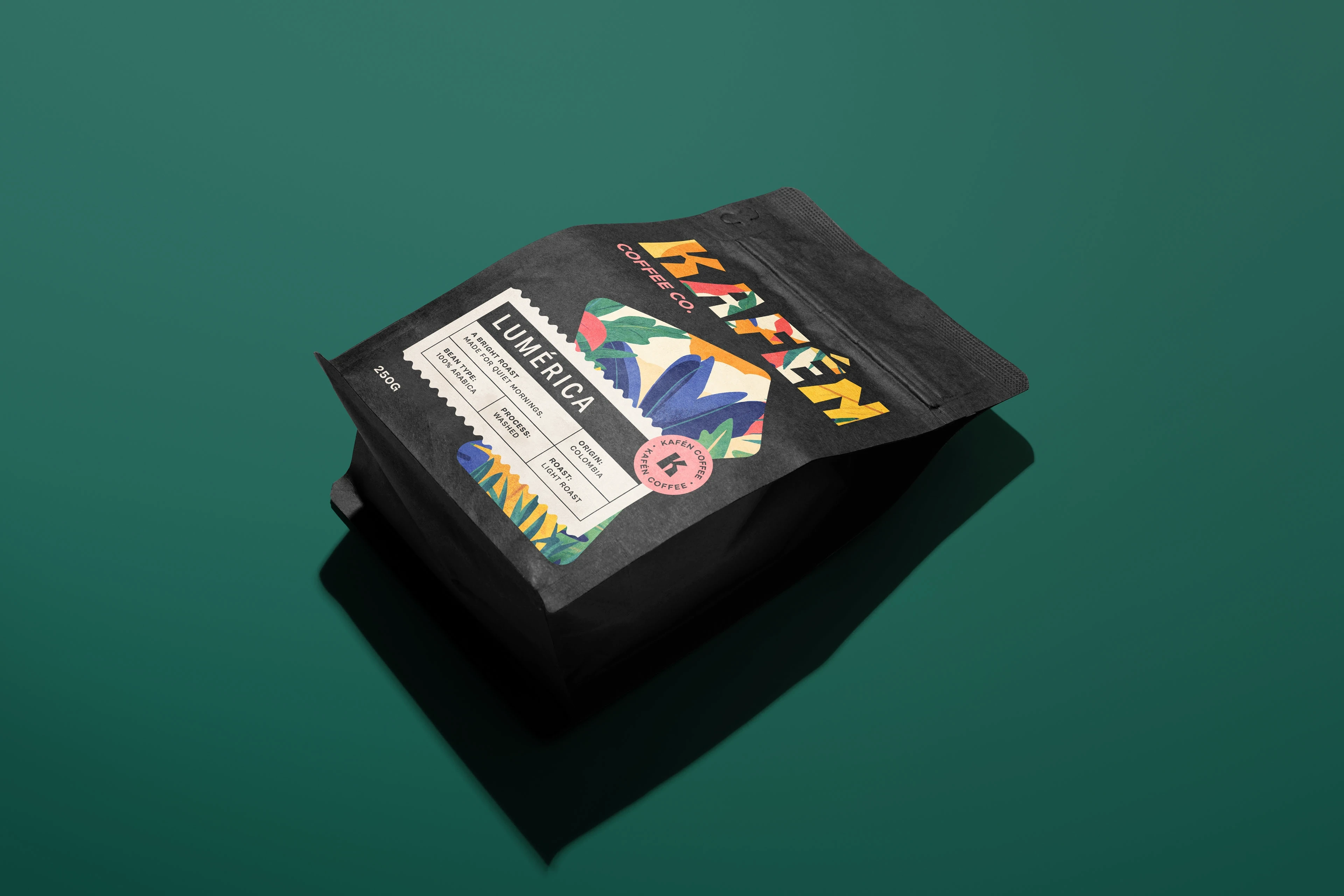
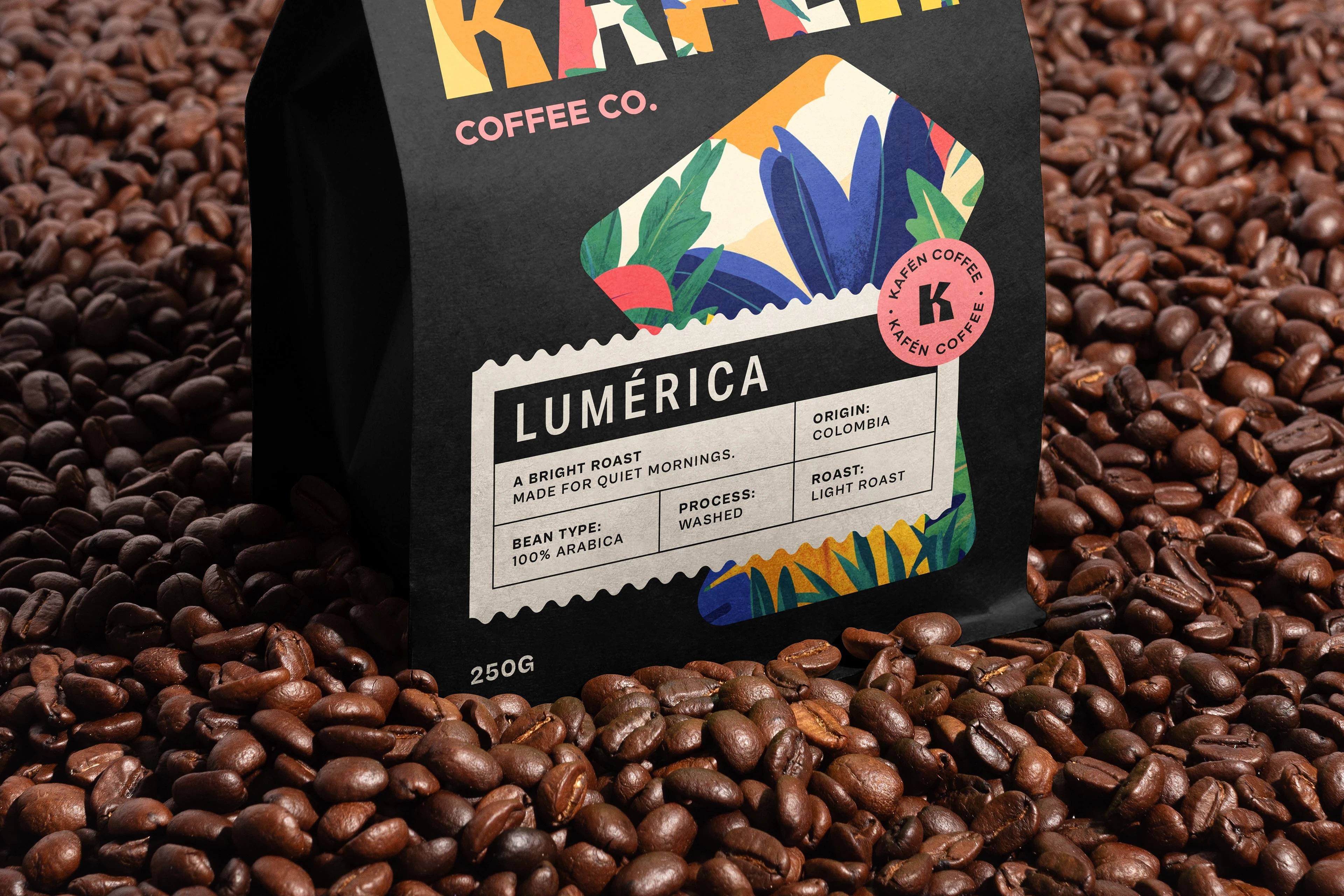
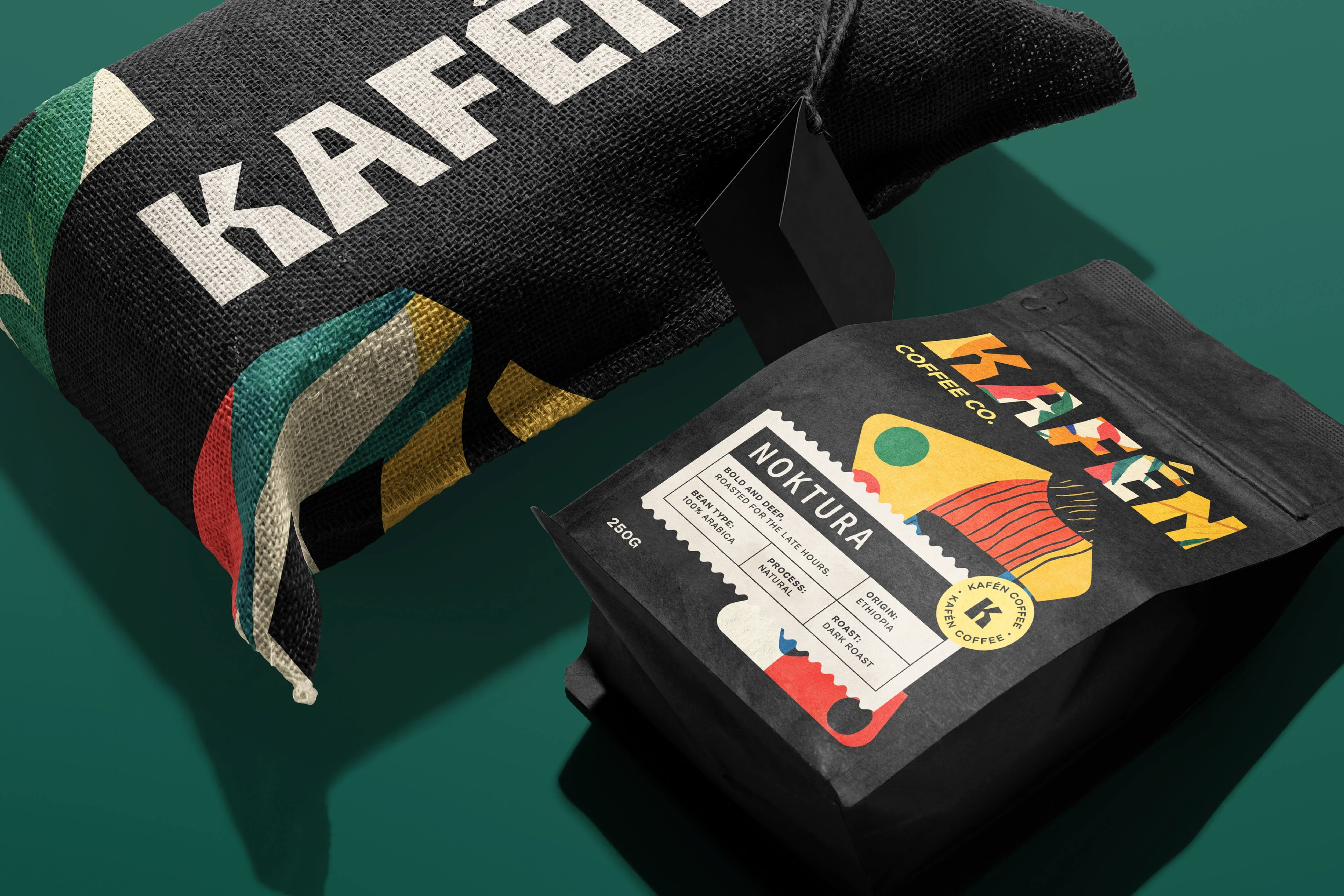
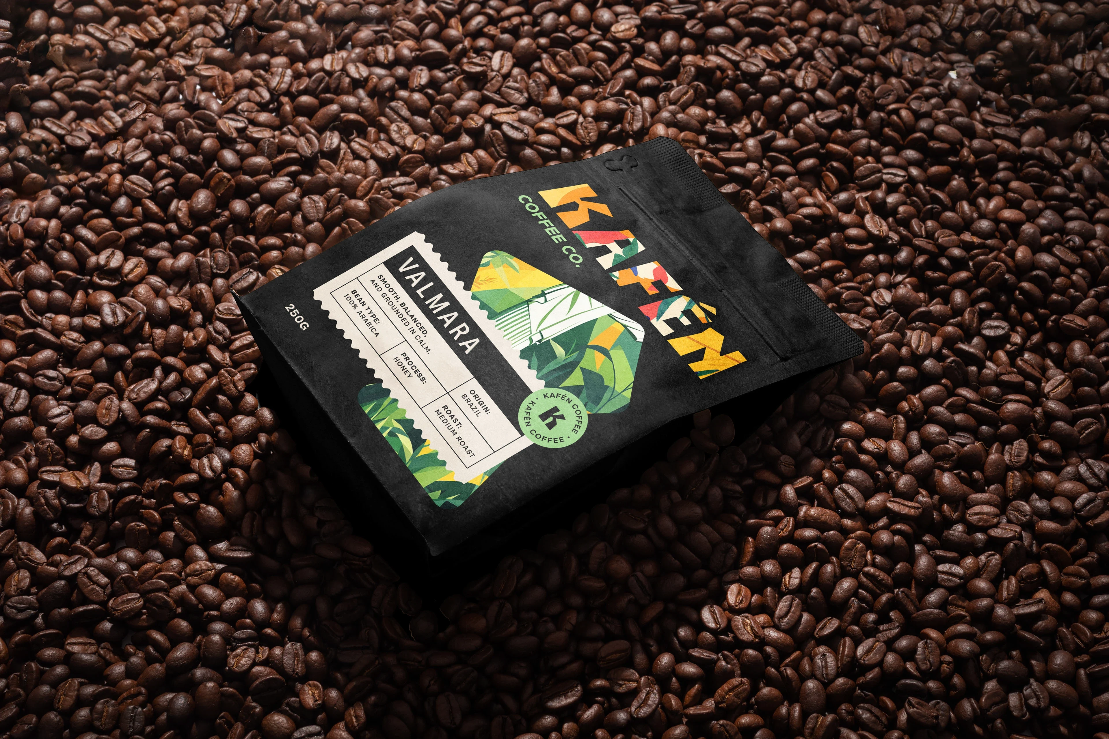
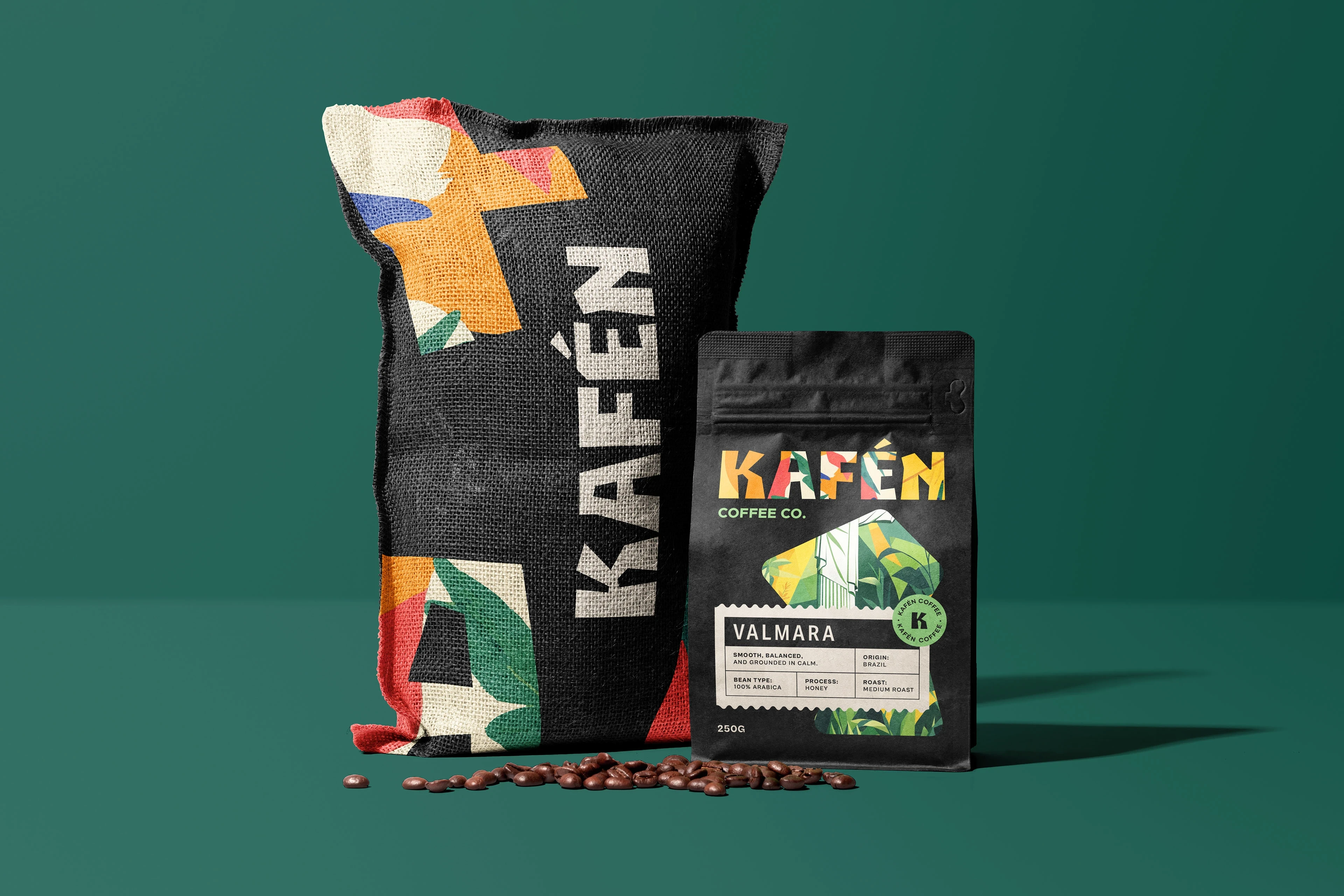
The packaging is grounded in black, giving the brand weight and focus.
On top of that foundation, colorful, nature-inspired illustrations bring life and motion to the product. These illustrations connect each blend to the world it comes from, not through photos or symbols, but through abstract textures that feel organic and real.
The balance between black space and vibrant detail gives KAFÉN a presence that feels both modern and rooted.
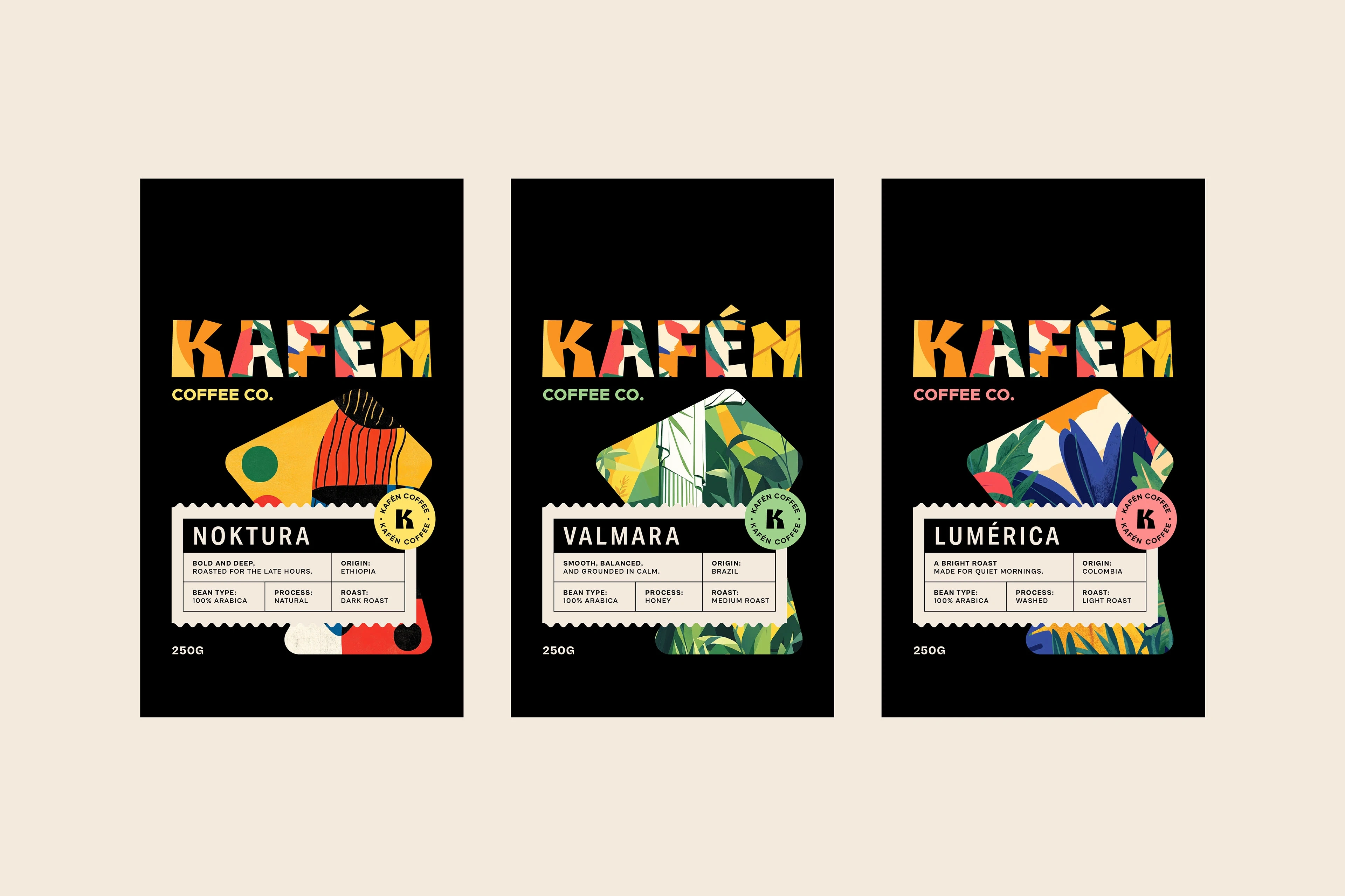
The product range was designed around a system, not a style.
The brand includes three blends: LUMÉRICA, VALMARA, and NOKTURA. Each roast has its own tone and energy, reflected through color and illustration. The layout and structure remain consistent. Type, spacing, and hierarchy don’t shift. Only the palette, name, and supporting visuals change. This keeps the brand flexible without ever losing control.
Every element of the identity sits between control and character.
The typography is strong and clear. Layouts follow a strict grid. But within that system, the use of color and illustration allows space for tone and texture. The brand doesn’t use storytelling to sell the product. It uses composition, contrast, and clarity. Every decision is considered. Nothing is added without reason.
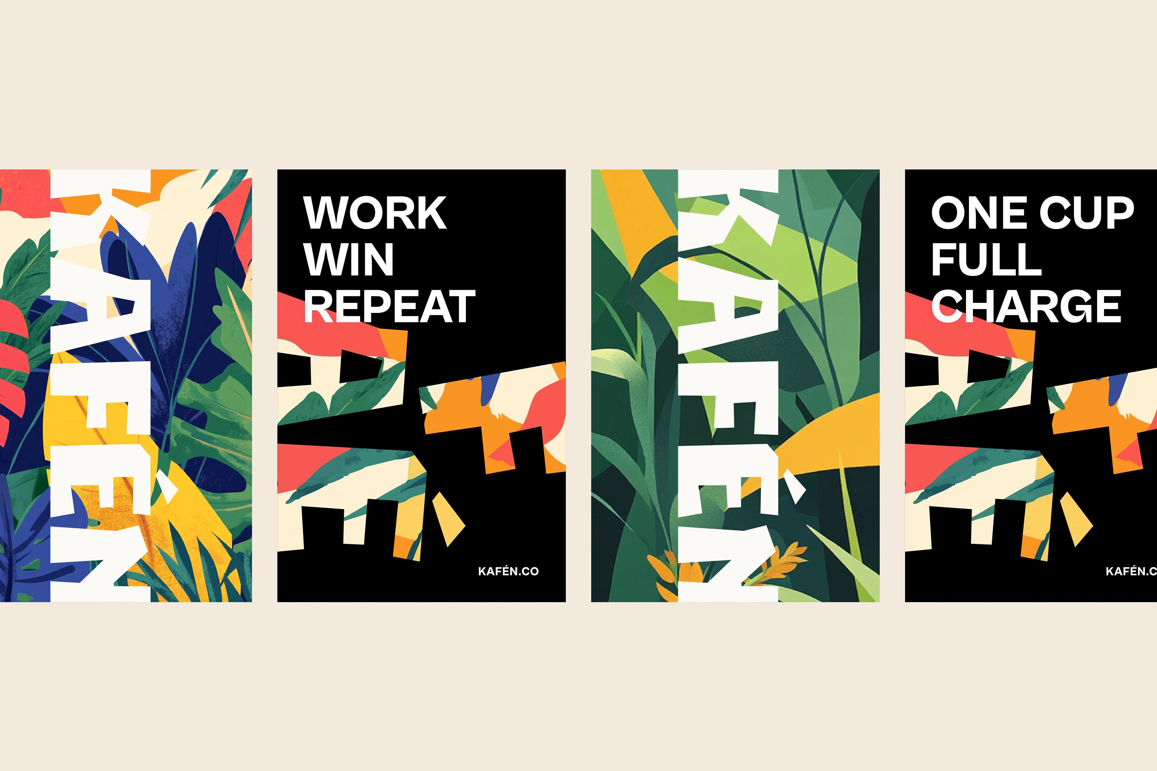
KAFÉN shows how a restrained system can still feel vibrant and full of energy.
This brand is about clarity, but it’s not cold. The black base holds everything together. The color brings energy. The structure keeps it usable. The result is a system that can grow, shift, and adapt without ever breaking its rhythm.
Like this project
Posted Jun 15, 2025
KAFÉN is a packaging design project for a new coffee brand built from scratch. The goal was to create a clear, structured identity system with room for natural…
Likes
2
Views
275
Timeline
May 20, 2025 - May 31, 2025


Ginga | Brand Identity

Barnas | Brand Identity
Otie: A Showcase of Unattributed Design
Talor Made: The Art of Flavorful Design