Branding & B2B E-Commerce Website
Muhammad Shahbaz
Client & Context
The project involved crafting a cohesive brand identity and B2B e-commerce website for a company specializing in smart phone accessories and repair services. The scope also included designing key brand collateral such as catalogs, packaging, product branding and the website, forming a unified visual ecosystem.
Vision & Objective
Position the brand to appear both professional and approachable—appealing directly to retail mobile parts market seeking quality, reliability, and design-forward solutions in mobile accessories and repair. The goal was to establisha brand presence that felt trustworthy, modern, and visually distinctive in a competitive market.
A Dynamic Manual
The following will guide you through some of the core elements of the Mobilesentrix Brand Visual Style.
They will help you design and produce compelling communications with a high degree of creative flexibility, while maintaining the MS Visual Brand consistency.
The Logo
The MS Full Logomark & MS Icon , as shown in this section, will serve as the primary and secondary logo.
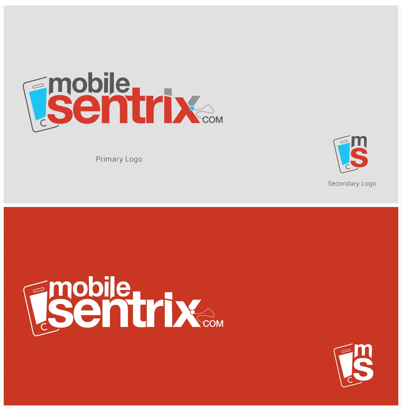
Logo BreakDown
The MOBILESENTRIX Logo is comprised of three components - a cell phone icon, mobilesentrix and a dotted line connecting with the word com followed by a big Dot.
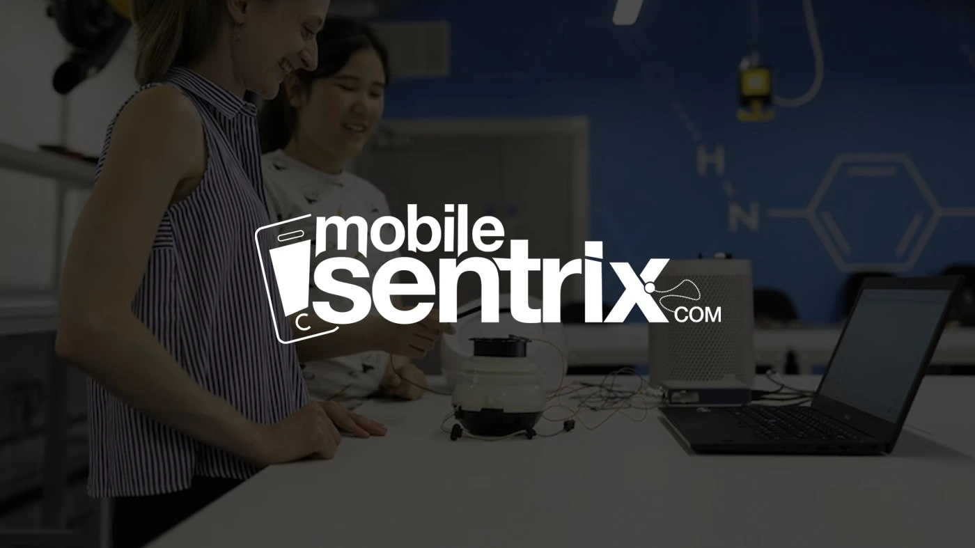
The complete logo must be used in all correspondence, mailings, brochures and other collateral. However icon can also be used
prepared by you or your agency for corporate and personal marketing purposes.
Please note that all logos will be provided as vector artwork.
Secondary Logo "an icon" can be used in absence of primary logo.
Secondary Logo should be used for social media profile photos or where size limitation is.
Never redraw or modify authorised artwork for the MS logo.
Never use the logo found in a reproduction (such as a letterhead), as inaccuracies will be introduced.
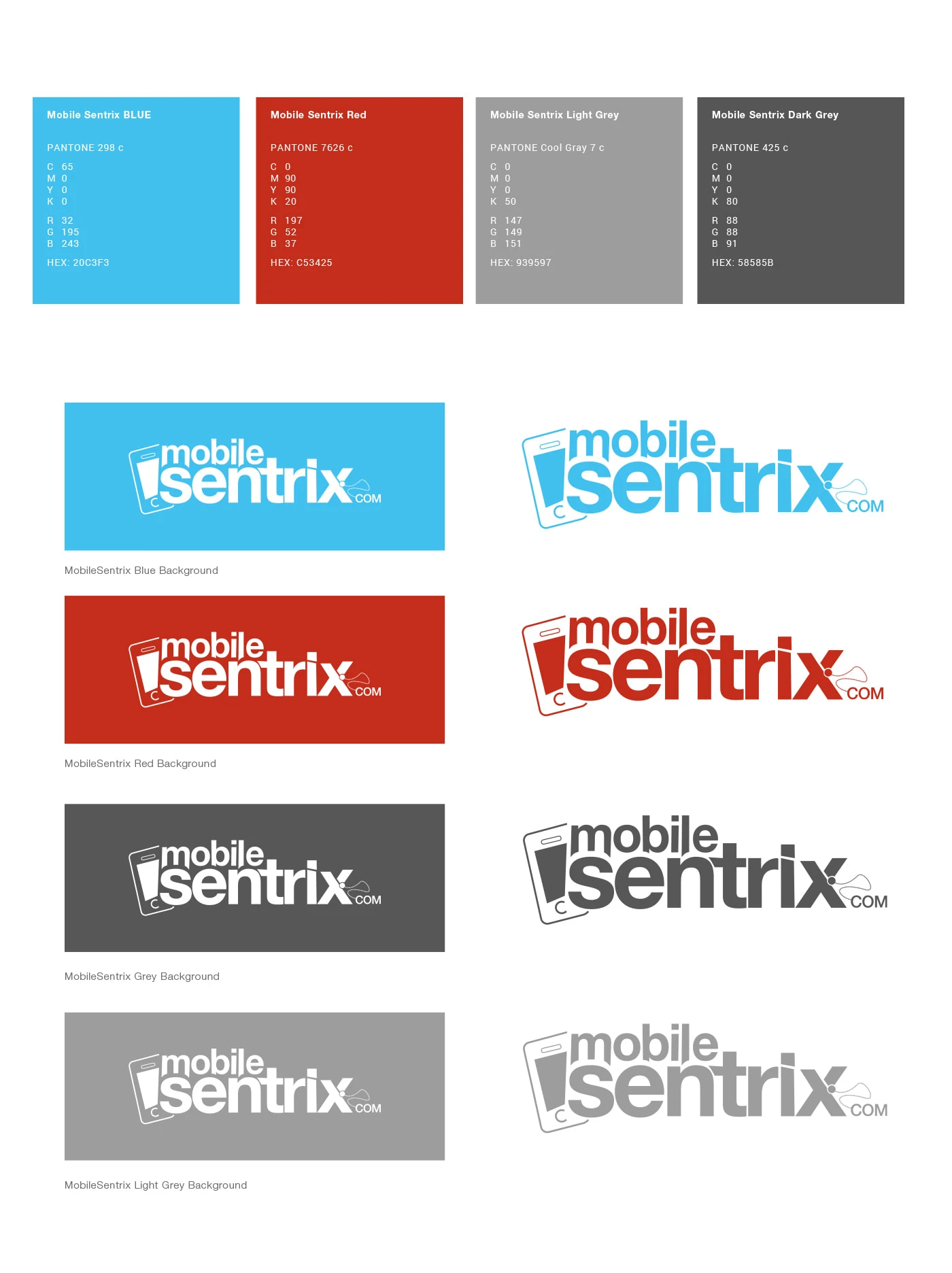
BRANDING ELEMENTS
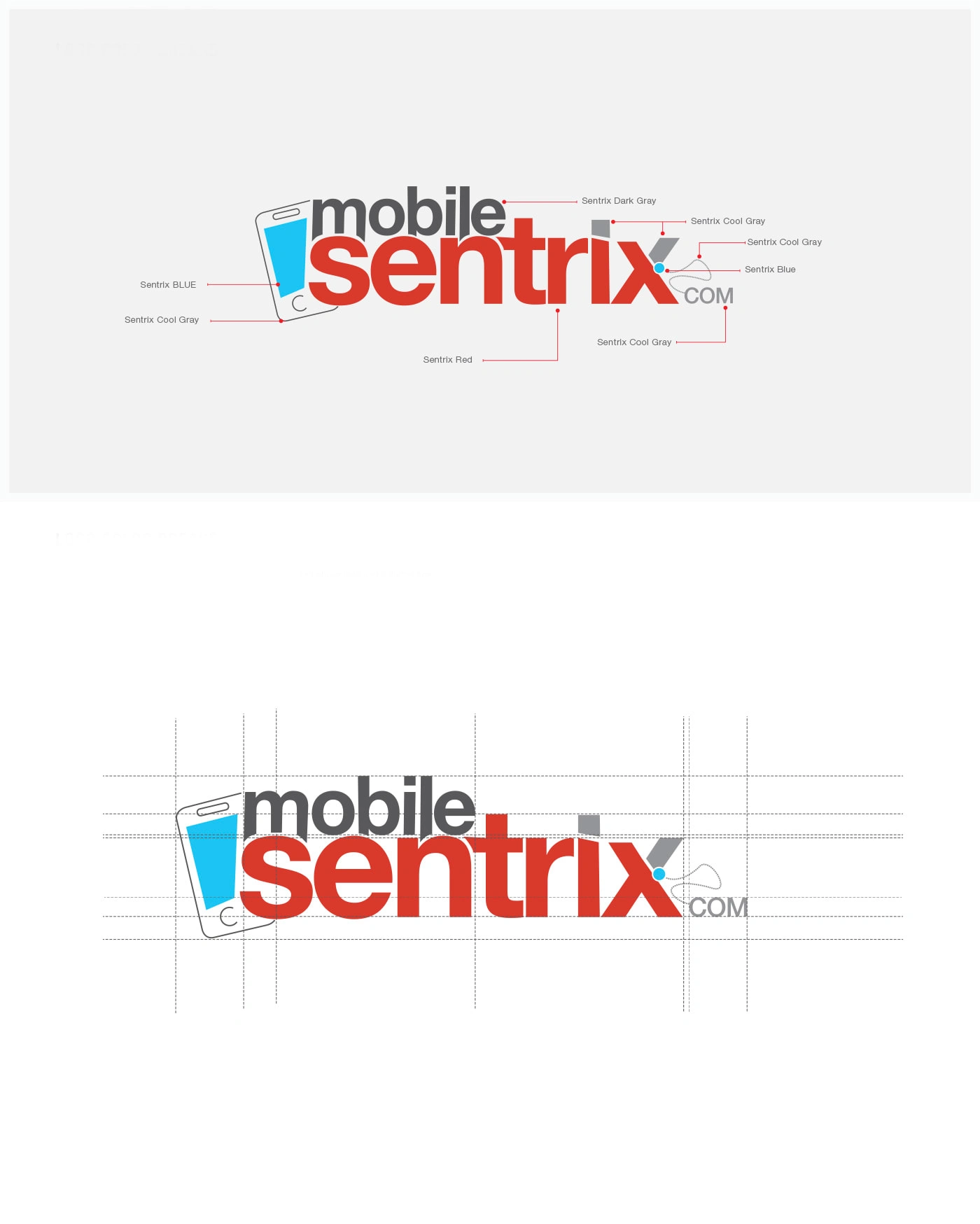
Colors
The colours shown here should not be used for colour matching. For accurate colour standards, refer to the current edition of the PANTONE Color Formula Guide.
For Printing, Use CMYK values mentioned above. Web colour values are also mentioned. Always use the corresponding colour values.
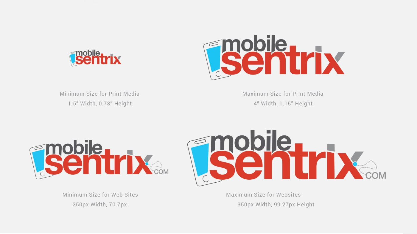
LOGO SIZE VARIATIONS
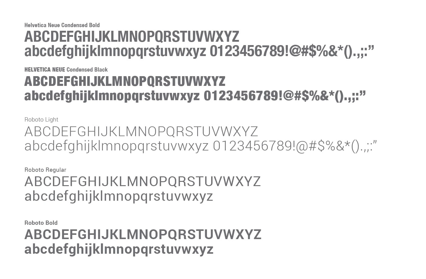
TYPOGRAPHY
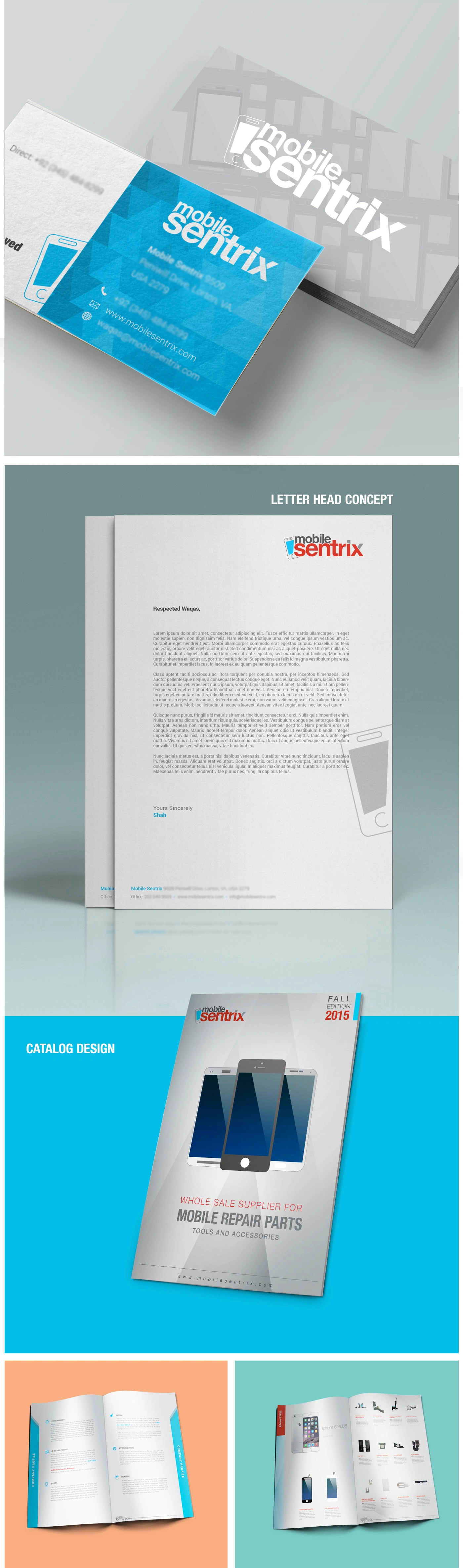
CORPORATE IDENTITY
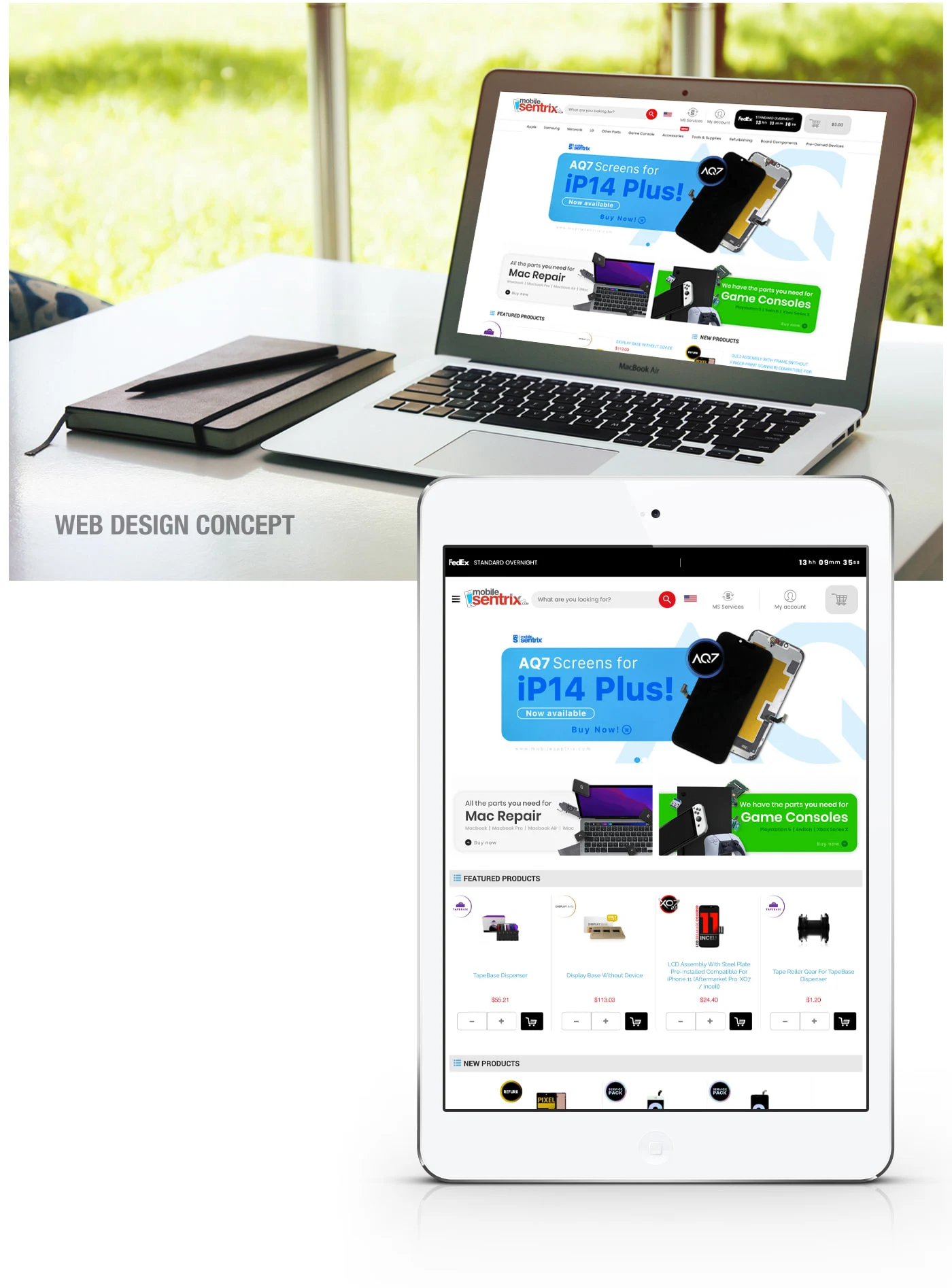
RESPONSIVE WEBSITE DESIGN ( B2C E-COMMERCE)
Results & Impact
Visual Cohesion: A harmonized look and feel across printed catalogs, packaging, and the e-commerce website, strengthening brand recognition.
Professional Appeal: The identity exuded credibility—vital for attracting customers to an accessory and repair business.
Scalability: A flexible branding system enabled easy adaptation for future campaigns (e.g., seasonal launches or digital ads).
User-Friendly Web Experience: The website design prioritized usability with clear navigation and product display, enhancing user engagement.
Like this project
Posted Feb 23, 2023
The project involved crafting a cohesive brand identity and B2B e-commerce website for a company specialising in smart phone accessories and repair services.
Likes
0
Views
42
Clients
MobileSentrix