Lime Rock Park — Reframing an American Racing Icon
Matias Lucero
1 collaborator
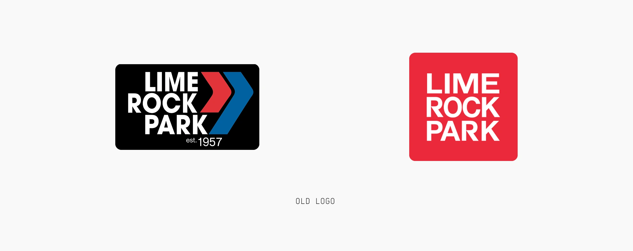
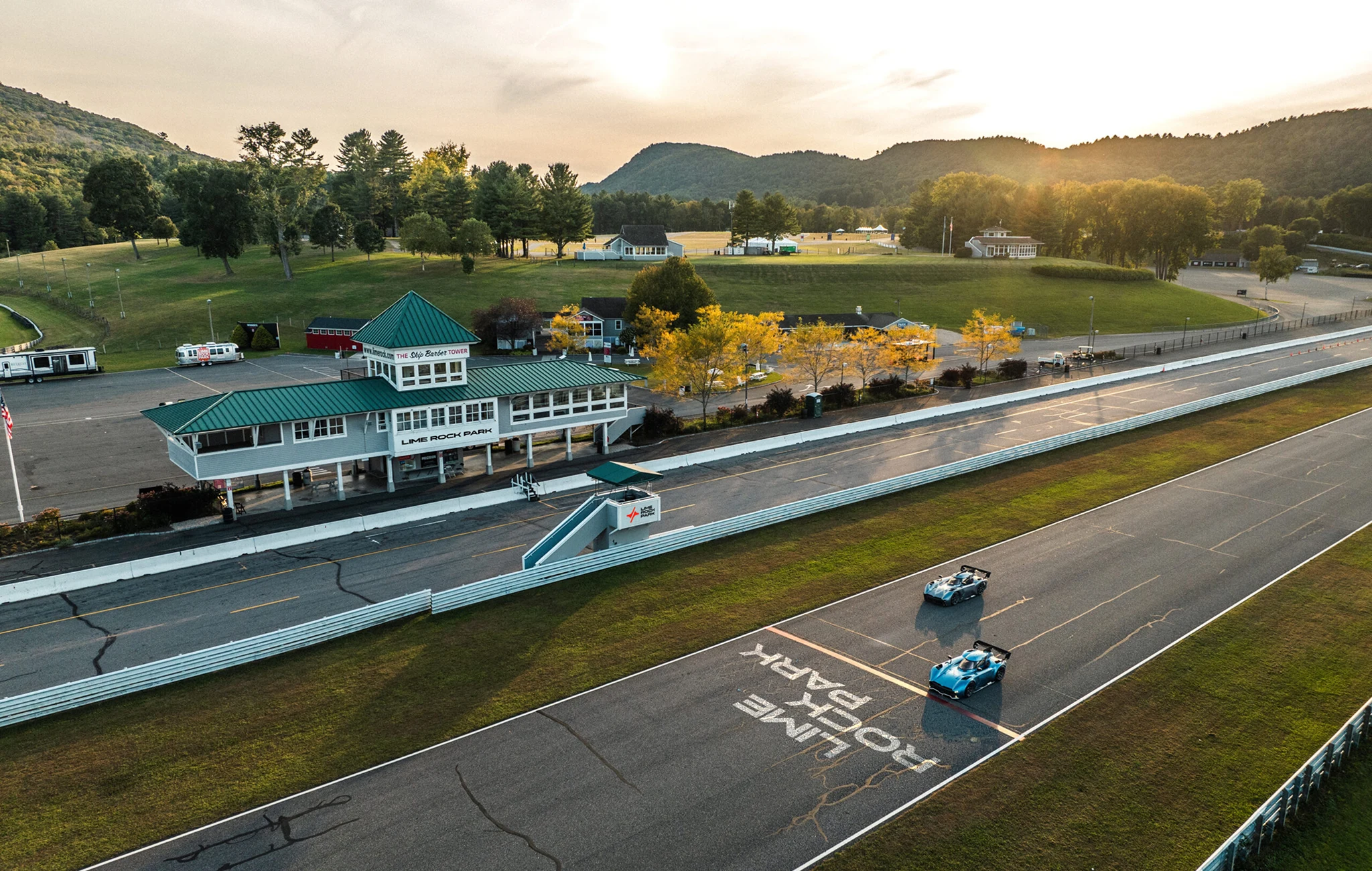
Lime Rock Park has been part of American motorsport culture for decades. Its history, setting, and reputation already gave it a strong identity. What the brand needed was a clearer and more consistent way to express that value today.
The previous identity had recognition, but it no longer reflected the full character of the venue. It felt visually limited and less distinctive than the experience itself. For a place with this much presence, that gap became increasingly noticeable across digital, print, signage, and merchandise.
Understanding the Opportunity
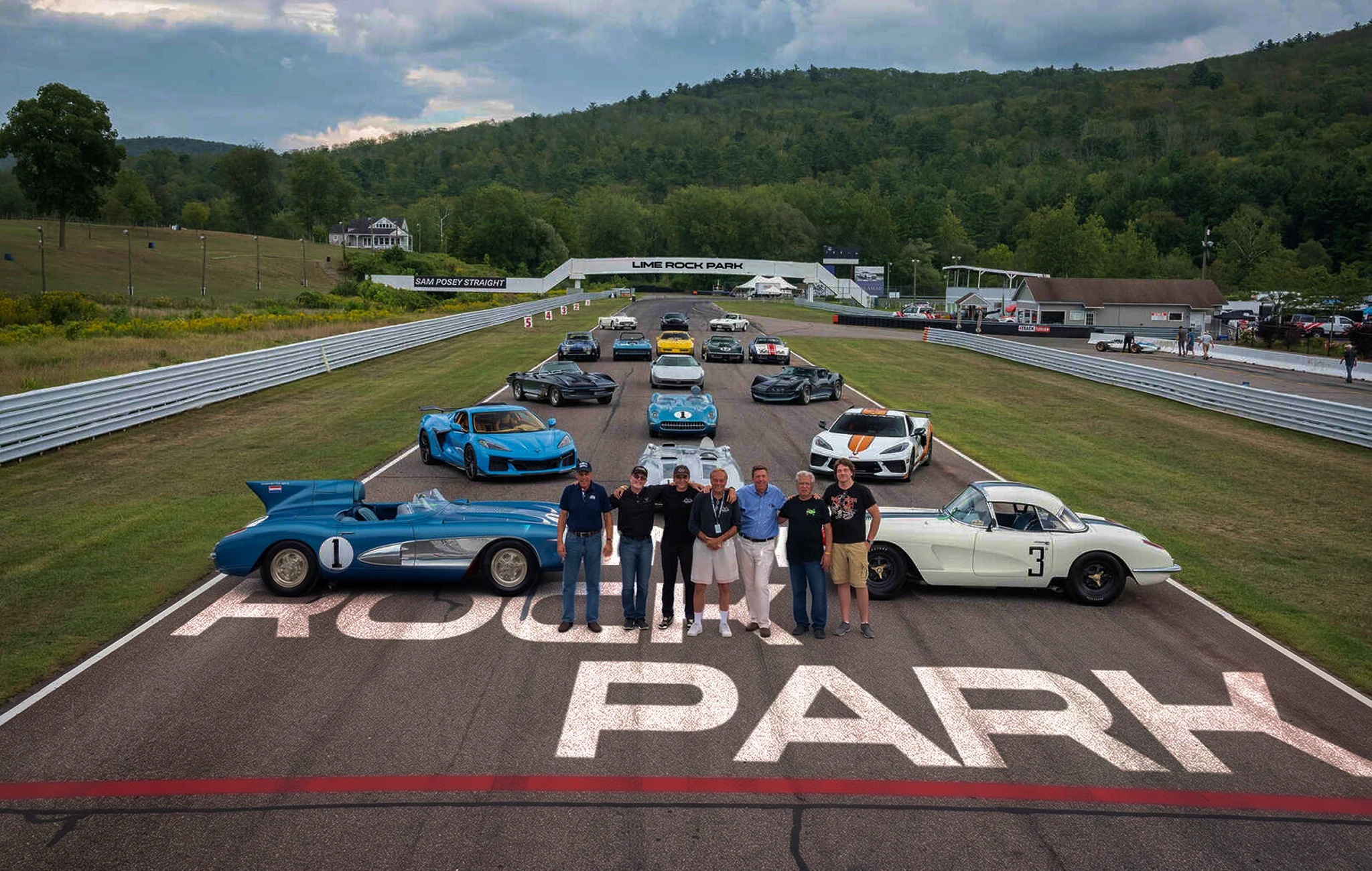
What makes Lime Rock Park memorable goes beyond the track alone. It is the combination of heritage, atmosphere, and performance. There is a specific visual and emotional quality to the place that sets it apart from other racing venues, and that distinction needed to be expressed more clearly through the brand.
The goal of the redesign was to build a system that felt sharper, more recognizable, and more current, while still staying connected to the history of the park. It needed to work across a wide range of applications and audiences without losing coherence.
The Identity System
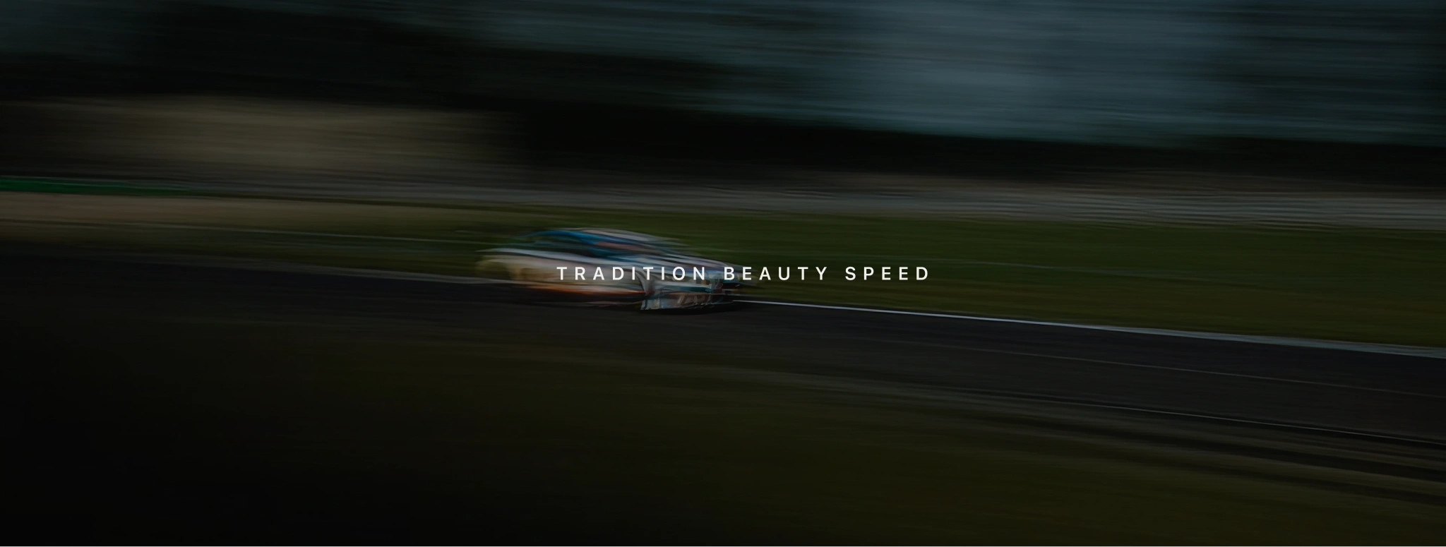
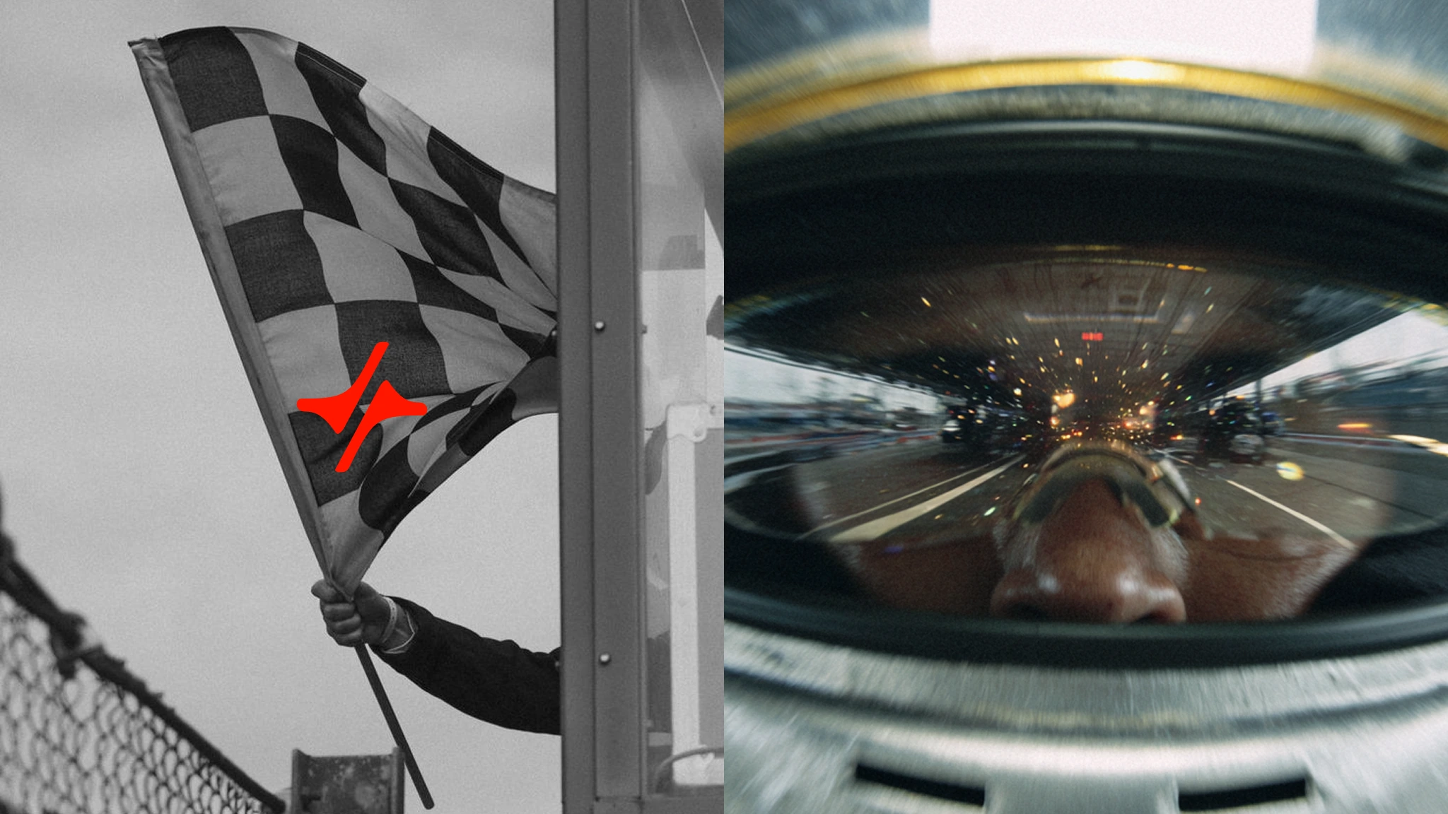
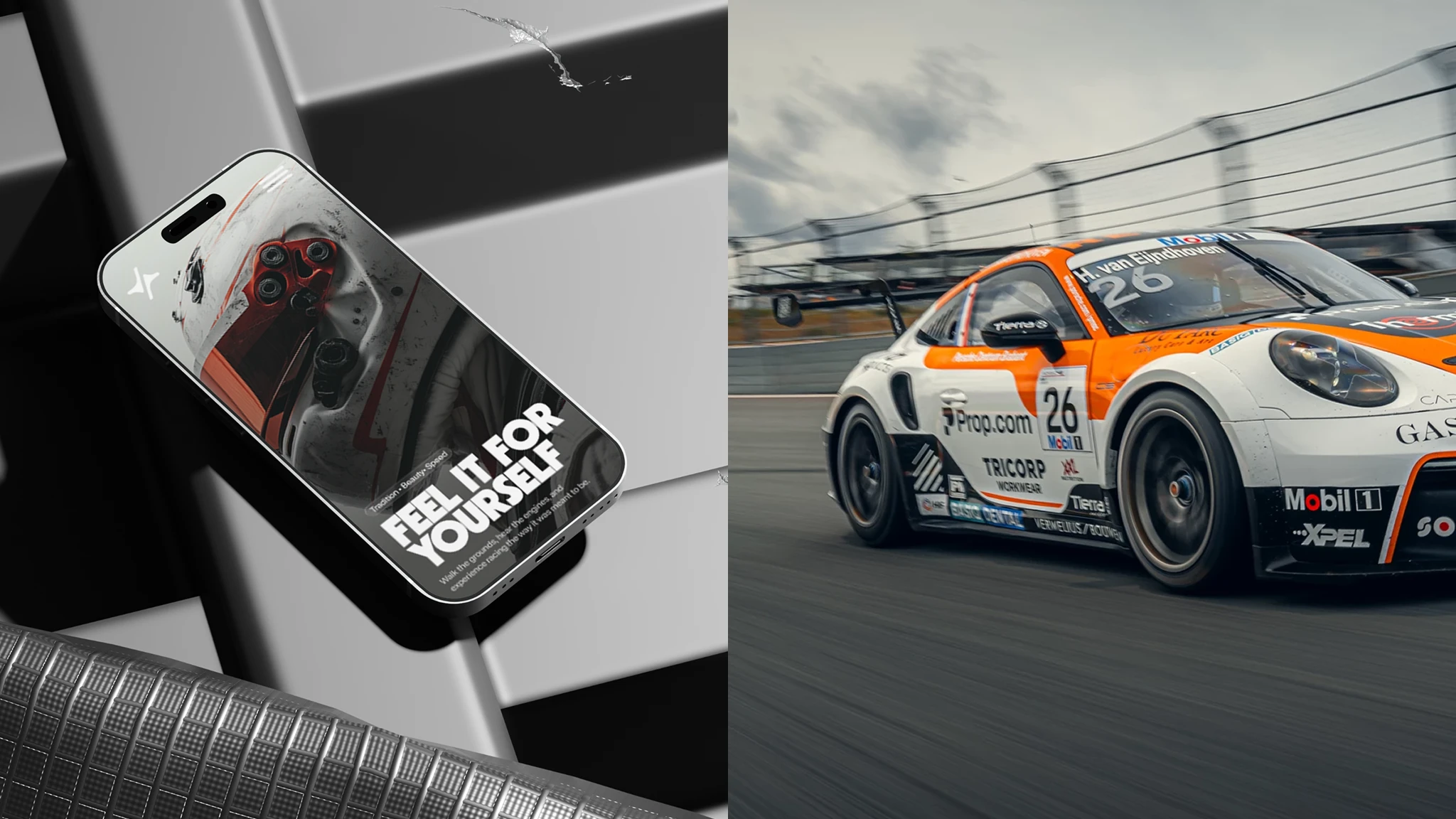
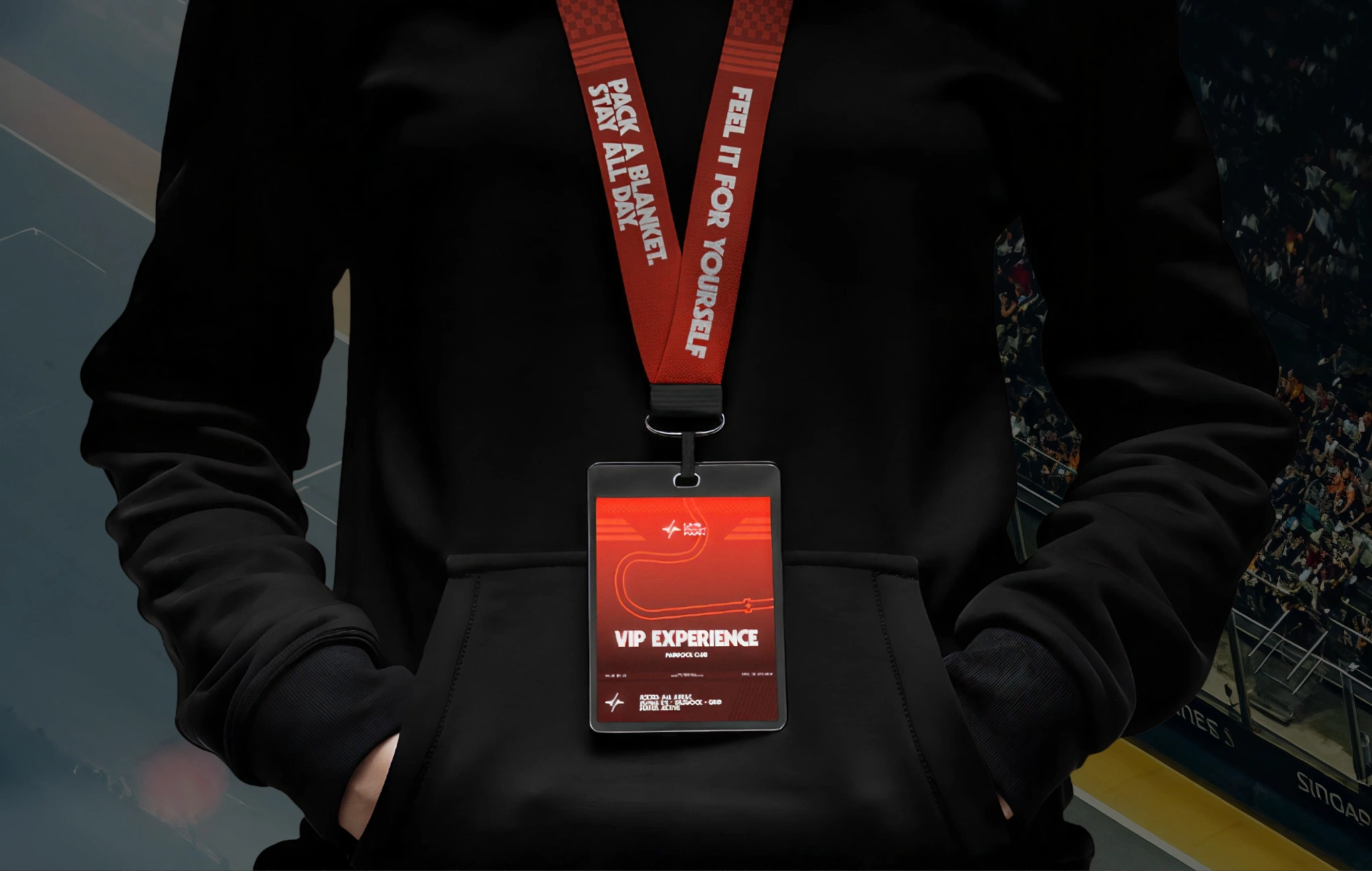
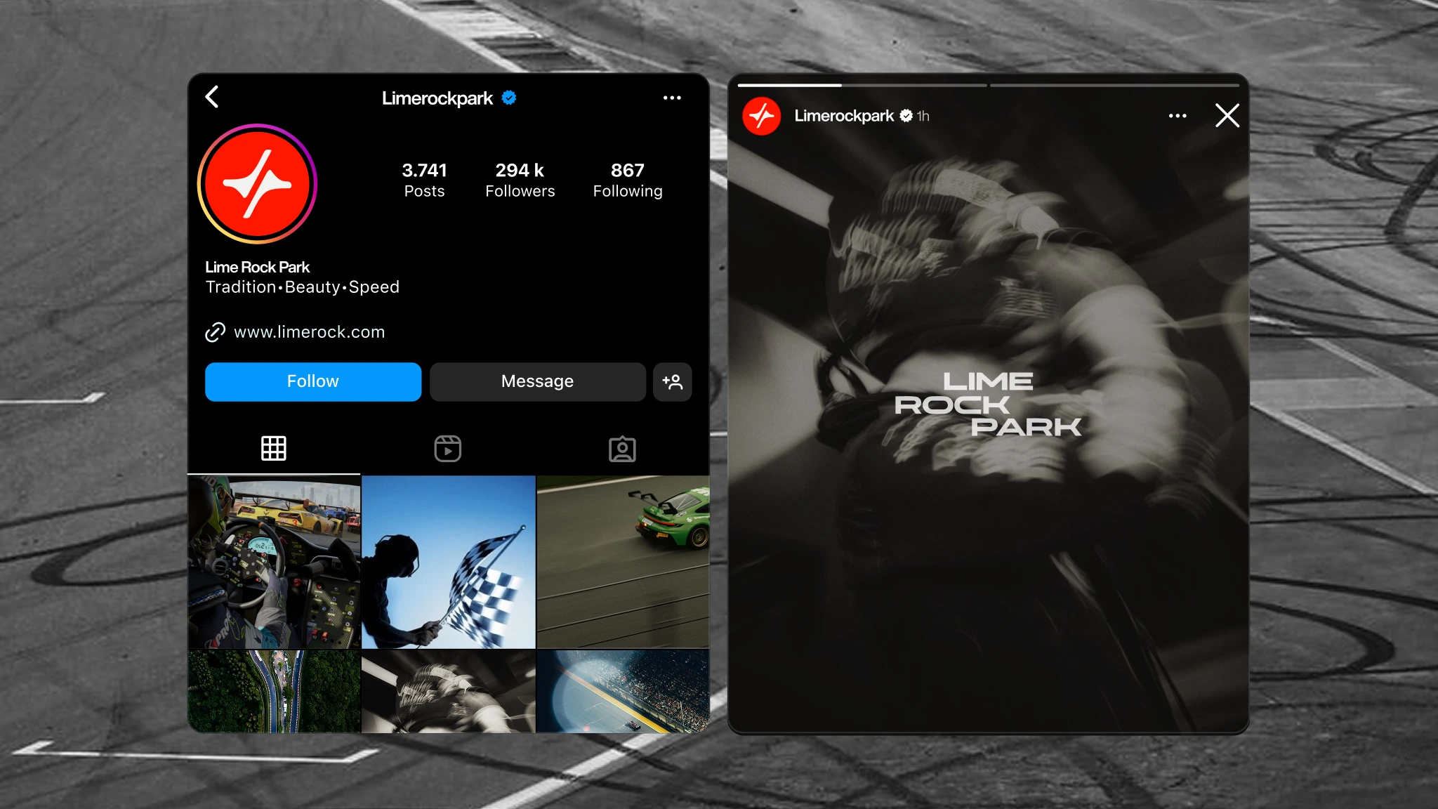
The identity system brings together a new symbol derived from the Lime Rock Park track, a bold and compact wordmark, and the existing tagline, “Tradition. Beauty. Speed.”
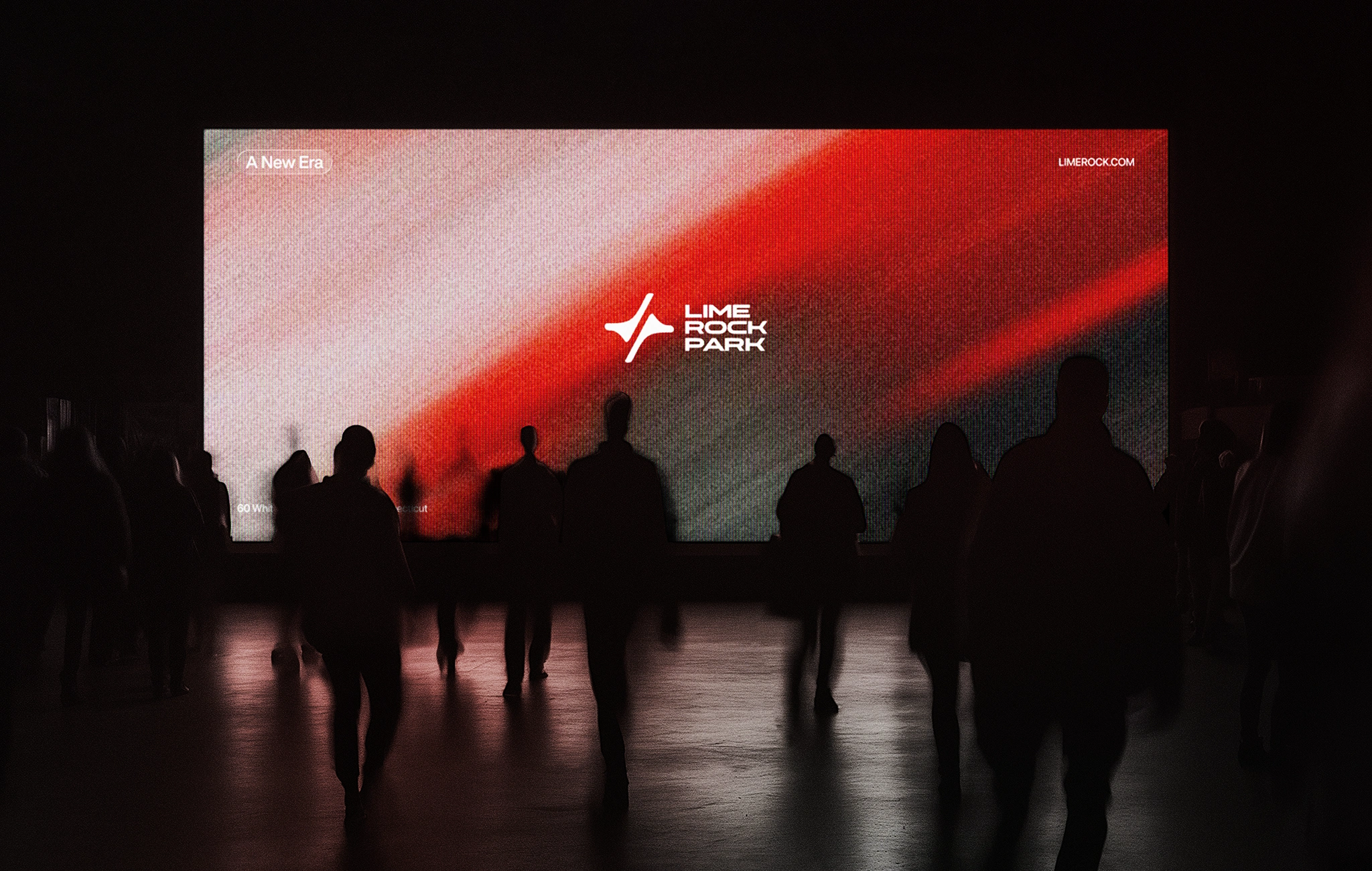
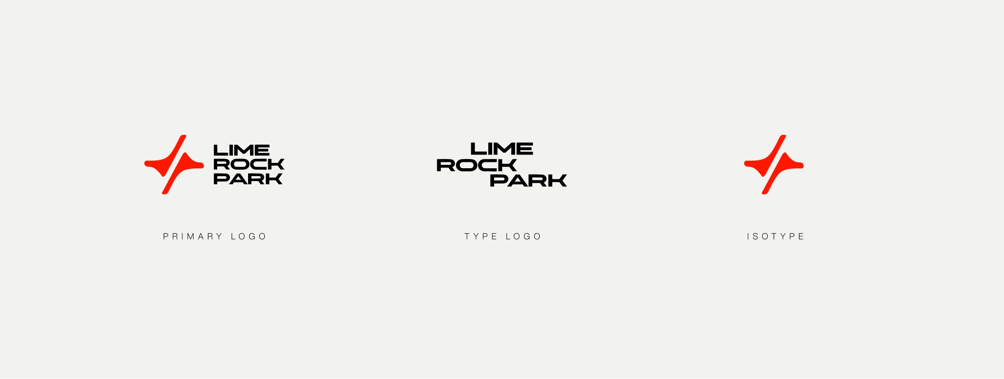
We simplified the circuit layout to its essential form and mirrored it to create a mark that feels distinctive and closely tied to the venue. Paired with a clearer, more confident wordmark, the result is a more cohesive identity that preserves recognizability while giving the brand a stronger presence across every application.
The tagline remained a key part of the brand, now supported by a visual system that better reflects the character and experience behind it.
The Visual System
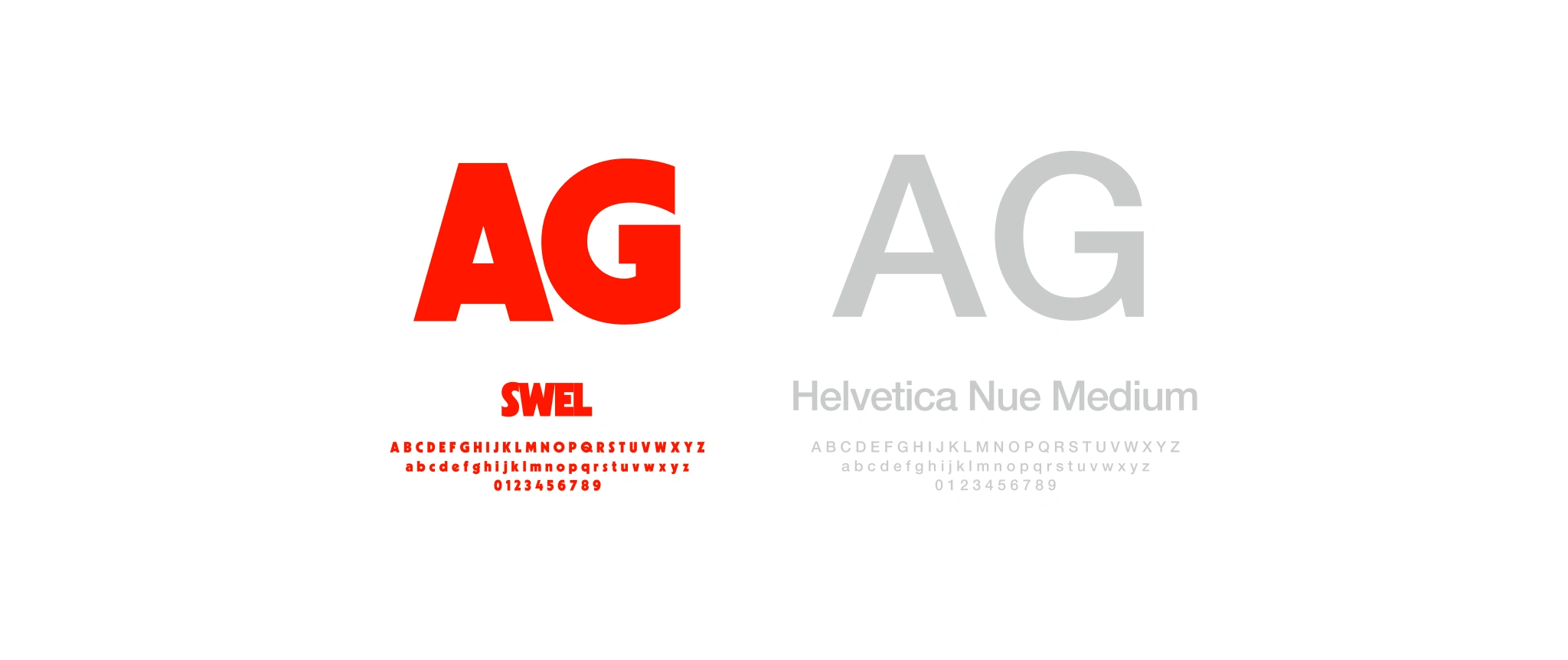
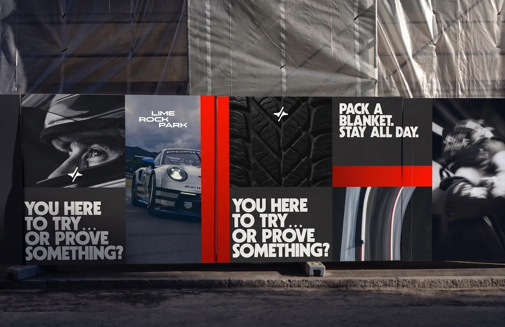
The visual system was designed to feel bold, clear, and adaptable across a wide range of touchpoints. Typography plays a central role, combining expressive display styles with more functional supporting type to create a brand language that feels both energetic and usable.
The color palette builds on familiar motorsport cues while giving the identity a cleaner and more contemporary feel. Together with strong contrast, dynamic composition, and image treatment, these elements help create a visual system that feels fast, recognizable, and consistent without becoming repetitive.

Across the Experience
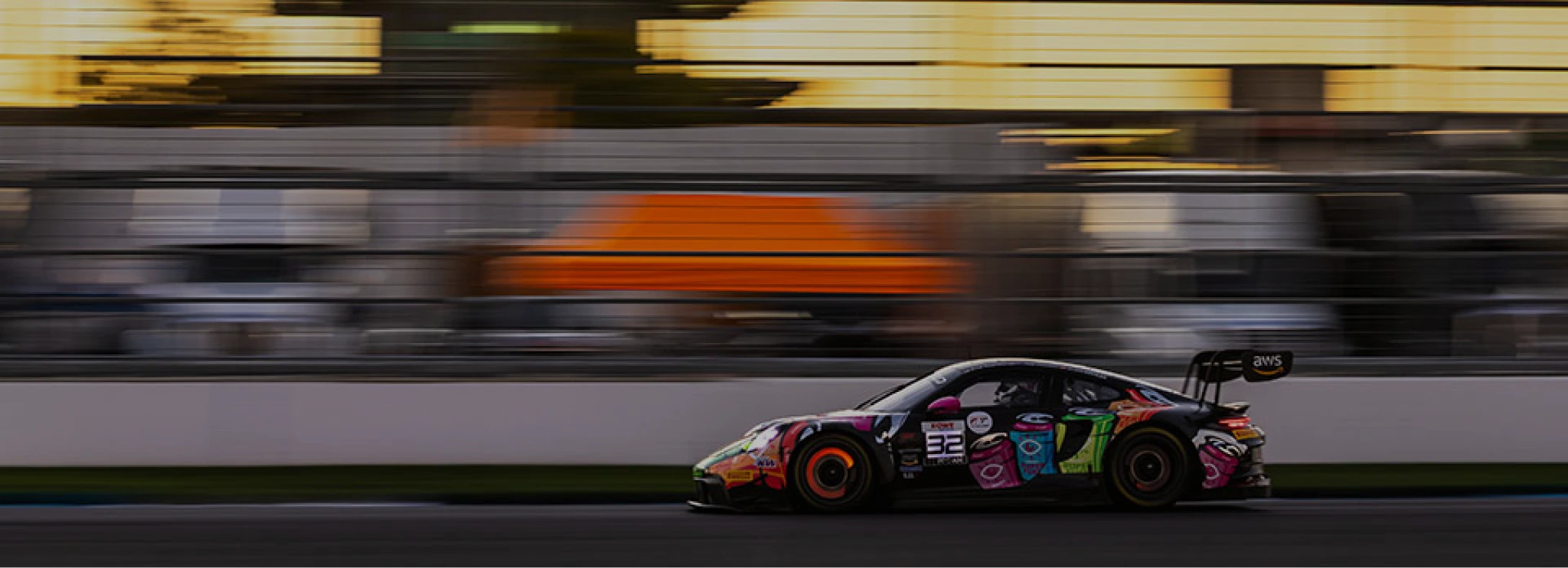
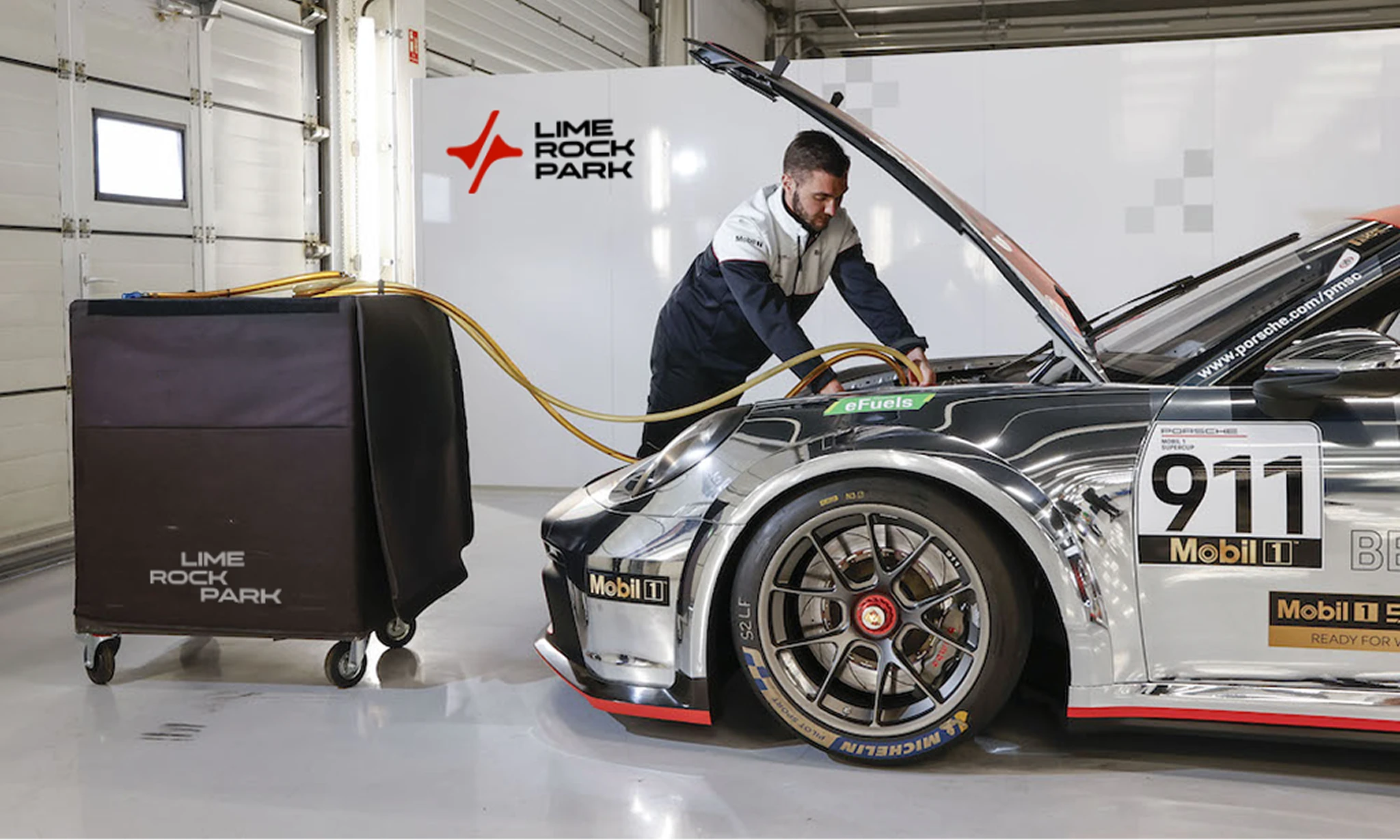
The identity was designed to work across the full Lime Rock Park experience. From signage and credentials to merchandise, digital content, and promotional materials, the system creates a stronger and more cohesive presence across every touchpoint.
Its flexibility allows the brand to move between practical and expressive applications without losing clarity. Whether used trackside, online, or in print, the identity remains recognizable, consistent, and closely connected to the character of the venue.
The redesign gives Lime Rock Park a more focused and contemporary identity, one that feels more aligned with the energy, history, and distinct character of the venue.
By building the system from the track itself and strengthening the elements that were already part of the brand, the project creates a clearer and more cohesive connection between Lime Rock Park and the experience it represents.
The result is an identity that feels more recognizable, more flexible, and better equipped to carry the brand forward.
This is a self-initiated concept project and is not affiliated with Lime Rock Park.
Like this project
Posted Apr 22, 2026
A full brand redesign for one of America’s most historic road racing venues, created to bring new clarity and energy to a legacy brand.
Likes
2
Views
49
Timeline
Mar 22, 2026 - Ongoing
Collaborators