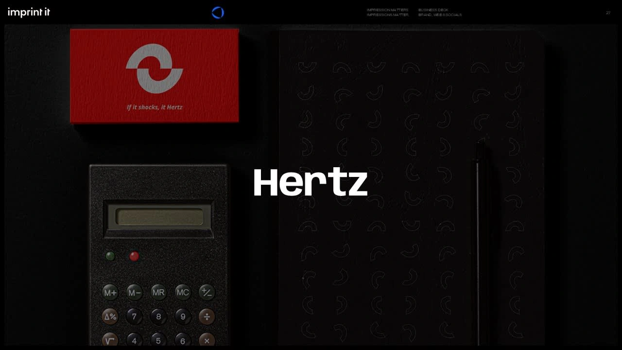
Hertz Electrical
Udit Shah
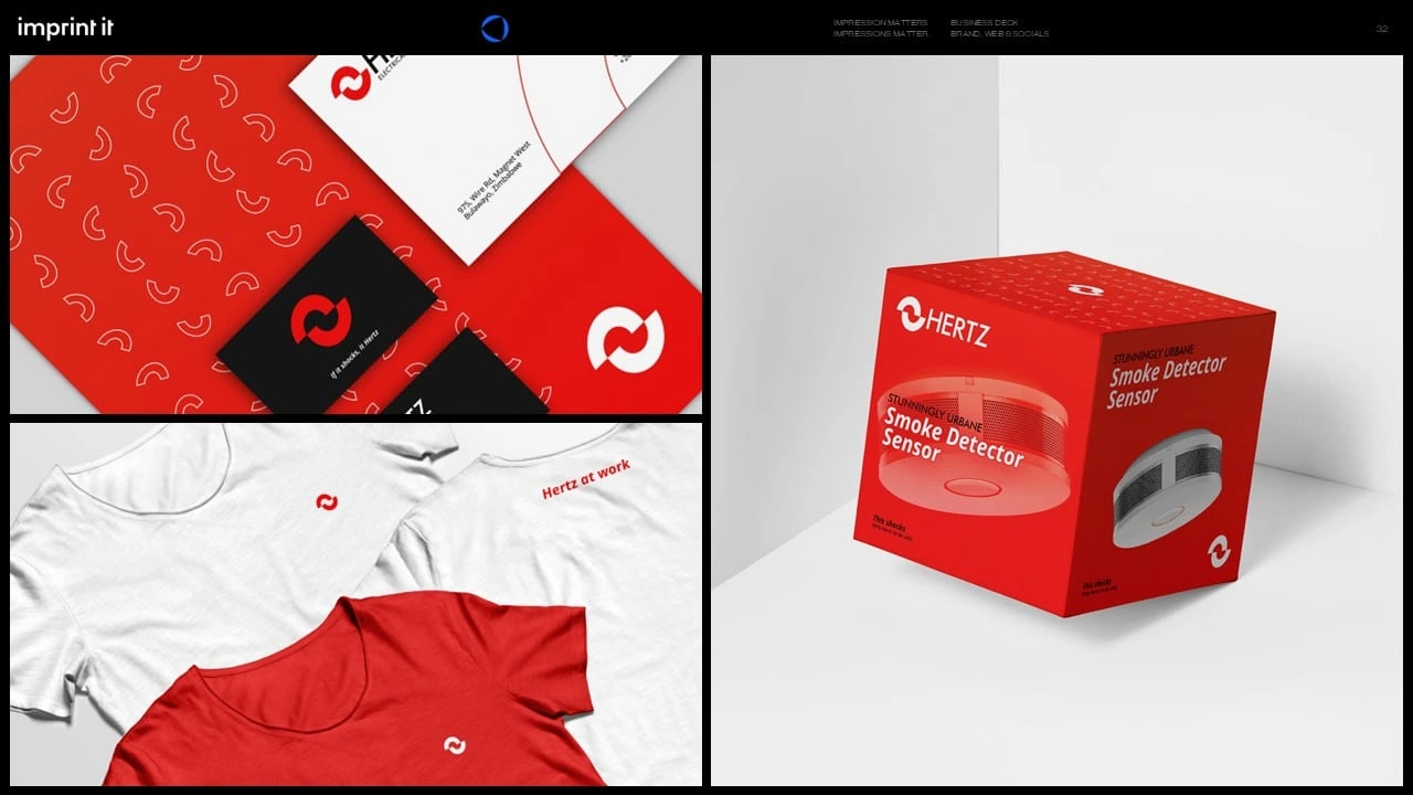
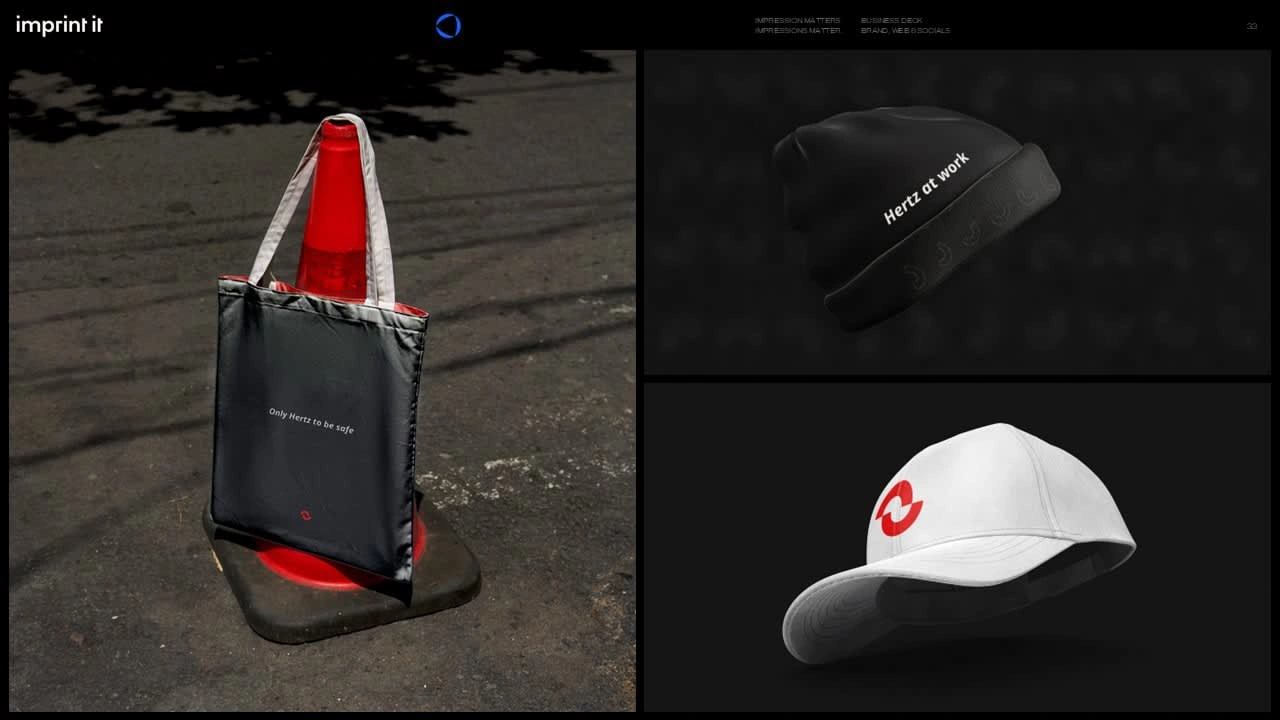
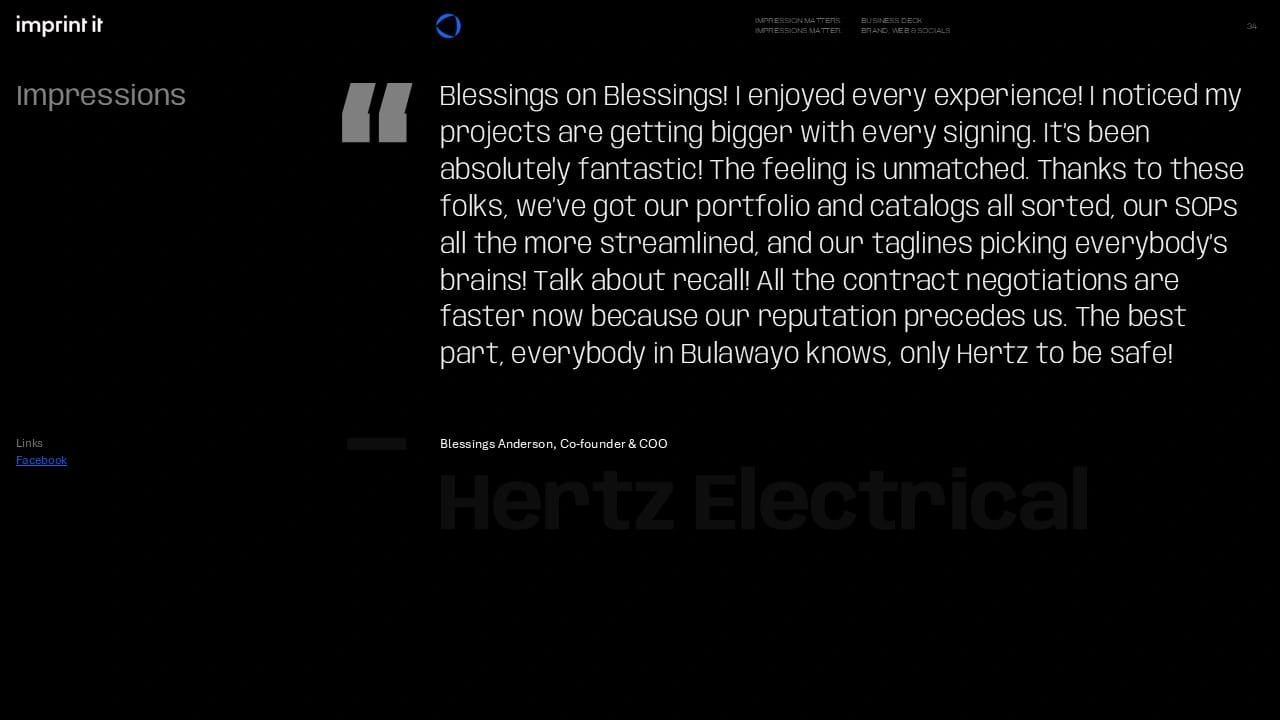
Only Hertz to be safe
Hertz Electrical Contractors are a confederation of industry professionals making modern products and technology, and high-quality services accessible to moderate- and low-income societies of Zimbabwe.
For Hertz, I developed a bold and approachable brand that reflects their mission to make energy solutions accessible to all. By focusing on the synergy between the founders and their vision to modernize Zimbabwe's electrification, we crafted a visual identity and tagline that resonate with their market. Our work helped Hertz stand out with a memorable, impactful brand, showcasing their commitment to providing safe, reliable solutions.
SERVICES PROVIDED
Name Creation, Brand Platform, Brand Slogans, Visual Identity, Print Collateral, Packaging
Baseline Evaluation & Naming
Two earnest entrepreneurs identified untapped potential in Zimbabwe’s fast-growing energy sector, in making electrical tech more accessible while also modernizing existing infrastructure.
The name "Hertz" emerged as a reflection of the duo’s synergy, with their shared vision resonating perfectly with the same frequency of thought. As Hertz is a unit of frequency in electrical terms, it became the perfect metaphor for their alignment and unity on the modernization of Zimbabwe’s power landscape.
We worked closely with Hertz to define their brand attributes
as Philanthropic, Expressive, and Canny—qualities that embody both their ideals to communicate, give back, and operate smartly. This stance led us to establish their Single Most Important Thing (SMIT): Accessible infrastructure for the masses.

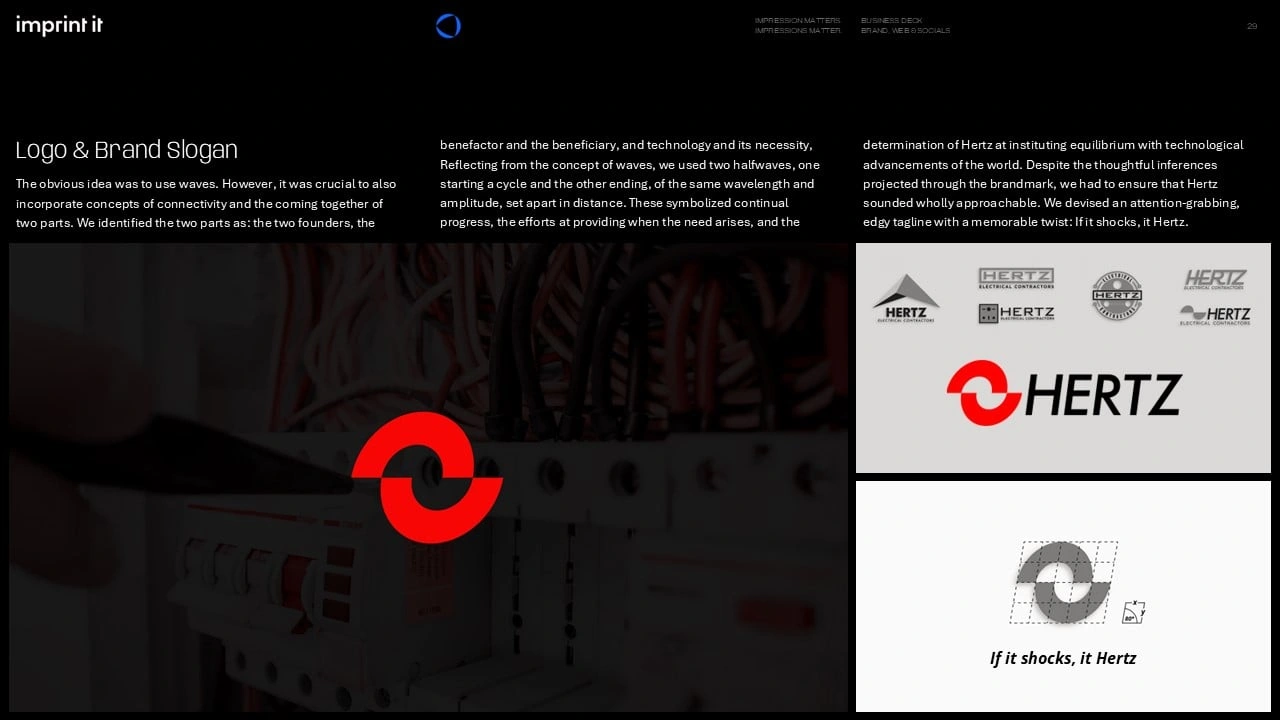
Logo & Brand Slogan
The obvious idea was to use waves. However, it was crucial to also incorporate concepts of connectivity and the coming together of two parts.
We identified the two parts as: the two founders, the benefactor and the beneficiary, and technology and its necessity. Reflecting from the concept of waves, we used two halfwaves, one starting a cycle and the other ending, of the same wavelength and amplitude, set apart in distance.
These symbolized continual progress, the efforts at providing when the need arises, and the determination of Hertz at instituting equilibrium with technological advancements of the world.
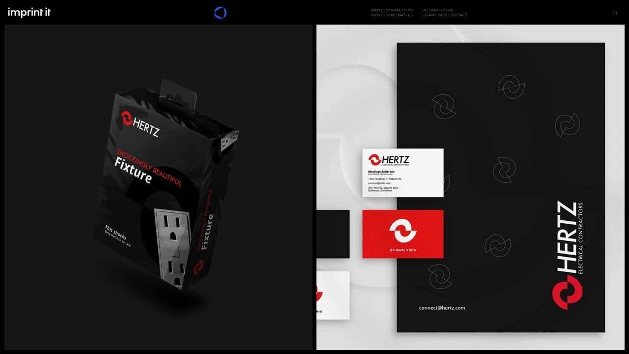
Despite the thoughtful inferences projected through the brandmark, we had to ensure that Hertz sounded wholly approachable. We devised an attention-grabbing, edgy tagline with a memorable twist: If it shocks, it Hertz.
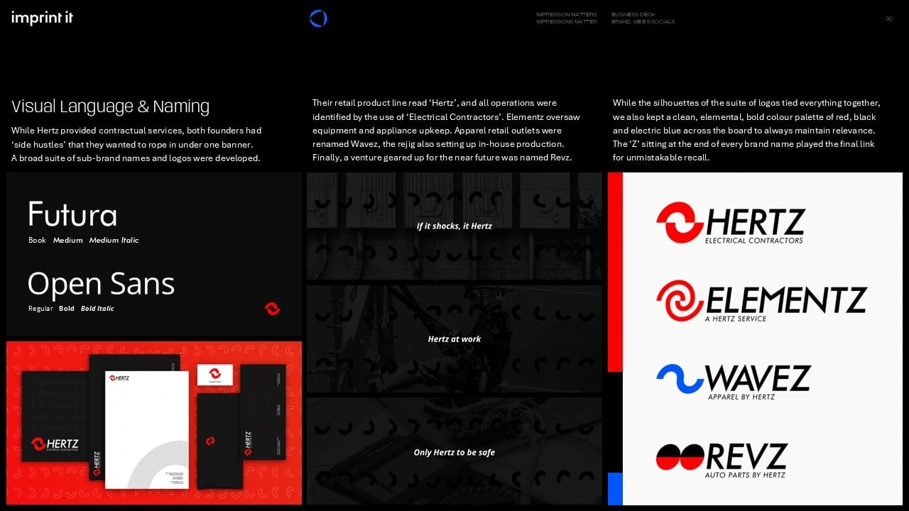
Visual Language & Naming
While Hertz provided contractual services, both founders had ‘side hustles’ that they wanted to rope in under one banner.
A broad suite of sub-brands were developed through corresponding strategies and identity systems.
Their retail product line read ‘Hertz’, and all operational services were identified by the use of ‘Electrical Contractors’ alongside Hertz
Elementz oversaw equipment and appliance upkeep
Apparel retail outlets were renamed Wavez, the rejig also setting up in-house production
An auto-parts venture geared up for the near future was named Revz
While the silhouettes of the suite of logos tied everything together, we also kept a clean, elemental and bold colour palette of red, black and electric blue across the board to always maintain relevance. The ‘Z’ sitting at the end of every brand name played the final link for unmistakable recall.
Like this project
Posted Oct 23, 2024
Developed a bold and approachable brand that reflects the mission to make energy and electrification solutions accessible to all.
Likes
0
Views
21