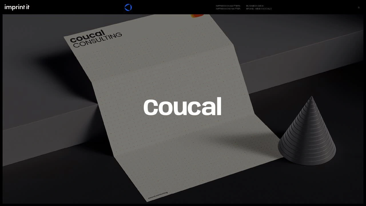
Coucal Consulting
Become future-ready, today!
Coucal Consulting empowers businesses to adapt and thrive in volatile markets. Specializing in strategic advisory, they support enterprises by fostering innovation and driving market resilience.
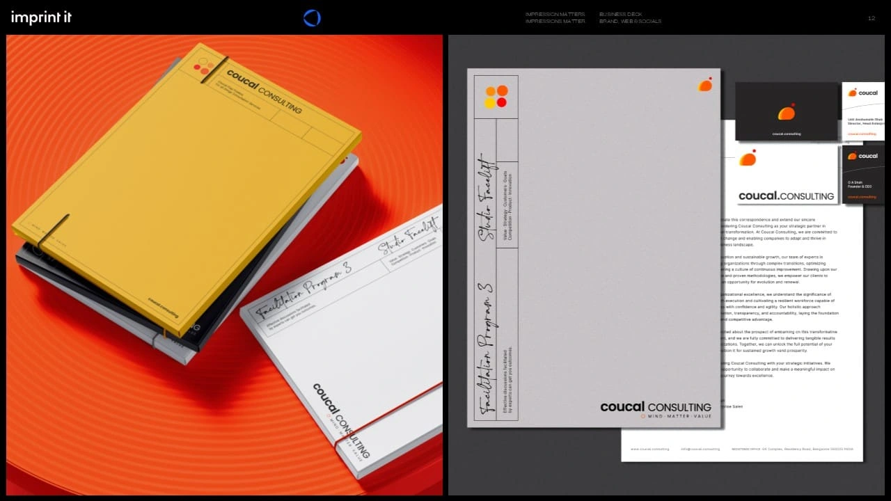
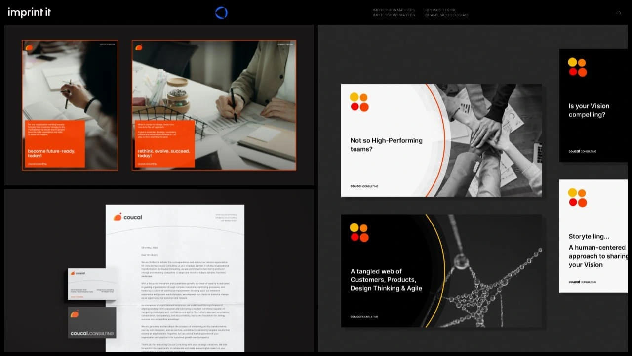
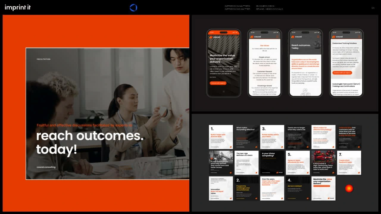
I worked closely with Coucal Consulting to create a visual identity that reflects their resilience and transformative impact on businesses. By focusing on their mission to guide organizations through change, I crafted a brand that emphasizes their ability to deliver value in volatile markets. The design systems highlight Coucal’s adaptability, aligning their brand with their promise to help clients become future-ready.
SERVICES PROVIDED
Name Creation, Brand Platform, Verbal Identity, Copy Review, Visual Identity, Web Design With CMS, Social Media Design
Baseline Evaluation & Naming
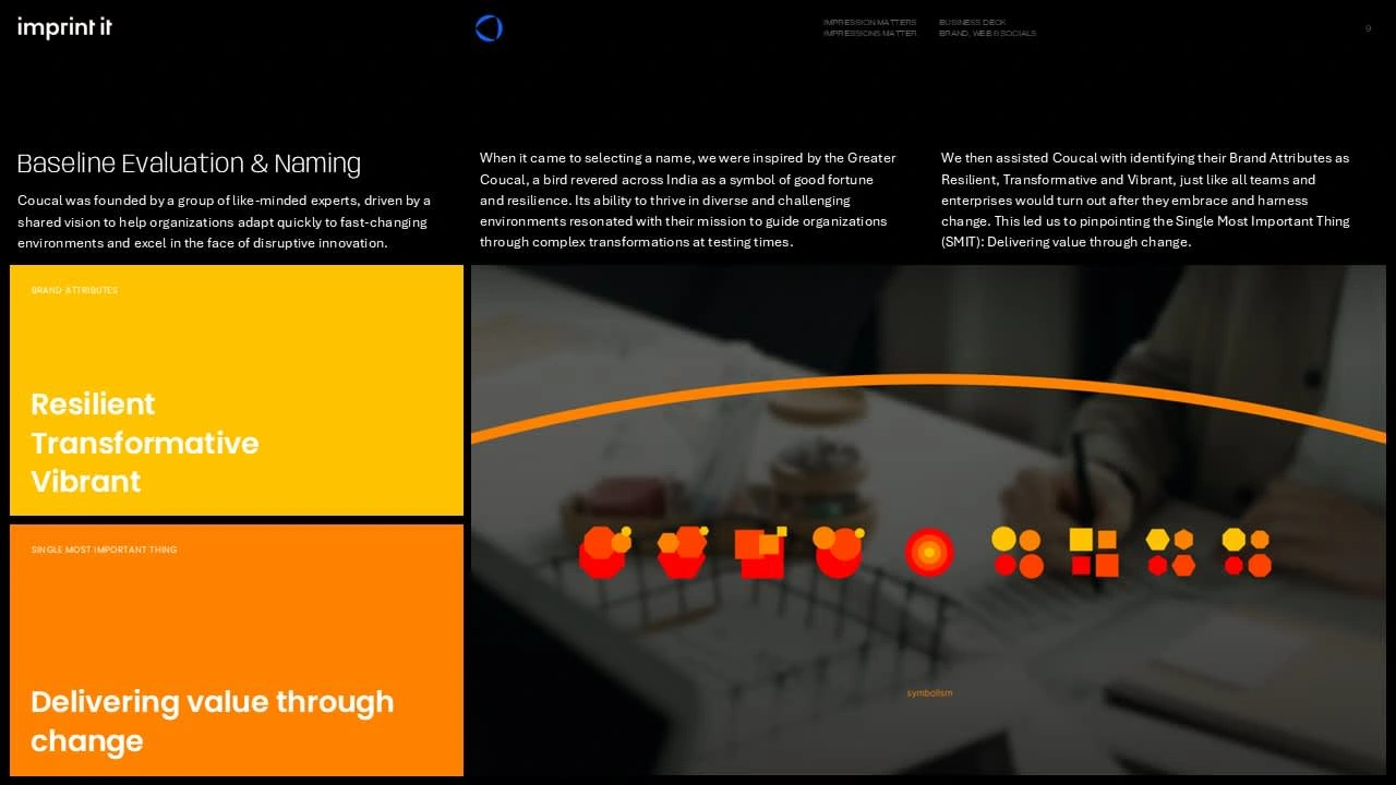
Coucal was founded by a group of like-minded experts, driven by a shared vision to help organizations adapt quickly to fast-changing environments and excel in the face of disruptive innovation.
When it came to selecting a name, I was inspired by the Greater Coucal, a bird revered across India as a symbol of good fortune and resilience. Its ability to thrive in diverse and challenging environments resonated with their mission to guide organizations through complex transformations at testing times.
I then assisted Coucal with identifying their Brand Attributes as Resilient, Transformative and Vibrant, just like all teams and enterprises would turn out after they embrace and harness change. This led me to pinpointing the Single Most Important Thing (SMIT): Delivering value through change.
Logo & Verbal Framework
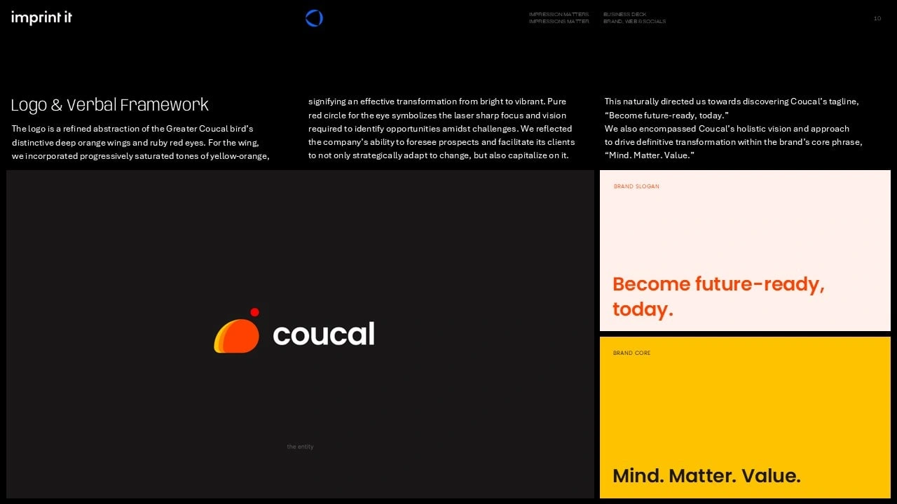
The logo is a refined abstraction of the Greater Coucal bird’s distinctive deep orange wings and ruby red eyes. For the wing,
I incorporated progressively saturated tones of yellow-orange, signifying an effective transformation from bright to vibrant. Pure red circle for the eye symbolizes the laser sharp focus and vision required to identify opportunities amidst challenges. I reflected the company’s ability to foresee prospects and facilitate its clients to not only strategically adapt to change, but also capitalize on it. This naturally directed me towards discovering Coucal’s tagline,
“Become future-ready, today.”
I finally encompassed Coucal’s holistic vision and approach
to drive definitive transformation within the brand’s core phrase, “Mind. Matter. Value.”
Visual Language
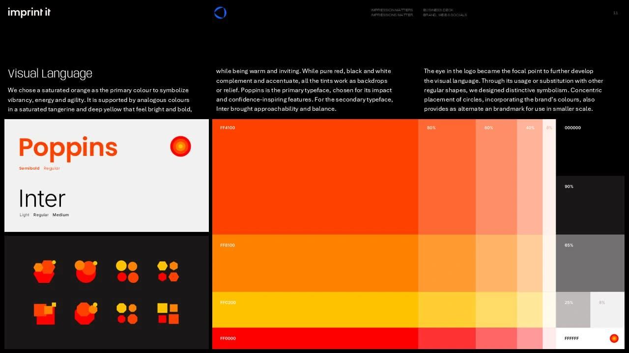
I chose a saturated orange as the primary colour to symbolize vibrancy, energy and agility. It is supported by analogous colours
in a saturated tangerine and deep yellow that feel bright and bold, while being warm and inviting. While pure red, black and white complement and accentuate, all the tints work as backdrops
or relief. Poppins is the primary typeface, chosen for its impact and confidence-inspiring features. For the secondary typeface, Inter brought approachability and balance.
The eye in the logo became the focal point to further develop
the visual language. Through its usage or substitution with other regular shapes, I designed distinctive symbolism. Concentric placement of circles, incorporating the brand’s colours, also provides as alternate an brandmark for use in smaller scale.
Like this project
Posted Oct 22, 2024
Worked closely with Coucal Consulting to create a visual & verbal identity that reflects their resilience and transformative impact on businesses.

