Clawpa — App Store Screenshot
Vicko Grafix
Clawpa — App Store Screenshot Design
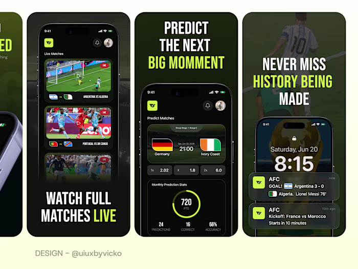
Good App Store screenshots aren't meant to explain every feature. Their job is to create confidence and give users a reason to tap Download.
For this concept, I focused on one clear message per screen, strong visual hierarchy, and clean layouts that guide attention naturally. Instead of overwhelming users with information, each screenshot highlights a single benefit while the UI reinforces the promise.
Design tip: If users can't understand your app's value within the first few seconds of viewing your screenshots, you're likely showing too much instead of saying the right thing.
The result is a gallery designed to communicate trust, clarity, and the experience of training a happier, better-behaved dog.
Like this project
Posted Jun 27, 2026
Clawpa — App Store Screenshot Design Good App Store screenshots aren't meant to explain every feature. Their job is to create confidence and give users a rea...
Likes
0
Views
2