
Vicko Grafix
UIUX Designer + App Store Screenshot. Mobile app UI | Web UI
Ready for work
Vicko is ready for their next project!
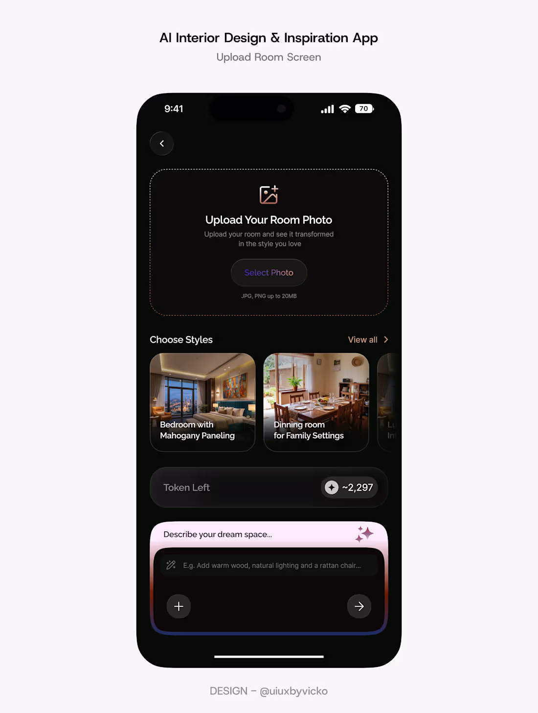
These two screens showcase the AI journey for DreamSpace, the mobile app interface I am working on:
Upload Room: Where users upload their space, choose a design style, and personalize it with a prompt.
Generating Design: Where AI analyzes the room and transforms it into a beautifully redesigned space.
This the type of quality responsive user eXperience you get from working with us! Quality isn't a feature. It's our standard.
1
25
POV: AI finally met good product design.
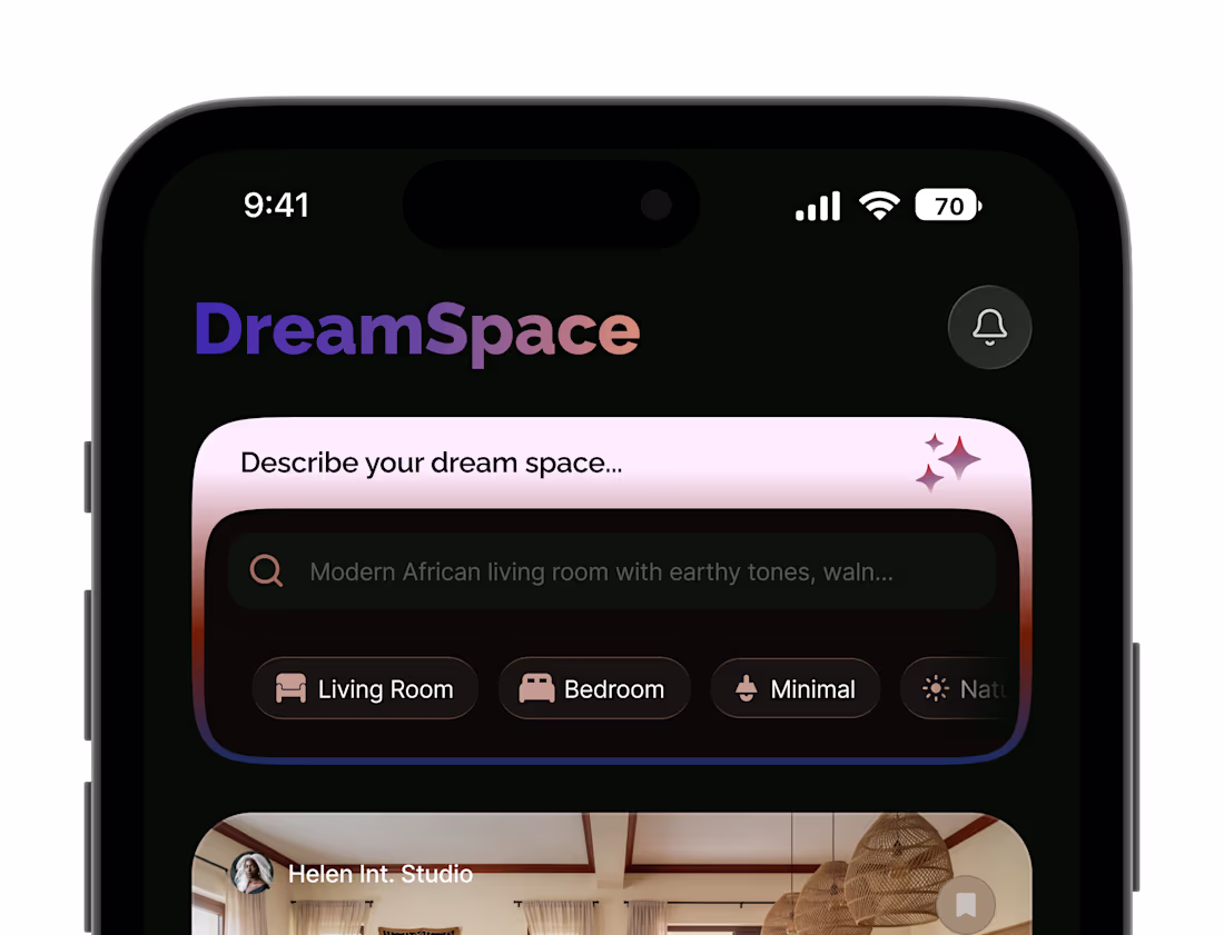
Meet DreamSpace, an AI powered interior design experience where you can discover curated spaces from top studios, save your favorites, or upload your own room and instantly visualize a transformation in your preferred style.
More than making it look beautiful, I focused on hierarchy, restraint, and giving every element room to breathe.
#productdesign (https://x.com/hashtag/productdesign?src=hashtag_click) #mobileapp (https://x.com/hashtag/mobileapp?src=hashtag_click) #ai (https://x.com/hashtag/ai?src=hashtag_click)
1
2
50
Stop blaming marketing!
Your App Store screenshots are costing you downloads.
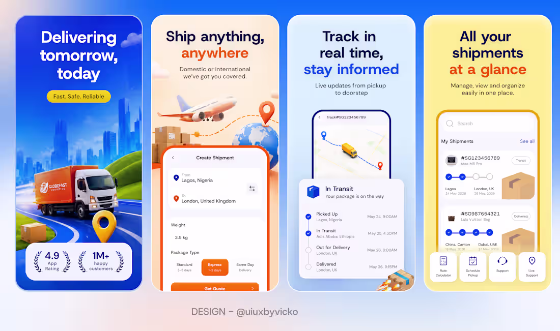
Here's a set of App Store screenshots I designed for a logistics app. Designed to build trust before the first tap. 🚚
1
2
40
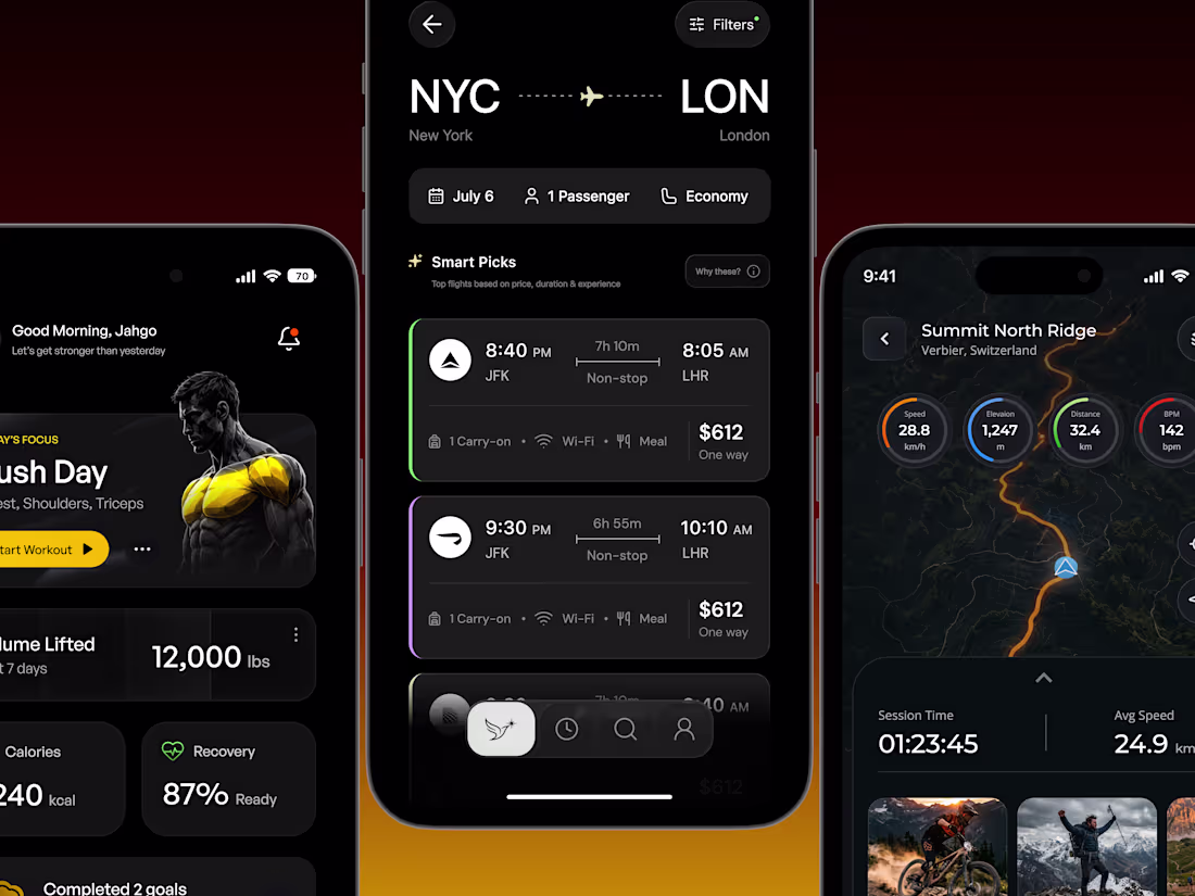
POV: Design mobile apps in Black and white
If you're a founder building something cool. Send a DM let's chat!
1
36
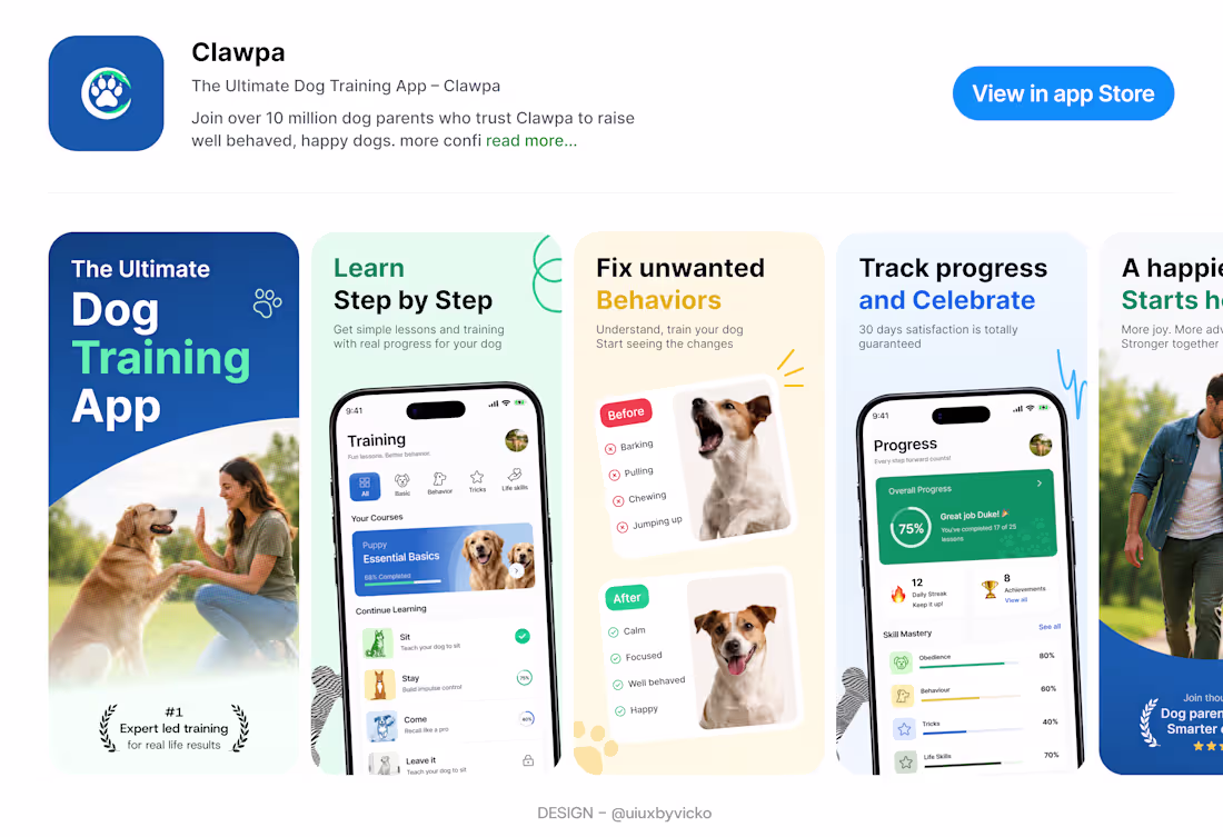
Clawpa — App Store Screenshot Design
Good App Store screenshots aren't meant to explain every feature. Their job is to create confidence and give users a reason to tap Download.
For this concept, I focused on one clear message per screen, strong visual hierarchy, and clean layouts that guide attention naturally. Instead of overwhelming users with information, each screenshot highlights a single benefit while the UI reinforces the promise.
Design tip: If users can't understand your app's value within the first few seconds of viewing your screenshots, you're likely showing too much instead of saying the right thing.
The result is a gallery designed to communicate trust, clarity, and the experience of training a happier, better-behaved dog.
1
94
Good morning and Happy new week 🥳
Wishing you a productive, peaceful, and successful week ahead ⚡
•
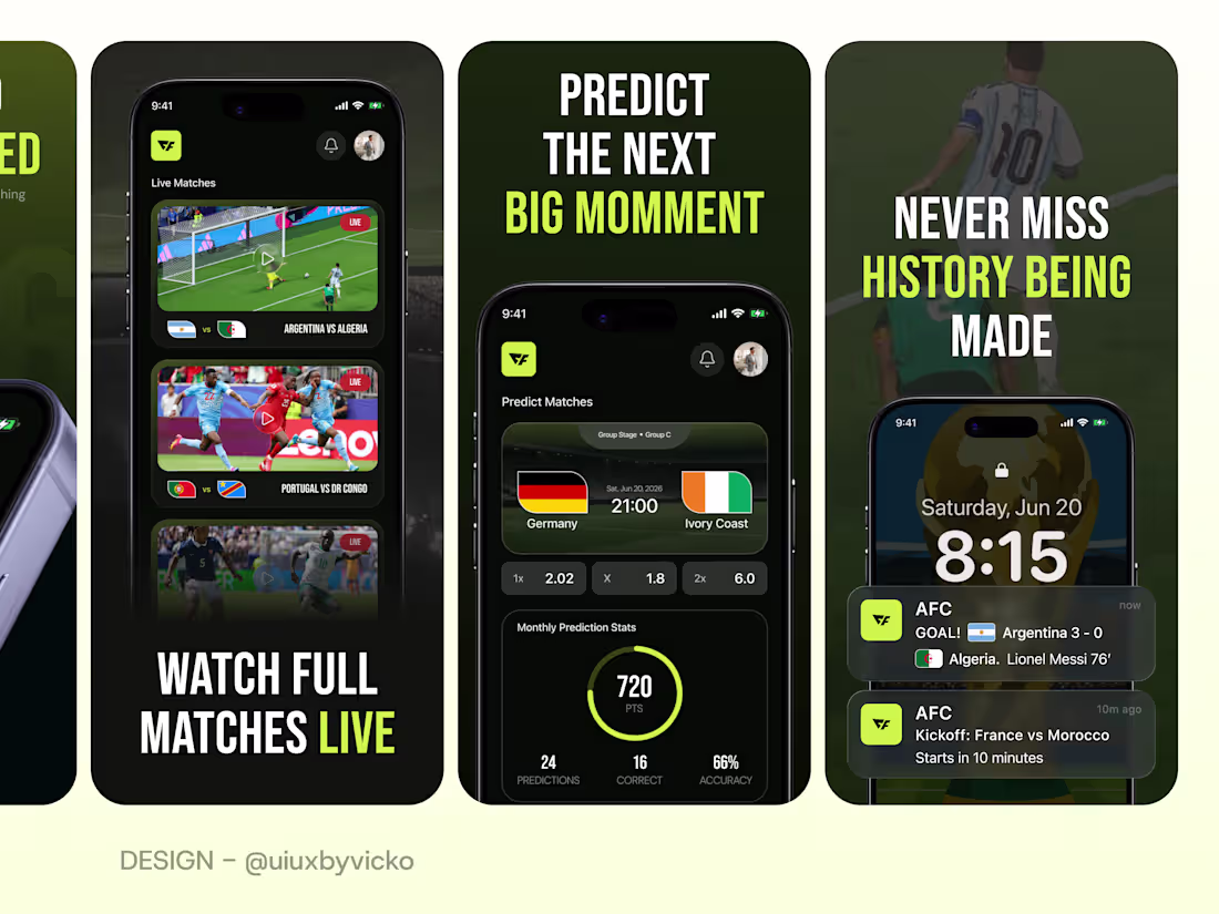
As a founder you should know that good App Store screenshots don’t just showcase your app, it has to market the experience.
Every decision matters, from the copy and typography to the spacing, visual hierarchy, and overall creative direction.
For this concept
A World Cup companion app, focusing on how to turn five screenshots into a marketing asset rather than just a product showcase.
The goal was simple: create visuals that instantly communicate value, build excitement, and make users want to download the app before they even read the description.
Great App Store screenshots are a blend of product design, storytelling, and marketing.
What’s the first thing you look for when an app catches your attention on the App Store? ⚽️🏆
#UIUX (https://www.linkedin.com/search/results/all/?keywords=%23uiux&origin=HASH_TAG_FROM_FEED) #ProductDesign (https://www.linkedin.com/search/results/all/?keywords=%23productdesign&origin=HASH_TAG_FROM_FEED) #AppDesign (https://www.linkedin.com/search/results/all/?keywords=%23appdesign&origin=HASH_TAG_FROM_FEED) #MobileAppDesign (https://www.linkedin.com/search/results/all/?keywords=%23mobileappdesign&origin=HASH_TAG_FROM_FEED) #AppStoreOptimization (https://www.linkedin.com/search/results/all/?keywords=%23appstoreoptimization&origin=HASH_TAG_FROM_FEED) #UIDesign (https://www.linkedin.com/search/results/all/?keywords=%23uidesign&origin=HASH_TAG_FROM_FEED) #Figma (https://www.linkedin.com/search/results/all/?keywords=%23figma&origin=HASH_TAG_FROM_FEED) #DesignProcess (https://www.linkedin.com/search/results/all/?keywords=%23designprocess&origin=HASH_TAG_FROM_FEED) #SportsTech (https://www.linkedin.com/search/results/all/?keywords=%23sportstech&origin=HASH_TAG_FROM_FEED)
2
3
47
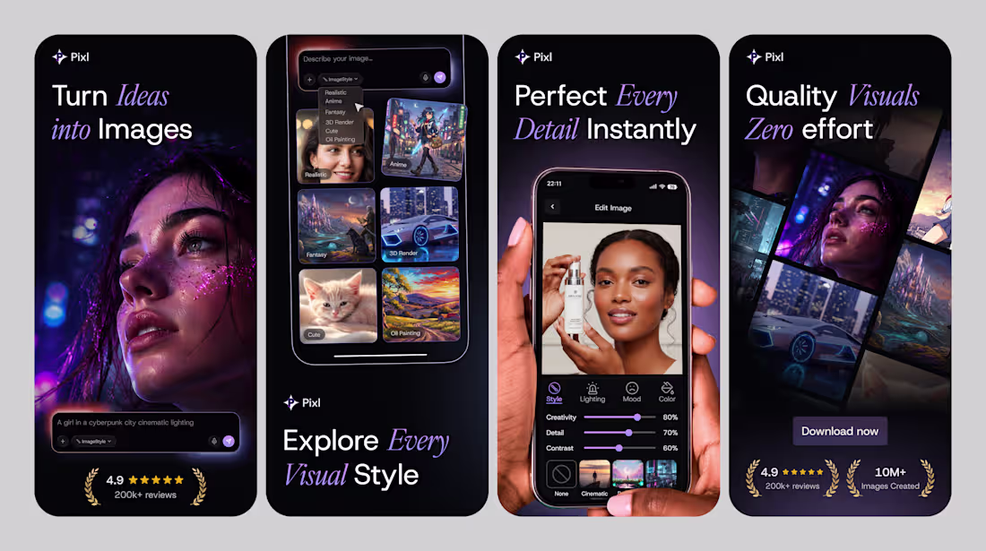
I designed these App Store screenshots for an AI image generation app
Pixl.
Dark. Premium. Built to convert. Every screen has one job: make you download Pixl. This is what good marketing design looks like.
0
25
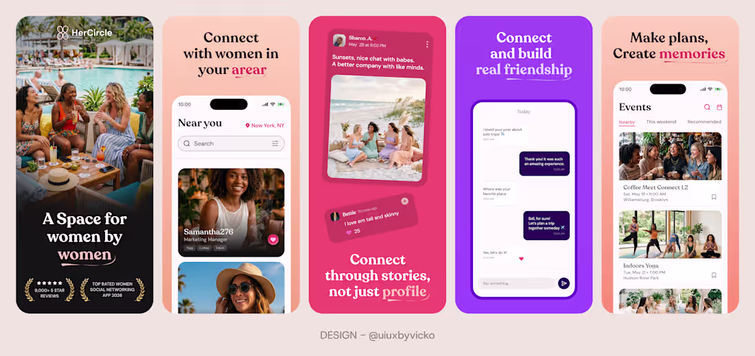
App Store screenshots for a women focused social app.
For this concept, I focused on clarity, visual hierarchy, and a story that unfolds across every screenshot, turning features into something people can instantly understand and connect with.
Good screenshots don't just showcase an app. They sell the experience.
0
23
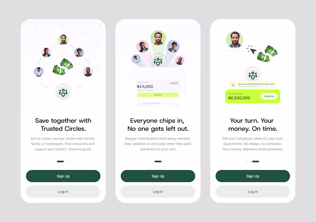
Onboarding screens done for a digital savings circle app built for people who save together.
Save together. Grow together.
0
30
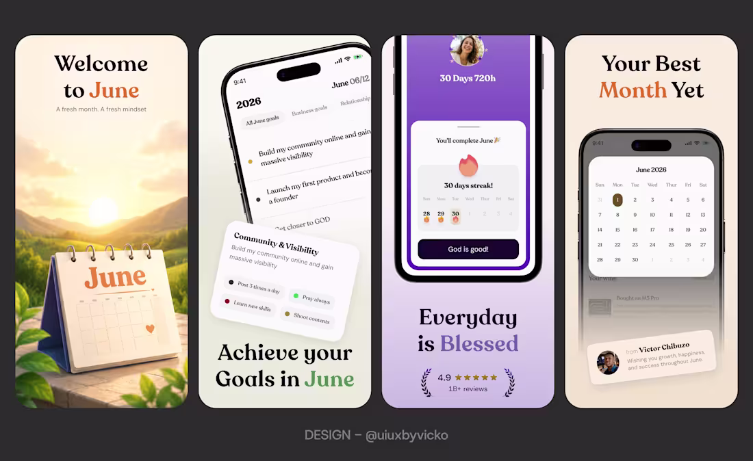
As we step into June, I hope it brings new opportunities, fresh ideas, meaningful growth, and wins worth celebrating.
Happy New Month
Here is June designs but as UIUX App store screenshot.
Wishing everyone a productive and fulfilling month ahead.
.
.
.
I help founders turn ideas into intuitive, conversion focused mobile app experiences. Thanks to the clients that has trusted us with their projects throughout this year, we appreciate. Lets handle your design projects in June.
0
26
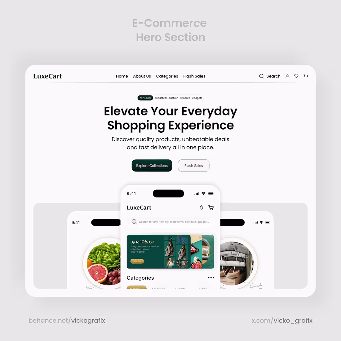
E-commerce App and Hero section
0
5
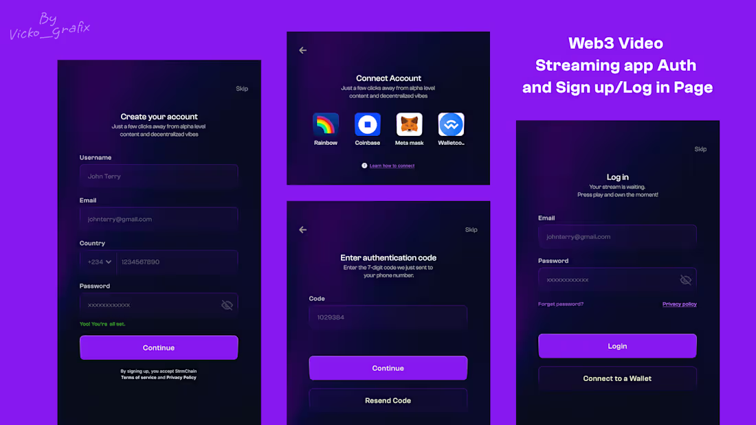
Auth, Sign up/Login page
0
6
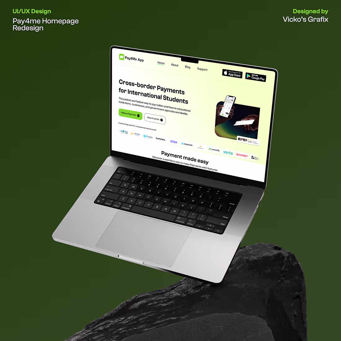
Pay4me Homepage Redesign
0
6
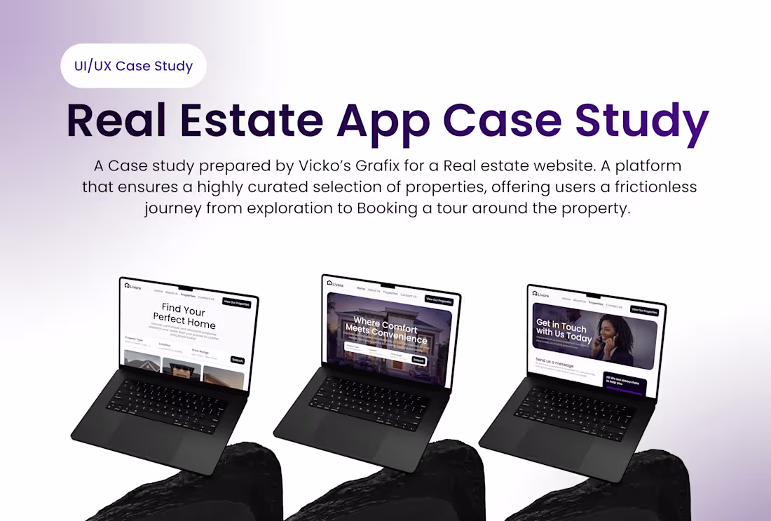
LIVORA (Real Estate Website)
1
3
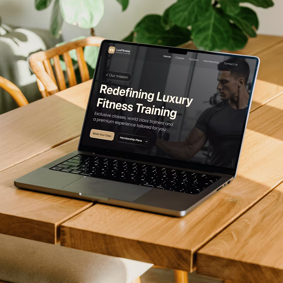
Fitness Training Website
0
5