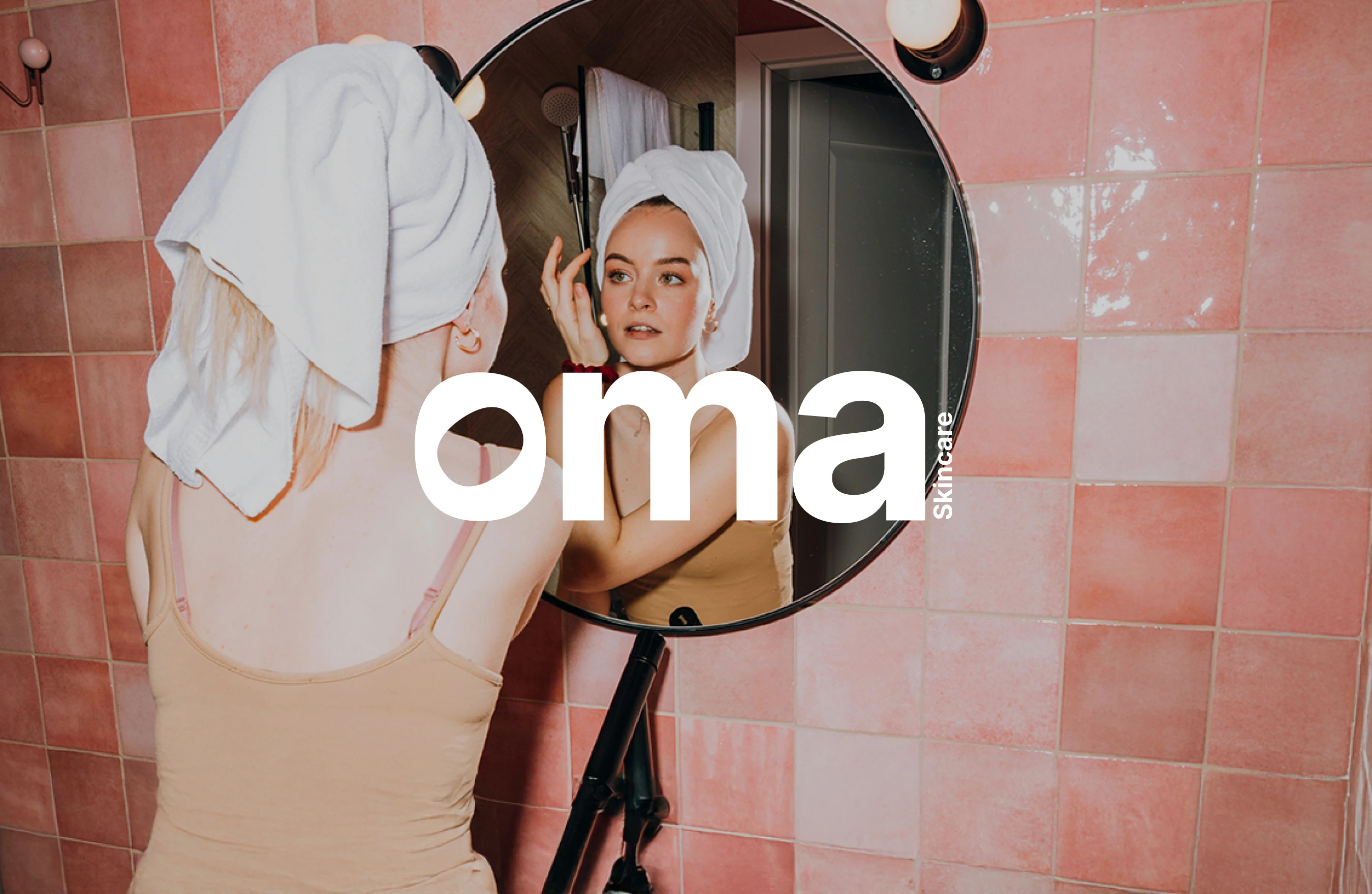
Oma: Bold Skincare That Cares
Julia Spieldenner
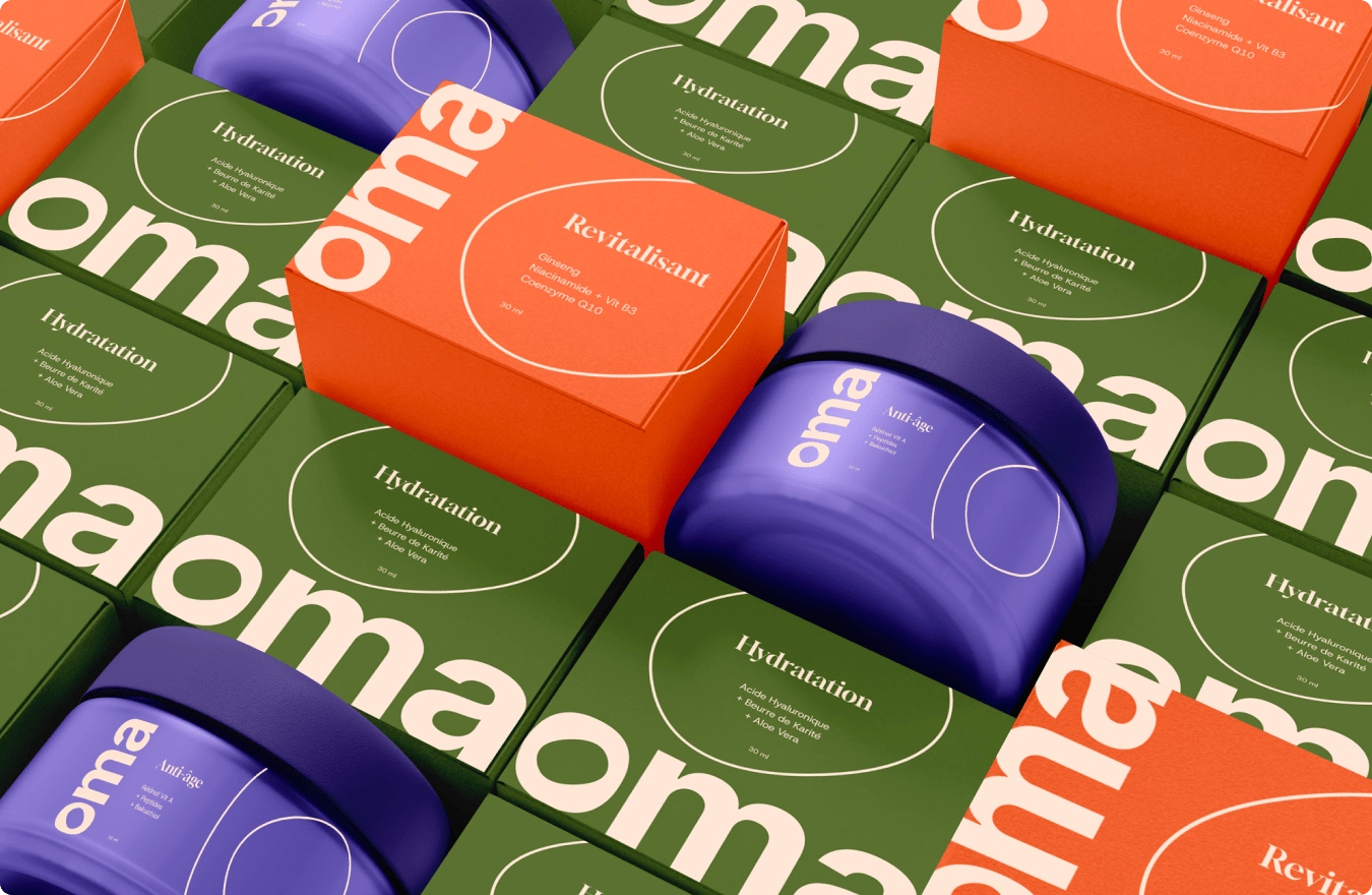
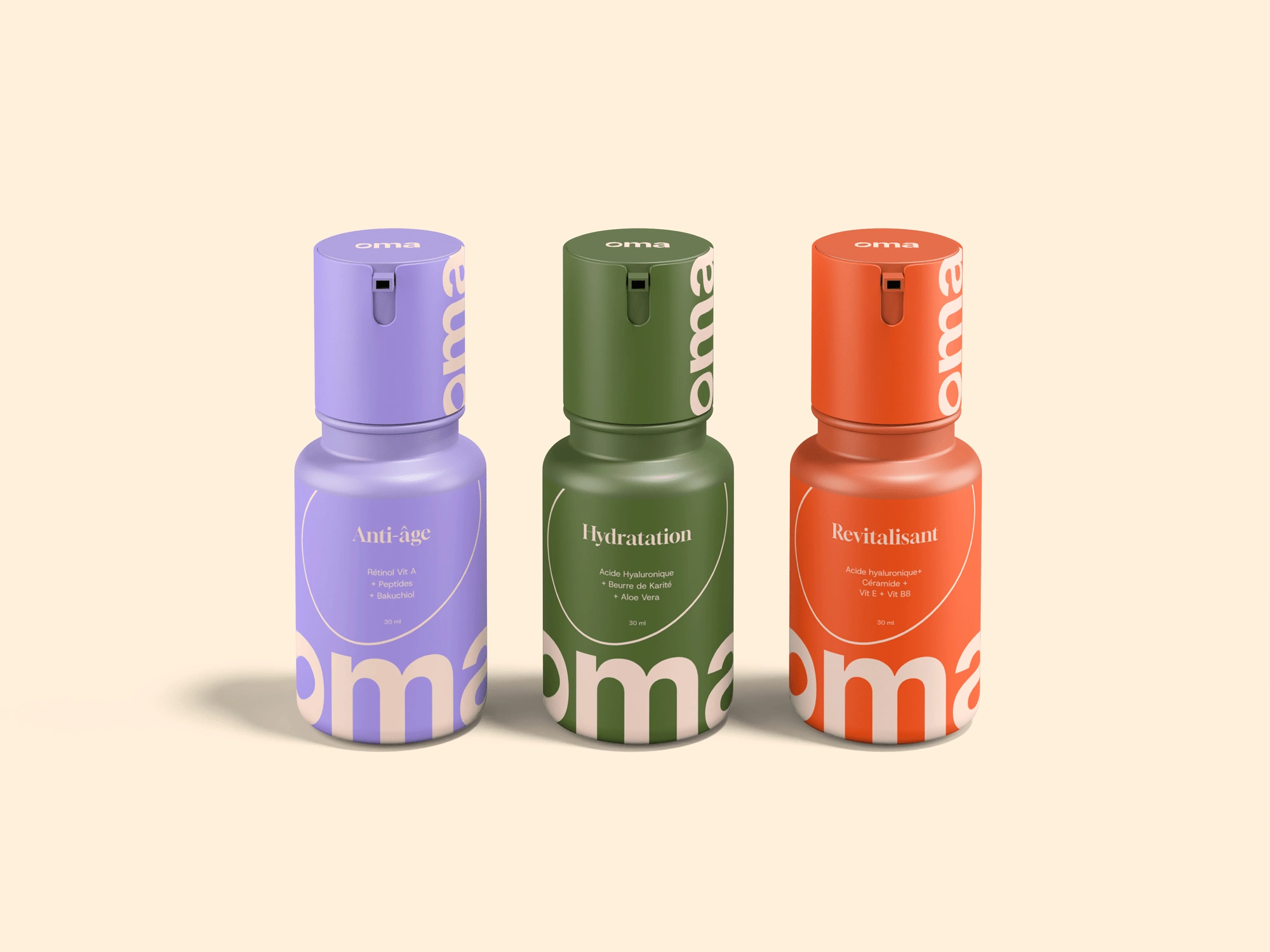
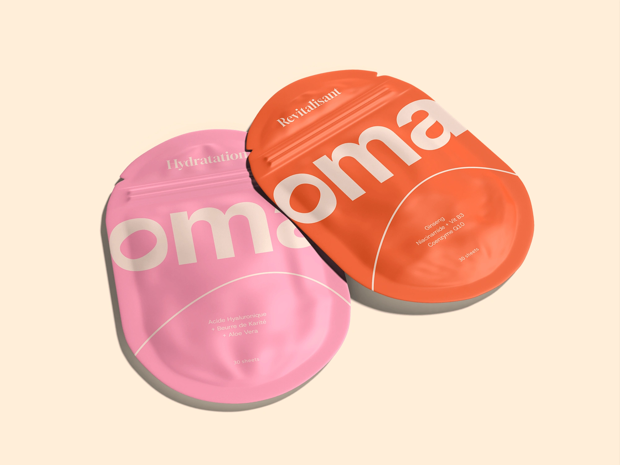
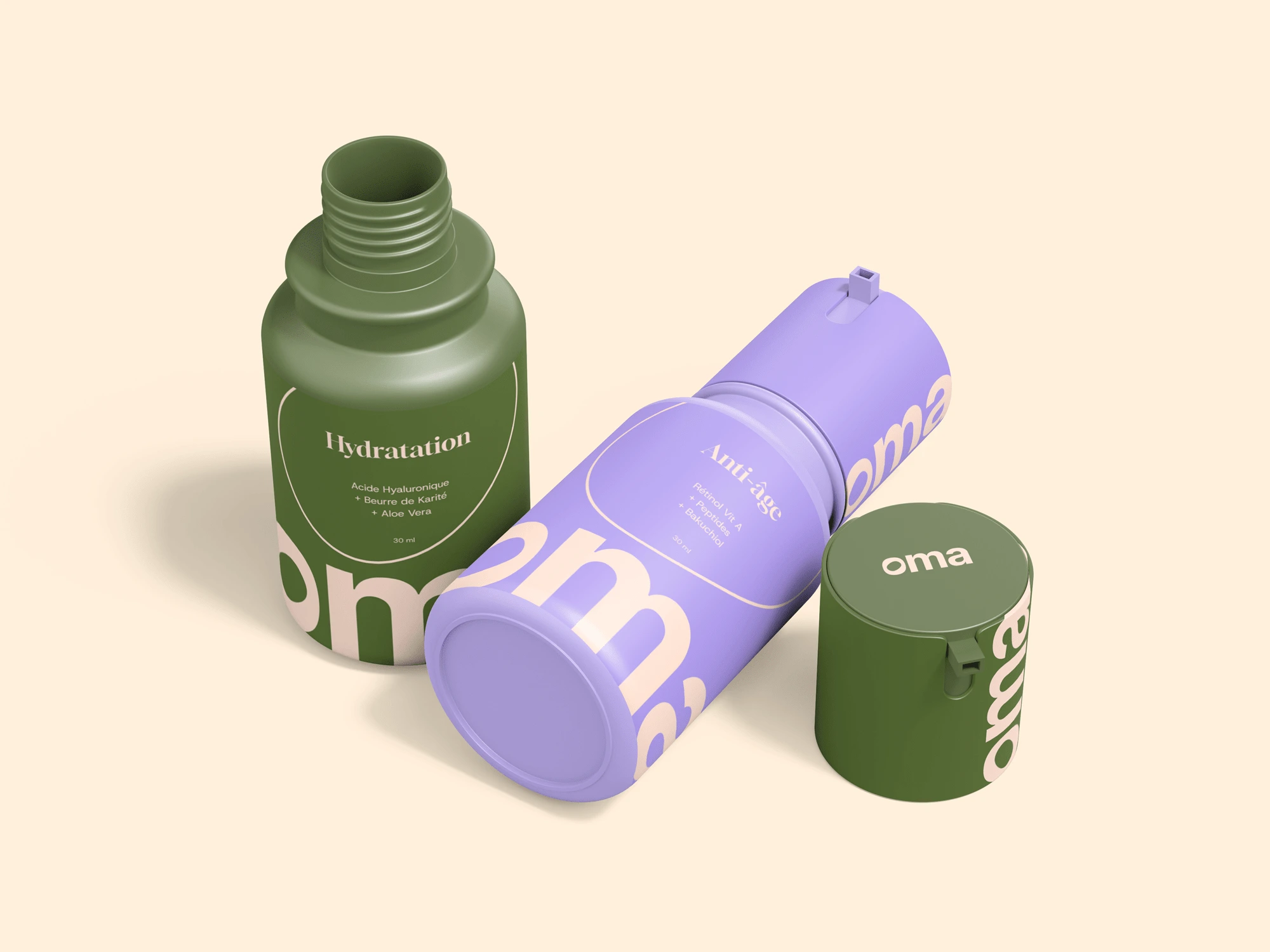
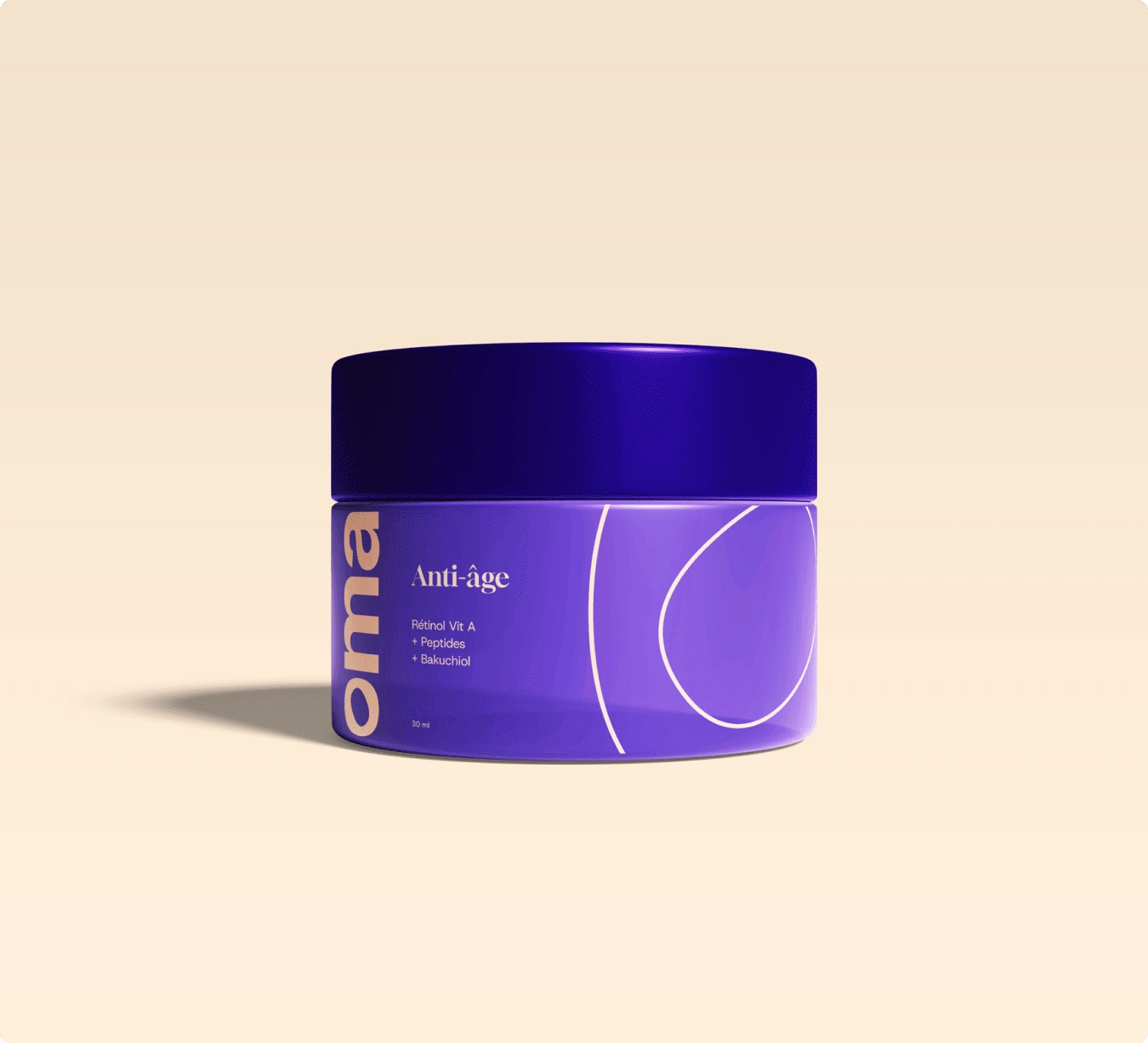
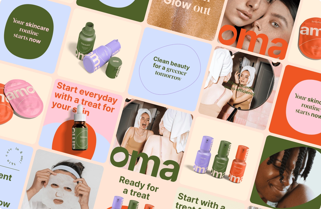
Oma is a skincare brand designed to stand out, both on the shelf and in your daily routine.
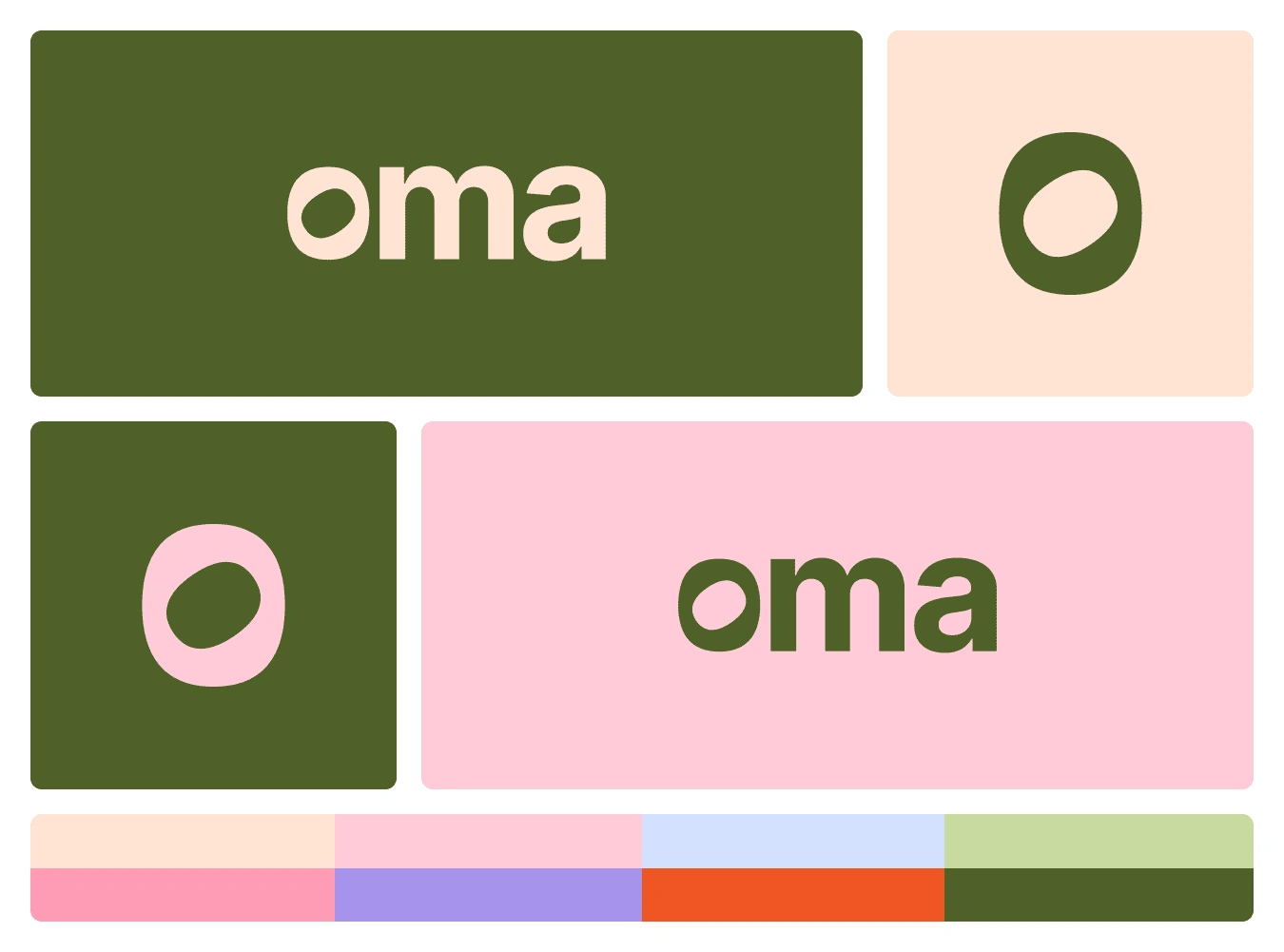
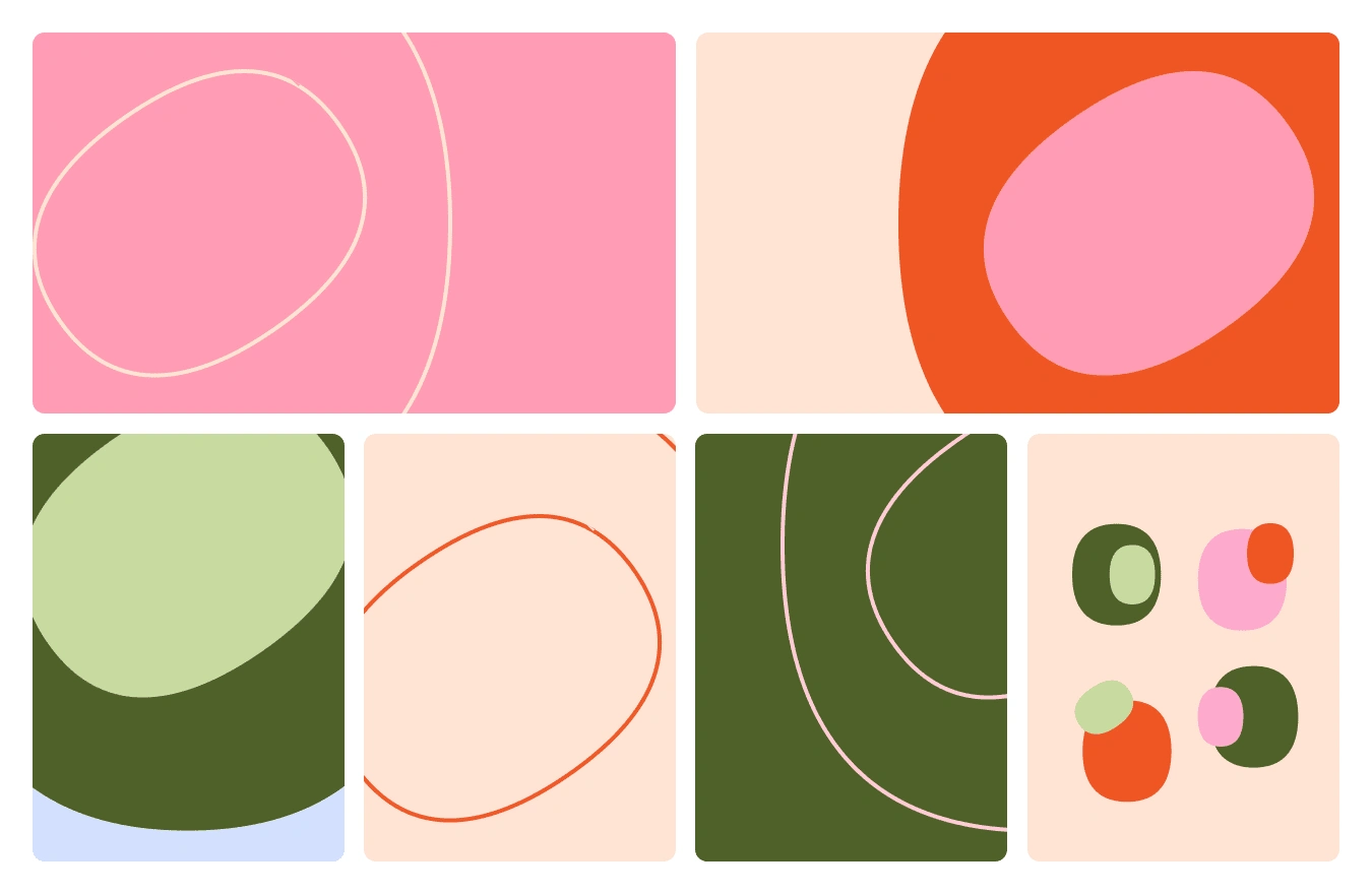
Combining vibrant, eye-catching colors with a bold identity, Oma redefines what it means to care for your skin. Its modern logo, inspired by the microscopic view of a skin cell, is a testament to the brand’s commitment to fun and science—a perfect blend of professionalism and playfulness.
Named after the Korean word for “mom,” Oma embodies nurturing care with every product, ensuring a skincare experience that is both effective and enjoyable.
Creation Process:
Discovery Workshop: Collaborate with the client to identify their vision, needs, and brand differentiators. Using the “Why, How, What” framework, we define the essence of the brand.
Competitive Analysis: Evaluate competitors to highlight their strengths and weaknesses, ensuring Oma stands out.
Concept Development: Create three unique design directions, each addressing the brand’s essence and goals.
Refinement and Finalization: Select and refine the winning concept, resulting in a bold, vibrant, and memorable brand identity.
Like this project
Posted Jan 20, 2025
Oma balances pleasure and impact. Inspired by “mom” in Korean, it blends care and science with a bold logo and vibrant colors for skincare that's nurturing
Likes
36
Views
232