Quinto Games Brand Identity Redesign

Jonathan Swanson

Quinto Games: Elevating the Online Casino Experience
Brand Vision
In the competitive landscape of online gaming, trust and sophistication are the primary drivers of user retention. Quinto Games sought to evolve its visual identity to better reflect its status as a premium gaming platform. The objective was to transition away from a casual, playful aesthetic toward a professional brand architecture that commands authority while maintaining its unique regional heritage.
Color Theory & Regional Identity
The color palette was reimagined to create an immediate association with luxury and trust. A dual-tone gradient was implemented, utilizing a deep Royal Purple to evoke the sophistication and high-stakes elegance synonymous with world-class casino environments.
To ground the brand in its physical roots, the purple shifts into a Tonal Azure, reflecting the coastal horizon of the Costa Rican islands where the company is headquartered. This "Oceanic Royal" gradient provides a distinct visual signature that separates Quinto Games from the generic red-and-black palettes common in the industry, offering a fresh, modern, and high-end feel.
Typographic Evolution
The original wordmark utilized a rounded, "bubble" aesthetic that leaned toward a younger demographic. For an online casino, however, the typography must communicate security, stability, and professionalism.
The new typeface was selected for its geometric clarity and balanced weight. Key refinements include:
Structural Integrity: Transitioning from soft, uneven curves to a more structured, high-contrast font that feels intentional and established.
Refined Kerning: Tightening the letter spacing (tracking) and adjusting individual kerning pairs to ensure legibility across small mobile screens and large-scale displays.
The "Q" Anchor: The letter 'Q' was identified as the brand’s strongest visual asset. By modifying the character to be more symmetrical and balanced, it now serves as a standalone icon. This "Visual Anchor" allows for consistent branding across social media avatars and mobile app icons, providing a recognizable shorthand for the full brand name.
Precision and Alignment
A rigorous grid system was applied to the logotype to ensure perfect visual harmony. By aligning the baseline of "Quinto" with a secondary supporting weight for "GAMES," the hierarchy becomes clear. The "GAMES" sub-text was updated to a cleaner, more spaced sans-serif to provide a solid foundation for the primary wordmark, ensuring that the logo feels grounded and architecturally sound.
Conclusion
The result is a brand identity that balances the excitement of the gaming world with the reliability of a financial institution. Through a strategic use of regional color theory and typographic refinement, Quinto Games is now positioned as a sophisticated leader in the iGaming space—built on a foundation of trust, luxury, and professional excellence.
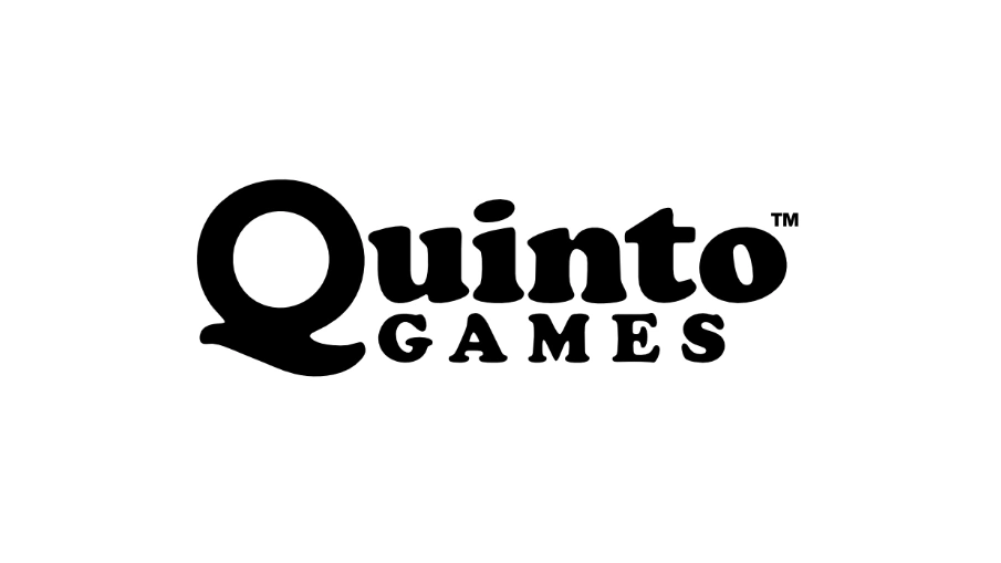
Original Brand Logo
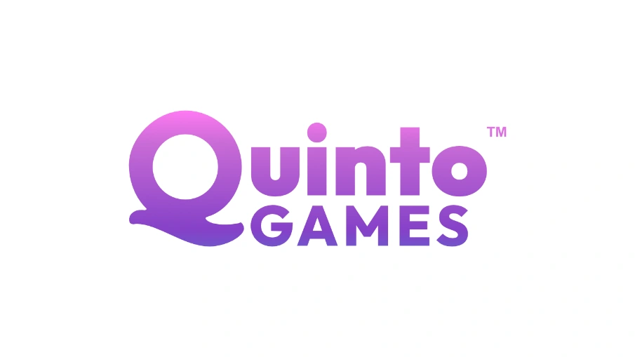
Updated Logo
Like this project
Posted Jul 11, 2026
The Quinto Games rebrand elevates a playful identity into a professional, luxury experience inspired by its Costa Rican roots.
Likes
1
Views
9
Timeline
Jun 1, 2026 - Jun 30, 2026